Proposal
In my level 6 practice I plan to carry on focusing on and developing the areas that I feel I have excelled in and have been very passionate about in level 5. These include, making ceramic forms influenced by historical pieces/ forms, I think I will also potentially look at human form itself and how to incorporate almost sculpted elements into my forms, “it would seem that the potter has always hankered to humanise his wares and to invest them with the lineaments of his fellow beings”, “pots in the form of human beings or with elaborate reliefs of rustic or domestic life have an ancient lineage”. I will also continue looking into people’s history, heritage and location and tell specific stories of historical note, “Art often tells stories. Sometimes by looking carefully at a single work of art, we can find many elements of a great story: the characters, the setting, the plot.”, “There is always something more to be learned in the visual arts of which pottery is one of the manifestations”. I also think that I will potentially look into language and colloquialisms as I think historically, language plays a huge roll in the stories of our past and in certain instances, the origins of our colloquialisms and language can open up even more of an insight into our history as people. “Storytelling with pottery decoration allowed many ancient civilizations to record unique and revealing narratives of their lives, as a means to record and reinforce their cultural beliefs for coming generations. This was usually integrated into a decorative theme and expressed creatively.”.
I will continue exploring not only the stories of people through my ceramics but also the relationship and history between people and clay, “Clay is one of the oldest materials used by the human race”, “An impulse towards knowing and feeling which shapes human action and hence the world we create”
I will be looking into artists such as Grayson Perry, “his insistence on the artisanal nature of the work, the emphasis on repetition, the mark of the maker”, “I’m interested in developing a rich vocabulary with one or two media and think artists who don’t do that are sacrificing part of their vocabulary, their kind of fingerprint on the work and that physical relationship to (the) work”, “ everything about the painting depends on line, the colour relationships, the composition, the hint, the reference, the texture, everything about them is so thought about”. I will also look at Ebony Russell who takes inspiration from historical pottery forms and themes and interprets them in new and extravagant ways using surface texture. Furthermore, I will be looking into Joellyn Rock for her unusual and creative use of colour, form, and narrative story telling through illustration.
Ashmolean Museum Collections, Initial. (2023) Around the world in 80 pots. 1st edn. London and Surrey: Welbeck Publishing Group.
Charny, D. (2011) Power of making: the importance of being skilled. 1st edn. London: V&A Publ.
Dalton, W.B. (1960) Notes from a Potters diary. 3rd edn. London: Pitman.
Hood, R. (2010) Ceramics, Sculptures and visual art- from antiquity to contemporary. Available at: https://www.veniceclayartists (12 June 2024).
Perry, G. and Jardine, L. (2004) Grayson Perry. 1st edn. London: Victoria Miro Gallery.
Haggar, R.G. (1950) English Country Pottery. 1st edn. London: Phoenix House.
From my proposal I thought that I would expand on why I chose the artists to look at that I did. First I decided to look at the artist and ceramicist Grayson Perry.
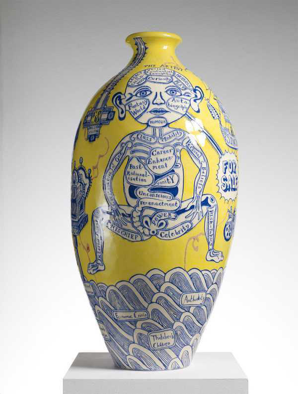

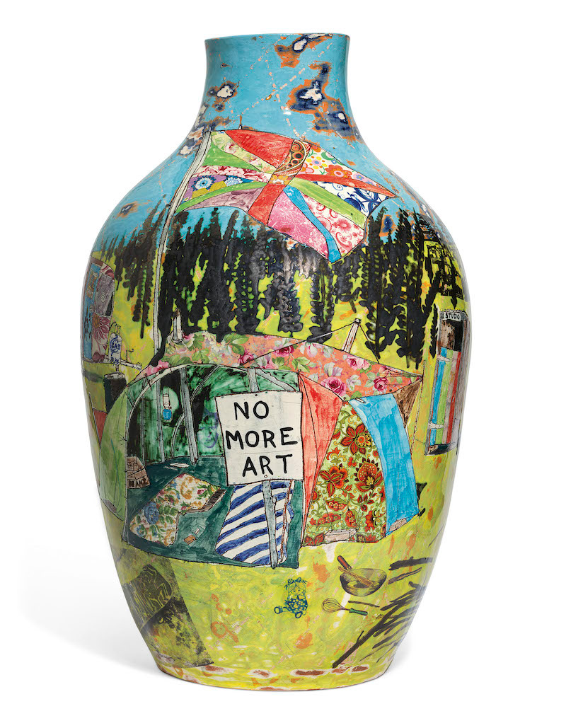
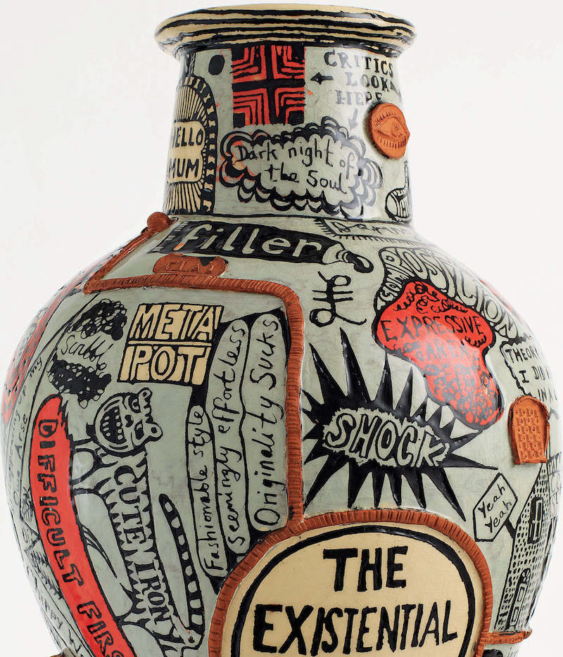
I chose Grayson Perry as inspiration for his elaborate story telling through varied surface design.i find Perrys ability to tell complex narratives through pottery inspiring and I aspire to do similarly with my own stories. I am also greatly inspired by his use of colour and variation of technique on his surfaces. I feel there is an element of freedom within his designs that I feel I would succeed from embracing. I am inspired by Perrys work not only visually but also on a visceral level. I will experiment in my own work with incorporating many different techniques of surface design and surface decoration to create more dynamic pieces with naritive. I do however find that sometimes when Grayson Perry has been an influence in a piece, that it shows and can almost come across as a poor copy or can look too simulated to the real thing, I will try to purely just take inspiration from his work and philosophy and not try to to make my work look like reproduction.
The next artist I looked at for inspiration was Ebony Russell.
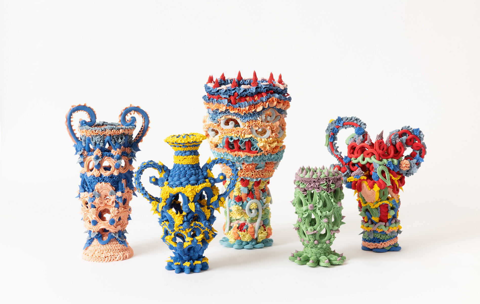
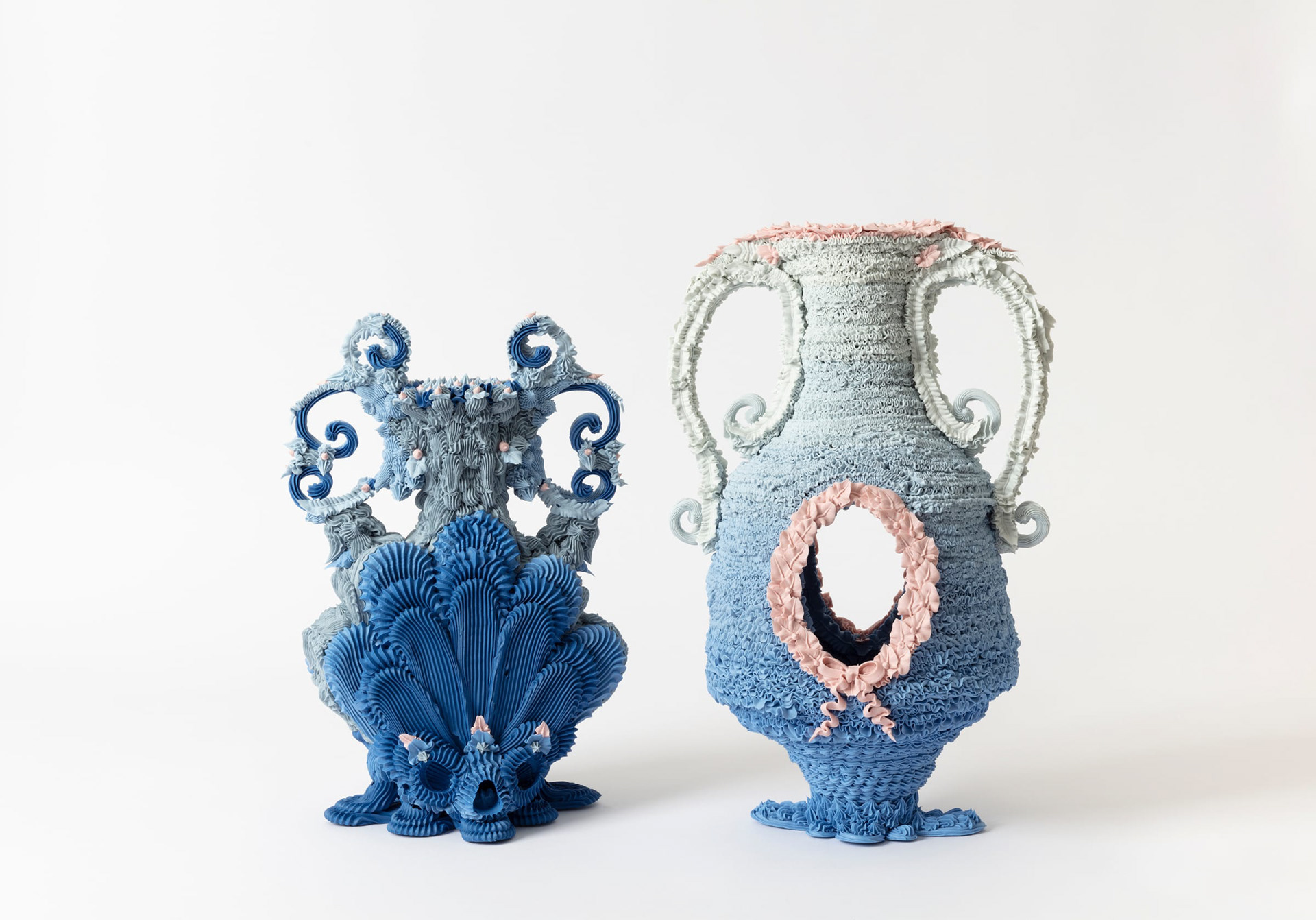
I came across Russells work first at the 2024 Collect show at Somerset House. I was hugely inspired by her use of texture, form and historical influence. In my next project I am setting out to make my pieces more texturally affluent. I really love how Russell incorporates rococo inspired forms with almost frilled and pleated texture, and modern colour ways . Russells work has a delicate aesthetic however I like how technically it is not perfect, in places it can be wonky and clunky but I like this as it comes across as non manufactured and the connection to maker is more than apparent. Her pieces have a lot of personality and this is something id like to emulate in my work. I will experiment with ways of applying interesting texture to my pieces.
Lastly in my proposal I looked at Joellyn Rock.
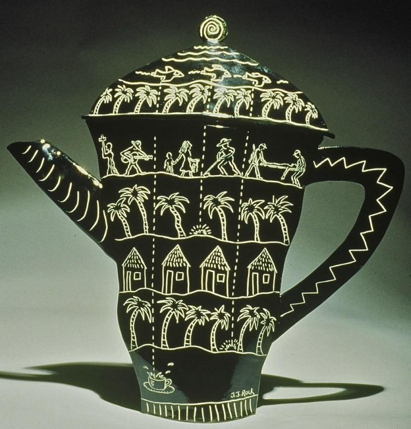


I like the work of Joellyn Rock because she blurs the line between surface imagery and form. Her narratives are so intwined with her work, they almost become the piece. I am inspired by her seamless integration of detailed illustration and 3D modelled elements. In my work this year I am keen to incorporate 3D modelled elements, I wasn't entirely sure how this could be successfully and stylishly integrated into my pots as well as illustration however since discovering the work of Rock, I have a become hopeful that through sampling and considered design I may be able to take on this challenge and complete a design with all four of my desired elements; Narrative, historical influence, illustration and 3D elements.
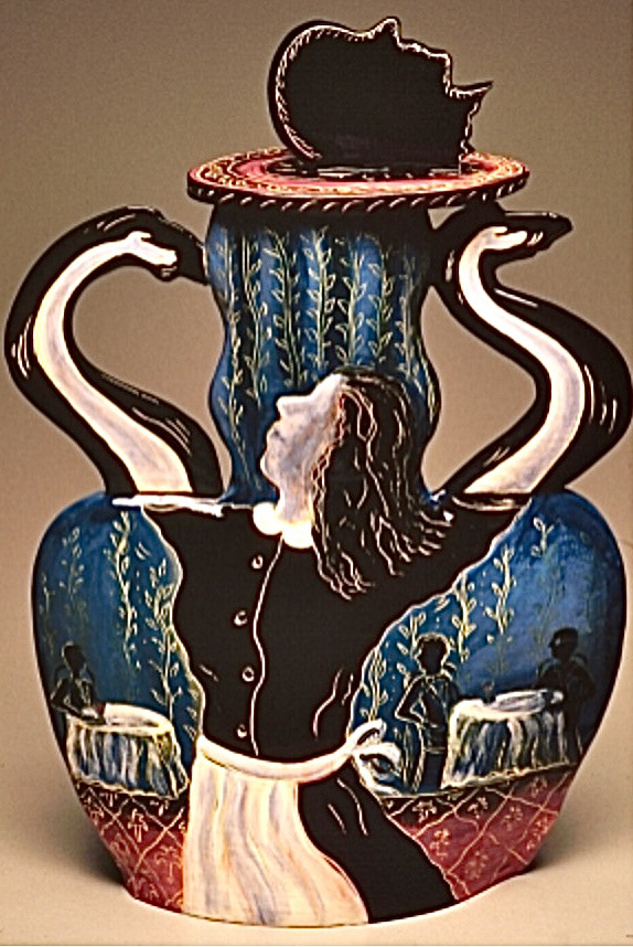
Throughout the summer I kept an eye out for even more inspiration that related to my proposal. Firstly I went to the Royal Academy Summer Exhibition, where I found a piece called "Dancing Queen II" elected by Elsie Owusu.
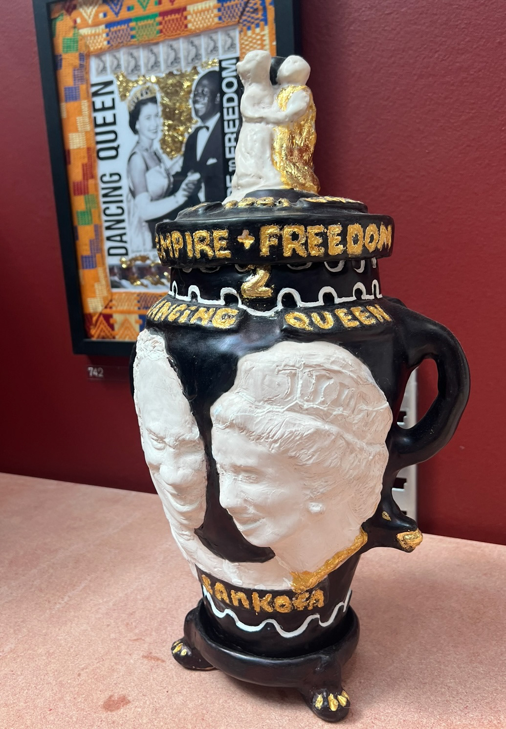

Unfortunately after much searching I couldn't find much information about this piece, however visually I was extremely intrigued. I thought that the way that the 3D portraiture was incorporated was very similar to the idea I had in my head of how I would incorporate some of my 3D elements, I have always practiced portraiture painting in my free time so I think that this would be a next level push of transferring my skills and understanding of light, shadow and form from 2D into a 3D medium . I also liked the clear historical influence and the fact that their was a narrative, however again I couldn't find exactly what that narrative was but I'm sure that if I had been able to find out, it would have made the piece even more interesting to me.
On the pursuit of sculptural 3D design inspiration, I decided to take a visit Sir John Soane's House Museum. I've been desperate to visit for years so I decided that whilst I was in London, in search of inspiration, this was my excuse.


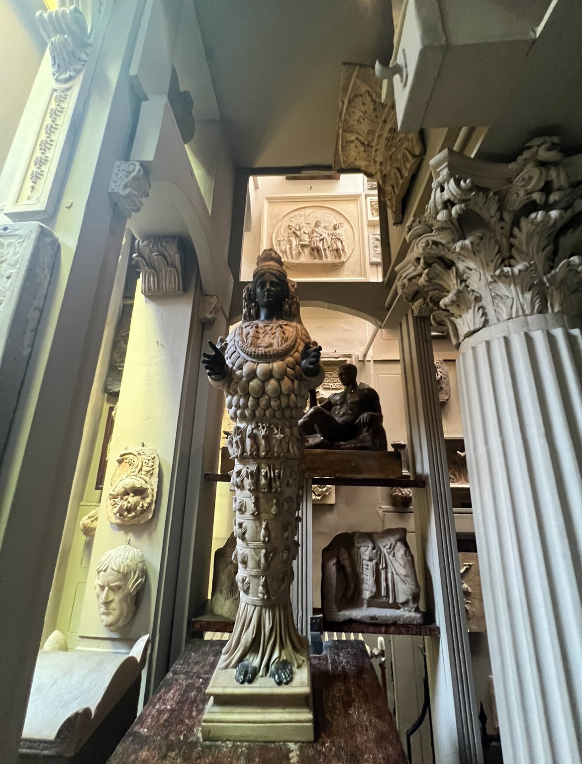
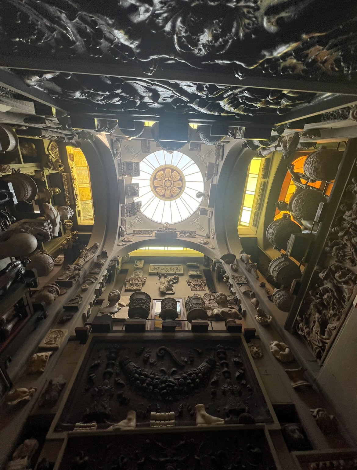


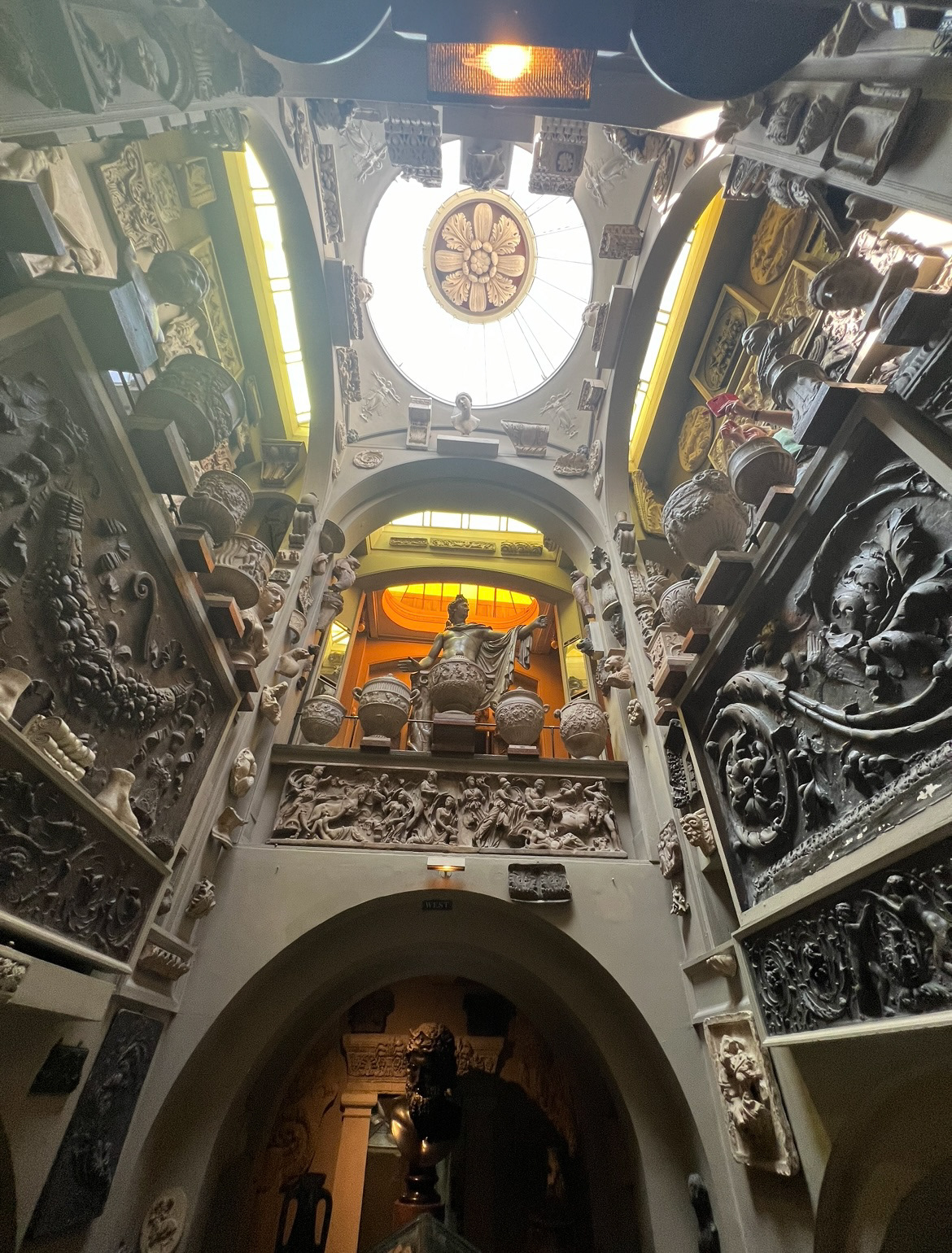
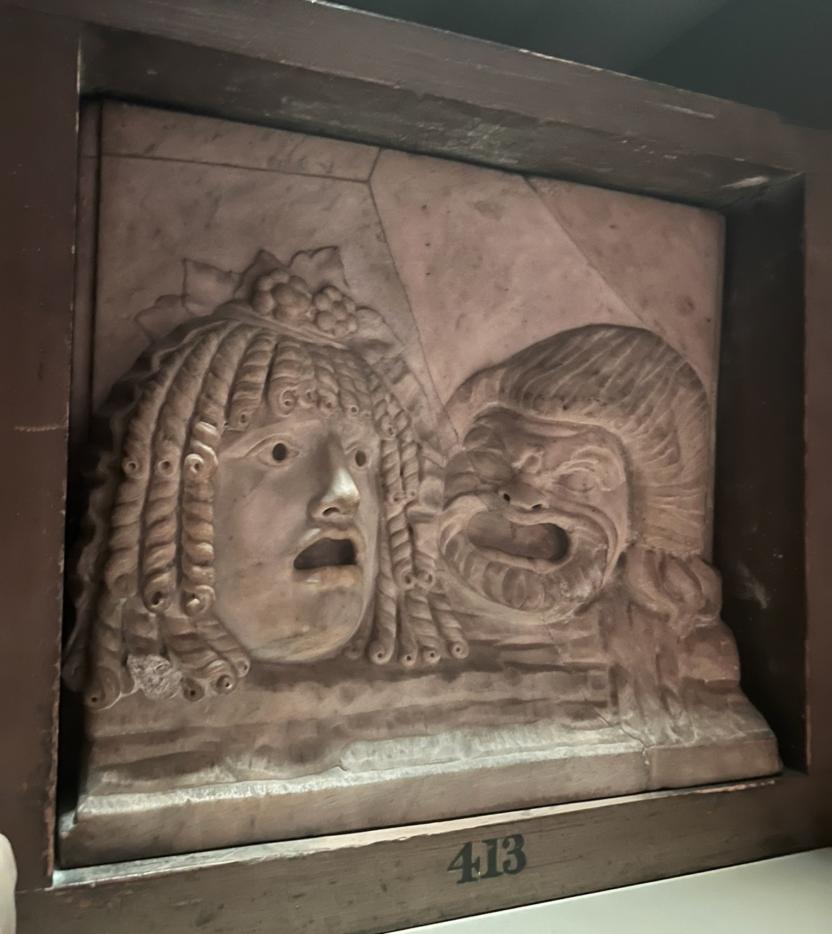


John Soane was an English architect born in 1753 who specialised in Neo-classical design in the regency era. He was an avid collector of paintings, sculpture, architectural fragments and models, books, drawings, furniture and antiquity from all around the globe. Soane displayed his collection in his home and in his later life opened his doors to the public, making his house into a museum. in his will, Soane declared that in the event of his death, a museum curator be housed as a resident in the houses upper rooms to take care of his collection, a curator is still housed at his home to this day.
I absolutely loved visiting John Soane's house, it was great food for inspiration and it was so interesting to see so many examples of historical design from so many different time periods and countries all in one place. Even from a personal connection, I believe you can know so much about a person just from what they choose to have in their house, and Soane's house was no exception. From such an abundant collection, you really got a feel for what he appreciated and what his personal taste was. I could really sense his passion for history, story and literature as well as spirituality. The main inspiration that I will take from here however will be from the abundant collection of stone imagery in relief, I think this will work as good reference for my 3D modelling on my pots.
Whilst I was at John Soane's house museum, there was a small private exhibition on from an artist called Pilar Corrias.

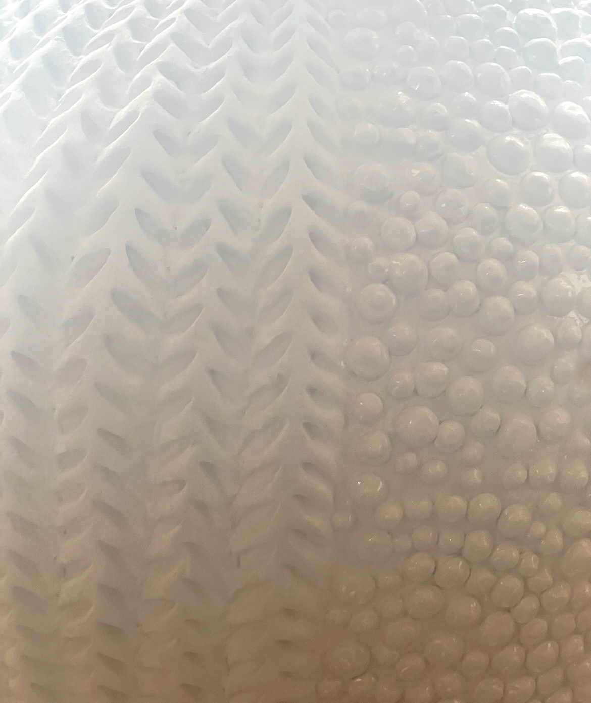
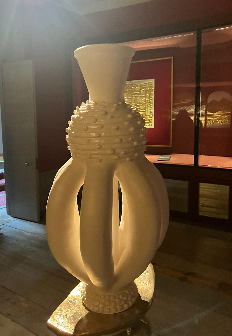
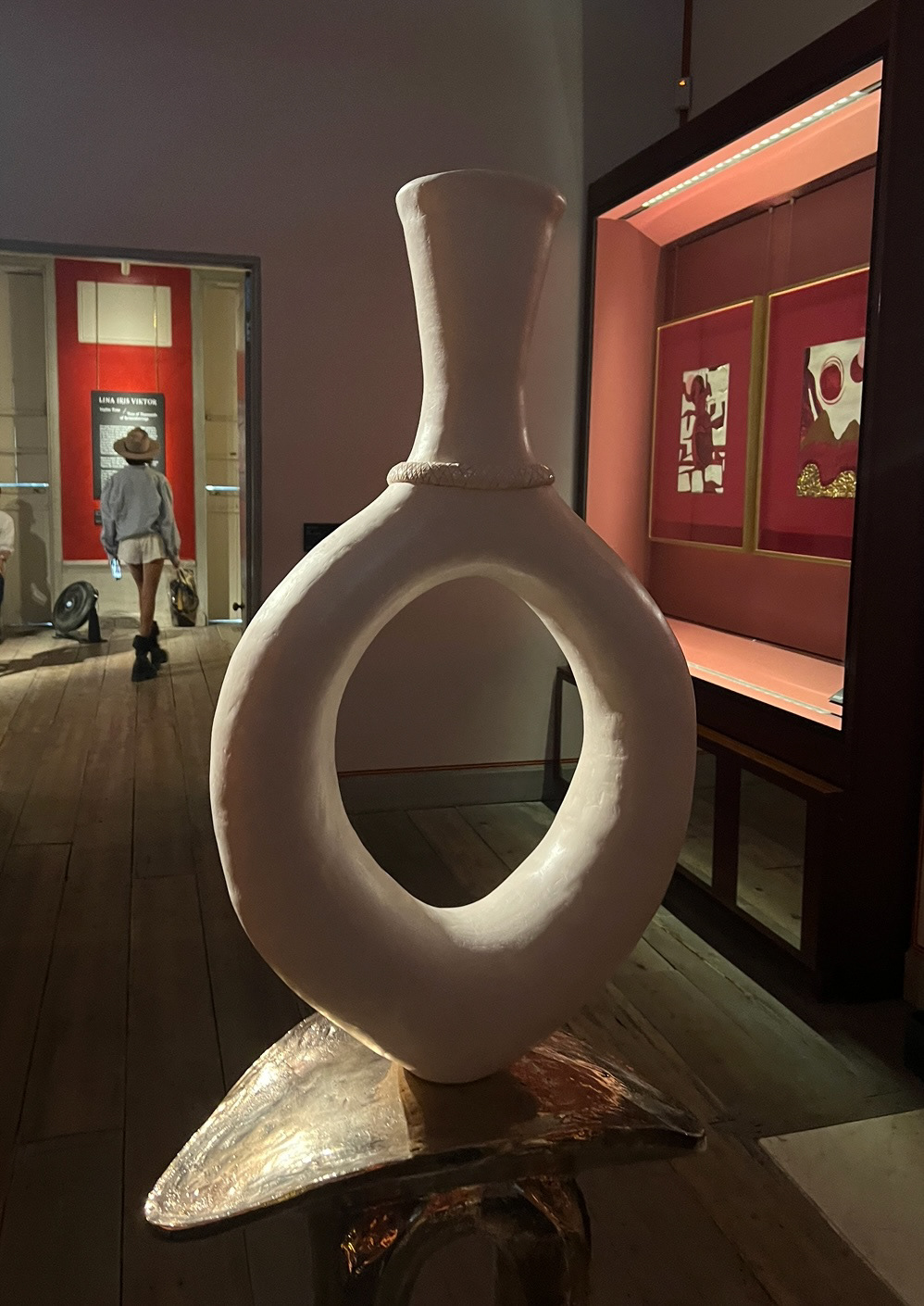
Im glad I stumbled upon this exhibition because it proved as amazing inspiration in terms of form and surface texture. I found the forms quite unusual and elaborate and defiantly provided food for thought on how I could potentially experiment with making my forms more elaborate and dynamic. Surface texture wise I found these pieces fascinating as the glaze was very minimal however the surface texture elevated them a lot. I really liked the integration between 3D pattern and sunken relief pattern, I think this was very effective and again something I will bear in mind.
inspired by experimenting with form, I made some samples of forms I had never explored before. making these forms also helped a lot with getting back into the swing of coil building again after a long summer, this however meant that they were not perfect but I was somewhat happy with how they turned out all the same.


I thought that through my proposal I could explore themes leading on from my work on UC2, where I looked at aspects surrounding the area of the north east where I'm from, as well as expanding out and exploring topics that correlate. I thought that language was a good place to start as I find that a great part of the culture of a place lies in its language and its colloquialisms, especially in the north east of England where a great number of different and diverse colloquial dialects live in a small area of land.
My family is from Sunderland which has its own distinct dialect called 'Mackhem' or 'Mak'em', not to be mistaken with its arguably more well known cousin, 'Geordie' which comes from the neighbouring towns of Newcastle and Gateshead, or more distant cousin 'Smoggie' from Middlesbrough and Teeside.
The word 'Mackhem' comes from Sunderland's Ship building heritage and the phrase 'We mak'em and you tak'em' (we make them and you take them) meaning the ships that were being built to export goods around the world.
The actual dialect of 'Mackem' however comes from much further back.
In 410 A.D. the Roman Empire falls and England is invaded by the Scottish Picts, with regiments along Hadrians wall in the north east. The king of the Brittons (English people) hires several armies from Germany and Denmark called the Angles, the Saxons and the Jutes to help fight the picts, However the Angles and Saxons decide they would like to invade England themselves, the Angles take over the north and the Saxons take over the south. England is now Anglo-Saxon. In 865 A.D. the Vikings from Scandinavia, land on the shores of the north east, settle there for a while and then take over the rest of England until 1042 A.D..
The Mackem dialect is therefore heavily influenced by Scottish, Scandinavian and germanic languages. This can still be seen today through Mackem words and phrases like 'Gannin Yem' meaning going home, which comes directly from the word 'Hjem' meaning home in Norwegian and Swedish.
I made a concept drawing based on my research inspired by a Scandinavian design style called rosemaling.
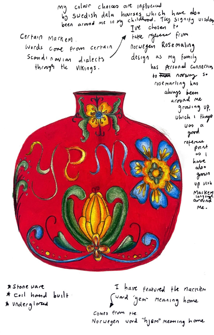
I chose this style based on designs from rosemaling pottery that are owned by my grandmother, bought in Scandinavia whilst visiting my mother when she worked in Norway in the 80's. My Grandmother also has long time friends and pen pals from Scandinavia, who send her presents at Christmas, some of these presents from friends in Denmark are Dala Horses. These Dala Horses and their design have been around me my entire childhood alongside the Mackem dialect, so these seemed appropriate to influence my colour pallet. The red of the Dala Horse also reminded me of the colour red painted on the bow line of the ships that used to be built in the ship yards Sunderland. I enjoyed the task of integrating all of these elements together into this pot idea and in future might find a way to integrate the Mackem words into the rosemaling designs more seamlessly.
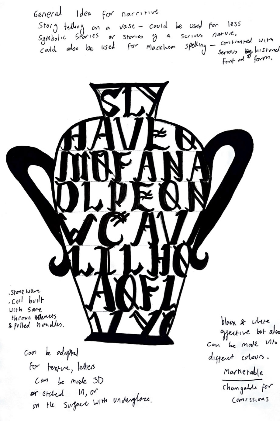
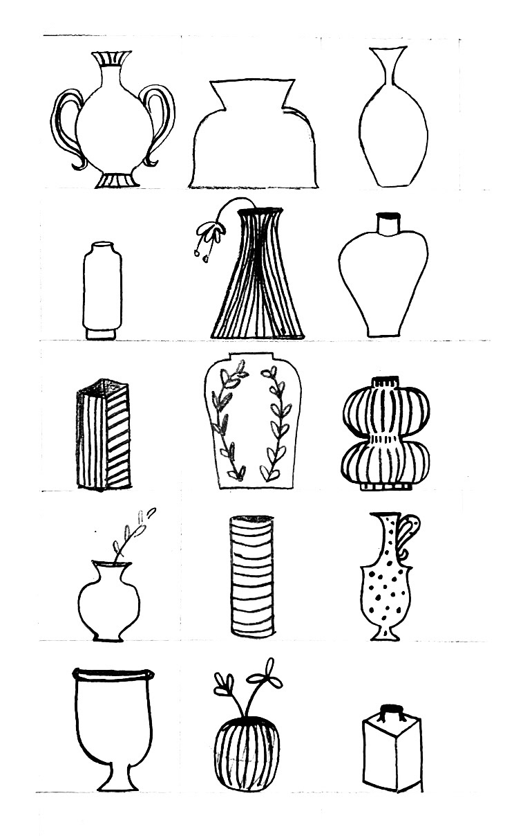
After drawing up this design I decided to draw up some more based on some general ideas that I had around language and narrative, these ideas could be used with language related concepts that I come across in future, and some forms that I could look at for inspiration and maybe utilise later on in this project.
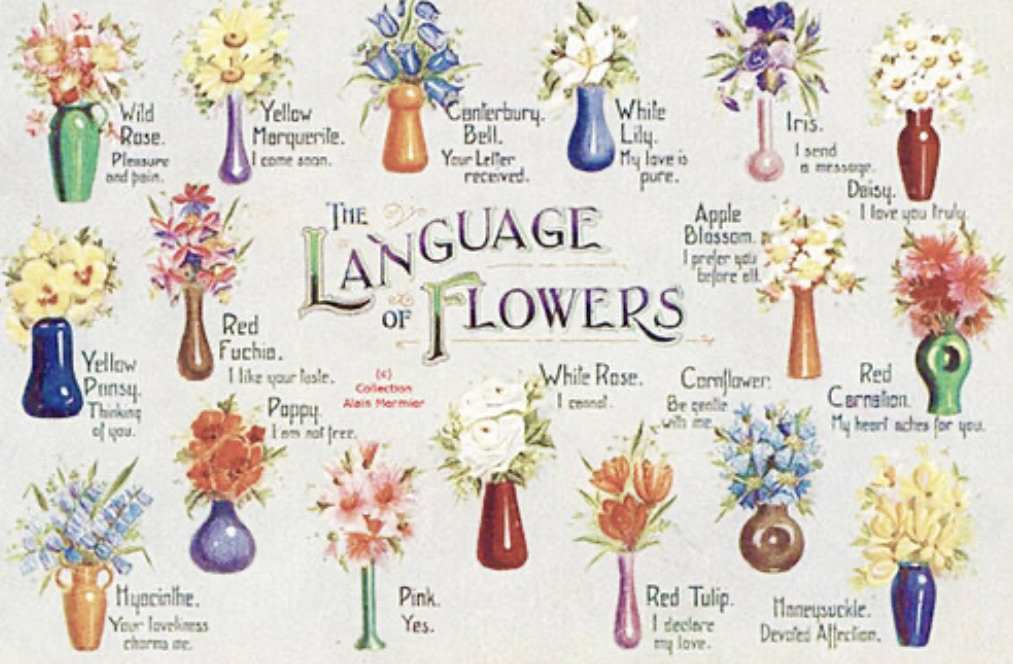
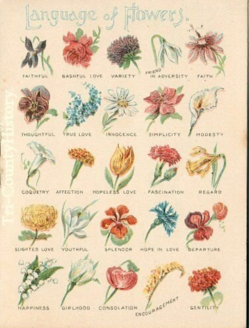
Next however I drew up some concepts for pots based on research I had done whilst expanding on my Mackem idea. I came across the phenomenon of Victorian Floriography. Floriography was a form of secret communication from the Victorian era (1837-1901), where people would send each other flowers and hidden within the bouquet would be a message. Each different type of flower would have a different word or phrase associated with it, each bouquet would have an iris incorporated, meaning "I am sending a message" then this would be replied to be sending a Canterbury bell flower meaning "I have received your message". I did my research using scans of victorian illustrations from pamphlets and magazines.
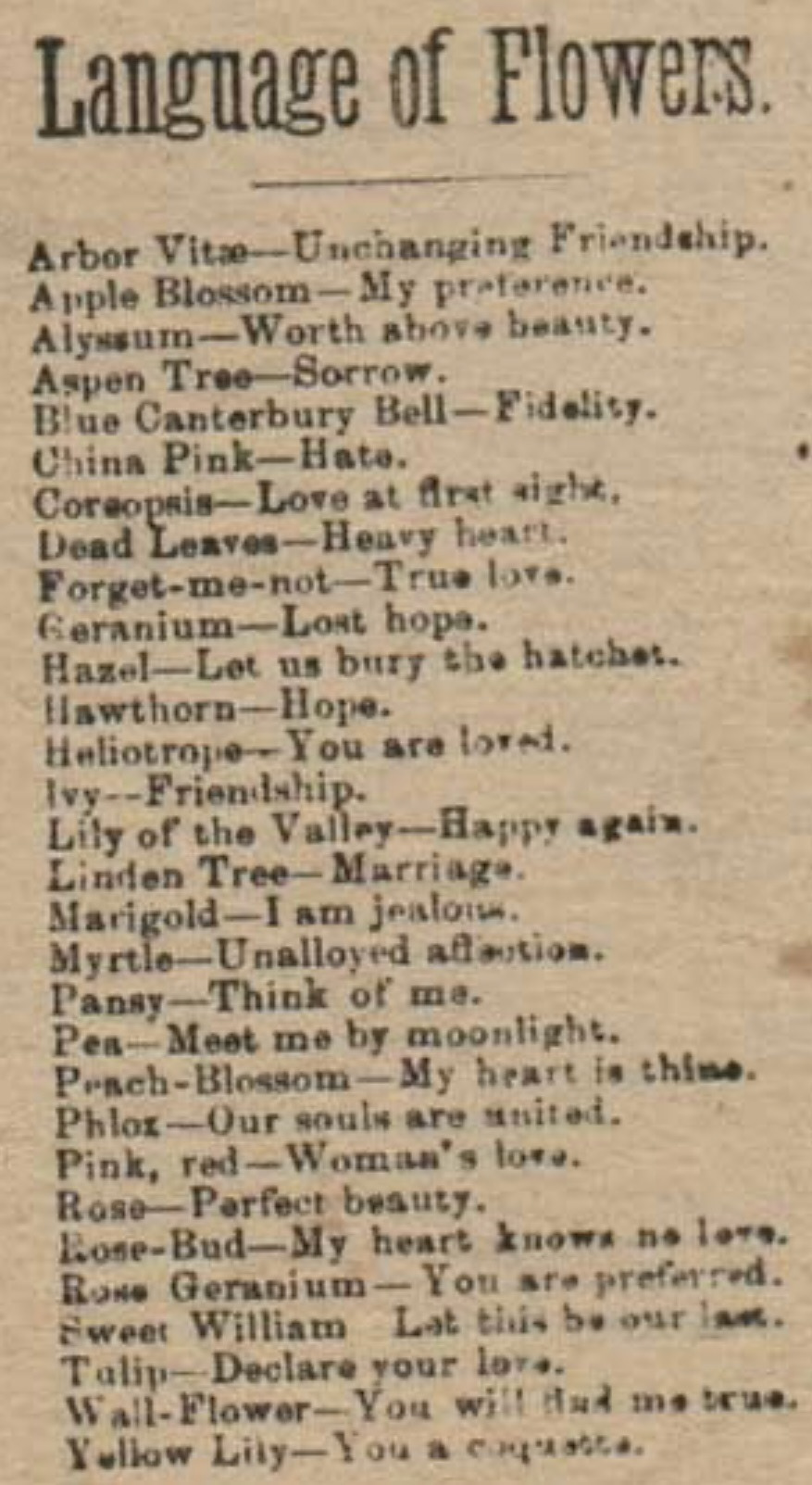
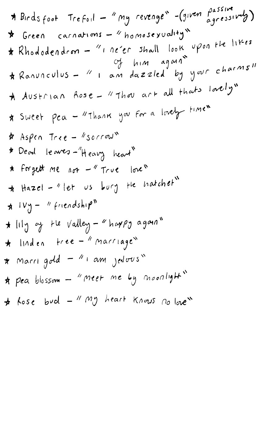
I then made a key in my sketchbook.

From my research, my idea was to create a pot concept that brought in this idea of a secret conversation between people. As the vine works its way around the pot, a conversation is taking place.
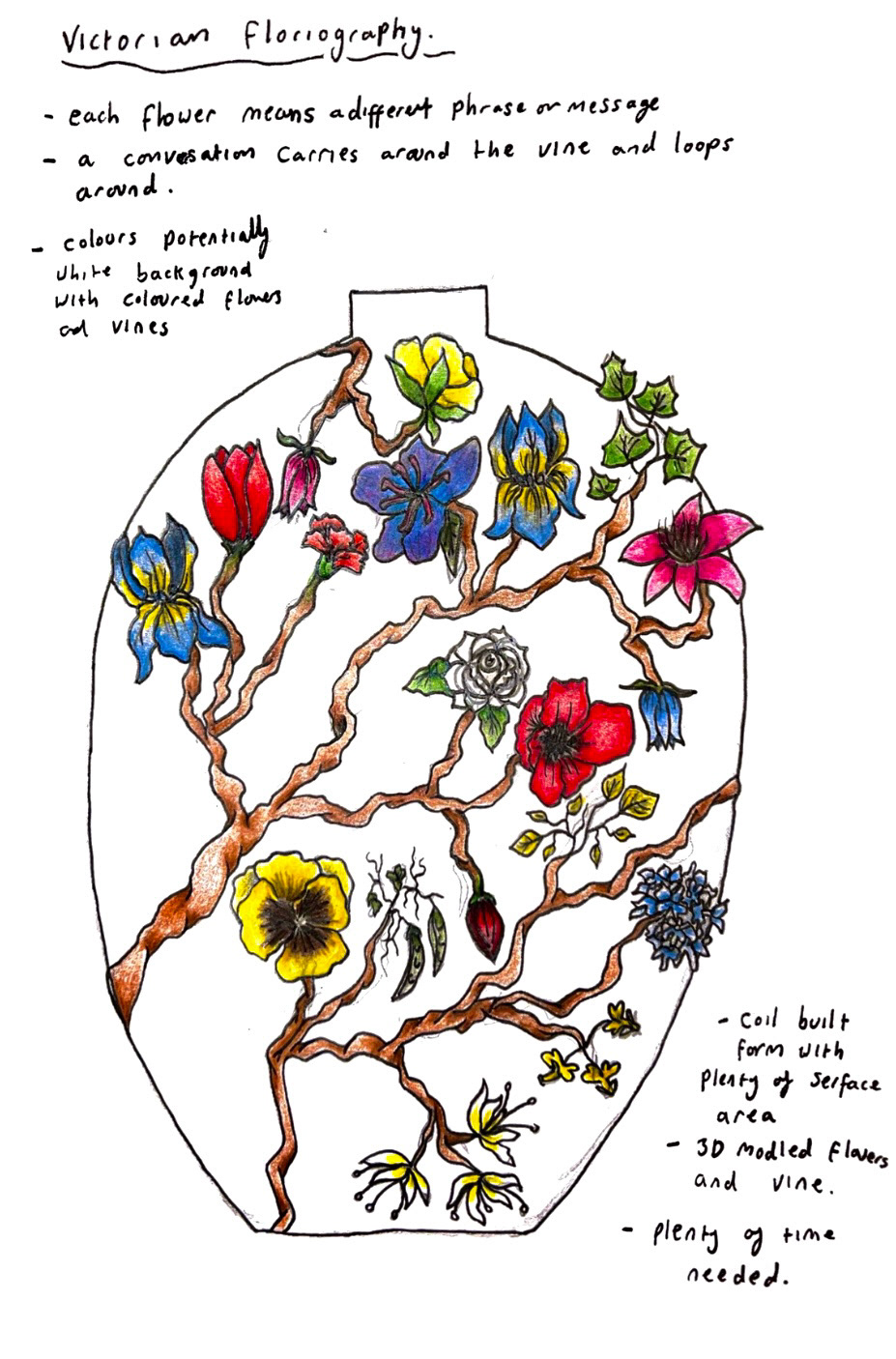
The flowers and vine will be three dimensional, practicing what I set out in my proposal about creating more elaborate design. this pot is still in the concept stage so I will try and practice these aspects in future as well as practicing with different glazes so that my pot can be as dynamic as possible. So that the flowers stand out as the main interest of the piece, I will leave the background white.
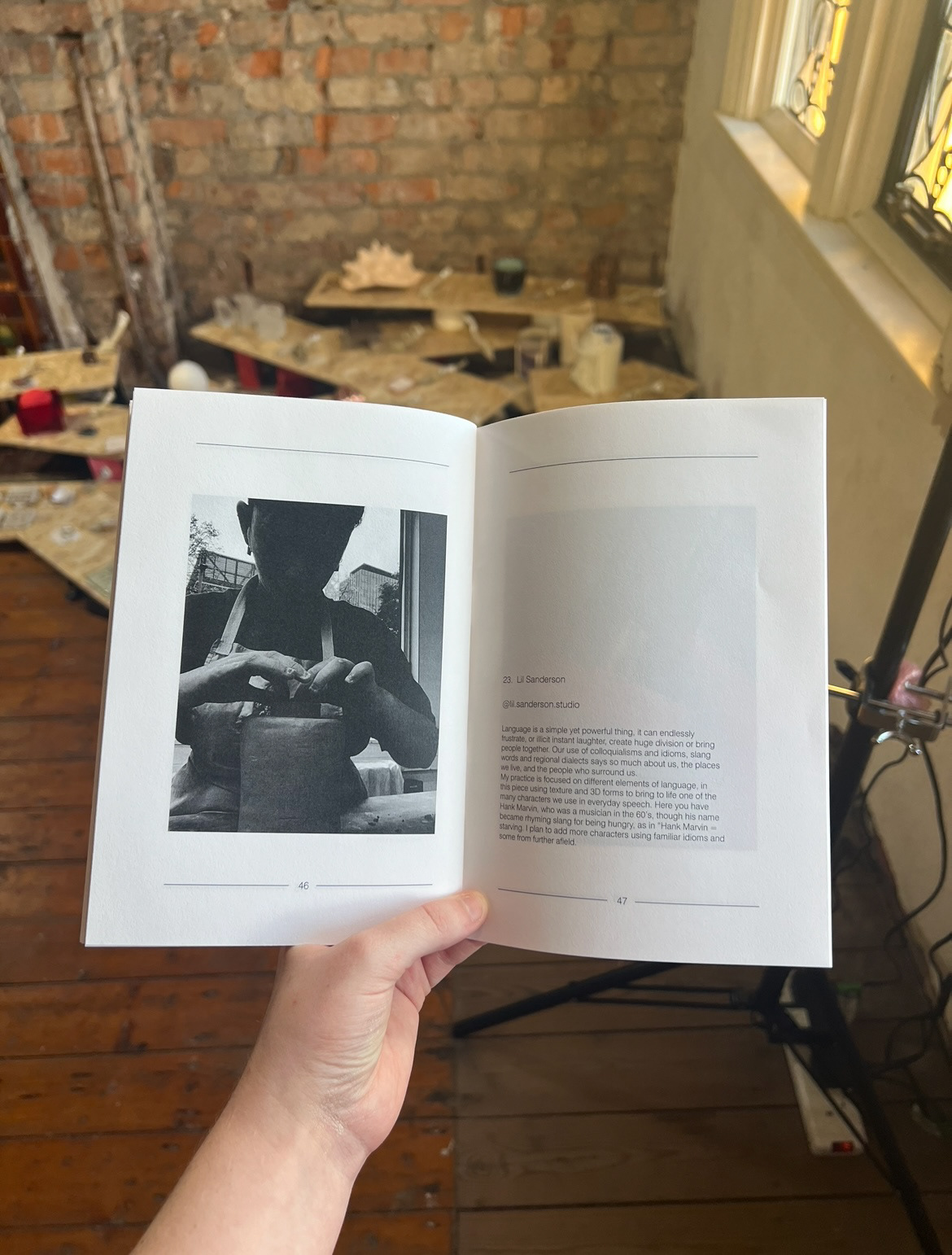
My Next idea and concept I drew up was based on colloquialisms and idioms. I was fascinated by the idea of idioms using peoples names such as "bobs your uncle" and rhyming slang such as "Hank Marvin starvin". I was interested in finding out who these people were and why we use their names in every day language and in colloquial slang.

My concept was to make a large pot with 3D modelled frames, featuring 3D modelled portraits of the people featured in the idiom sayings, with banners accompanying them with their names to create almost a gallery wall look.
After I had drawn up all of my potential concepts, I decided that I would create some samples based on them so that I could practice a bit of my 3D modelling and get more of a feel of what my concepts could look like once built.


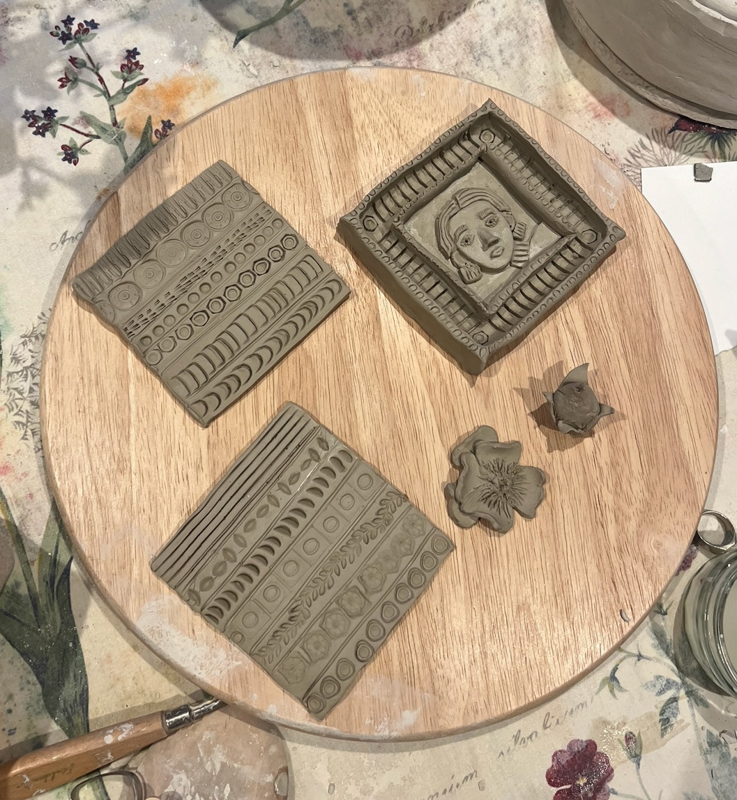
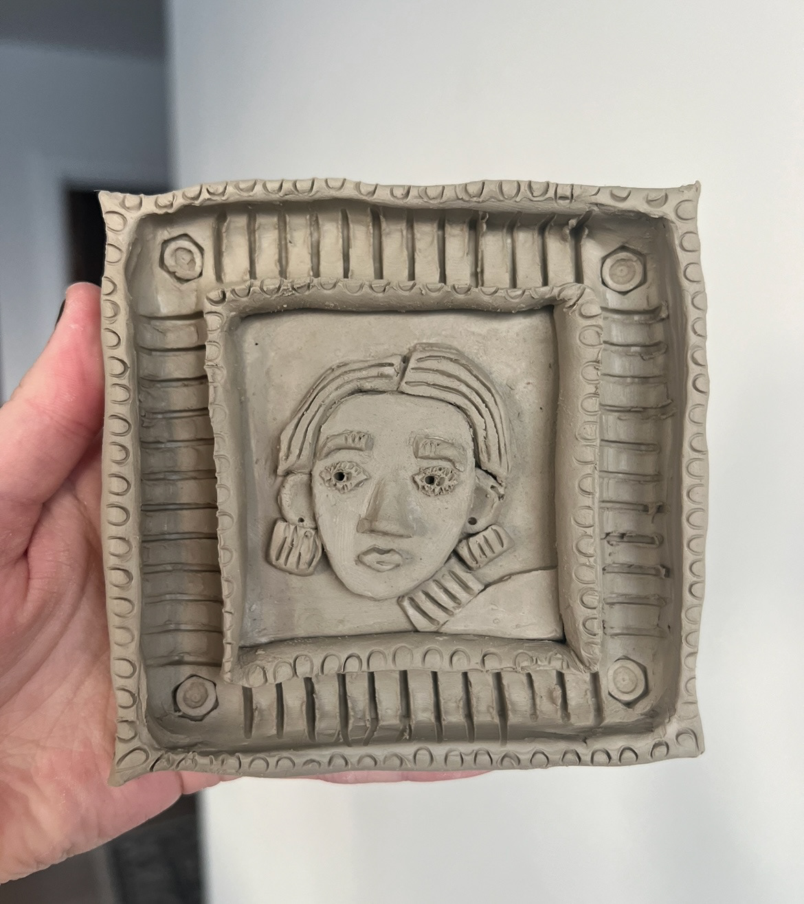
I started off by making some texture samples by testing different ways of making pattern using house hold items pressed into my clay tiles. These really helped when making my frame sample as I could choose my favourite texture/ pattern and incorporate it into my decoration. making my frame sample was defiantly the most difficult as it had a lot of small parts, especially when making the figure as all of the parts had to fit together and all be on the right scale. in the end this was my favourite sample as it was the most detailed and came out better than I could have expected.
I made the frame by first making a square tile, I then attached four thick sausage pieces to the edges to create the body of the frame. This created a flat sunken area in which the portrait would sit. I then used a loop tool to scoop out the middle of the sausages, this made the frame look really dimensional. Next I added the frame decoration, I used the lid of a pen to create the corner detail, a fork to create evenly spaced stripes and a bent piece of wire to create the smaller rim details.
Next it was time to create the portrait, I didn't go into making this part of the sample with a plan as this was just a first practice sample so I was working it out as I went along. I started off by making the head shape, I drew this out on a piece of paper and made a template which I could then cut around into a piece of rolled out clay. I then attached this to the surface in my frame. using the paper template, I could then use this for reference when cutting out a hair piece, neck and facial features. I then added texture with a pin tool.
I then also created some 3D flower samples based on my concept drawing of my floriography vase.
Once I had completed these samples and I was happy with them, I decided to do some further research on some key themes of the year ahead.
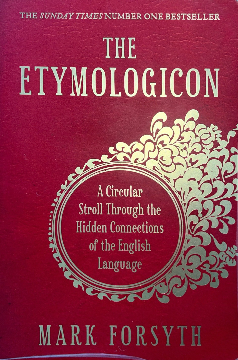
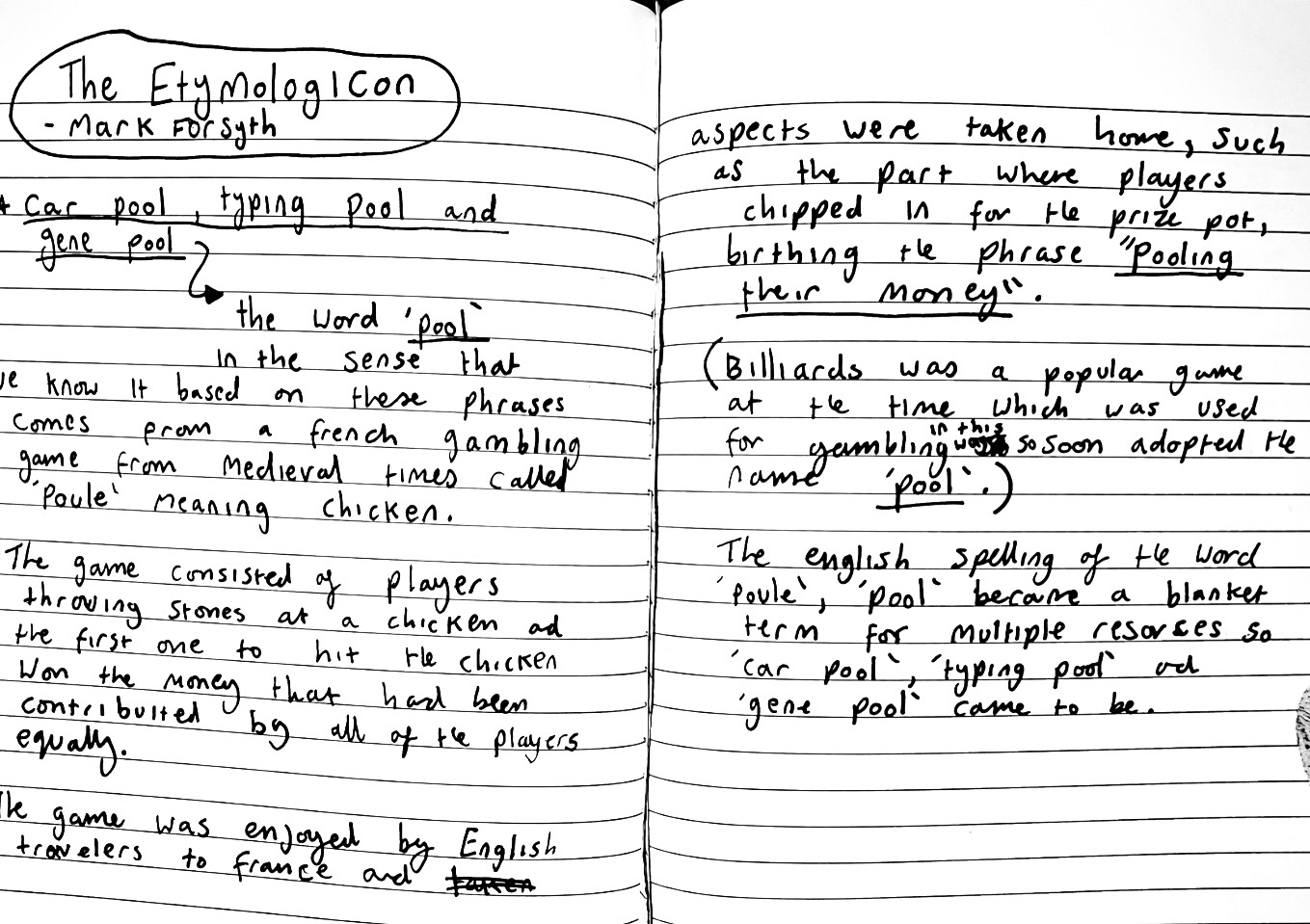
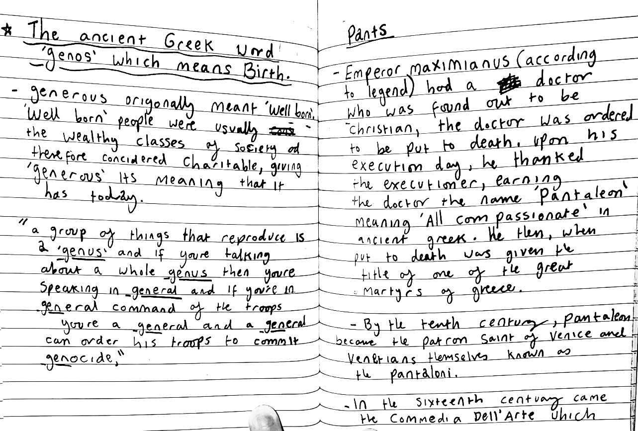
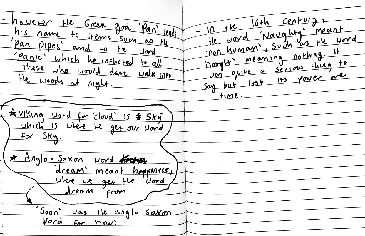
I first started by reading 'The Etymologicon' by Mark Forsyth, in this book Forsyth explores the origins of words an phrases in a cyclical manner. I found this book extremely interesting and a a fountain of knowledge for etymological knowledge. I think that I will be able to find much inspiration from this book going forward. I made some notes while reading.

I also read 'Clay' by Jennifer Lucy Allan
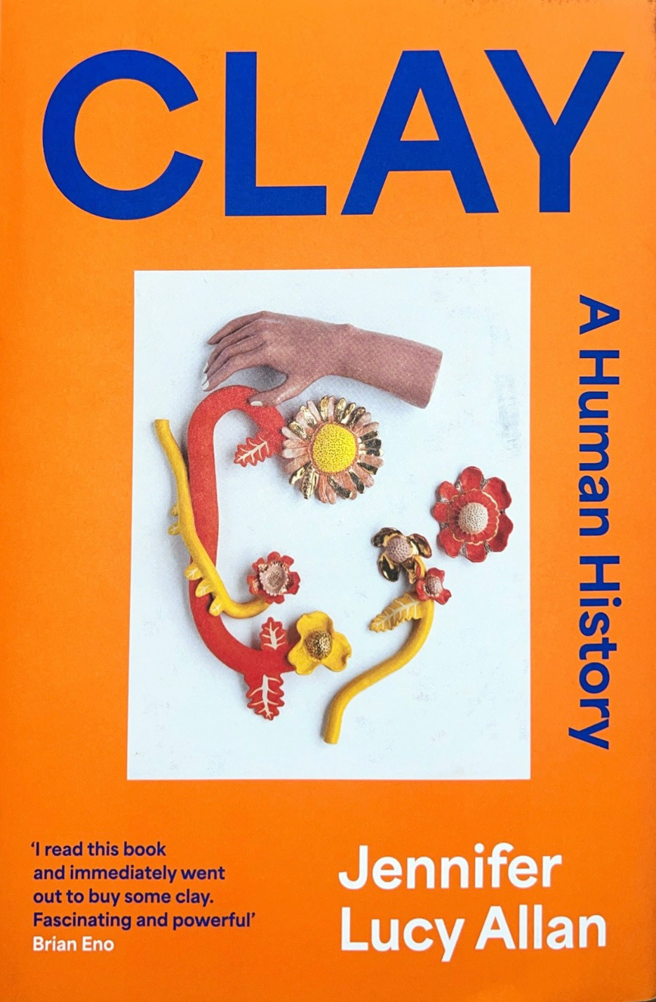
This book was a really good insight into another perspective into the theory of making and the history of the connection between humans and clay. Allan also looks through the V&A archives and documents the works of different artists and ceramicists. I really loved this book and think it will inform my practice on the history of my materials and engage my passion for my practice.
Finally I read 'How to become a successful artist' by Magnus Resch
This book is about the essential knowledge needed to have the best start in your career as a freelance artist. I am still in the middle of reading this book however I think that so far what I have read about finding gallery representation is very promising and I think I will be reading this book very closely and taking on a lot of the infomation for later on in the year.
After presenting all of this as my project Beta presentation, I was recommended to contact the artist Erin Dickson about her work on the north east dialect. I really liked her work titled "pain in the back of my neck", in this film piece she works with a vocal coach to try and speak "properly" to work out her north east accent, it is a commentary "between class and accent in the UK". Whilst emailing with her Dickson told me that this piece was named after a Two Ronnie sketch of the same title. She also directed me to an article by The Guardian about the judgement of North east accents which I will dissect later on in my project, I will also do this later on with a piece she recommended I look at by an artist called Fiona Hill called 'There is nothing for you here'.
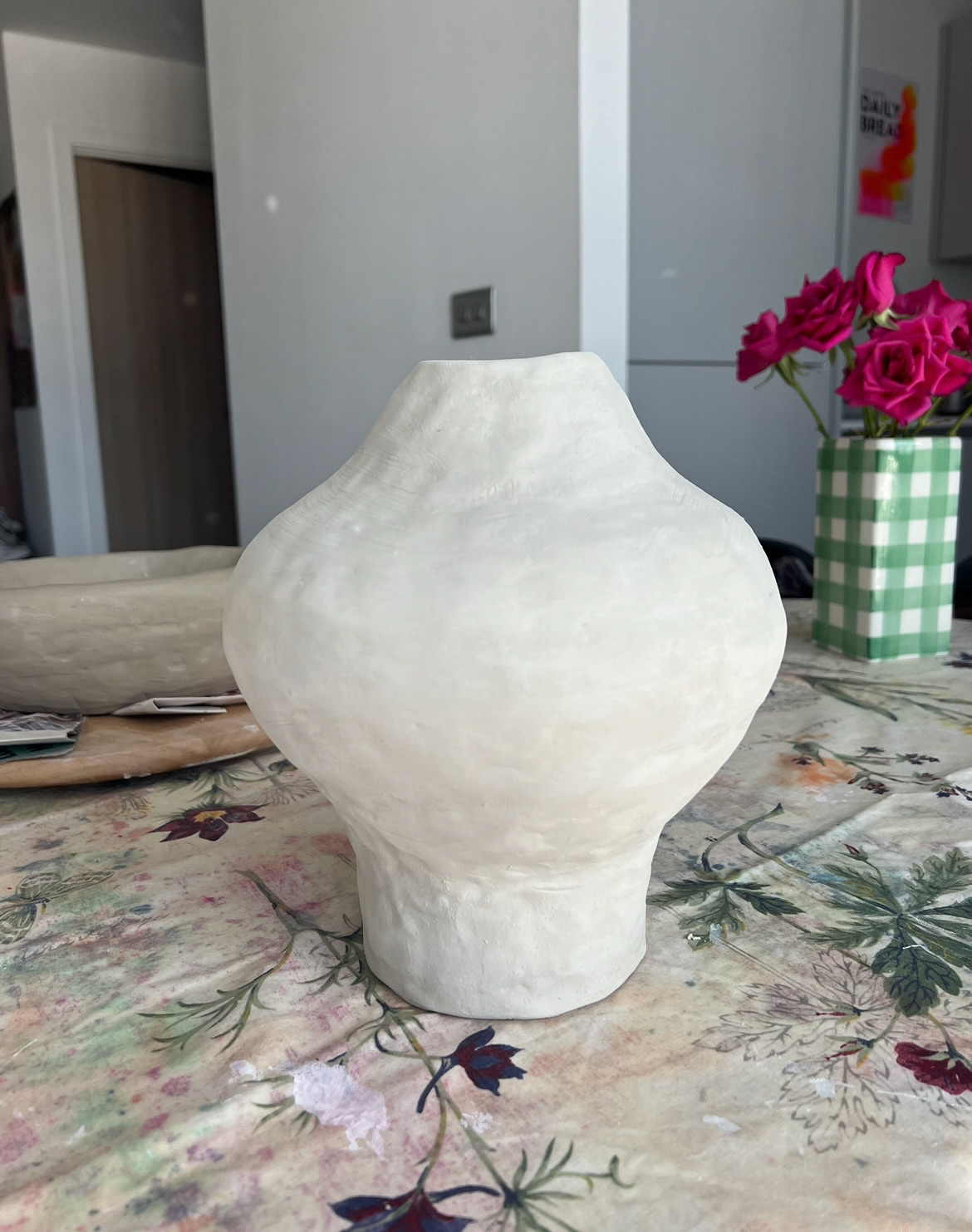
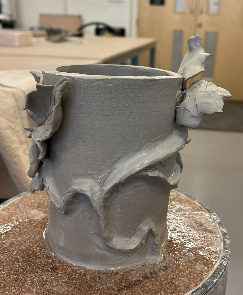
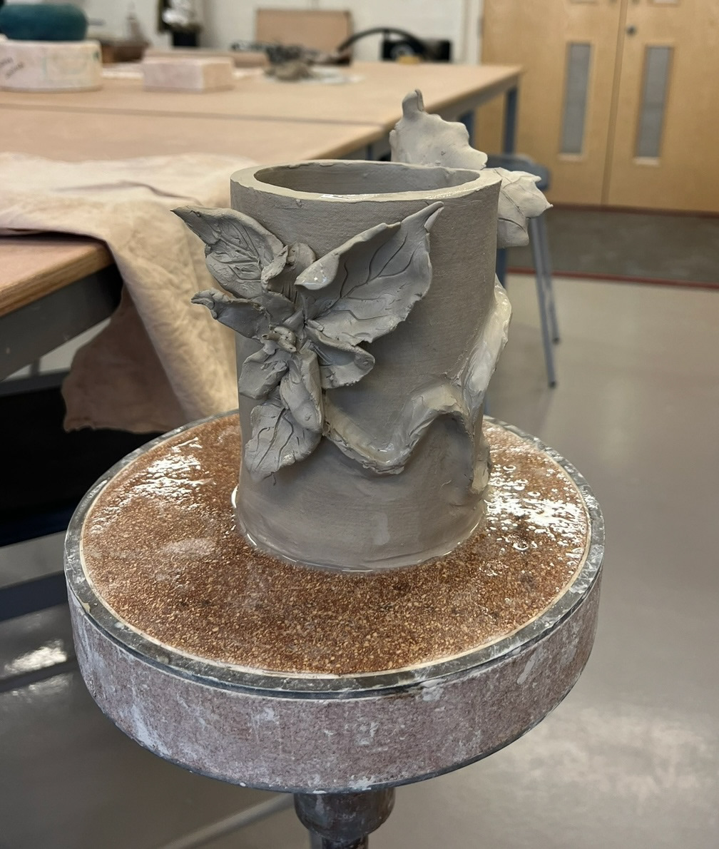
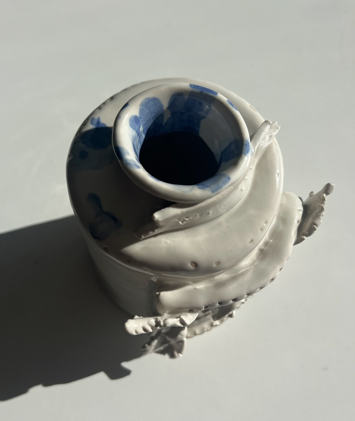
Once my samples were done and I could get into the studio I decided to make some more resolved samples to practice attaching 3D pieces to the side of vessels. I was most excited by the concept of my victorian floriography vase concept so I decided to use this as inspiration for this first test.
I started by making a simple slab built from by slab rolling and cutting out a base. I then used another slab rolled piece of clay and wrapped it around the base like a collar. I then smoothed out the join and finished off the vessel with a sponge. Next I created a stalk for the plant that would decorate the side of the piece. I rolled out some long sausage like pieces, trying not to make them uniform as to get more of an organic feel so that it would look more plant like. I then attached these to the side of the vessel and smoothed out the edges so that they were flush with the sides of the vessel. Then it was time to craft some 3D leaves. I took a small ball of clay, just under leather hard clay and squashed it against the table with my palm, I then took it and thinned it out further with my finger tips, I then shaped the piece to be more leaf shaped, then ripped the edges of the piece to make it look more organic. I then attached the leaf to the side of the vessel and drew veins in it using a pin tool. I then repeated this a few times until the piece was finished. (pictures below)

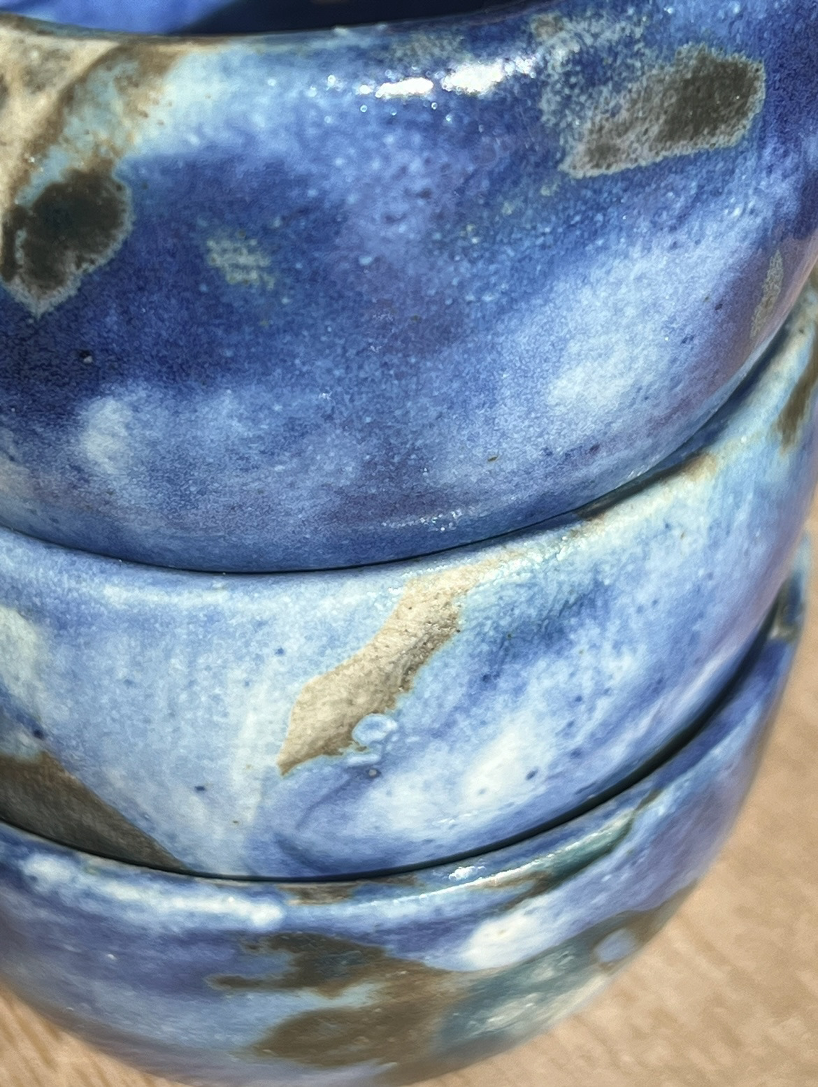
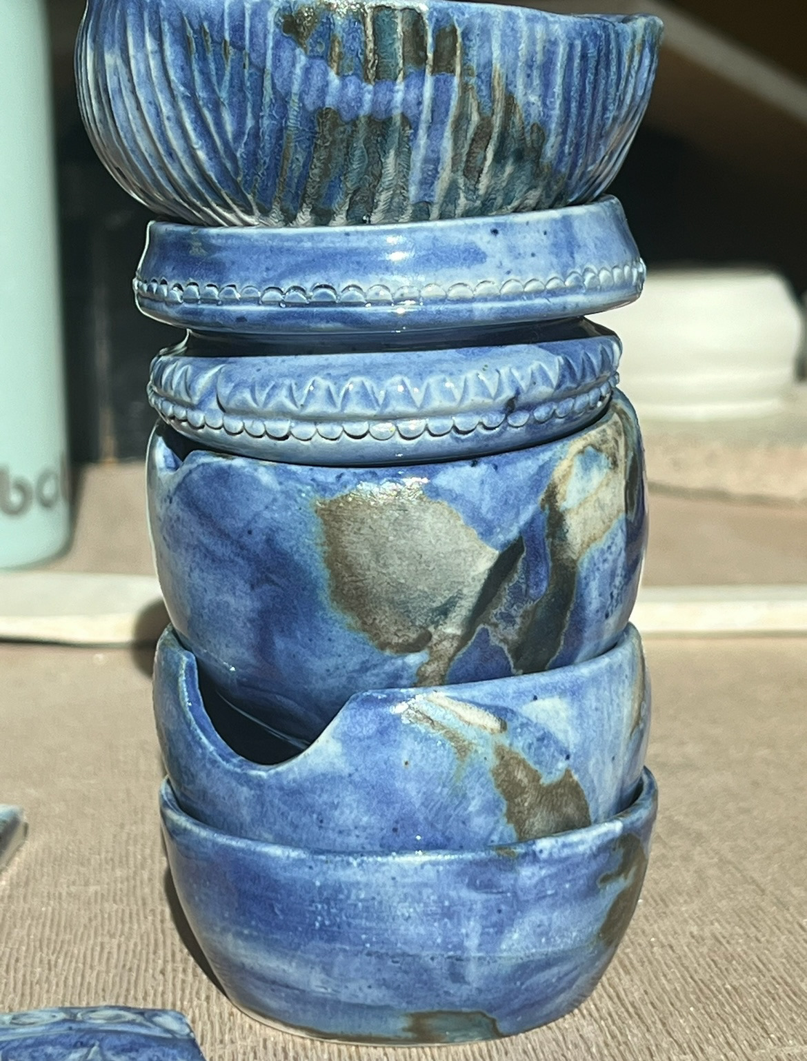
Once this had gone in the kiln it was time for glazing. Based on the artists that I had stated in my proposal I had said that I would like to include more colour and more dynamic glazes in my pieces rather than just the blue and white underglaze I had used last year. I decided to carry out a number of glaze tests to test out different ways of applying glaze and colour to my pieces as well as the best ways of enhancing the texture in my pieces.
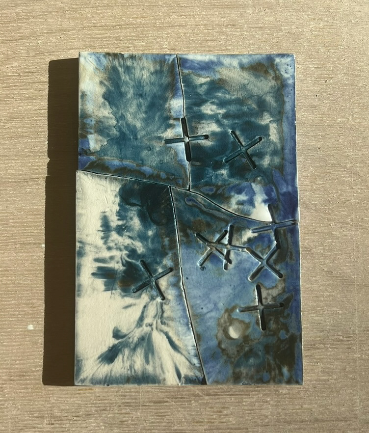
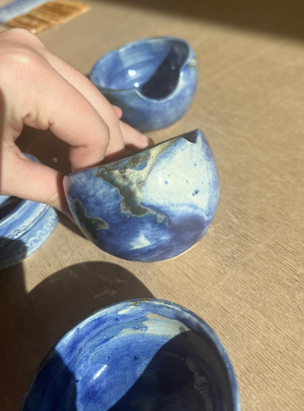
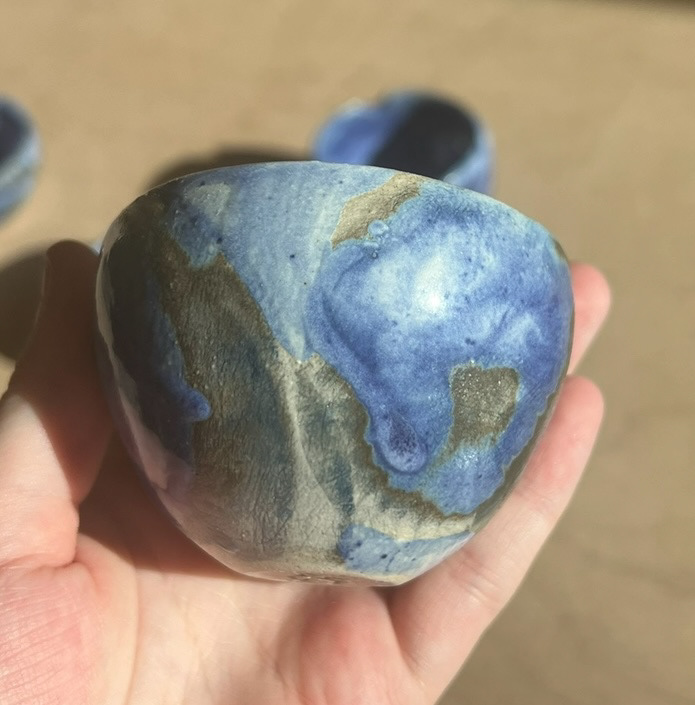
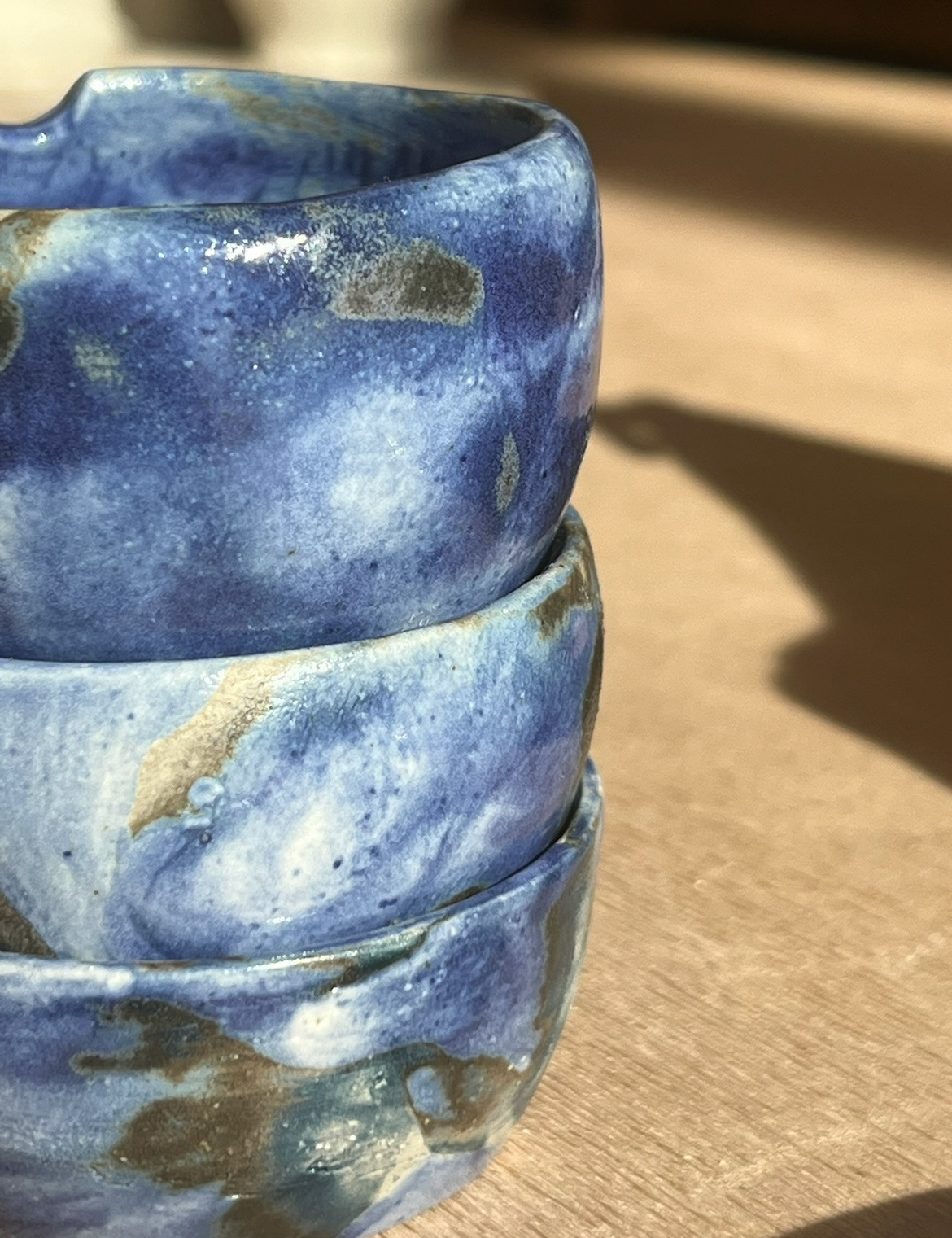
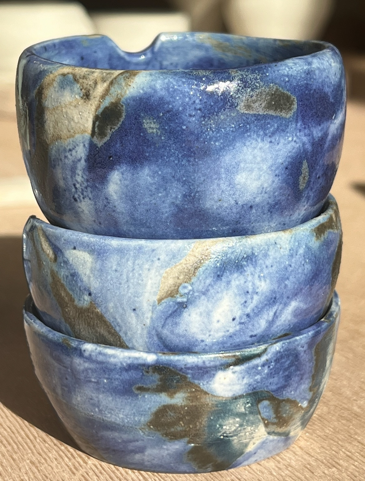
I started off by testing glazes on my texture sample tiles that I had made over summer, I thought that these pieces would be the best way to start as I could really see how glaze would enhance texture. The first glaze I tested on these was a Celadon green glaze. I chose this glaze as last year I had written a CP2 essay about a piece by Grayson Perry called "Poverty Chinoiserie", in this piece Perry uses celadon glaze to intensify his subject matter. I had been interested in finding out more about this glaze and found out that there was three different types; Yue Celadon, Yaozhou Celadon and Longquan Celadon, named after the different provinces in china where they were made . All three originated in the Shang Dynasty (1600-1046 BC) and the Zhou Dynasty (1046-256 BC) when Chinese potters started experimenting with their glaze recipes. It gets its colour from its high iron content. The Celadon glaze that we have in the glazing studio is closest to Yaozhou Celadon which is known for its tendency to pool and highlight texture. I decided to use this on my first texture sample for this reason. On my second texture sample I decided to use oxides because I knew that they are good for picking up texture also, I applied cobalt oxide to my piece using a brush, I then dipped the tile in Zirconium to give it a shiny more substantial finish. I chose zirconium over just a cream shiny finish as I really liked its sort of milky properties, going forward I have an image of my pieces having quite a heritage almost country house look to them, which I definitely associate with a thicker, almost cloudy and again substantial finish. I also chose cobalt oxide because although I said I wasn't going to use blue very heavily this year, I knew that this was the most pigmented oxide available to me so thought that this would be the best and clearest way to show how it could enhance the texture of the piece.


Once these pieces came out of the kiln (above), I could make a bit more of an assessment and a decision for how I would glaze my larger sample. I was a bit disappointed with my experiment with celadon (above right) as it came out mostly brown instead of its recognisable green colour, I asked Rudy the technician why this was and he said that there was an imbalance in the glaze itself. He said that this would be fixed so I could carry out more accurate experiments at a later date. However my Oxide sample came out quite nicely, although it was uneven and a bit wishy washy, I put this down to my own application, I think I will use oxides on my bigger sample pot however experiment with different forms of application. When I was in the glazing room I had accidentally dripped some cobalt oxide into a Tupperware of zirconium, I observed that the oxide spread out in veins like a starburst shape on the surface. I really loved how this looked and was interested to see if I could transfer this effect onto the surface of a ceramic piece. I found a stoneware bisque fired tile and decided that I could try a sort of water marbling technique. I dripped more oxide onto to the surface of the zirconium and once I was happy with how it looked, dipped my tile lightly onto the surface so that it would just pick up the surface design. This worked quite well and picked up a slightly warped version of how it looked in the Tupperware, I then repeated this a few times until I had four tiles with this technique tested. (fired samples below).


I really liked how these samples looked but in my practice I don't work much with flat pieces so I needed to work out a way that I could apply this technique to rounded pieces, just to see how it looked and to see if this was a technique that I could use going forward to make my pieces more dynamic glaze wise.i repeated the process however instead of dipping tiles onto the surface I found some small stoneware bisque fired bowls and rolled them onto the surface of the glaze and oxide. Again I think this worked well however I think the movement had the effect of mixing the two elements rather than transferring the design. Again I repeated the process a few times so that I had multiple examples on different shapes and textures, I then put the pieces into fire. (fired results below)


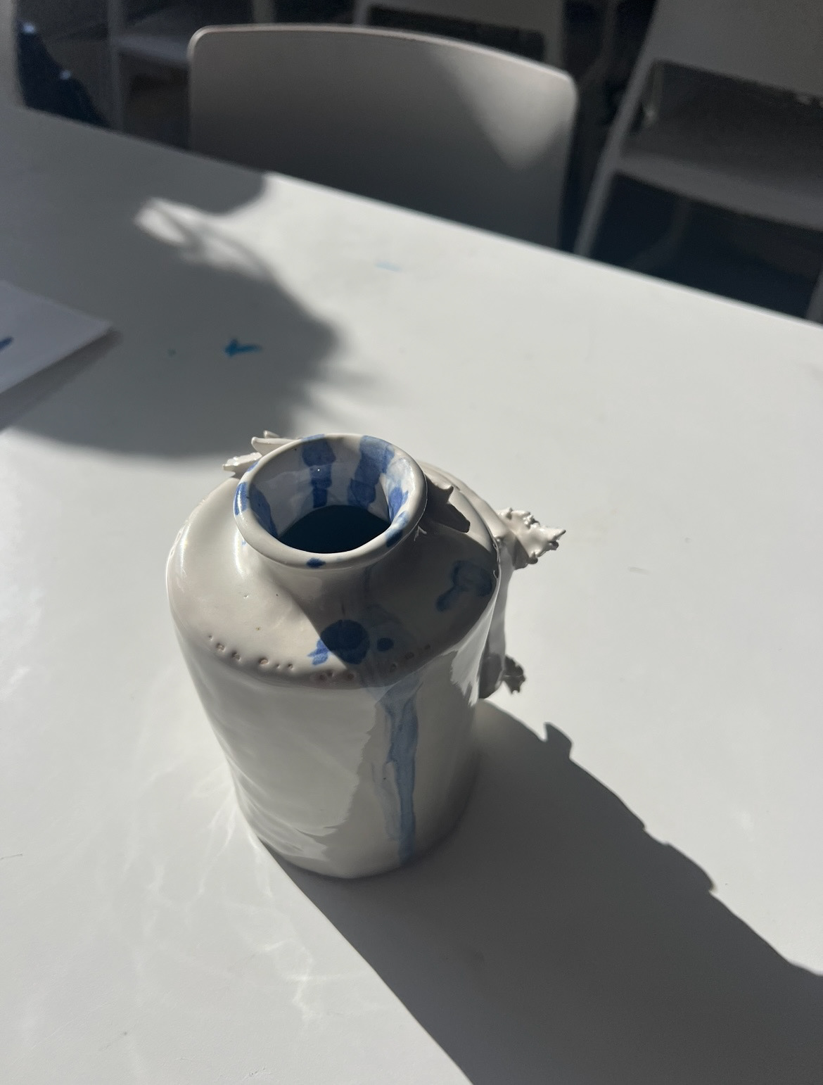
After this I had decided that oxides and zirconium were the way to go for my larger sample. I decided however to keep this piece a little bit more minimal and only apply colour to the leaves. I also decided to use a different form of application, I got three small pots and filled them with zirconium glaze, I then added 5 drops of green chromium oxide to one, 10 to another and 15 to the last one. I then got a large brush and dripped the three glaze mixes into the 3D leaves on my pot, starting with a layer of the 5 drops glaze and then layering with the other two. I then brushed pure zirconium glaze onto the rest of the pot. I then put this into the kiln for its final firing. (results below).
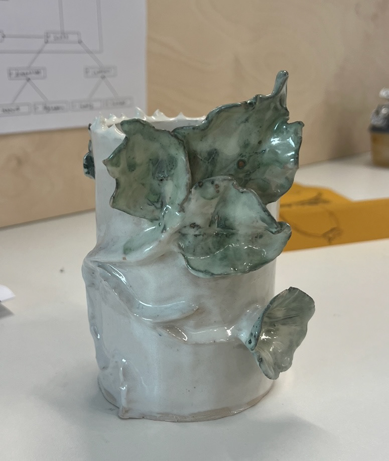

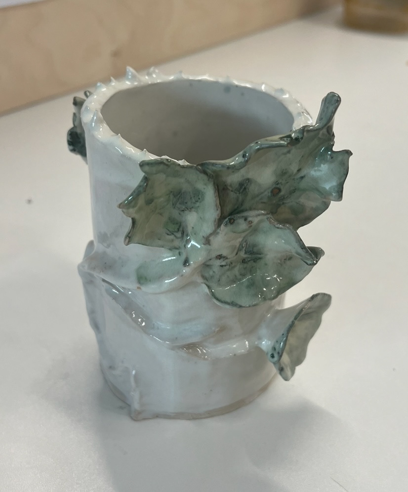
I actually really liked how this piece turned out, I think that this technique of application has a lot of potential as I think it picks up texture and has nice light and dark areas. however I wish that I had used a brown oxide such as crocus martis on the stem of the plant to add extra interest to the piece but this is a lesson for next time to not shy away from colour application when trying new techniques.
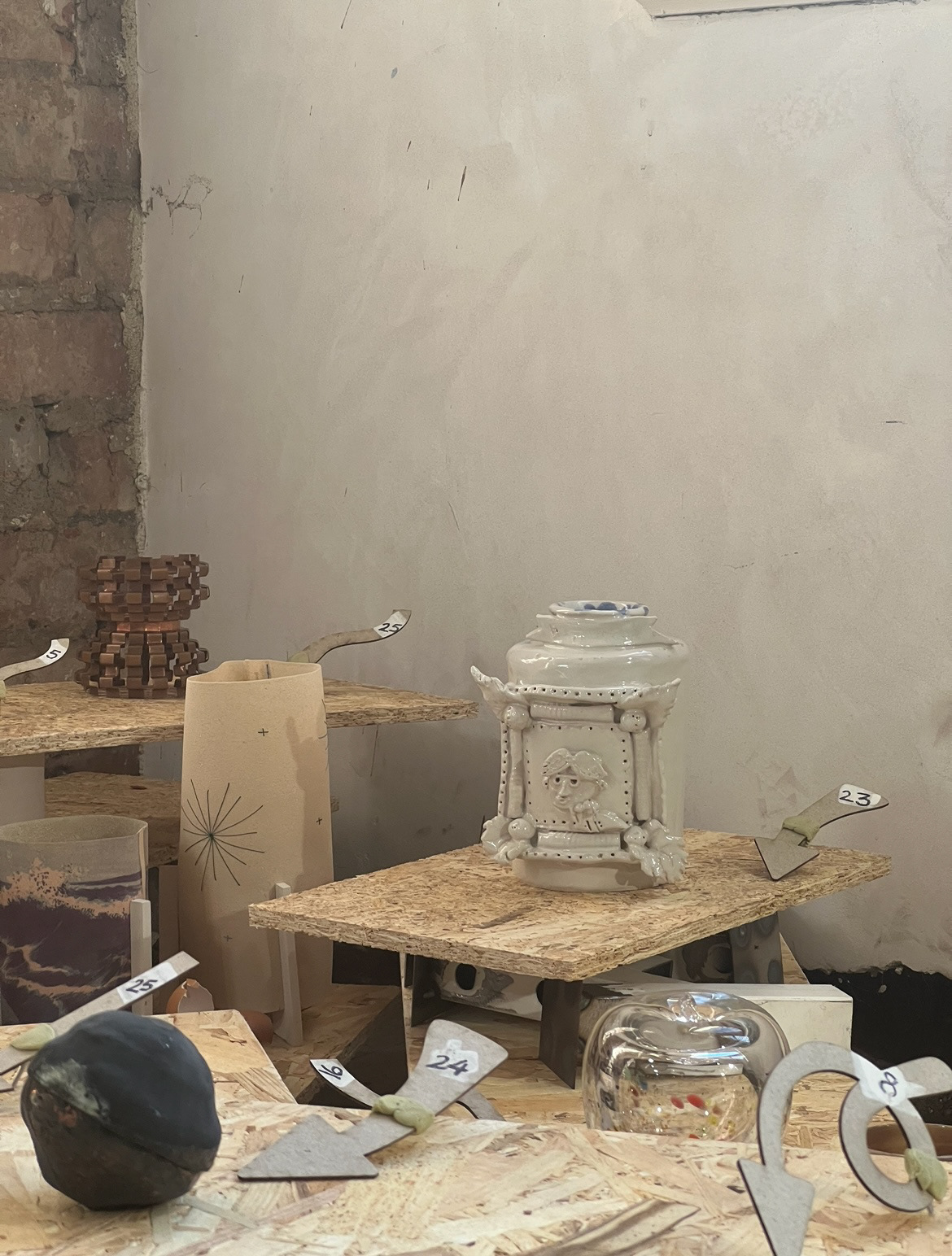
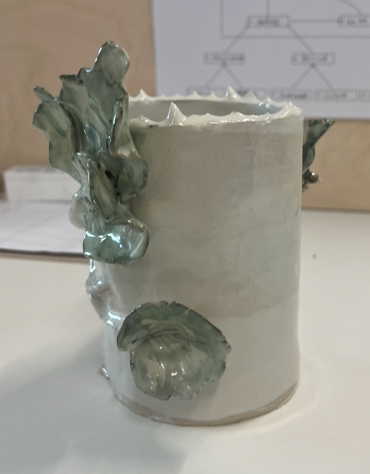
I decided after this to take inspiration and build a sample based on a different one of my concept drawings. This time I chose to make one based on my idioms frame concept. Even though this was a large vase concept, like I had done with my last sample vase id decided to down size my idea. I would make a small canister vase with one frame featured.
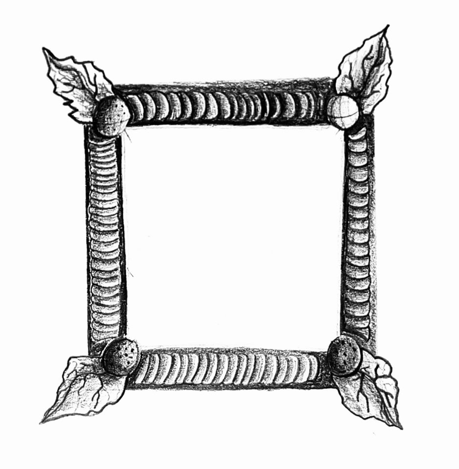
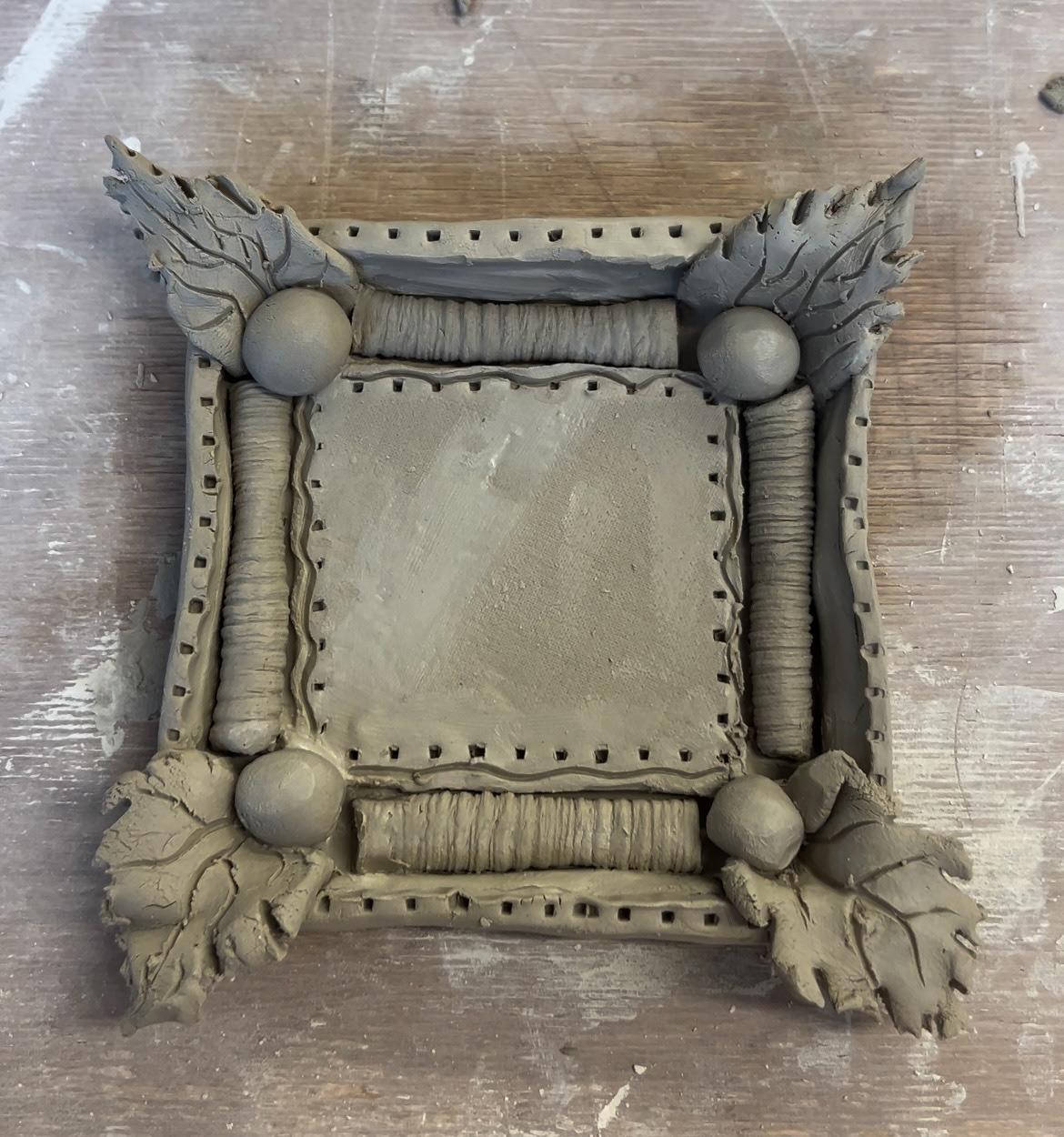
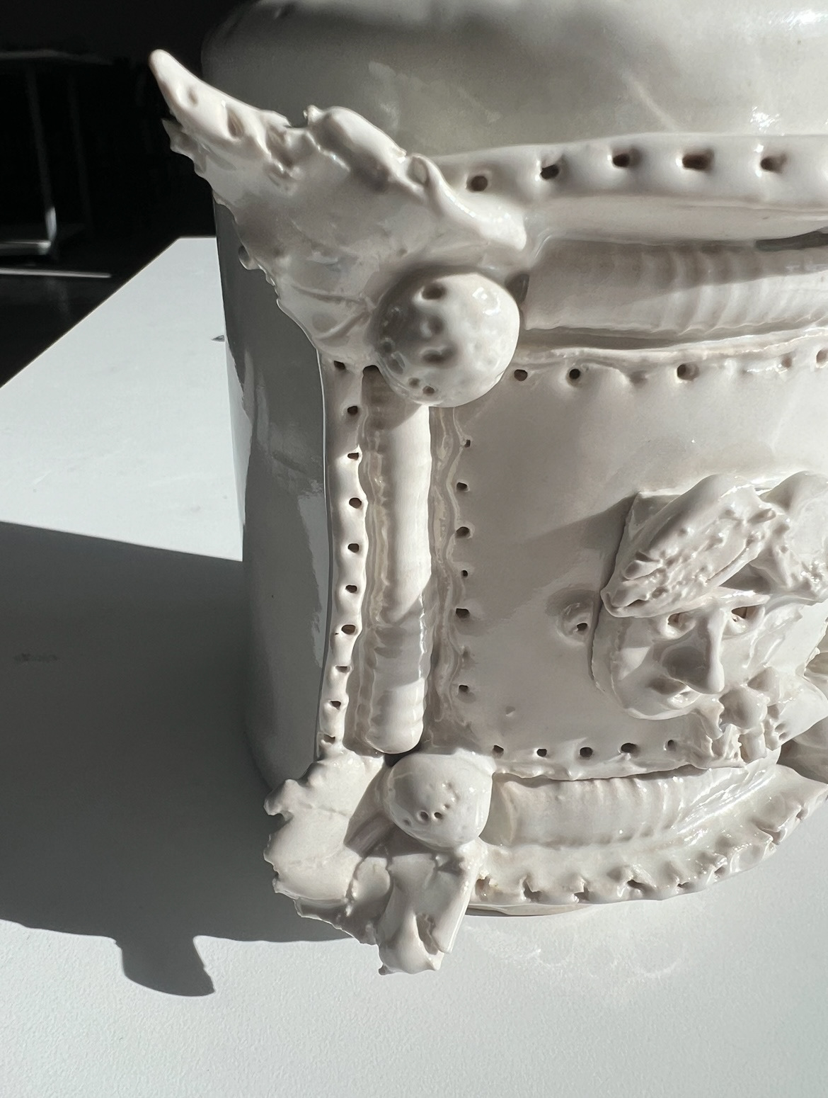
I started building my vase in the same way I had built the last, with a base and a collar, however this time I cut out two base pieces and attached one to the top of the piece, making a cylinder. I then attached a small neck piece to the top of the cylinder and cut around the inside to create a hole through to the inside of the pot. I then shaped it with a bat and modelled the rim so that it would be thinner and would have more of a defined shape. Once I had the base shape of my piece, I could then add the surface decoration which would be my frame. For the bare bones of the frame I carried out the same process as before when making my first samples. However this time I decided to make the frame a little bit more ornate and 3D, I was inspired by frames from the Baroque period, these have very ornate corners and a lot of 3D elements so I thought they were an interesting starting off point. I started off by crafting some small leaves for the corners, the same way as I had on my last vase sample however obviously a lot smaller. I then rolled out four sausage shapes of equal size and rolled them onto a plaster bat with striped texture in it, this made my pieces really interesting and dimensional, I then attached these into the concave parts connecting the corners, I then created some balls to also go in the corners so that the frame would feel a little bit more substantial. finally I added some last few details around the rim of the frame and flat picture surface using a fork to achieve equally spaced indents. (original sketch and final frame below).
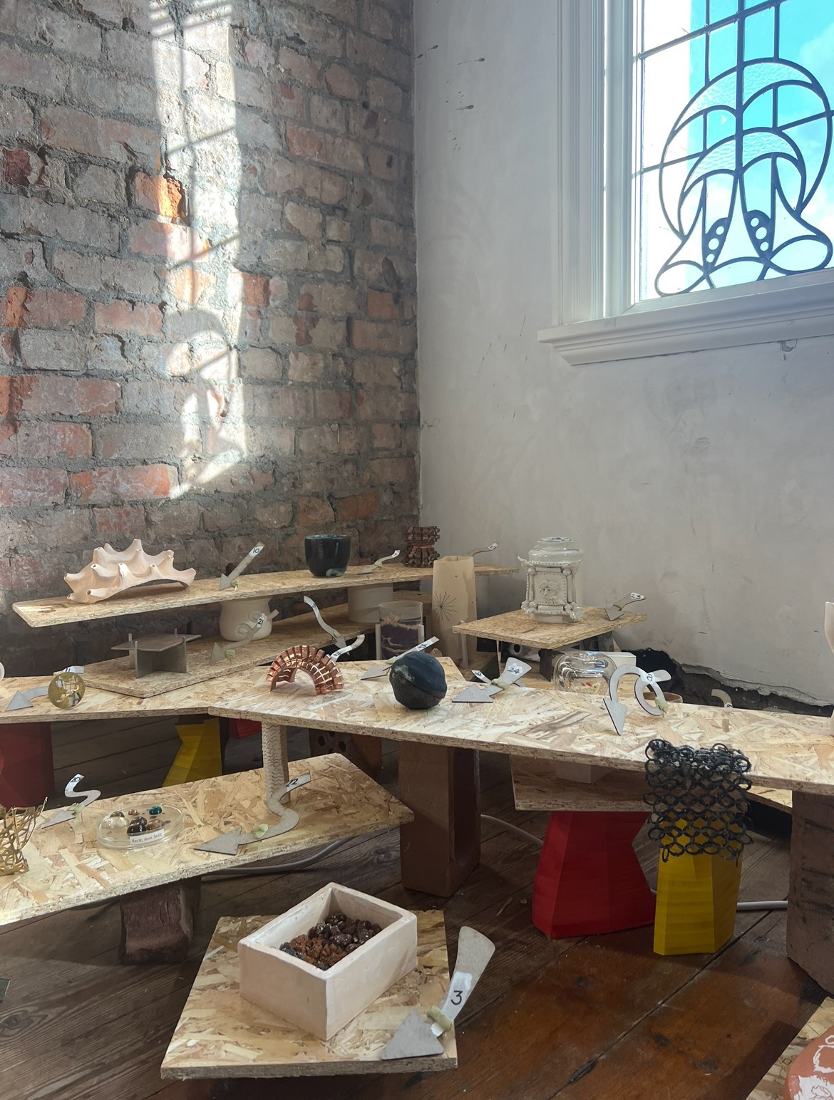
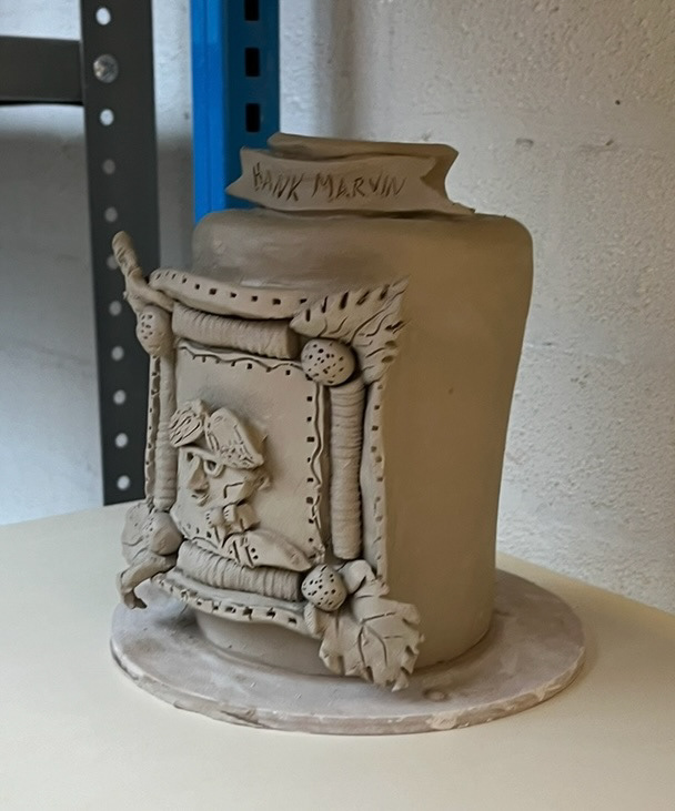
Next I had to add my figure to the frame, I had decided to use Hank Marvin which is rhyming slang for "Starving" in the north of England and some boroughs of London. Hank Marvin was a music artist in the 1960s, I reviewed a few of his signature looks through pictures and tried to create a tiny version of him In clay to sit in the frame, my construction was done by using the same sort of method I used when making my sample however I had to try a few different methods of building his glasses which were very small and fiddly. I then had to attach the frame to the pot itself, I used a slip and score method, using thick slip to make sure it would stick securely as the frame was quite heavy. After I had finished this I made a small banner with Hank Marvins name written on it to attach onto the neck of the piece, I was decided to do this as I thought it would be useful to add a bit of context into my piece but I also did this as I was also inspired by baroque picture frames which house portraits of importance, these commonly have a banner featured somewhere on the frame so I thought it would be another way to reference my inspiration. Once my pot was finished I could put it in to fire. (finished pot below).


While this was in the kiln I joined the class committee for the Great Northern Contemporary Craft Fair.
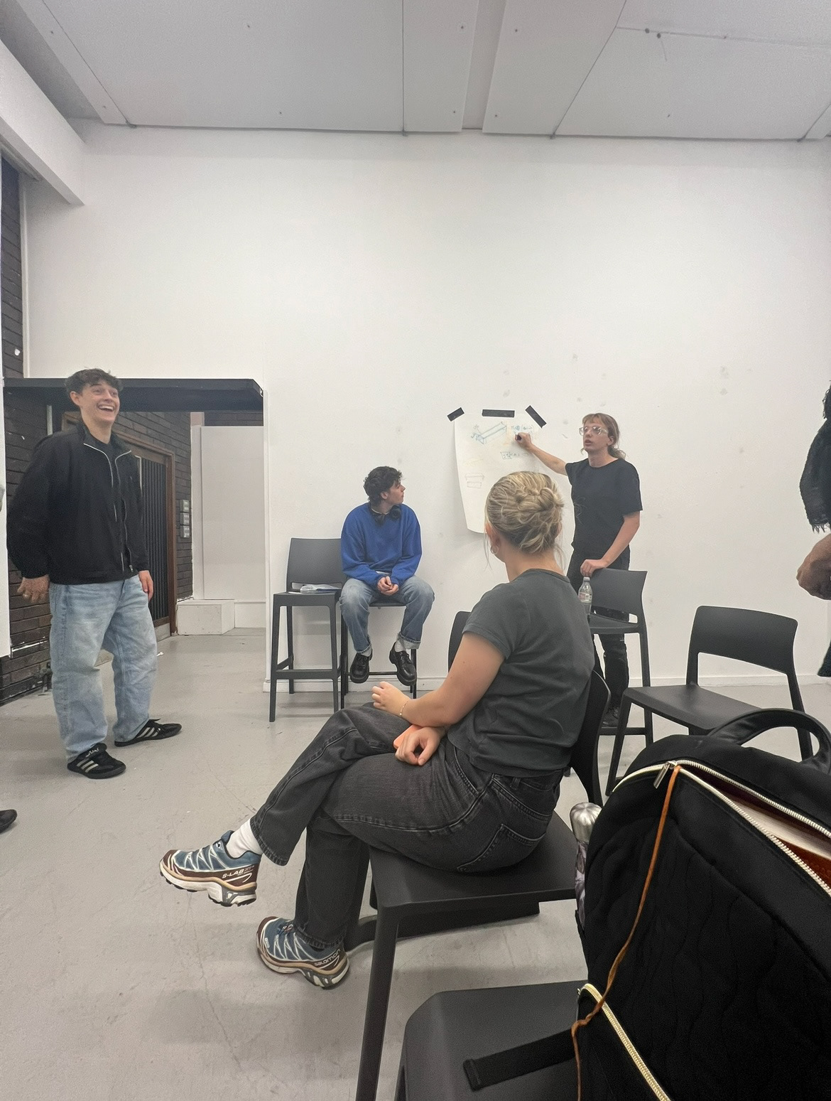
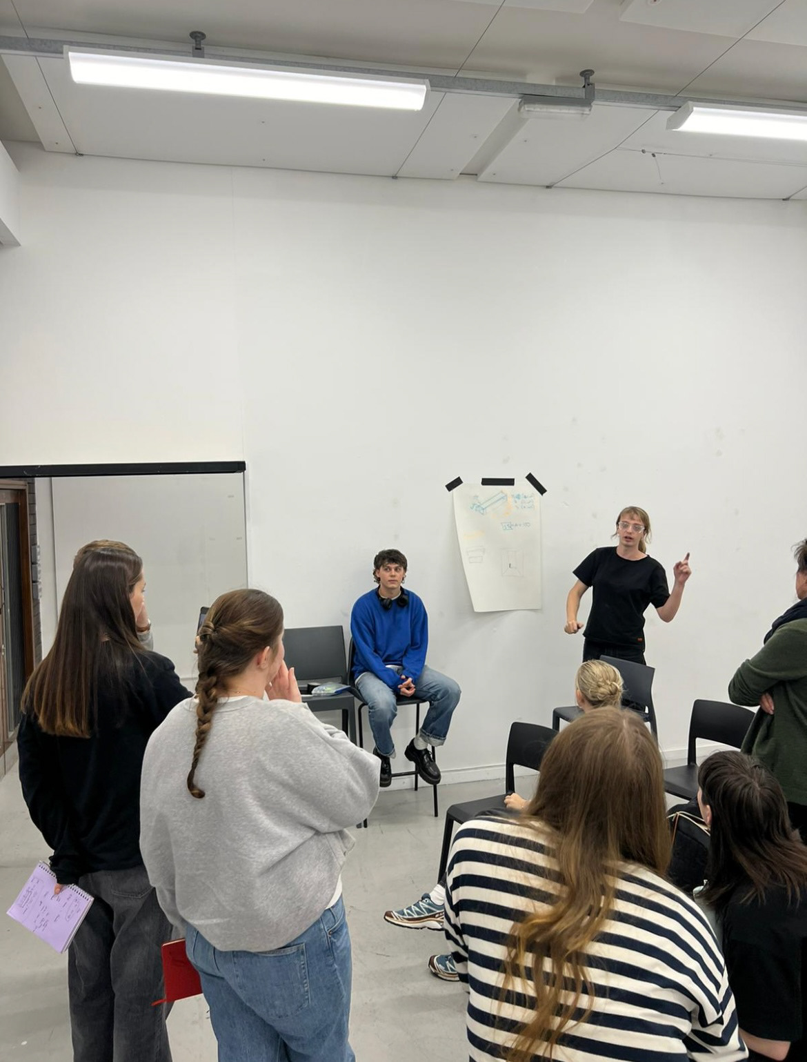
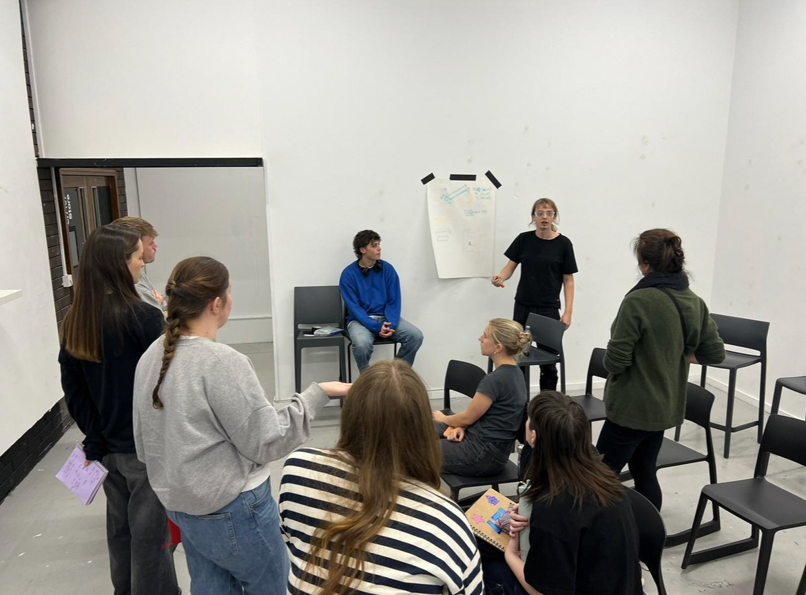
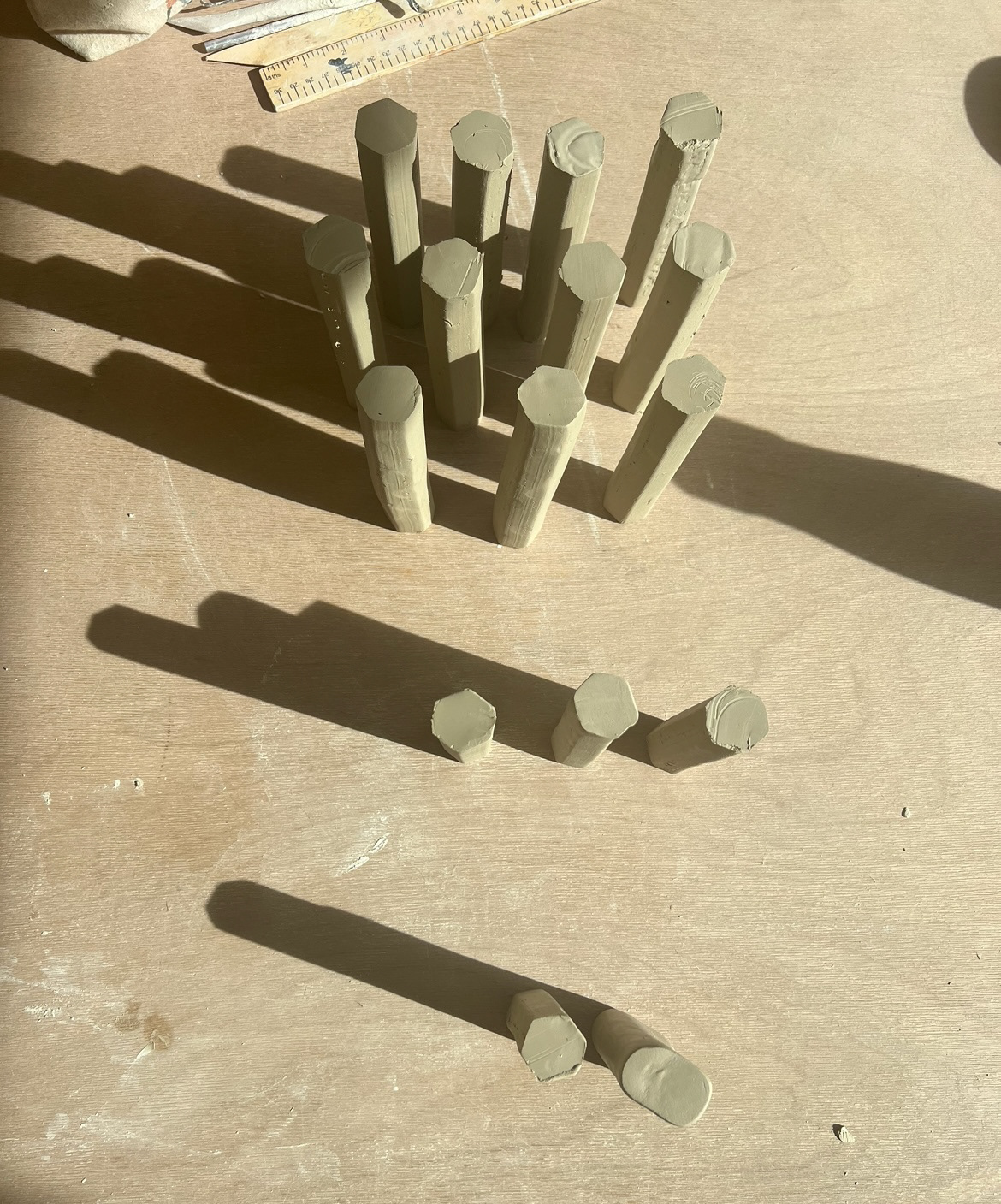
We were given the task of creating a set up for the show based on a concept given to us my Mark Mcleish. Our prototype exhibition would be named 'Its Got Legs' and most of us were given the job of making the legs for tables upon which everyones work would sit on. I was one of the people tasked with making table legs. I had to build 13, 6 inch legs, 6, 5 inch legs and also 4 legs that were 4 inches, however I did make a spare one of each size just in case anything went wrong.
In the studio, I built the body of my legs using a hexagonal extruder die. I extruded many long pieces of clay and then cut them to size, trying my best to account for shrinkage once fired. I used clay that was just under leather hard so that it would be soft enough to put through the extruder but also sturdy enough to hold its shape. (making legs below).

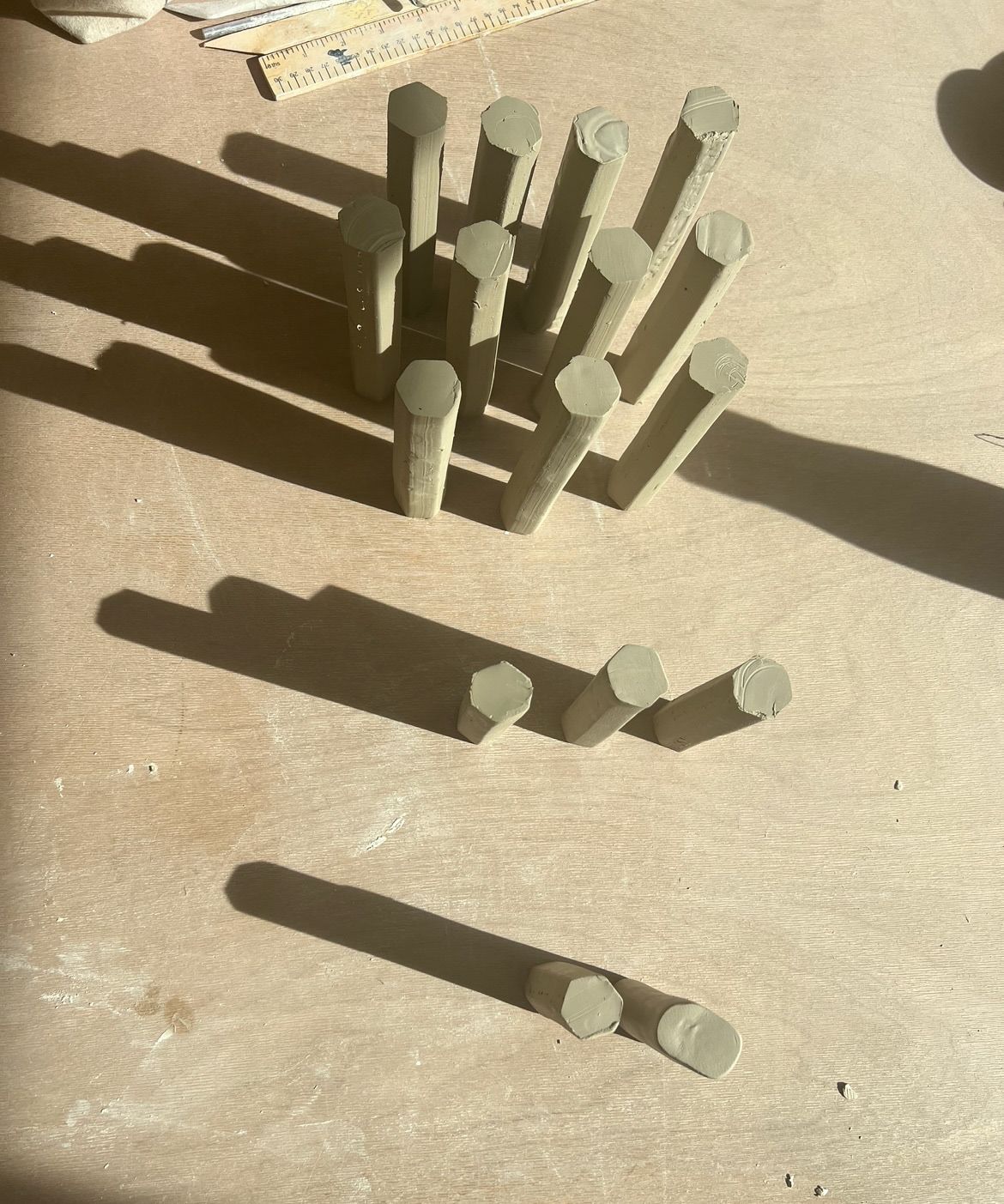
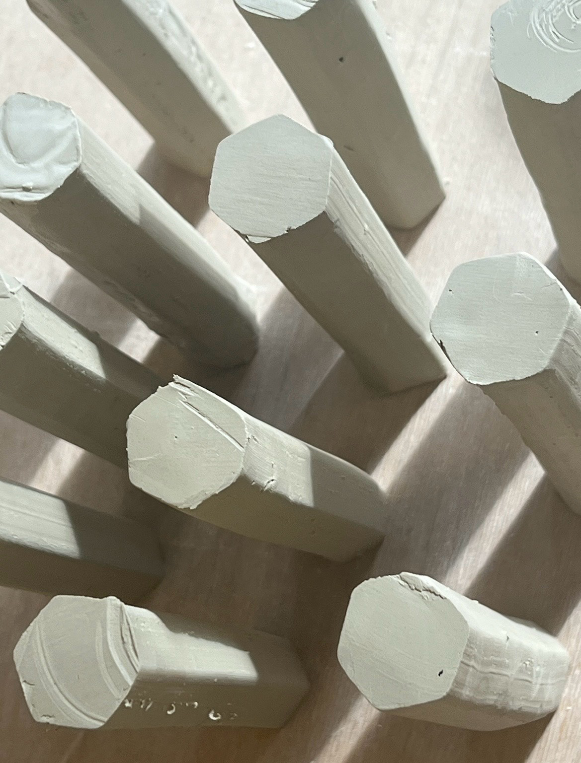
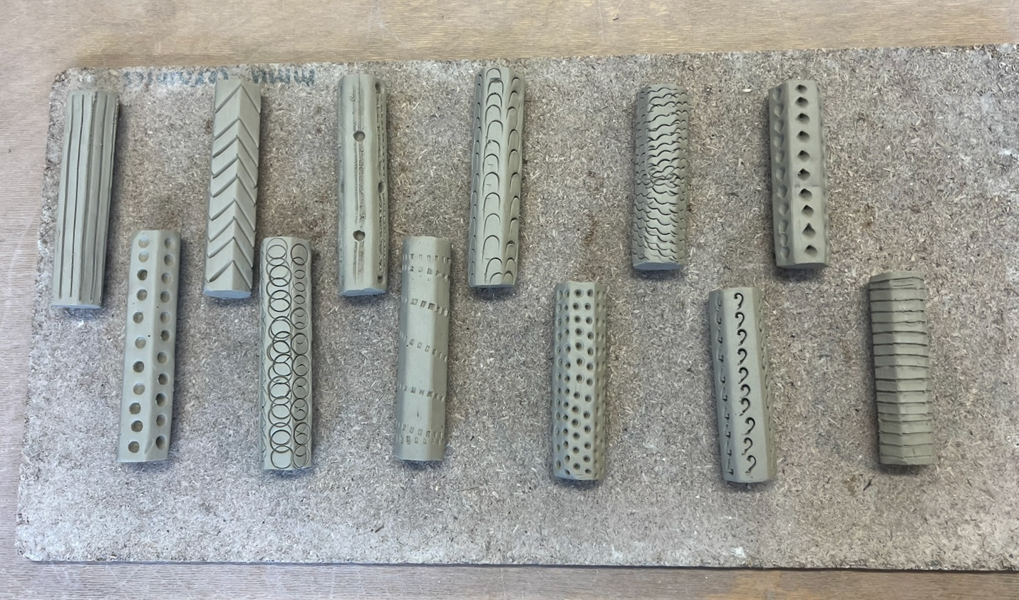
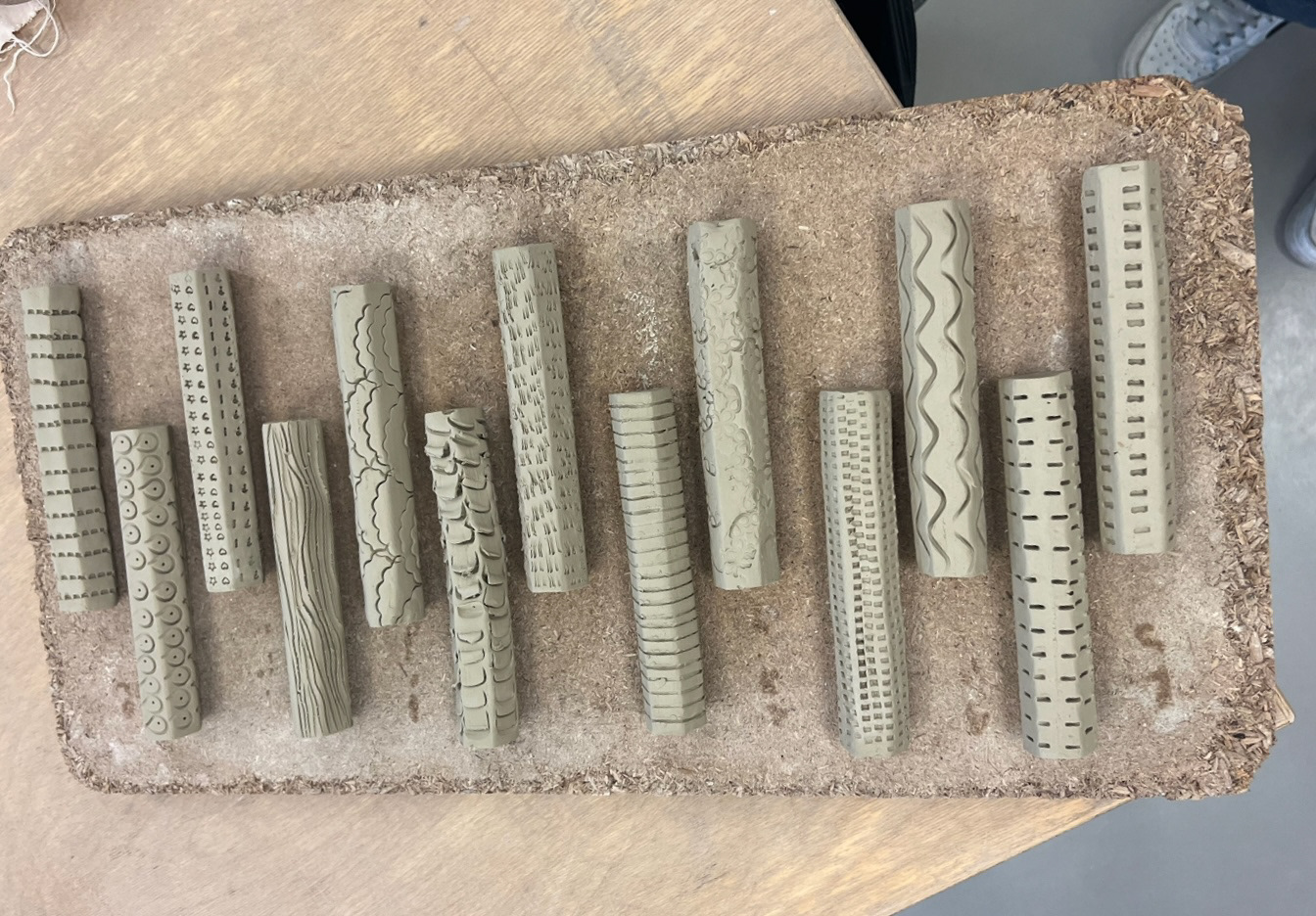
These legs on their own were quite boring so as I had been looking at applying texture to my pieces I thought that it would be interesting if I tried to give each leg its own textured pattern. I scoured the ceramics studio and ended up finding many everyday items that I could use to apply texture, such as, shells, pen lids, biscuit cutters, scraps of metal and plaster, clay bag ties, cutlery and also obviously my clay tools. (textured legs below).

I then put these into the kiln to bisque fire, simultaneously, my frame pot was coming out of the kiln. I had at this point decided that this would be the piece that I would like to display at Great Northern so I had to make some speedy-ish glazing decisions as I had to get it in the stoneware kiln that day. I decided that because of the elaborate frame, I would quite like to use quite minimal glaze and colour as to not detract from it. I ended up glazing this piece in just pure zirconium, without oxide mixed in. I thought that this would again give my piece a bit of a heritage sort of look. However I did think it looked a bit boring just plain white so I added a few drops of cobalt oxide around the rim and Im glad I did because I think this added a bit of an extra element to the final finish. (finished glazed pot below).

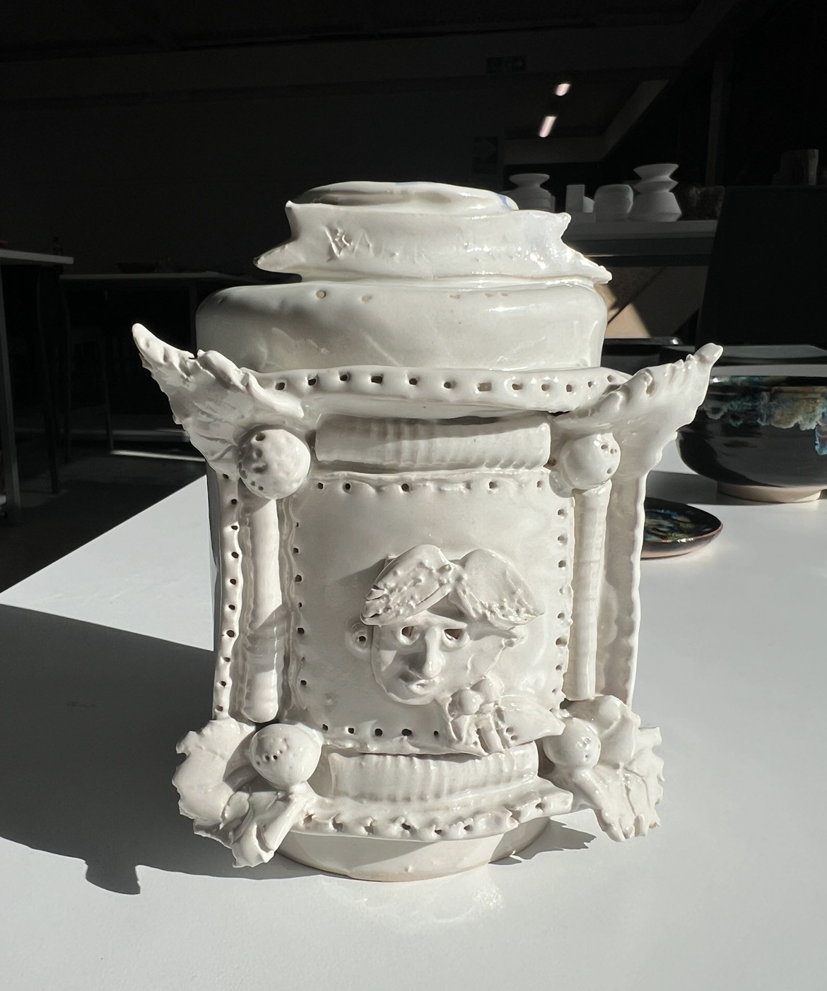
After my pot came out of the kiln, I was a little bit disappointed as I think I had either applied my glaze too thick or it wasn't the right glaze for the piece as a lot of the detail and small lines got lost, also there were a few air bubbles that I think I missed when glazing so they became quite obvious after firing. However this is just a prototype and our show was a prototype show so I still felt confident to submit this piece to great northern.
As for the legs that I made for great northern, they were rather thick so took quite a while to dry before bisque firing, so by the time they were fired I was pretty much on deadline. I would have liked to have glazed them potentially just to really make them stand out however this was not possible and a lesson in clay thickness and time management for me.
When it came to the actual show of Great Northern I invigilated on the Saturday and Sunday. On the Saturday I had a really great time talking to people about our show and I even went and made a plate at a clay workshop run by Joe Hartley. on the Saturday evening I was there for the exhibitors hour where I got to meet and talk to many of the stall holders about our show, I think this was really good for me as I also got to talk to artists about their work and how they manage their practice, I also learnt about a number of different graduate schemes that were showing there also which I will defiantly look into for next year. On the Sunday it was a bit of a slower pace, although I did finally get to go and look round, I really enjoyed getting to meet new artists who's work I had never seen before, I also got to see some artists again who I had met at some networking events over the summer such as Alison Waters. I took lots of business cards and added people on instagram later, some of which followed me back and commented saying that they loved my work which was a real boost of confidence for me. I also went back to Joe Hurtles workshop which I was briefly put in charge of because of my ceramics teaching skills that I have picked up at my job that I started over the summer. (GN pictures below).