in this project I will research traditional crafts and expand these processes through a creative lens. I will learn traditional processes and make samples reflecting this, I will also innovate these processes in my own way to create something new and inspired by heritage craft. I am inspired to make meaningful pieces, that will express me and my making process as an individual as well as shine a spotlight on my chosen area.
I have chosen to make ceramics my focus as I am extremely interested in the material of clay itself as well as the history of its use in art as well as culture.
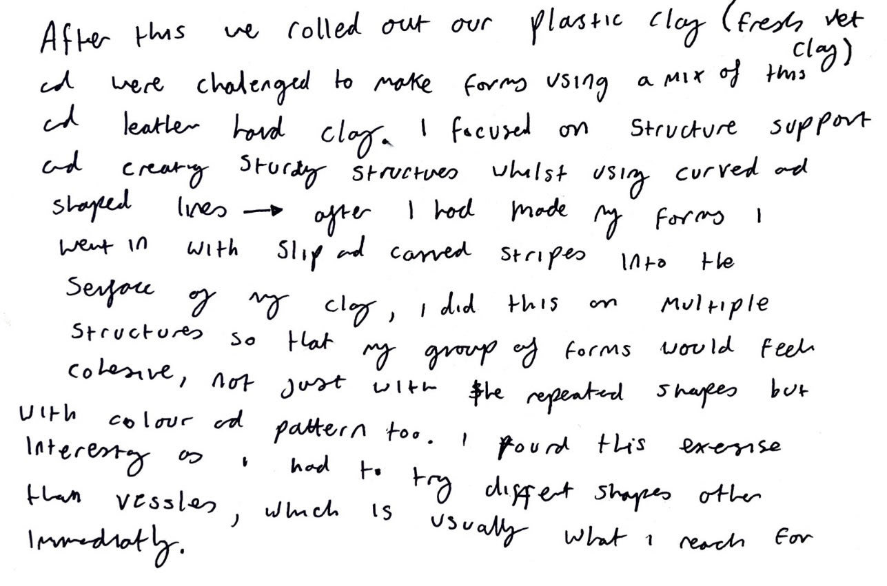
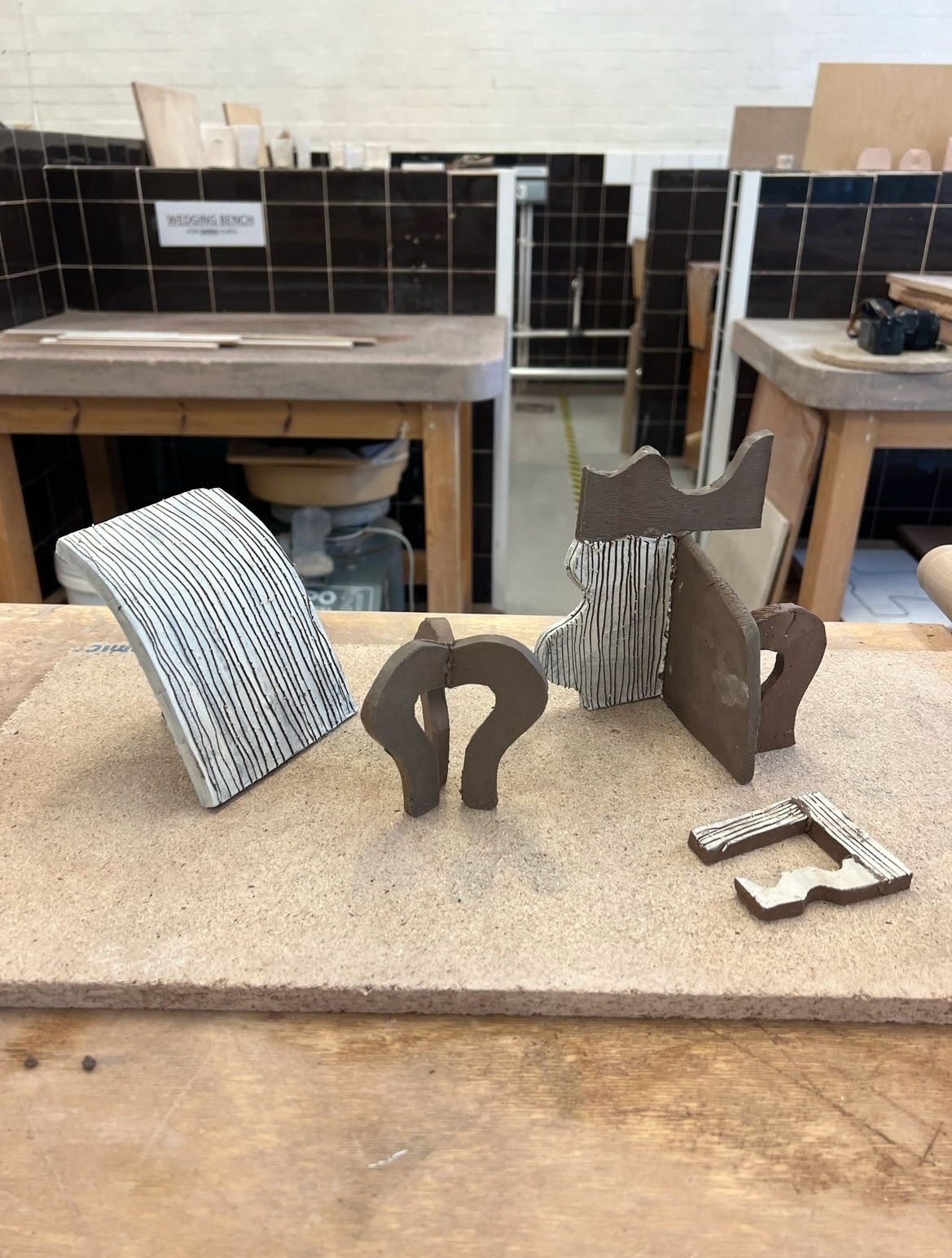
In my first ceramics workshop this year we went bact Fack to basics and went over some of the essentthe act of actuallF ials of slab building.
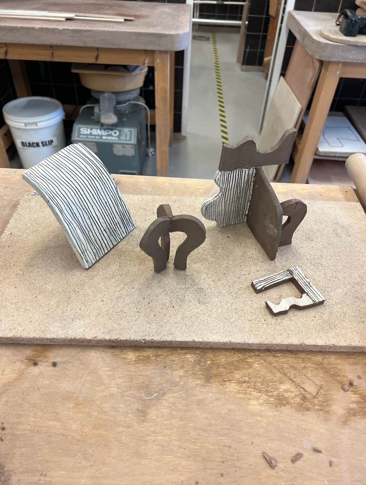
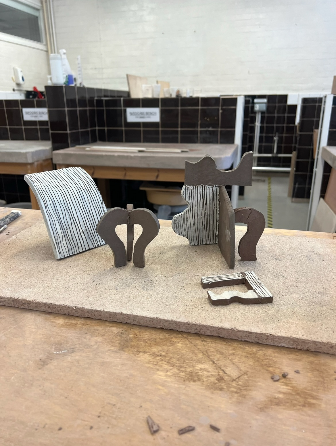
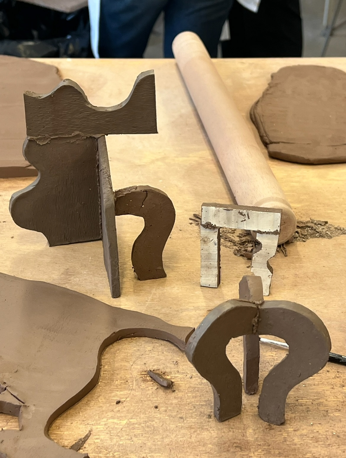
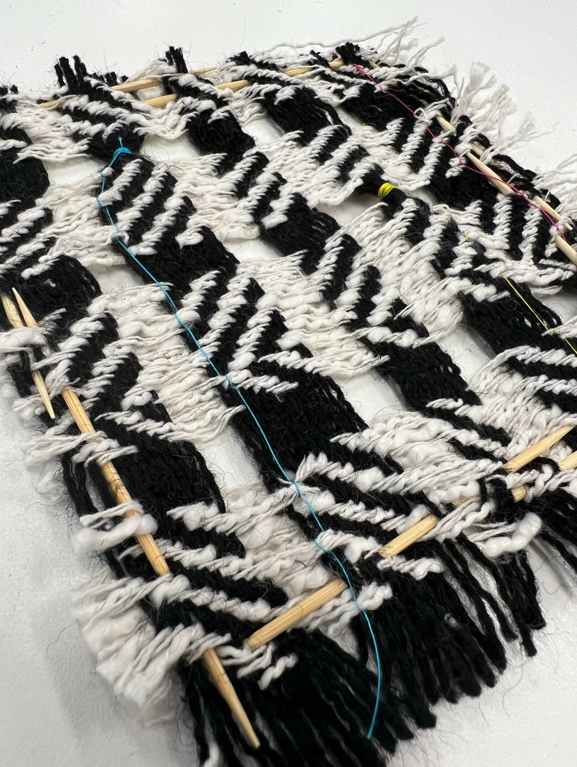
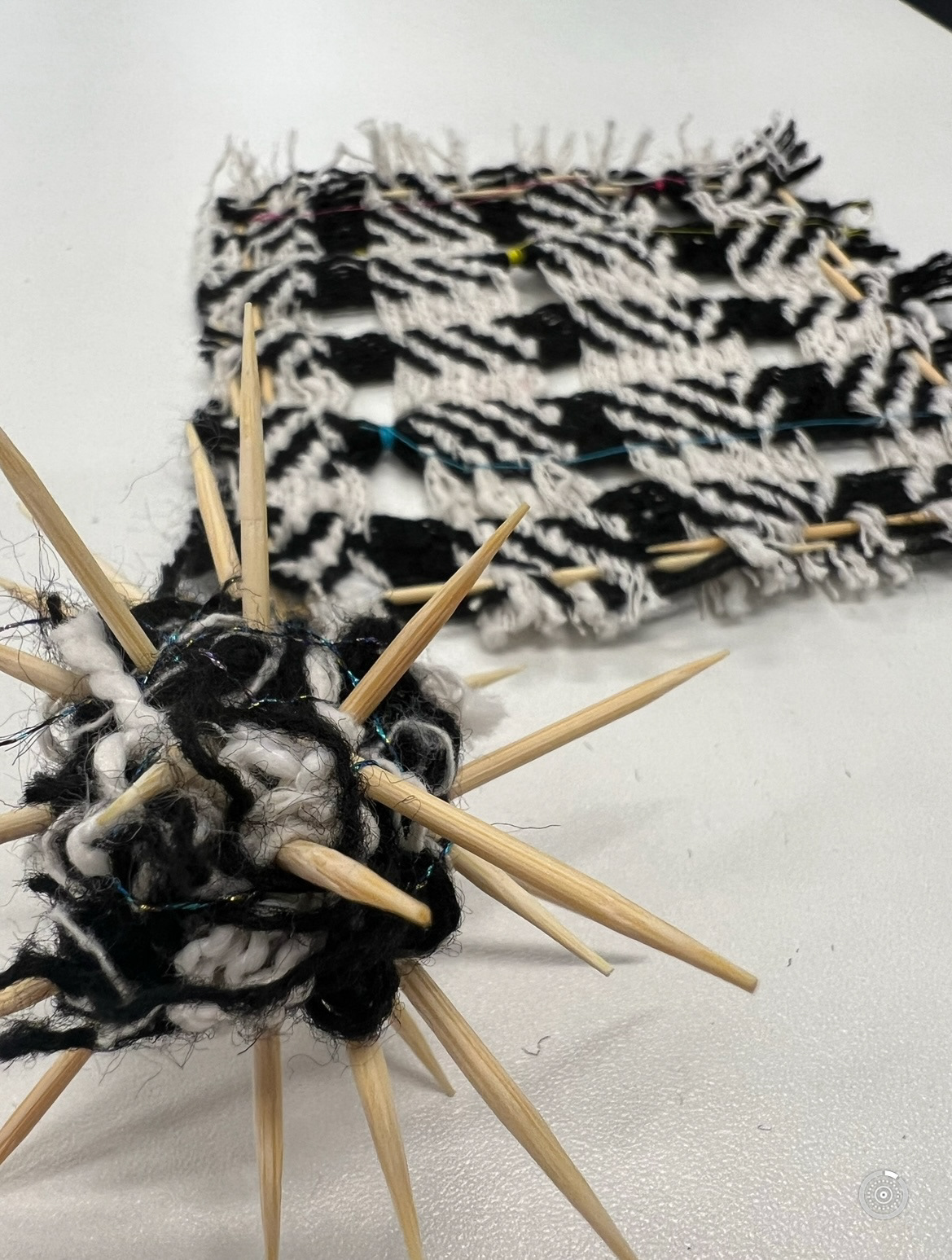
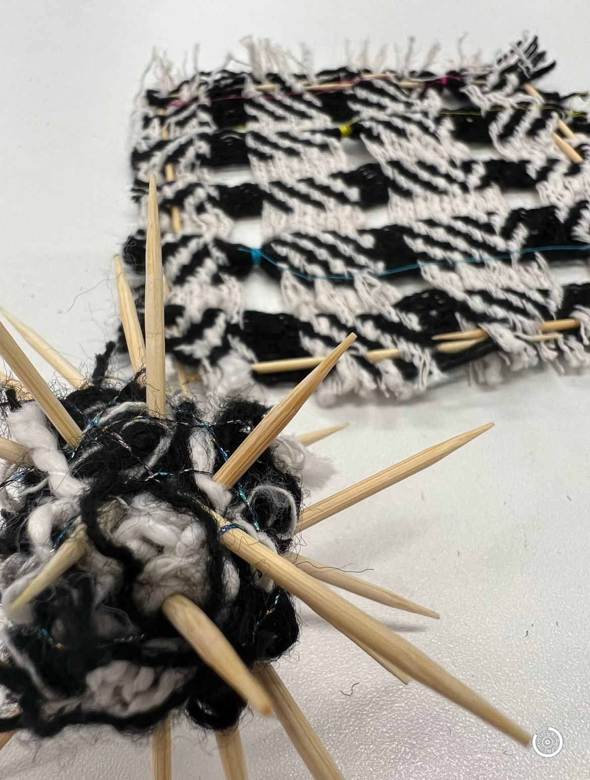
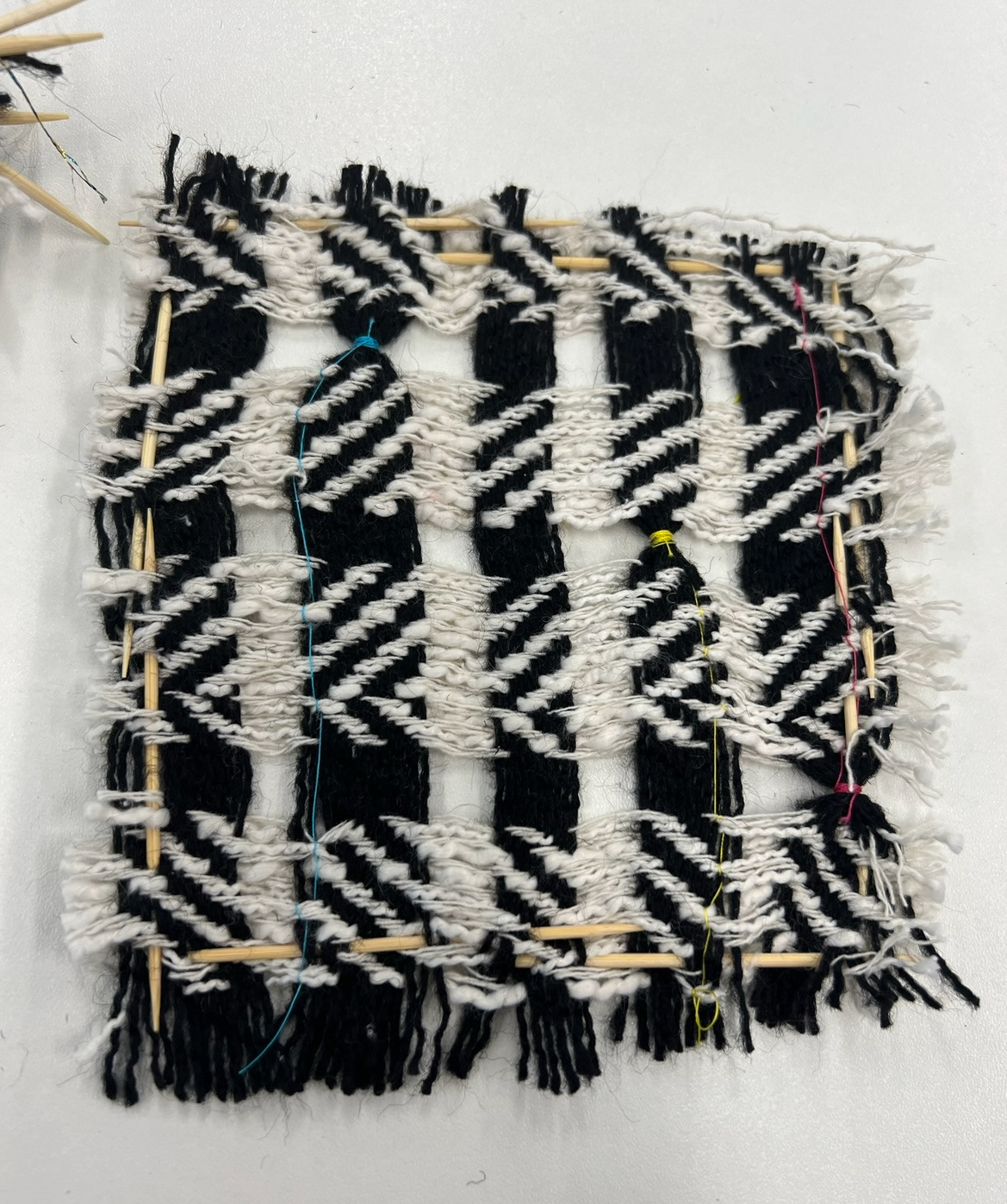
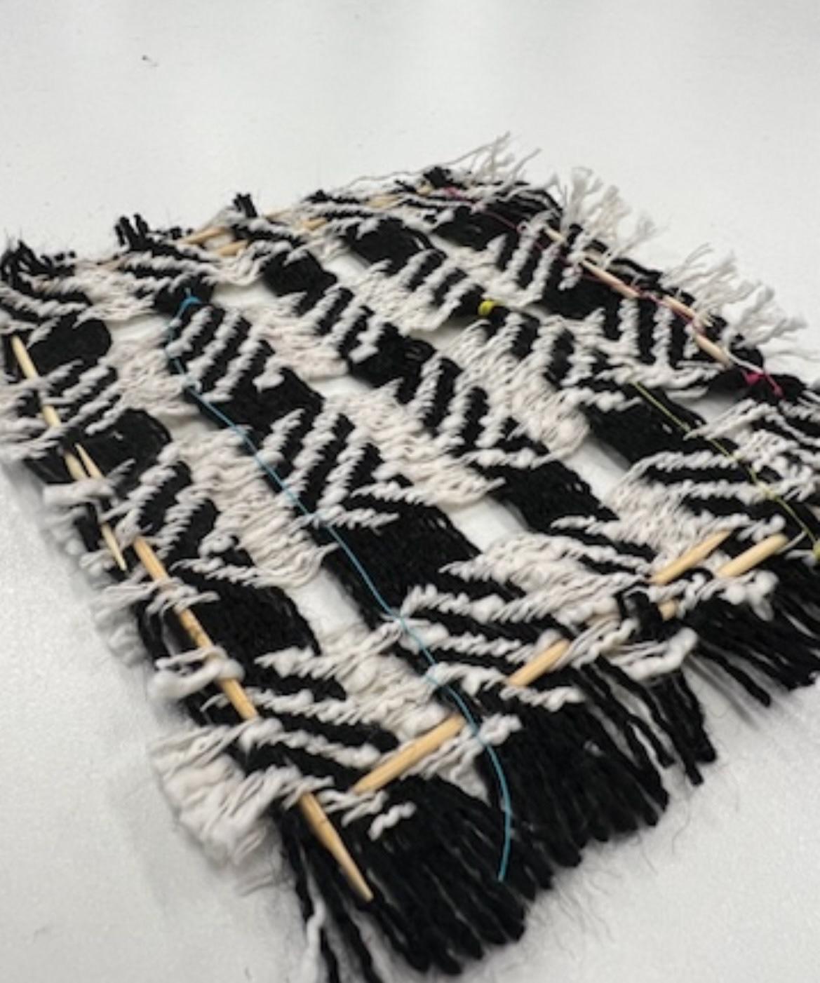
Next we were all set a task to follow similar briefs to see how different our outcomes were, we were given a mix of materials such as fabric, toothpicks, thread, paper plates and more. My brief was: 12 holes, stitch and asymmetry. for my piece I took a piece of woven fabric and pulled out the thread fibres to create 12 holes, I then stitched three different coloured threads through the thread in an asymmetrical pattern. I then made an extra beige using the pieces of thread which I had pulled out and tied them into a ball, I then secured this by spearing twelve toothpicks through the ball of thread, creating 12 'holes'. with this again I think I achieved the brief of 12 holes, stitch and asymmetry. at the end of the task I found I was the only one who didn't utilise a paper plate, this in turn made me confident in my creative thinking abilities.
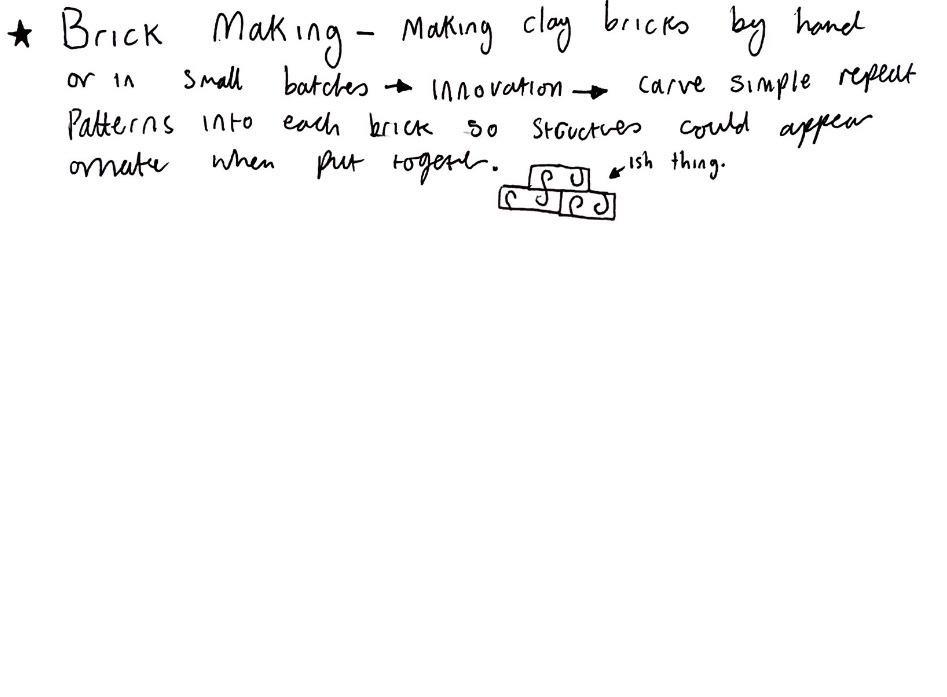
This same day we had a lecture about how to move forward personally with our project and our practice. we had to come up with ideas in areas of our interest based on the list of endangered and extinct heritage crafts. this would provide the tradition aspect/ starting point of this tradition and innovation project.
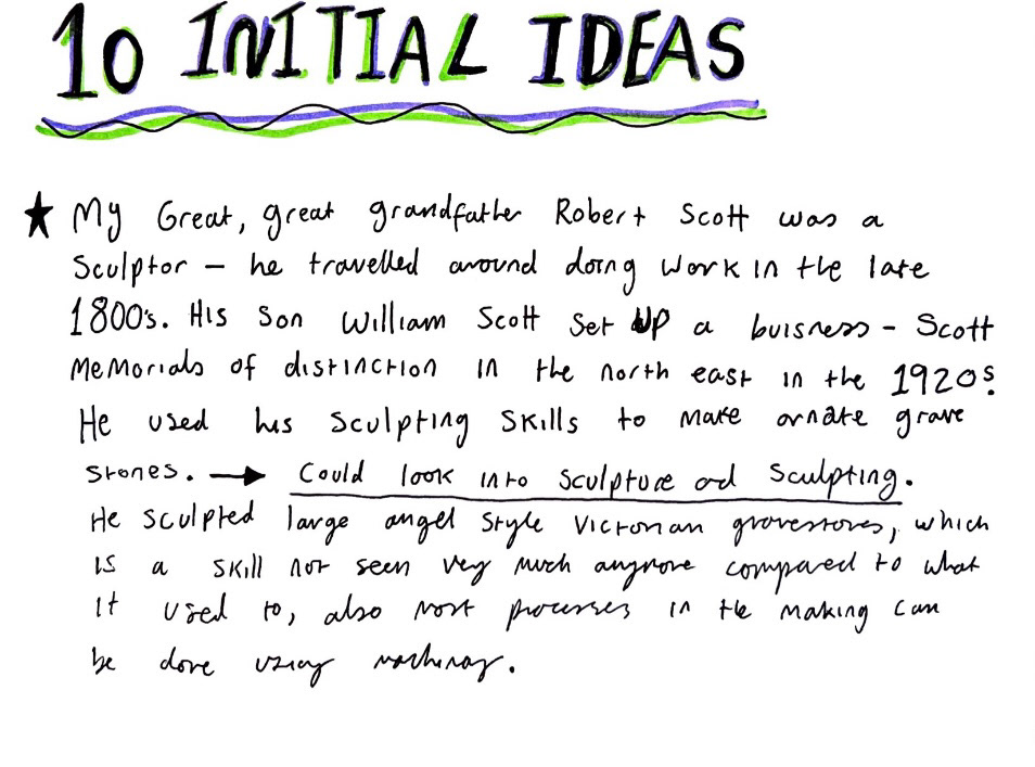
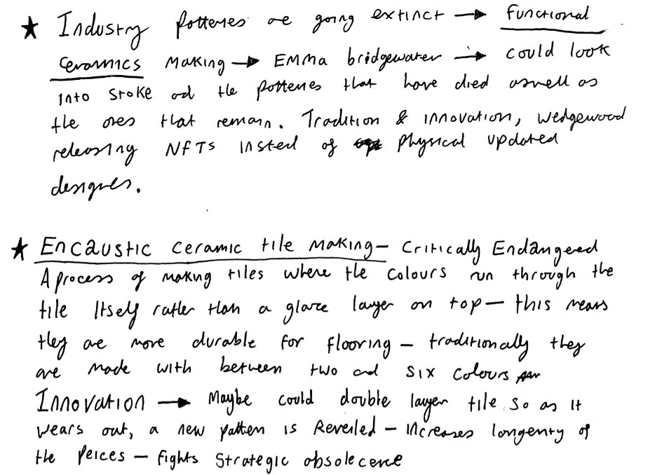
I decided to look into industrial potteries as I have a passion for functional ceramics and ceramics that are used and loved within the home. I think these items play a huge part in human history and I like to think of all the people who have touched that piece, from the first person who made it, to the last person who had a cup of tea out of it or ate their lunch off of it ,and who will touch it in the future. I also like that some of our oldest known artefacts are shards of ceramics, I like that ceramics are pieces that are used and loved and studied as glorious proof of our past.
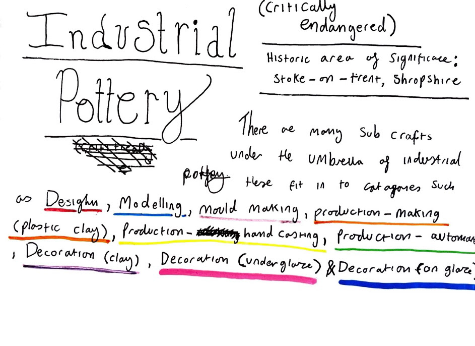
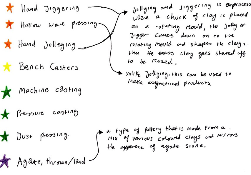
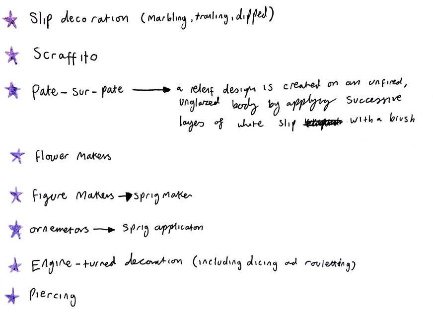
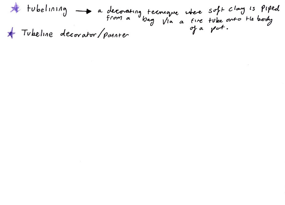
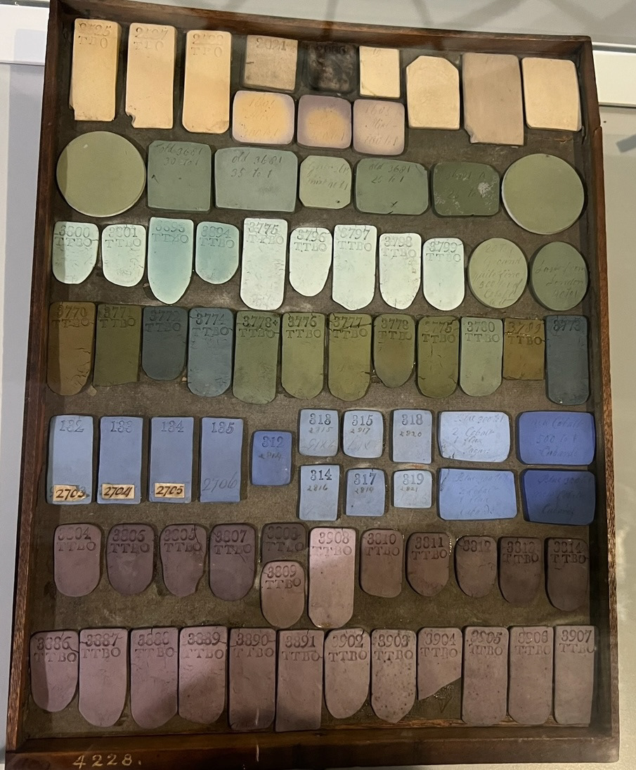
I then studied the rolls in an industrial pottery factory and researched what some of the rolls were that I had never heard of before to hopefully gain some inspiration on processes that I could potentially try in future.
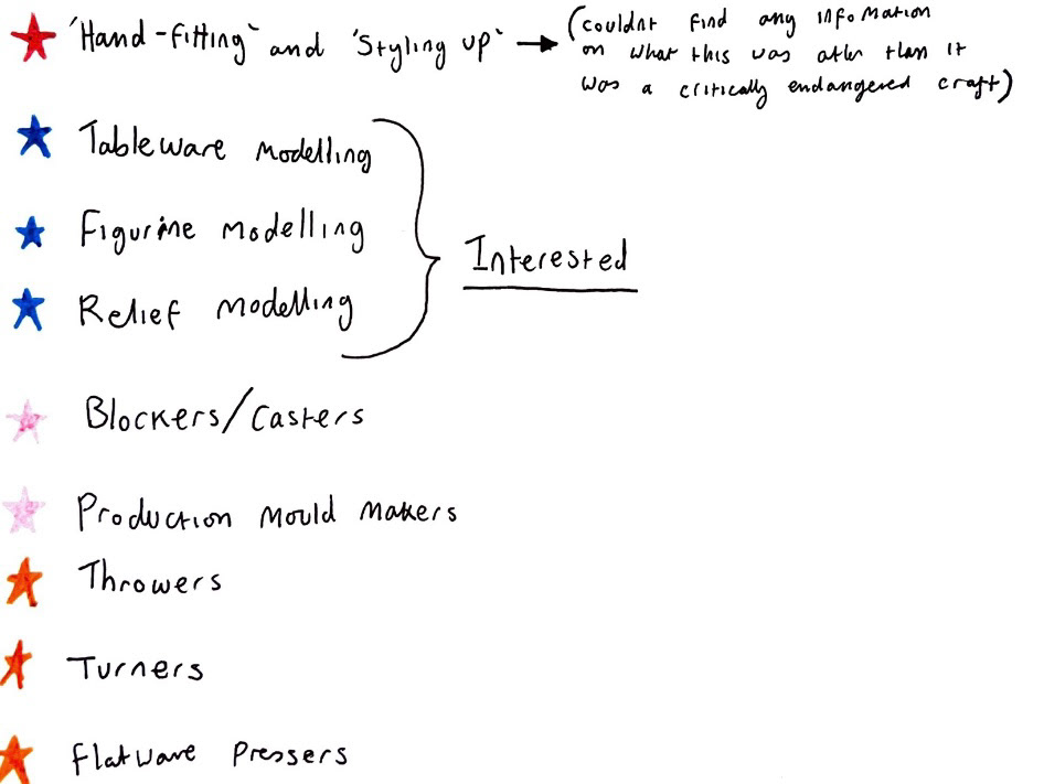
I then recorded forms and common themes I had observed from certain industrial pottery factories.
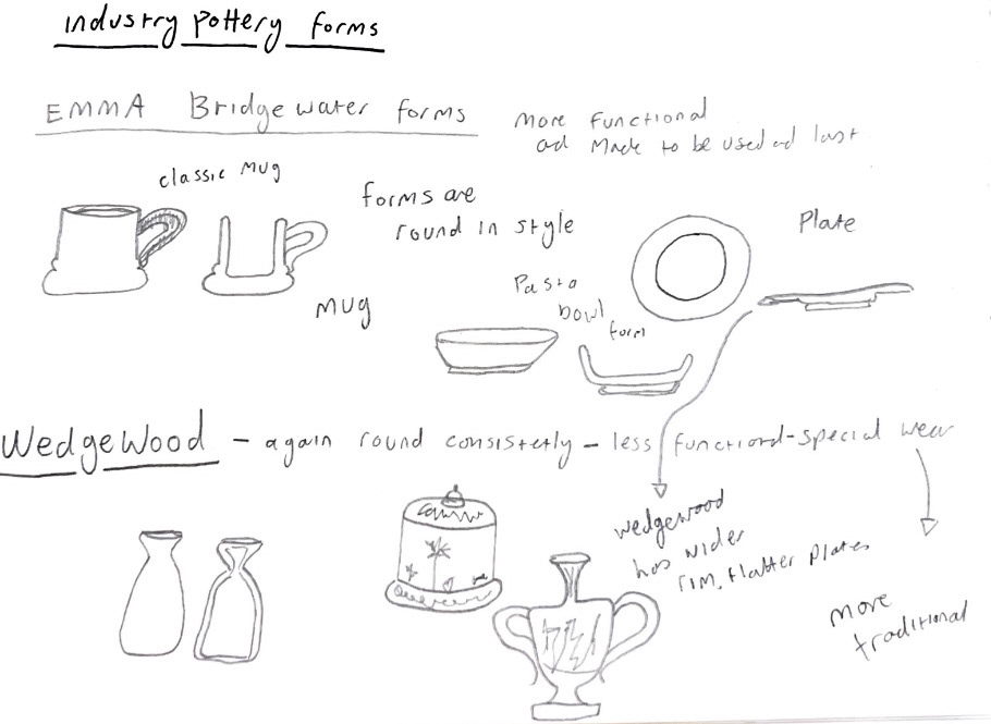
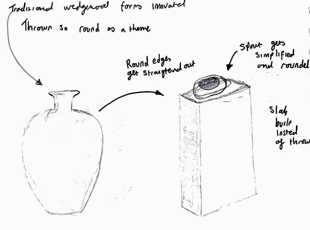
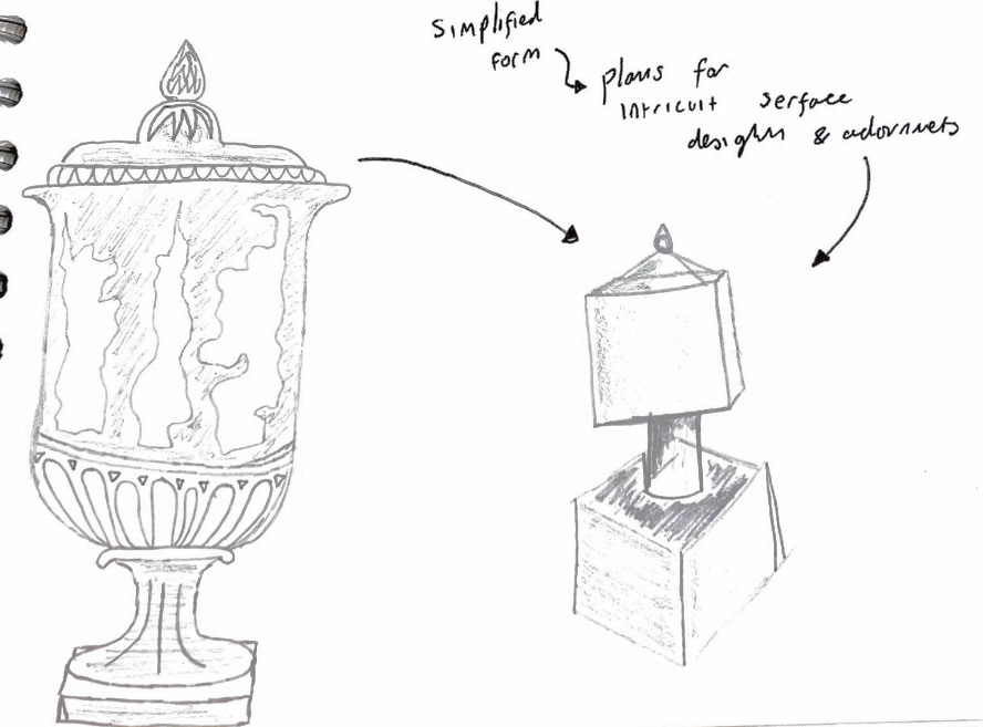
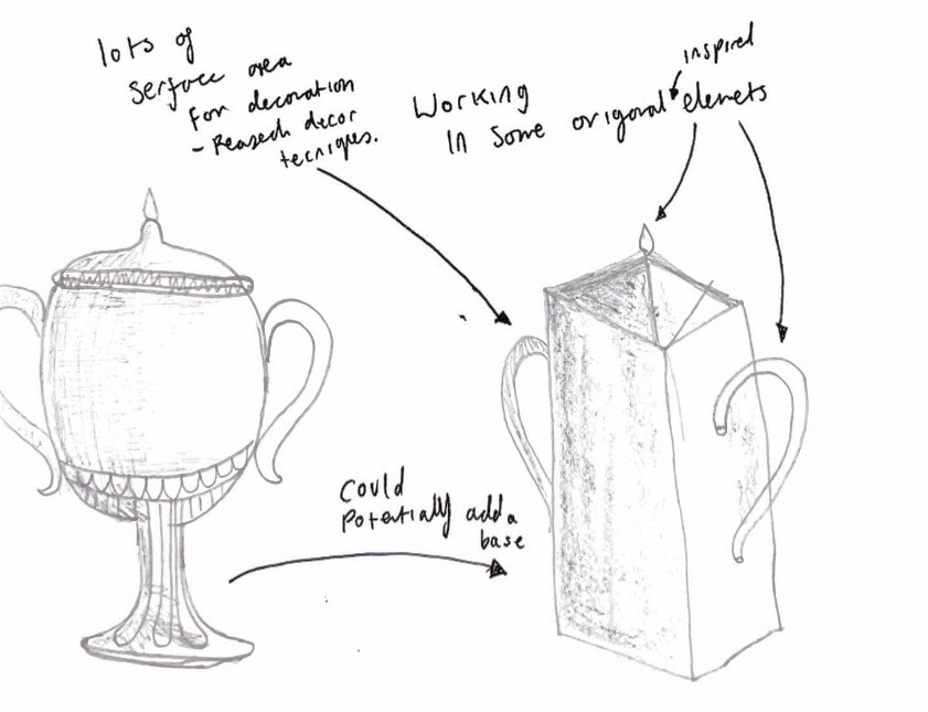
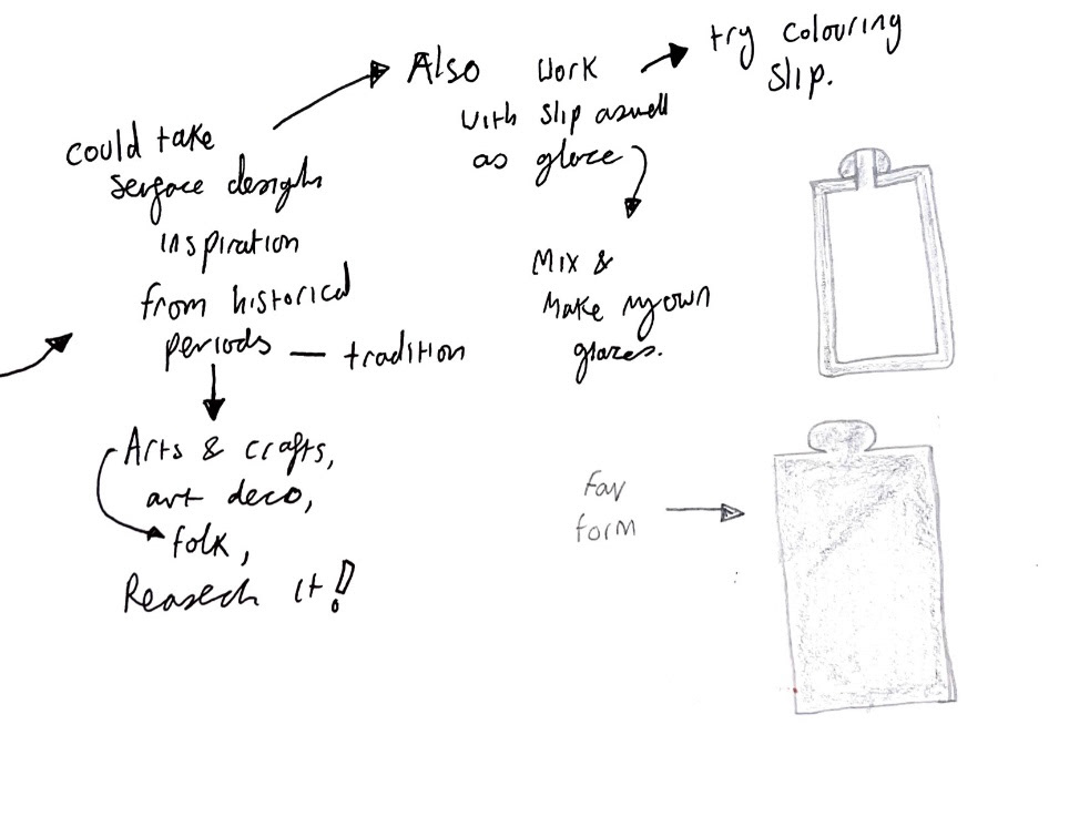
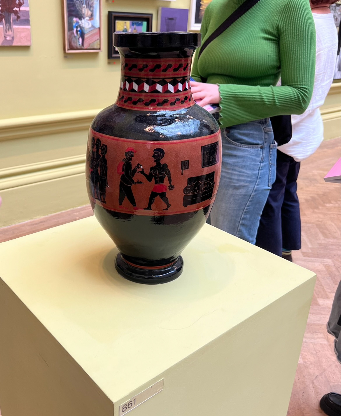
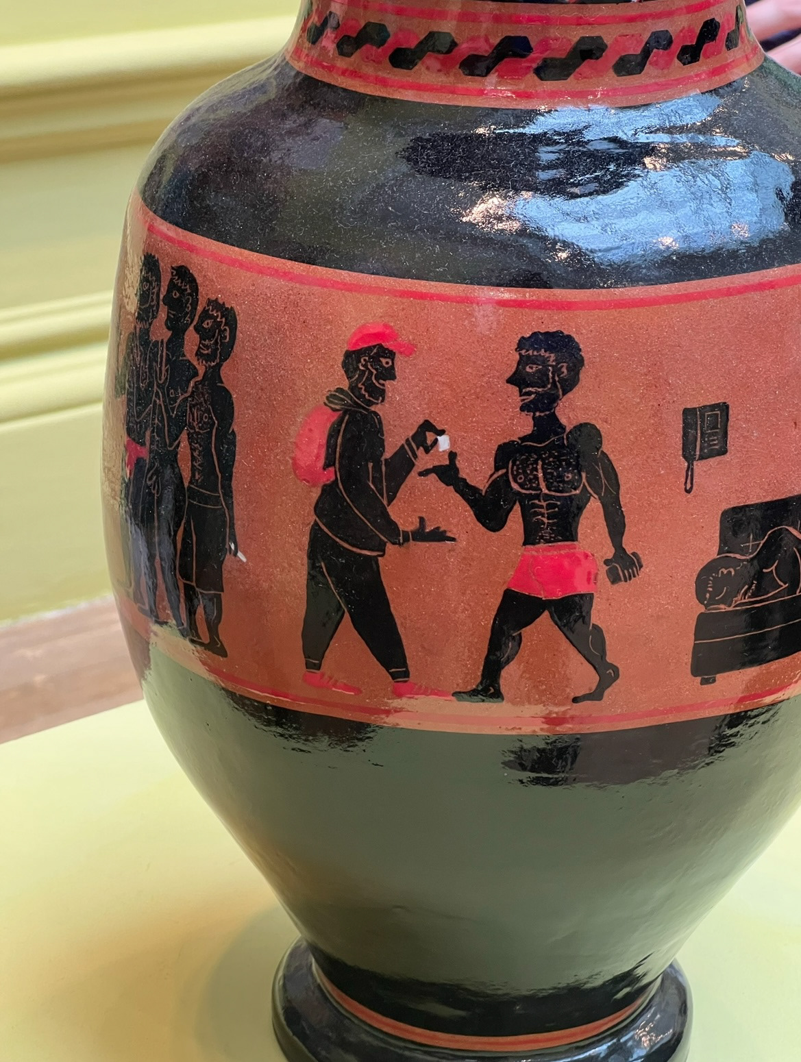
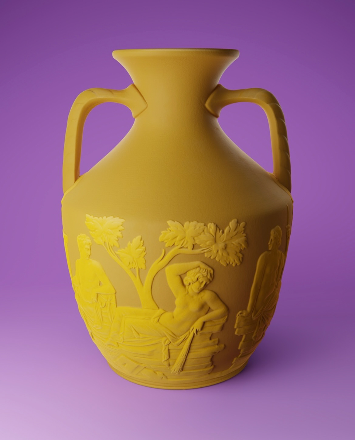
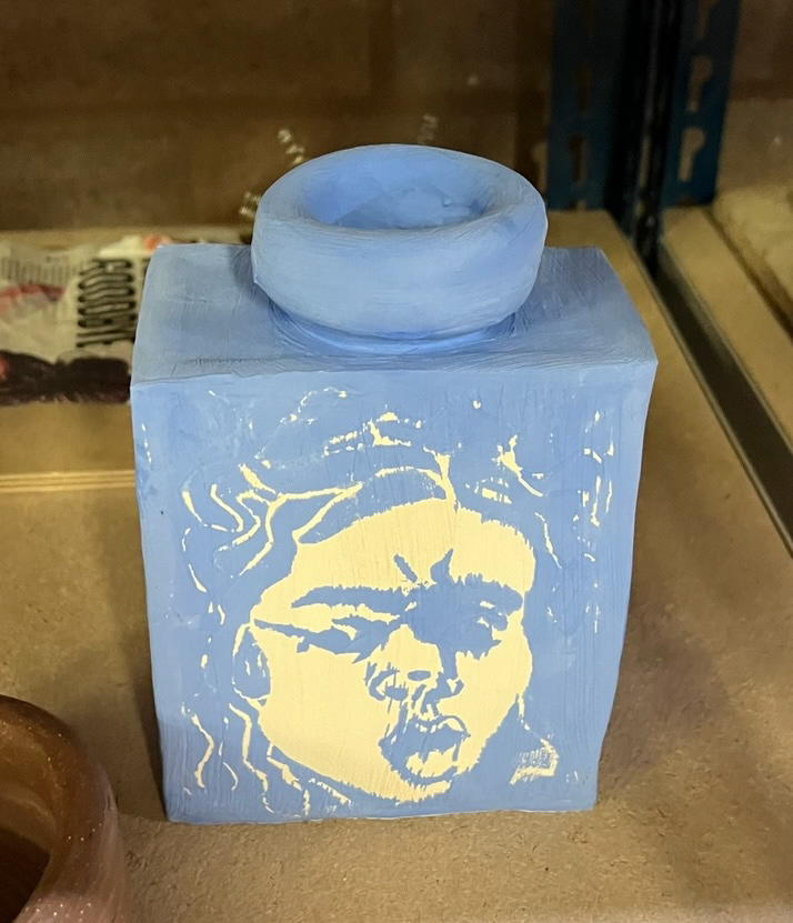
Next I thought about the innovation part of this project and how I could innovate forms documented by Wedgwood specifically. I noted that due to Wedgwood's master forms being predominantly throw, they were round as a theme. I decided that I would make similar forms and make them angular and more square, I would do this by slab building and modernising some of the more traditionally shaped aspects.
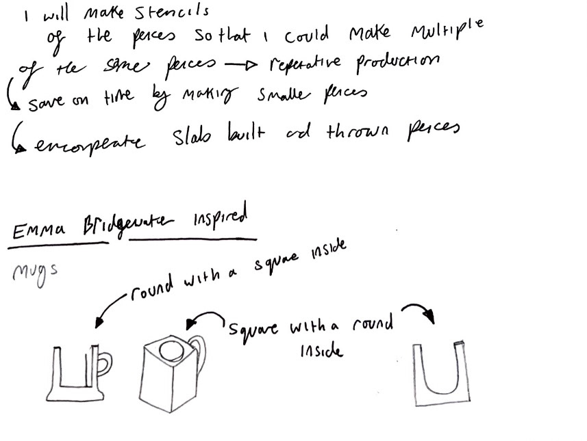
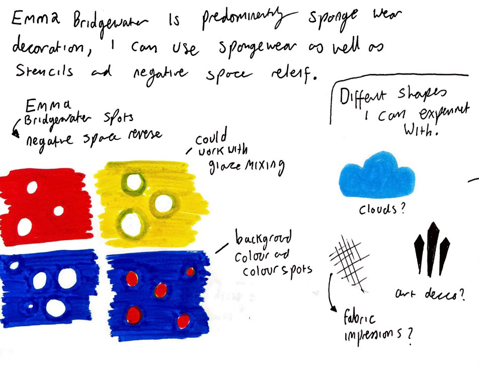
I also looked a little bit into Emma Bridgewater and how I could innovate in the area of surface design inspired by their iconic sponge wear patterns.
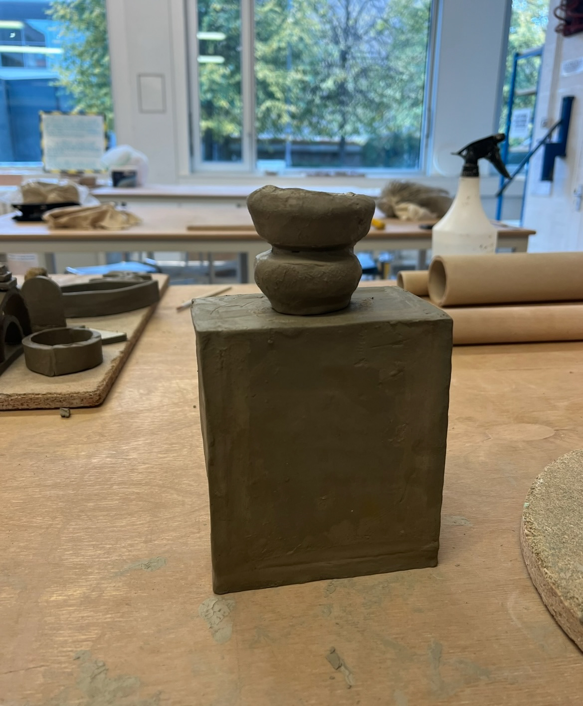
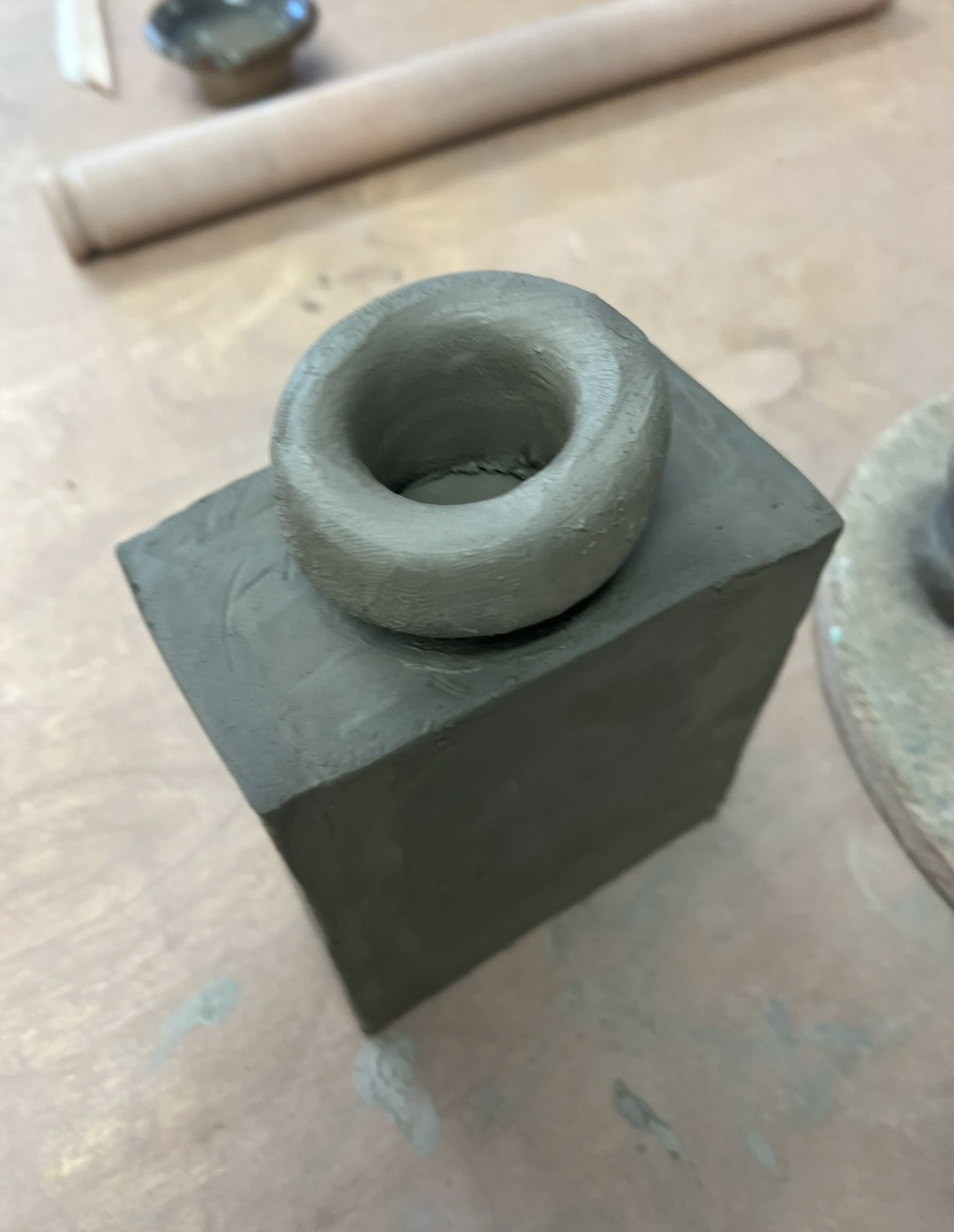
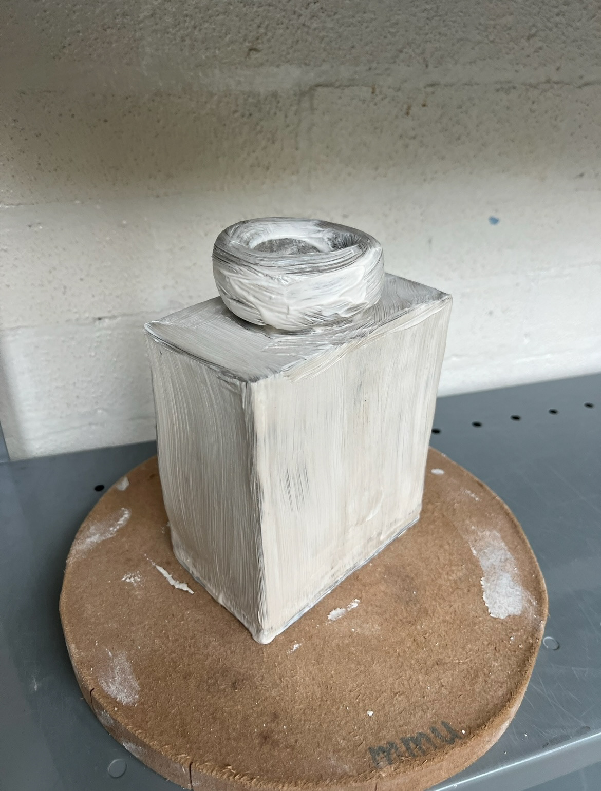
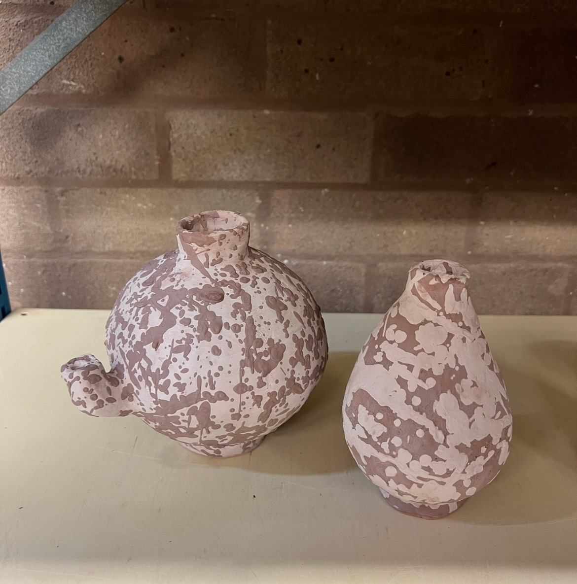
I then started to put some of these ideas into physical form. I started making my first idea. I measured out my slab pieces after rolling my almington clay out on the slab roller. i decided that the best way to make this form was to construct a box, then I would throw a neck attachment.
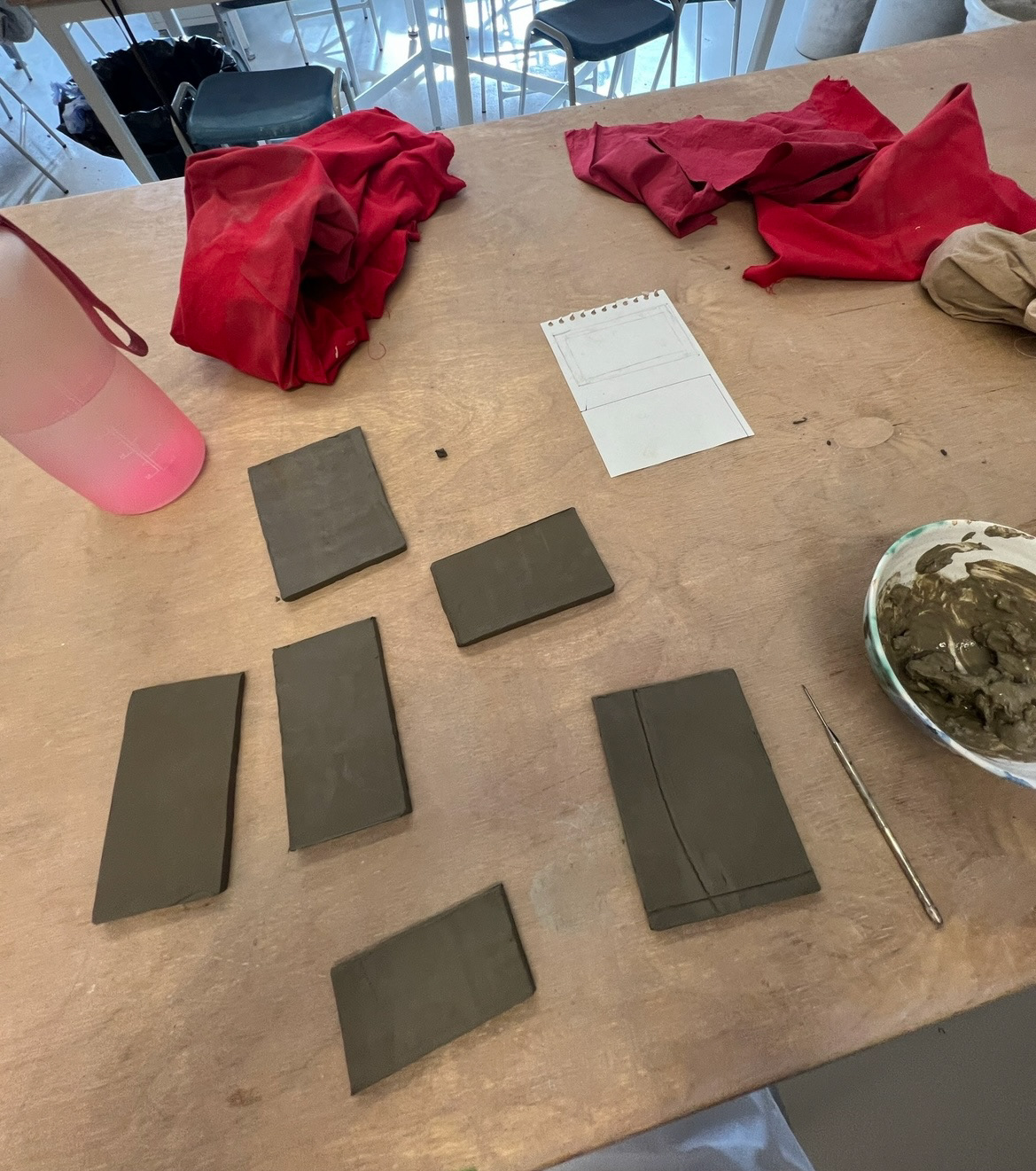
I later came to find out that when it came to construction, making this form out of paper panels first would have been a wise idea. I could have then used the paper panels as stencils for cutting out my clay panels. as I didn't do this, some of my panels came out with inaccurate measurements, which I did not find out until I was at the joining stage of construction.
Next in the construction of this piece I had to throw a neck piece attachment. I hadn't thrown in a few months so I struggled with this. The clay I used was also quite hard so this did not make the process any easier for me, but worked as a learning experience for future throwing projects. (thrown pieces and constructed box below).
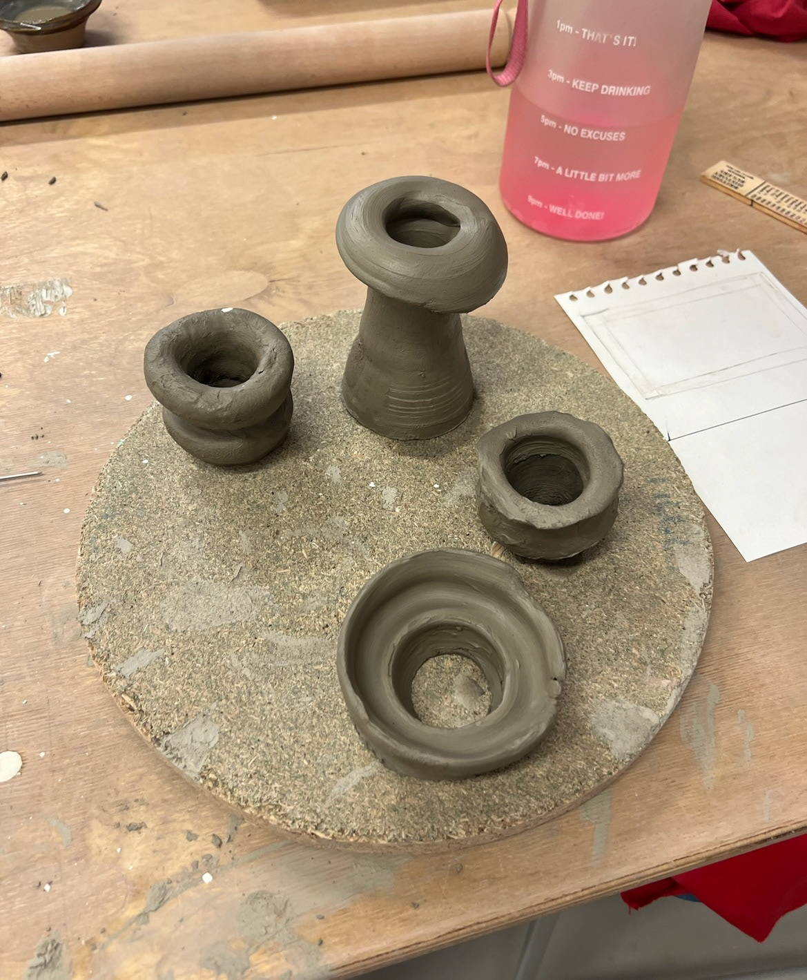
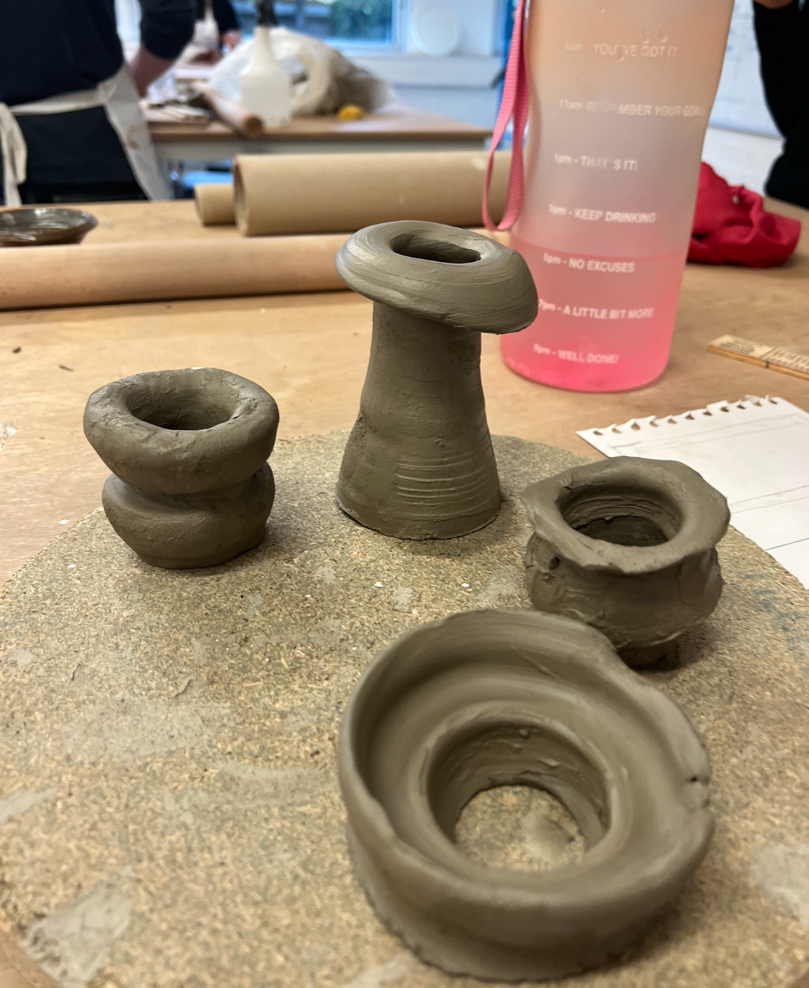
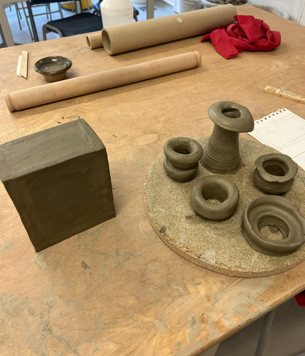
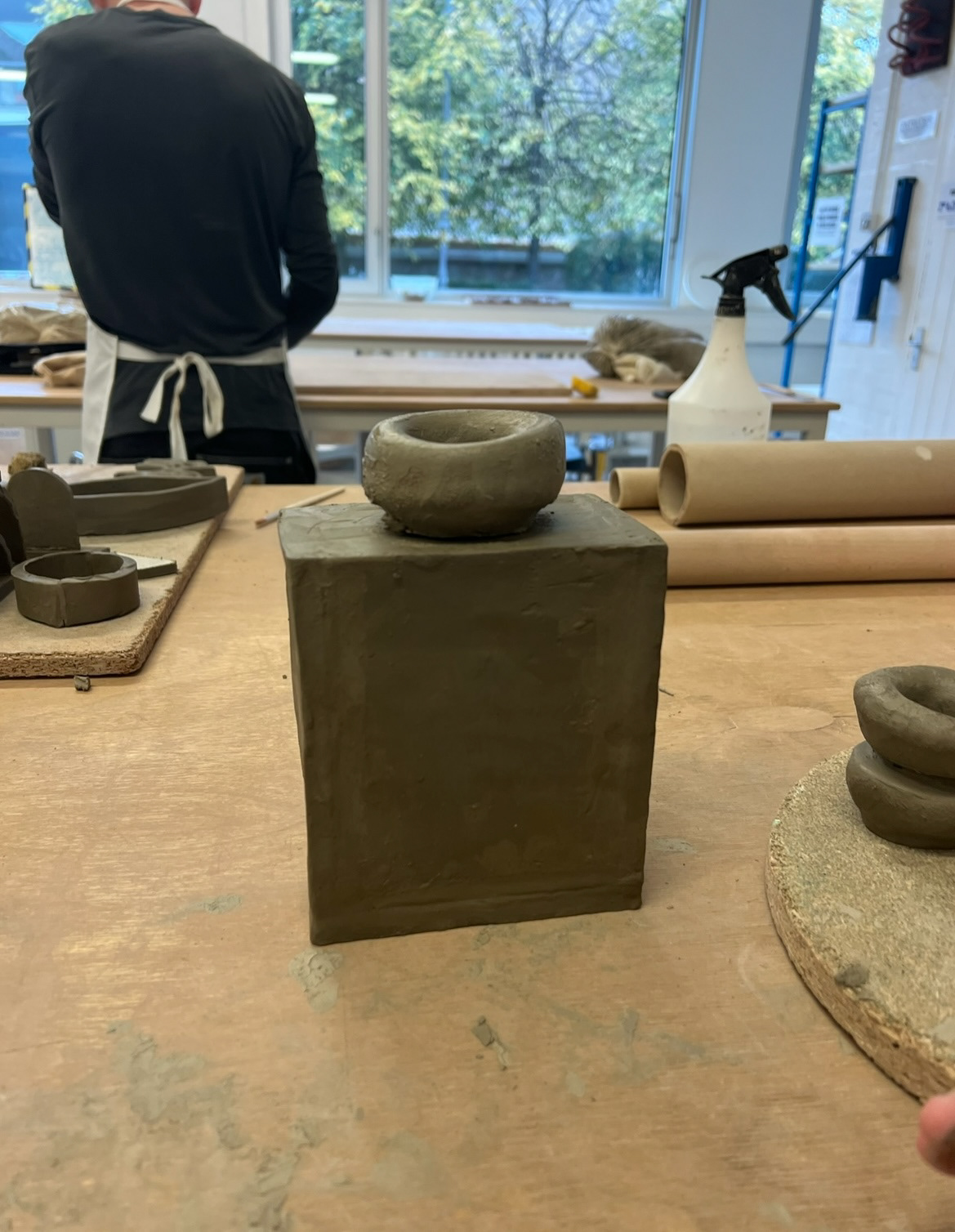
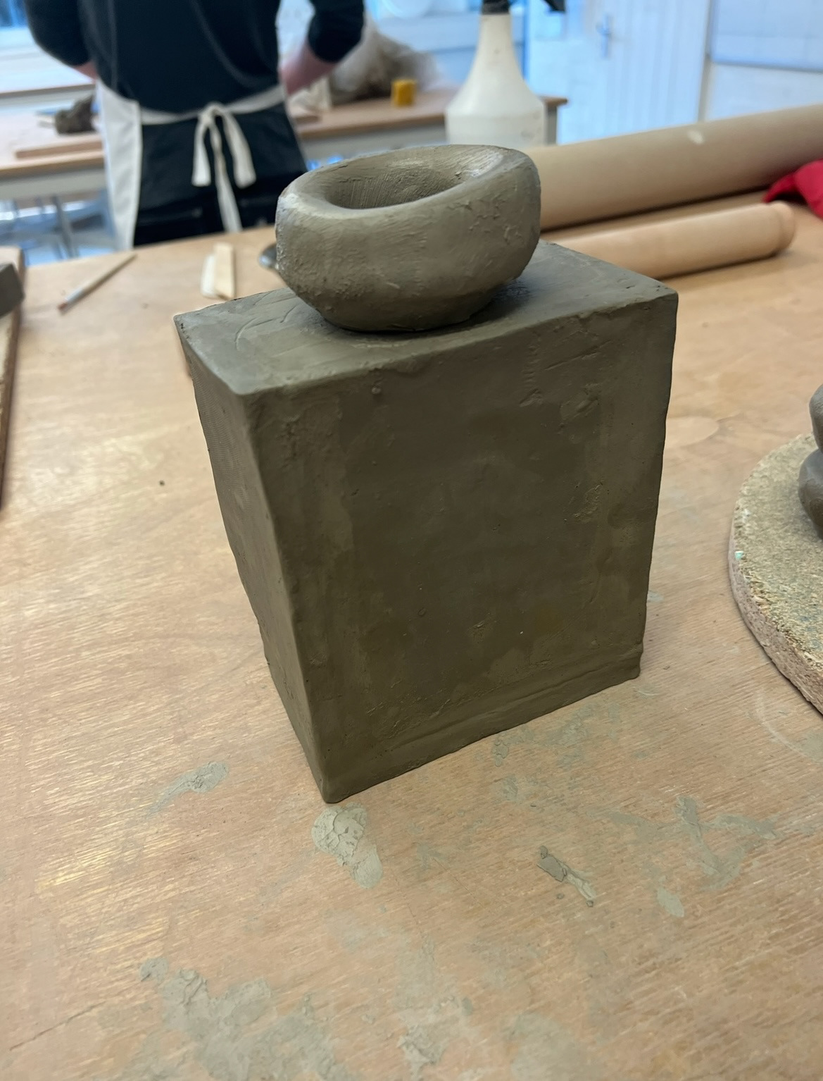
I wasn't hugely happy with the forms I had thrown, but I tested how they would look on my piece anyway.
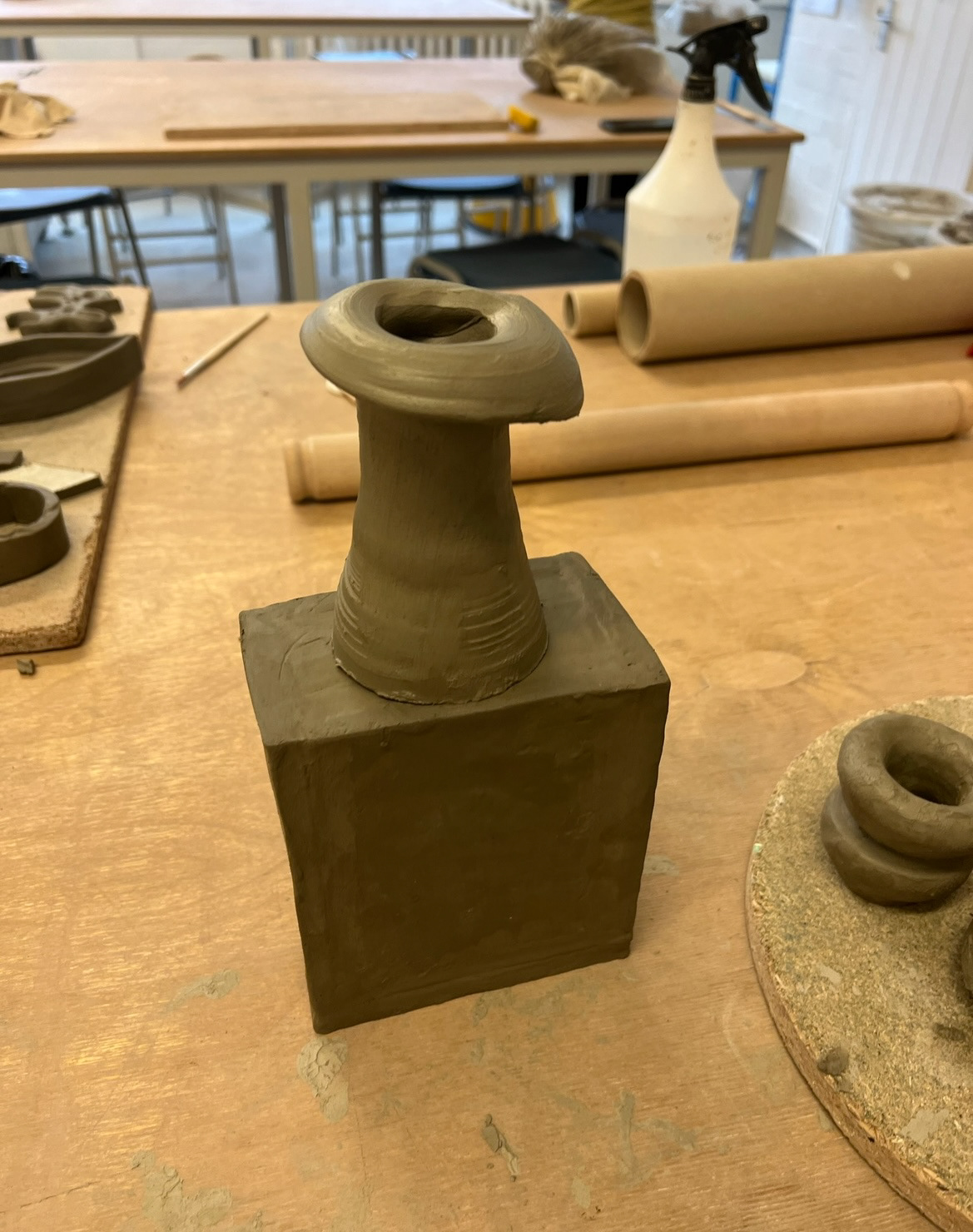
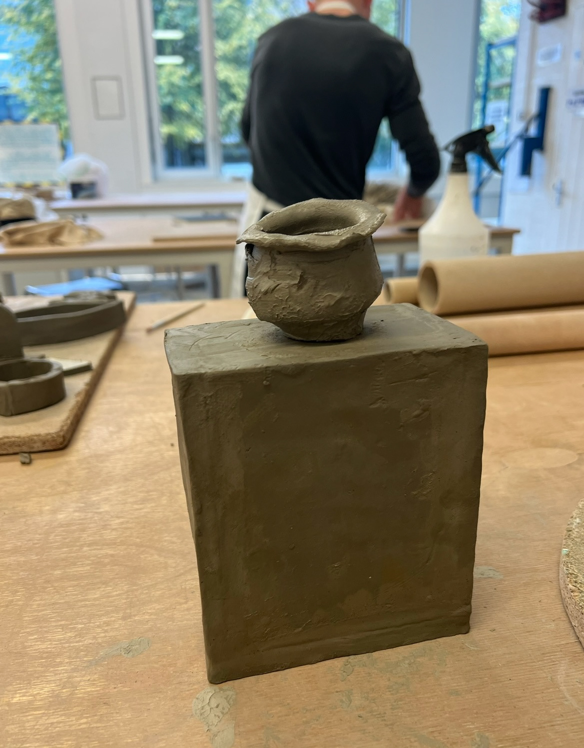
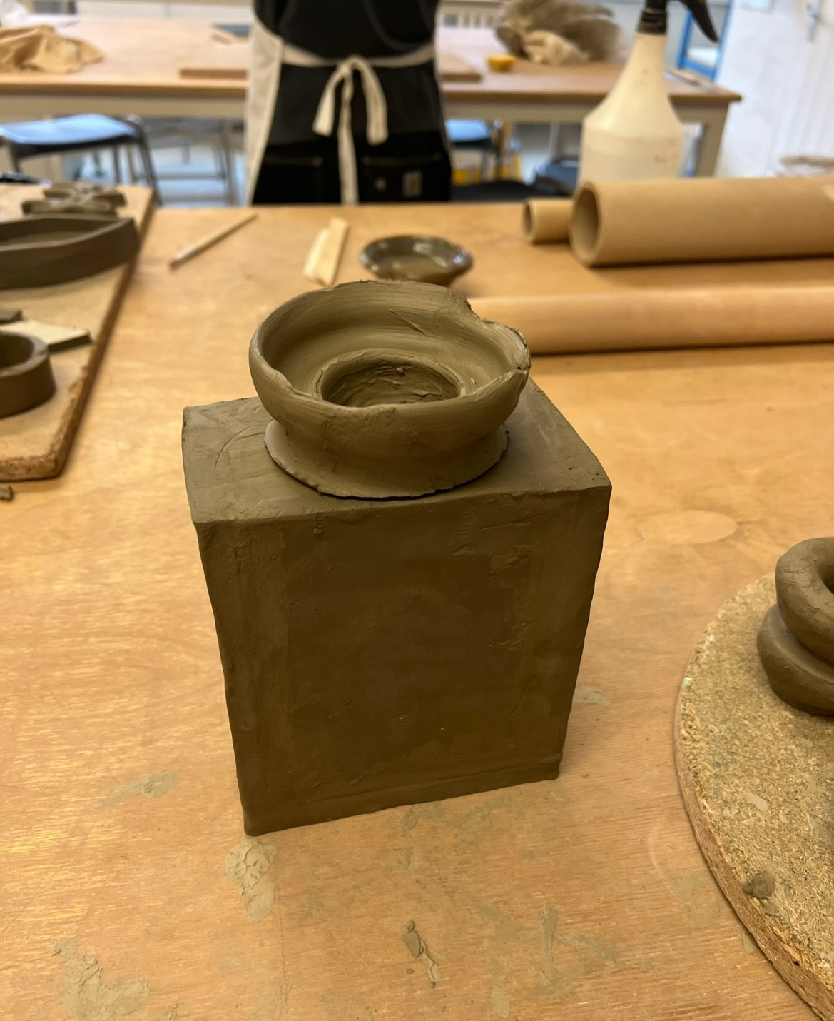
I was happily surprised however with how my final attachment turned out, it ended up looking very similar to my concept drawing and worked proportionally with the rest of my piece. I chose this one to attach to my final vase. (below)
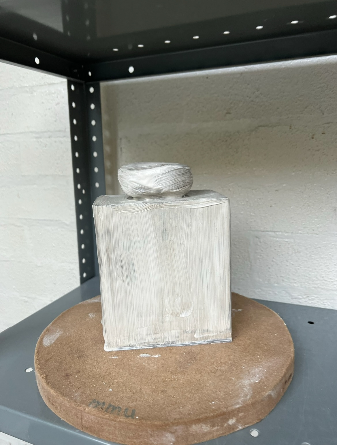
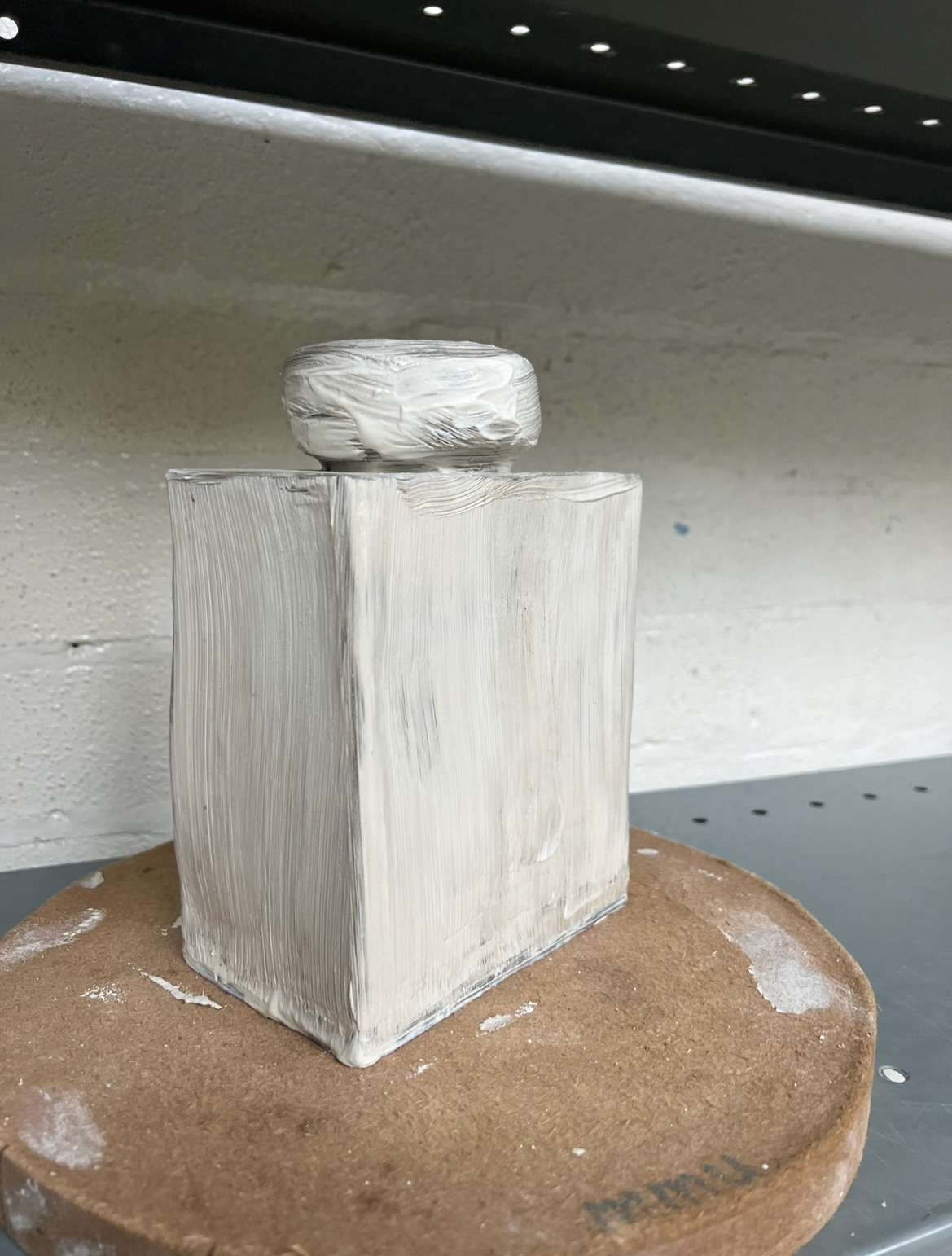
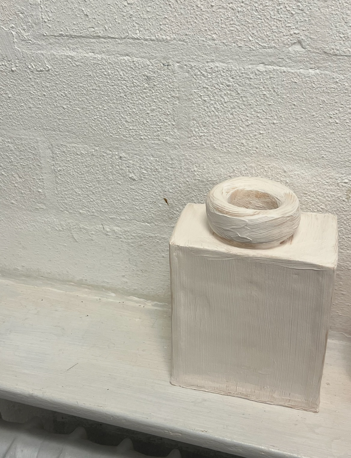
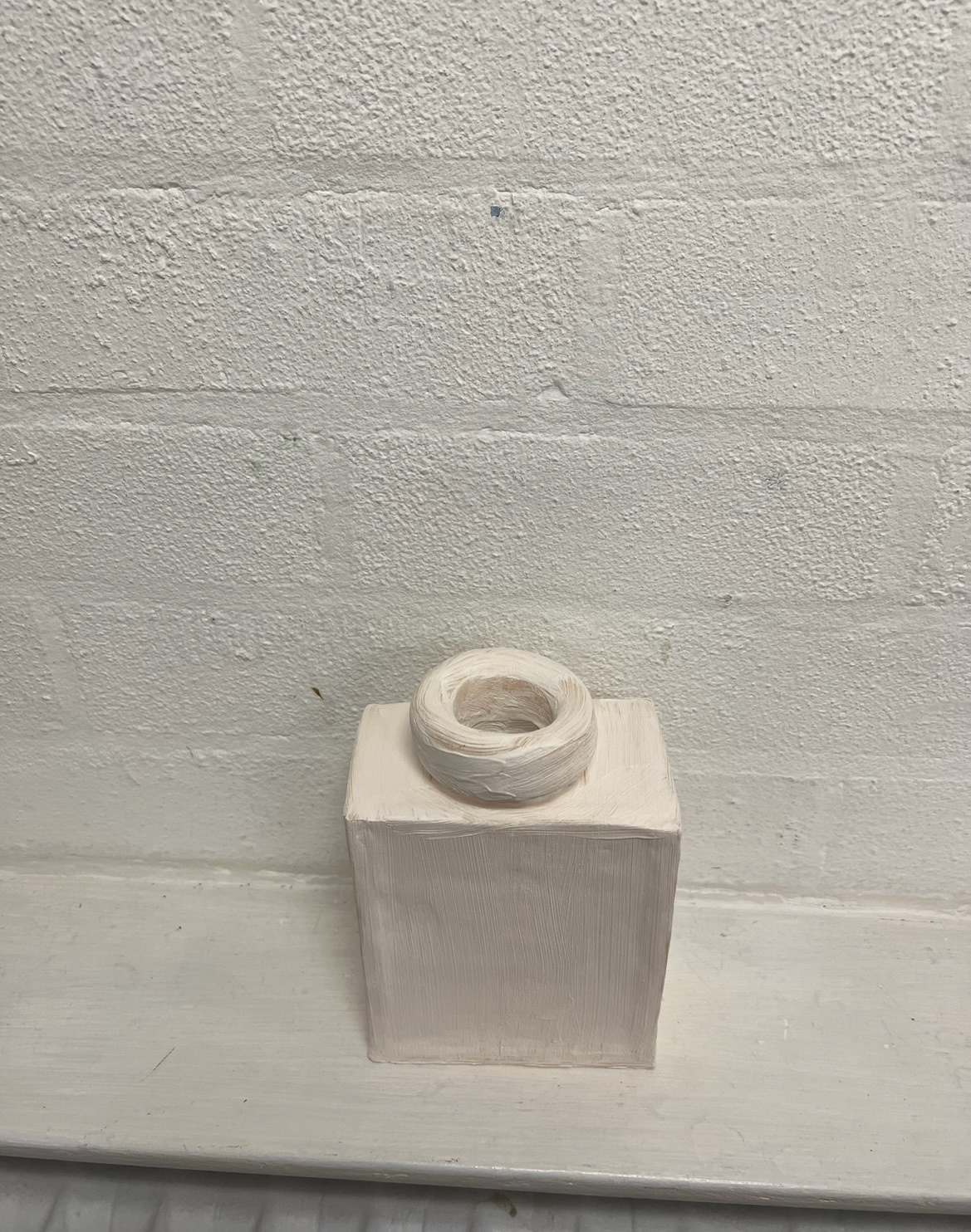
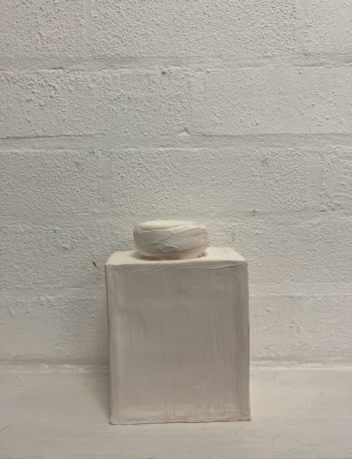
The next stage of building this piece was to paint it with slip (below) and bisque fire it (below below).
At this point I took some time to look into other artists who had innovated traditional ceramics. Immediately the first example that came to mind was a piece which I had seen at this years Royal Academy Summer Exhibition in London, by a ceramicist called Michael Robey, called 'Reflecting The Times, A 'Chill-out''. Robey had taken the form of a traditional Ancient Roman olympic vase or "amphora" and instead of the surface design depicting scenes of olympic sports or mythology, had instead depicted scenes of modern life on the party scene. I really liked this piece as the imagery was unapologetically modern (however a little bit too crude for me) but stuck to the traditional style.
As I had been doing some work on researching Wedgwood and their traditional forms, I was keen to do some research on how they had recently been innovating their practice to move with the times in an ever changing market. I have followed Wedgwood for a while now and have noticed that over the past couple of months some very notable and exciting (for me) innovations.
first I noted that in June, that Wedgwood released their first line of NFT (non-fungible token) digital ceramics. I found these to catch my eye especially because I have forever wished for some Wedgwood jasperware designs in some brighter exciting colours. I thought it was an interesting choice for them to release this line exclusively in digital NFT form, but I think the innovative nature of this project by such a long standing craft pottery quite notable.
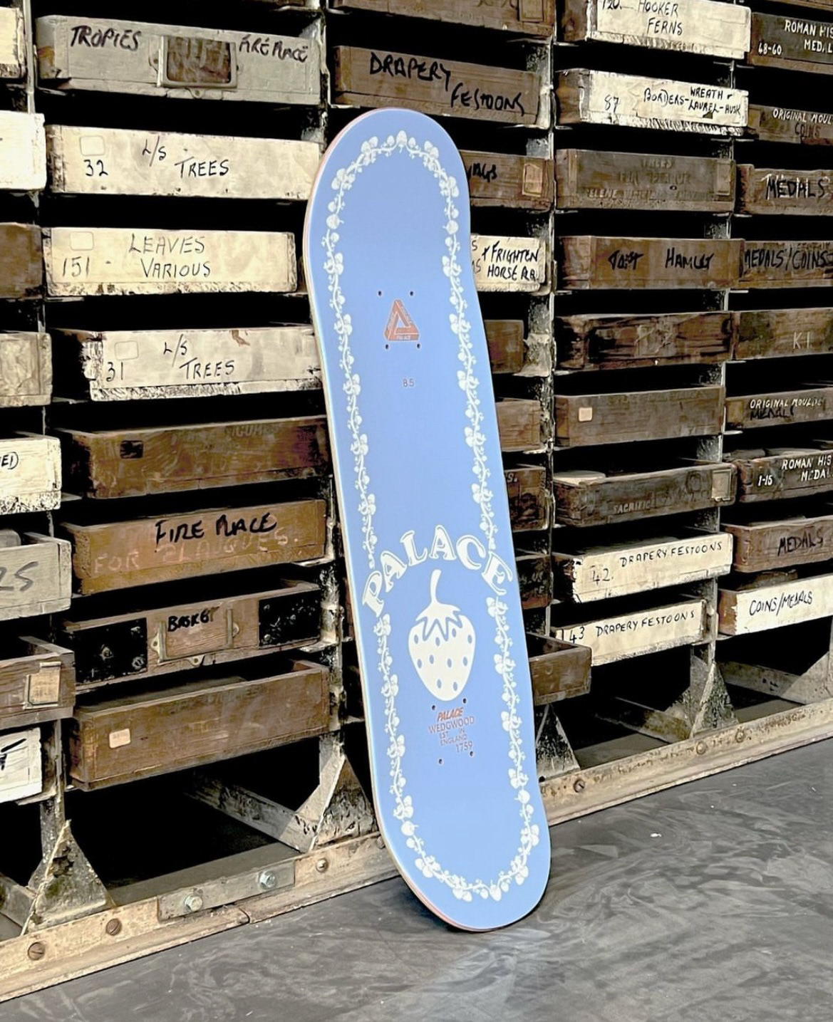
Another way in which Wedgwood is innovating its practice, is by collaborating with current designers, specifically those popular with a younger audience such as Charles Jeffery (LOVERBOY) and Palace. I personally am a huge fan of Charles Jefferys LOVERBOY brand, so this was a very exciting collaboration to me and I absolutely fell in love with the results and am very inspired by the harsh contrast of traditional form and Jasper-ware aspects and and modern surface design additions.
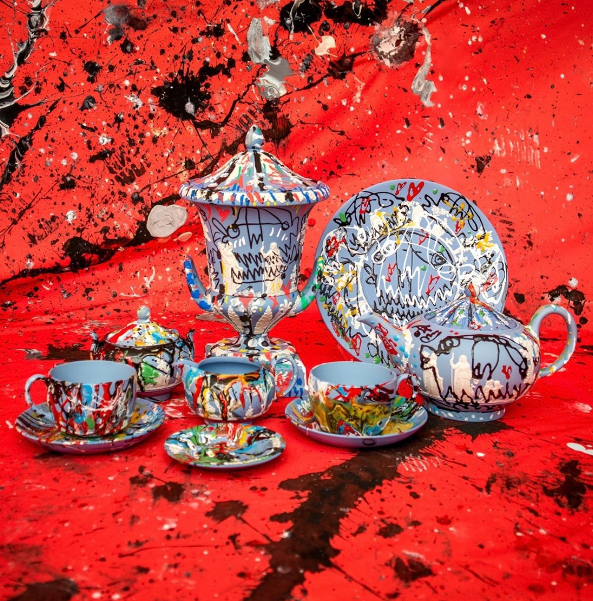
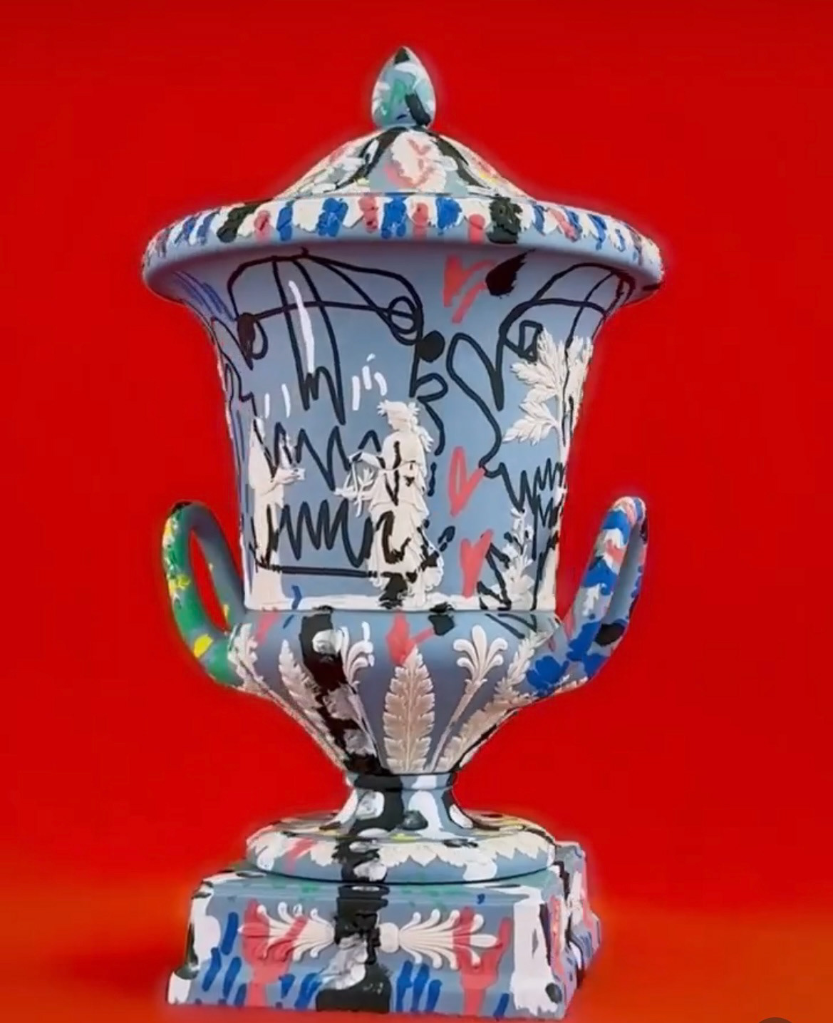
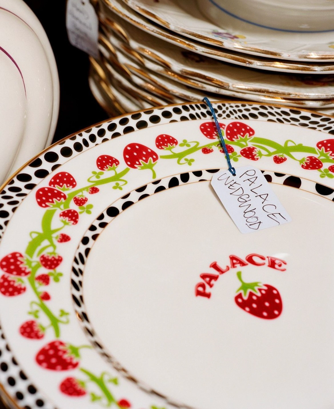
I also did like the recent Palace X Wedgwood collaboration but however I do think that the designs catered less towards the art and crafts side of the market but more to the mainstream modern interior design market. I found that this collaboration lacked connection to the heritage of Wedgwood and it was more a trade of design motifs than a real collaboration, however I did like the outcomes.
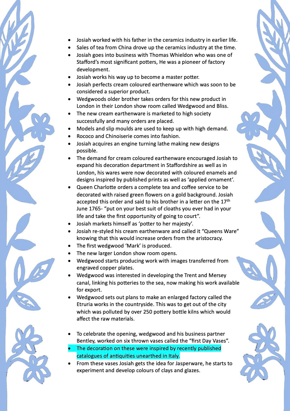
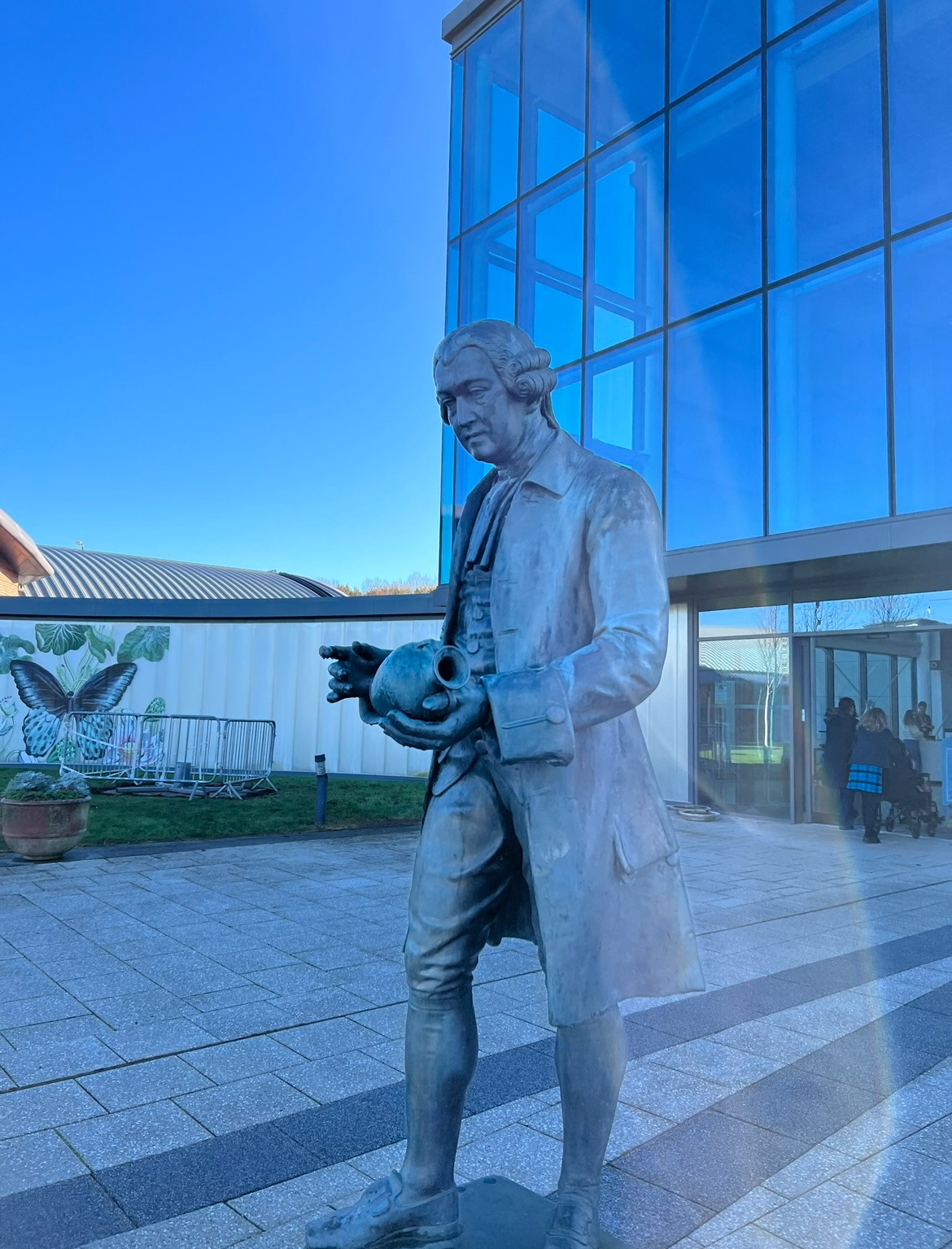
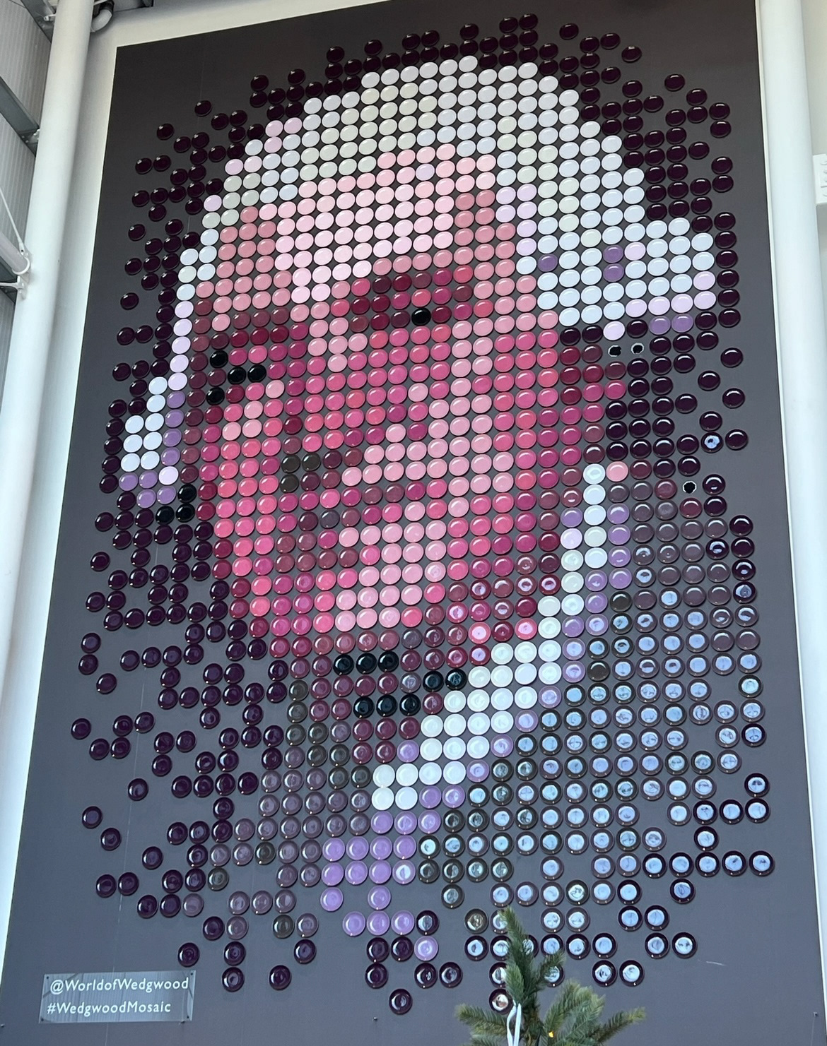
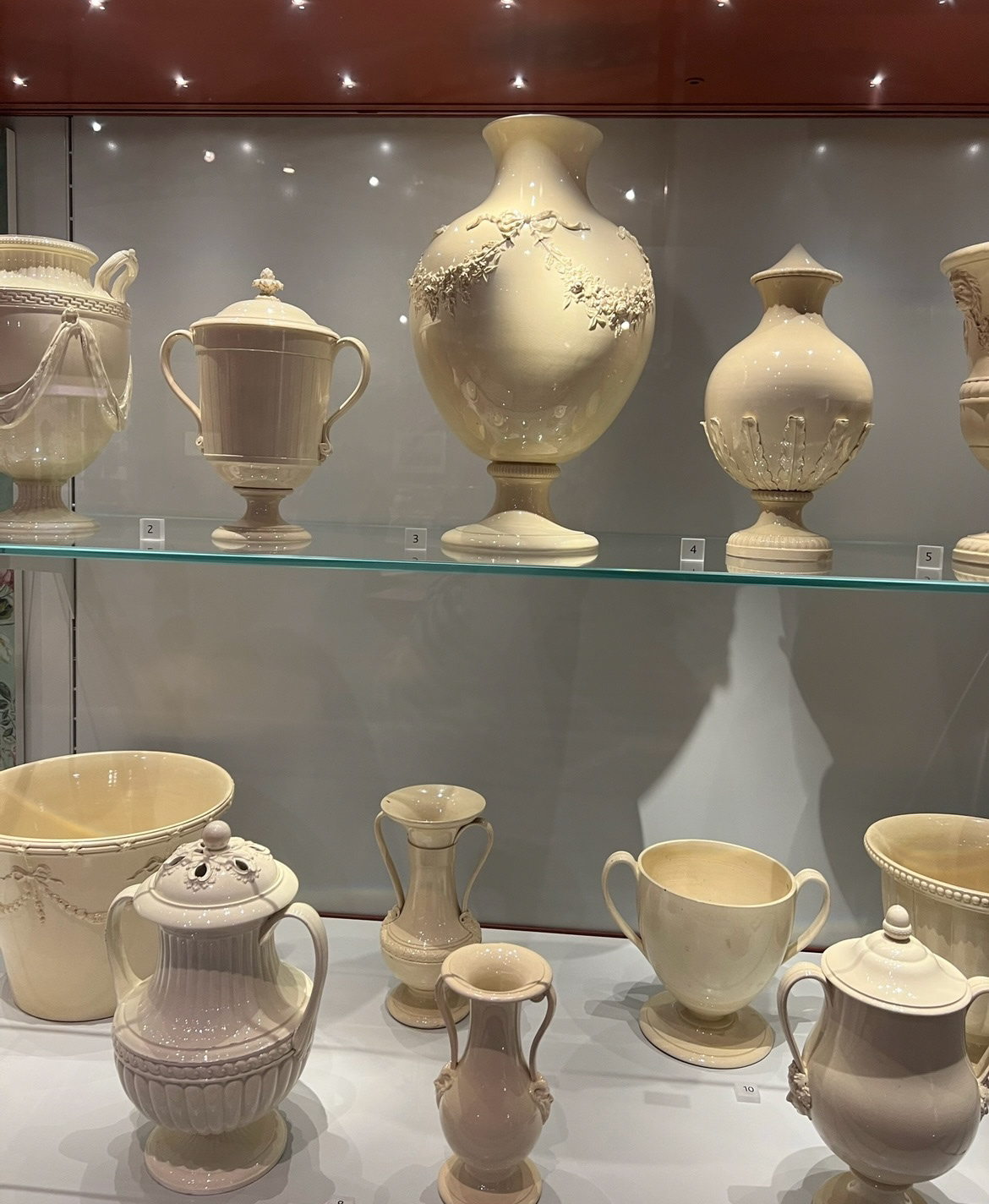
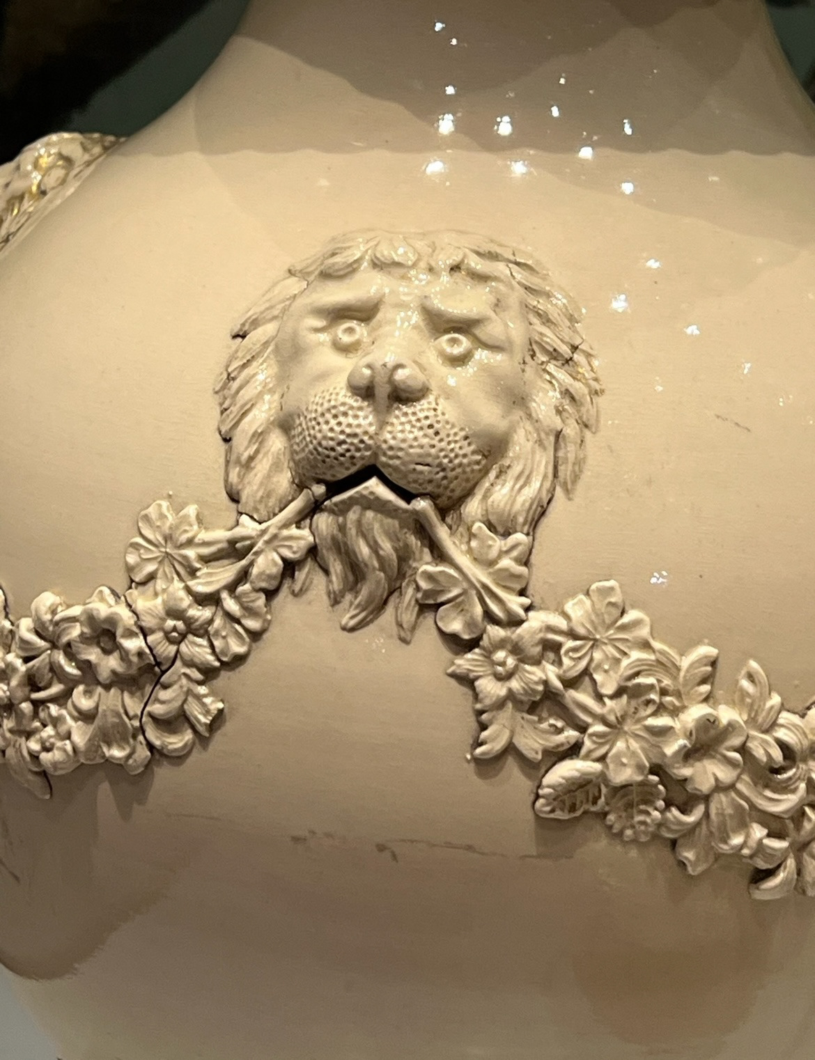
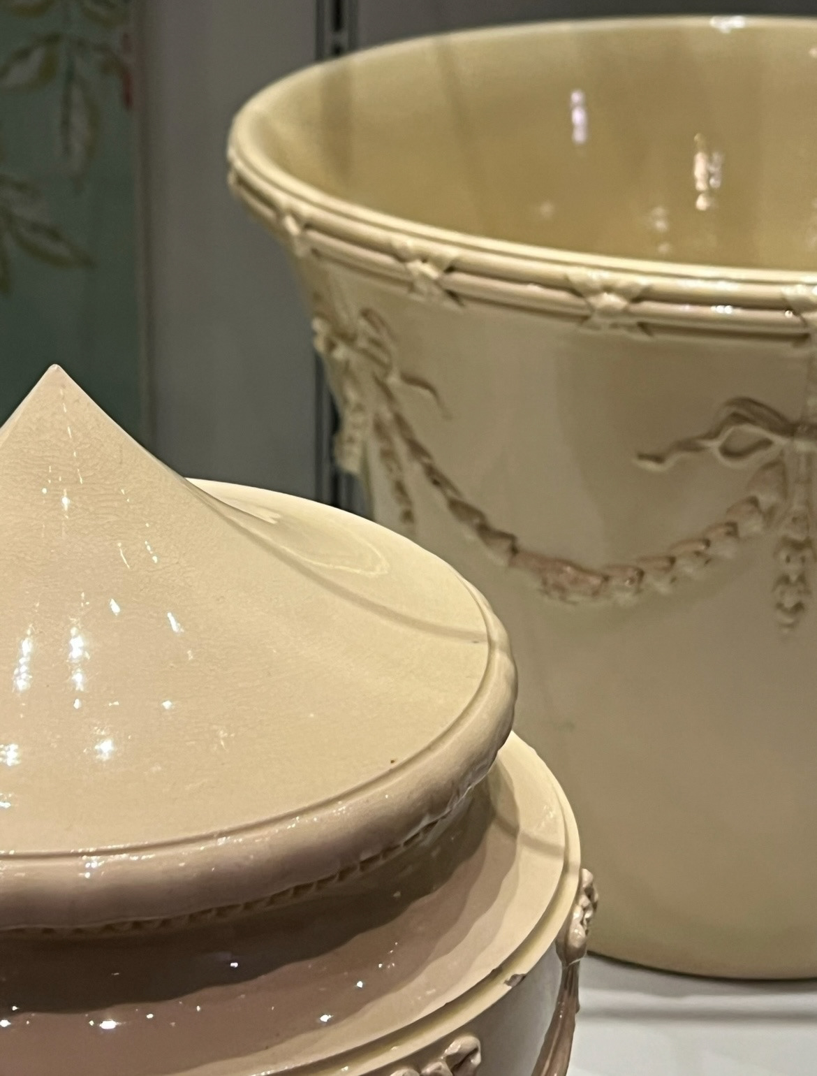
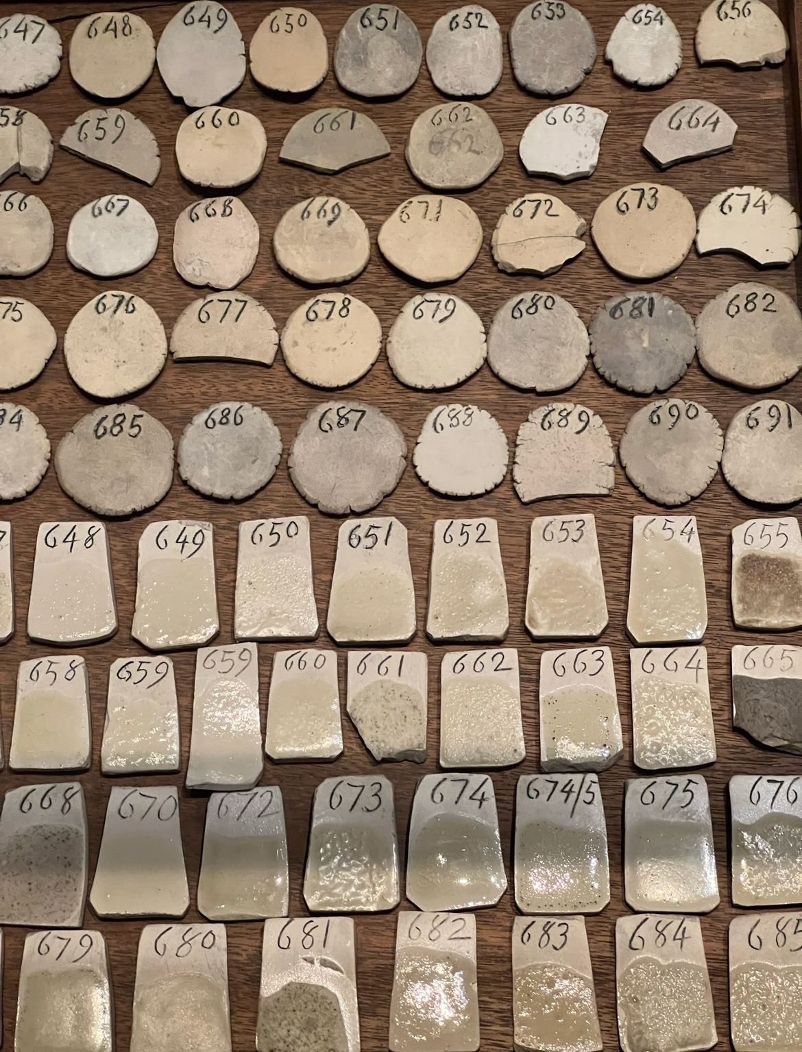
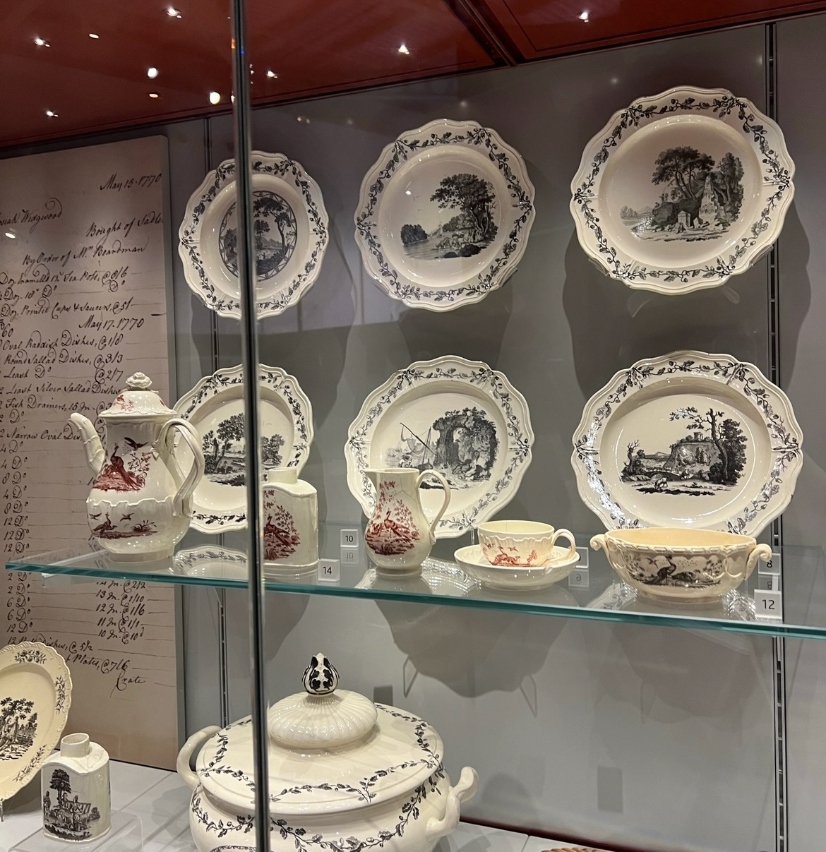
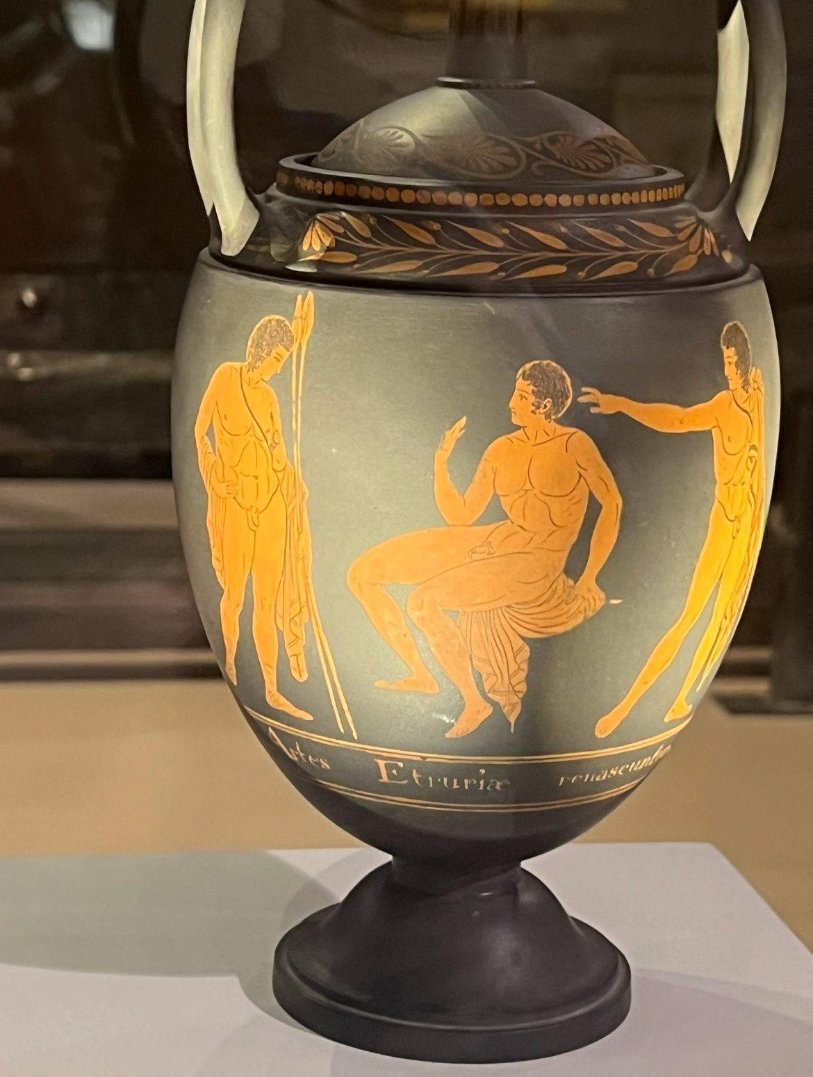
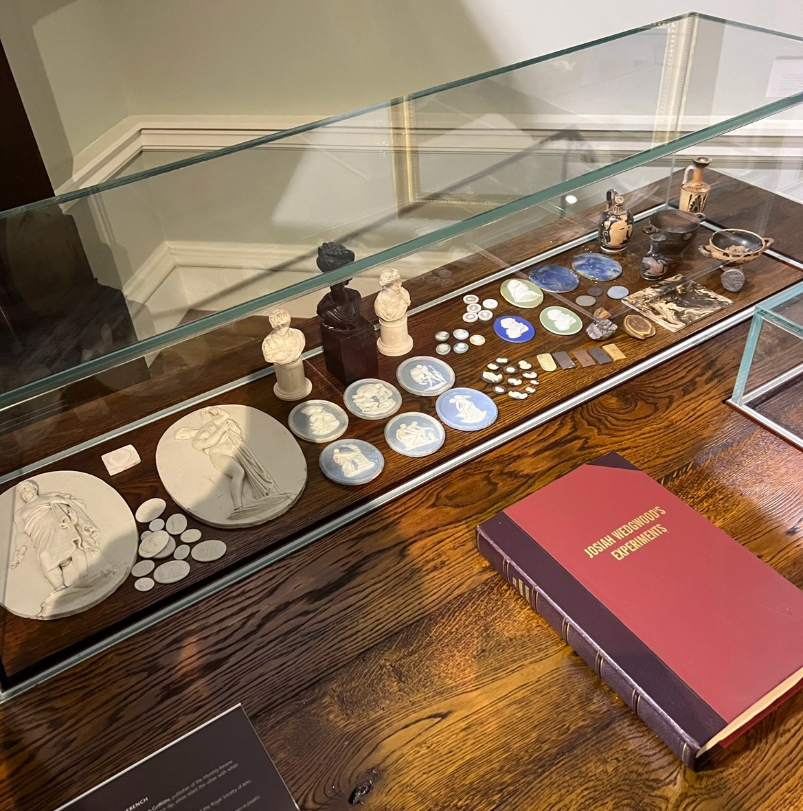
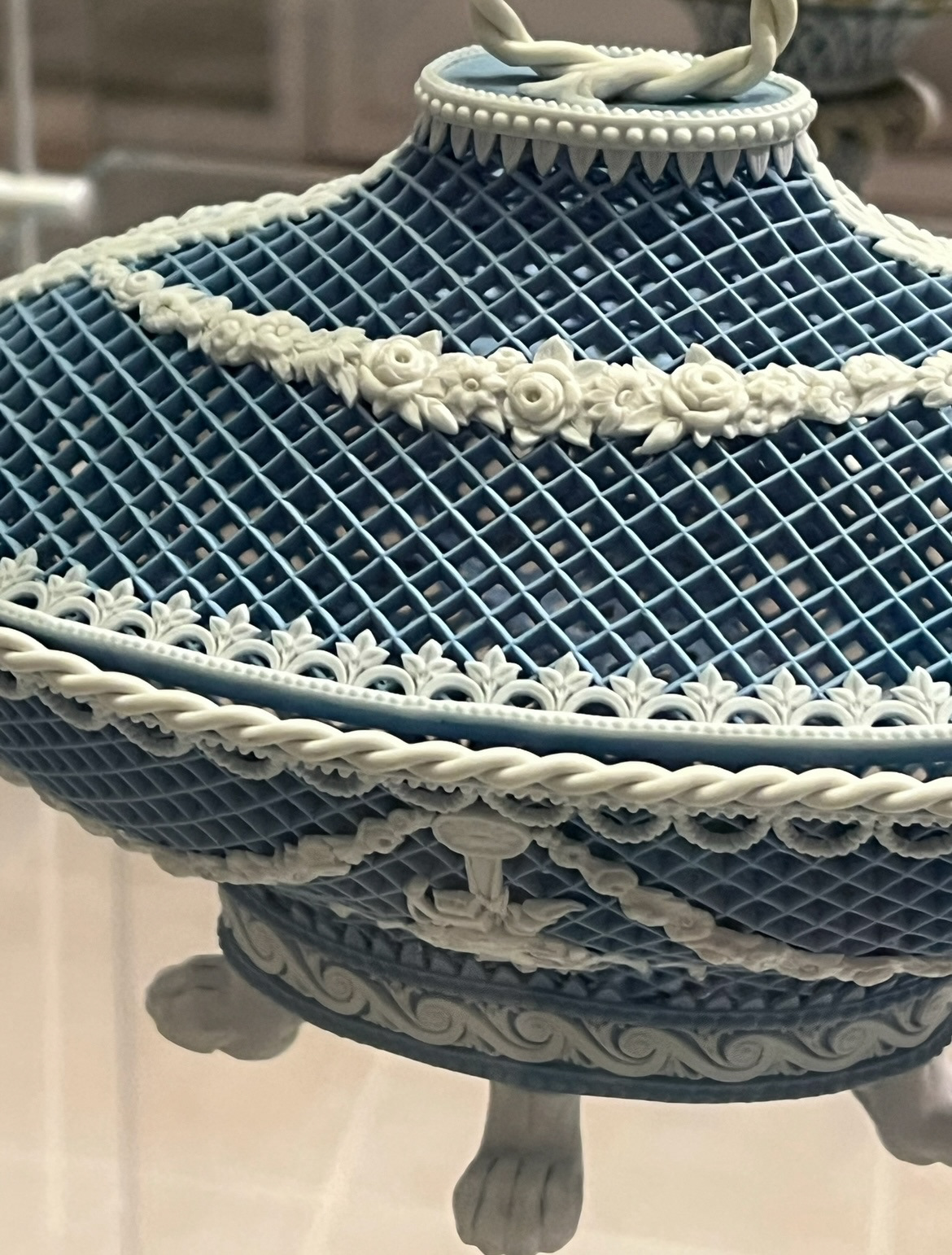
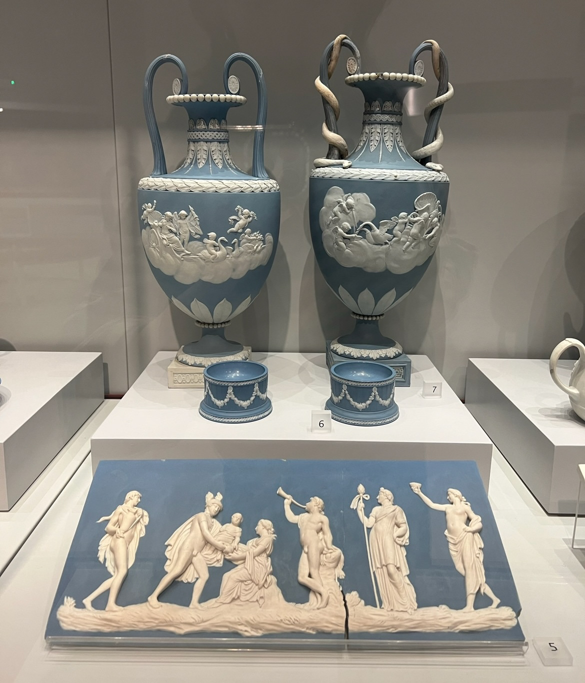
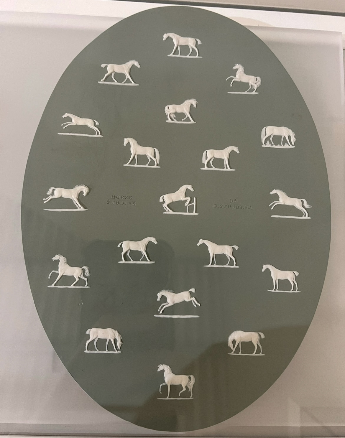
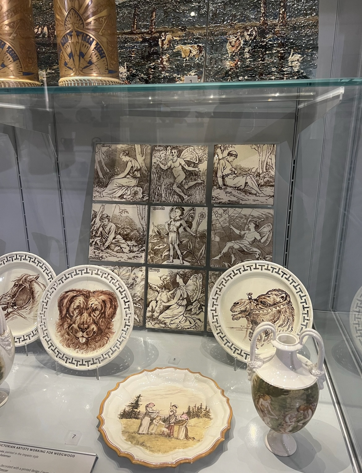
I had been looking into Wedgwood so much I decided that as part of my research it would be useful for me to go to the Wedgwood factory in Stoke to learn about the history of Wedgwood in more detail as well as see what their actual factory floor looked like. (the history of Wedgwood from the V&A collection at the world of Wedgwood).
(Some of my pictures from 'World of Wedgwood' below)

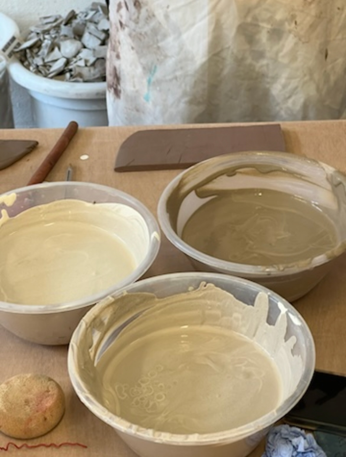
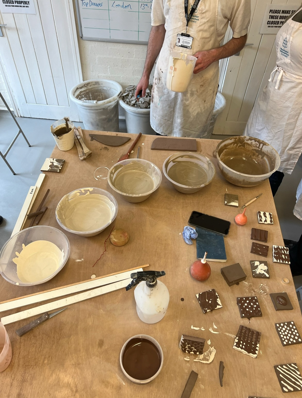
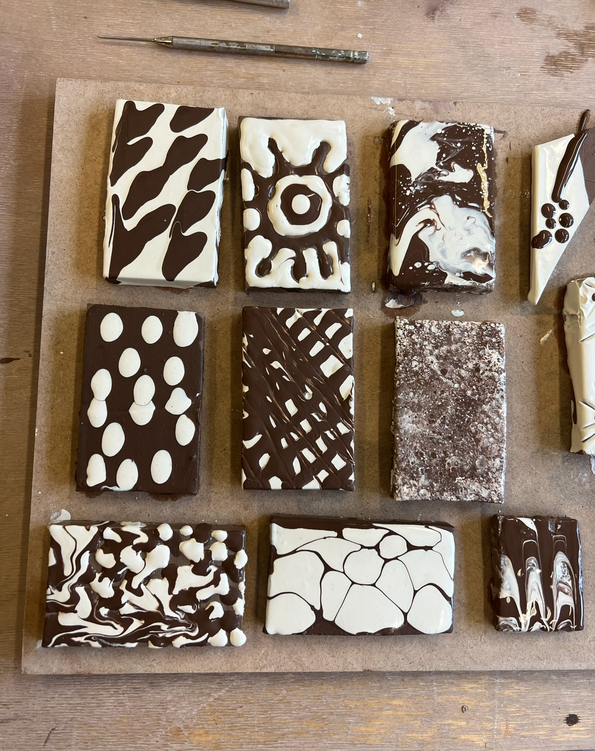
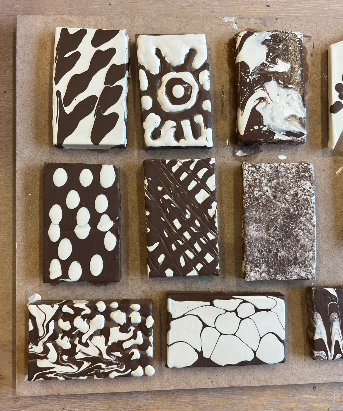
Back in the workshops we learnt how to line blend with glazes. I very much enjoyed this process as well as the suspense of waiting to see what my glazes would look like after coming out of the kiln. I decided to line blend using tin shiny earthenware glaze and matt black earthenware glaze as I viewed these as the most different therefore would potentially offer the most varied and unexpected results. (workshop sheet and notes below).
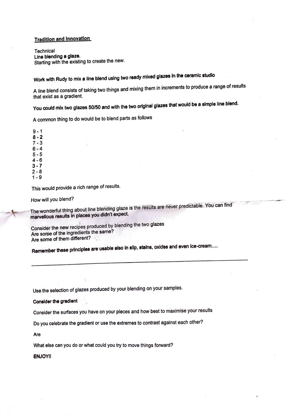
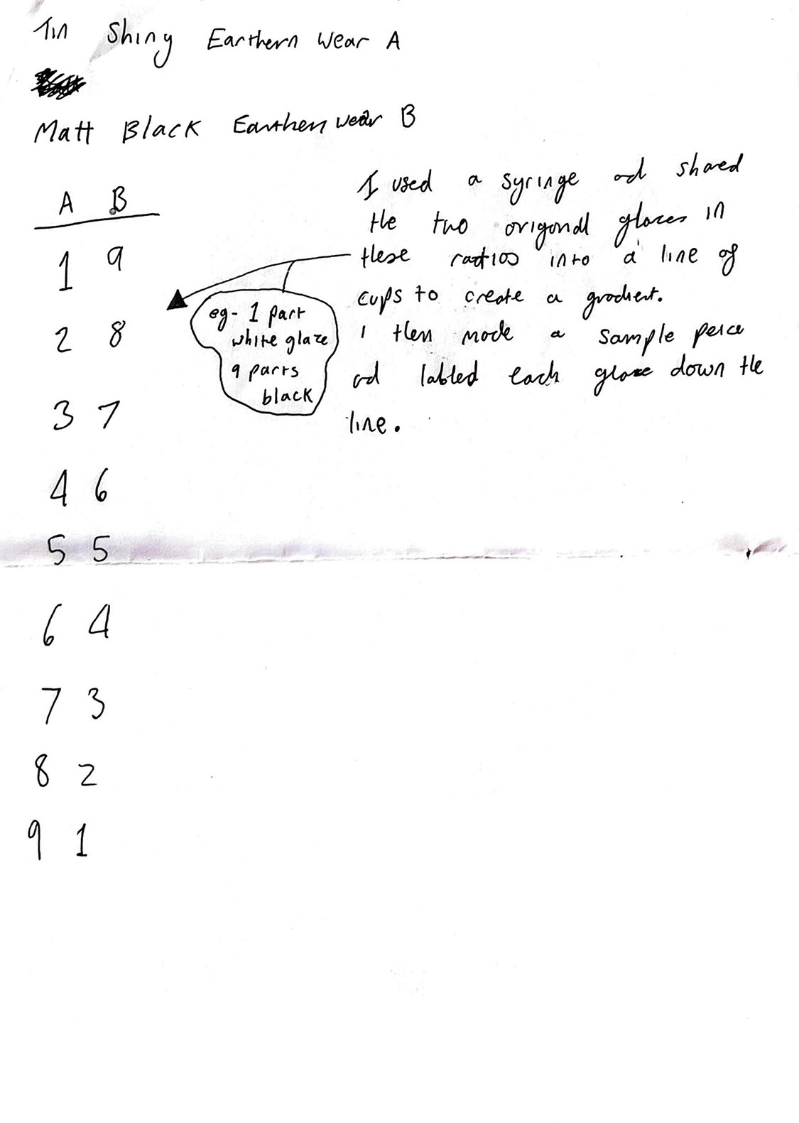
Using our line of blended glazes, we made a sample piece using each one to display the ratios and results for after firing so we would know how to mix those colours again if we wished in future. we also used these to glaze our pieces that we made in our first workshop when we were focusing on joining. some of my pieces did not stay together in the kiln but I will take it on as a learning experience for next time. (glaze sample bowl and glazed pieces below)
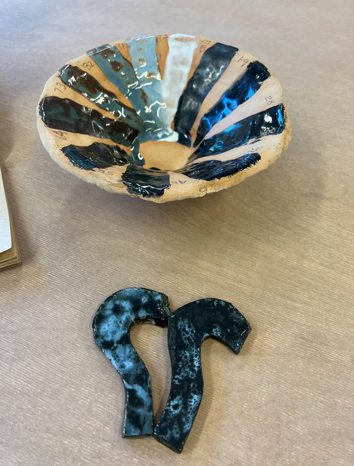
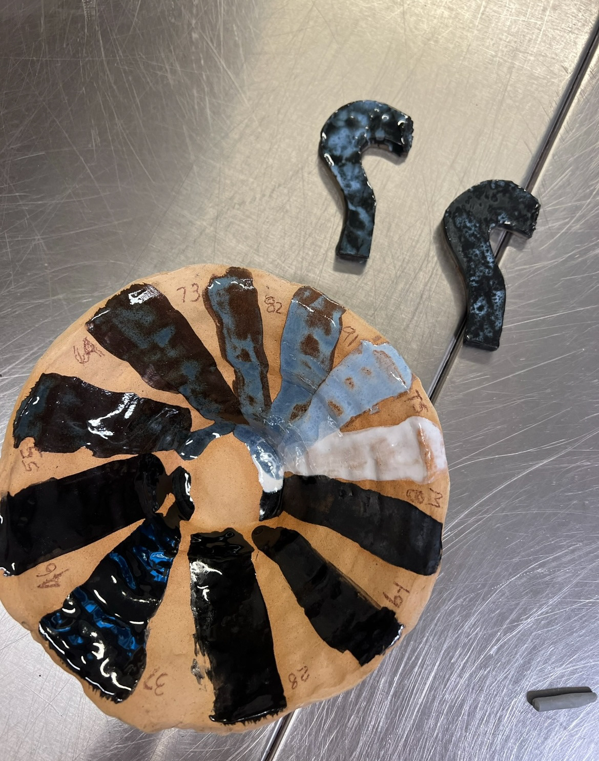
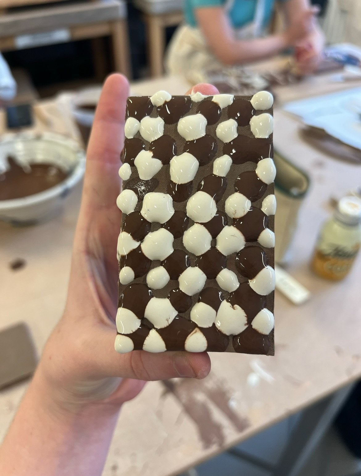
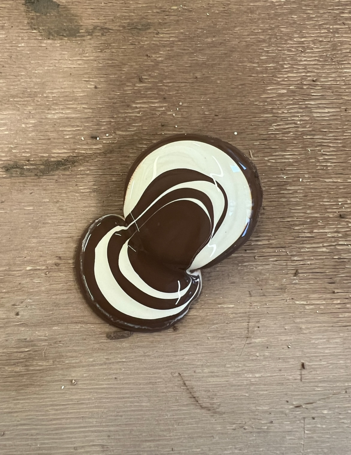
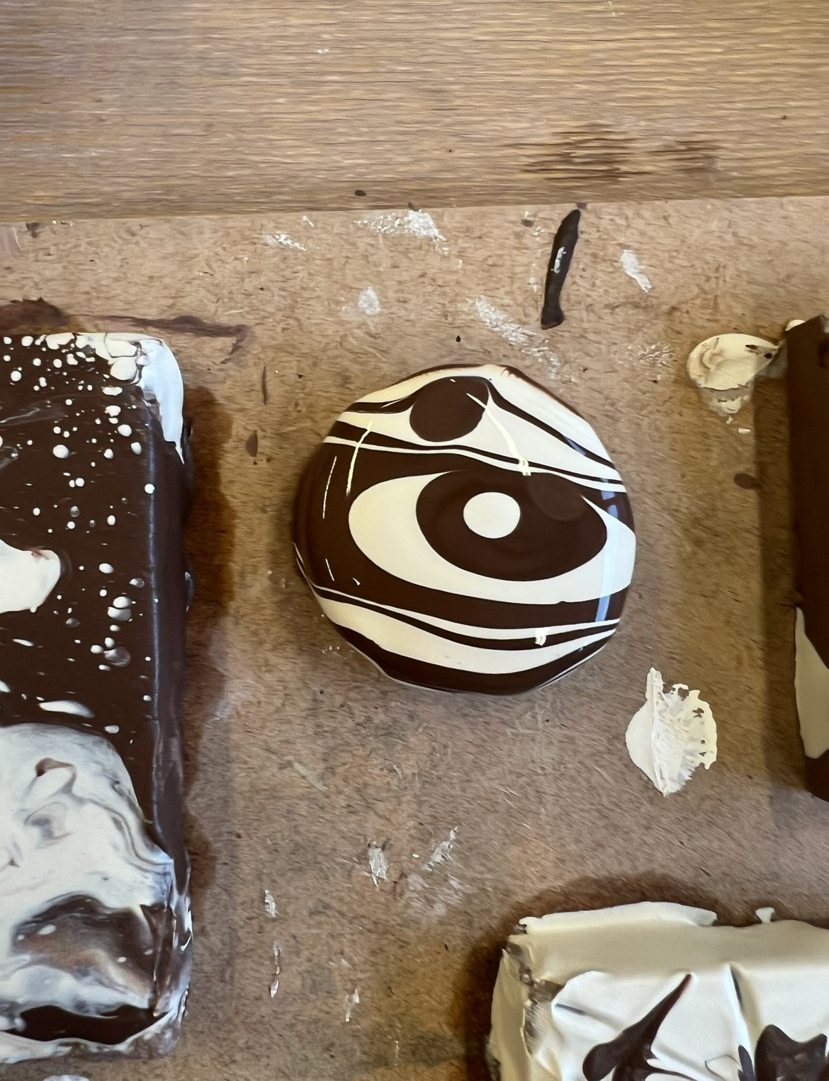
At this stage I learnt the importance of labelling my samples. I ended up absolutely loving the glaze displayed on the two question mark shapes shown above. I knew that with both f these pieces I painted a glaze on the surface of the bisque fired clay, and then splashed a different line blended glaze on the top of that in a random and dripped fashion. I desperately wanted to recreate these glazes on larger pieces but I first had to work out what I had done and which glazes I used to create the effect. After studying the colours and finishes (how matt and how shiny) I decided that one was 1:9 over 9:1 and the other one was 9:1 over 1:9. I then found some discarded bisque fired almington pieces and recreated the glazes and techniques again. (on the shelves ready to be fired below).
Once these pieces came out of the kiln I think I decided that I think this glaze technique works best on flat pieces such as tiles rather than 3D pieces. I think on flat pieces, it gives the glaze an opportunity to pool more and create the desired effect present on my sample pieces. however I do like the shine level on the smaller piece.
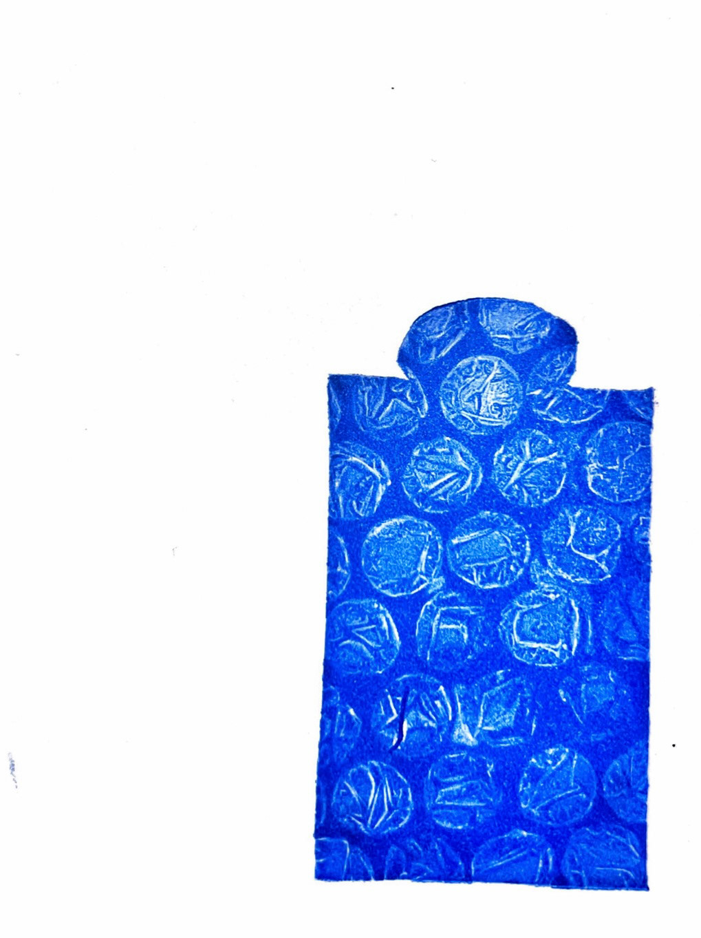
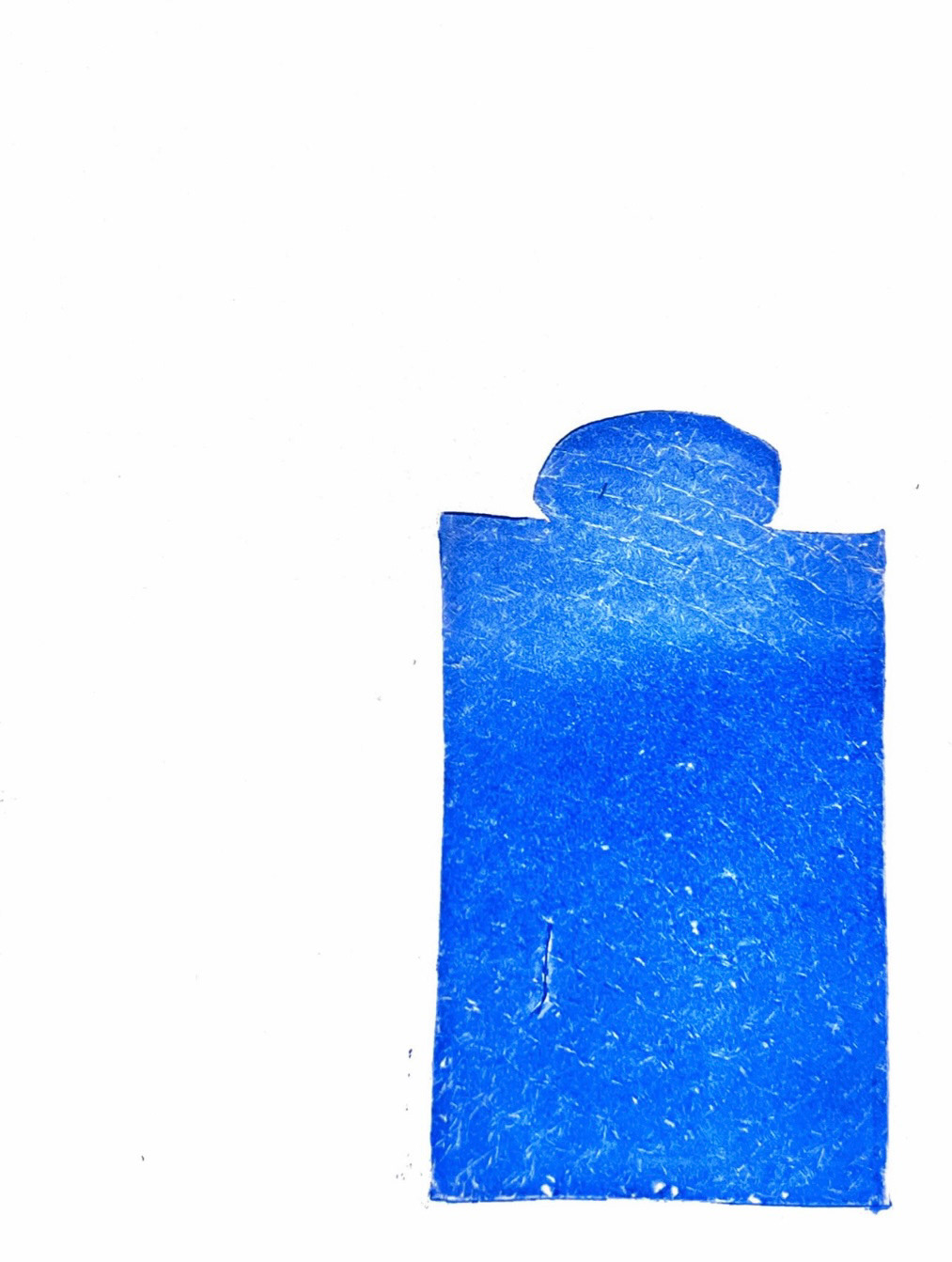
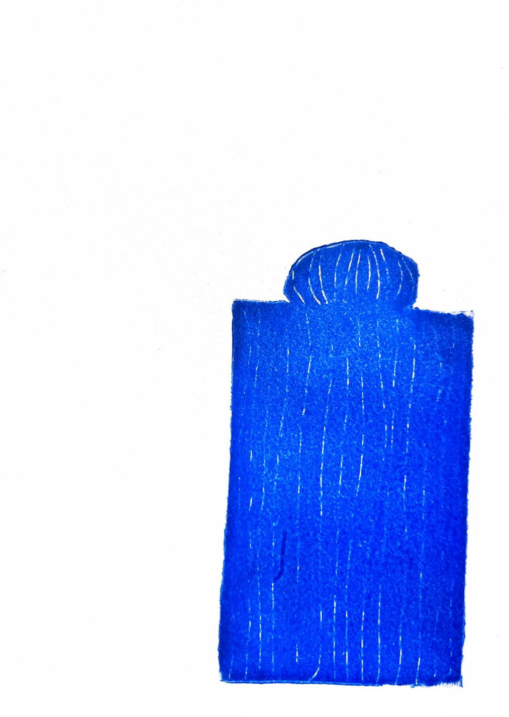
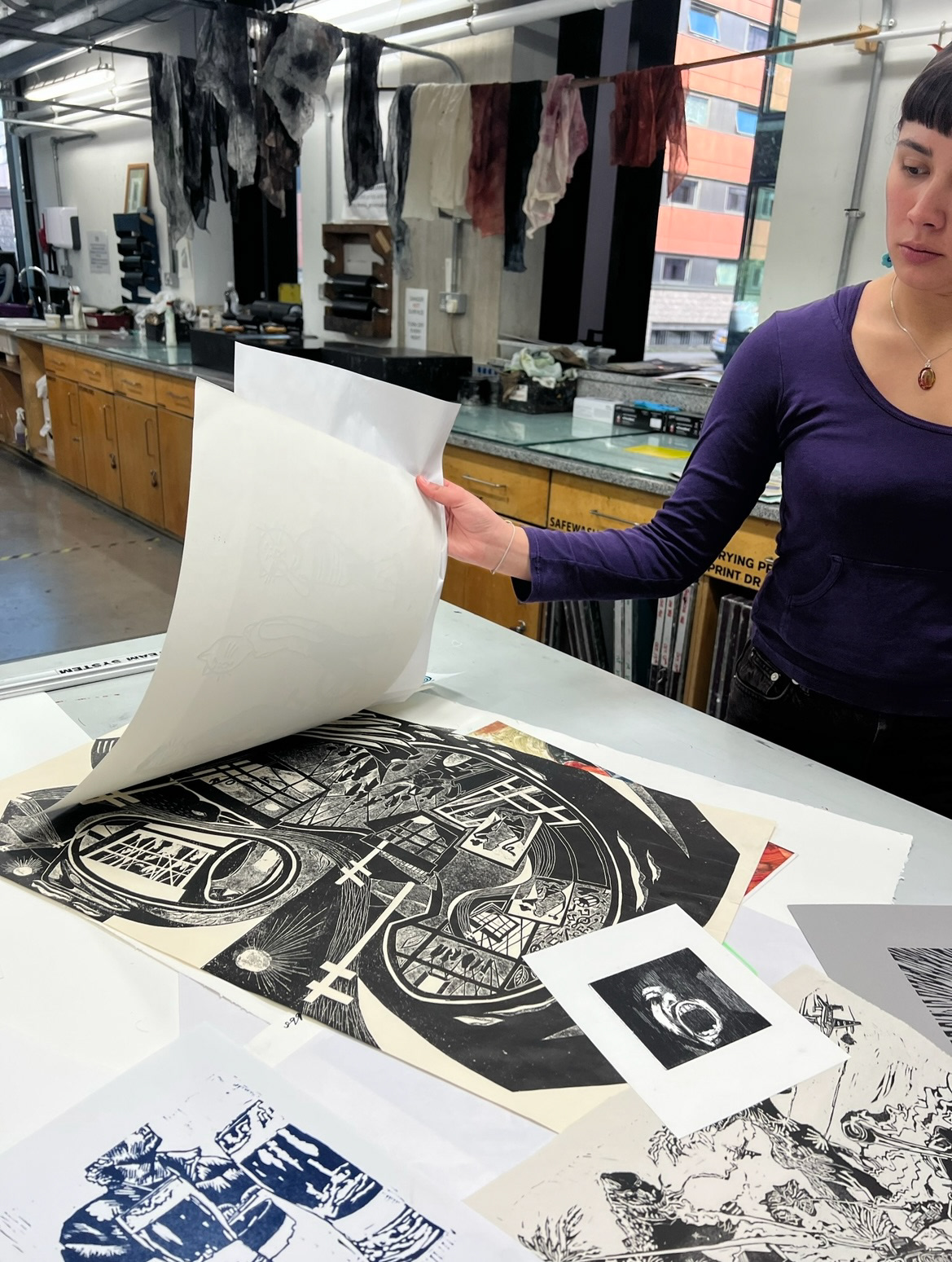
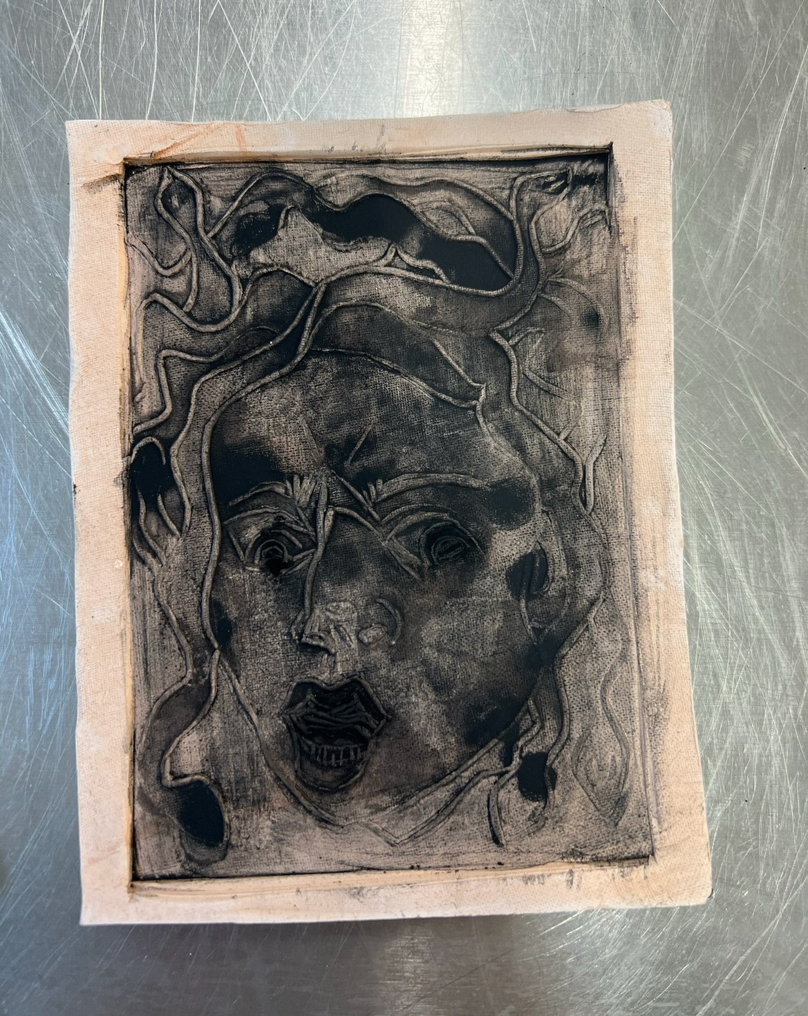
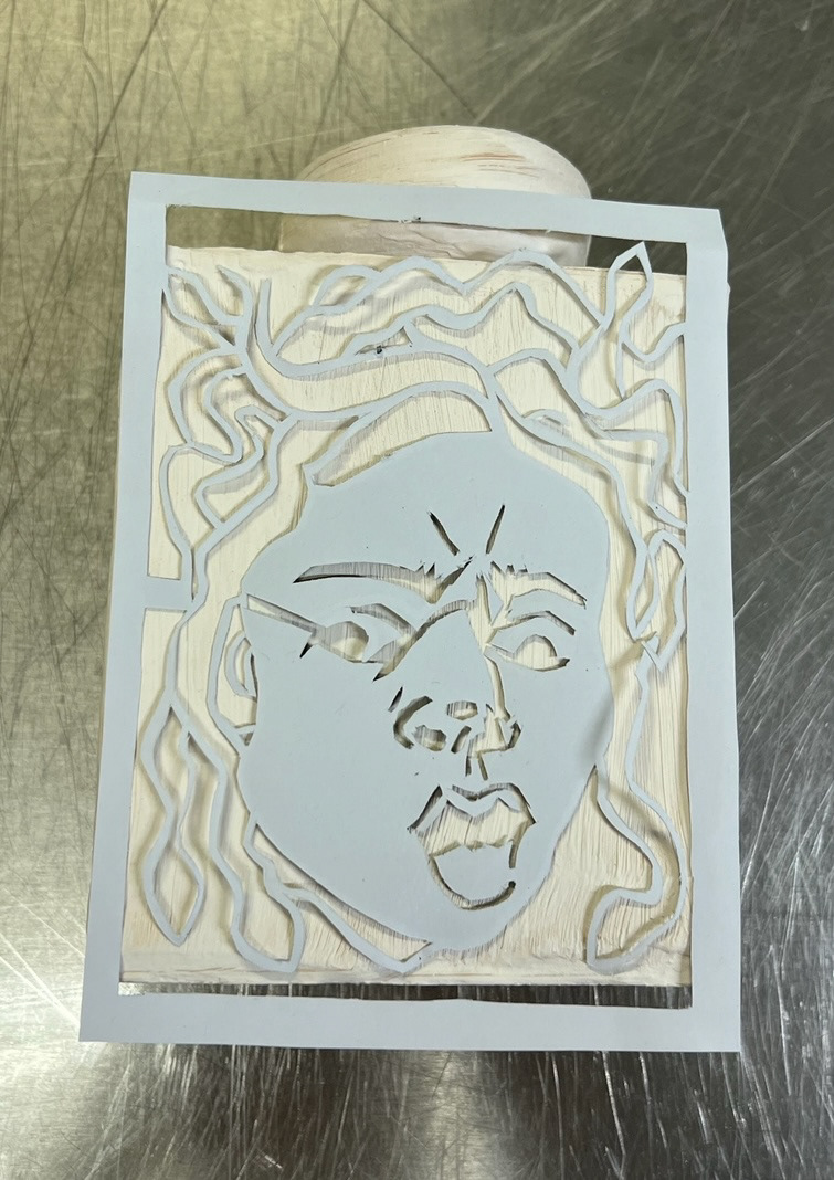
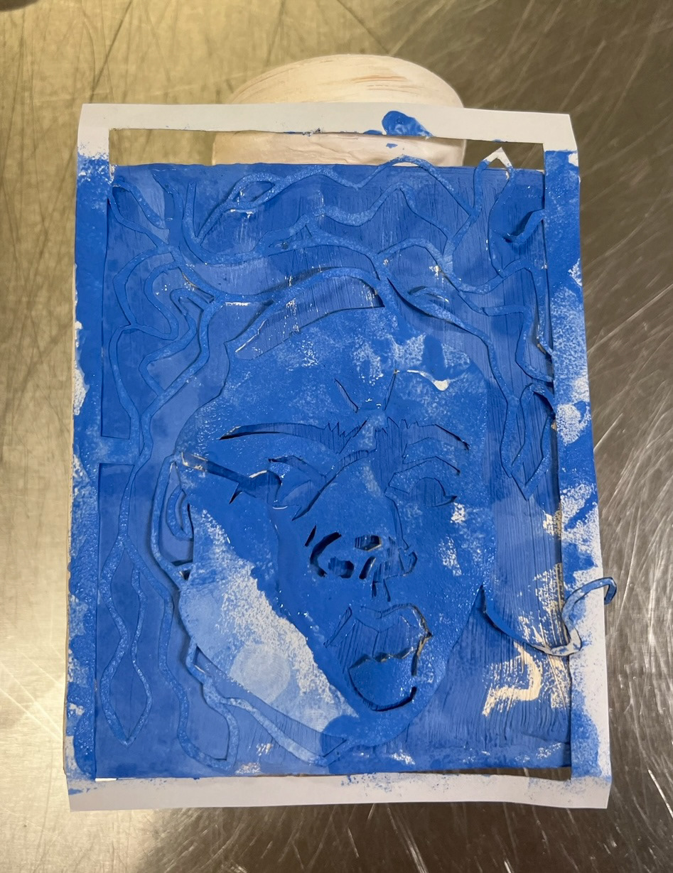
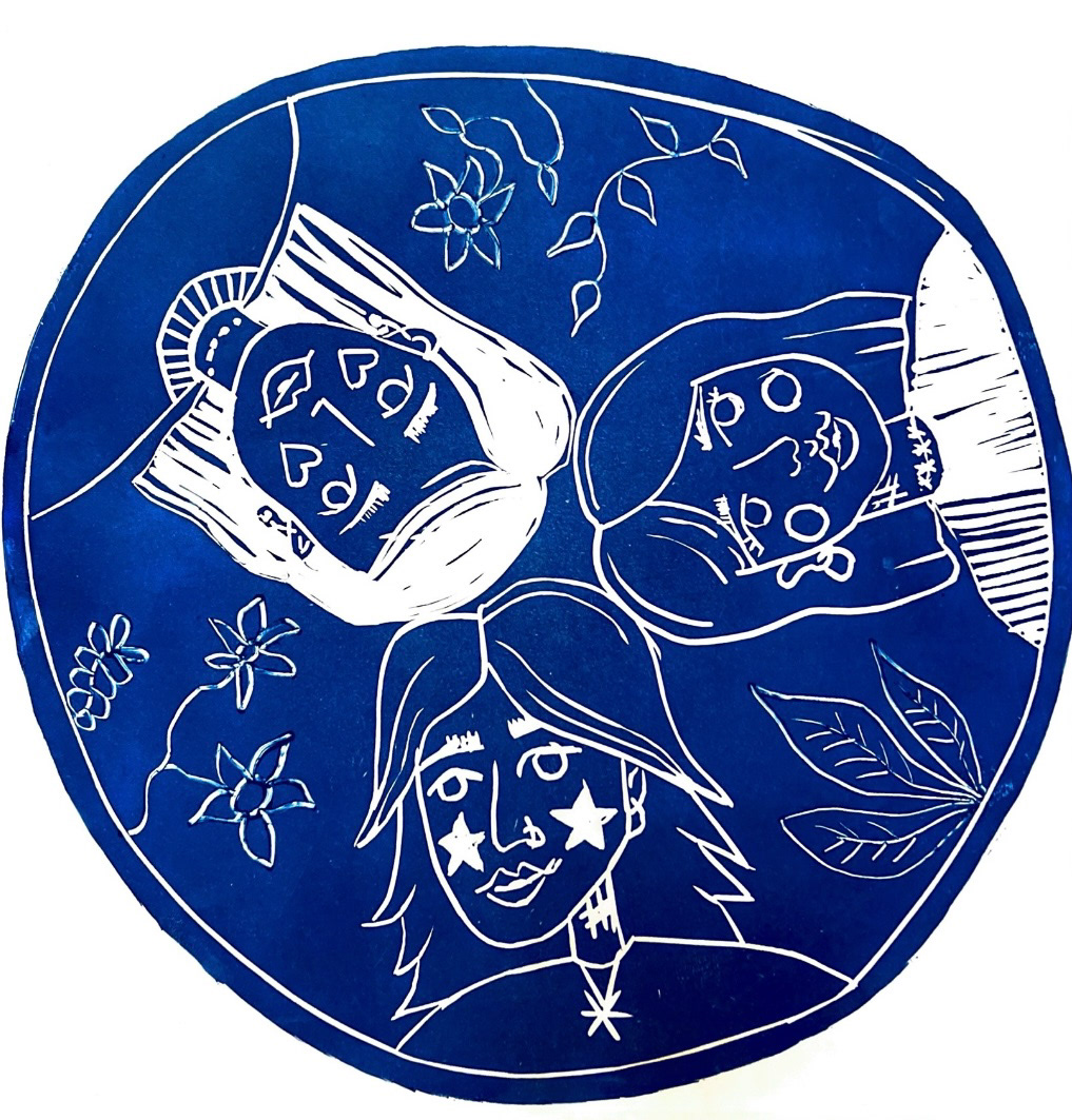
Next in this project we were inducted into the print workshop, we were challenged with making forms from Lino which we could then use to print with. I decided to, instead of carve, but cut out the shape of my vase that I had made earlier on in the project. I thought this would be an interesting exercise in visualising exactly how I could glaze this piece later on. (prints below). I tried to create texture and dimension by pressing bubble wrap and net into the wet ink on my Lino piece before printing. I also used a toothpick to scrape ink off of my Lino piece to create thin stripes, I also used this technique to try and shape the dimensions of the piece, for example the round neck, I think this went quite successfully and overall really enjoyed the process of Lino printing and was looking forward to pushing this technique further. The overall experience of working in the print room and looking through past print students work made me very inspired to push the possibilities of surface design when carried over into my ceramic practice.
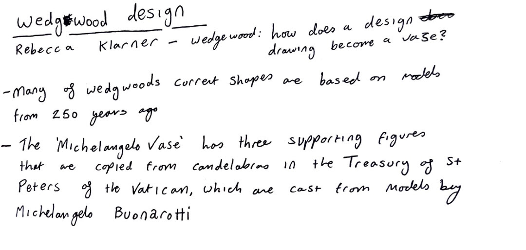
I next started looking a bit into the history of Wedgwood design and decoration, I read a few excerpts from a book called 'Wedgwood: how does a design drawing become a vase?' by Rebecca Klarner and made some notes on things I found interesting.
Also in her book I read about the designs specifically found on Wedgwood jasper ware pottery and the history behind them.
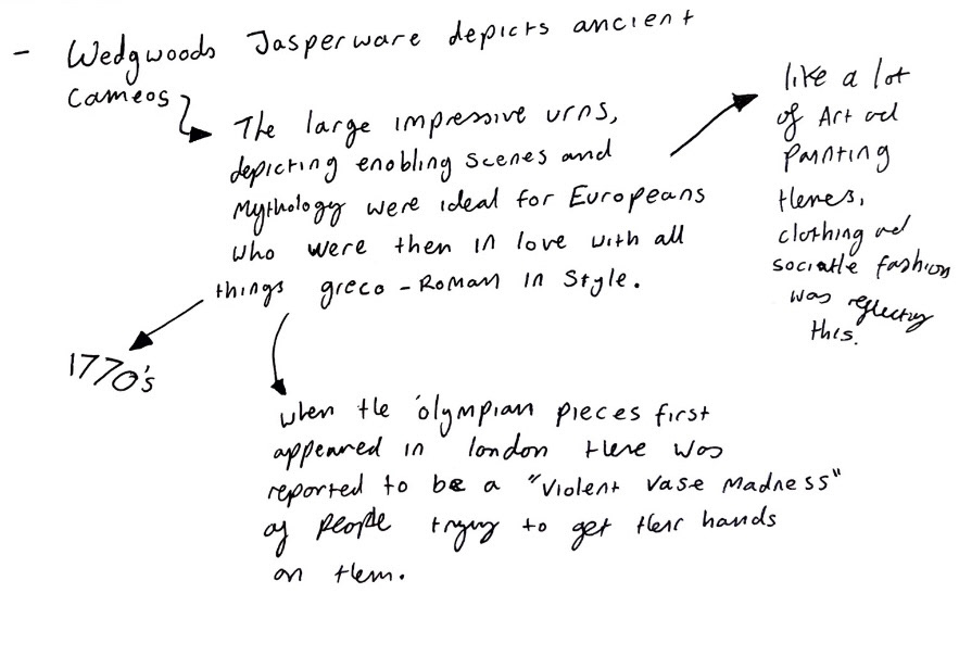
From this research I was especially captivated in the history and mythology around the imagery displayed on Wedgwood's Jasper ware and how this imagery alone amounted a lot for the initial success of Wedgwood Jasper-ware ceramic designs in society in the 1770s. I was also fascinated with how the same imagery, themes and stories were still being produced on the jasper ware being made today and how these pieces continue to be a vessel of ancient story telling and through these pieces, these stories and myths from the ancient world can still be portrayed today. I also thought how that today, the story of Josiah Wedgwood himself is told, almost like the myth of a master craftsman and business man and how his story is also told through these vessels and has been through the centuries.
I started thinking more about mythology, specifically greco roman mythology. This lead me to re visit the story of Dantes Inferno, which I had read over the summer. Dante took much inspiration from Greco-Roman mythology as well as medieval catholic demonism whilst writing his divine comedy. I like to think of this splicing of mythology and stories as a form of innovation in itself.
I decided to go back and make notes on some key themes and characters of the book from which I could pull inspiration.
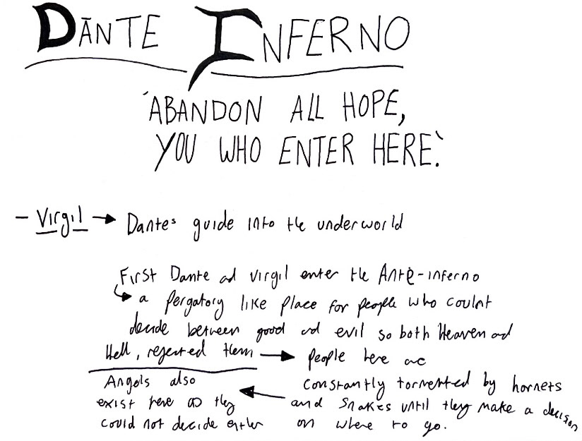
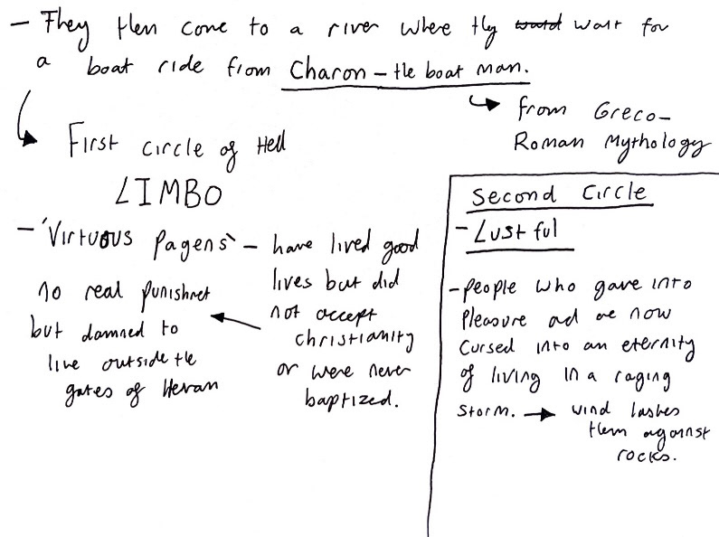
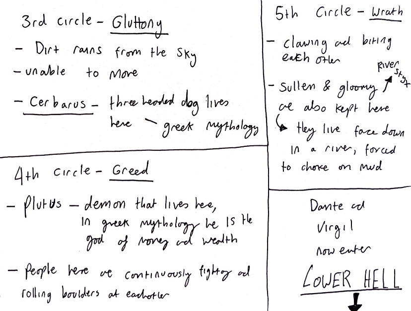
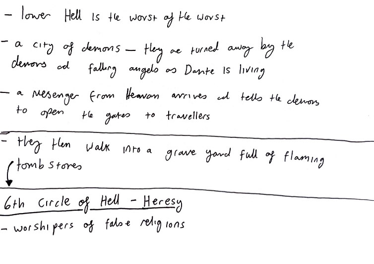
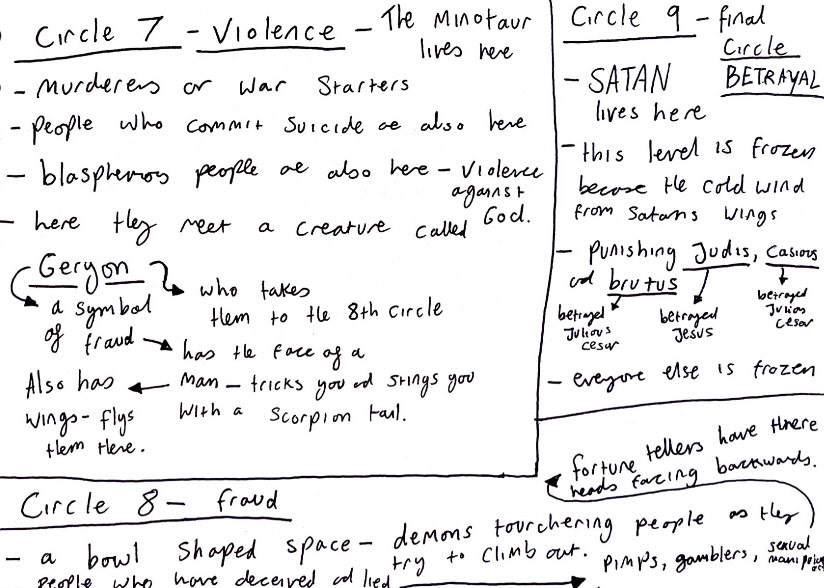
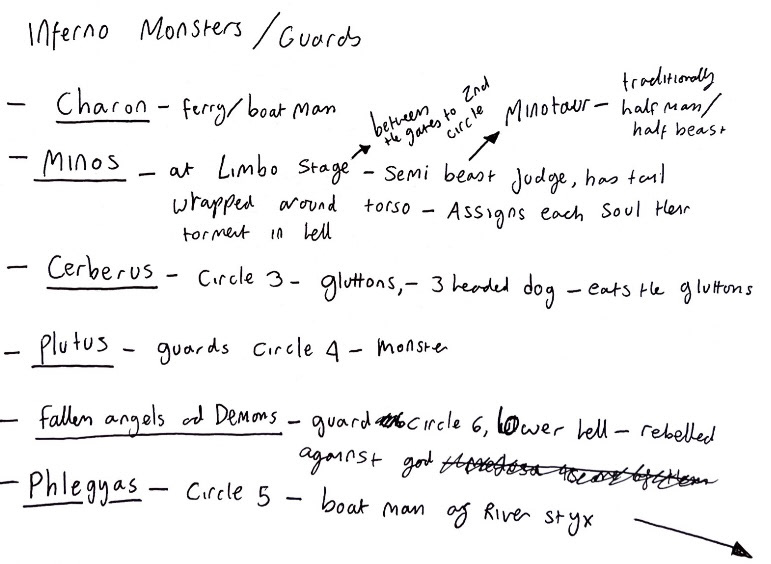
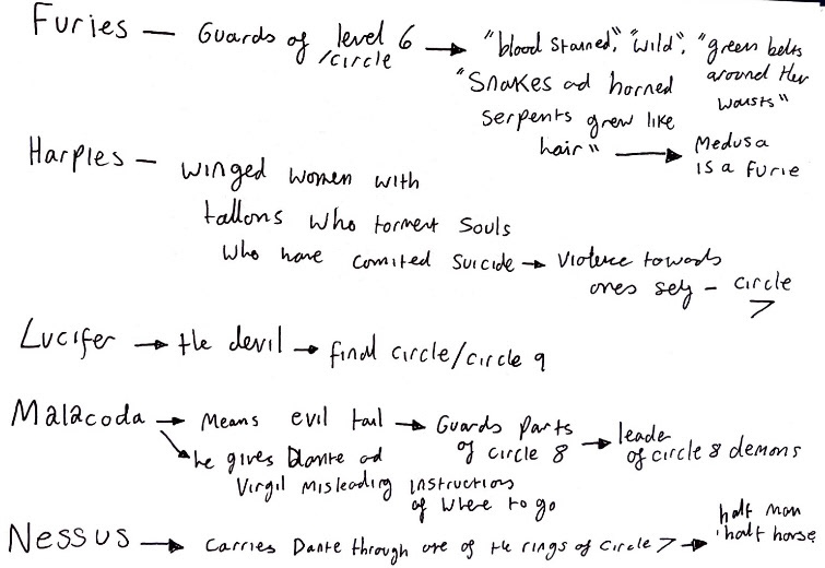
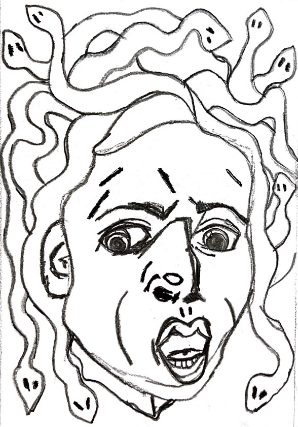
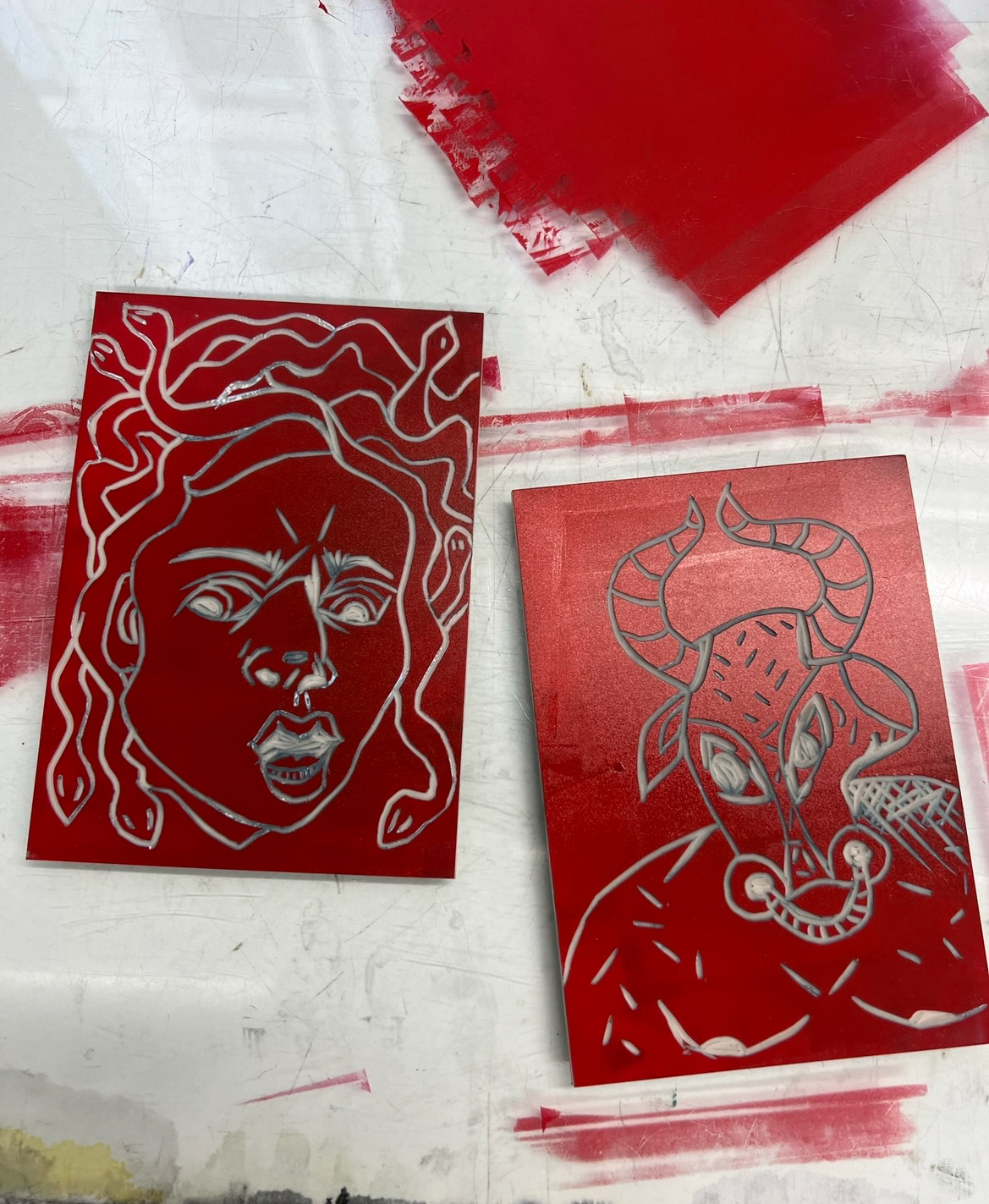
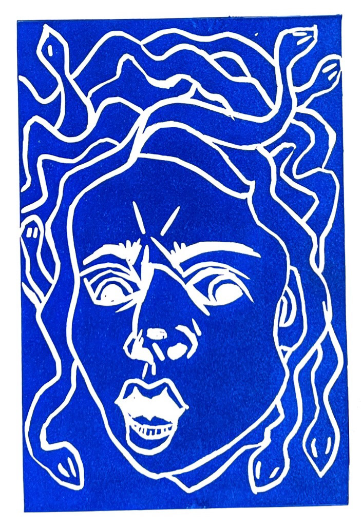
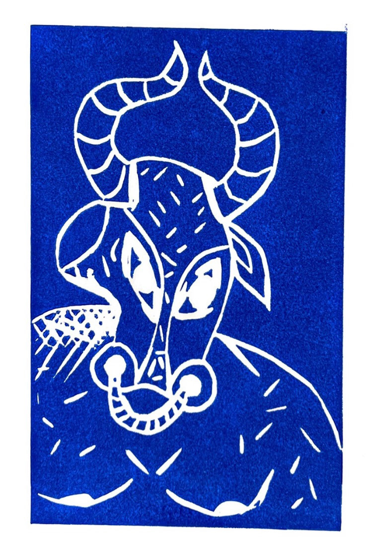
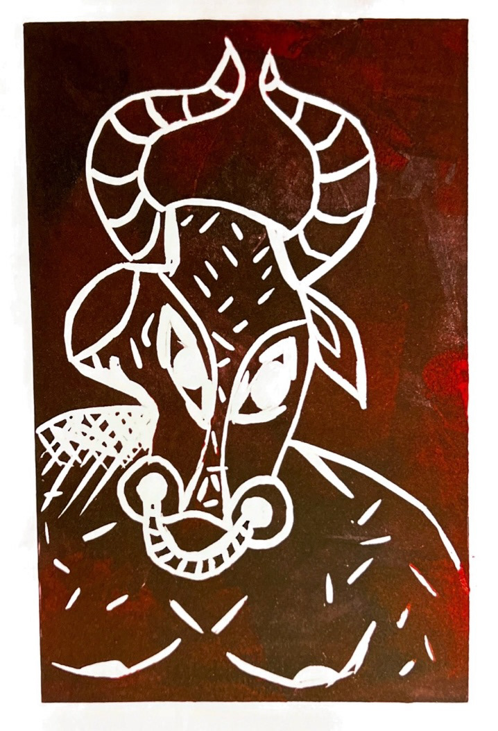
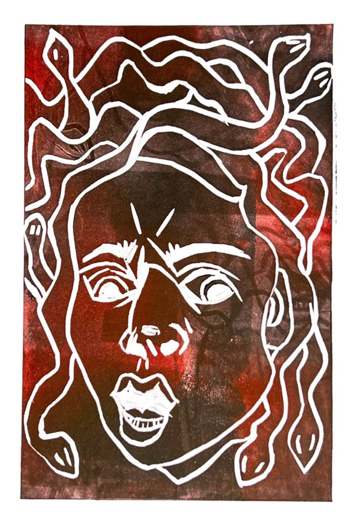
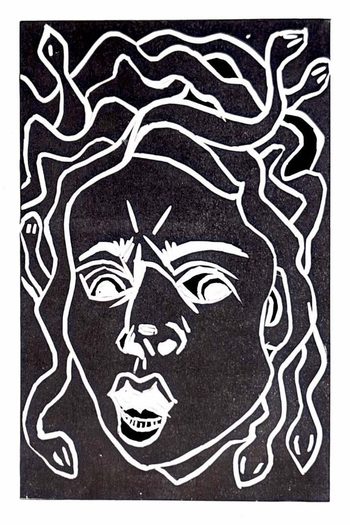
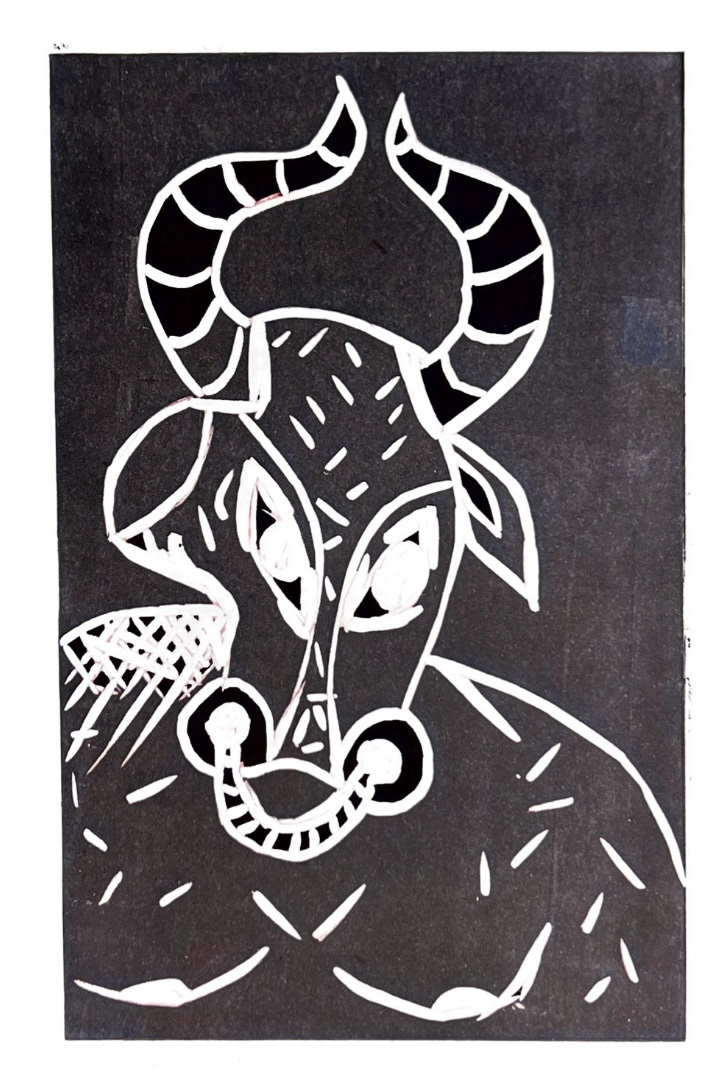
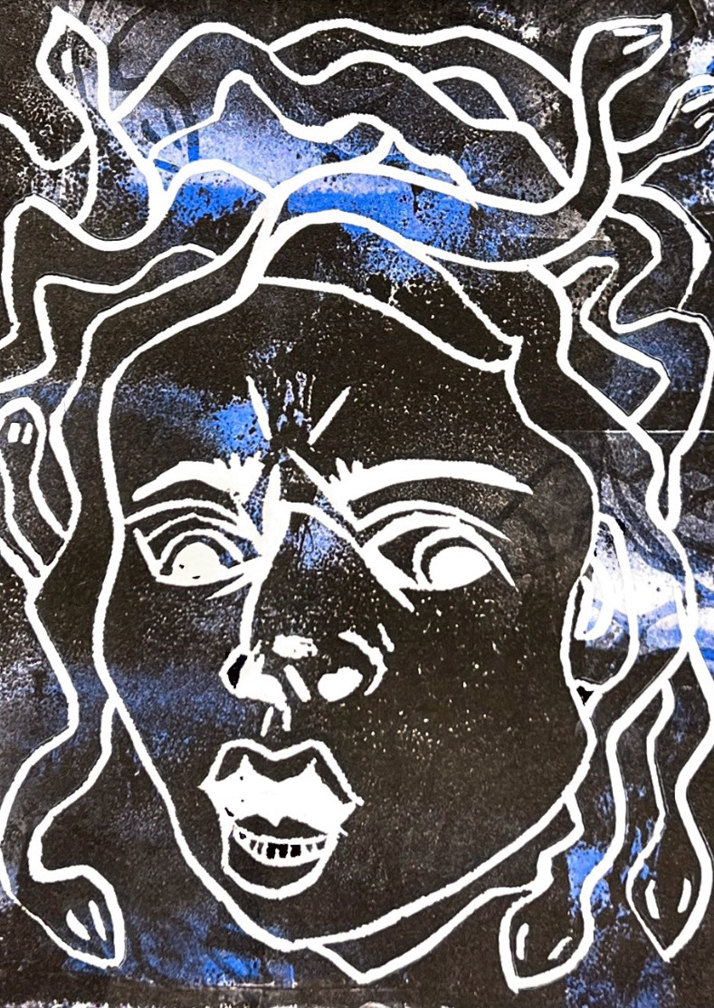
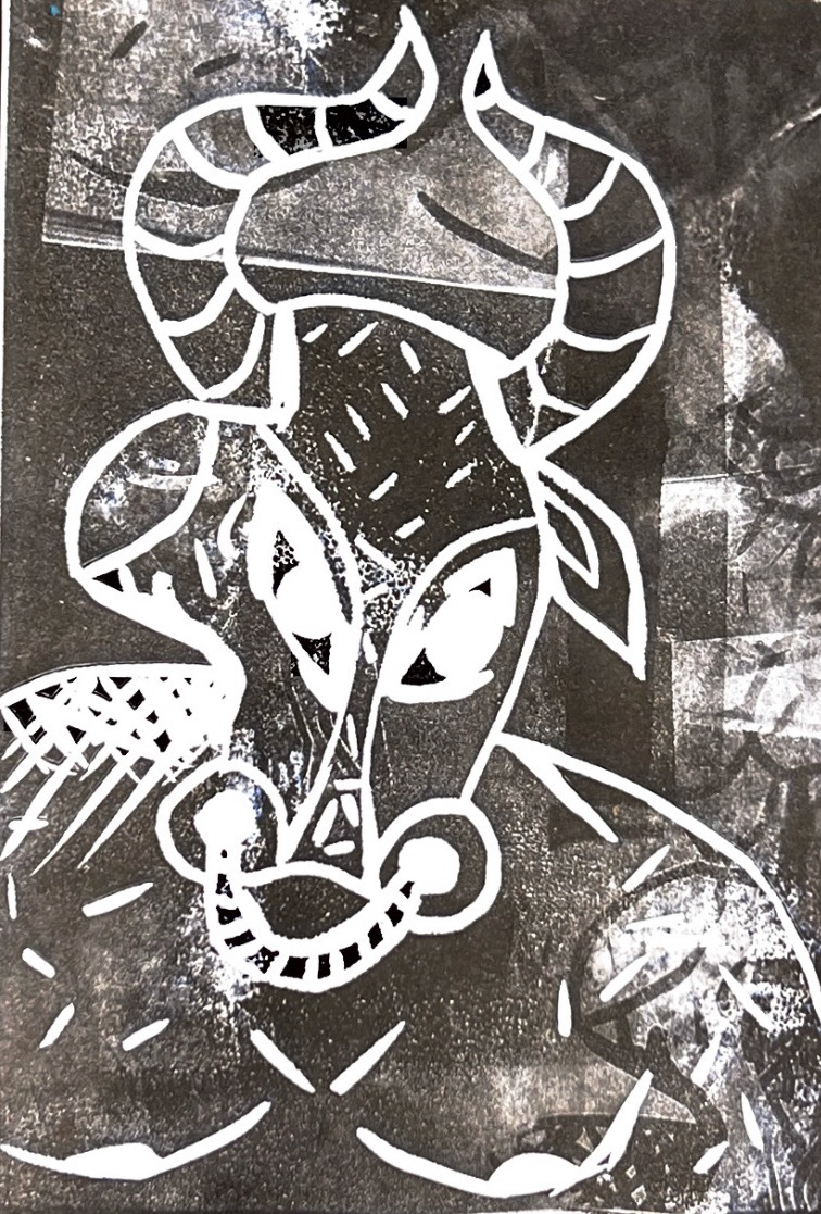
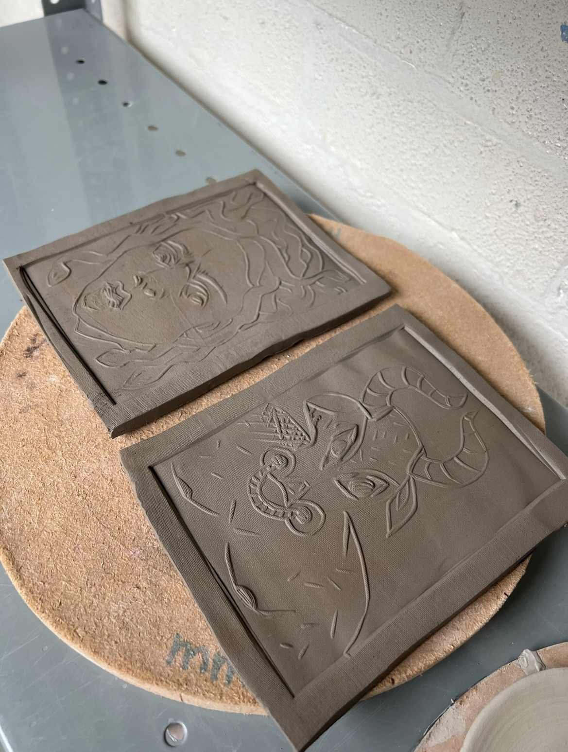
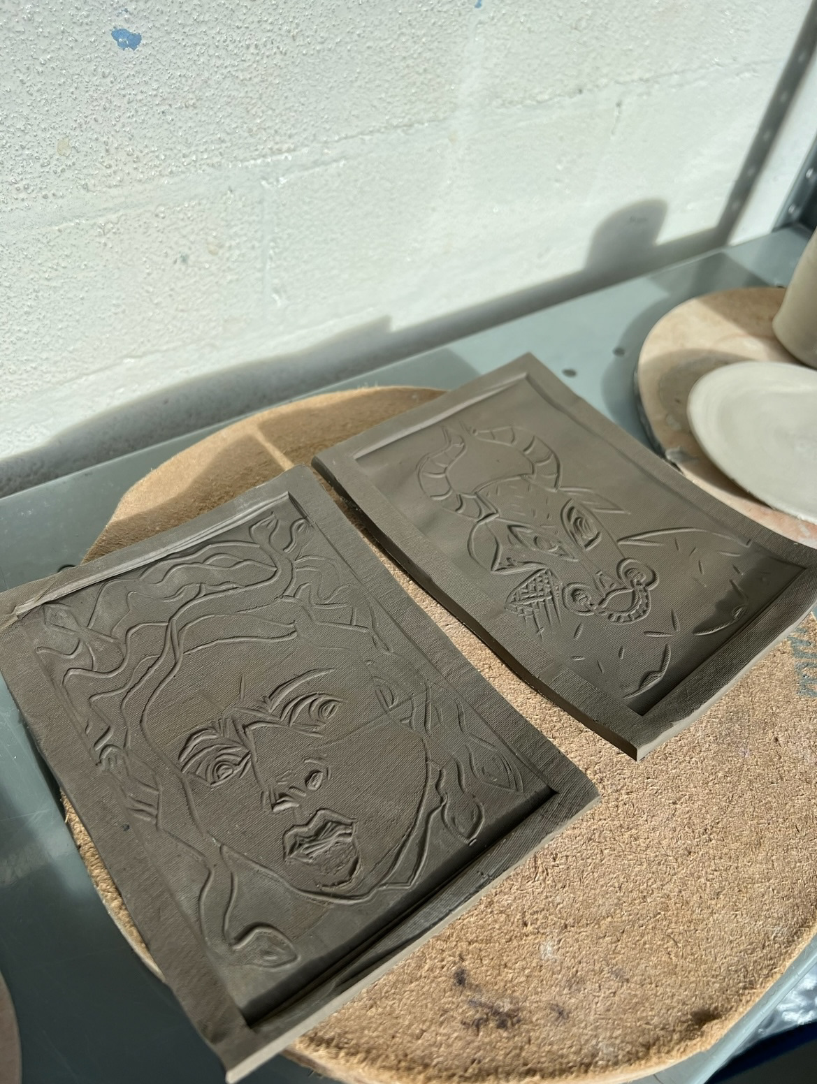
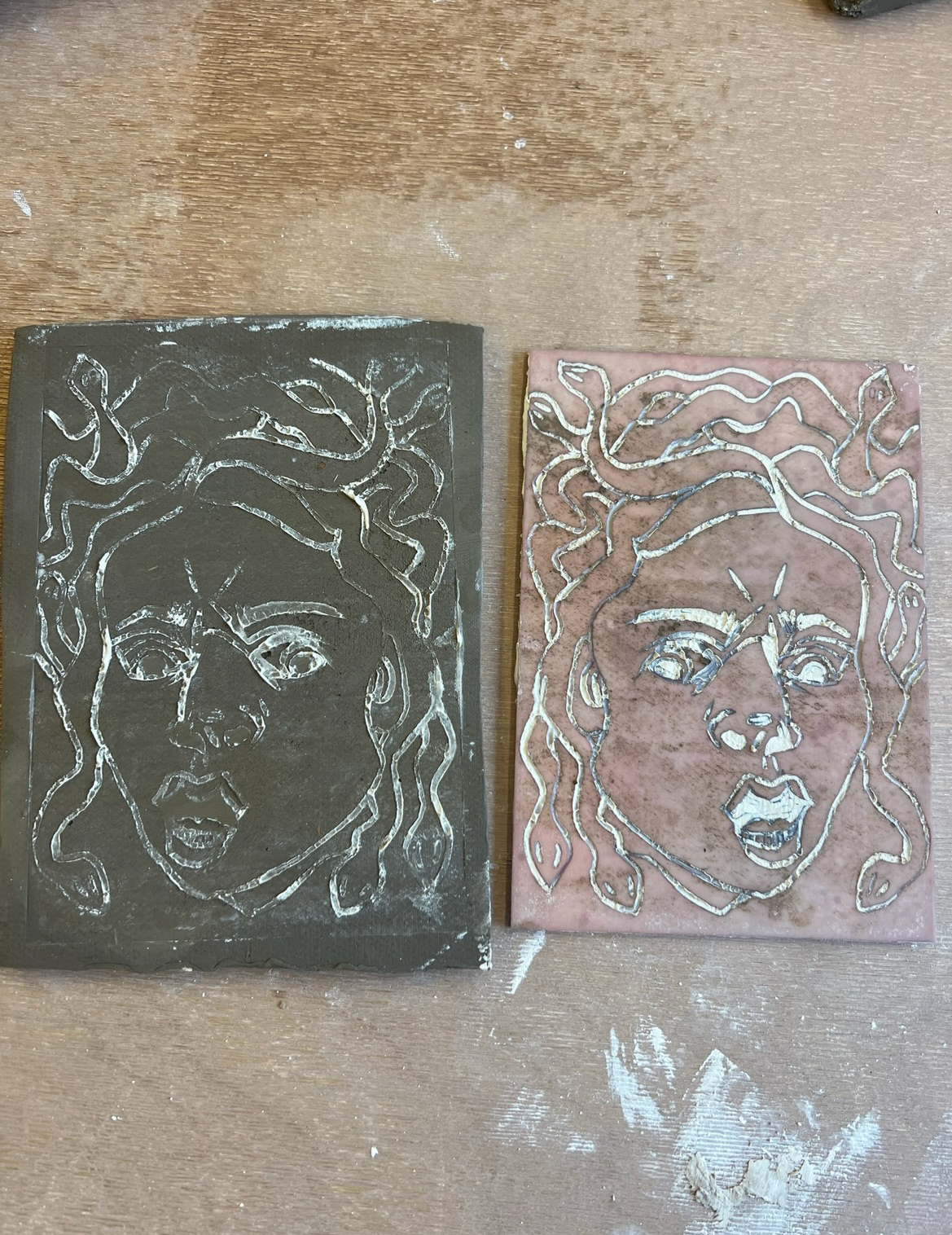
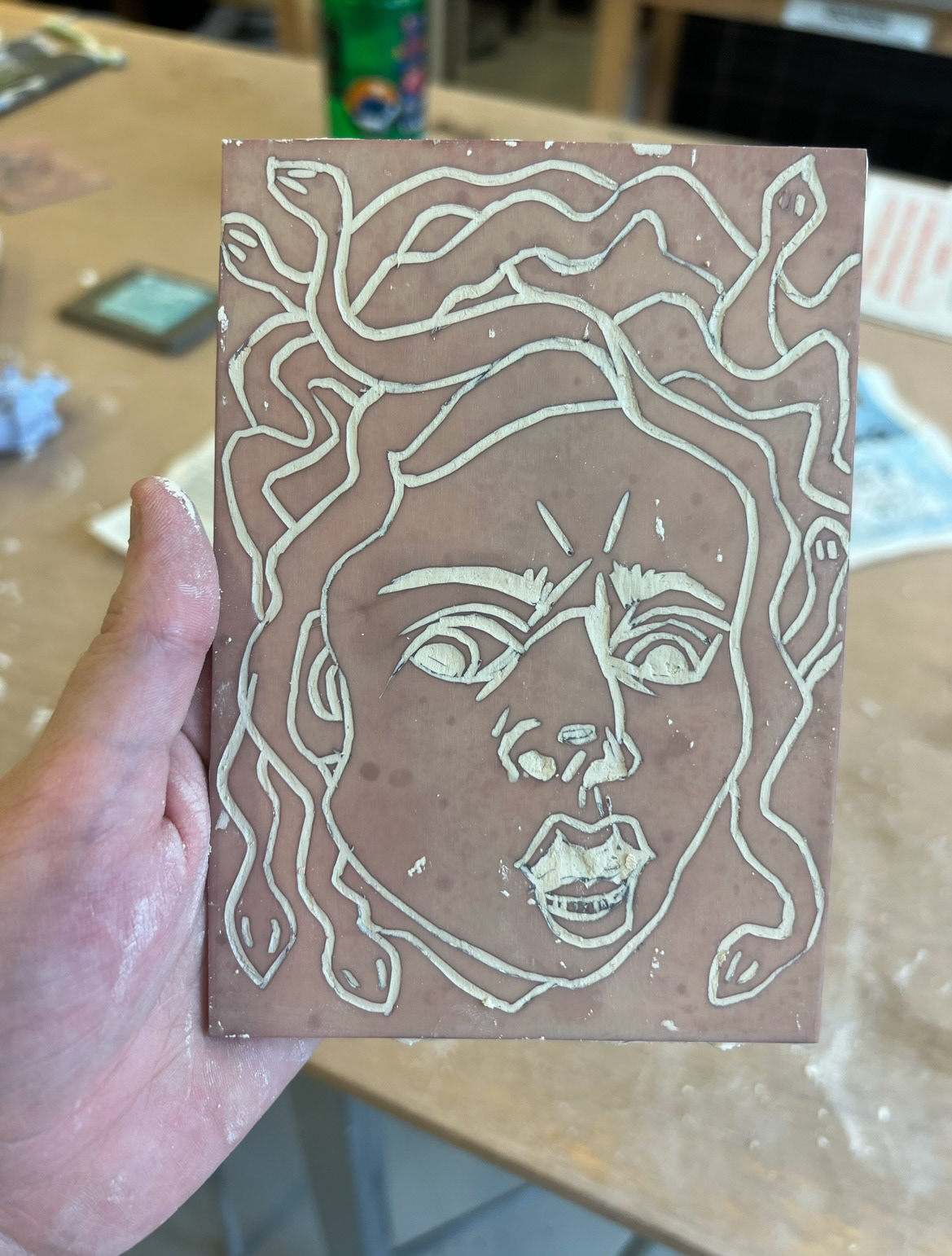
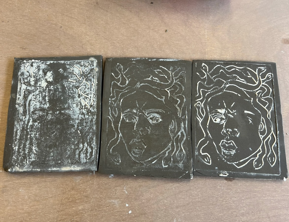
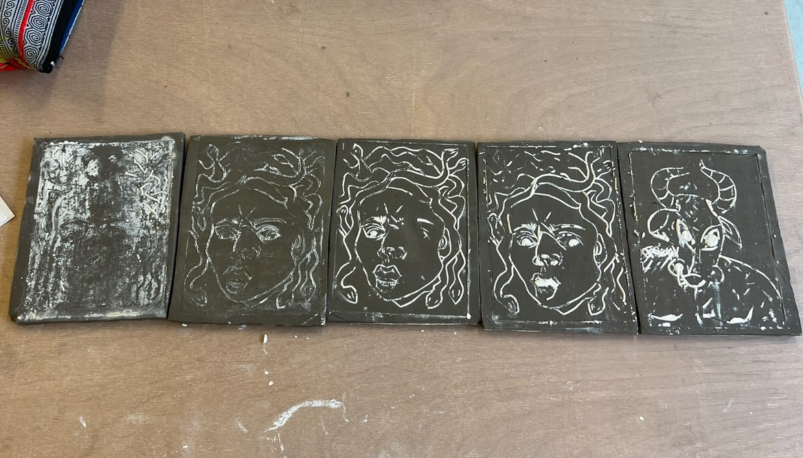
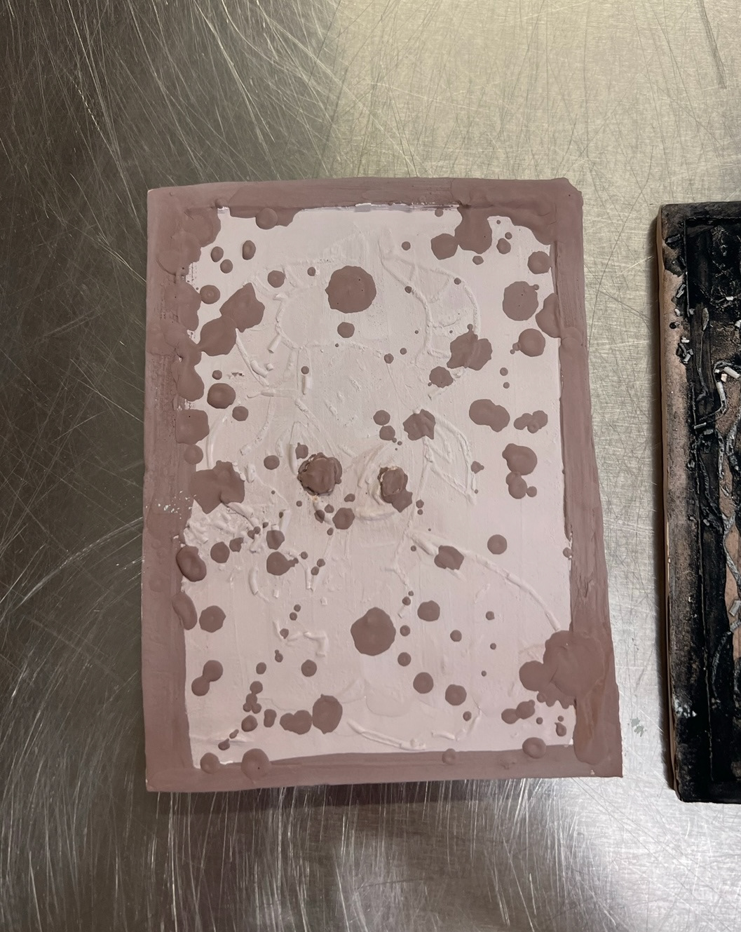
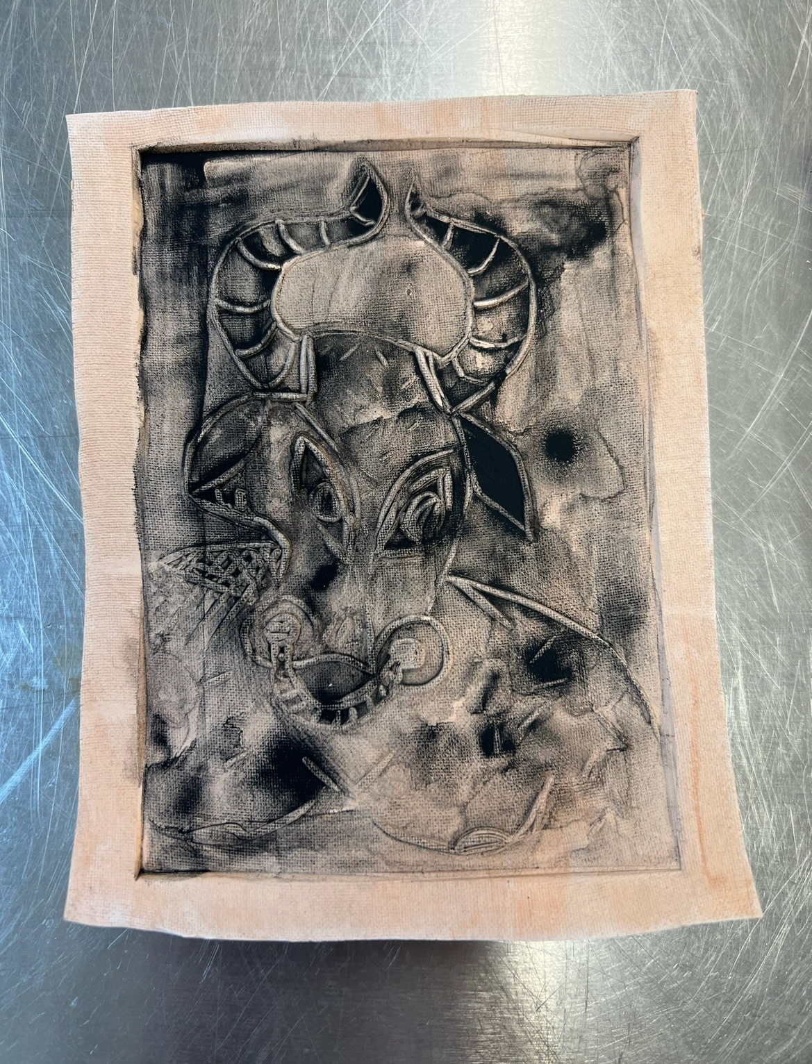
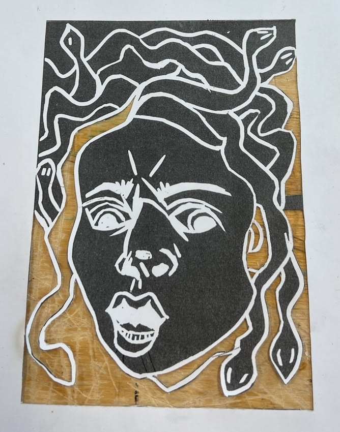
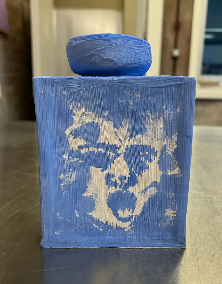
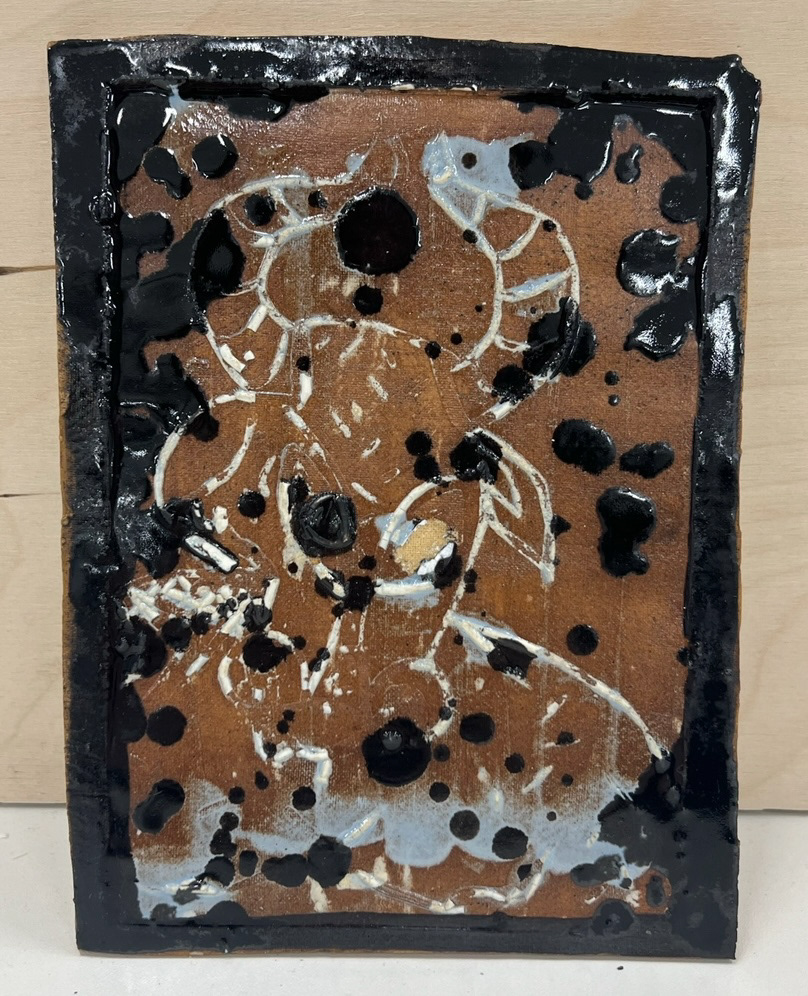
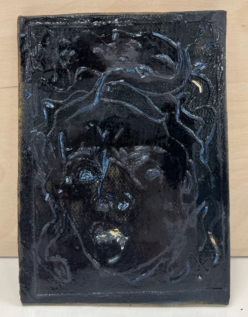
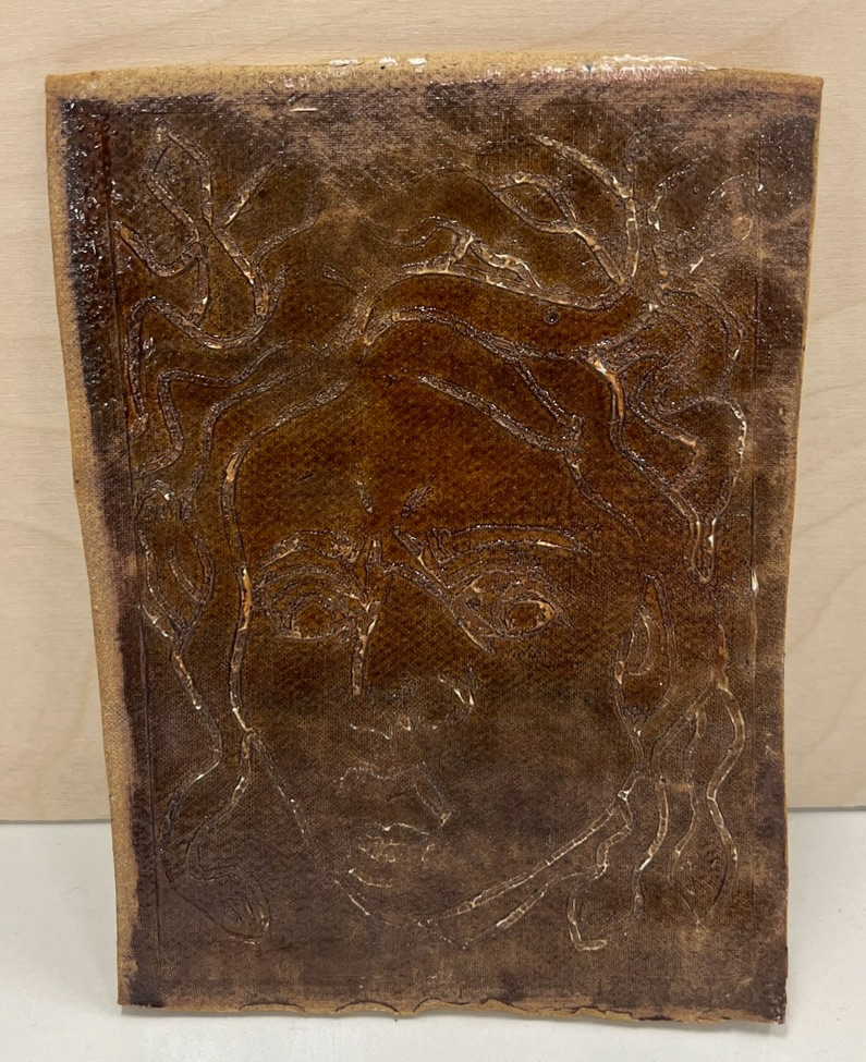
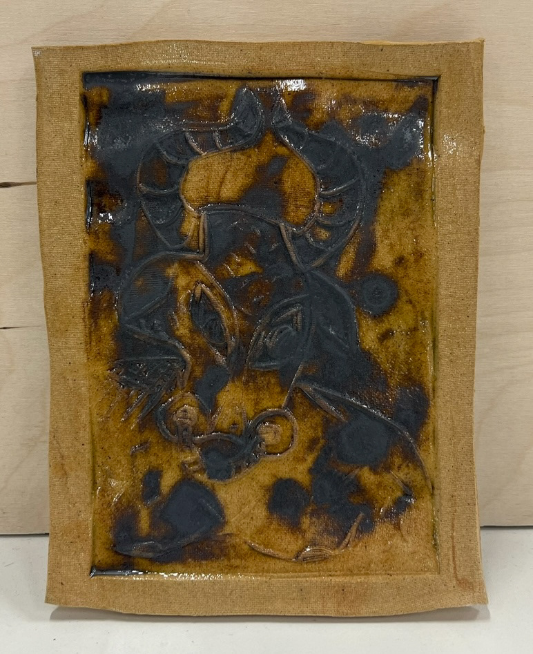
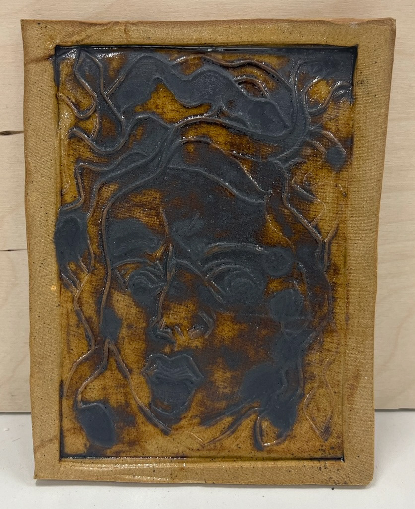
I found myself particularly inspired by the monsters/Guards present in Dantes Inferno, as these were the most recognisable of Dantes references to Greco-Roman mythology. I decided that I would use my skills that I had learnt in the print workshop and transfer them over to make some imagery inspired by some of Dantes monsters. I chose to draw Minos/the Minotaur and Medusa, one of the Furies as these are very recognisable as originally Greco-Roman characters.
Whilst drawing Medusa I took inspiration from Caravaggios 1596 painting 'Murtula', which depicts the severed head of Medusa, I have always been drawn to this painting through the wrenching emotion displayed and movement effect expertly produced, this was the painting which started my appreciation for the art of Caravaggio, therefore I was very keen to reference it through this work. For my Minotaur drawing I chose to keep a more contemporary, illustrative style. I did this so that side side by side my drawings, which would soon me made into prints, would show as a pair of one being more traditional (Medusa having a classical reference) and contemporary (The Minotaur being a new image by me).
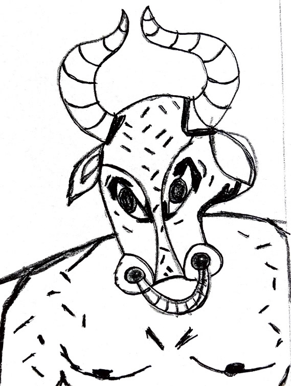
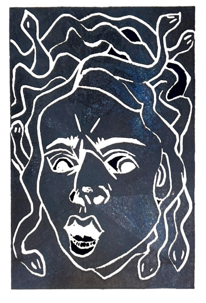
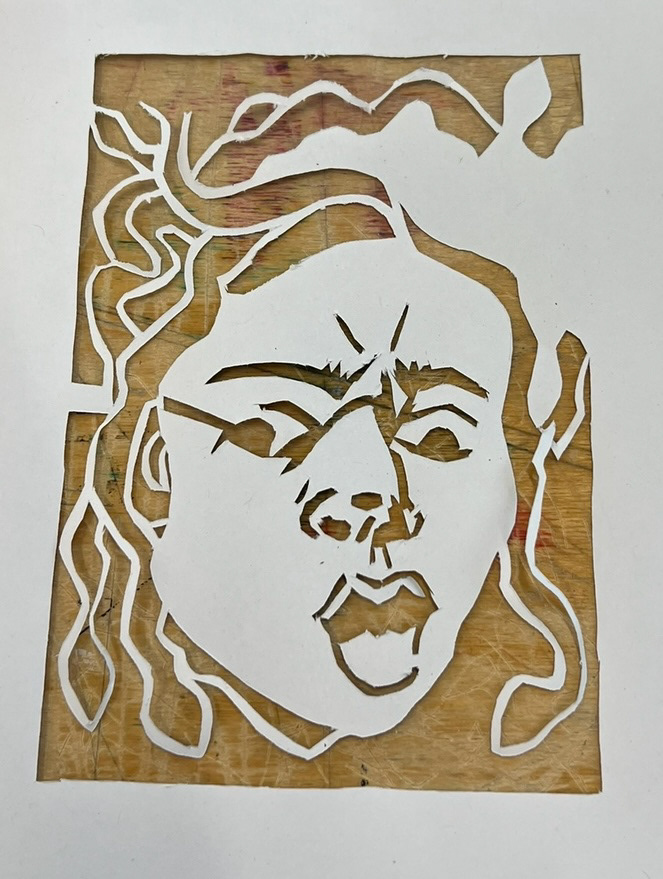
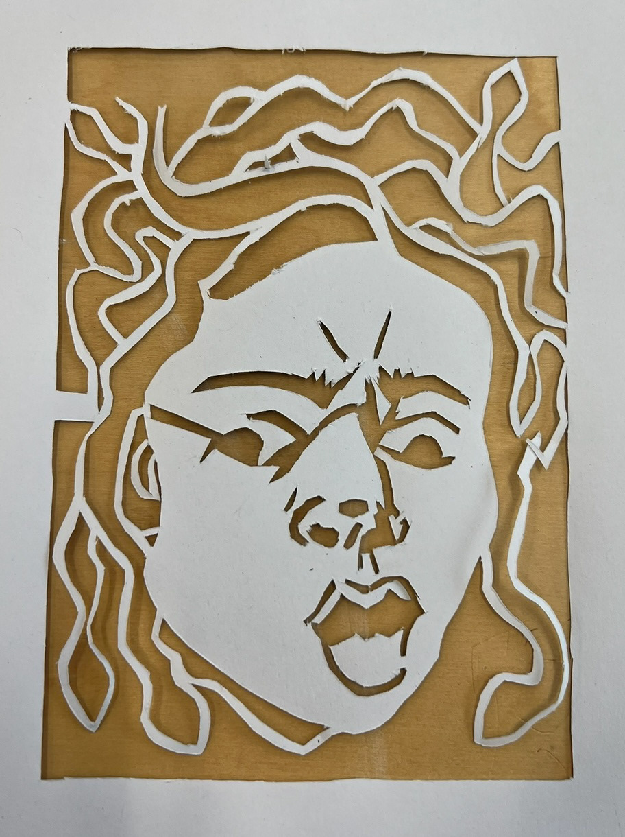
I then traced these drawings onto sets of Lino and painstakingly cut them out to try and incorporate as much detail as I possibly could. I then took them into the print studio the next day and produced my Lino prints.
(studio photos below)
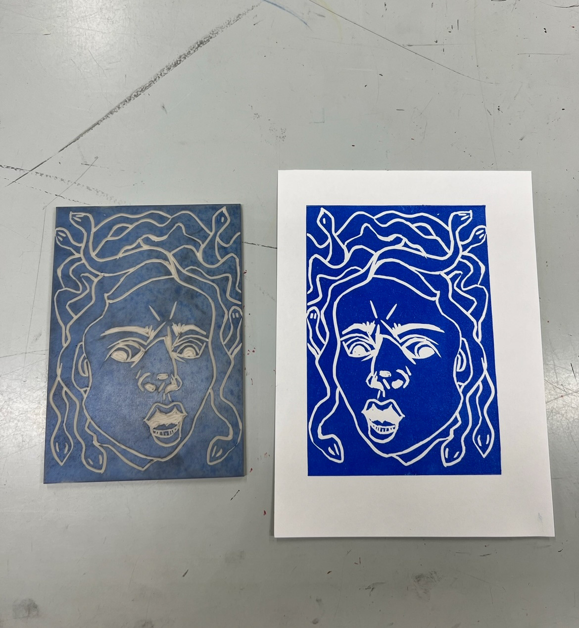
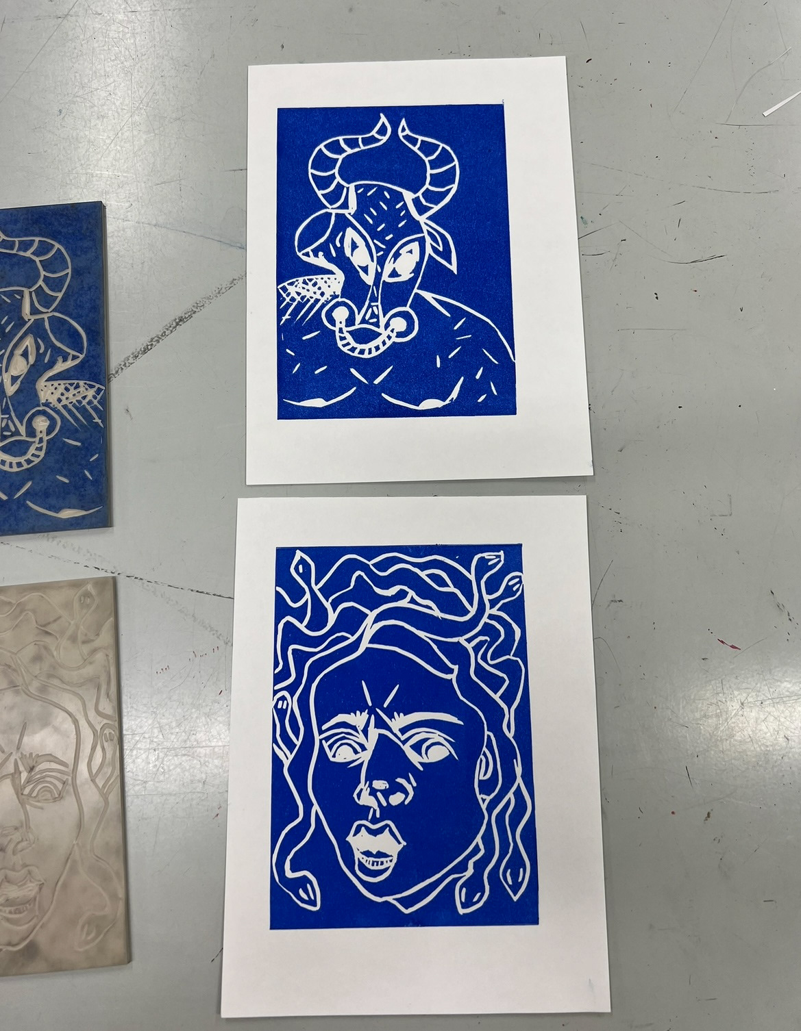
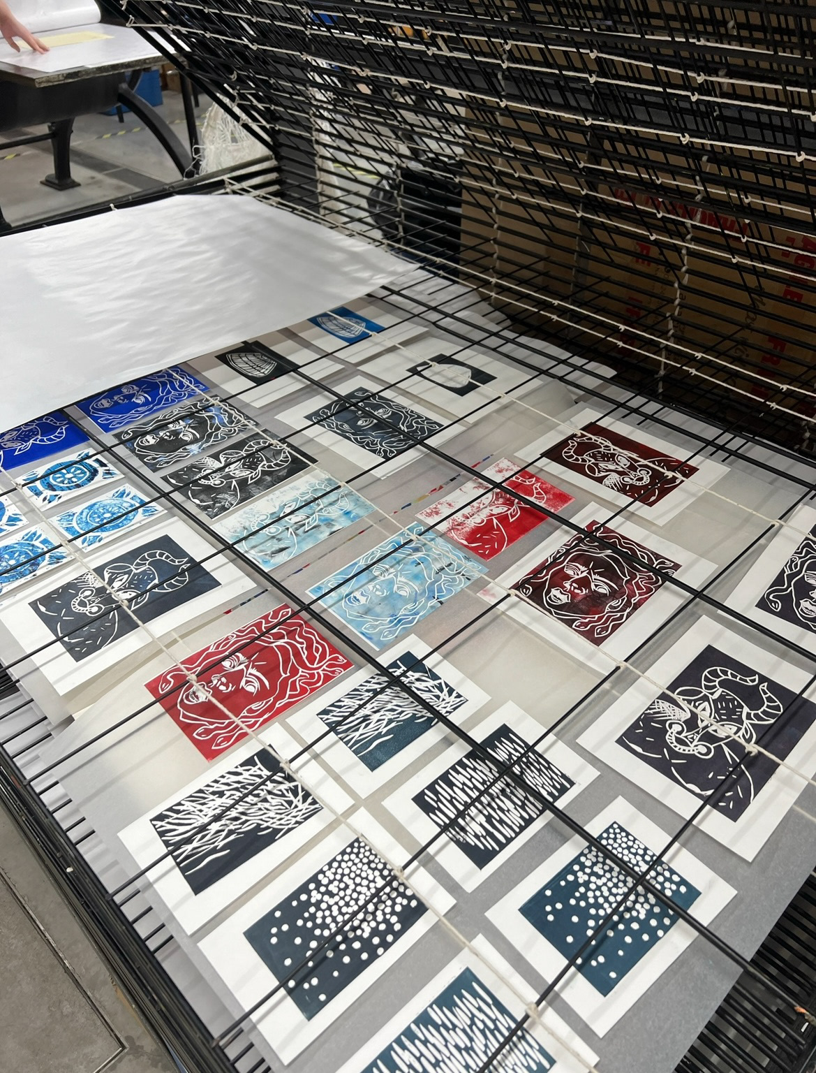
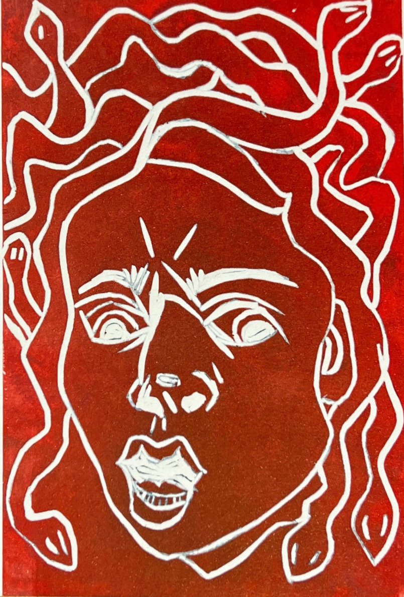
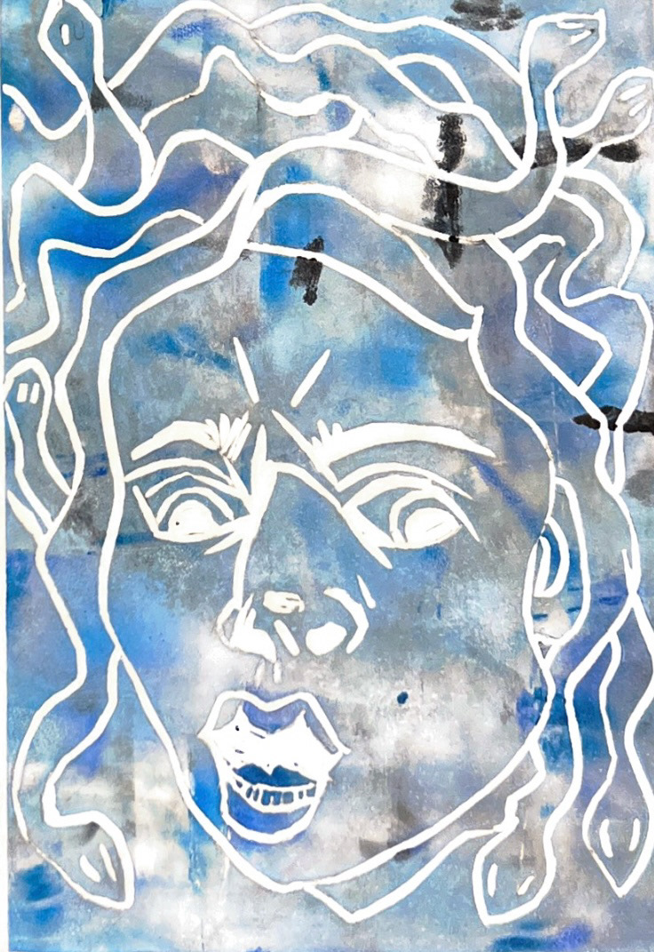
Whilst in the studio I enjoyed testing and experimenting with different colours, techniques and ways of achieving pattern and dimension just by using the ink roller. I really enjoyed making these prints and experimenting further with this medium.
(all final prints below).

I was really happy with how my prints turned out so after this I was determined to be able to transfer these Lino images onto clay in some way and use them in some ceramic experimentation.
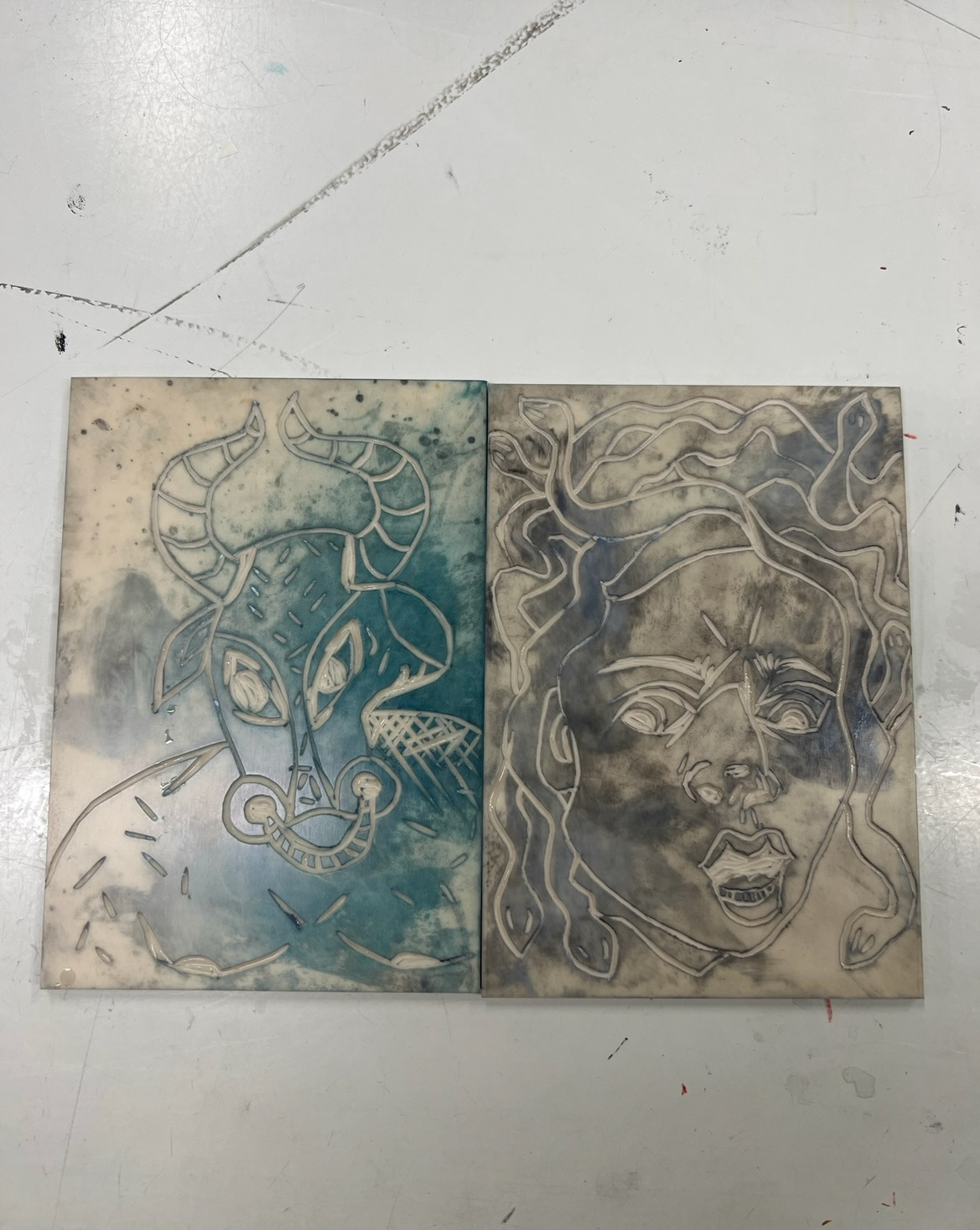
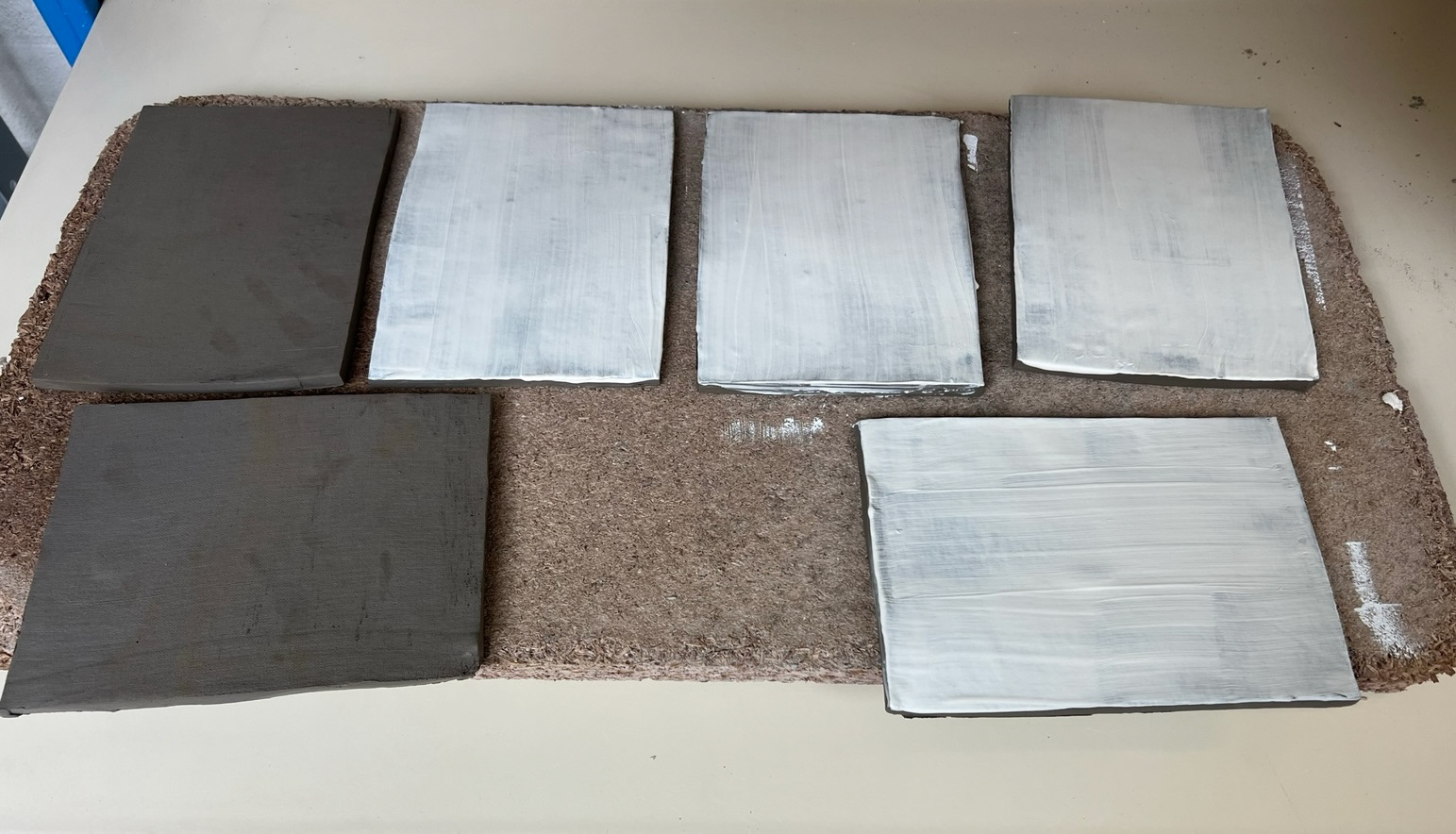
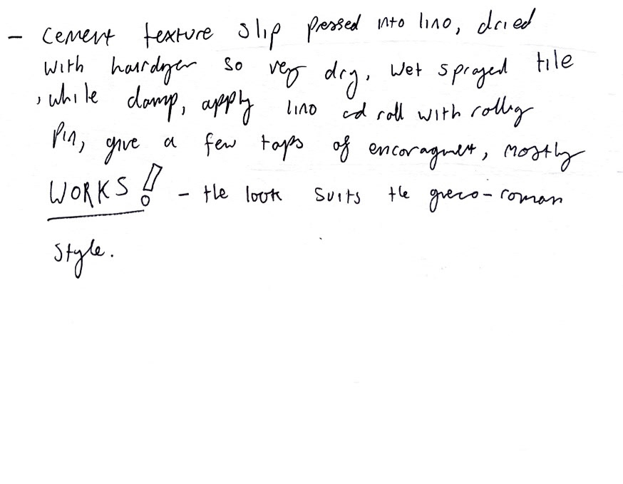
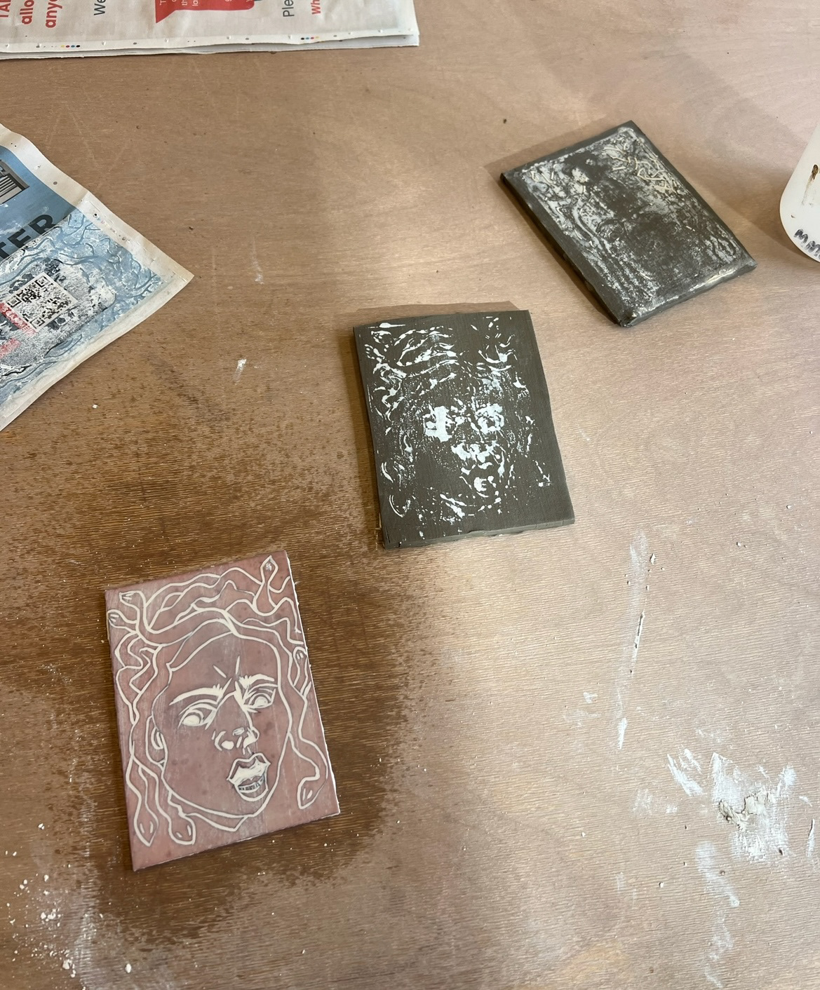
I got to work cutting some tiles the same size as my Lino (leaving room for shrinkage) and covered some white china clay slip and left others as plain clay and left them to get leather hard.
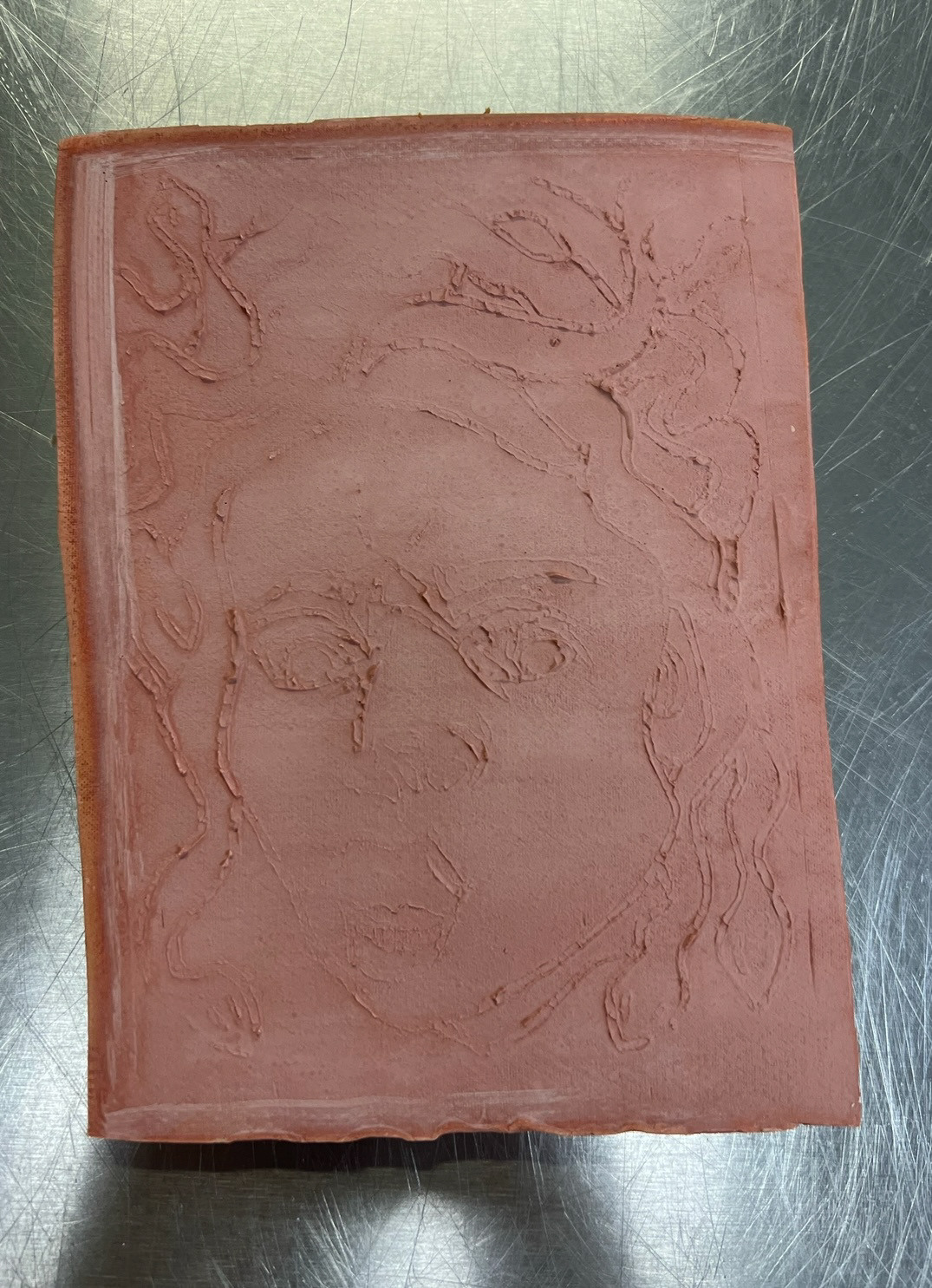
However I did leave two tiles to the side and while they were still plastic, pressed my Lino pieces into them to create a relief image in the clay. I put them into be bisque fired.
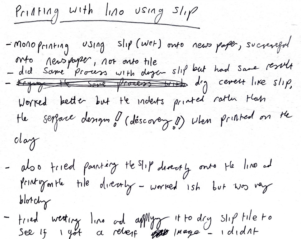
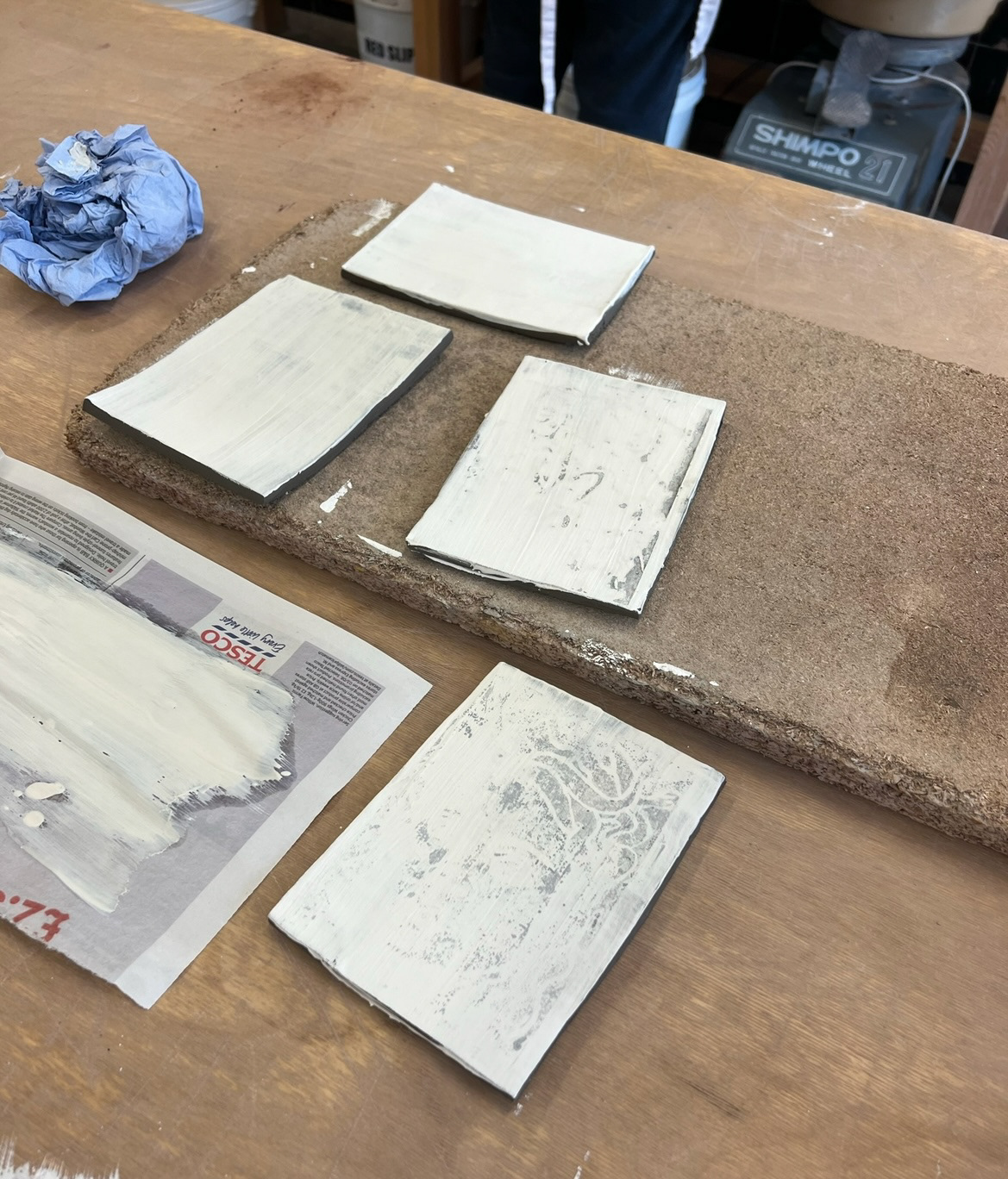
Once my tiles were leather hard I worked closely with Rudy the ceramics technician on working out how we could use slip to print/transfer my Lino images onto my tiles. We tried mono printing and a block printing technique however filling the indents of the Lino with thick slip scraped from the side of the slip bucket proved to be the most effective. We did many experiments testing wet slip on dry tiles vs dryer slip on wet tiles. This experimentation was an interesting exercise in putting my ceramic knowledge into practice. It was also a good exercise in putting my practical workshop masterclasses into practice as we had been learning about the importance of wet and dry states of clay when building with Joe.
(experimentation notes and pictures below)
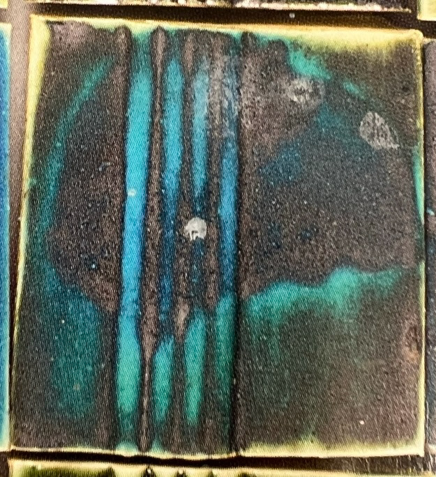
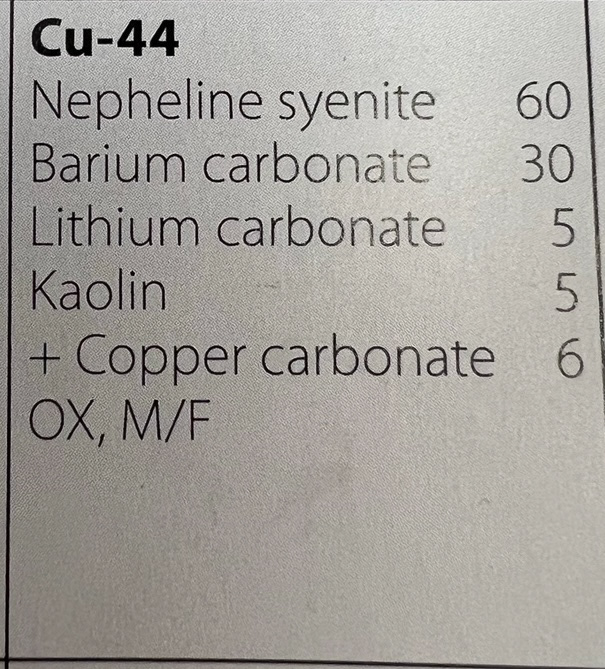
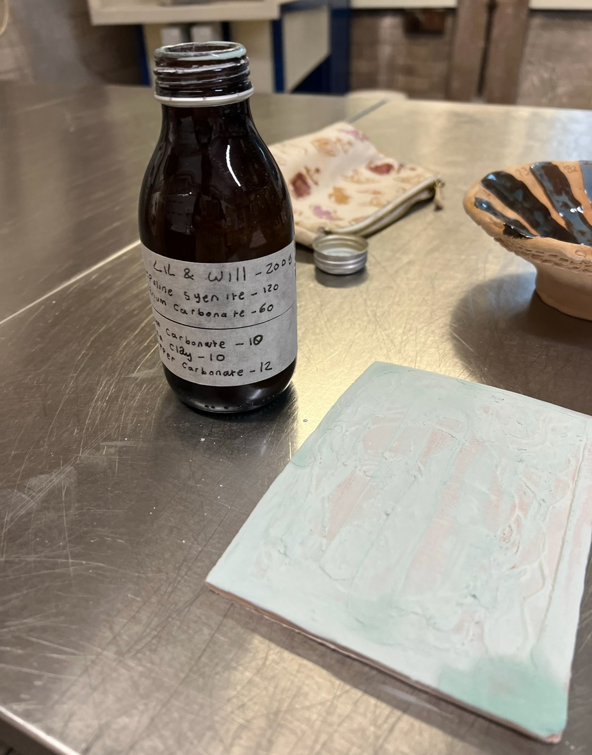
Meanwhile as these were being bisque fired, we had a masterclass workshop on how to mix our own glazes. This was very exciting to me as this was a process that I've always wanted to try as I already own my a glaze recipe book, so I would be able to try some of these out in future. For this workshop we used a recipe book called 'Developing Glazes' by Greg Daly, and we chose a glaze called Cu-44. I chose this glaze because I really liked how the bright blue shock highlighted the texture on the sample tile picture.
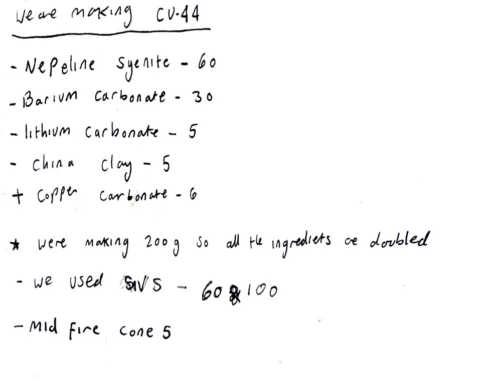
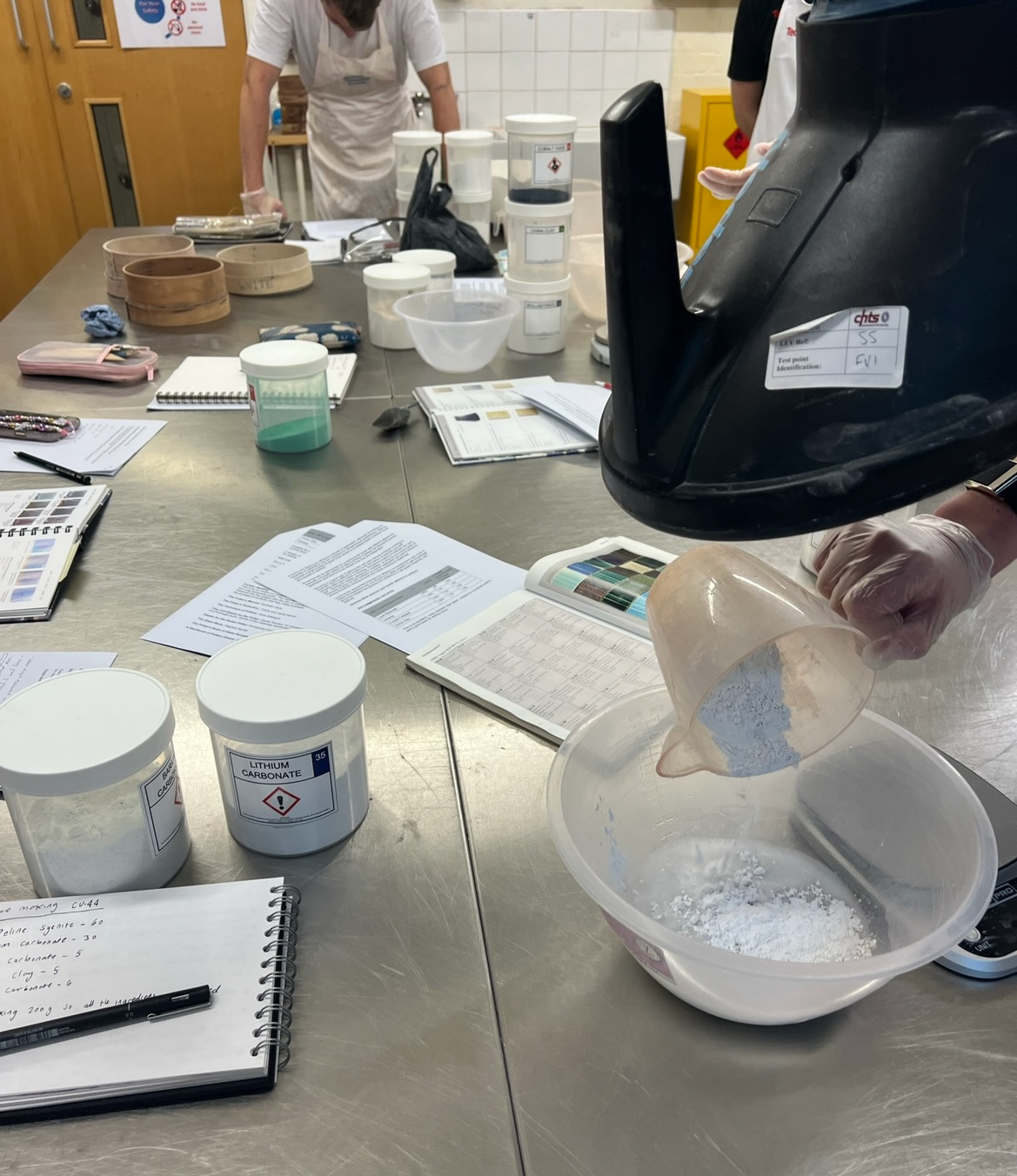
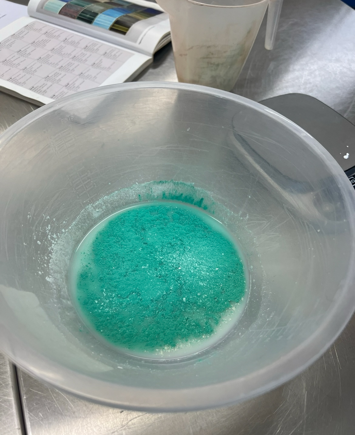
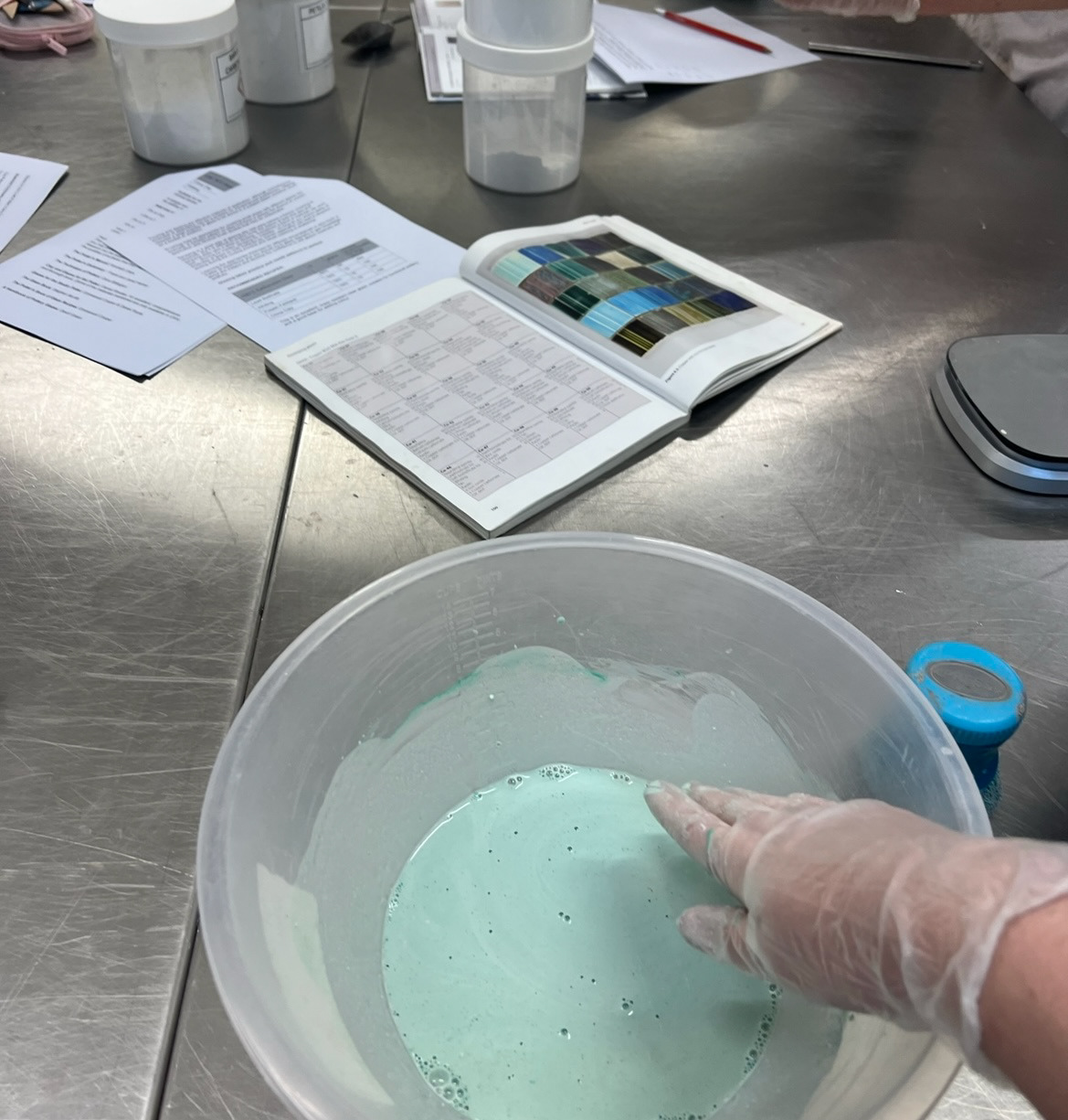
After measuring out and mixing our glaze, we put it in a bottle and left it over night to settle so that we would get the best results when used.
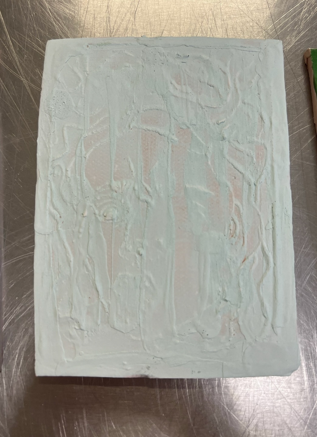
The next day my medusa slip experiment tiles were out of the kiln and I could now experiment with glazing them, I was interested in seeing which glaze/ glazing technique would show the most texture to highlight my slip imagery.
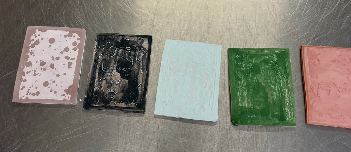
For this tile I used my line blended glazes using the same technique I had used previously. 9:1 and 1:9 Matte black and Tin shiny.
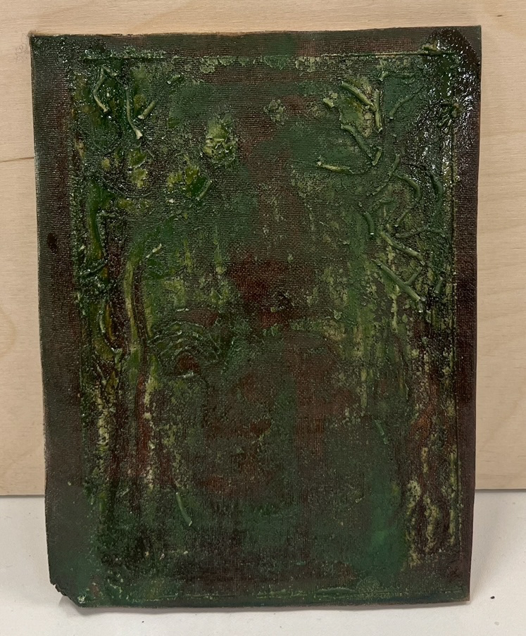
This tile was brushed and dripped with cobalt oxide, I tried to create different areas of more and less pigment so that I could see the difference once fired. I also applied a top layer of clear shiny glaze over the top.
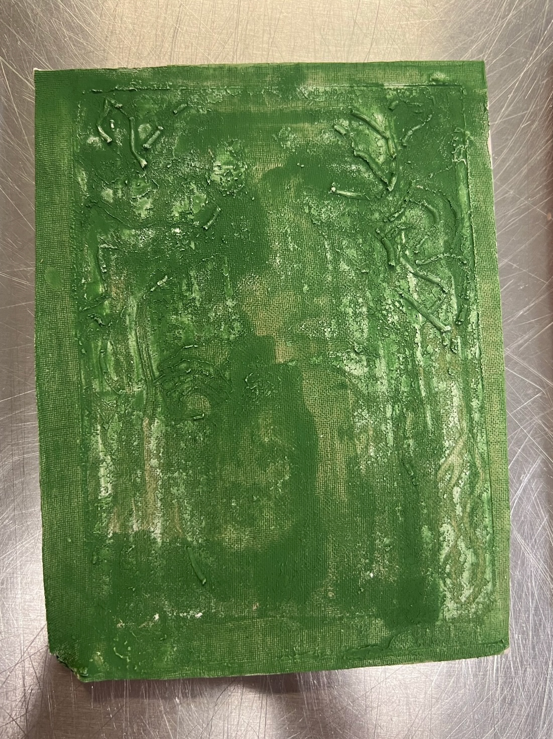
This tile was brushed with chromium oxide, even before firing I liked how this one looked, as the texture of the tile as well as the colour and application, made the tile looked old and moss covered which I think worked well beside the medusa imagery. I then also covered this tile with a clear shiny top glaze.
For this tile I dipped it into shiny honey glaze, I thought this would show some good texture as when fired, where the glaze gets caught in the grooves of the piece, it goes a deeper darker colour. I had to be aware to not put too much of a thick layer on this tile as if it was, I would have risked loosing most if not all of the texture detail.
And for my final slip tile, I decided to test some of my newly made glaze, I thought that this glaze would work well at capturing texture as on the sample picture in the book, the texture of the piece was really highlighted by a bright blue shock of colour so I thought this would look quite affective on this tile. The glaze we mixed would only work in a reduction firing so this tile had to go in separately to the others. (below)
lastly I took my final two tiles which had not had slip application, and applied some copper oxide to them. I chose copper oxide as when using it in the past it has produced, greens, browns and blacks so I thought I would be able to use it to make a quite dynamic set of tiles. I also covered these with a clear shiny top coat before firing. (below).
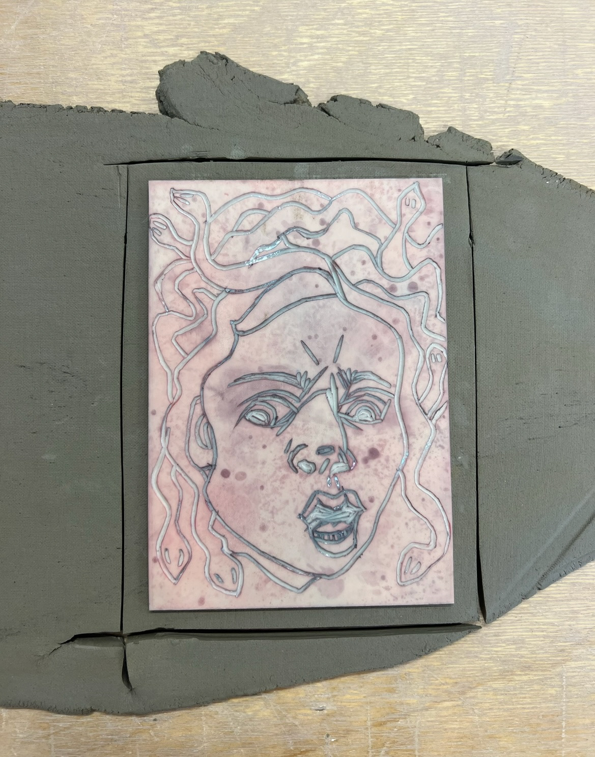
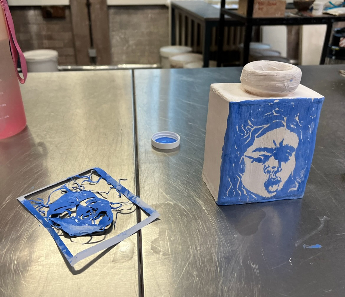
Whilst I was glazing these pieces I wanted to test out some other ways of transferring my image onto ceramics. I thought that instead of utilising the Lino panel itself, I could look to my prints themselves as tools. I decided to make a photocopy of one of my prints and use a craft knife to cut out each coloured section individually. I had to partially edit my image however whilst doing this, to offer supports so that all of the pieces would be connected as one image.
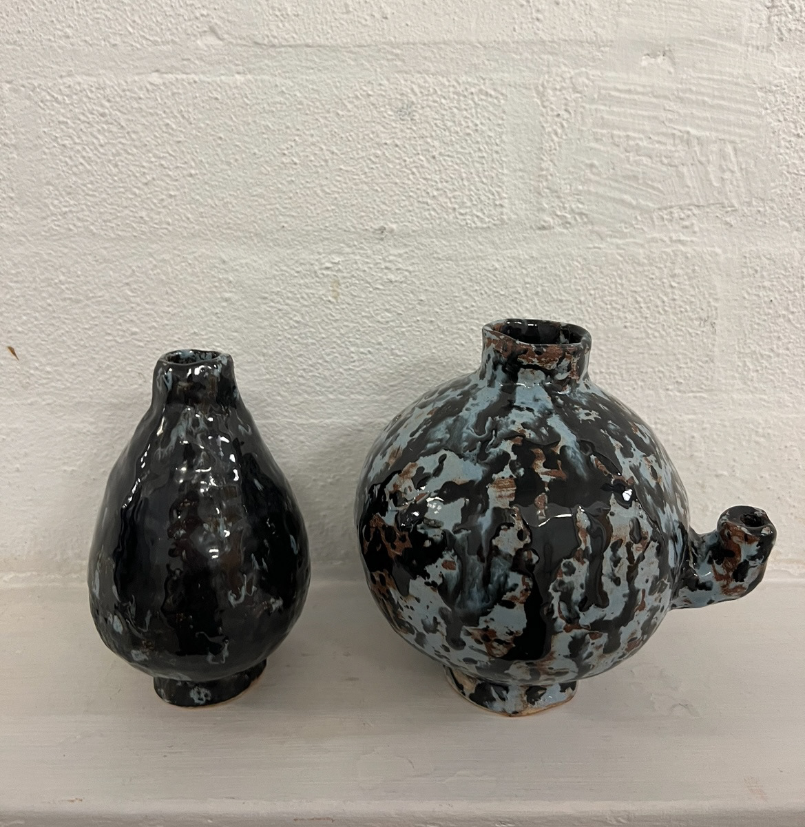
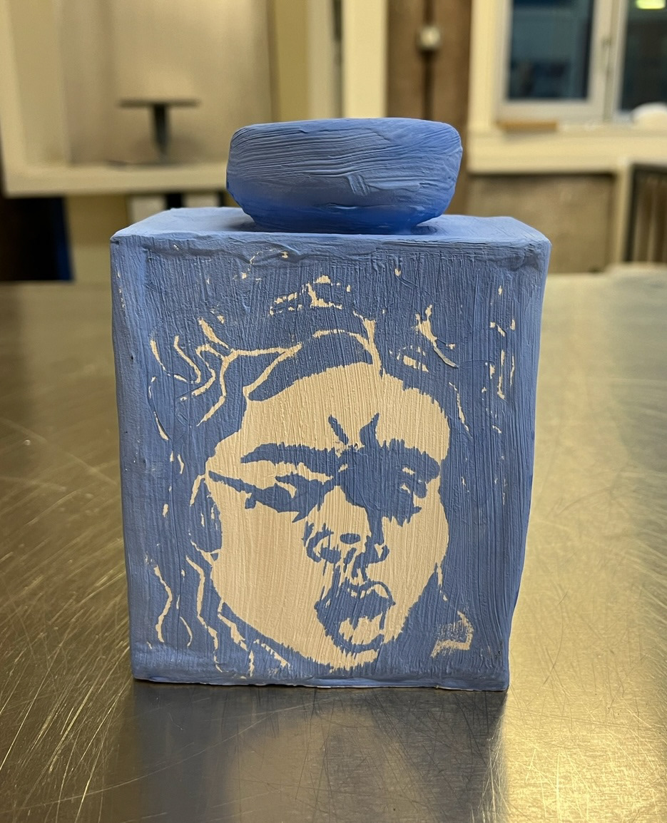
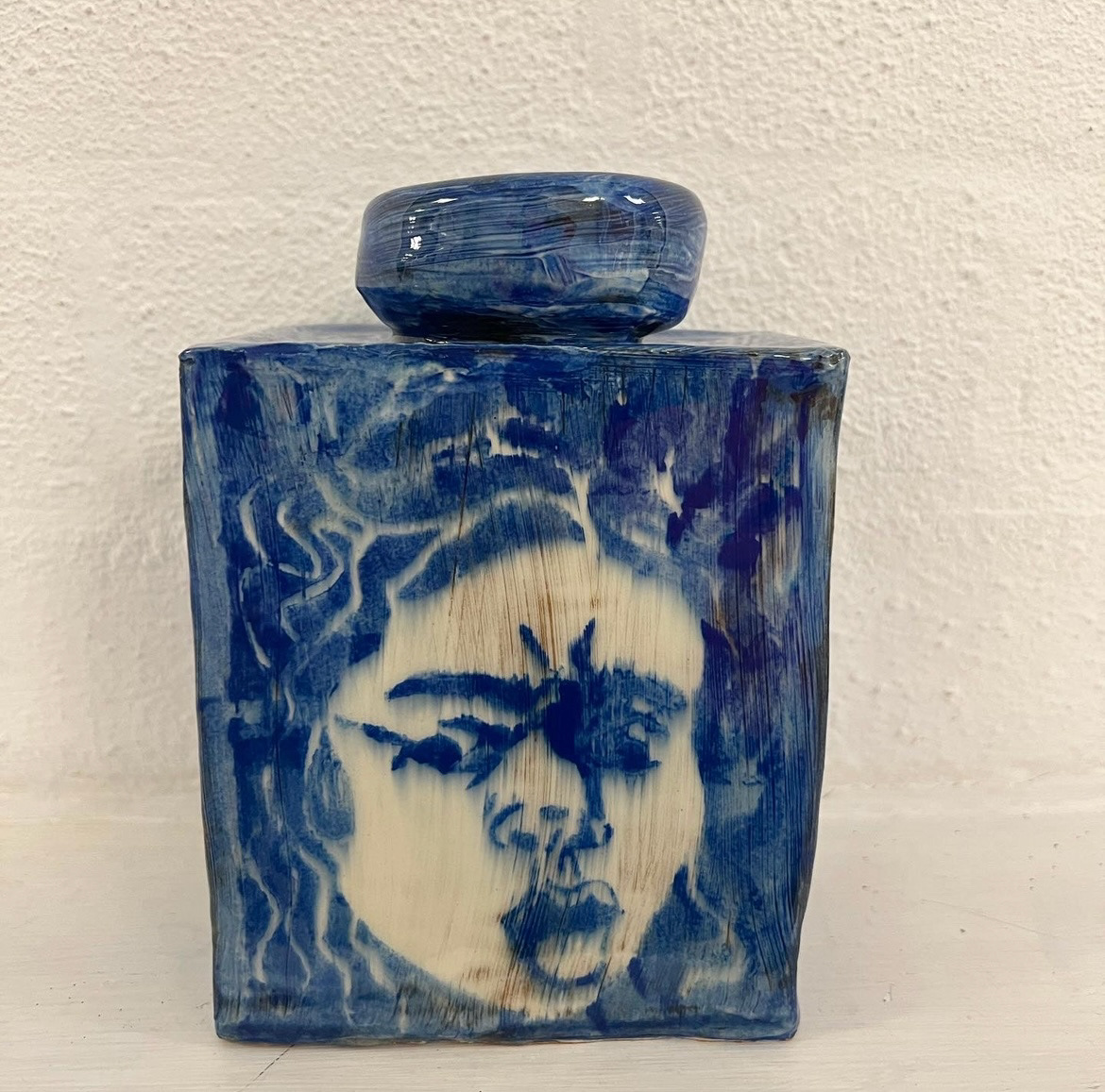
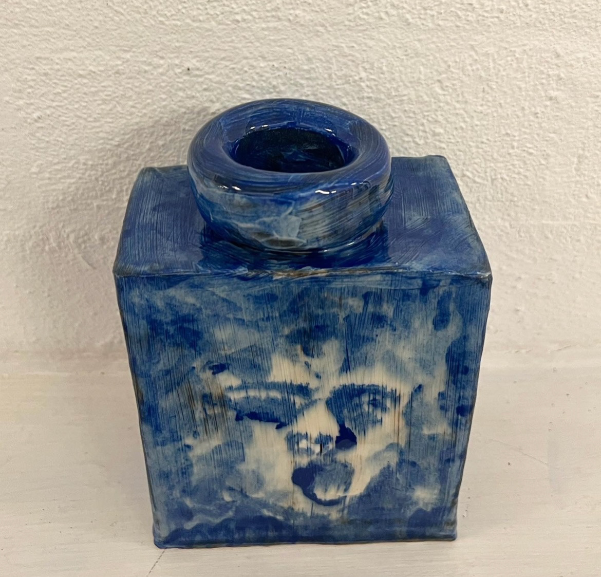
Once my stencil had been cut out, I decided that I would use my Wedgwood innovated form vase to print on as it had flat sides, perfect for this form of surface design, I also thought that the final piece would act as a fully formed innovation on Wedgwood jasper ware as the form and the design of the surface design subject matter had been taken as inspiration, innovated and then put back together again. from this I chose a blue underglaze to immitate Jasper-wares most iconic and collectable design. I would apply underglaze through my stencil with a sponge to get the most detail and clearest image.
I took off my stencil to reveal my image and even though the image wasn't perfect I think it came out even better as I could have imagined. I think the stencil printed image captured the emotion and feeling found in the original Caravaggio reference painting even better than my initial inspired drawing that I started with. once I had printed the first side of my vase, I decided to re use my paper stencil on the other side of my vase as well. after the first use my stencil was now wet and falling apart quite significantly so I knew that this second image would not be as clear as the first. however I think that the second print came out with even more emotion as the first. I think the second image came out with a more contemporary feel as the first, I like this as it further pushed the idea of bringing old and new (tradition and innovation) together.
Whilst these were in the kiln we went to print city to have an induction on 3D printing. Although this was an exciting opportunity, I don't think I will be using these new skills too much, as in my practice I like to be able to see the person behind the craft and I believe that human error adds to the beauty of a piece. I also think that skills in certain crafting areas are being lost to this kind of technology so I think it is important to preserve these processes rather than to turn to these new methods. also from a sustainability perspective, the filament used by these printers is made out of plastic and cannot be recycled so I think I will try to avoid these materials in my practice if I can. (induction notes below).
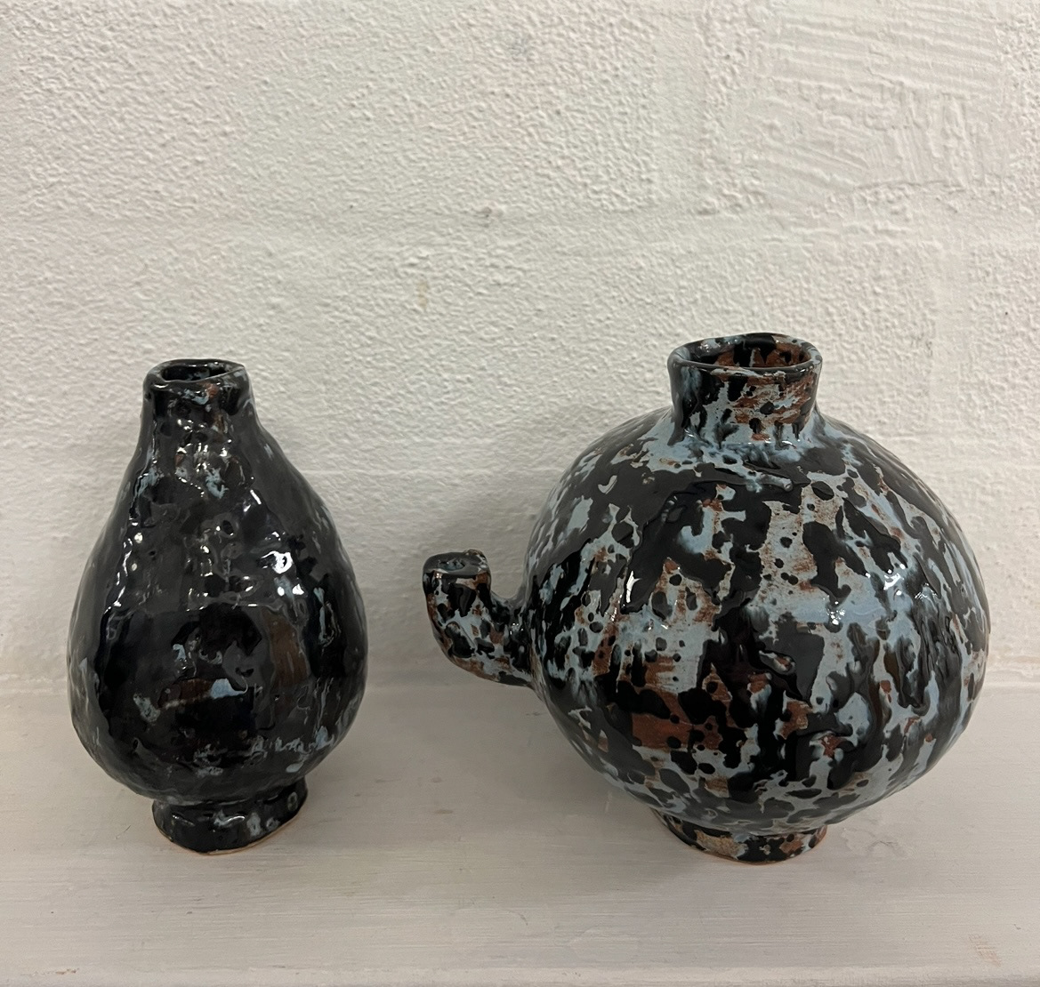
Finally I could go and pick up my tiles and vase from their final firing (results below).
Line blended glaze process using 9:1 and 1:9. I think this process made the tile look more interesting but did almost nothing for revealing the texture. however the shiny finish of the glaze helped with this a little bit, I think the contrast of the harsh black against the white slip, helped bring my image forward.
This was my cobalt oxide tile, this was arguably the most successful tile in this set of samples, I think that when I applied clear shiny glaze over the oxide, they mixed together and created this affect, id be interested to try this out and explore this in future.
This sample was brushed with chromium oxide, I don't think it was too successful in the sense of showing the texture of the piece, however I do think it created a nice overall look especially along with the context of the imagery.
This piece was made with just honey glaze, as this tile was the one with the flattest texture, I think the glaze did a really good job of bringing out the image however I do think that this is the least visually interesting.
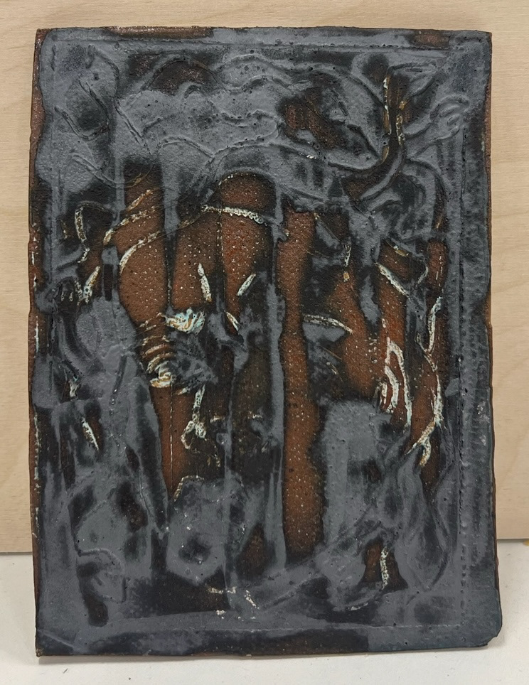
This tile was brushed with my glazed that I mixed. The glaze did not come out as It was supposed to. we decided that this was due to the glaze being brushed on rather than dipped, swell as the glaze containing too much copper.
Below are the tiles with copper oxide on, I was expecting these tiles to overall be more exciting but they did not come out as I had expected, however they did bring out the detail quite well.
Finally my vase came out of the kiln and I couldn't be more happy with it, I think the only imperfections were the brush marks of the underglaze being visible however I quite like how this looks as I think that the imperfections add to the character of the piece.
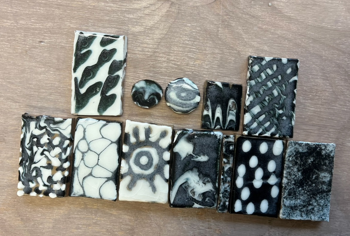
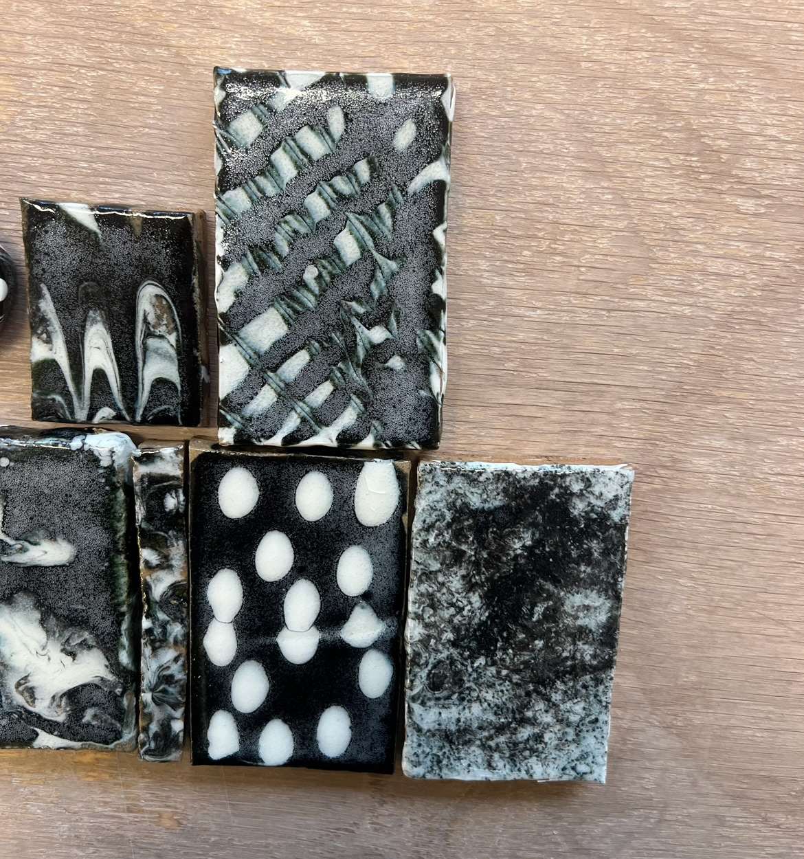
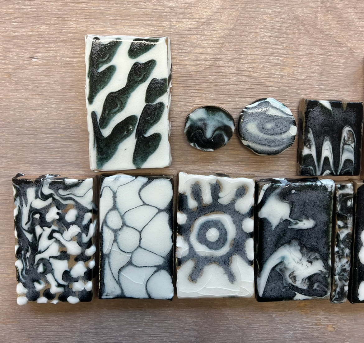
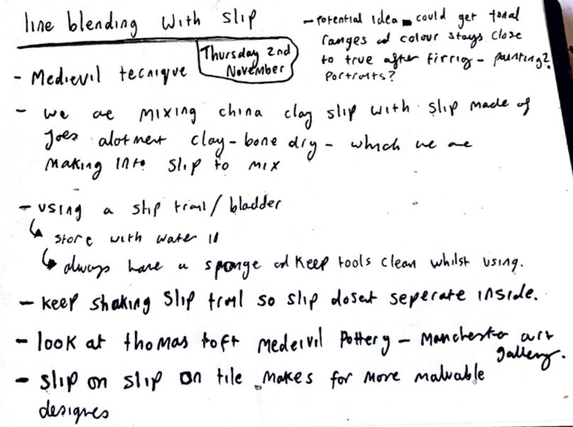
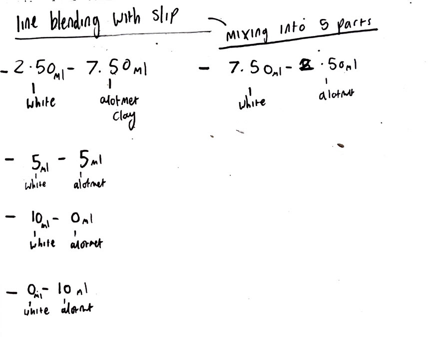
Next in the workshops we carried out another line blending workshop but this time with slip. We also learnt how to use a slip trail to create designs on tiles, this is a medieval technique which was traditionally done using a pigs bladder. I was really interested in trying this technique as it was a technique that I saw displayed on work at the Wedgwood museum, done by Josiah Wedgwood before discovering his Cream Stoneware. (pictures below.)
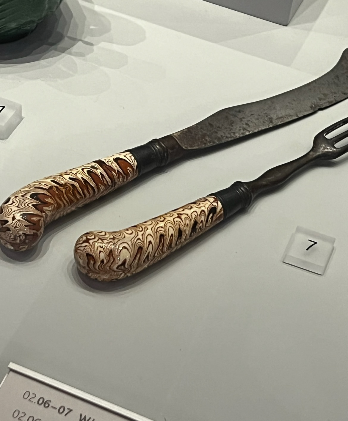
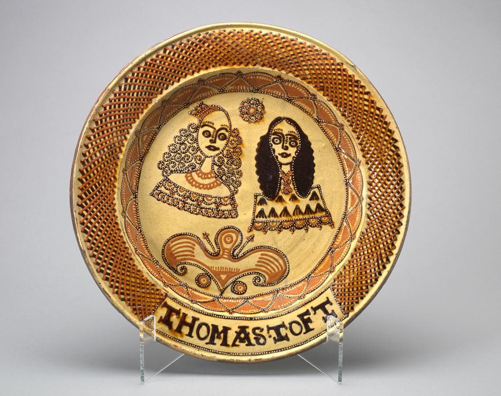
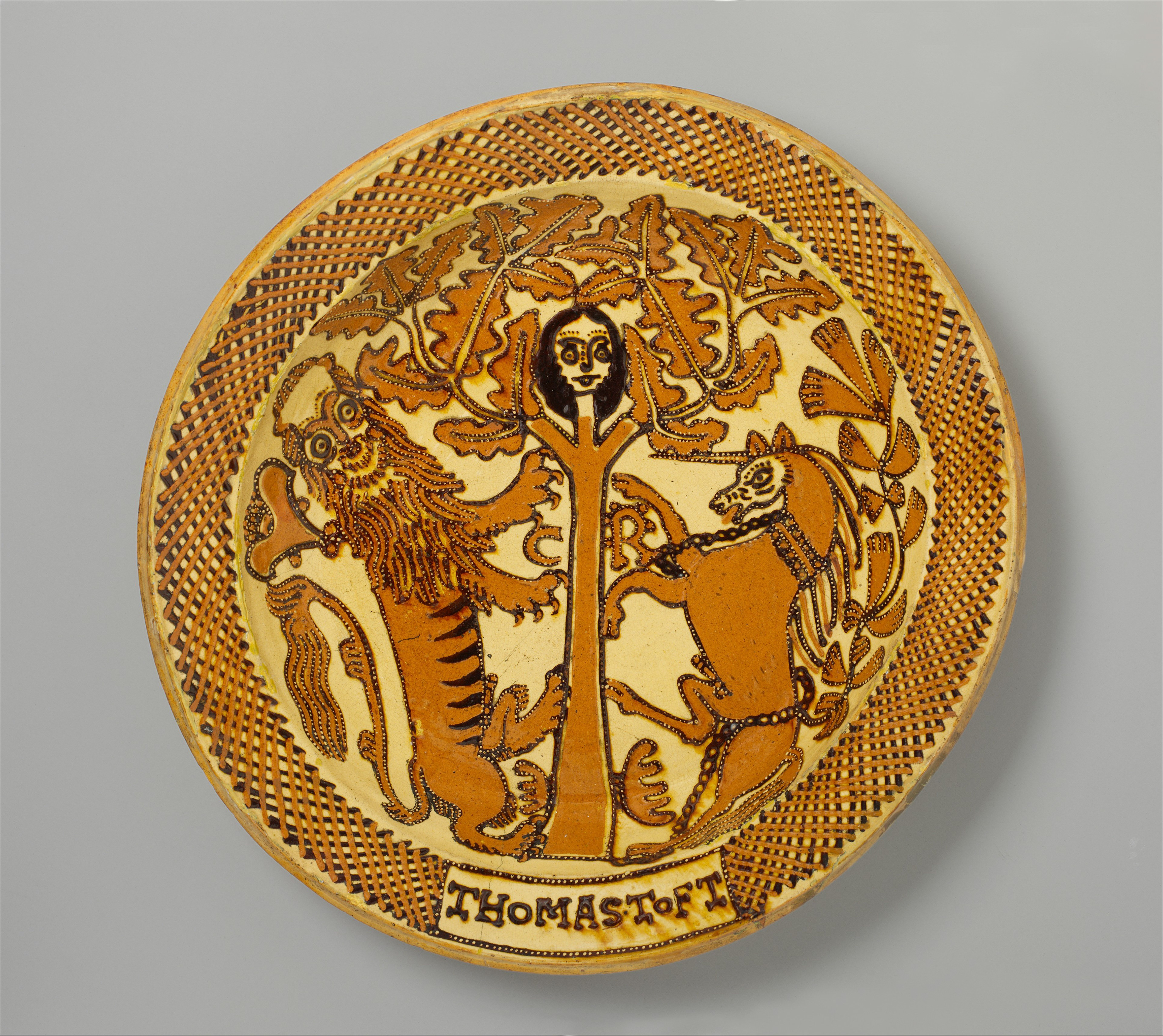
,Another ceramic artist from the Staffordshire potteries was an artist called Thomas Toft. Toft worked at the potteries from 1671-1689. Staffordshire potteries at this time were known for their exquisite slip ware. Thomas Toft used a technique of slip trailing, in those days usually done using an animals bladder, this technique allowed for accurate slip application which lent itself to detailed drawing, illustration and surface design. Tofts' work depicts usually, coats of arms, people, animals and mythical creatures such as mermaids and unicorns. I find myself very drawn to the work of Toft. I particularly enjoy the illustrative style, subject matter and use of pattern such as cross hatching which was commonly featured on Tofts' work. I found great inspiration in the work of Thomas Toft, especially in the illustrative style.
in this workshop however I used a plastic slip trailer (rather than a traditional animal based one) and created various patterns and designs rather than illustration , playing with thickness and wetness of the clay as well as movement to create different patterns, lines and shapes and variations of fluidity. (workshop pictures of line blending and slip trailing below).
(samples after glazing below)
from specifically the line blending portion of this workshop I discovered that I'm really enjoying learning how to line blend in different ways, I'm seeing a lot of potential in future projects as in a lot of instances with this process you come out with a tonal range of colours, this would emend its self perfectly to my passion of monotone portrait painting outside of university. I think in future I could bring this passion and ceramics together to create some interesting, portraiture based surface designs.
I also think that this way of creating pattern with slip really opened my eyes to the possibilities of working with slip from a surface design side of things, I'm looking forward to using slip as a big part of my surface design in future.
Next we had a talk with Erum Aamir, an alumni maker who talked to us about her career as a maker so far and how she gains her inspiration for her work. (talk notes below).
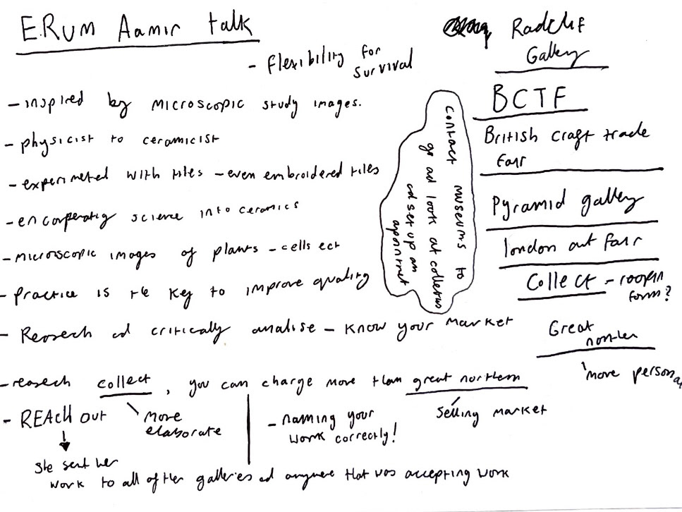
I had the amazing opportunity of having a one on one tutorial with Erum. In this talk I was able to show her my work and have her give critiques, feedback and advice on where to go next. Erum noted that she thought my work could be enhanced with a bit of connection to me as a person and a maker. As I felt I was now ready to move onto the next stage of my project, I took this advice and brainstormed with it.
This gave me the opportunity to think in depth about how I thought of ceramics and what qualities of ceramics I connect with most and what drew me to choose industry ceramics in the first place.
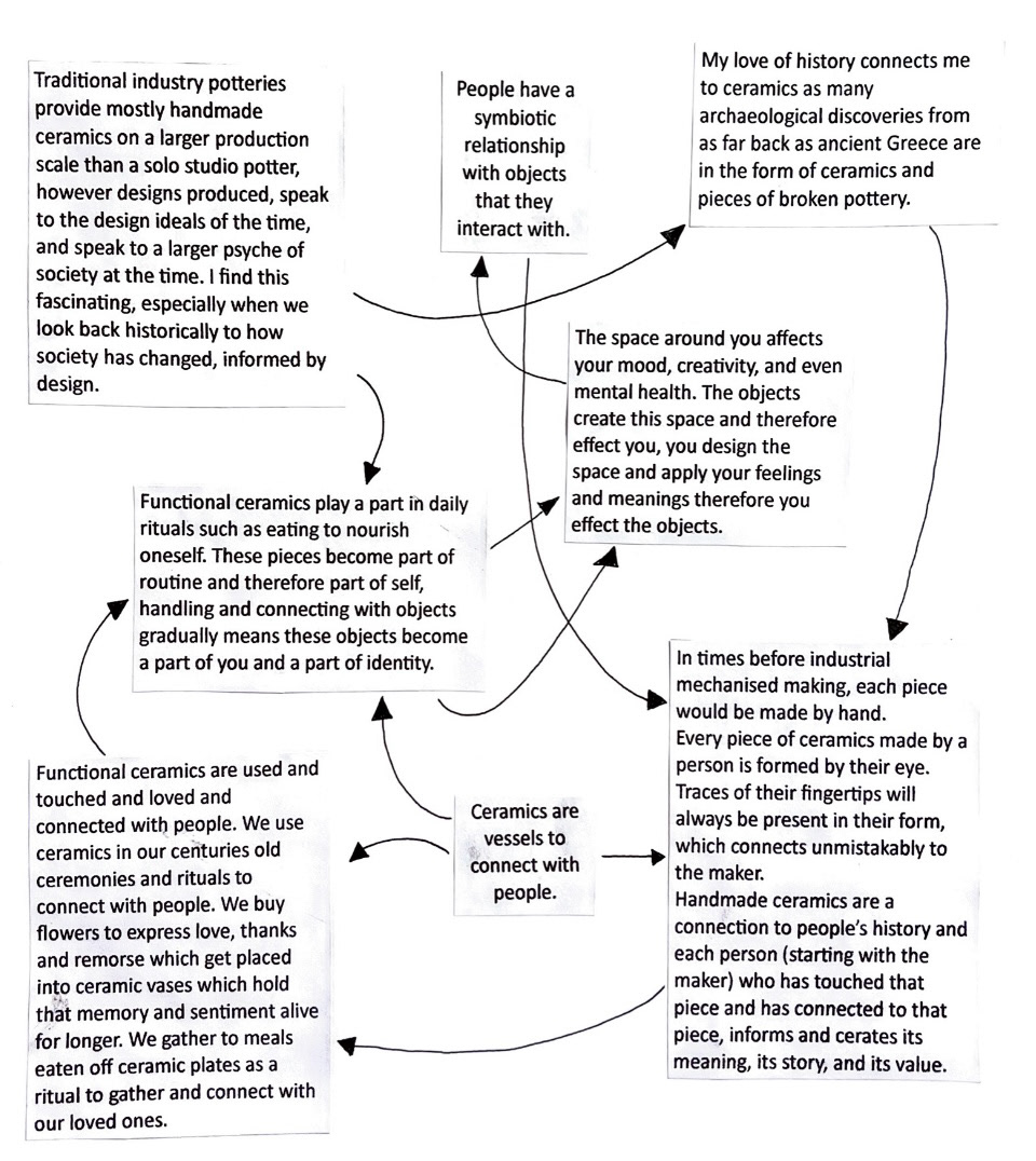
from this brainstorming session I noted that one of the main reasons I love functional ceramics, like those made in industrial potteries is the way that pieces can be so deeply connected to a sense of self. I especially like the thought I had about the symbiotic relationship between people and object and how that connection historically goes back for as long as ceramics have been made, even just by noting the time and care taken by the maker to make that piece in the first place.
I got quite interested in this idea of object being connected with a sense of self and did some reading of several articles.
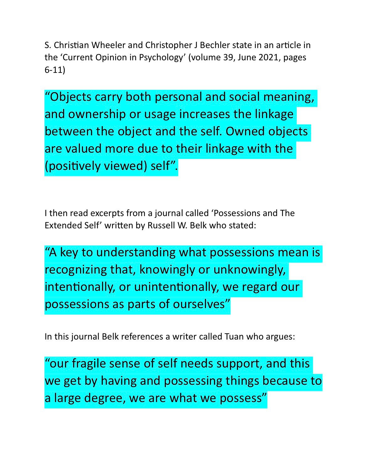
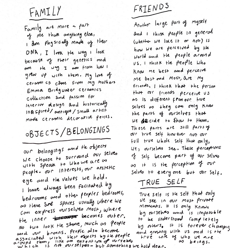
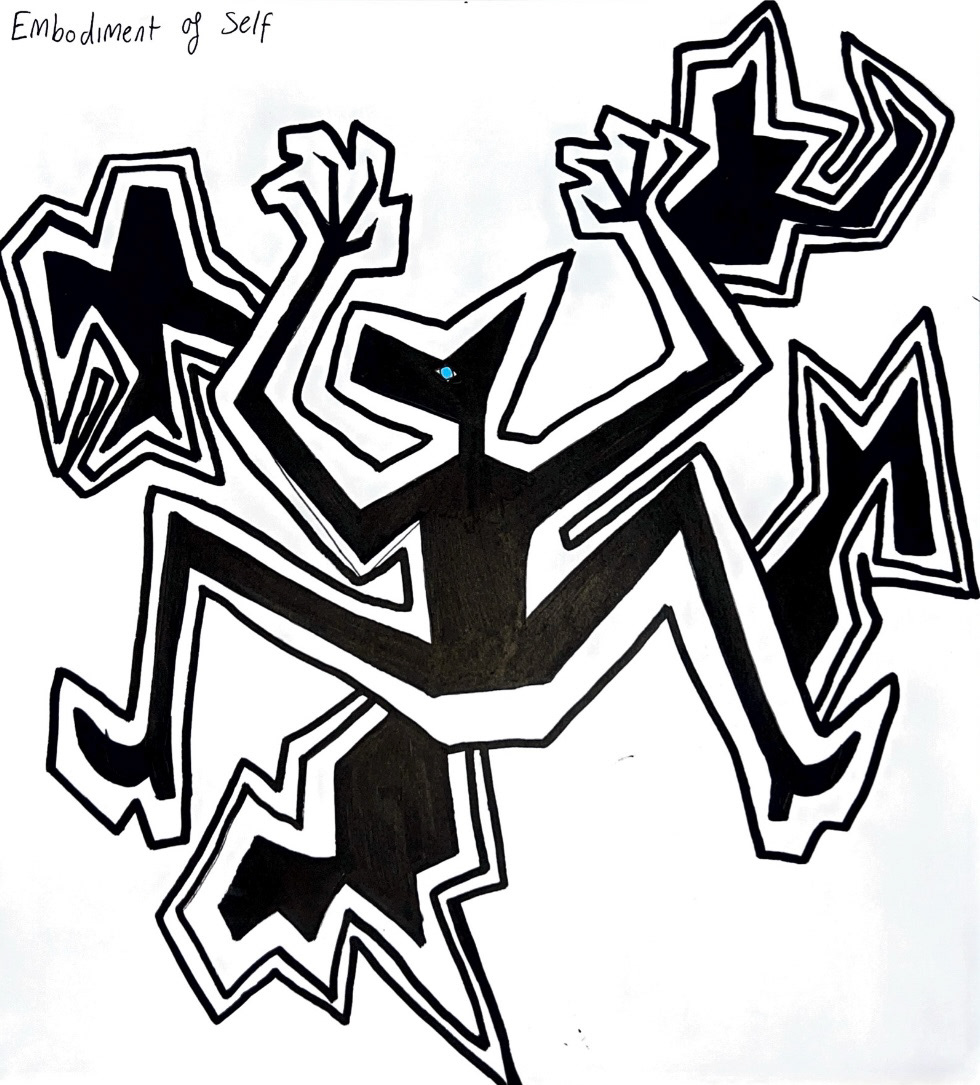
I came up with the idea that the objects that we connect with and surround ourselves with could be counted as much of a facet of self as things such as family and your true perception of your self. I like the theory that I, as a person can be made up of many different compartmentalised selves that make up one whole self.
I started to come up with some ideas surrounding the idea of representing these facets and sections of self as individual ceramic objects which could come together to make one set of objects that work together and become one, or one correlating series, representing the whole self.
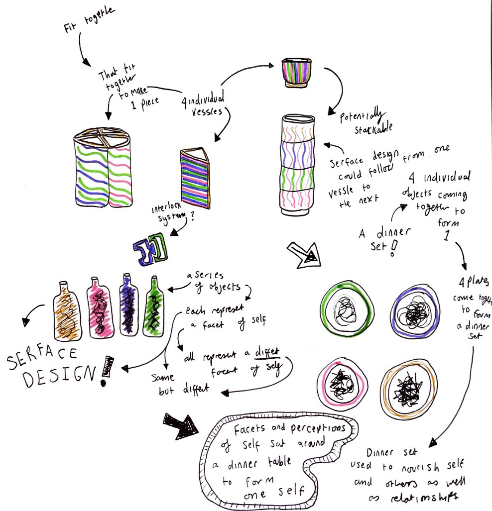
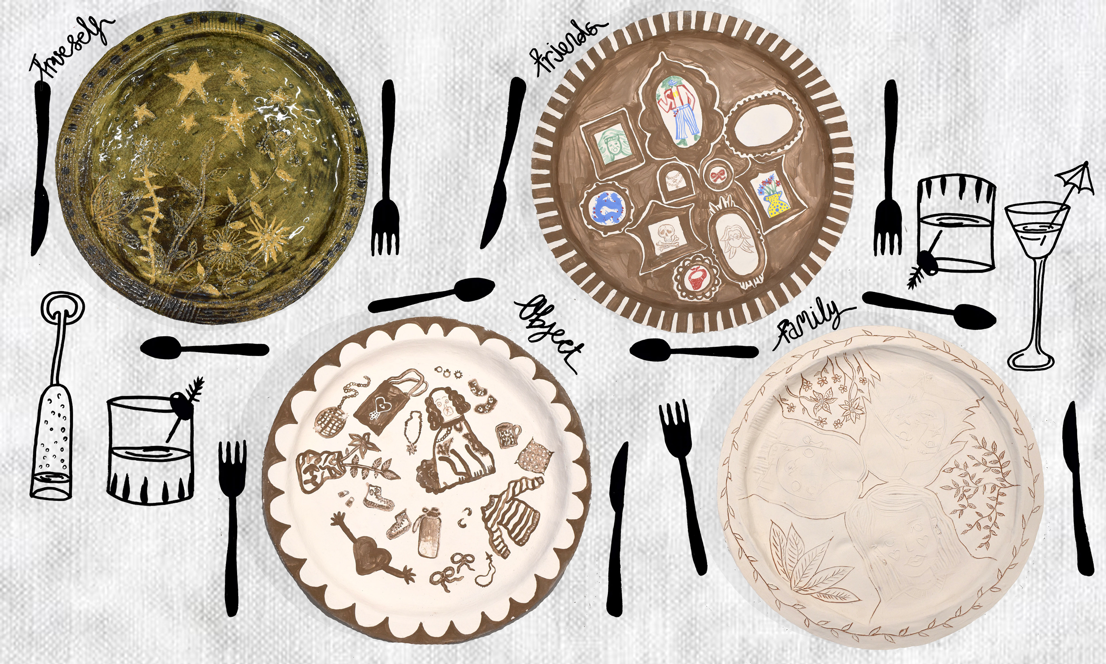
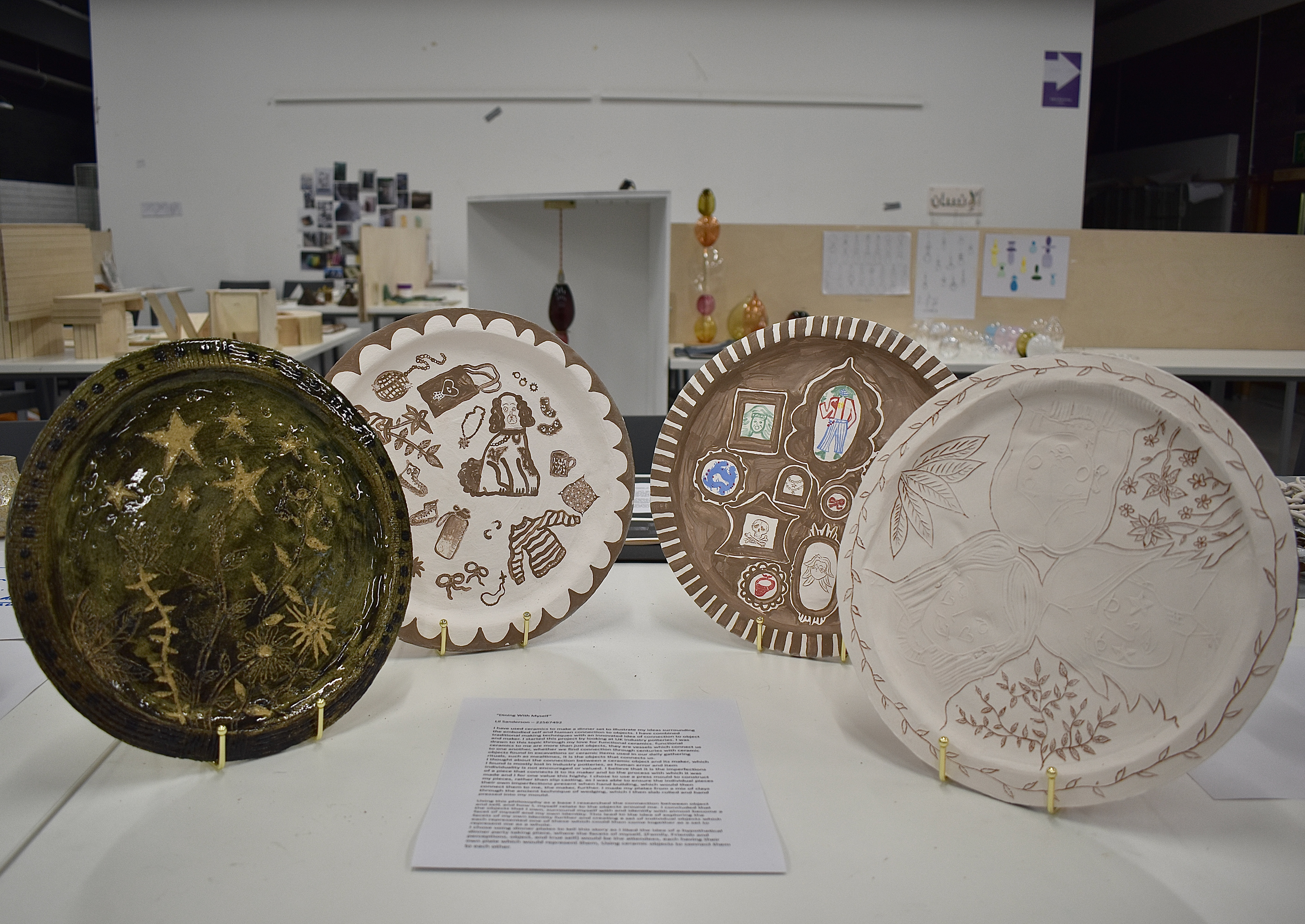
I liked the idea of making the set of dinner plates, I liked the conceptual idea that four facets of self could be sat around a table (possibly in my brain) discussing topics from different perspectives as individual people whilst also all being part of one person. They each have a dinner plate that represents them.
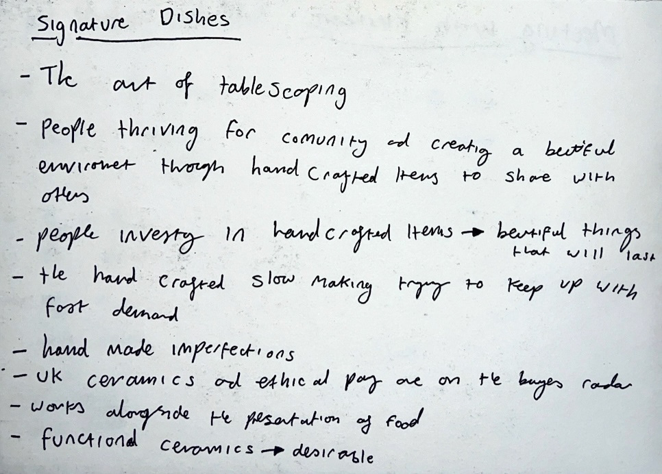
I started doing some research into dinner plates starting with an article called 'Signature Dishes' by Isabella Smith. (notes below).
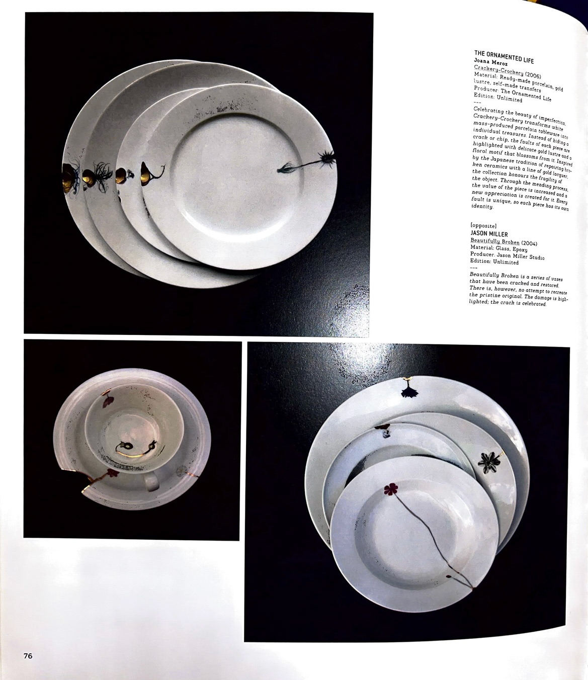
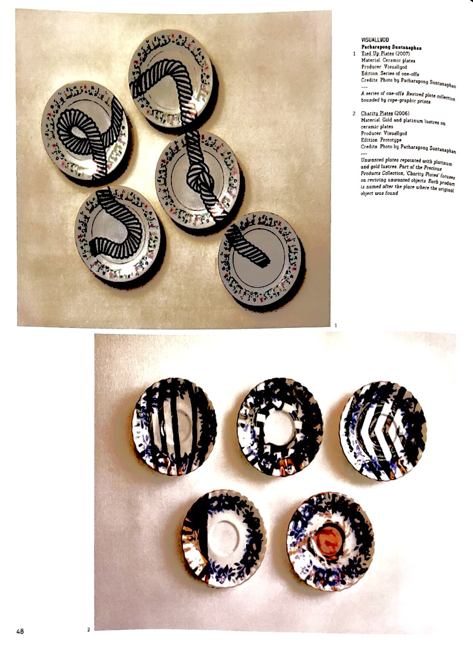
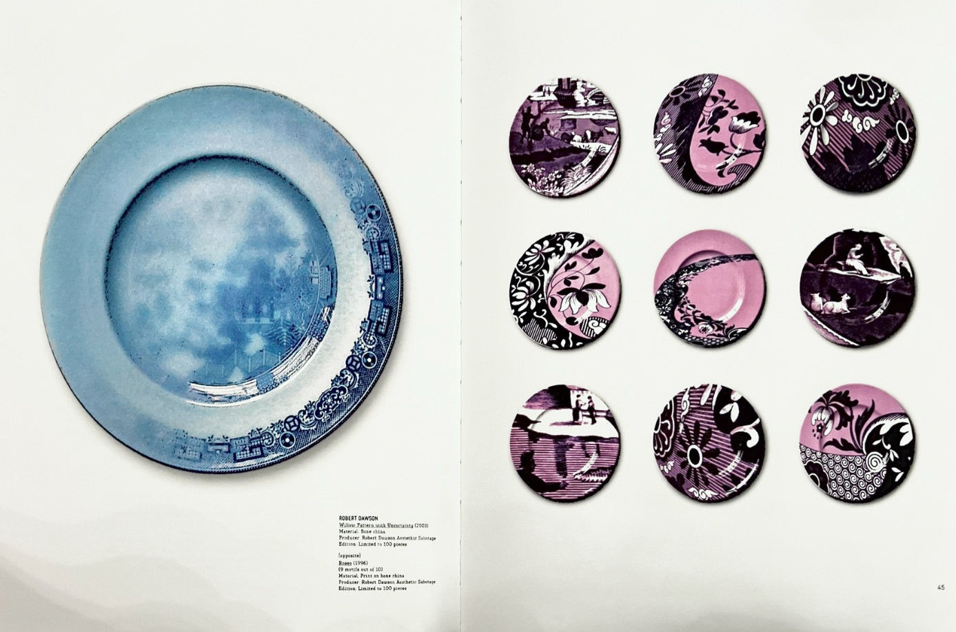
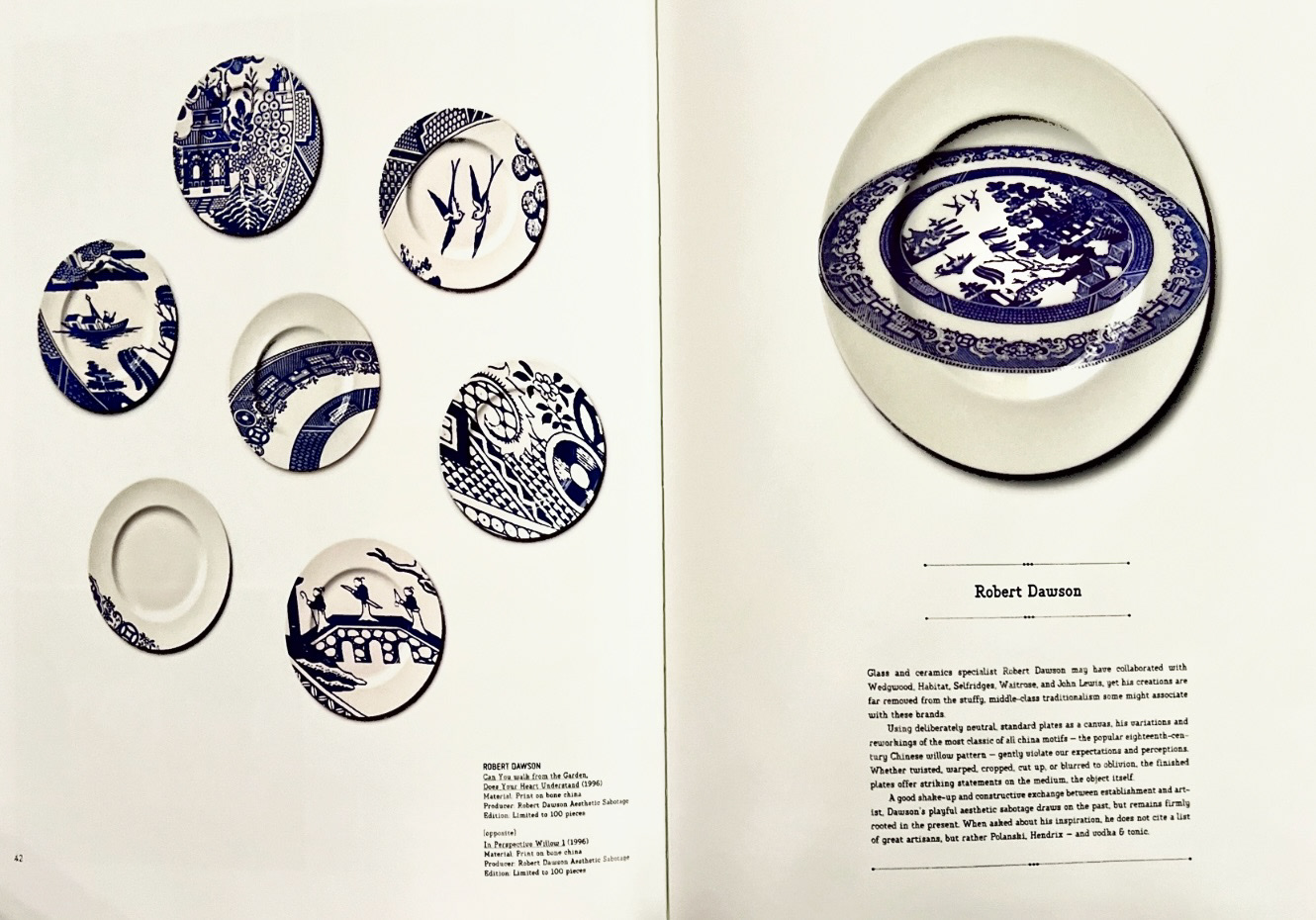
I also looked for some artist inspiration on plates using a book called 'Fragiles"- published by Gestalten, (Berlin 2008). Artists such as Joana Meroz, Visuallyod and Robert Dawson.
Joana Meroz uses imperfections and breakages as design features in her pieces titled 'The Ornamented Life' and draws attention to them rather than hiding them away. I really loved this idea as I think the imperfections are what brings character to a ceramic piece. I really liked in the examples of plates by Visuallyod, how each plate is different but are cohesive and work together as a set to make a whole piece. and the Robert Dawson pieces are the embodiment of innovating tradition, taking classical surface design motifs and altering them to make something completely new.
Now I felt like I could go back to my idea and start with the design and concept process. I started thinking about what these parts/ facets were and how specifically they each connect with my and how I connect with them and how they each make up a part of me.
Once I had these down, I could start thinking of imagery that I could use to represent these facets on my plates, and also how I would execute transferring this imagery onto ceramics.
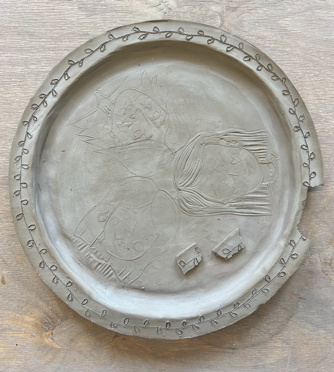
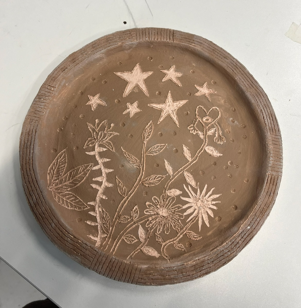
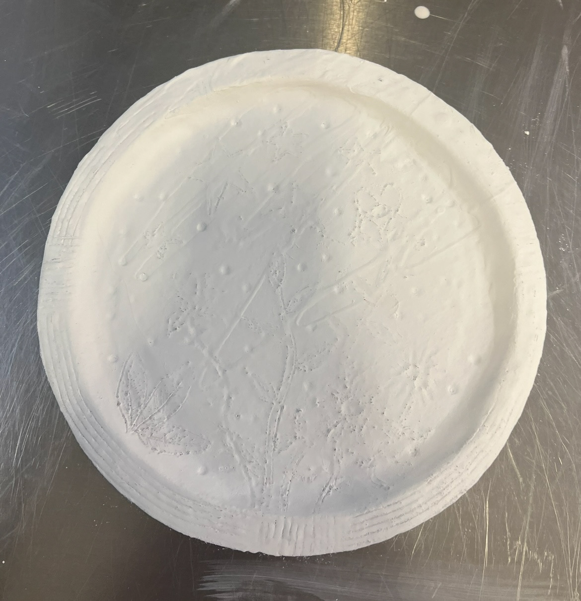
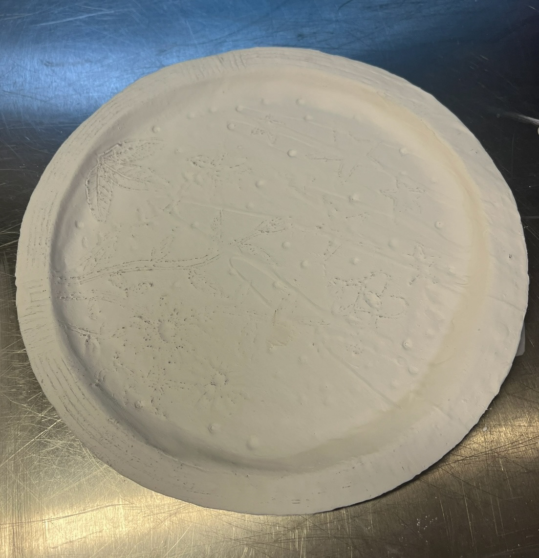
I realised that I was being quite ambitious with my idea so decided to start with designing and making my first two plates first, rather than taking all four on at once. (initial designs for my first two plates, family and friends, below).
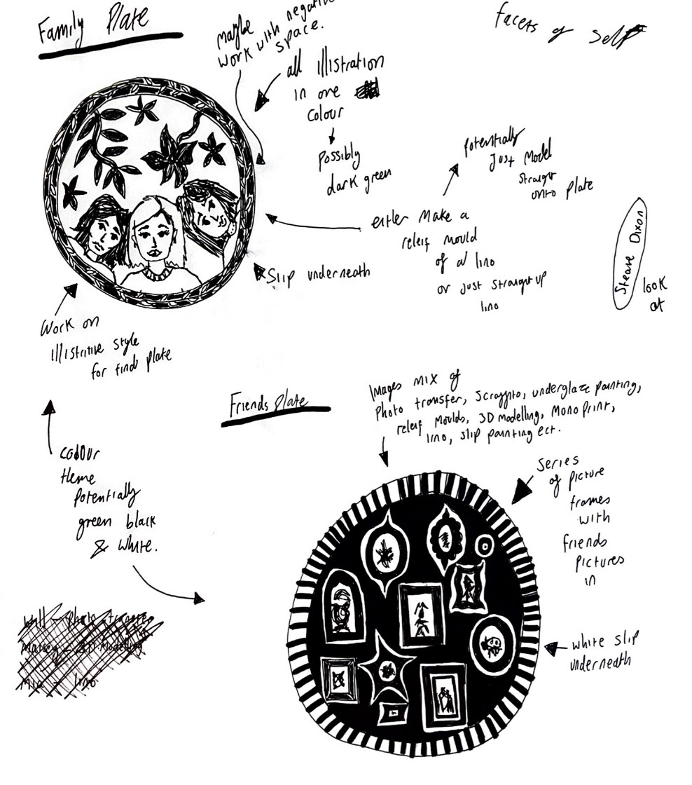
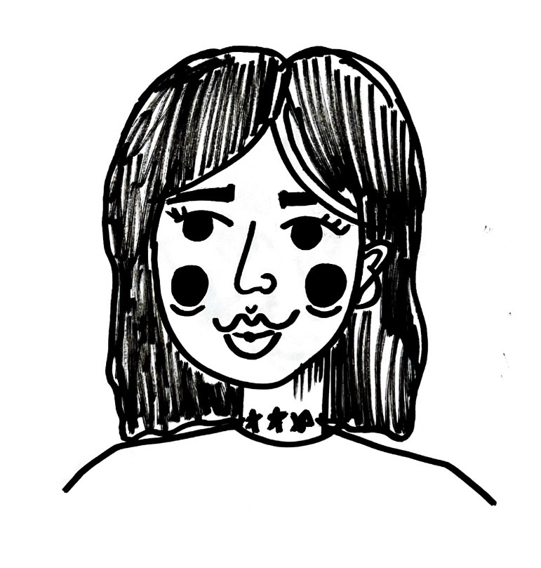
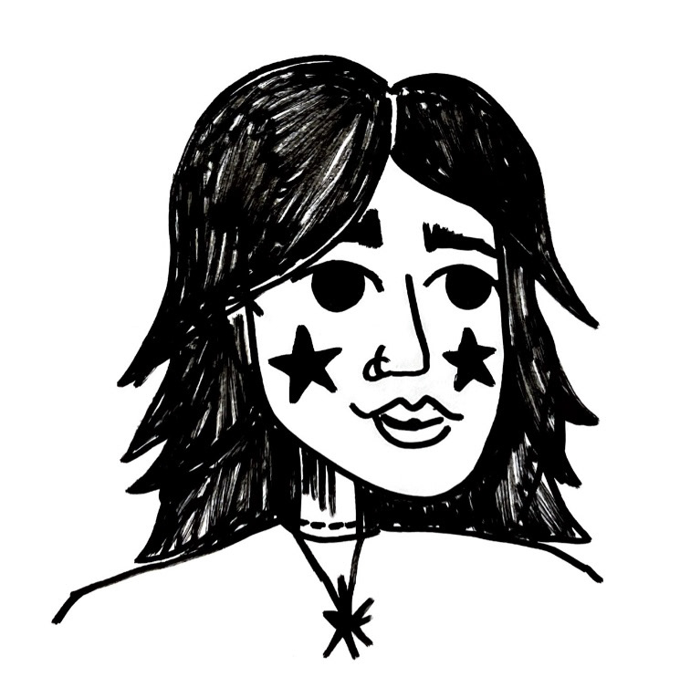
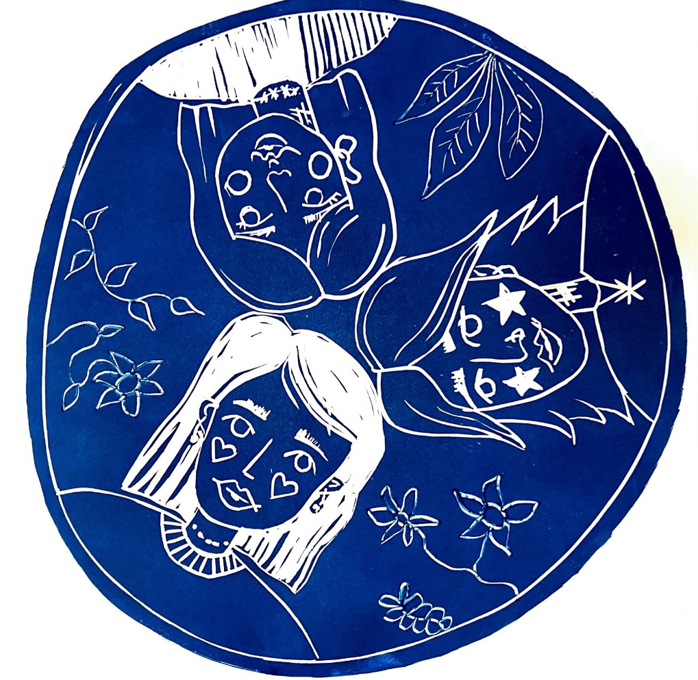
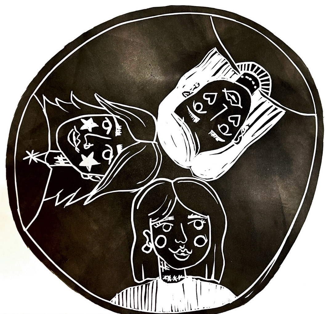
in this project my focus has defiantly grown to be surface design as it is an aspect of ceramics which I am hugely drawn to. I was really keen for these plates as a set to have a very illustrative style as I felt it would connect them to 'sense of self' further, having a unique personal style. I started working on my design for my 'Family' plate. I decided that this plate would be very literal and depict me, alongside my sister and my mother. I started working on these illustrations. (below)

After I had completed and was happy with my first illustrations (above), I scanned them into photoshop, edited them slightly and made a mock up of how they could fit around my plate. (below).

I then had to start thinking about how I would now transfer this image over onto a ceramic piece. I looked back at my research and the work I had done trying to transfer my Medusa Lino image onto ceramics and thought that the line work of my illustrations would work well when transferring over to Lino. I decided though that when it came to transferring the Lino over onto ceramics, that the medusa samples that came out best were the ones where I had simply pressed the Lino into the ceramic piece itself, so I kept this in mind whilst cutting my image into my Lino piece as to which parts would be raised and which would be on level with the rest of the clay.
Before I took my Lino piece over to ceramics however, I made a few prints with it in the print workshop. (below). I found that I could almost create a mock up of what the other surface design was going to be on my plate by using a cocktail stick and scraping the ink away on my Lino before printing to create extra design, I thought this addition was quite symbolic as it could represent the act of 'growing' up with and alongside my family, much like plants in a garden, this was also inspired by my original design drawing.
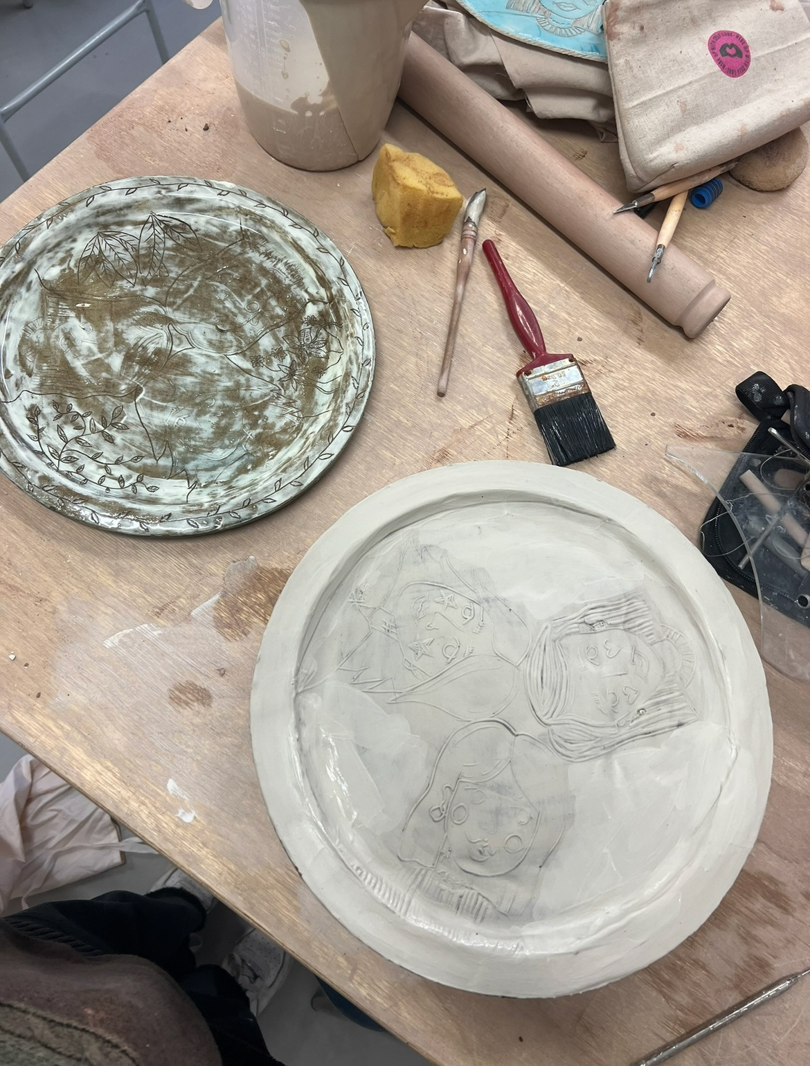
Finally it was time for the act of taking my design into the ceramics workshop and making my first plate. I didn't have much experience working with press moulds but I thought that I would rather work with a press mould instead of the traditional industry potteries method of slip casting because I was able to work with my hands a bit more and ensure that each plate would have their own unique imperfections and therefore the connection to maker is stronger. I decided I would learn on the job with using my press mould. I used a mix of dark clays, such as crank, terracotta red clay and almington. I used dark clays as they lead themselves to hand building better than light clays such as ivory stoneware. I mixed these together using the technique of wedging which I had learnt in my first workshop of this project. I would then use a slab roller to roll out my clay so that it was an even width across the whole slab. i found that when rolling out my slab on the roller, the slab always came out in a rectangular shape, which was not ideal when preparing it for a round mould. So I found that if I rolled out my slab of clay on the roller once, I could then go back in and fold my slab of clay in half, rotate it 90 degrees and then roll it again, and this created a more even shape rather than a long skinny rectangle that I would have had to patch into the mould. having a more even round shape meant that I could then take the clay slab straight from the roller and flip it into the mould and smooth out the clay so that it fit snug with the mould and I would have an even flat surface to work on later. I then trimmed the excess clay from the edges if the mould. This is the process I will repeat while making all of my plates before design.
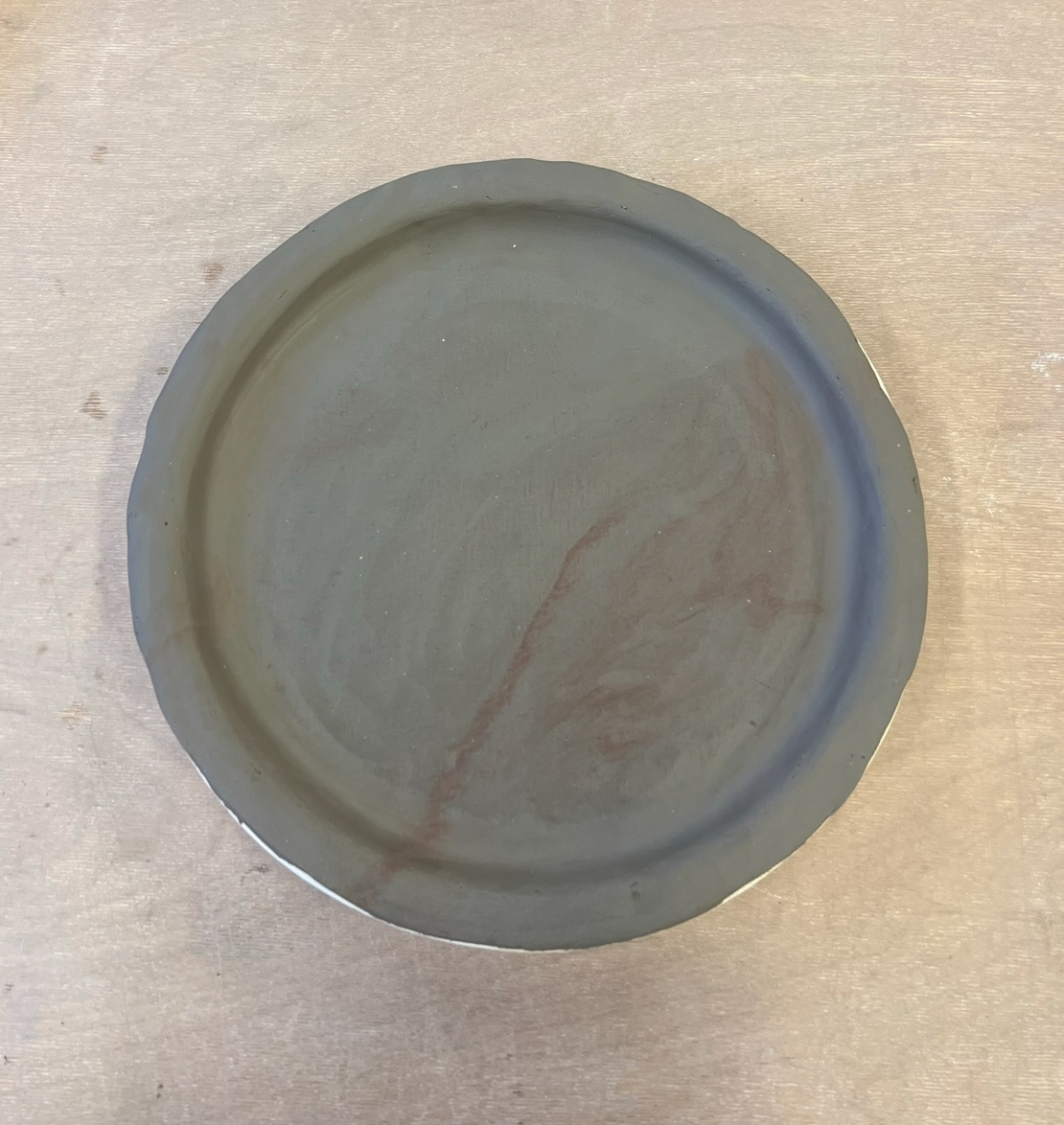
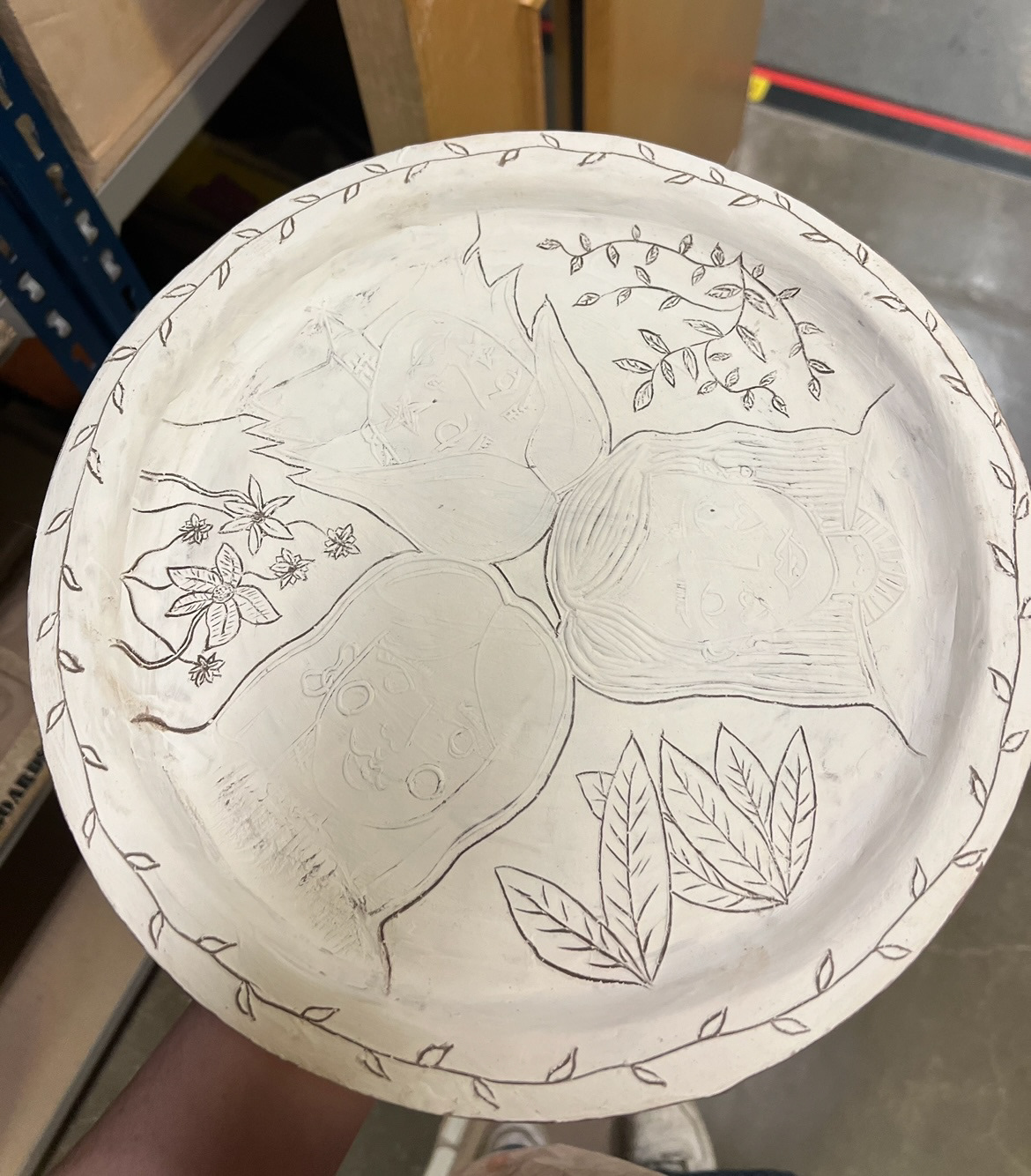
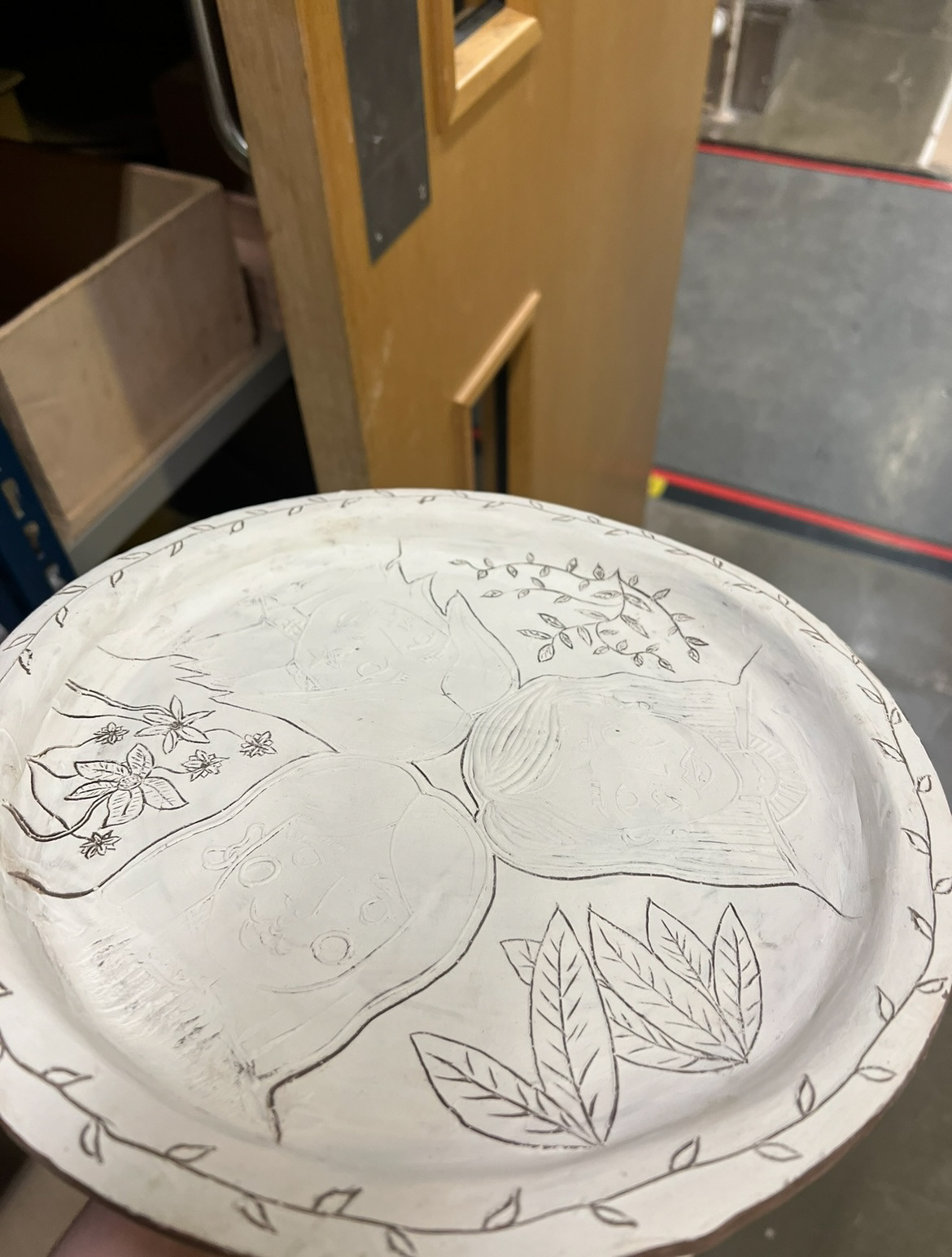
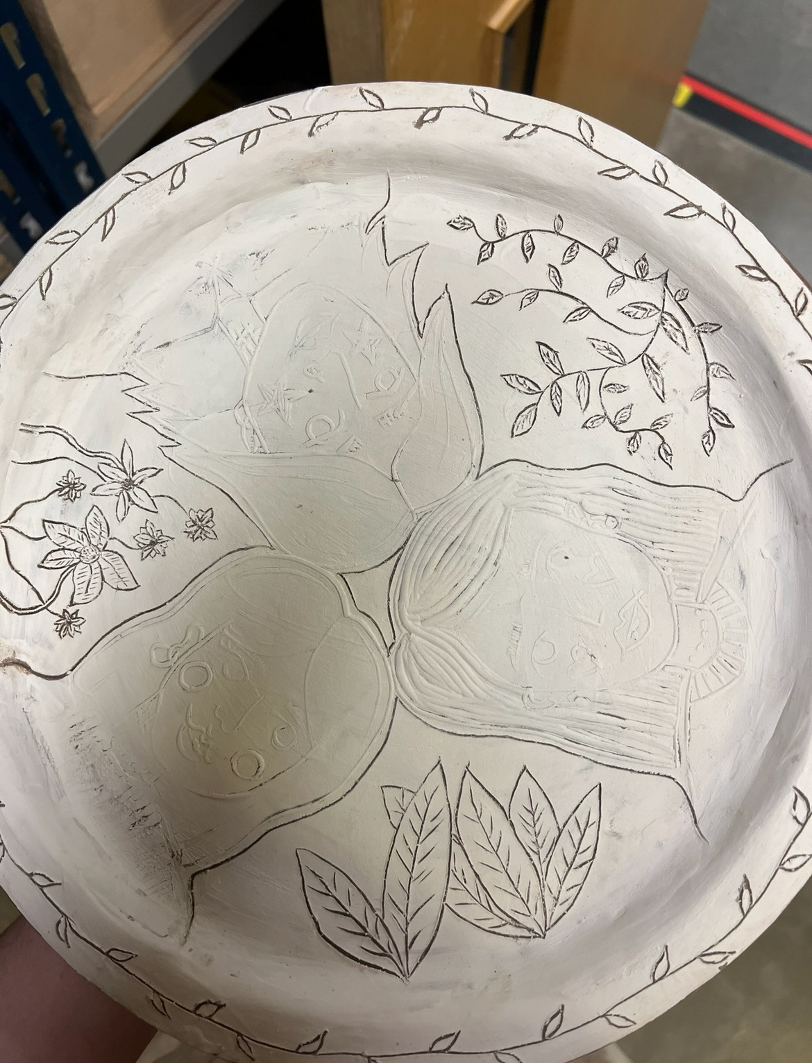
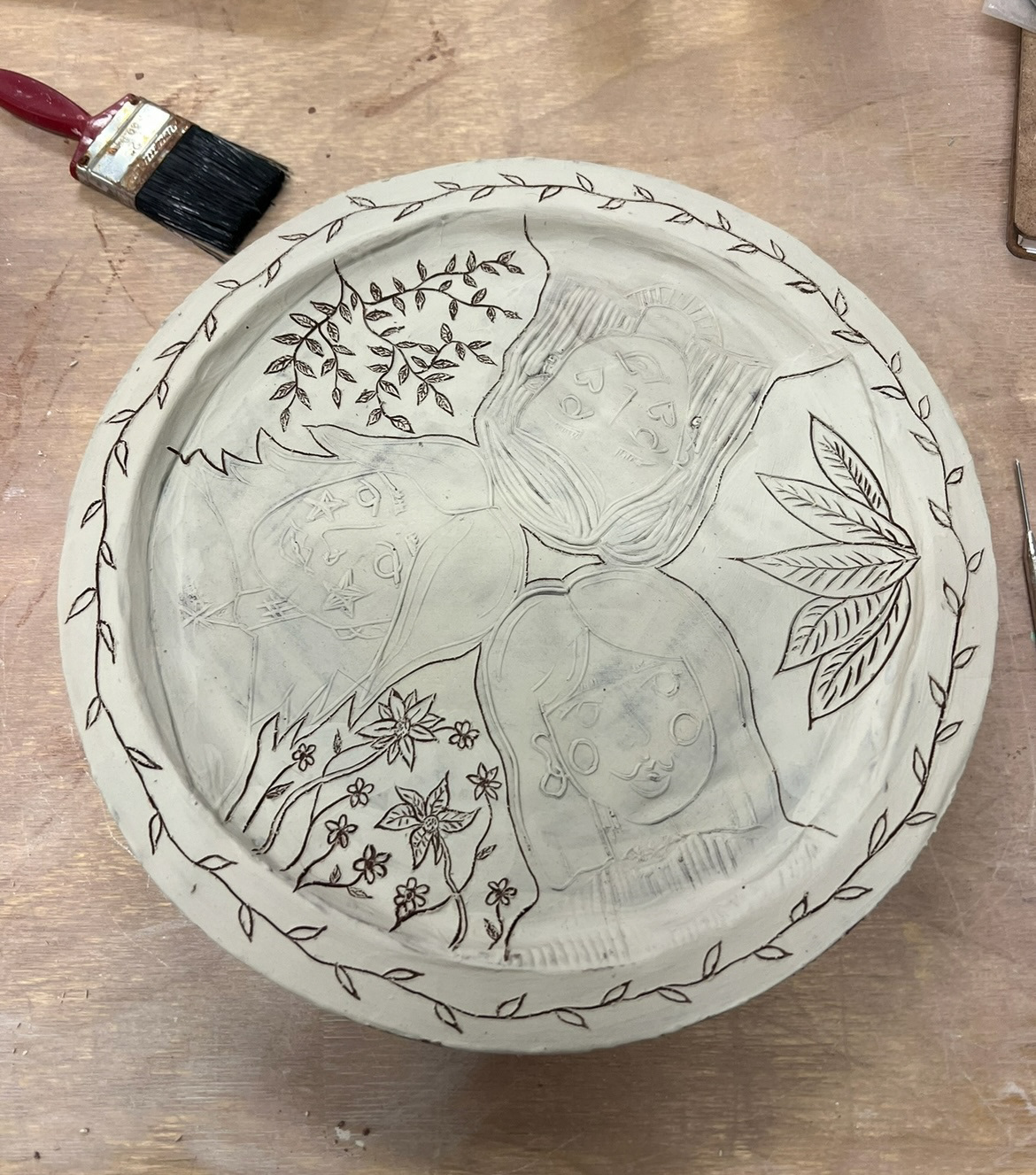
Now it was time to apply my design. I had to wait for the clay to dry to just before leather hard otherwise some of the surface of my plate would come up when I tried to lift up the Lino. once it was at this point, I applied my Lino and bashed it into the surface of my plate with a rolling pin, to make sure that all the detail of the Lino would be picked up when I removed it. This worked well however some grooves in my Lino were quite shallow so some areas of the print were quite hard to see, however I carried on to add some etching work into the rim of the plate in the pattern of vine leaves, inspired by my original drawing of my design and my print where I added fauna details.
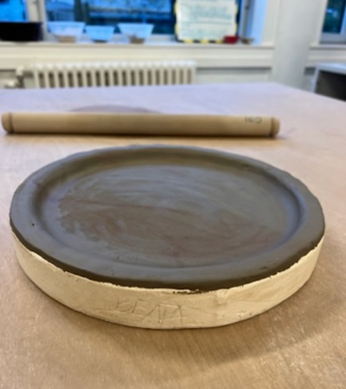
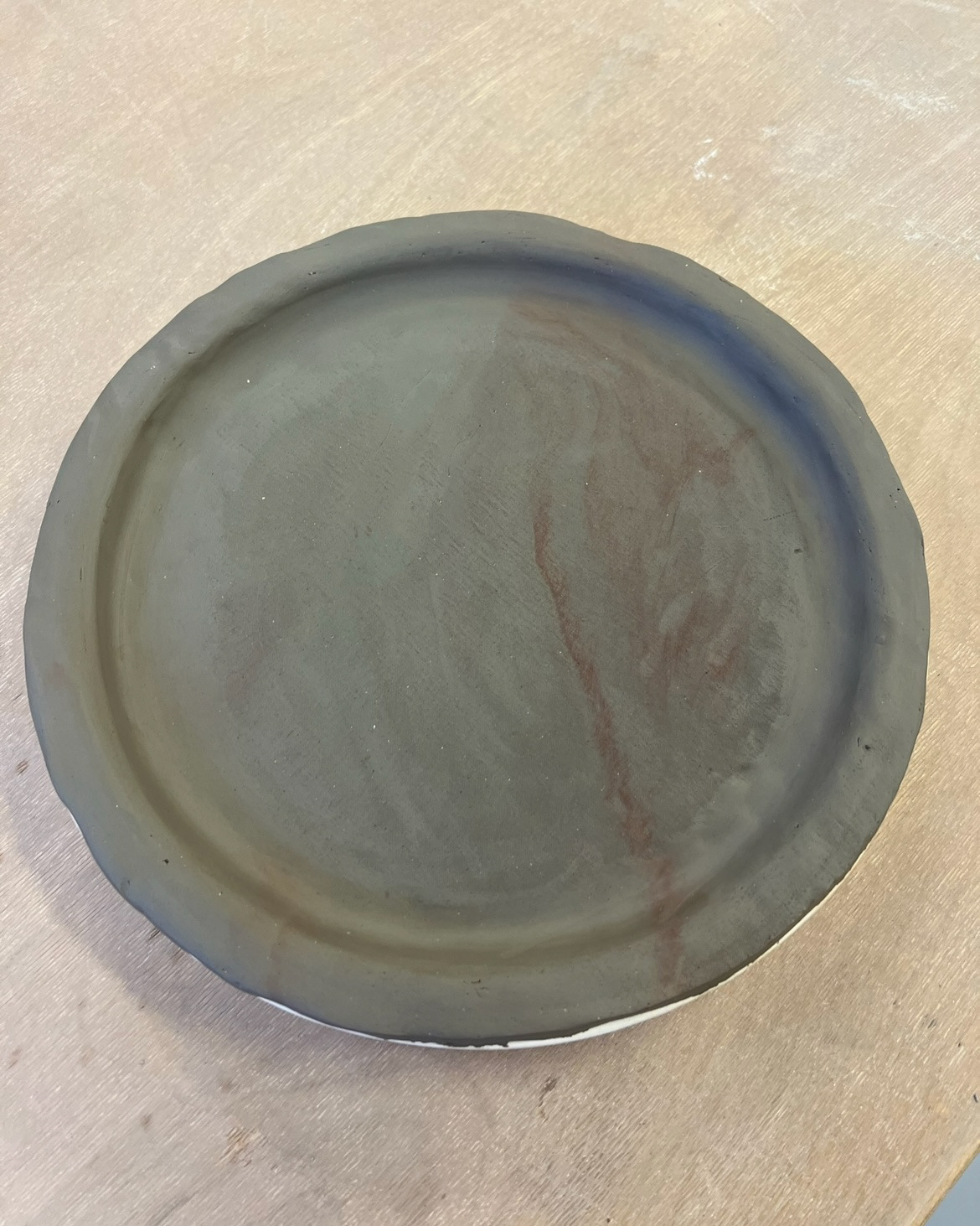
Not being very experienced in press moulding, I proceeded to leave this plate overnight in the plaster press mould, thinking that this is how long it would take for the piece to be dry enough to lift out of the mould. However, this proved to be far too long, and when I came back to my plate, it was far too dry and part of the rim had cracked and broken, but I took this as a learning experience moving forward that the clay did not need that long in the mould, and to re-make and improve on this plate when I make it again next.
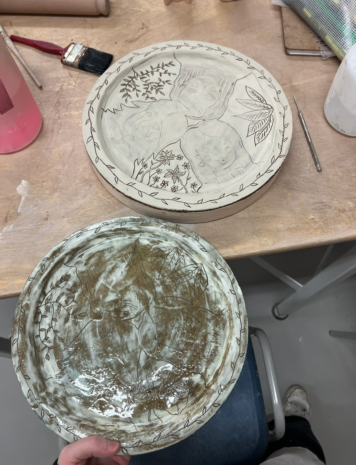
To re make my plate, I repeated my process for making the form in my press mould. However I had since had time to review my design choices and was inspired by our slip trailing workshop to work with slip and take inspiration from my original design drawing and make my plates almost entirely black and white bring out detail and make my surface design more striking.
This time, before applying my Lino, I brushed on a layer of white slip. before letting it dry completely, I applied my Lino in the same way as before, this was the wrong decision though because a lot of the slip layer was taken up by the Lino so I had to take as much slip off my clay as I could and start the whole plate making process again. This time however before applying my Lino, I let the slip dry to the point where it wouldn't be picked up by the Lino, but was still malleable enough to not crack when taking the indents of the Lino, I used a hairdryer to ensure that the slip was consistently dry all over the surface. I also went back into the Lino with my Lino tools to make some of the grooves deeper so that they would be more readable in the clay.
I repeated my process with the Lino, this time with the slip on and the correct dryness. it worked really well and I was finally pleased with the results. Also inspired by my original design drawing and my print, I went in and applied some sgraffito in the slip to make my design more dynamic and to get a contrast of the design being carved into the clay as well as being raised from the clay, where my Lino print was. I was finally happy with this plate so let it dry the appropriate amount, took it out of my mould and put it on the shelf, ready to be bisque fired.
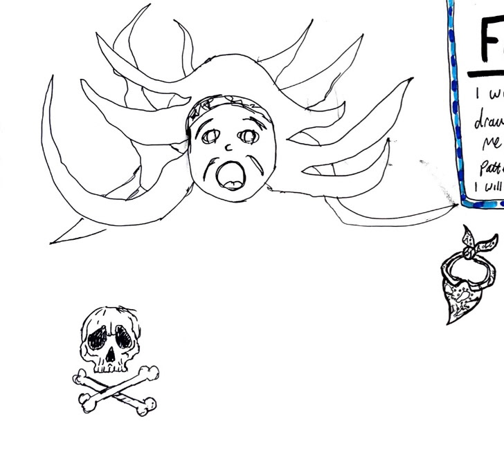
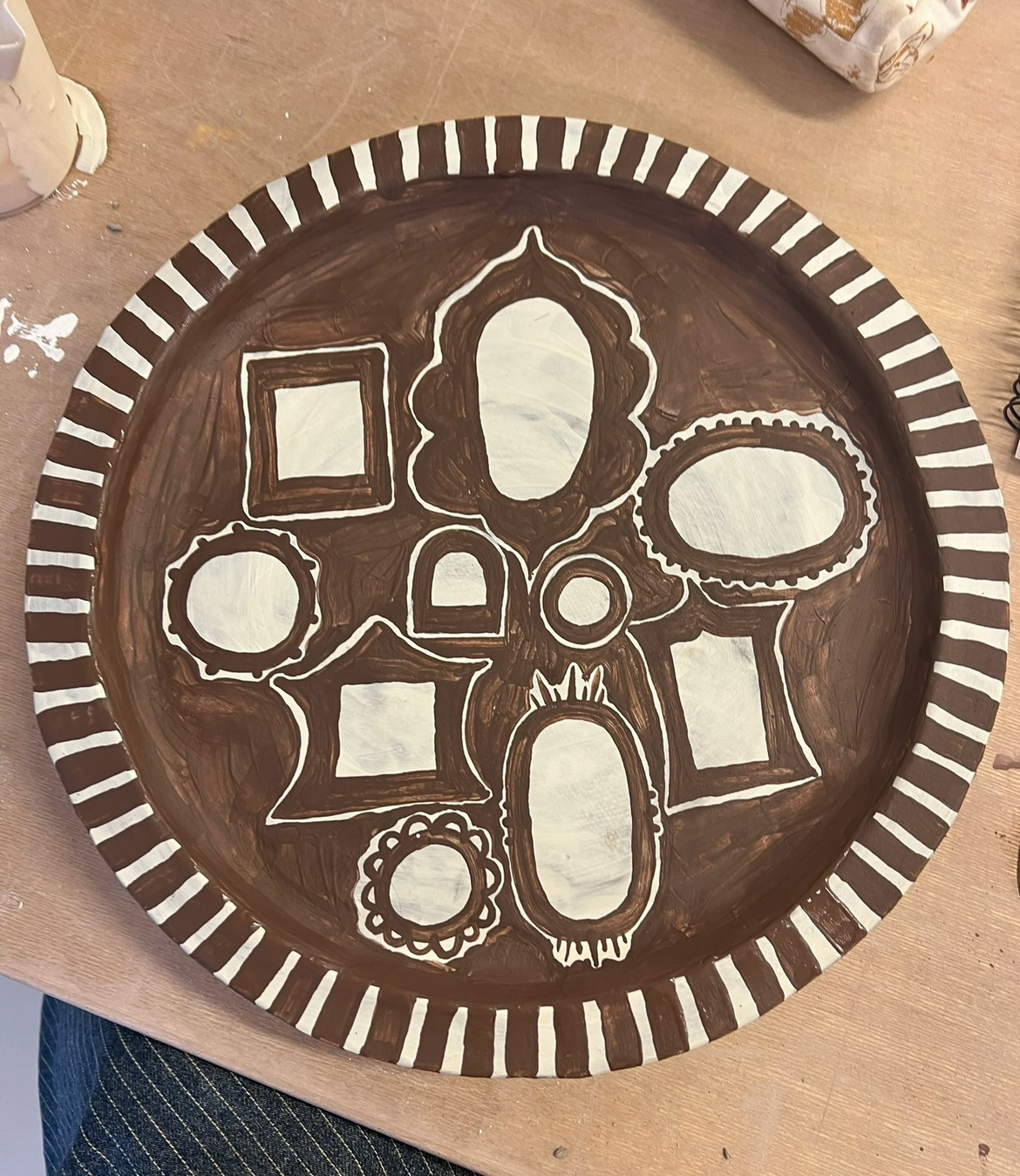
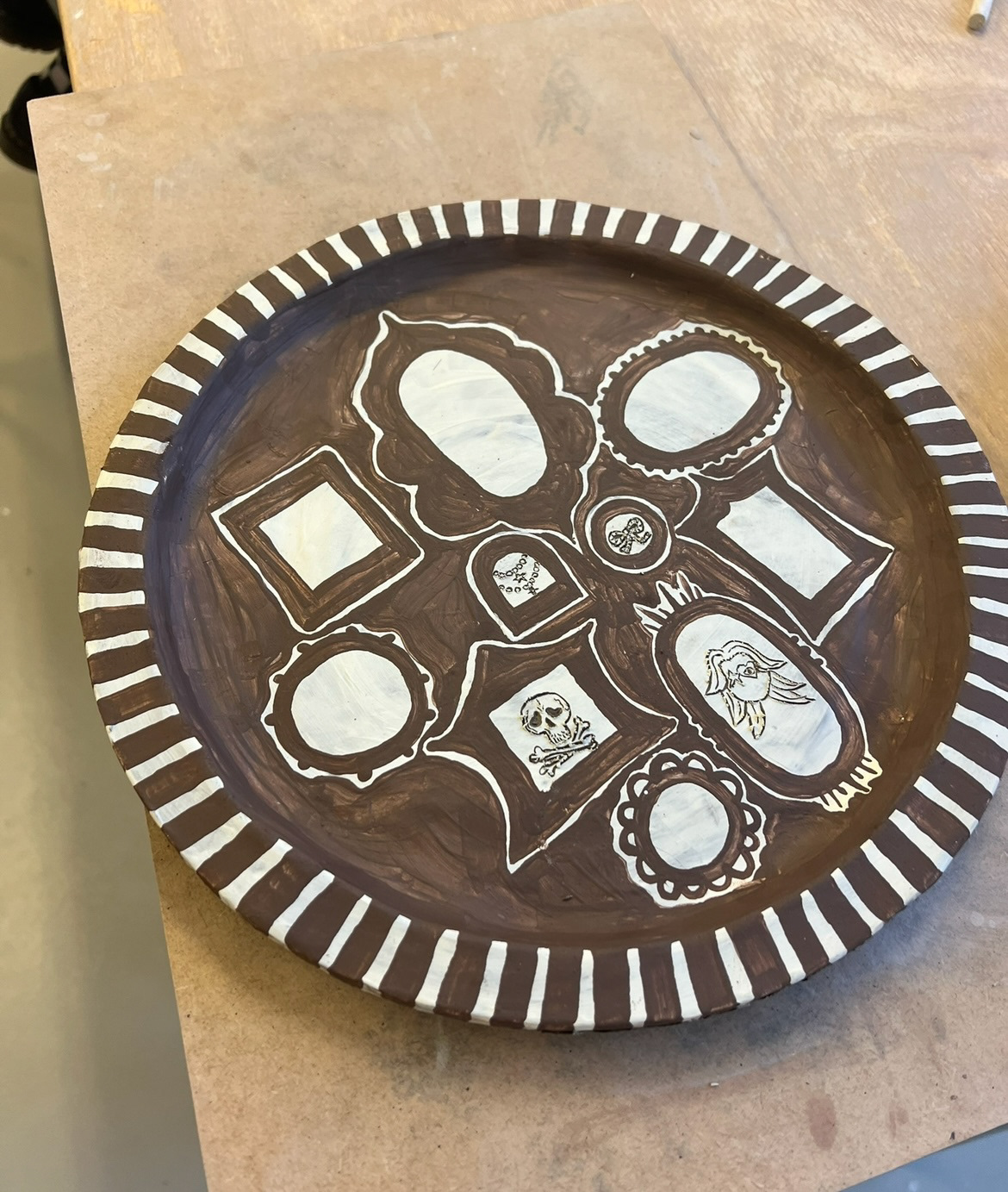
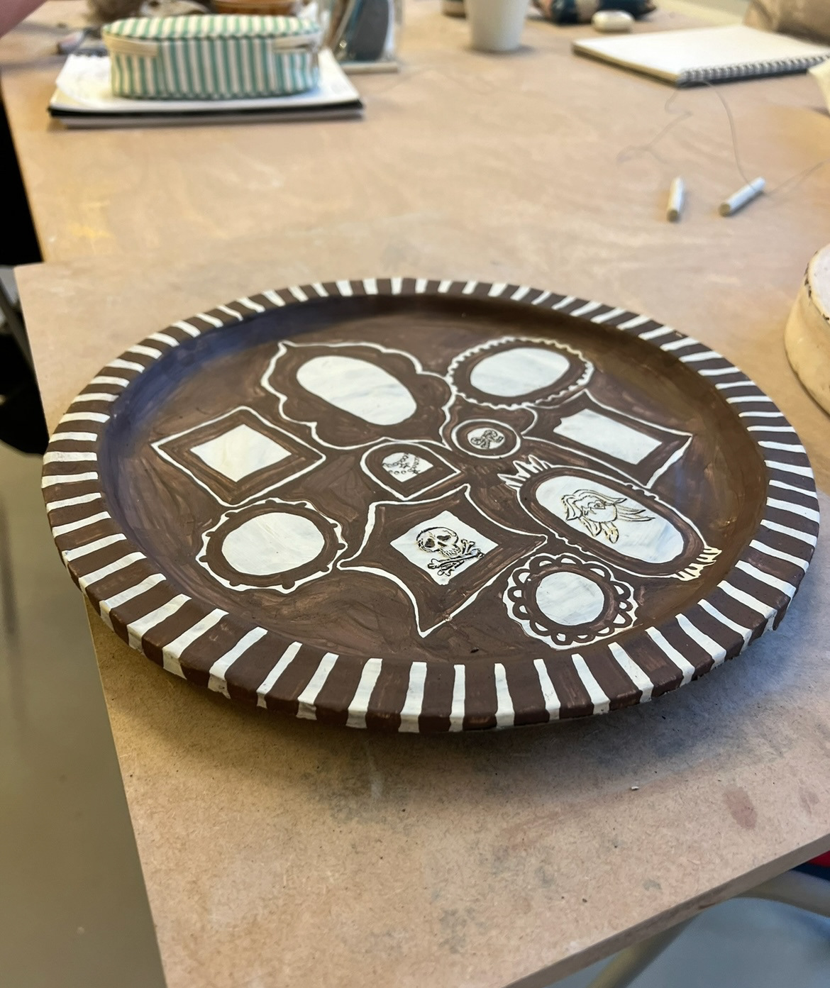
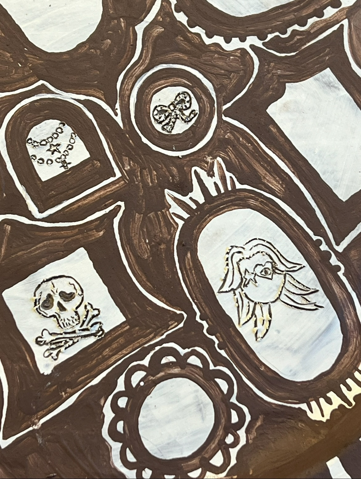
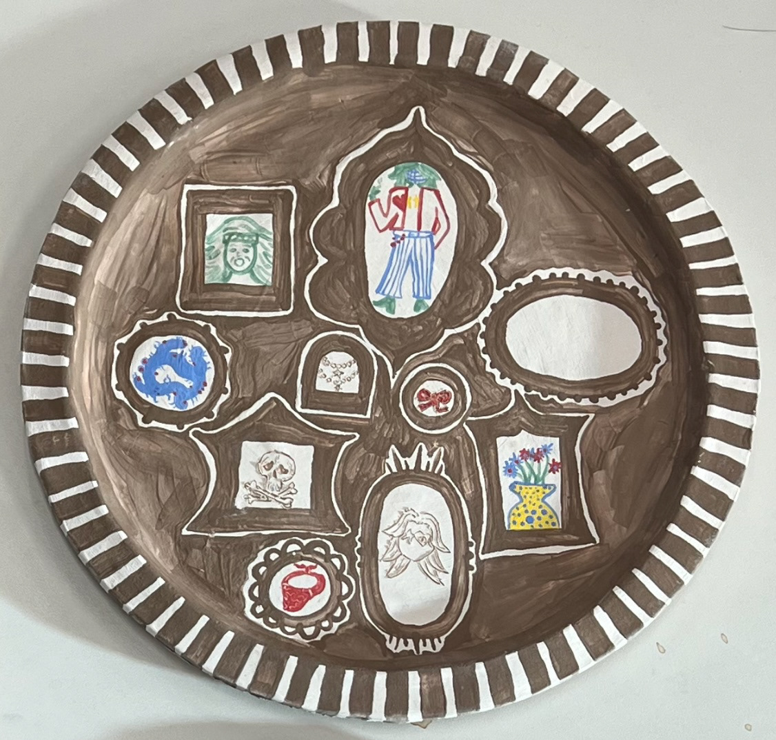
Now it was time to start thinking about my next plate and how I would execute its making. This plate was to be surrounded by the idea of friends and their perceptions of me and my self. I spent quite a while trying to think of how I thought my friends and the people around me, perceived me, but I thought that this would defeat the point because depicting my ideas of their perceptions would not be authentic to the concept. So my solution was to ask my friends and close ones to draw a doodle, likeness, item or creature that in their mind represented me. I would then illustrate my plate with picture frames like a gallery to display their artworks. (The artworks they sent me below).
Now that have my initial design and my content drawings I could embark on the making of my second plate.
I once again repeated my plate forming process, including the white slip layer present on my previous 'Family' plate. I then looked at my original design drawing to take inspiration for the placement and shape of my picture frame illustrations. I painted these in with black clay slip, again, which I had used in our slip trailing workshop. I tried to stick closely to my original drawing design, however I did change some of the frame shapes and sizes so that they would be appropriate for the drawings that would be placed inside them, swell as the size and shape of the plate. I then painted the rest of my plate with black slip, leaving a thin white outline around my frames so that they would stand out. I also painted the striped rim. inspired by the sgraffito present on my first plate, I decided to complete some of the more thin line drawing using the same technique, I think this worked really well and was a good use of this technique in correlation with the drawings. By the time I had completed all of this, my plate was now dry enough to take out of the mould, this would now be left to dry further and be put on the bisque shelf for firing.
Whilst these two plates were in the kiln, I could start designing and making my object and true self plate.
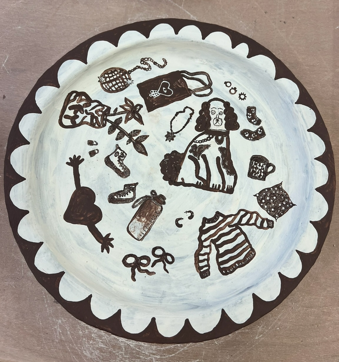
I started off my object plate by thinking of the objects that meant the most to me and felt like a part of myself and my identity. I decided to illustrate these items as designs to feature on my plate and write about what they meant to me and why.
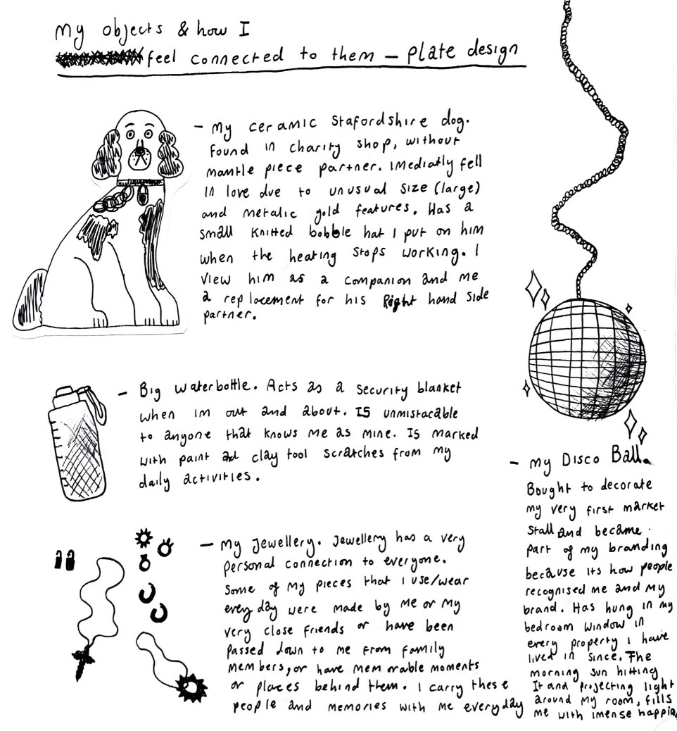
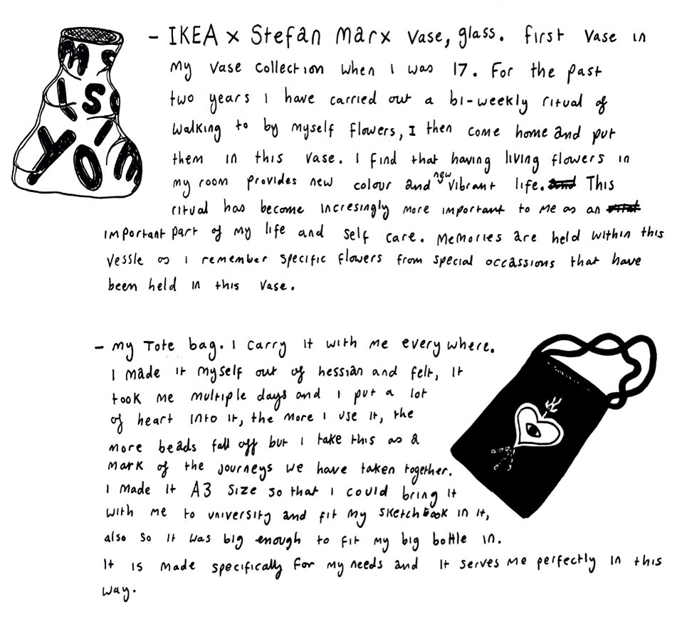
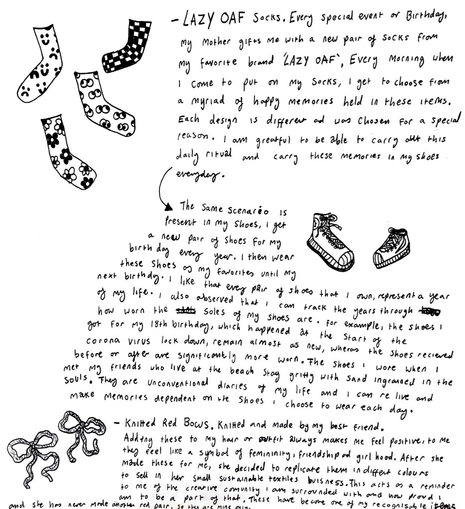
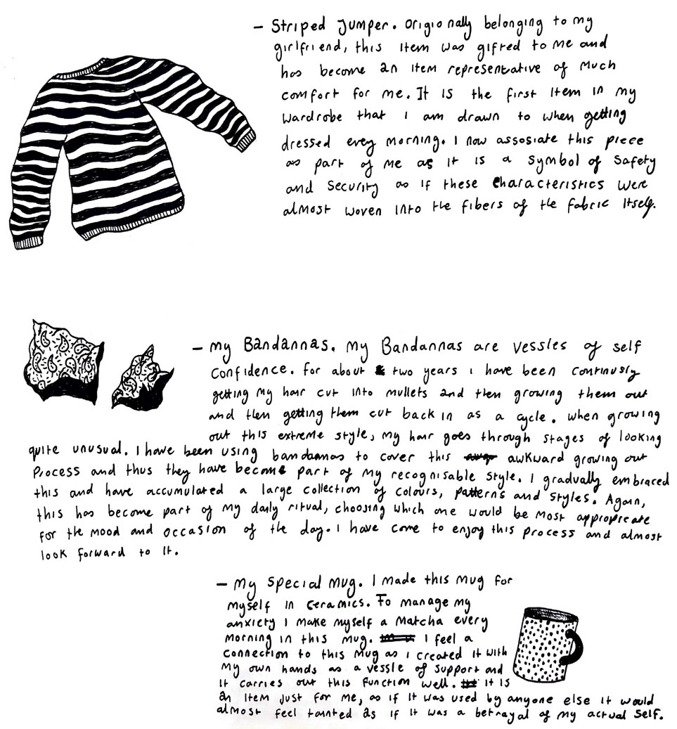
Now that I had my illustration designs, I could start making this plate. I again repeated my mould technique with my mixed clay, again painting my moulded plate with a layer of white slip. I then, using black slip, arranged and copied my designs onto my plate, adding some additional objects such as my favourite heart shaped pillow with arms which was gifted to me by my mother when I left home. This process of painting these illustrations took a very long time and to get each illustration just how I wanted, took a lot of wiping away, waiting for the right slip dryness and re painting over the top. I also went in with a pin tool to carve out some of the finer detail in some of my illustrations. Once I was happy with how all of the illustrations had turned out, I painted a border design on the rim and removed the plate from its mould when it was dry enough to do so. Because of how long I spent making this plate and the love held in every illustrated item, this quickly became my favourite and most precious plate of the set. I then put this plate on the bisque shelf ready for firing. (plate below)
Finally it was time to design and make my final plate. This plate would be representative of my 'True Self'. I surprisingly found it extremely difficult to come up with and execute a design for this plate in particular as I found myself constantly trying to come up with designs which I would then edit to be perceived well by other people instead of being true to the 'true self' I was trying to depict. I tried designing a creature that represented me, symbolism and even an edited version of my face, however this neither fit into the illustrative style of my plates, nor captured the spirit that I was trying depict. (these three design concepts below.)
I found that the more I thought about my design, the further from truth it became. So I decided that I would go ahead and make my plate and whatever I decided to design freehand onto my plate in the moment, would be the most true to 'true self' as I could possibly get, as it would act as a stream of consciousness straight on to my plate.
So this is just what I I did. Again, I repeated my clay moulding process. I then let my imagination take over, I painted my plate surface with black slip this time as I already had a plate which was strictly exclusively white slip, I thought I would create a spectrum and make this one strictly, exclusively black slip. I used sgraffito to carve shapes and patterns into the surface of my plate, using the raw clay as a contrast to the dark black slip to make my design stand out. in the end this plate came out nicely and I was finally confident that I had captured the 'true self' accurately, if not partially accurately. once I was happy with it, I could then lift this plate out of the mould and leave it on the bisque shelf for firing. (plate below).
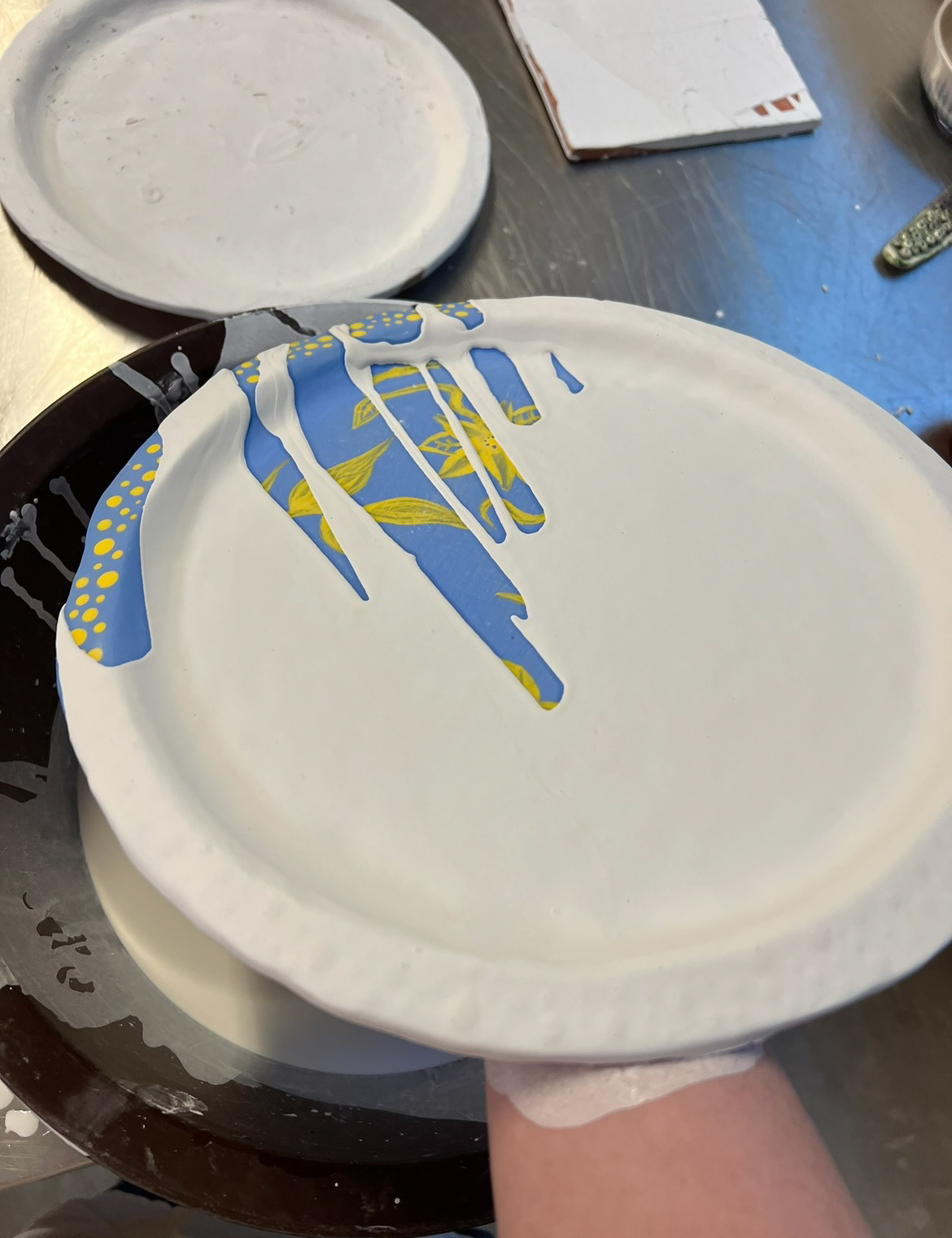
By this time my first two plates (family and friends) were out of the kiln and successfully fired to bisque. Now it was time for glazing. For my friends plate I decided that I would paint the majority of my friends drawings in their frames using underglazes, which would then go darker after firing with a clear shiny earthenware glaze over the top, I then also thought for this plate that I would use a photo transfer to transfer over one of the more detailed drawings, this step however would have to happen after the clear shiny glaze had been fired. So for right now I would copy my friends drawings using underglazes. Once I had done this, my plate went in for a second firing before it could have its shiny top glaze applied. (friends plate below).
My 'Family plate' however did not need any additions of underglazes so was ready to be sealed with a clear shiny earthenware glaze. When thinking about the glazing of this plate I thought about my experiments I carried out around highlighting texture using my medusa tiles. My findings from these tiles were that more than any colour or oxide, the shiny finish of the clear shiny earthenware glaze was enough to highlight the level of detail I set out to highlight. Also no oxides could be used on these pieces anyway as the use of them would render my plate not food safe.
When it came to glazing this plate, Rudy helped me and ran a mini, one on one workshop to teach me the correct technique to use when glazing a flat plate, to achieve an even, flat layer of glaze over the surface of the piece.
He taught me to hold the plate facing away from me while resting it on my forearm and holding it on the tips of my fingers. I then poured the glaze around the rim in an arching motion to follow the edge of the plate, making sure to pour the glaze consistently and at a consistent speed so that the glaze would be even all over. I then wait a minuet and repeat this however just over any places that the first pour missed. I then place the plate carefully down on a surface and use a brush to paint glaze in any smaller spots that were missed, for example where my finger tips were covering. I then, use my fingertips in small circular motions to gently smooth out any bubbles of drips in the glaze. I then turn the plate over and wash any glaze off of the bottom of my piece using a damp sponge. finally I can put this piece in for its final earthenware firing and wait for my finished plate. (picture of one on one glazing workshop using an under-glazed practice plate below).
I decided to wait until this 'Family plate' came out of the kiln first before repeating this process across my other plates incase there was any problems with the glaze I had used or the technique etc. that I could emend when moving on the glazing the rest of my pieces.
I'm extremely glad I did this as it proved to be a very wise choice in the end when this plate came out of the kiln. it had a hole blown in it from an air pocket in the glaze and it turned out that my slip layer had been applied way too thin. once the shiny top glaze was applied and fired, almost all of the slip applied on my plate had almost completely disappeared. This was devastating to say the least as I had applied the slip to all of my plates the same way and now that they had been bisque fired, this was irreversible and I would not have enough time to re make all of my plates so that they would survive glazing. I was especially upset because the plates such as my 'Friends plate' and especially the 'Object plate' relied on slip application almost exclusively as their surface design, both of which I had spent many hours on and put a lot of hard work into, I found that to glaze them would be to loose all surface design so I had to make the choice to either sacrifice all of my hard work and surface design in place of function or keep my plates as decorative prototypes and sacrifice their functionality as usable dinner plates. I chose the latter, as I thought that the story and message of my plates were told through their surface decoration so it was more important to show than not. (glazed plate below).
However I was now in a quandary because I had now effectively lost one of my plates, so I no longer had a cohesive set, so I would have to make this plate over for a third time.
When making this plate for hopefully the third and final time, I decided to mix a clay that had a higher ratio of terracotta to crank and almington. I did this because on my last plate I found that when the almington level was higher, the sgraffito aspects did not stand out as much as I would like as it fires to a lighter pale pink sort of colour which I think in some places got lost against the white slip. This time using more dark terracotta would ensure that the clay that was visible through the slip was darker and therefore the sgraffito illustration would show through more and be more impactful.
To make my final plate I repeated my process of wedging, double rolling my clay and forming it into the mould. I then applied thicker white slip so that one day if I did want to take the chance and glaze this plate, it would be more successful than the last time. I then let it dry to the appropriate level, applied my Lino, luckily and to my delight, it came out perfect first time and all of the detail was visible. I think this was perhaps partly due to the higher ratio of terracotta as this is a softer and more malleable clay than the other dark clays I have been using.
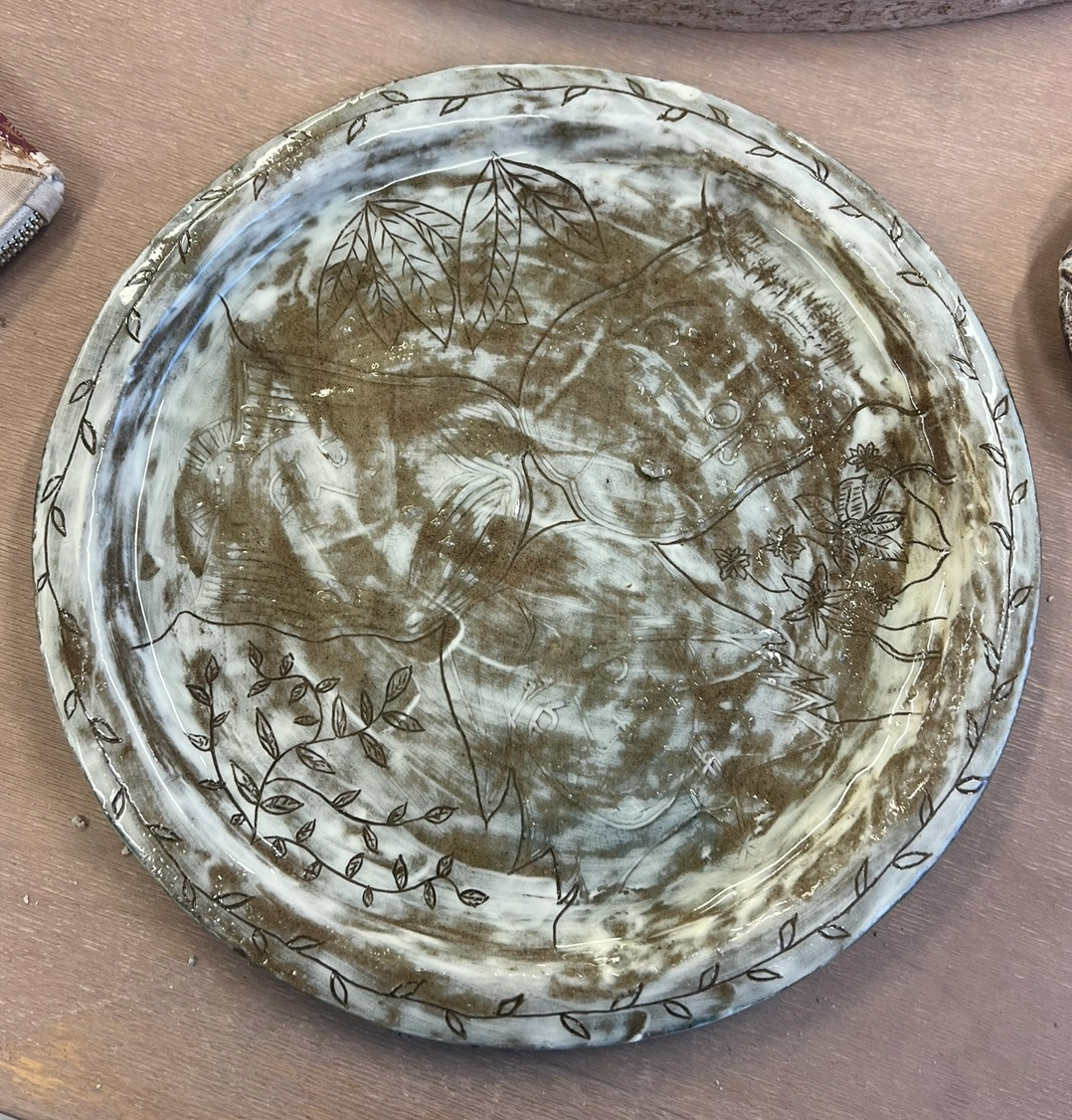
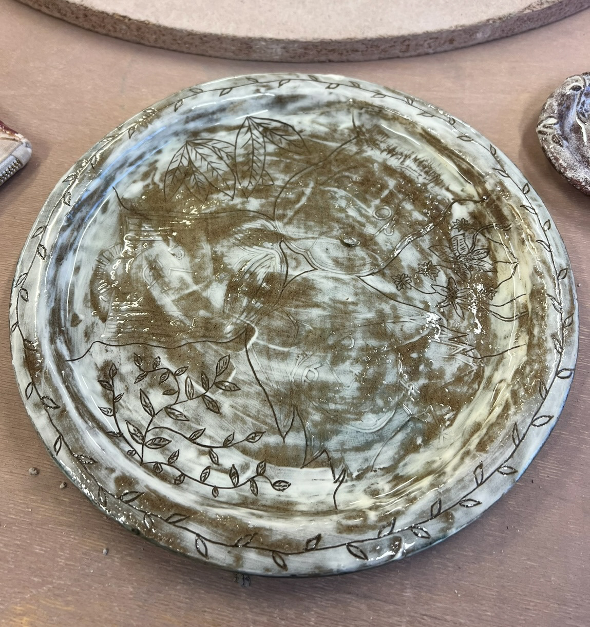
once I had removed my Lino and applied my sgraffito illustration, I could now lift my final plate out of its mould for the last time and leave it to dry on the bisque shelf where it would receive its only and final firing. I think this plate came out better than the two before it as I think the choice of clays defiantly impacted the detail of the design and allowed for the best possible outcome. This is something I will take into consideration when moving forward in my practice. (making and contrast pictures below).
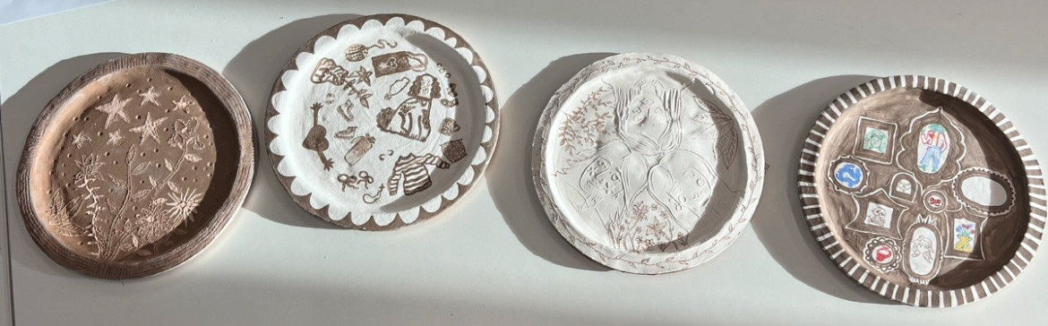
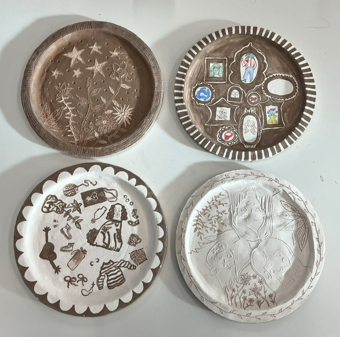
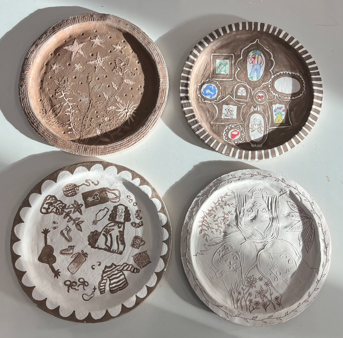
Once this plate was out of the kiln, I finally had a cohesive set of four decorative plates. I took them upstairs to the studio to photograph and display them.
Whilst reviewing my plates and samples and having a discussion with CJ we decided that it may be beneficial to have another shop at glazing another one of my plates, so that I would have an example of a plate with glazed black slip. We decided on taking this gamble with my 'true self' plate as the majority of the detail was done using the technique of sgraffito so that if all of the slip disappeared once it was glazed, the majority of the surface design would still remain.
So I took this plate back down into the glazing studio and repeated the plate glazing process that Rudy taught me, and put this plate in for its final firing. (final plate with glaze on below).
Once this plate had come out of the kiln, I was finally able to put it on display for hand in alongside my artist statement. (below).
(Artist statement below).
(Pieces in context below).