In this project I will be researching the future of my craft career and developing my practice ready for my final year of study. I will be looking into pricing, marketing, making and more.
first in this project we had a talk with CJ explaining this unit. (notes from this talk below).
From this talk we learnt about a number of shows and competitions that would be options for us to apply for at the end of our third year. It was interesting to hear about the different types of shows and the demographics for each one, for example the Collect craft show has a higher price point market that great northern so that will be something to think about whilst developing and making and choosing which one to apply for.
immediately Collect took my fancy, as I am a fan of artists and makers who have shown / show their work there.
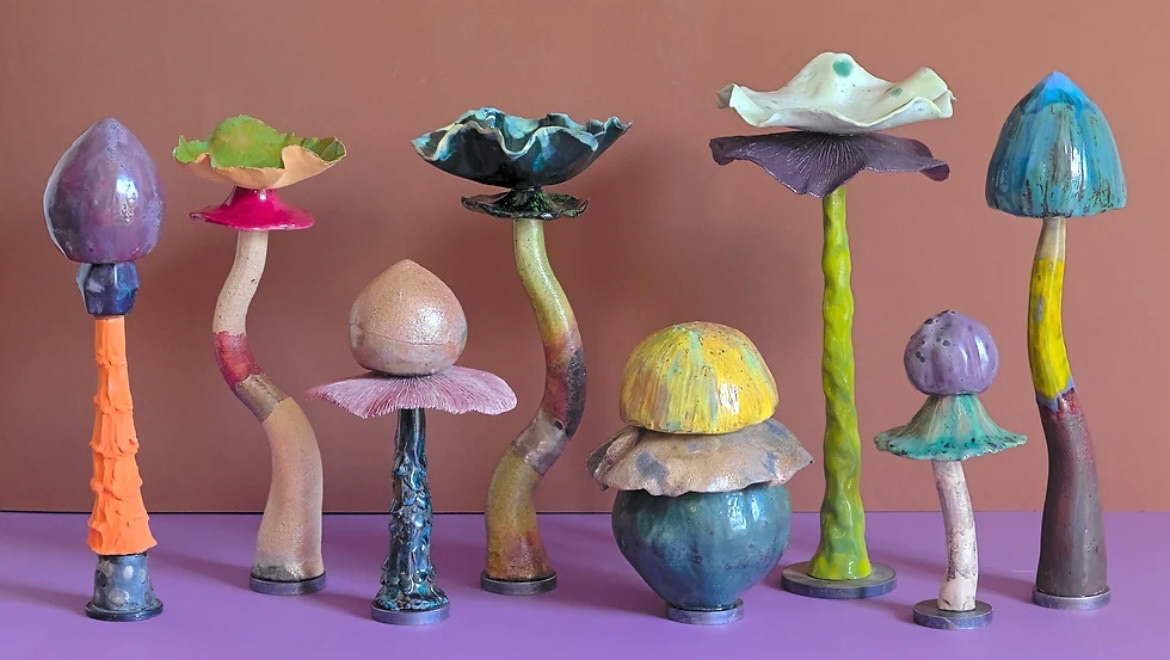
Artists such as Lucia Zamberletti I am a big fan of hers as I feel that she shares certain philosophies around ceramics that I do, such as this quote when talking about her work: "I also value imperfection which is a distinctive concept both in nature and in ceramics, I like to underline it in my works because it is how I mostly feel as a human being". I also, like Zamberletti, value imperfection in ceramics and underline it in my work; however I like it as the imperfections and human error in a piece ties that piece to its maker and to the history of the piece and the love behind the making of it. Zamberletti is also very explorative in her work, experimenting with different firing temperatures and processes, glazes, oxides and more, I really admire this playful approach to making. Zamberletti works mainly around the themes of nature, creating sculptures based of flowers, plants and fungi. Her work inspires me to explore more with colour and sculptural forms going forward in my practice.
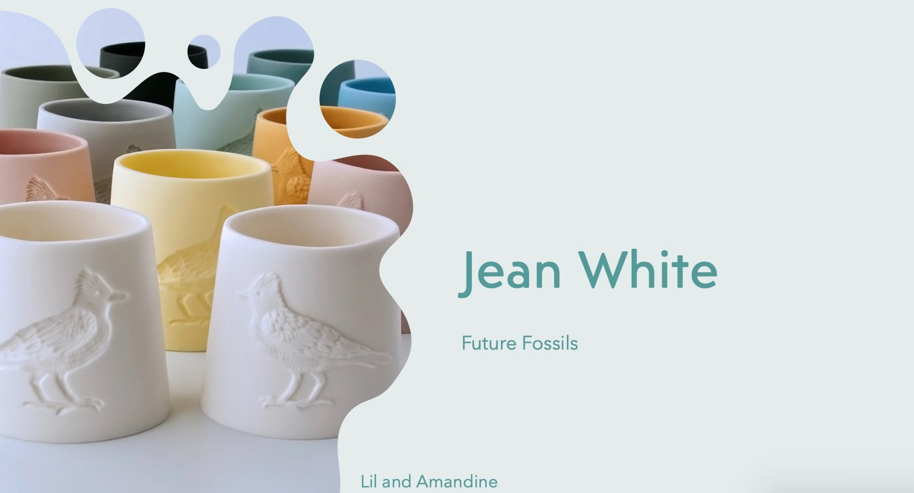
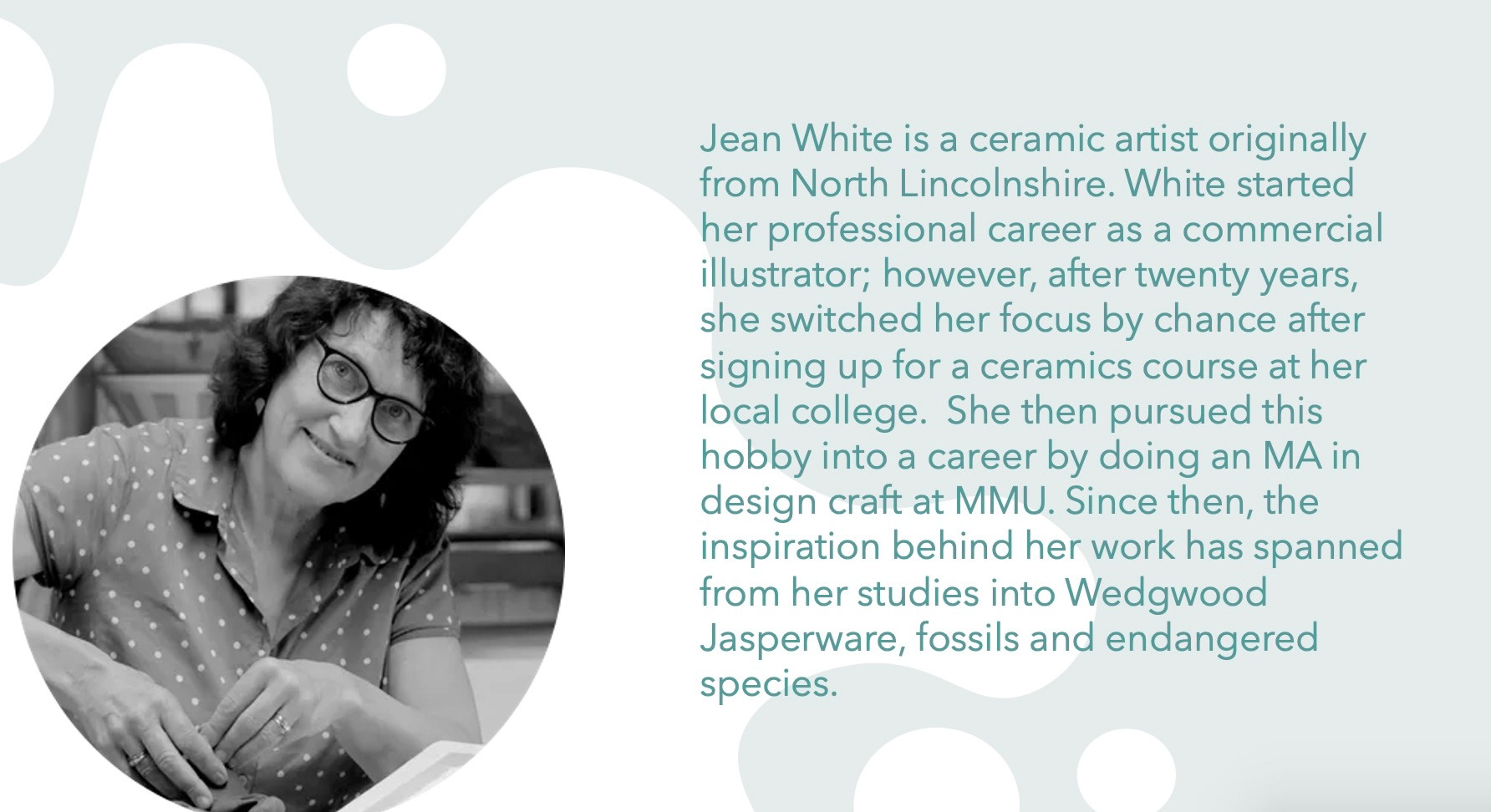
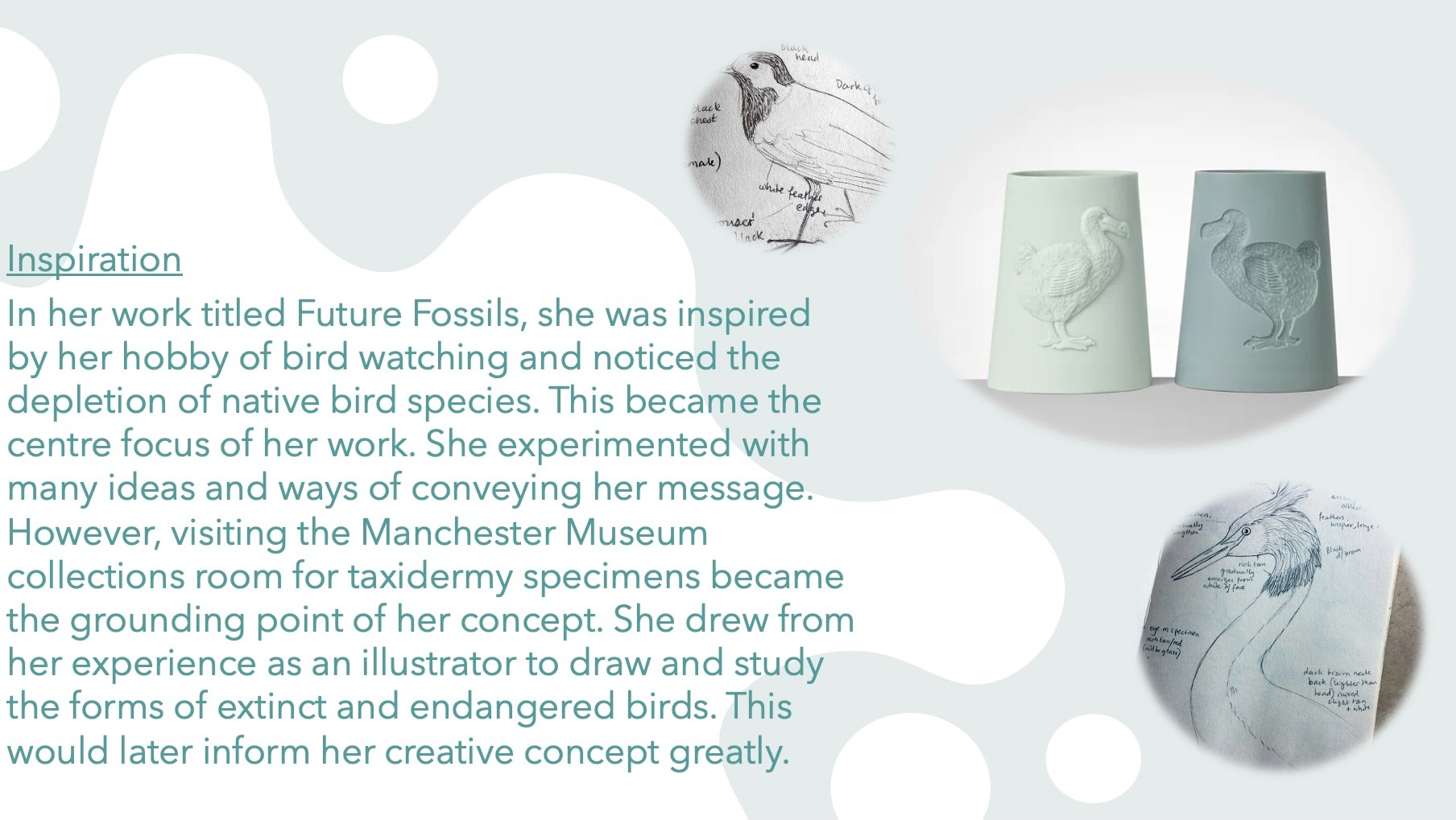
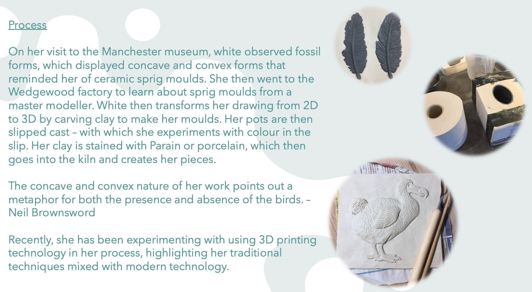
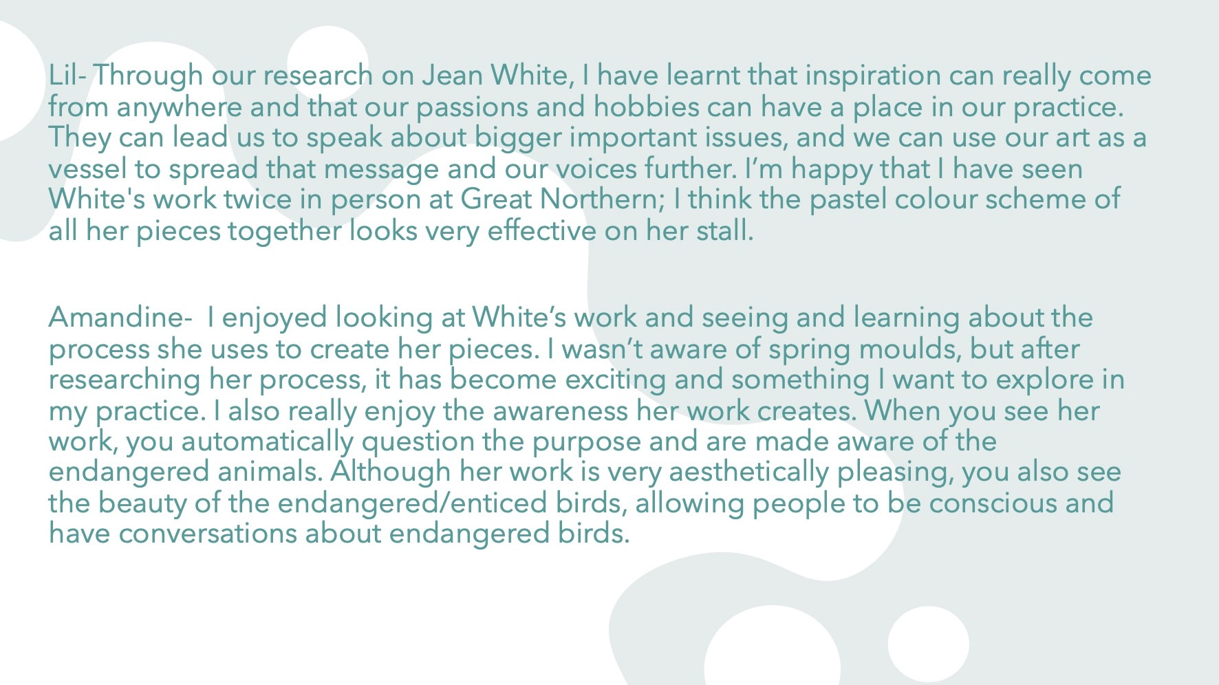
I also worked in a pair and did some research on an artist called Jean White and produced a powerpoint (slides below). I was lucky to have seen Whites work in person at The Great Northern Contemporary Craft Fair this year and the year before.
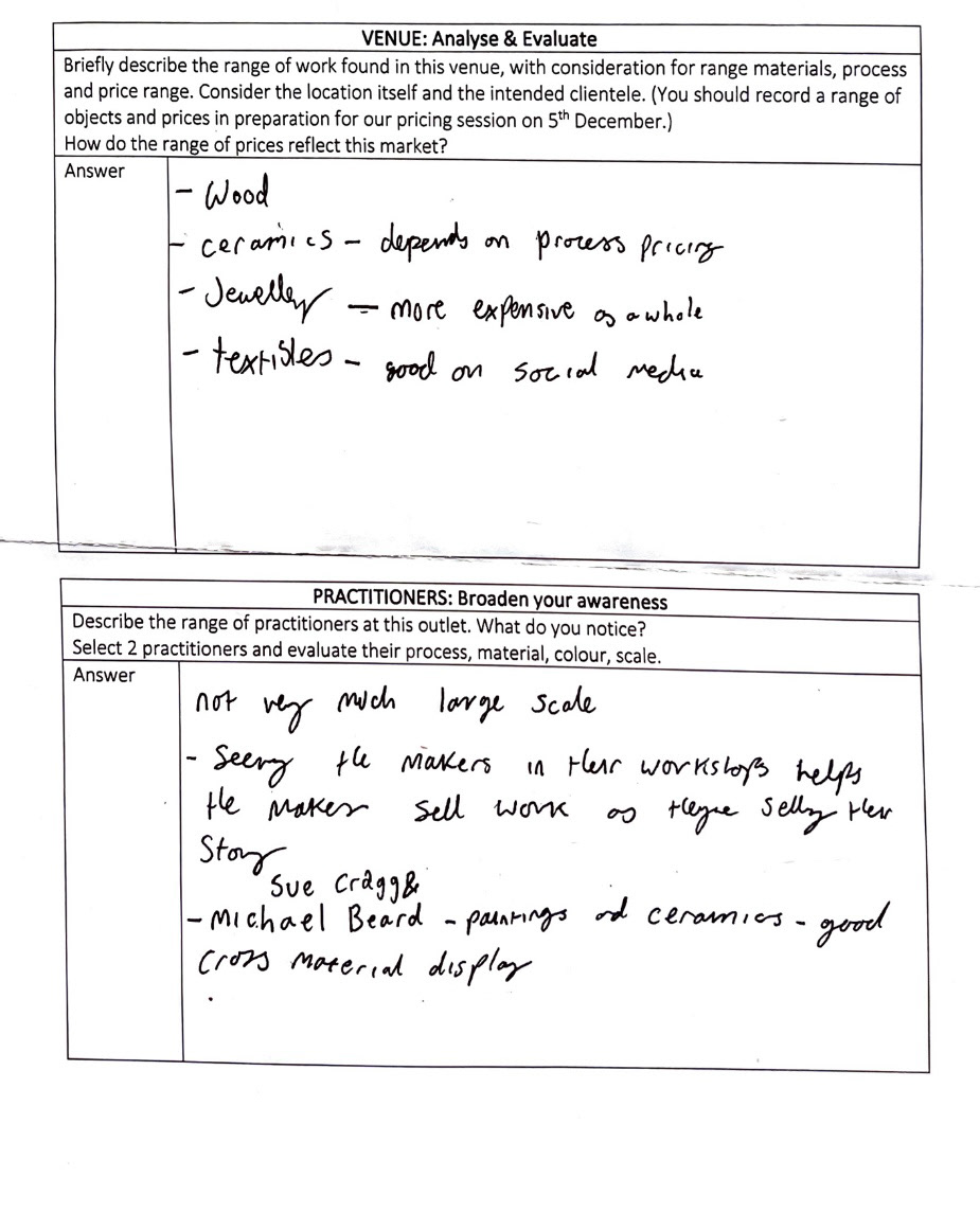
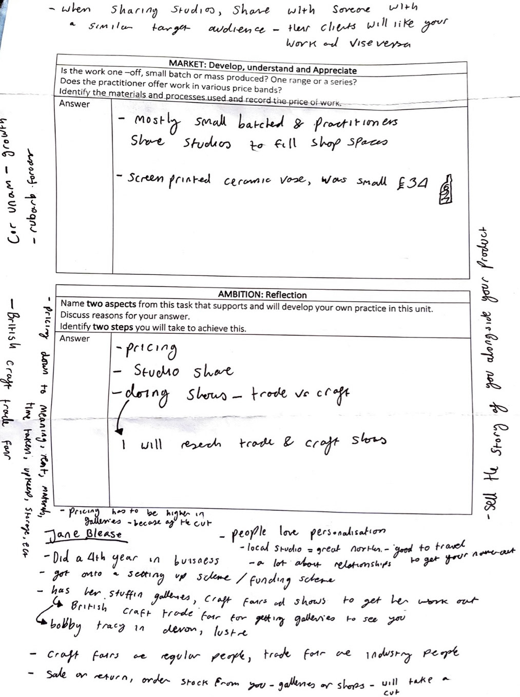
The week after this we took a trip to the Manchester Craft and Design Centre. I found this trip extremely useful, not only seeing a working studio and selling space but also talking to some of the designers and makers that make and work there. we filled out some question sheets and had a talk with Jane Blease, a maker who had a studio and shared a shop space there. One of the most useful pieces of information she gave was the difference between trade shows and craft shows, trade shows are we're industry people come and look at your work, more like Collect, whereas craft shows, like great northern are where the public come and look at your work, so catering your work to fit in at both is a very useful thing to do. (sheet with answers and talk notes below).
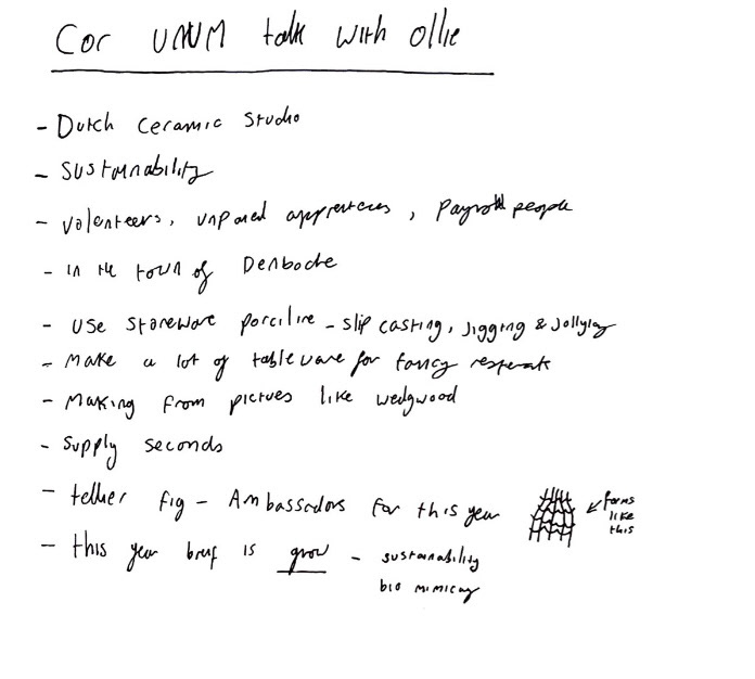
We also, the next week had a talk with a fellow student called Ollie who won the Cor Unum competition last year, (notes on his talk below). I had initially been quite interested in Cor Unum as it is a ceramics based, interiors based competition which speaks almost perfectly to my practice, however I did come to the decision that my personal work and ideas would be more suitable for the Collect and Great Northern shows instead.
We were challenged to come up with 12 initial ideas of what we are interested for our practices going forward. I have always had an affinity and passion with functional ceramics, as I have always been fascinated with the idea of the relationship build between person and object. I think the every day interaction and use of an object forms a bond and that object gradually becomes a part of you and your identity.
I find a perfect example of this in my own life is with my mothers collection of Emma Bridgewater crockery. Growing up, every meal time, snack, cup of tea and so on was served with Emma Bridgewater multicoloured polkadots. Gradually over time our collection grew and each new plate and mug bought came with a new exciting design, I found myself stood at the cupboard deciding which plate design fit my mood for that day or which mug fit perfectly with the personality of a guest . This almost daily ceremony I feel placed these objects in my soul and they some how became a part of me and my sense of home, Even the original cracked and chipped polkadot plates stay as a reminder of how we've aged together, the memories of those objects are a part of me and the memories through the chips and ware that I have caused are a part of them.
I think going forward in my practice I would like to explore this concept more and how the objects that surround us can influence emotion and identity. I came up with some of my 12 ideas with this in mind.
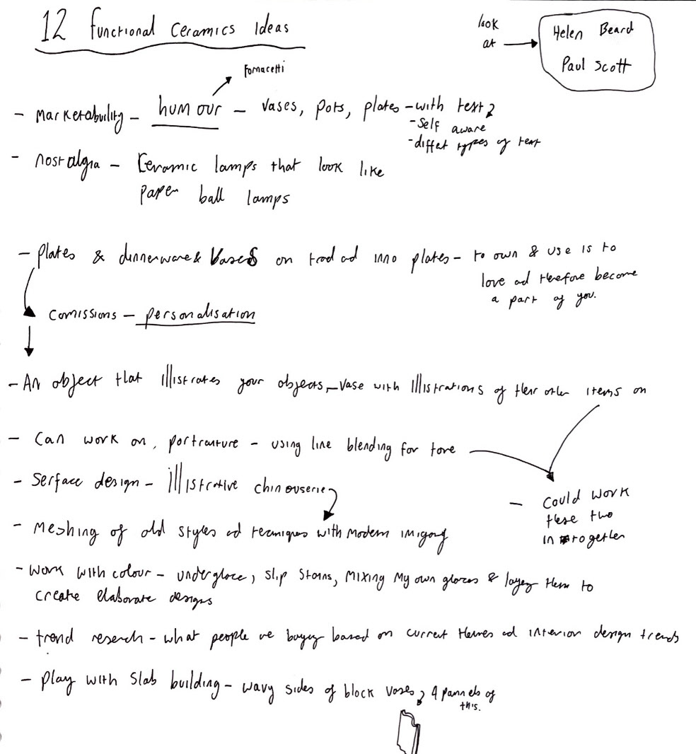
I decided from some of my ideas as well as from my progress on my Tradition and Innovation project that looking into surface design would be a good place to develop my practice. I'm a huge fan of colour and interesting imagery so I thought that exploring some initial imagery and styles for surface would be a good place to start.
I thought that it might have been interesting to work with a mix of more photo realistic styles incorporated with an expressive illustrative style.
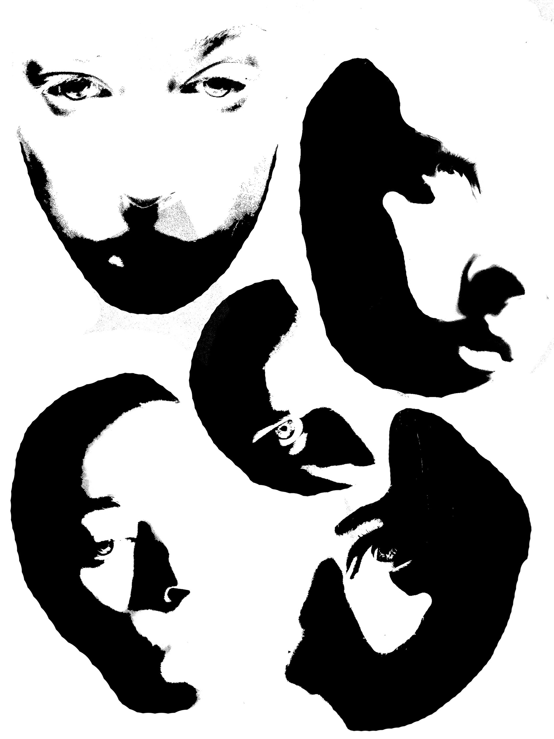
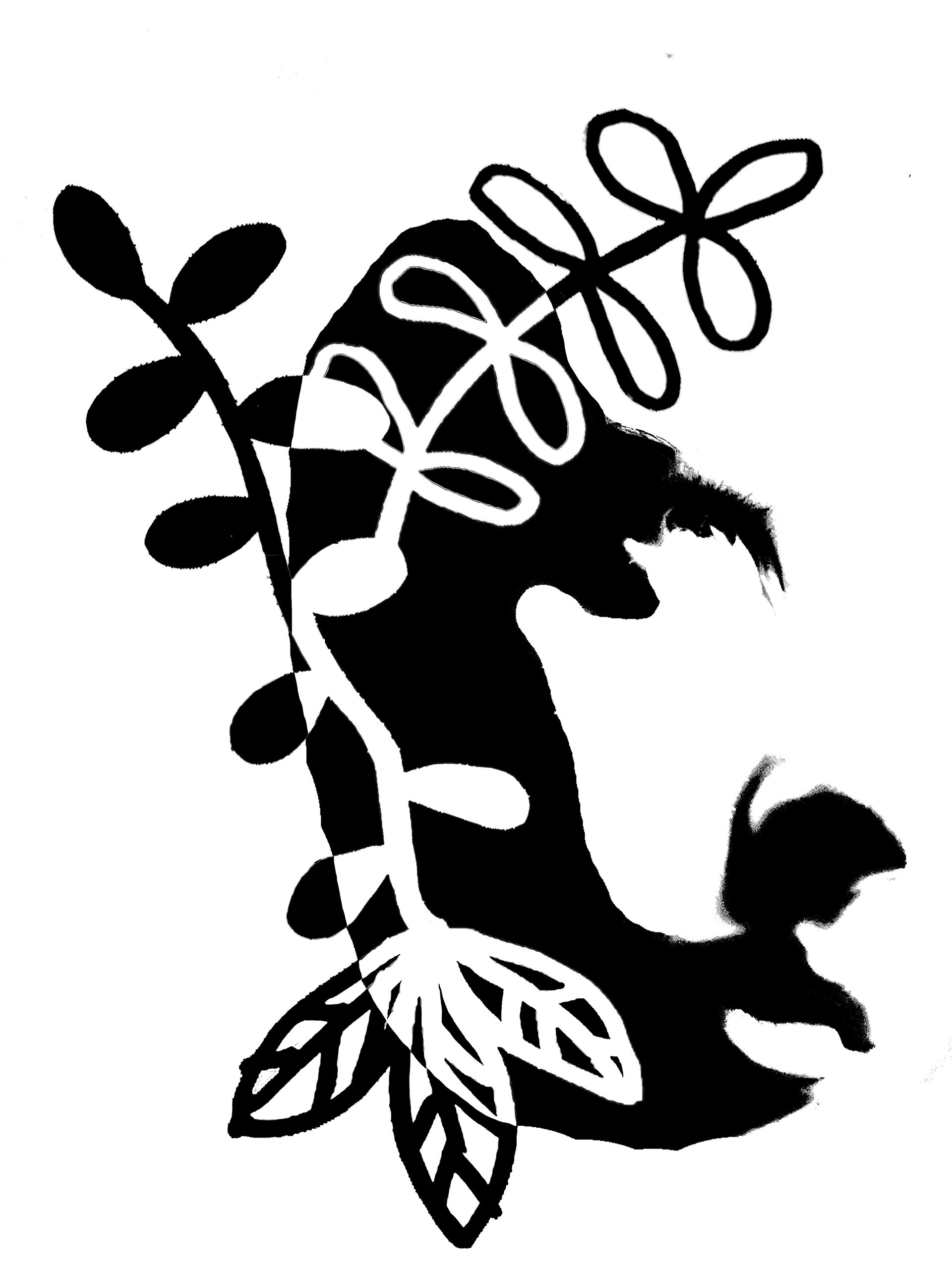
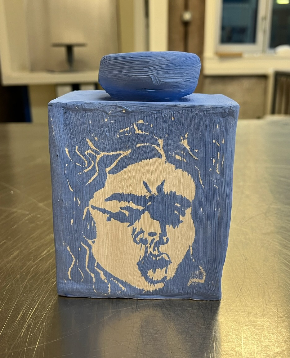
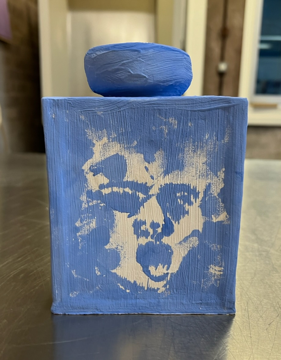
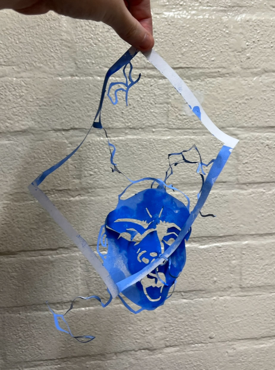
I was drawn to thinking about this as a possible idea, especially using illustration because it is something that I am passionate about. however the idea of using faces came from my tradition and innovation project as I had drawn and cut out a stencil of medusa inspired by Caravaggios' medusa, I had chosen this painting for reference as I was drawn to how expressive the face was. as my stencil was made out of paper so when I sponged underglaze through it, it almost immediately fell apart, the results being that the image left behind had almost more expression and emotion that the original image did because of its imperfections. I then printed with the broken stencil again and again the emotion changed to be stronger. I thought that this would be an interesting thing to try and harness. (pictures below).
I pinned this up as a possible starting idea and moved onto looking at some trend research as well as pricing which I hoped could inform some more solid ideas.
CJ ran a workshop on pricing. (notes below).
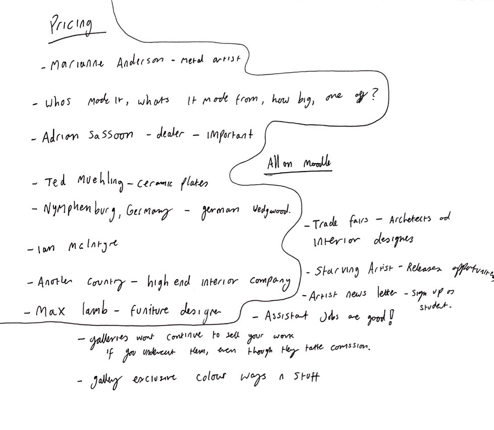
I found this workshop extremely helpful. it was very interesting to find out all of the factors that go into pricing. pricing can be affected by the materials you use, time spent on the making process, how big the piece is, who its for, how many of that piece are there (is it a one off?), if the piece is a limited edition, how / who are you selling it through, commission?. I also came away from this workshop with lots of information about makers, interior design companies and certain art dealers who are important to be aware of.
Next I completed task 4. (below).


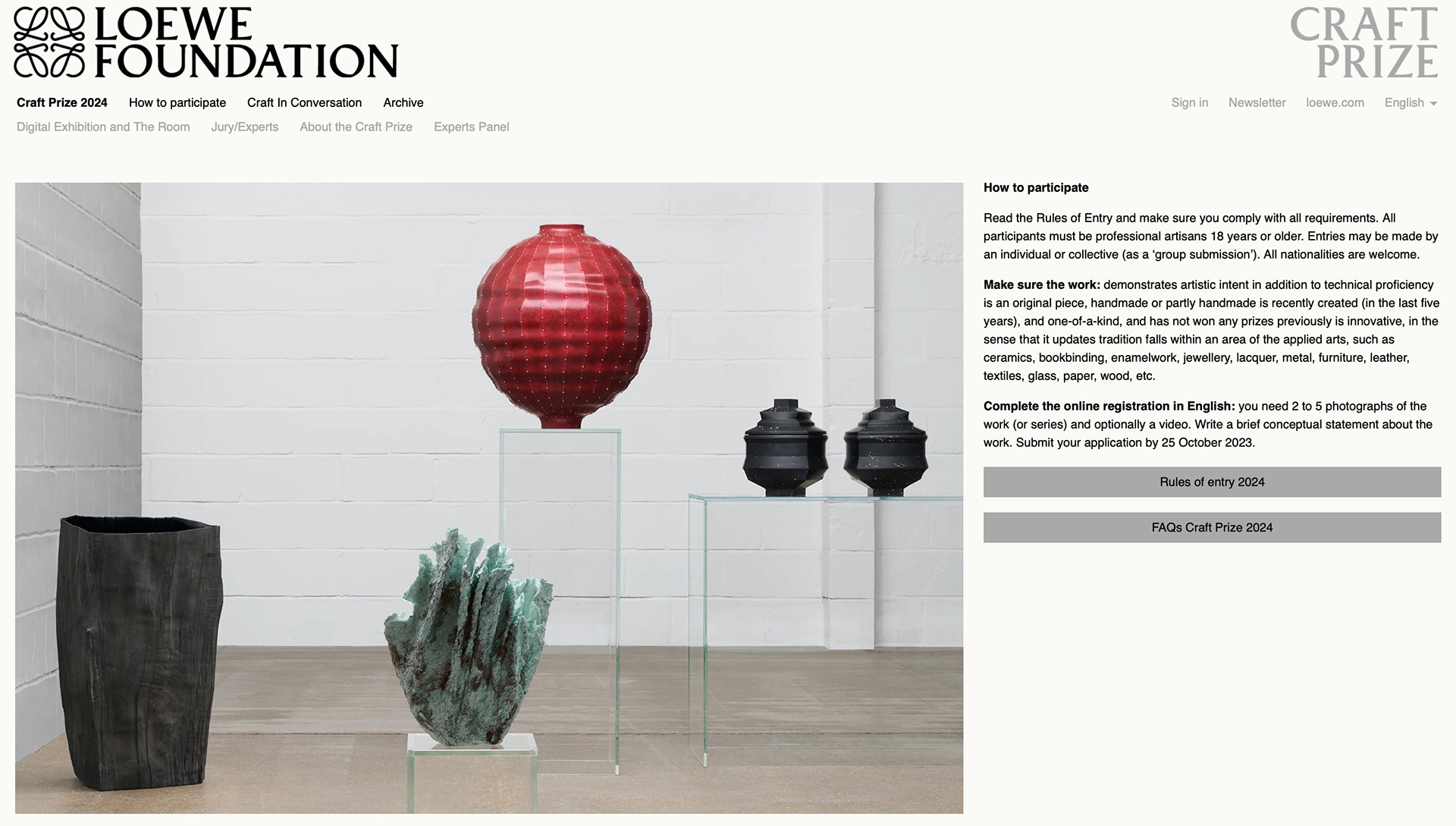
I also found as a bonus, a competition called the Loewe Foundation Craft prize. (info below).
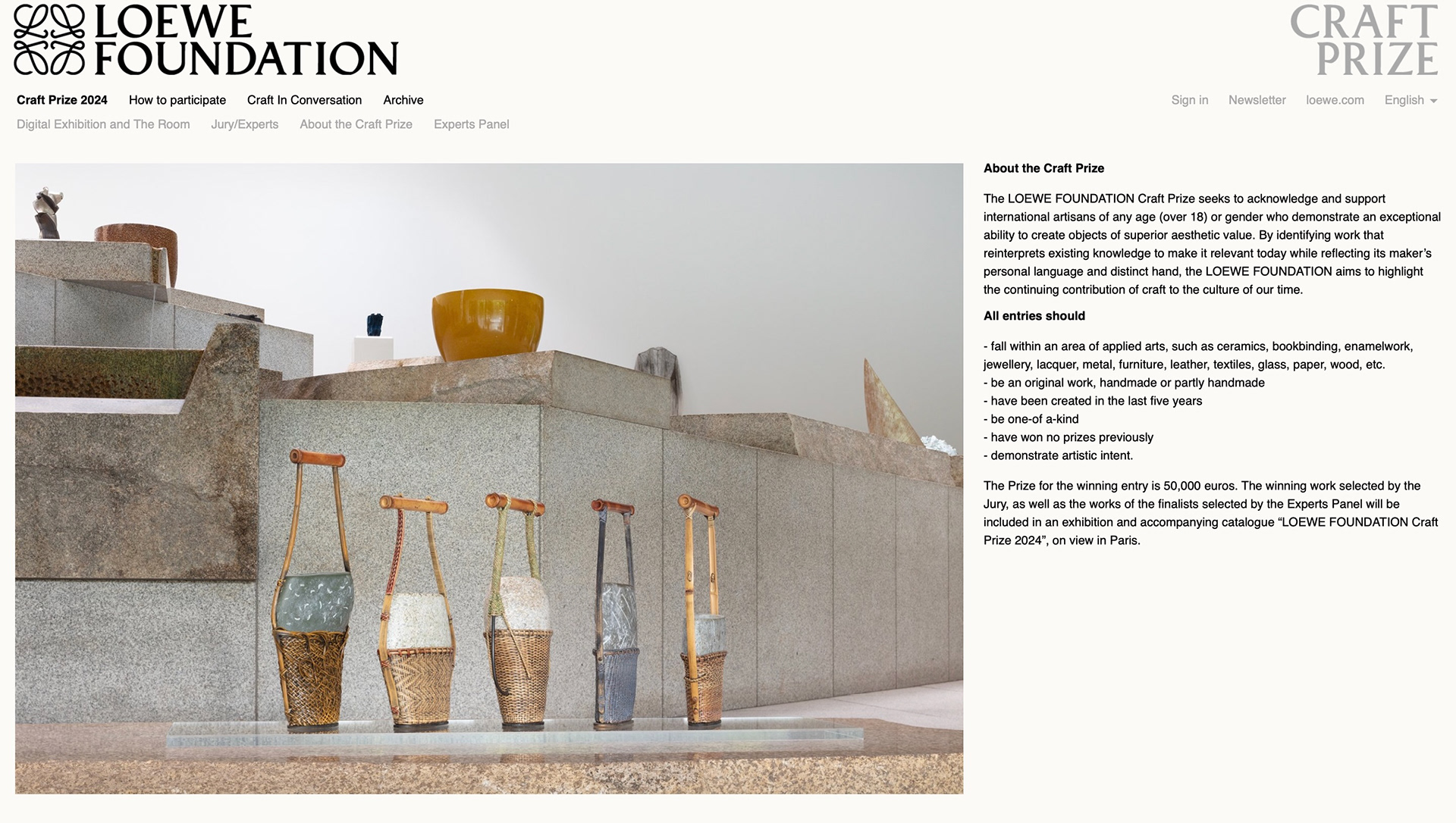


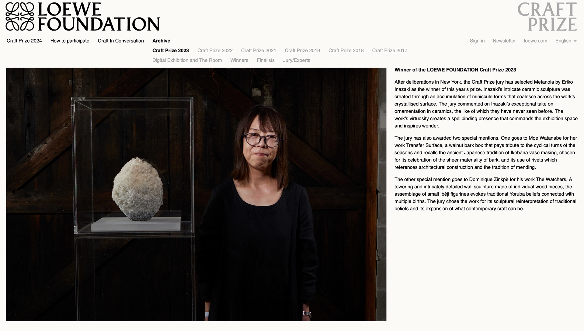
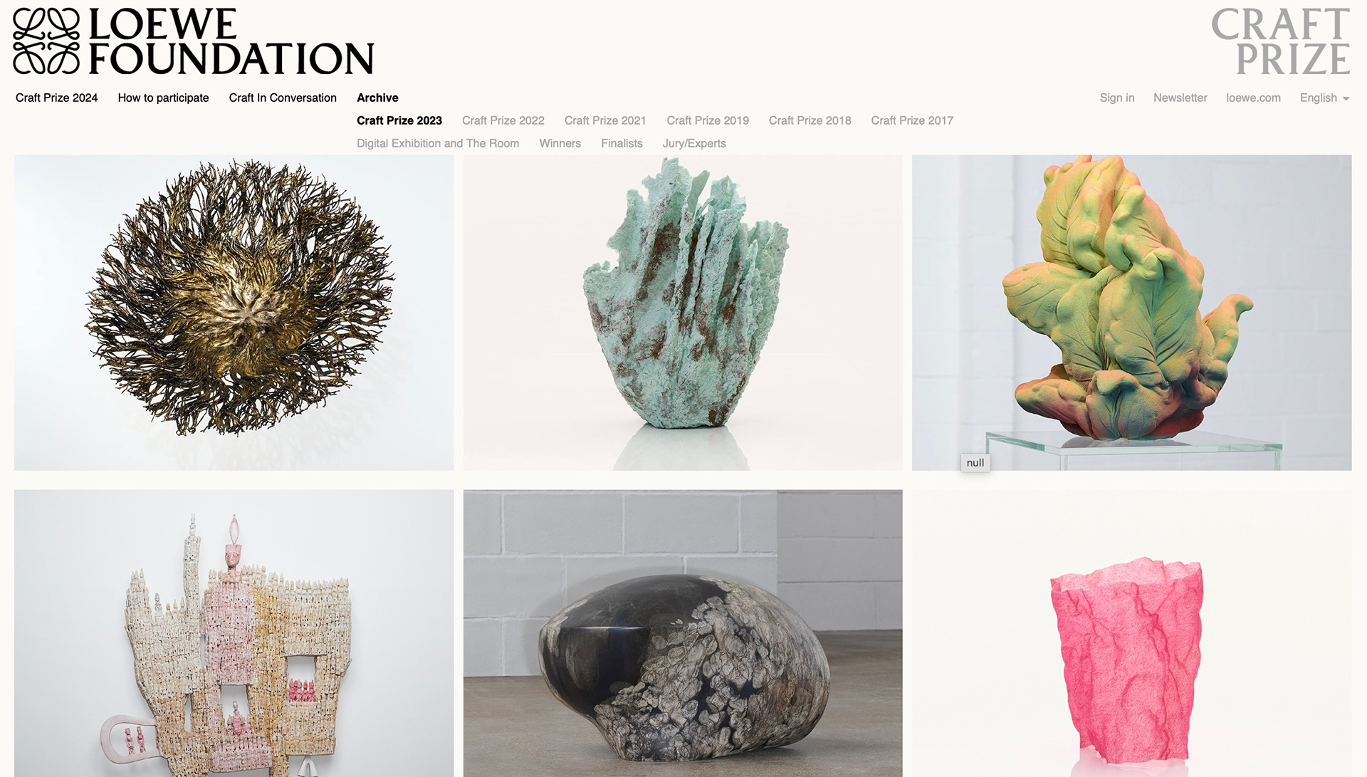
I looked at last years winner and a few of the works that were shortlisted. From looking at a few past winners and finalist pieces I jotted down some of the the common trends that are apparent in most of the pieces so that if I was going to enter this competition I would be able to be better informed for what the jury of judges look for. I noted that texture was a big theme, natural materials and colours, however this year has a lot more colour included than previous years. Natural elements and themes are also quite common. (below).
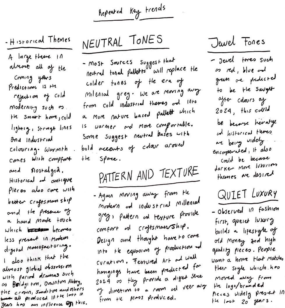
Next it was time for trend research. This is an extremely important aspect of my practice as my aim is to work within the space and market of interior design. I started looking at the up in coming trends for interior design in 2024 so that if I could get a good gauge on what peoples houses and interiors are going to look like this year, I could work with that idea and make things that would work alongside those interiors. I looked at a number of publications and jotted down bullet points of their key predictions.
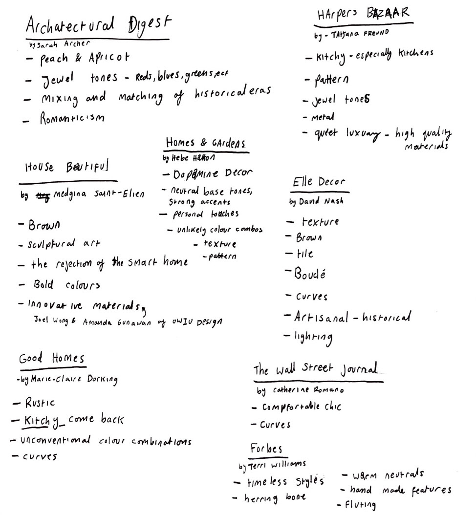
I decided to dissect some of these key repeating trends further as to what they mean and why. (below).
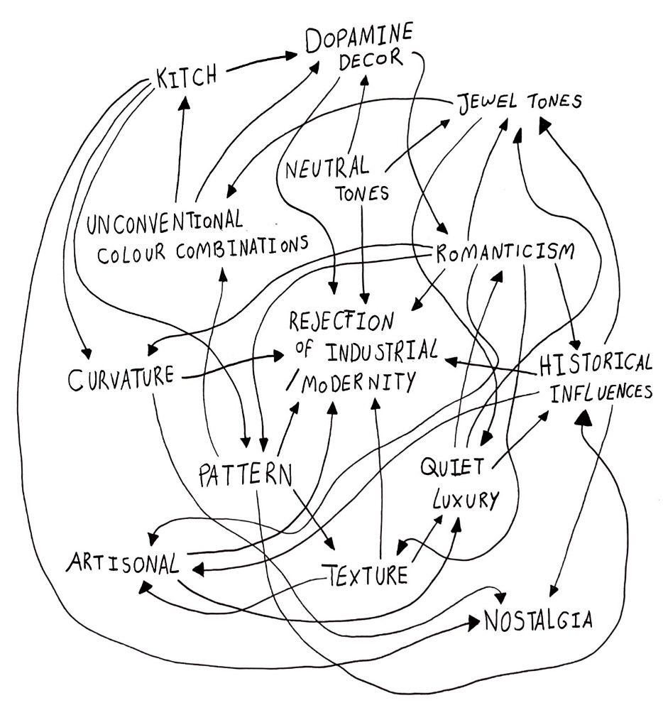
I then also looked at key themes and looked at how they connected and informed each other. (below).
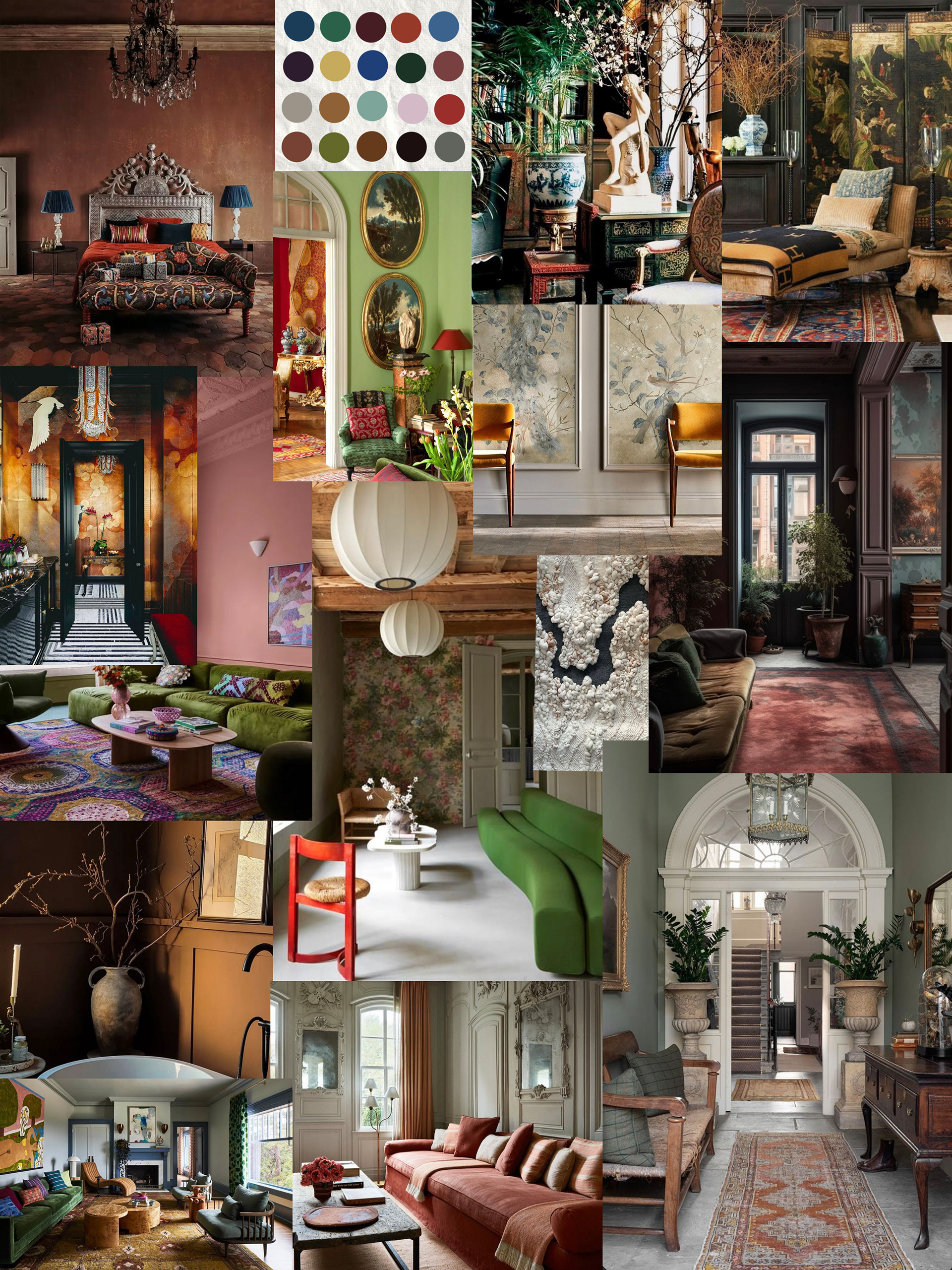
I made a mood board of spaces that I thought displayed all of these trends well swell assume colour swatches of neutrals and jewel tones that I observed. (below).
From my 12 initial ideas and my trend research I started to feel a bit more informed and confident about what pieces that I make could potentially look like. (drawings and potential plans below).
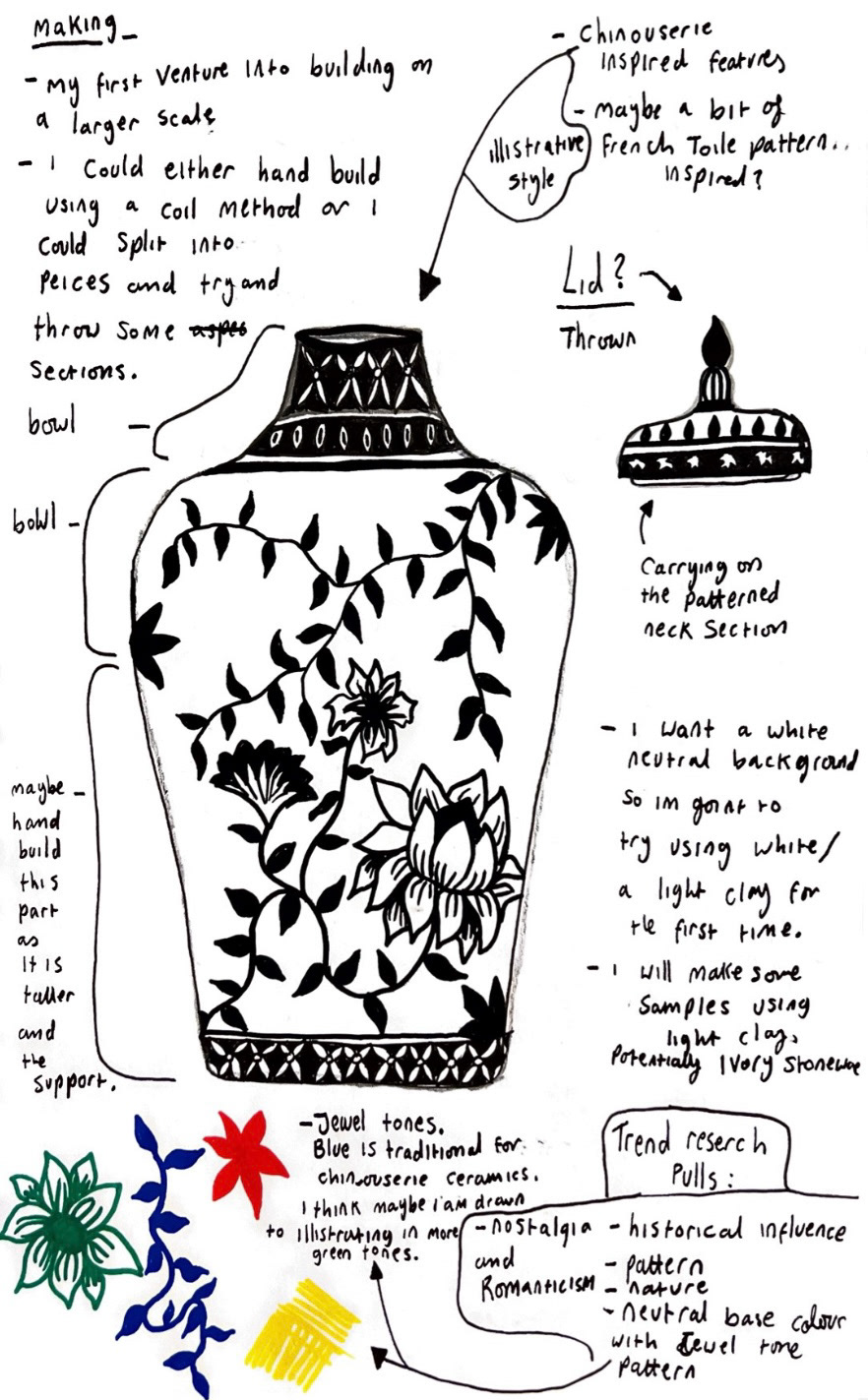
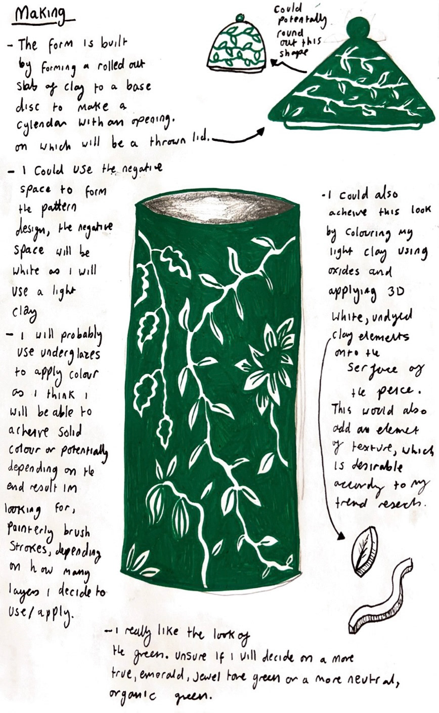
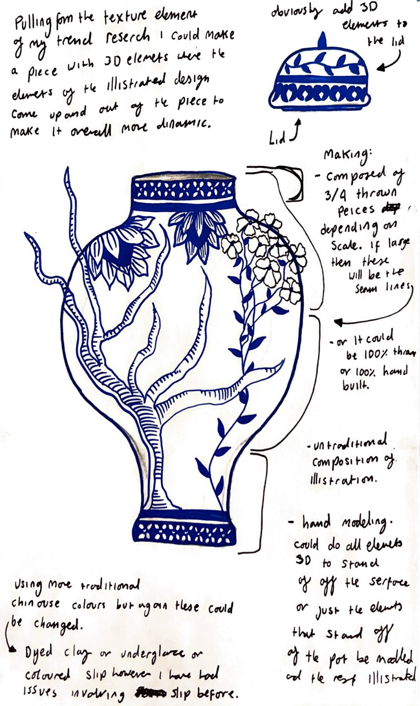
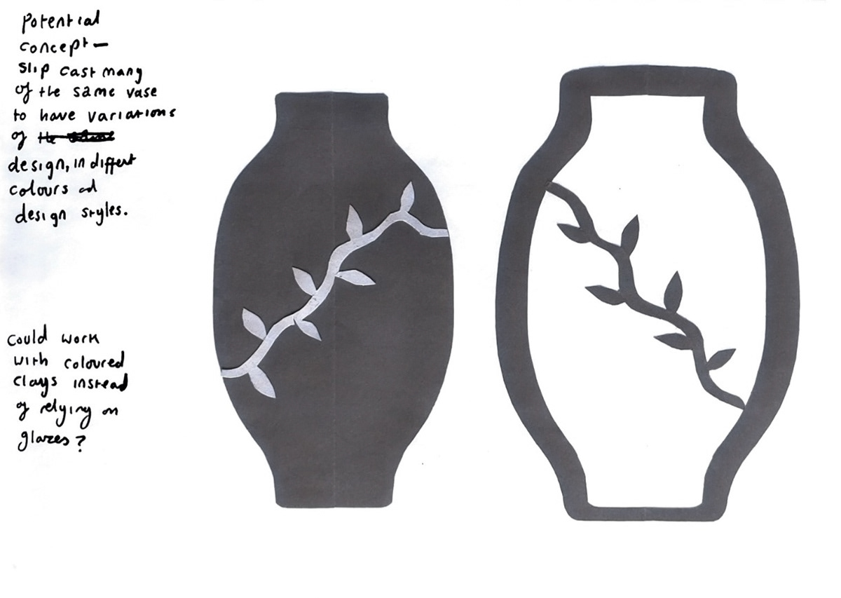
After mapping out my potential designs, I decided that I would have to practice with using some unfamiliar materials such as light clay and brush up on my throwing skills and practice creating some different styles of forms that I had not really attempted before. I decided to set off to produce some sample pieces.
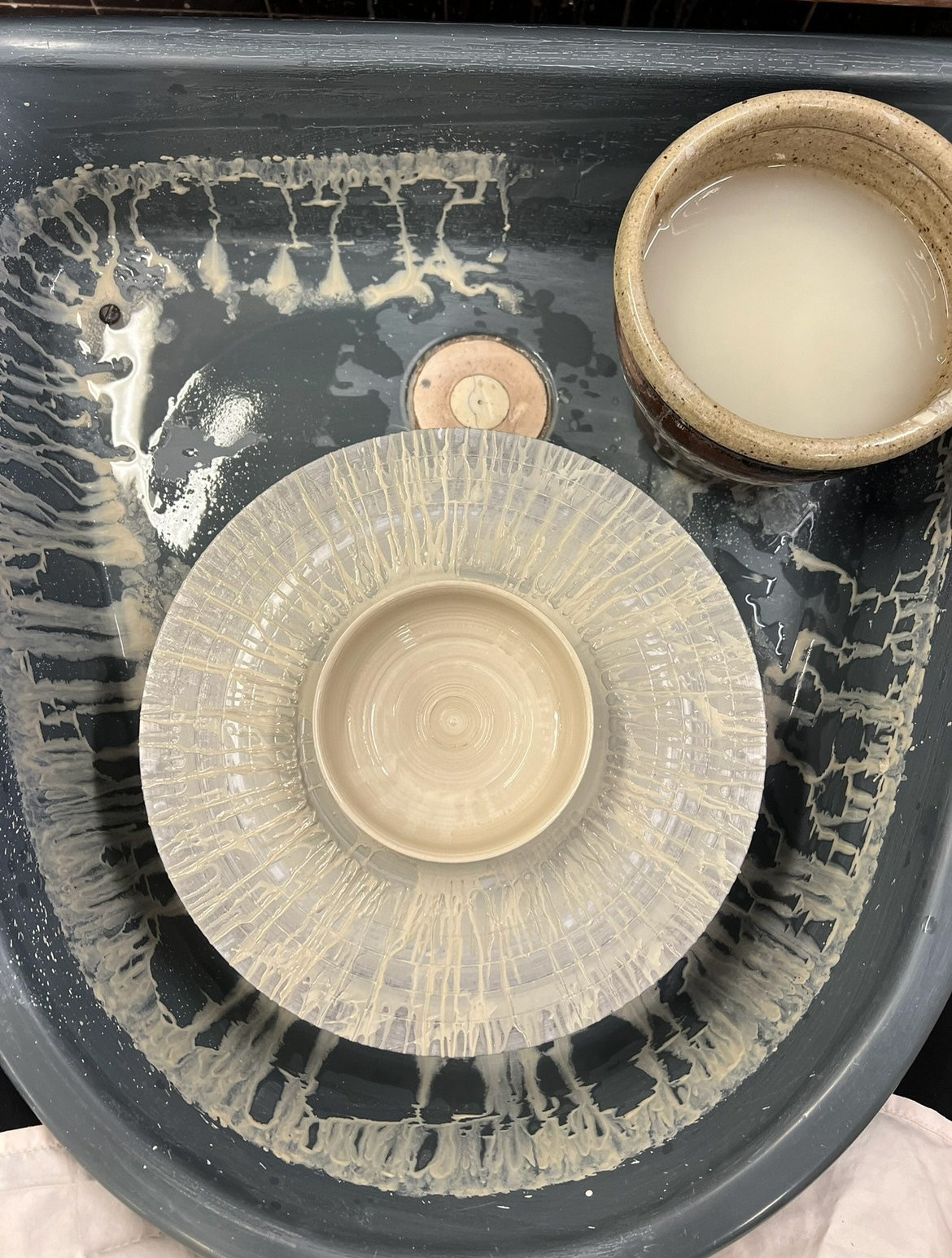
I started off building my samples with getting my hands on some ivory stoneware clay. I had never used this clay before but knew that as a light clay, it lent itself well to throwing. Throwing with this clay for the first time I was pleasantly surprised, as the clay has a bit more elasticity than dark clays that I was more familiar throwing with, I felt I was able to control the clay more and achieve smoother thinner forms.i also think that I found it easier to throw more dynamic forms. I really liked throwing with ivory stoneware and I think that this will be my chosen material moving forward. I also thought about turning my hand to trying to throw with porcelain for the first time, however this is a much more expensive clay and although using a more expensive clay would mean that I could increase the prices of my pieces on the market, I think that at this stage of my practice I would benefit from using a cheaper, easier to source material so that it would be more sustainable for me to continue working with. (pictures of throwing below).
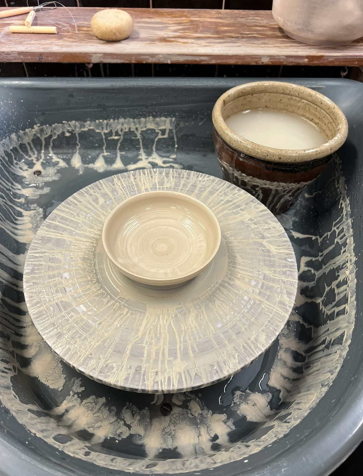
once these pieces had been in to bisque fired, I could now think about colour application. I chose to work with pre mixed underglazes as I am familiar with how they work, firing pigmentation and layering opacity. At this point in my sample making I was cutting it fine with time to instead of taking my time hand painting every single piece, which I would have liked to have done, I thought that the importance stood with the demonstration of materials and usually after firing and top glazing my underglazes tend to change colour so I was more inclined to see what the colours would look like when changing two factors, the colour of clay they were being applied to swell as the firing temperature, as I have only ever fired my glazes to be earthenware before, however I was now using a stoneware clay so I was unsure how they would react and how true to their colour they would stay. I cut my own sponge stamps to create a mix of abstract and thought out simple patterns, using sponges to apply my underglazes defiantly saved time and I was also happy with how they worked in the area of pattern application.
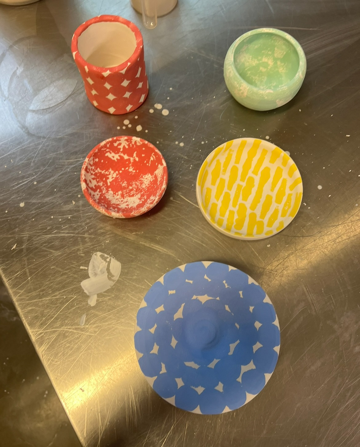
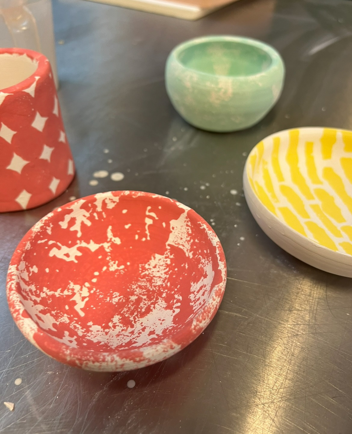
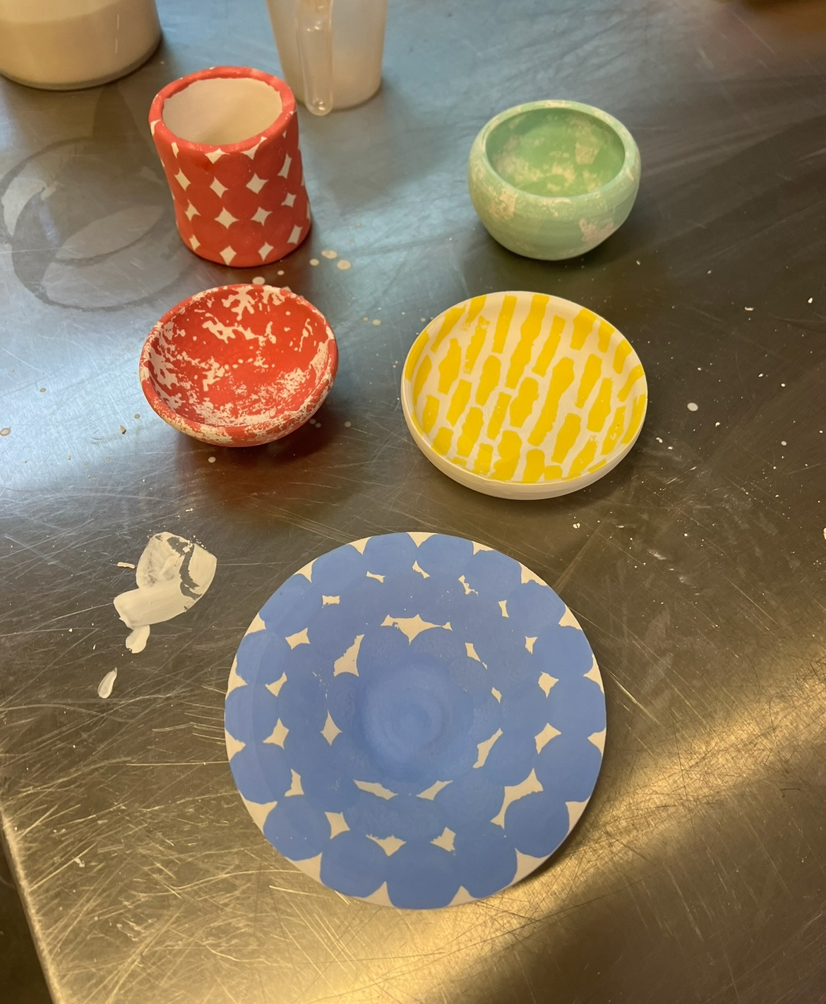
I chose underglazes that were jewel tone adjacent to follow my trend research, however I knew that these underglazes would come out a lot brighter than my desired jewel tones that I was going for however I will in future run some line blending to try and achieve some darker colours that would fit in more with my desired pallet.
After the colour had been applied, I would usually put my under glazed pieces in for another bisque firing to seal the colour so that there would be no movement once the top glaze was applied. However due to time restraints, I was not able to fit this firing in. I let the underglaze dry however, then I used a clear shiny stoneware glaze over the top of my pieces in a mixture of a dipping and pouring method, again I had never fired stoneware before so it was my first time using this stoneware specific clear shiny glaze so this was another factor for observation in these samples.
(final fired samples below.)
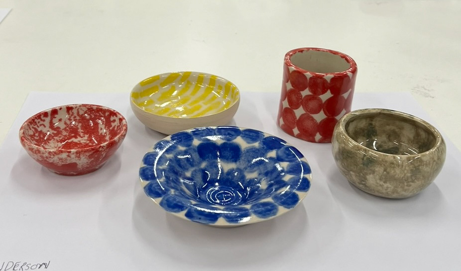
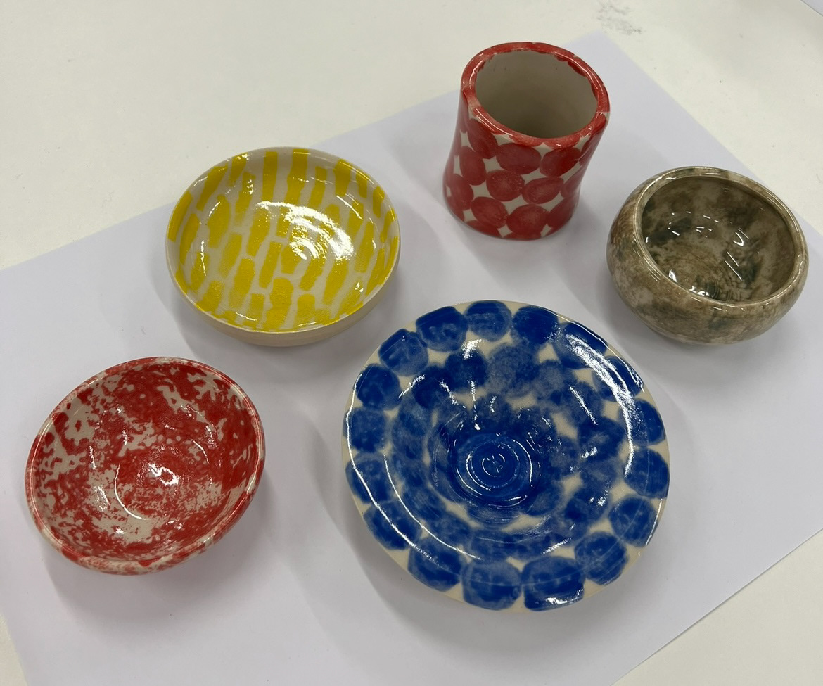
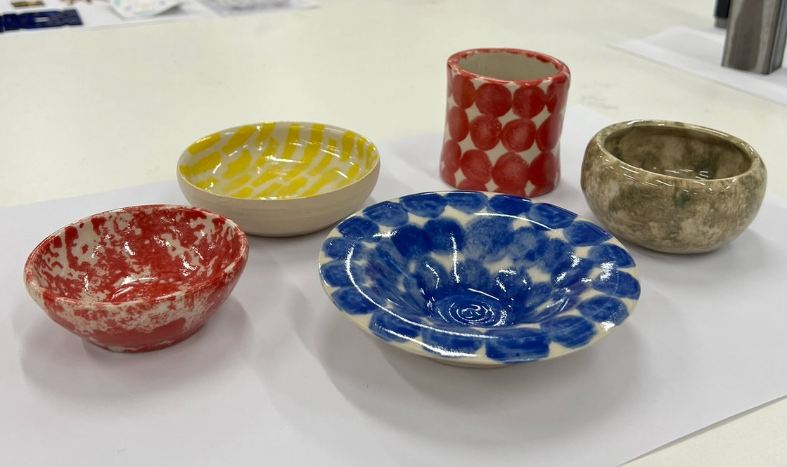
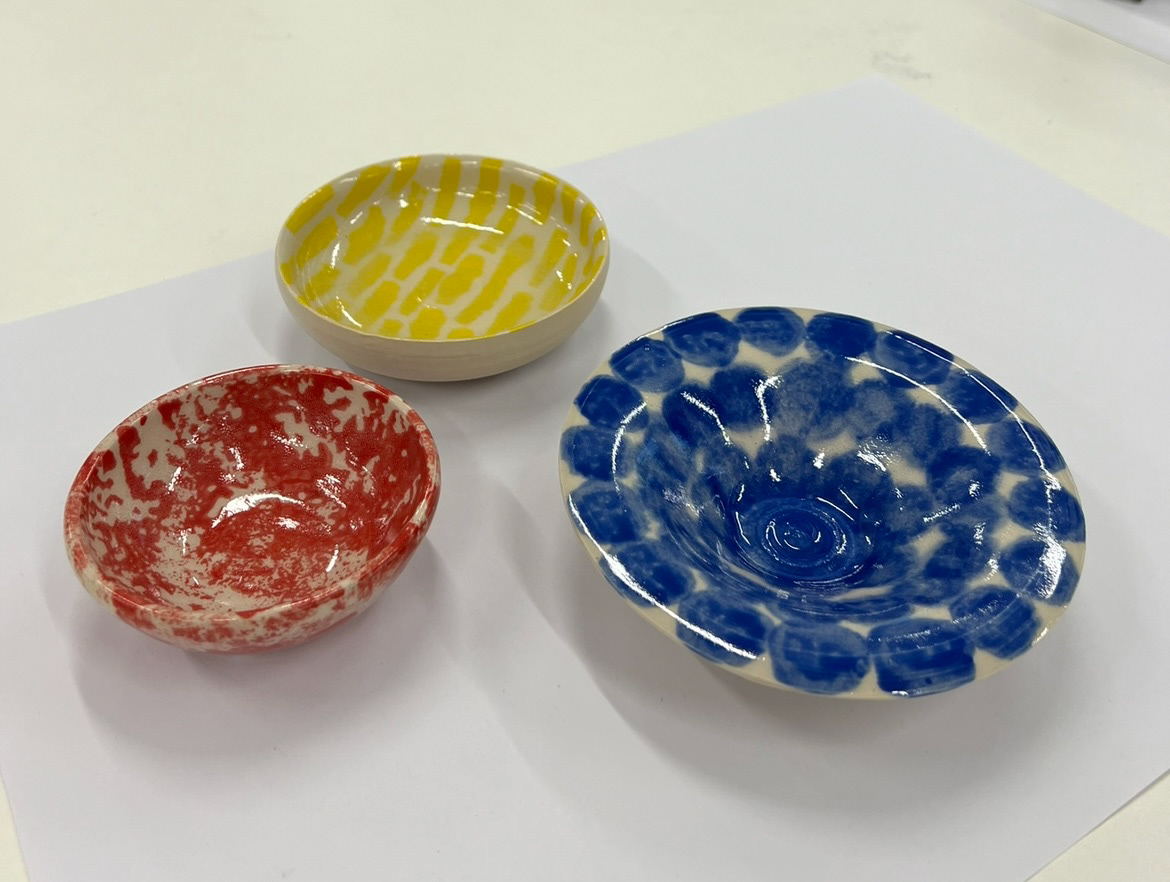
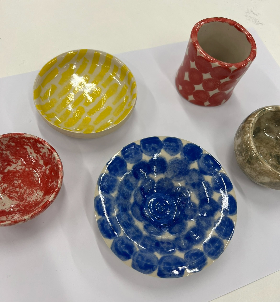
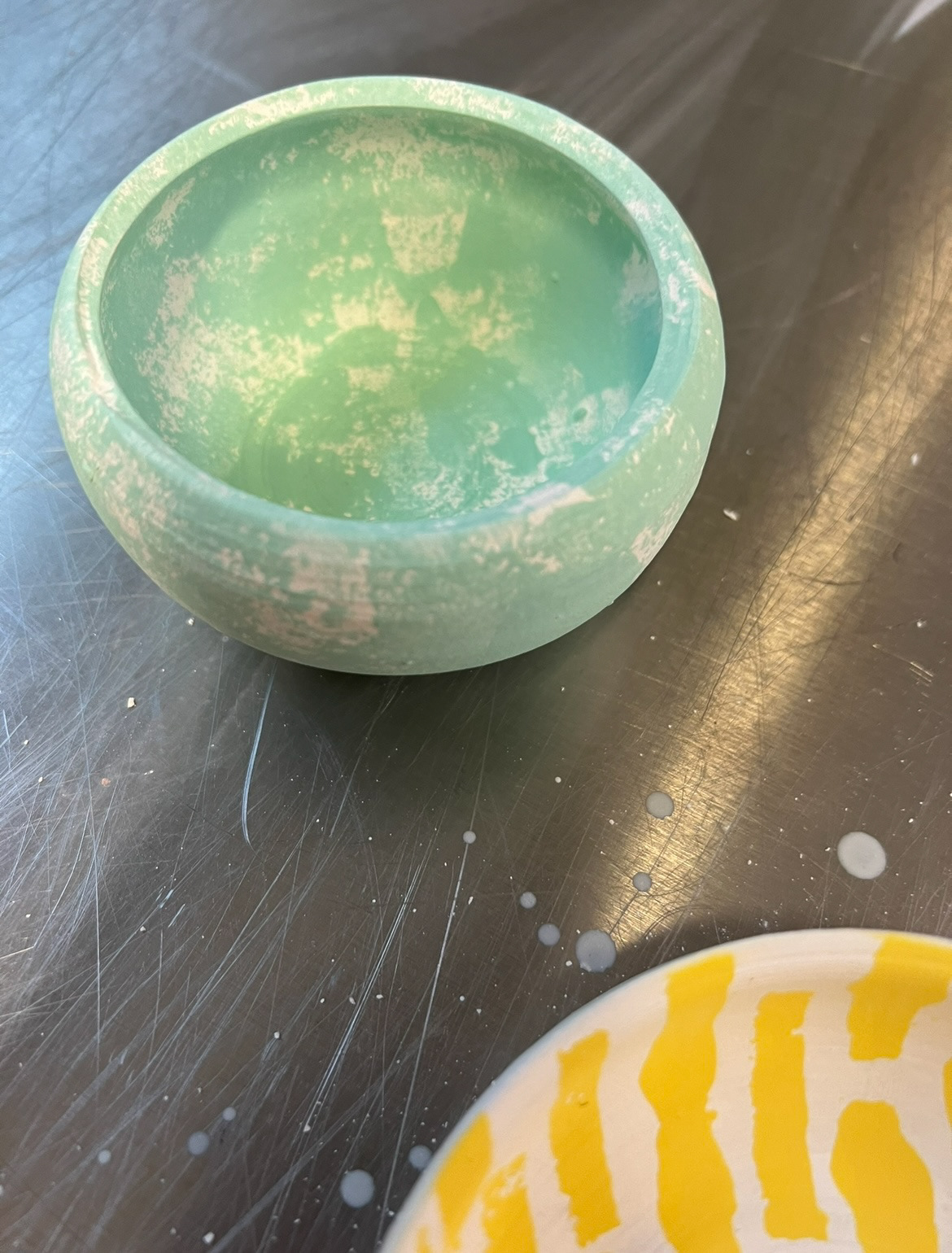
I was really happy with how these pieces came out of the kiln. I very pleased with how the piece with green underglaze came out, I think the colour came out as a perfect earthy neutral green which is exactly what I was hoping for so I will defiantly be using this colour going forward in my making process. Another colour I will defiantly be using going forward is the blue underglaze, I really like the texture that the sponge application provided with this glaze, I think that when applying my repeat pattern collars, I might potentially make some sponge pattern stamps to achieve this texture again. The red and yellow however were much too bright for my desired look, I think I might try some line blending especially with the red to try and achieve a deeper richer red rather than a tomato red. I think for the yellow I will try and achieve a more gold colour, I will also try and source a more emerald green.
Im also extremely happy with the finish of the stoneware clay and glaze. I really love the off white colour of the clay and the smooth surface I was able to achieve, as well as the thin shiny finish I was able to achieve with the glaze.