After the Great Northern show I felt like I had a little bit of time to stop and reflect about my project so far. I thought about how this year I really wanted to focus on what I enjoy and carry it through in my practice as I believe that I create my best work when I am completely passionate about what I'm doing. I looked back at all of my ideas and studio making and thought about exactly what it was that I had enjoyed the most about this process so far. I found that a common theme that I have been looking at was heritage through forms and glazes, and when looking at what I had enjoyed making the most discovered that it was my baroque inspired picture frames and design history that had it had been inspired by and that my chosen subject matter almost came secondary in my head. Throughout my practice I feel that the best work I have produced what when I was inspired by historical heritage pieces, such as my ginger jar or Fletcher Moss bowl from last year. the more the more I came to the conclusion that my passion was not actually in language like I had stated in my proposal at the start of project beta but in the stories and history that went along with it. When assessing where I find inspiration I reflected on how I am very much a visual person and that I find the most inspiration by looking at tangible objects, which is why I think I found I was struggling somewhat with my language topic as a lot of the information was in writing and not much else. I thought back in the history of my practice and tried to look back at when I was the most passionate about what I was doing. I came to the conclusion that it was when I was working on my UC2 project about raising awareness about the crafting heritage of the north east. I think that when I was coming up with my language project I had thought about this and had tried to pull from the north east aspect of it however I think where I should have been looking was at the heritage aspect. I have decided that in my project I will now continue to look at his further however not just in the north east but in the rest of the uk as a whole and create a body of work raising awareness for lost/ close to being lost crafts. I will look at the Heritage Crafts red list and pick and choose some example crafts from there (rather than the whole list as I think this would be rather a mammoth task) , and research, contact practitioners and create pieces that will bring attention to these dying crafts. I feel like I have a strong connection to this topic as being from the north east I have seen first hand what happens to a land when the crafting practices are removed, mainly through brick making which is now on the endangered crafts list. I think it is important to raise this issue before more heritage crafts are lost to the extinct section of the list.
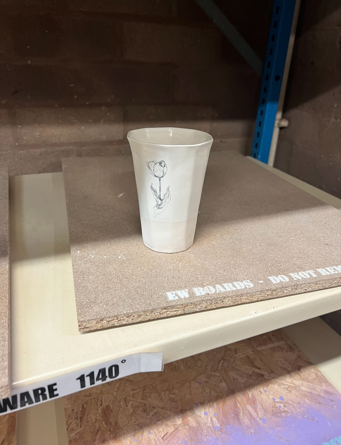
As part of this project I will also look at heritage / historical forms and aesthetics. I find great inspiration from looking at pottery forms from the past. last year I focused a lot on making ginger jars as I feel their forms have an element of class and sophistication. Last year however I don't feel I entirely achieved my goal of submission a full ginger jar as my piece did not have a lid, I think the inspiration was clear through its blue and white colouring however I don't feel the form was necessarily completely all there. This year I will focus more on the form and less on the iconic colour scheme. I will this year explore with a much wider and vibrant colour pallet as I stated previously in my project beta proposal, also still carrying on from my proposal I will carry on with exploring 3D modelling to truly enhance my pieces and give them more dimension.
I will still look at artists such as Grayson Perry for his use of colour, narrative and heritage forms, Ebony Russel for her unique texture and again heritage forms and also Kate Malone for her integration of historical inspiration. I am also inspired by the work of Matt Smith and his use of 3D modelling and historical influence. I am also going to try my best to contact practitioners of endangered heritage crafts and interview them about their processes and motivations to keeping their craft alive.
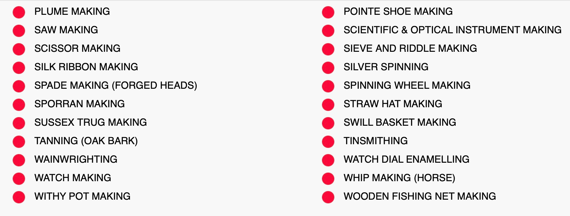
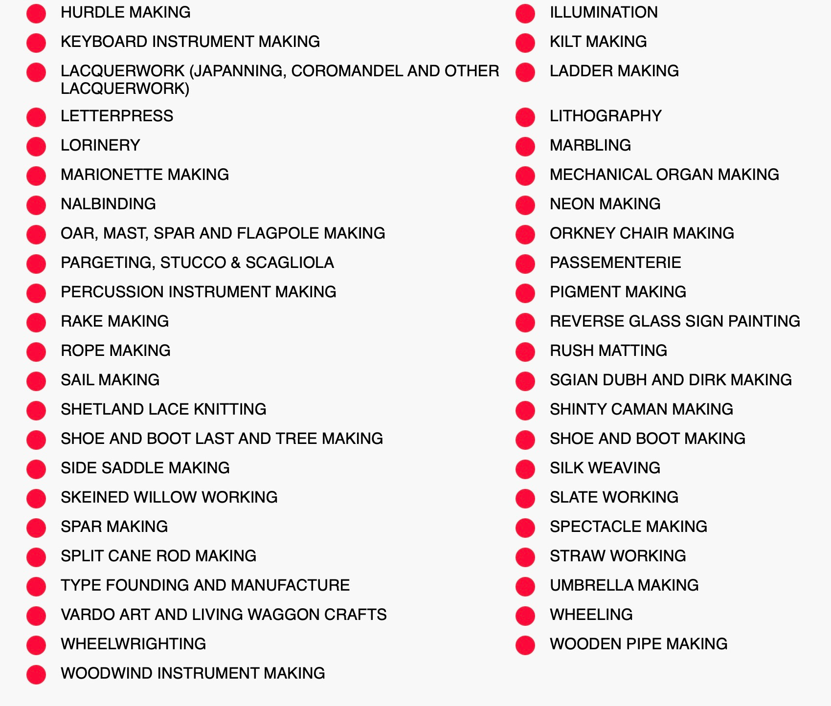
I thought that a good place to start with this project was to look at the Heritage Crafts Red List and choose some practices that I think I would be interested in exploring further. I thought that it would be useful to me to look at the critically endangered and endangered list as if I chose something from the extinct list I wouldn't be able to find any practitioners to talk to about their practice.
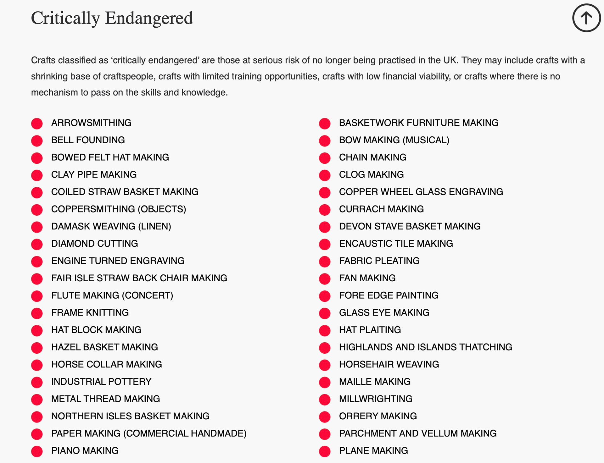
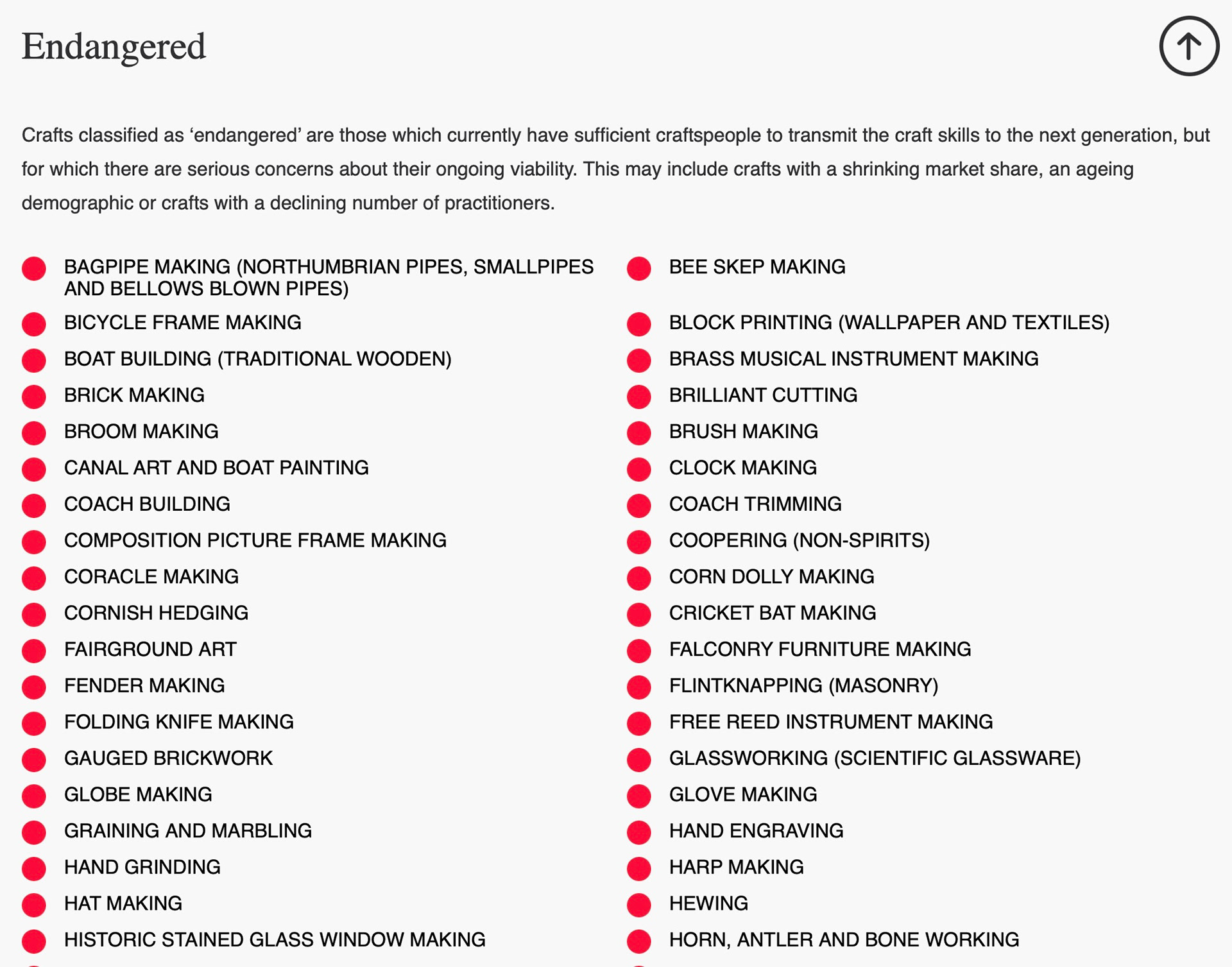
I thought first from the list I would look at the endangered craft of brick making as I think I have quite a personal connection with this craft in particular.
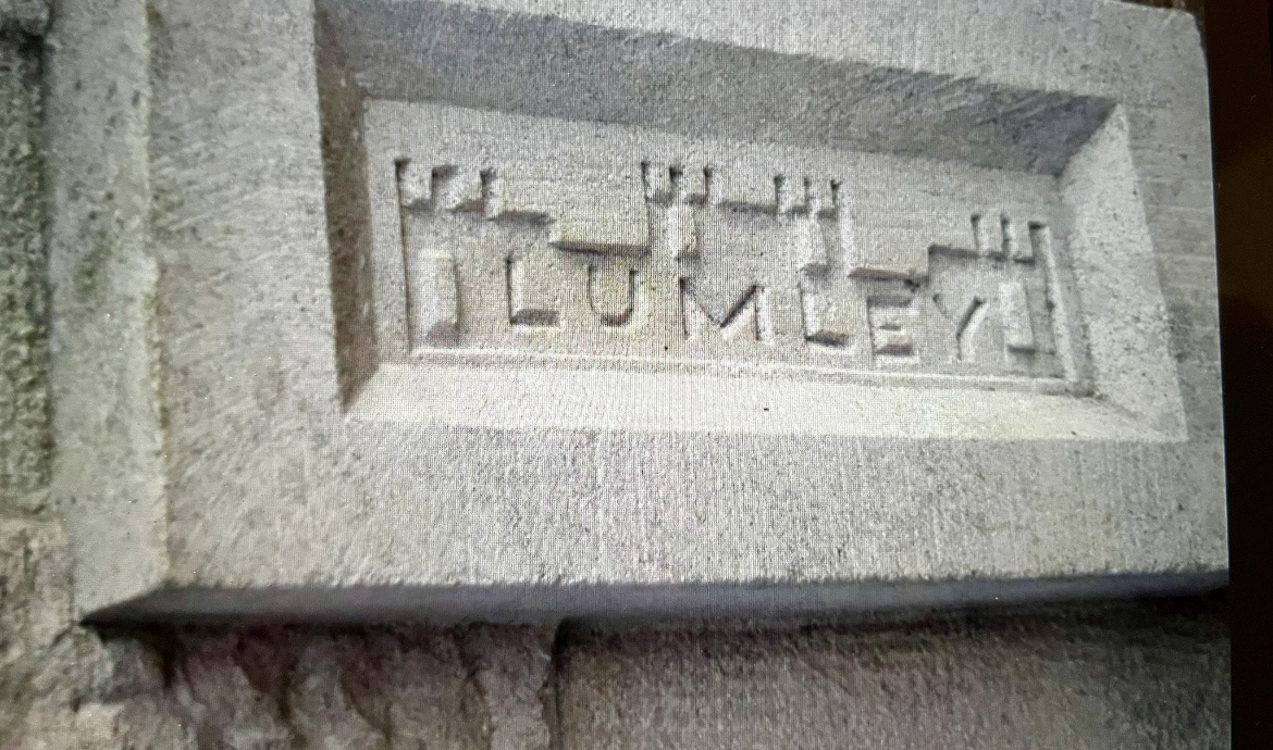
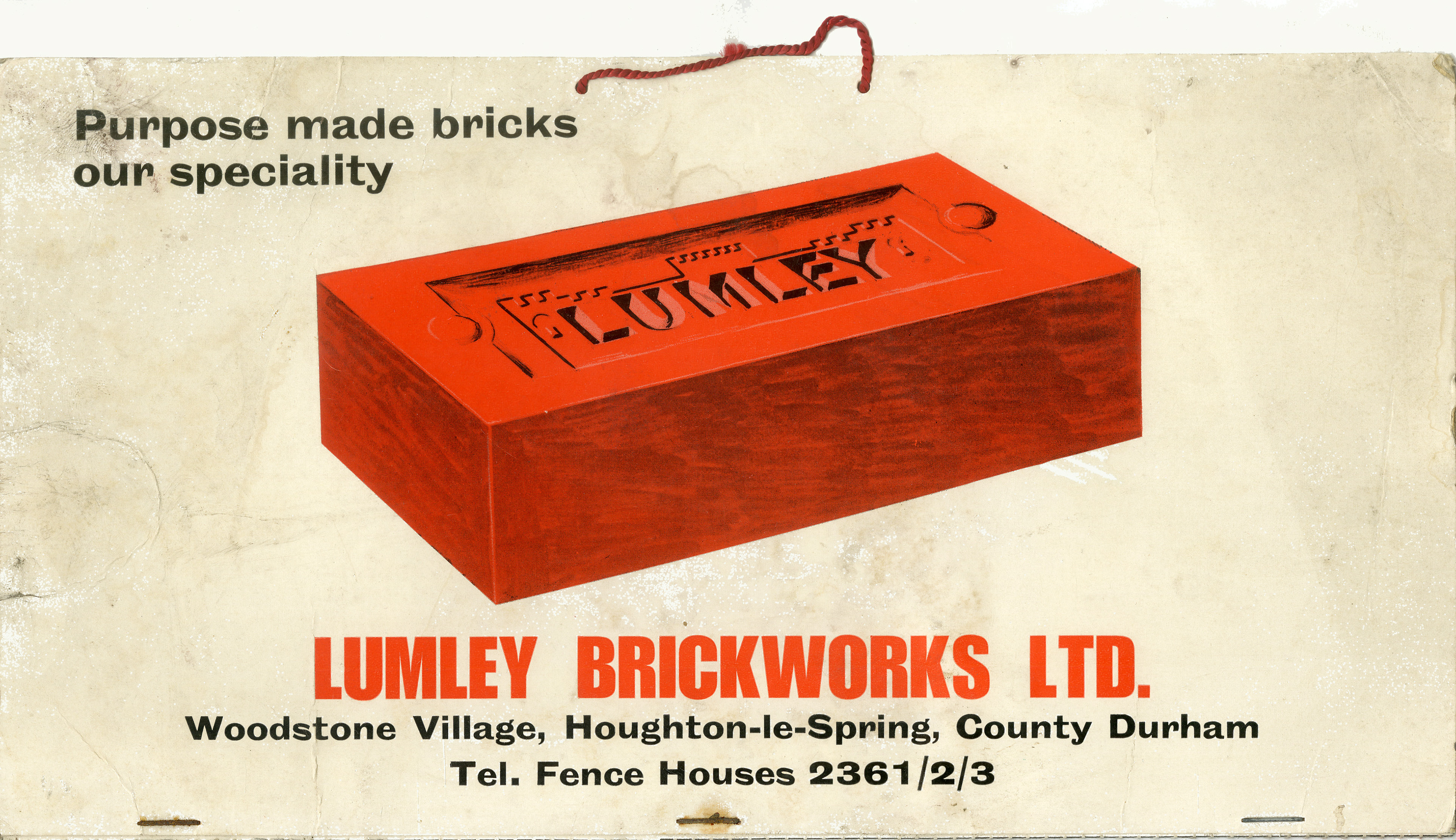
Back home in the north east, my home is built on the site of the old Lumley brick works. The Lumley brick company produced enamel bricks from 1870-1980. Many of the bricks were made with a 'frog' (stamped imprint of the company name), early bricks produced here were also stamped with a castle design to represent the near by Lumley castle. The company was based beside the Lumley 6th pit where the clay would be dug up, taken to the factory and then fired in 8 Newcastle based kilns.
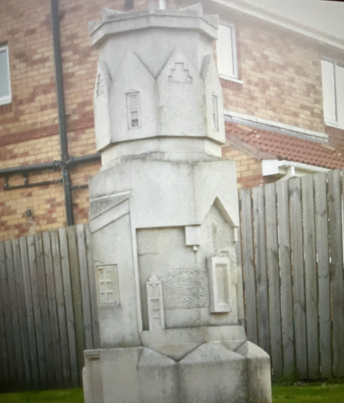
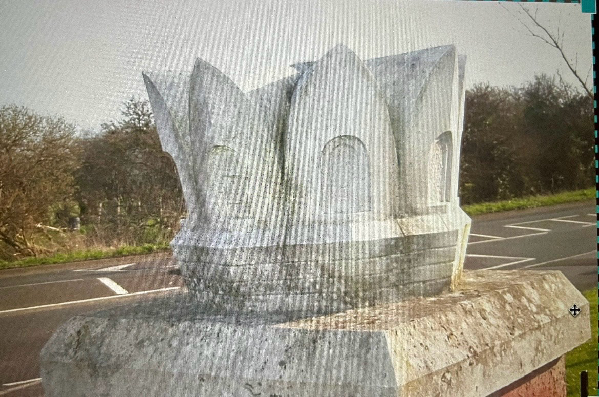
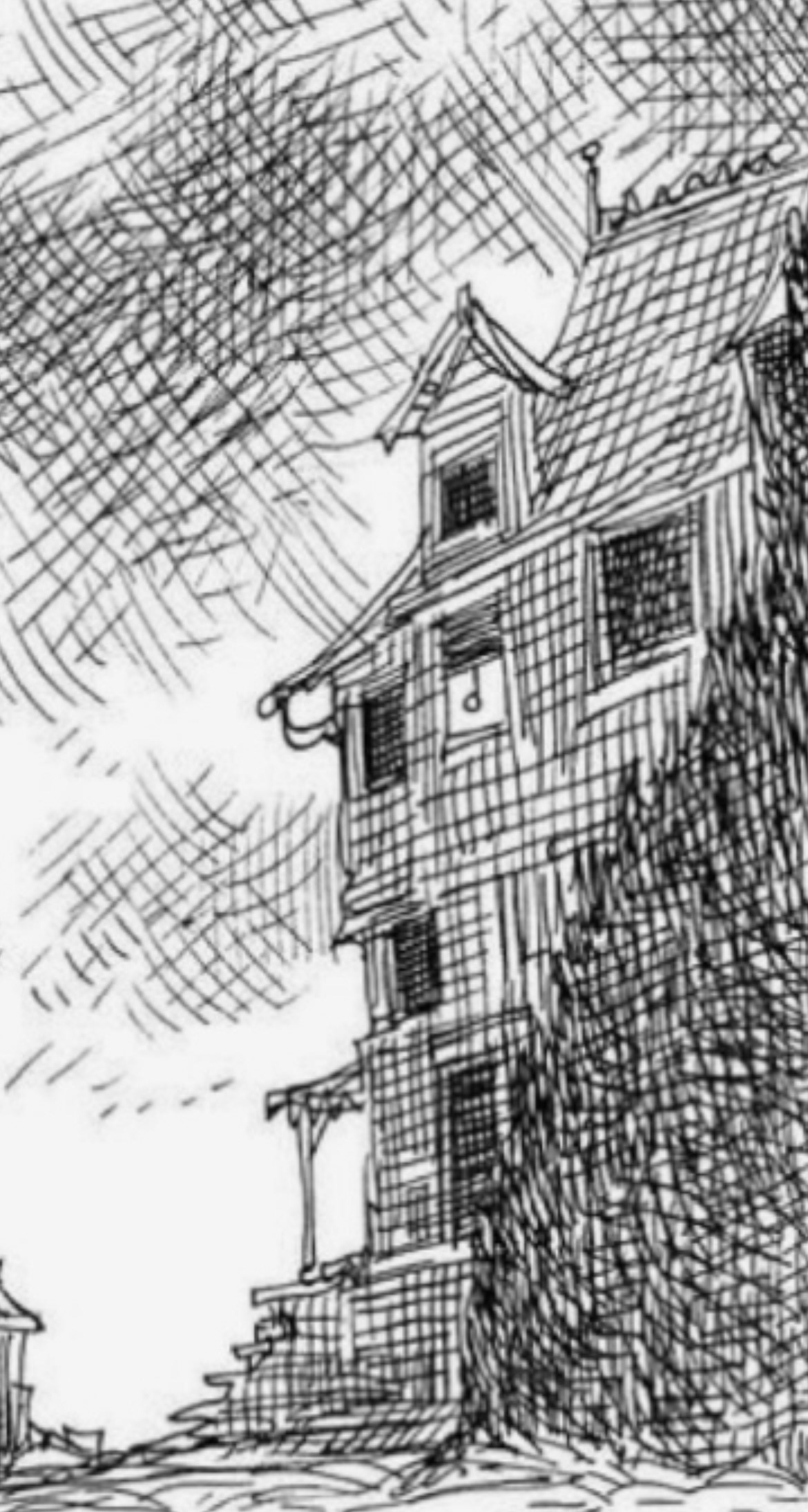
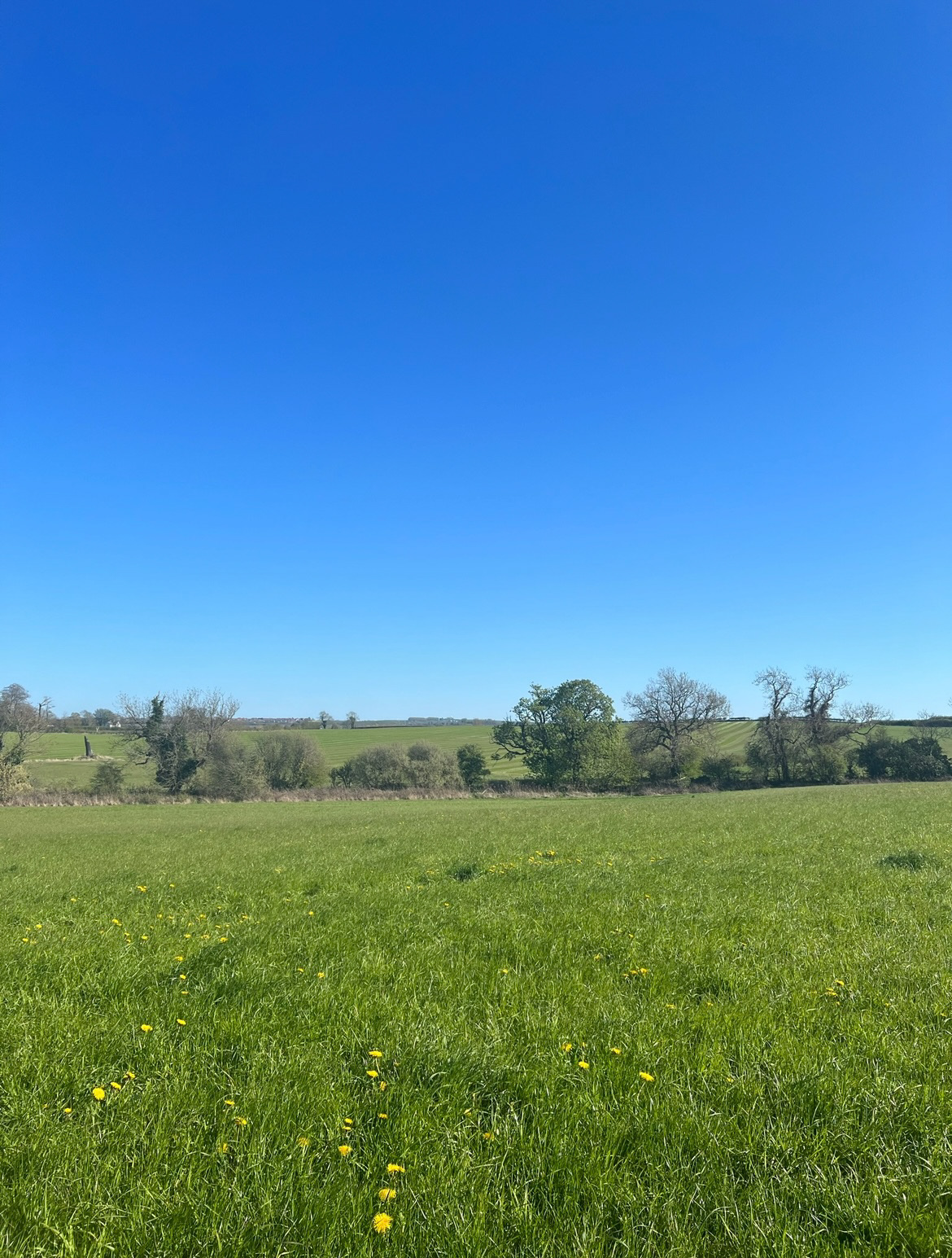
On the entrance to my estate there is a monument commemorating the old brick works, it is decorated with figures of the brick industry and of corse a model of one of the original Lumley bricks. As a child my grandparents would always take me and my sister over to the monument on our bikes, I remember being so captivated by it with all of its shapes and indents, These pictures (below) were taken on a digital camera in around about 2007/ 2008 on one of these said excursions. Now however the monument is largely overgrown and lost in trees, almost to the point that you wouldn't know it was there unless you had seen it in the past. I think that this is a quite symbolic parallel of the crafting history of the land being lost to all that don't explore and enquire about it.
I first became aware of the Lumley Brickworks and the clay beneath my feet when I was young and heard my mother complaining about the clay soil and how she couldn't grow the plants that she desired in her garden because of it. From this point I always wanted to know more about the clay I was raised upon and where else clay might be in our surrounding area. However I seemed to have never found the time.
last year I got quite excited when I saw a post online about someone who had one walking along the Tyne at low tide and had found a collection of bricks. (below). The first one was stamped with the Lumley Brickworks mark, swell as the area 'Fence houses' which is about a 3 minuet walk from my front door. The second however, rather curiously had my name stamped on it 'LILY', This seemed a little spooky and I knew I had to finally investigate further.
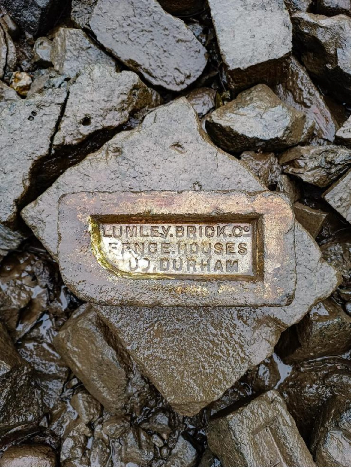
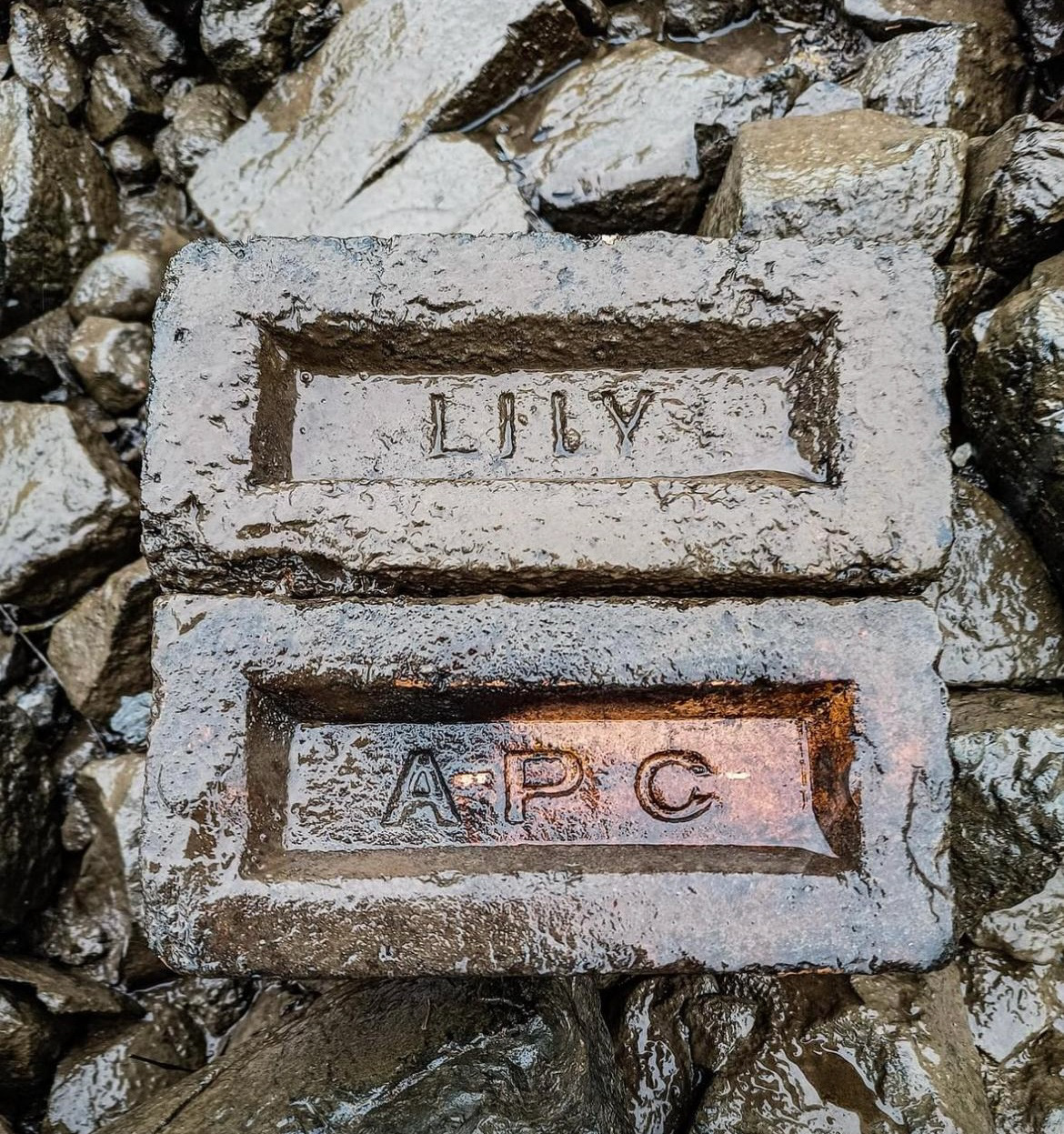
After doing some research I found that the Lily brickyard ran from 1901 to 1976. The brickyard was established when the Preistman Collieries Ltd took over the Lily Drift pit. By 1955 the brickyard was producing over 150,000 bricks per week for pit building however by 1964 they were producing more high quality facing bricks for use in the wider area of the north east, such were used when building the Nuffield Hospital in Jesmond in Newcastle. Unfortunately I couldn't find any research of where the third APC brick came from.
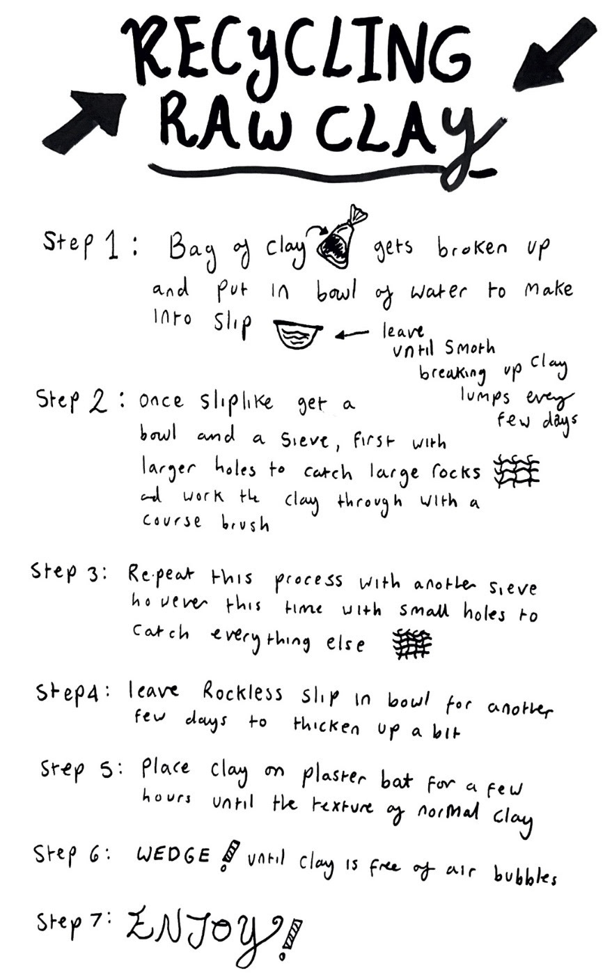
My mother had been doing some gardening had had come across a quite a clear patch of clay whilst digging. Fortunately she decided to dig it up, wrap it in a bag and bring it to me on a visit. This was Lumley brick works clay so I was an extremely excited about the prospect of using it for this project and reviving this clay into a creation of my own which would raise awareness of the receding brick making industry and the once mighty Lumley brick works. obviously this clay had just been freshly dug out of the ground so it needed recycling into smooth useable clay.i had never harried out this process before so I had to come up with a plan of the best way to do it (below).
Feeling prepared I then took my clay into uni and carried out this process.
See 'Unit X Videos' file (Video 1 Lumley clay recycling)
Once I had recycled my clay it was time to do some clay tests. Because this was raw clay we didn't know what temperature would provide the best results when it came to firing. I took three small balls of clay and we put one in the bisque kiln, one in the earthenware kiln and another in the stoneware kiln. I made sure to mark them with a B, E and S so that when they came out I would know which one was which. I wasn't really sure what colour my clay would come out because the classic colour of clay for brick making is usually an orange, however my clay when recycling was quite green in colour, so I was really looking forward to seeing the results.
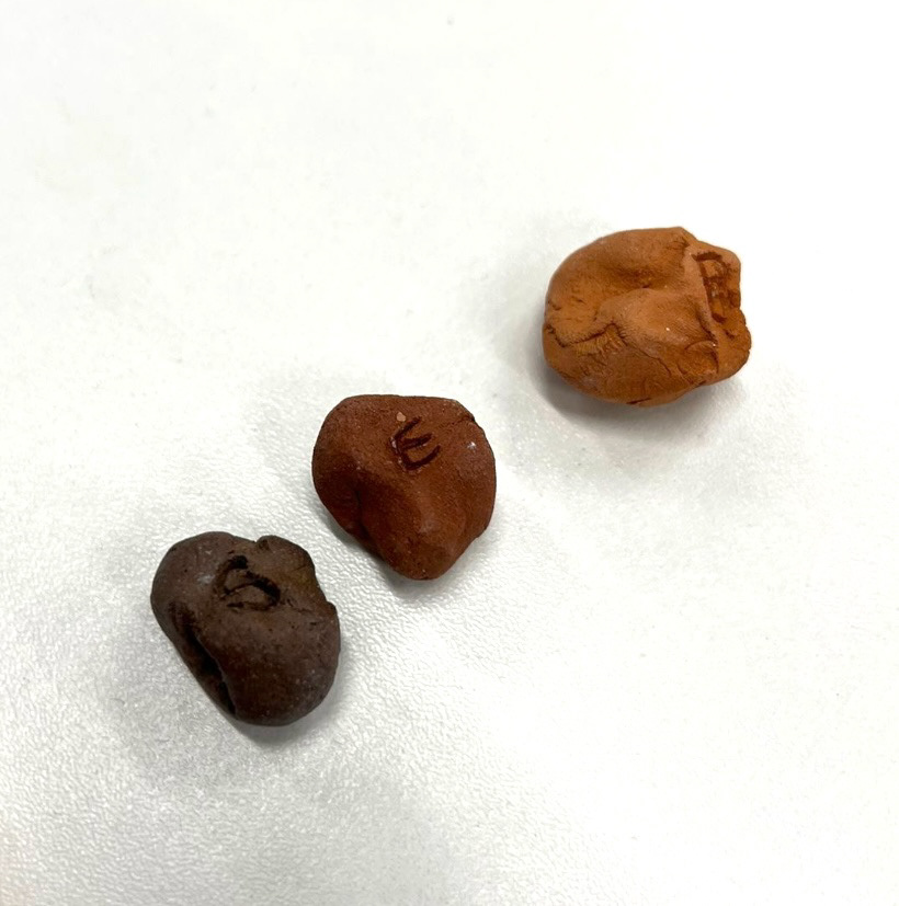
When my samples came out of the kiln (above) I was quite surprised to see the variety of colour change. I expected that the clay might come out almost a terracotta orange much like how the bisque fired piece came out, however I was not expecting the dark colouring of the earthenware and certainly not the super dark almost burnished finish of the stoneware firing. I asked Rudy about this metallic finish and he said that he thinks that it is because there is iron present in the clay and also that the stoneware firing was too hot and melted/ burnt my clay. From these tests I discovered that my clay is defiantly an earthenware clay so that is the temperature that I will fire it at in future.
At this point I had a tutorial with Geoff Mann. I explained my project so far and he said that he thought that the best thing going forward would be to focus on just the endangered craft of brick making and really dive into the story of Lumley and explore it further using my home dug clay rather than exploring multiple endangered crafts and potentially only scratching the surface. Geoff also said that I should really keep developing my illustration skills when it came to surface design as he views this as one of my biggest strengths, I agree with this so will definitely be taking this on.
From this tutorial I worked out that a lot of testing and sampling needed to be done. As I'm working with raw clay, it does not behave the same way as the pre bought, pre processed clay that I'm used to working with as it has no grog in it to help support itself when building.
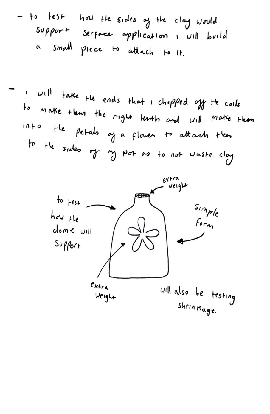
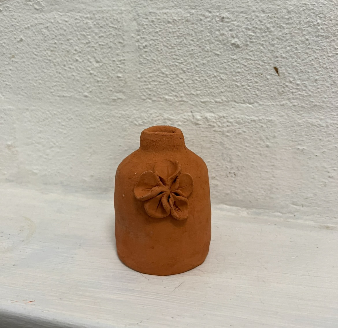
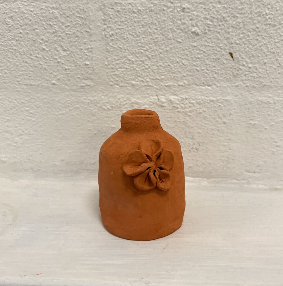
I decided to make a small coil built sample out of my raw clay to test out how this process would fare once fired and to see if it would keep its form.
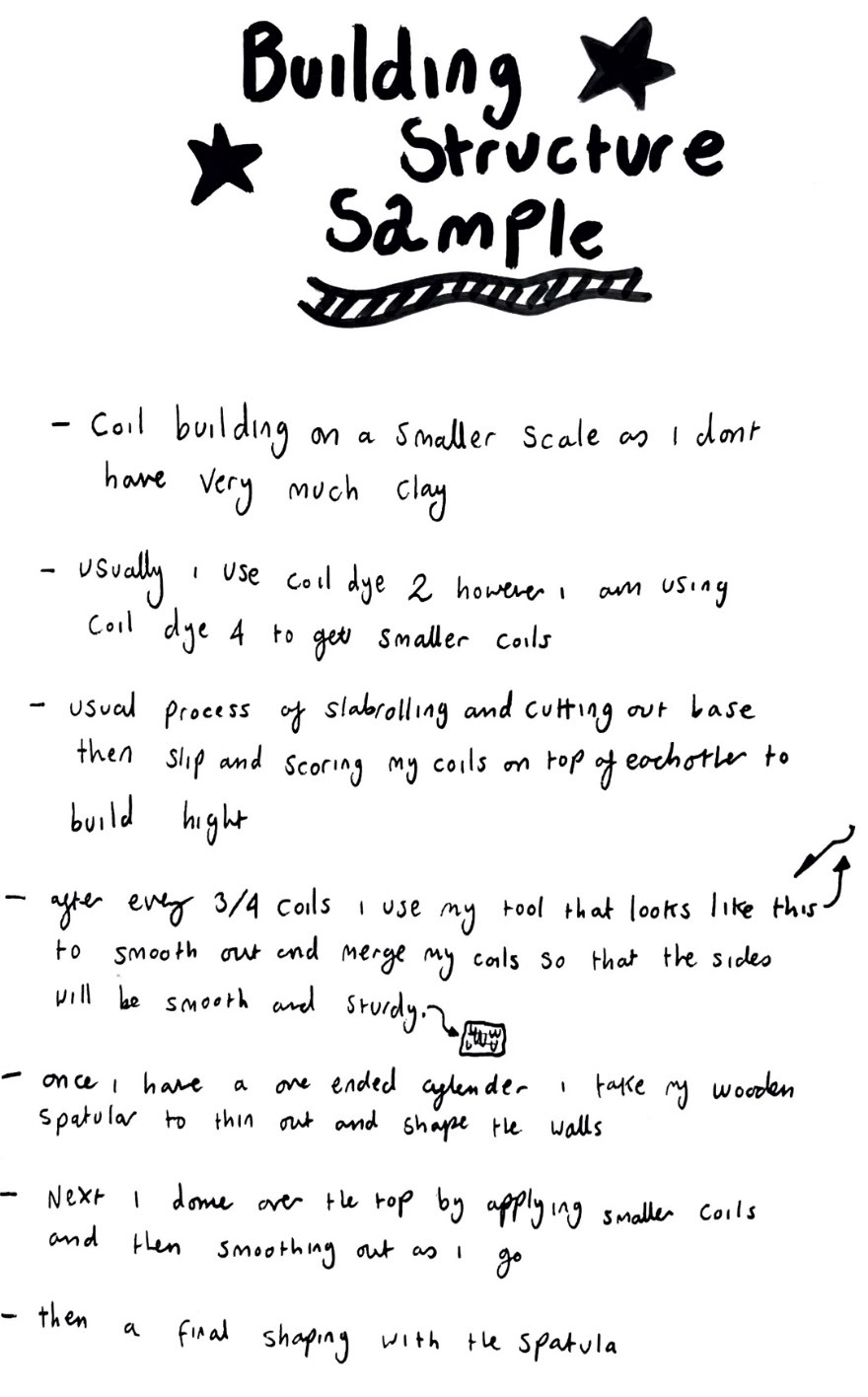
When making this I filmed a small video of my process.
See unit x videos file (video 2 structure sample making).
(Pictures of sample before firing below)
After building samples to test the technical, structural side of building my piece I started thinking about the surface of it and how I could apply decoration and illustration. I believed that this would also take a lot of additional testing because of my clay choice as I usually am drawn to applying my illustration and decoration using coloured underglazes, however this time I'm using a quite dark clay so coloured underglazes would go muddy and I don't think the finished product would come out looking very appealing, so I had to come up with a solution for this.
I came up with two options, option one was to maybe use strictly one dark underglaze such as black to illustrate with, I thought that this is one of my most pigmented underglazes and with a few coats would show a clear image against the dark clay. This option would defiantly need sampling as again I'm not yet sure completely how my clay behaves so I will need to see how it takes to glazing. However my second option illuminates this altogether as I think another way of applying imagery I could try could be to use texture, surface pattern and engraving to create shadow to act as my tonal value. I think on paper this idea sounds quite minimal however I think with the right application, this could look really interesting and decorative.
As I had decided I was going to be applying illustration in just one tone against my surface I decided to look at other illustrators that rely on pattern and application rather than colour to create dynamic and atmospheric pieces.
The first illustrator I looked at was Edward Gorey. (below).
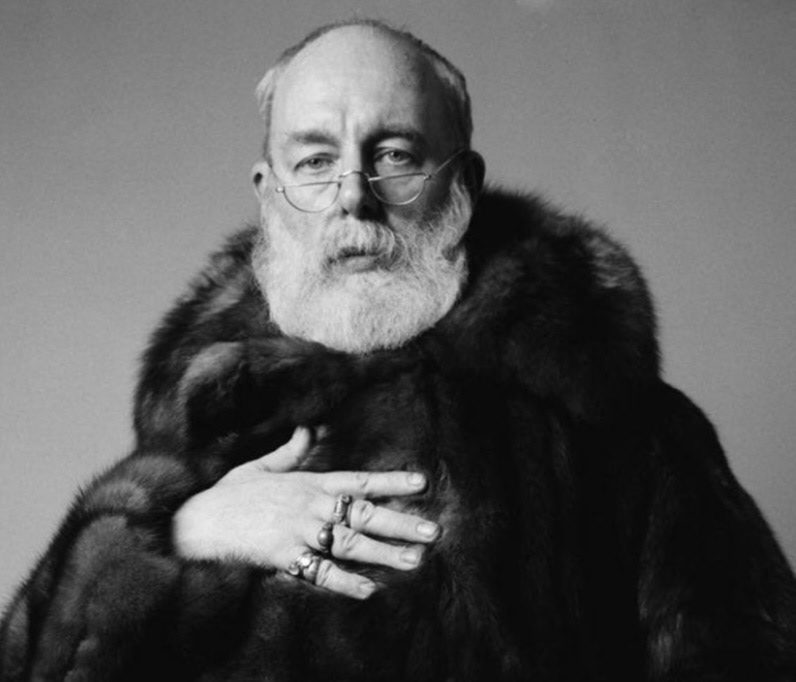
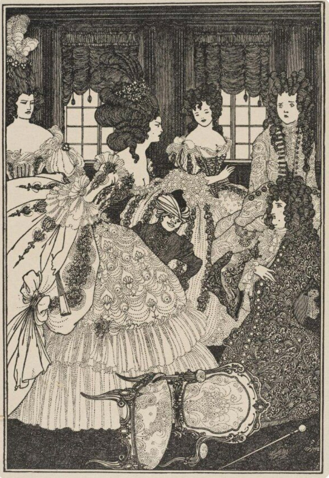
Edward Gorey (1925-2000) was an illustrator and costume designer based in New York whose work was most prominent in the 1950s and 60s. His work is known being humorous and rather on the macabre side, he produced many books of his own, as well as working for the New York Times and illustrating well known books such as Bram Stoker's, 'Dracula' and H.G. Wells', 'The War Of The Worlds'. Gorey classified his own work as surrealist and "literary nonsense" which I think comes through in his work as a sense of not taking itself to seriously which I'm very much drawn to.
As a child I owned one of Goreys' books called 'The Gashlycrumb Tinies', ever since laying eyes on that book I found myself obsessed with his illustration style. I really loved the gothic style and how it was some how quite over the top but at the same time quite simple. I think the lifework in is illustration has always drawn me in too, how he achieves so much tonal value through pattern.
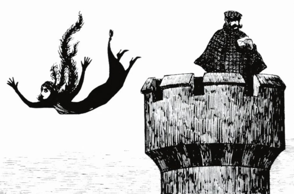
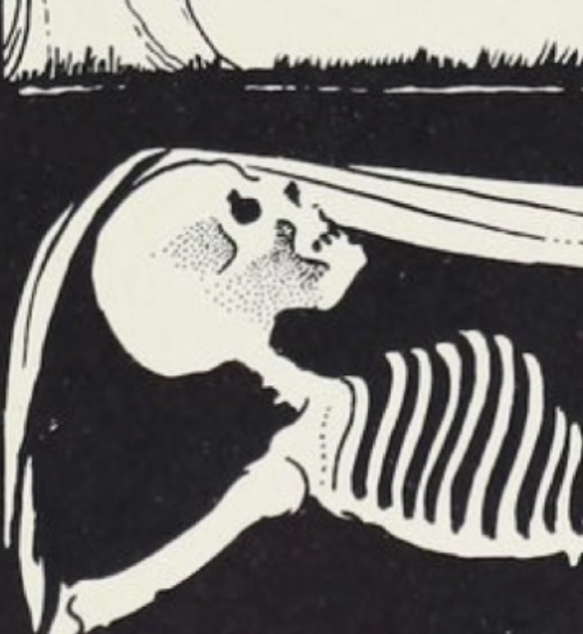
Taking a closer look at Goreys line work (above), I couldn't help but notice that in places it reminded me a lot of how clay can look when a pin tool has been run into the surface, and how I could experiment with a technique like this in my own work to create shade and texture. I kept this idea in the bank whilst I kept exploring other illustrators that had perhaps have been inspired by Goreys work themselves.
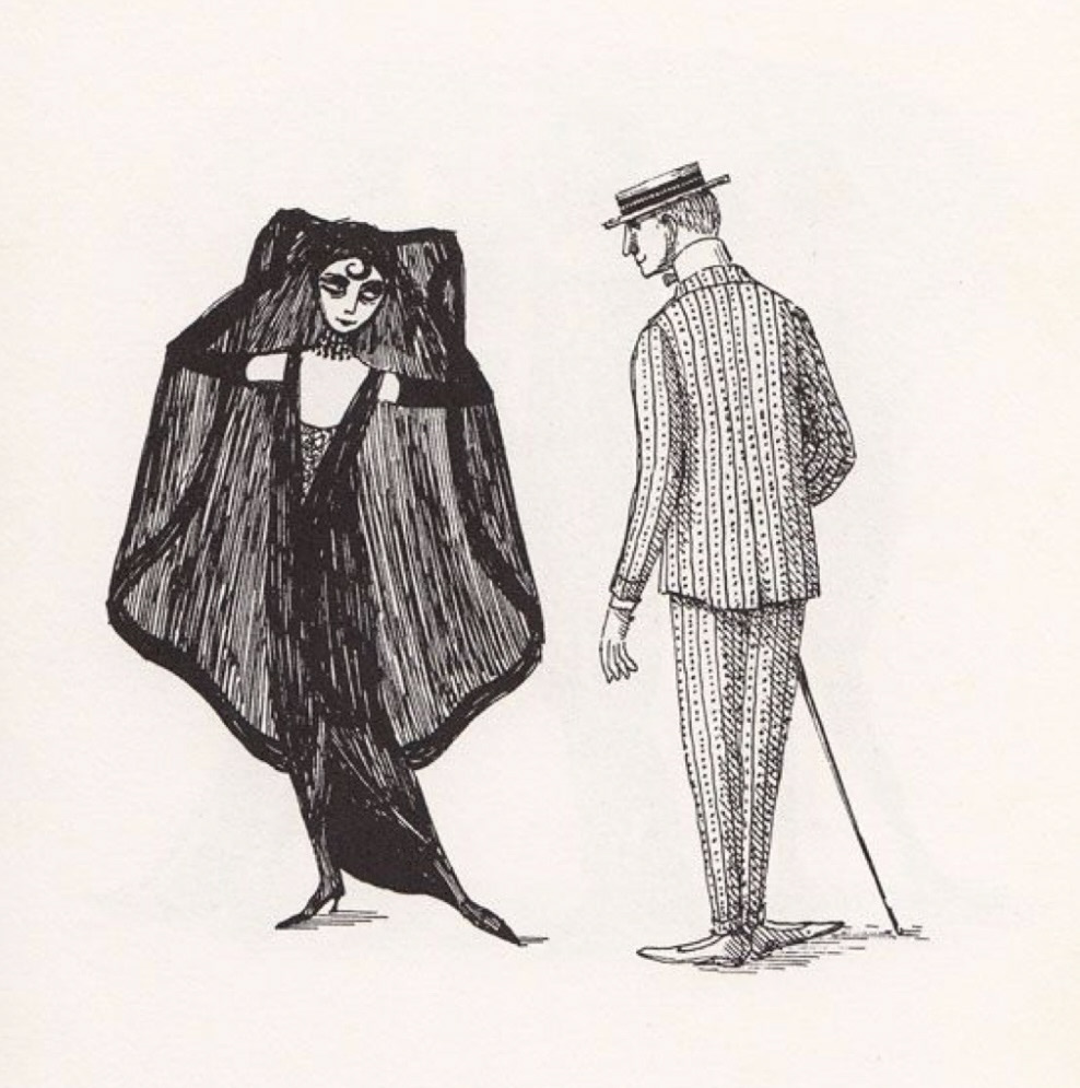
One of these artists would be an illustrator called Chris Riddell. (below).
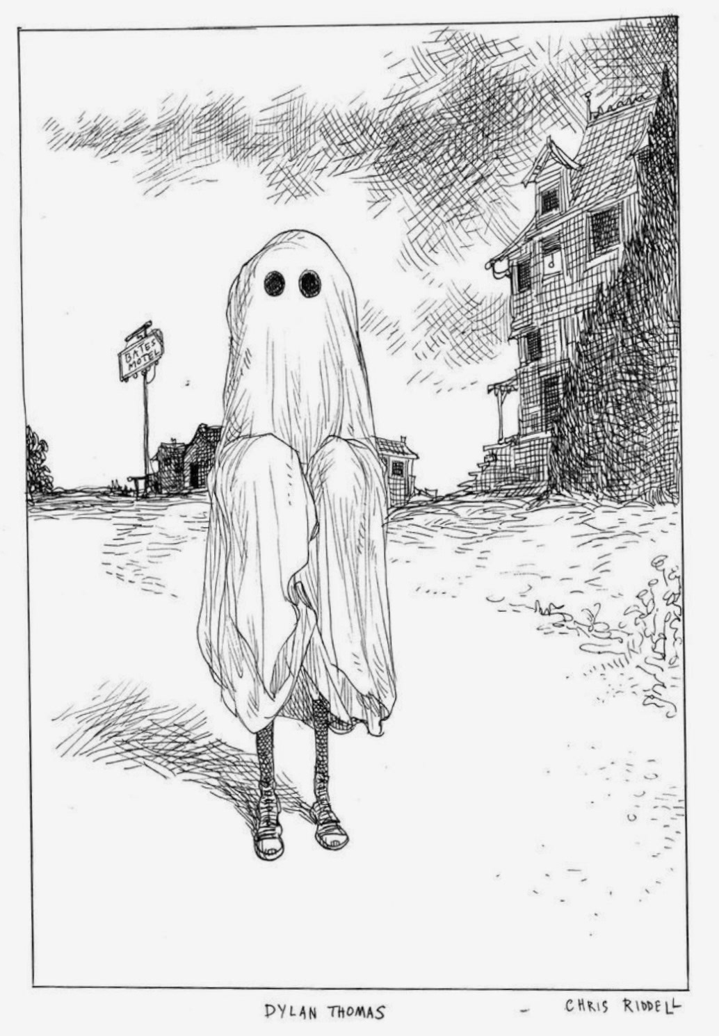
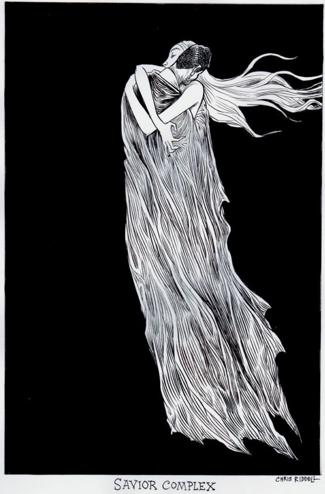
Chris Riddell is another illustrator that I came across when I was very young, I was introduced to him through his own children's works such as 'Ottoline' and 'Goth girl' as well as his collaborative works with the author Neil Gaiman, such as my favourite book 'Coraline'. Much like Edward Gorey, I remember falling in love with the dark, gothic style of his illustrations, although not as macabre as Gorey, I found great interest in the detail in Riddell's work as I find his images to be packed to the brim with atmosphere and narrative. Much like Gorey and to a bit more of an extreme, Riddell uses large areas of black to contrast with his patterned line work which I really think lets the work stand and again adds some of that desired atmosphere.
Taking a closer look at Riddell's work (above), I have observed that unlike Gorey, Riddell uses a cross hatching technique rather than a line technique to create his tonal value, I think that this adds a lot more detail however I'm not sure how this technique would fair when crossed over into ceramic application as I think the clay has a potential to break and squish into itself (for absence of a better word), but this is something I will have to experiment with. However I do think that this technique could work well if the black under glaze is used, also I think in my underglaze samples I will try and work with the contrast of large black areas however I don't want to cover too much of the base colour of my raw clay, but this can all be tested with sampling.
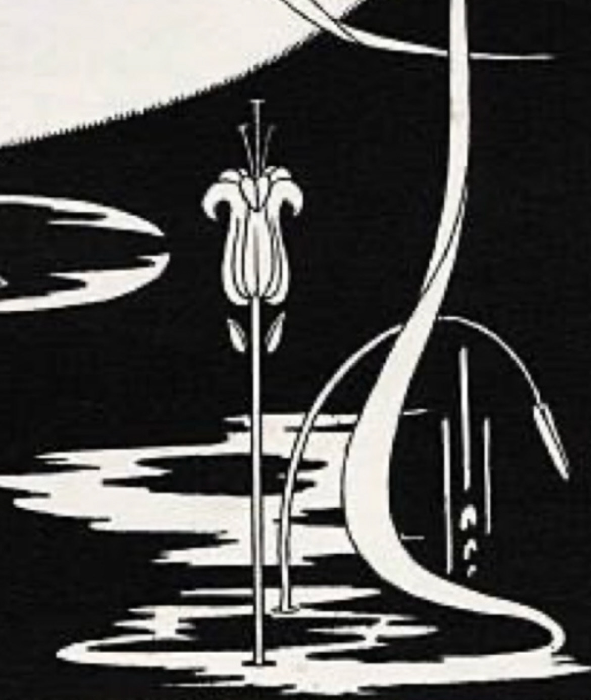
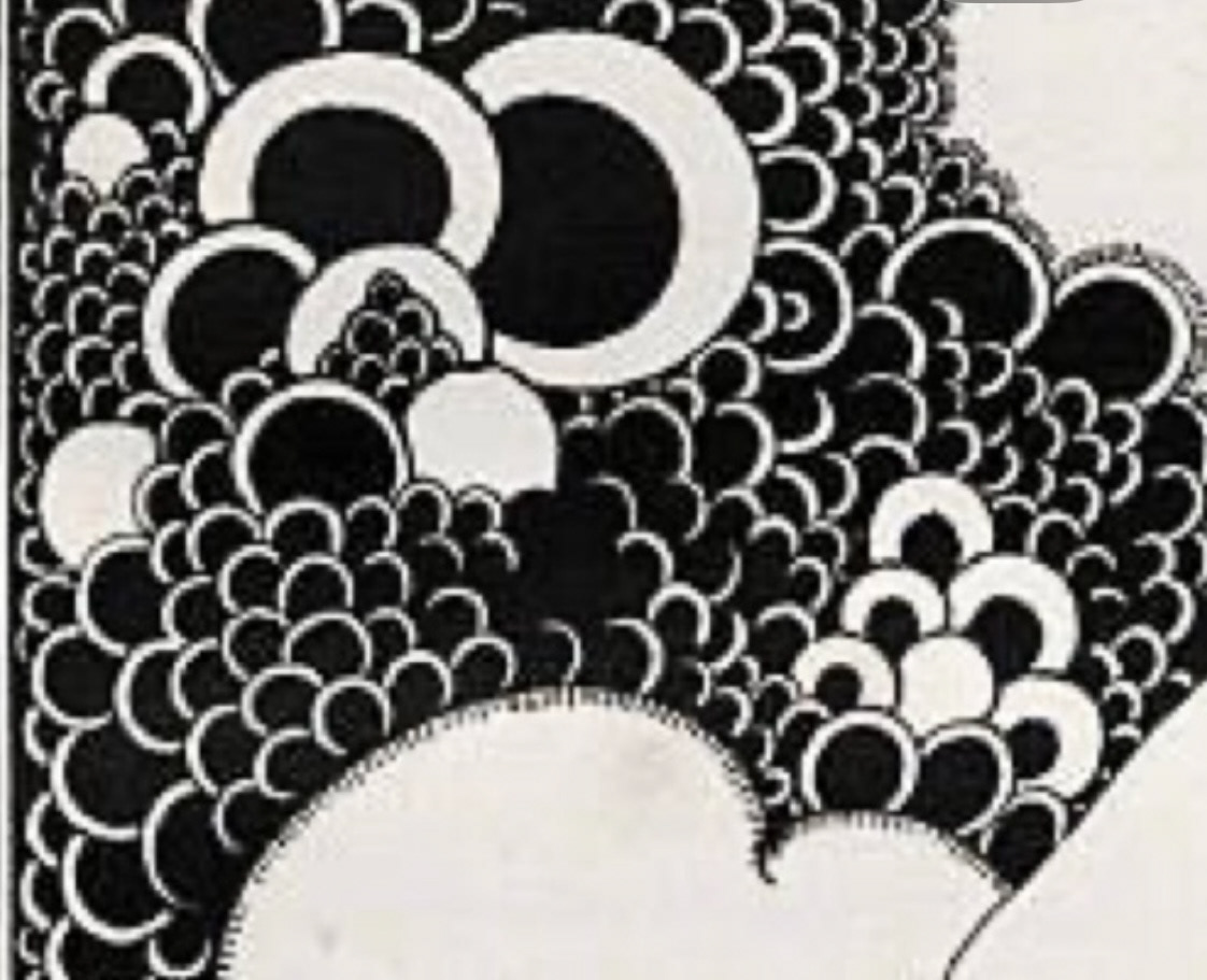
A few years ago I attended a talk given by Chris Riddell at the Northern School of Art in Hartlepool where he listed a few of his influences, one of these influences, along with Edward Gorey was an artist called Aubrey Beardsley. (below).
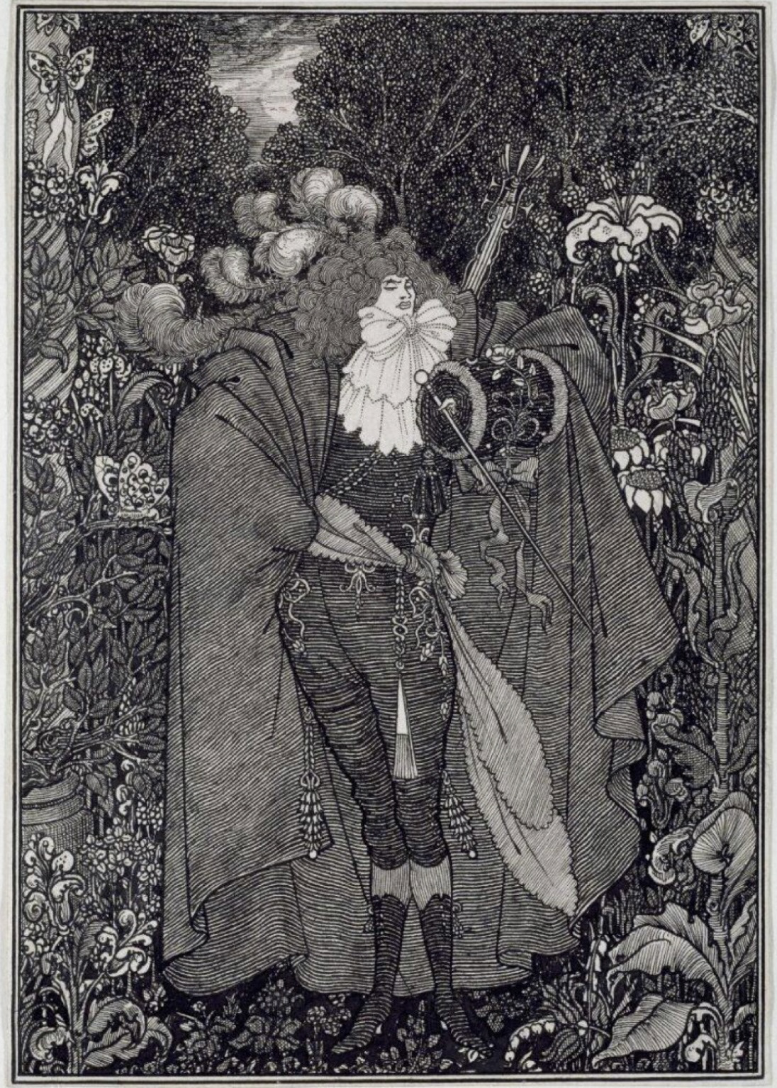
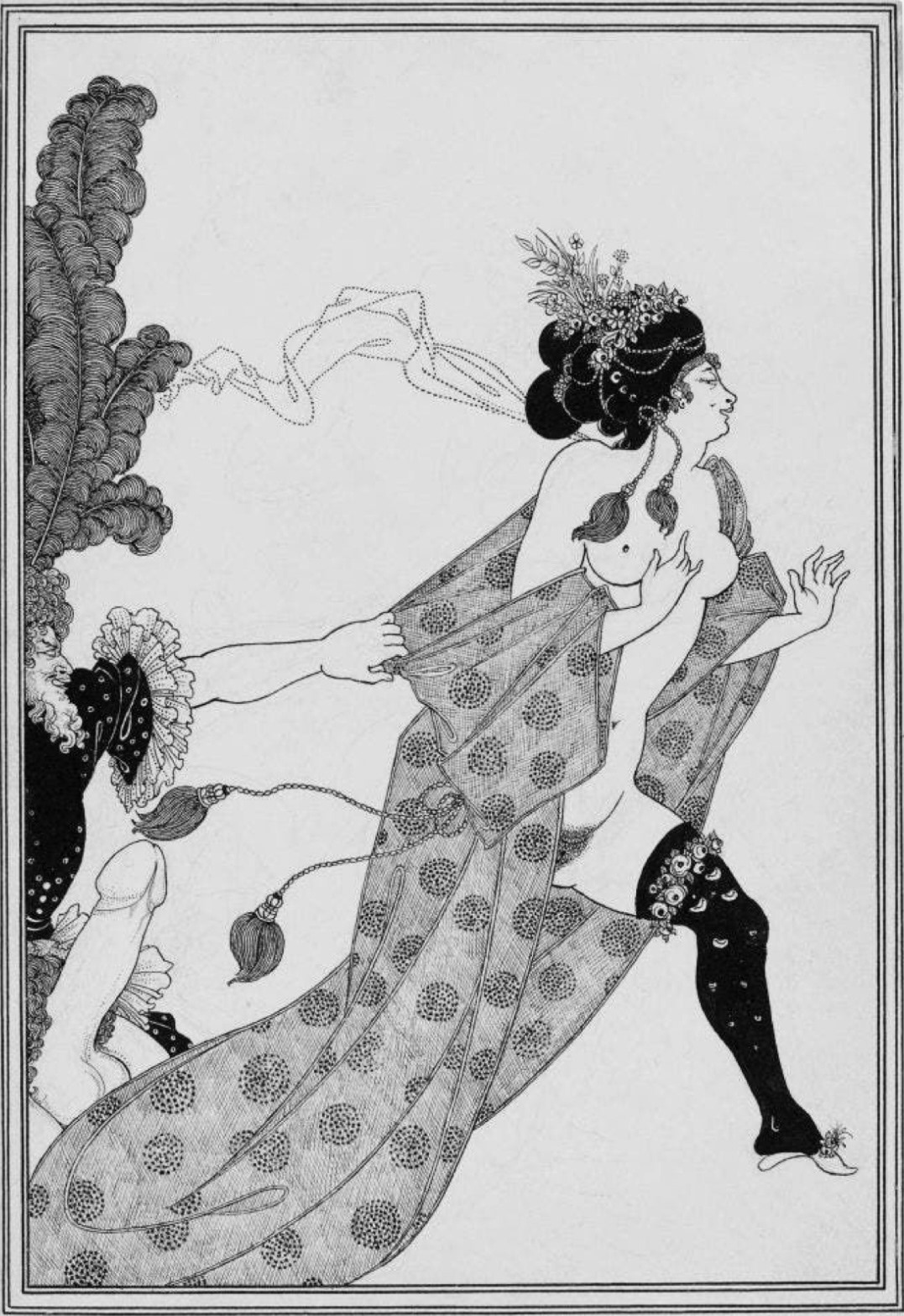
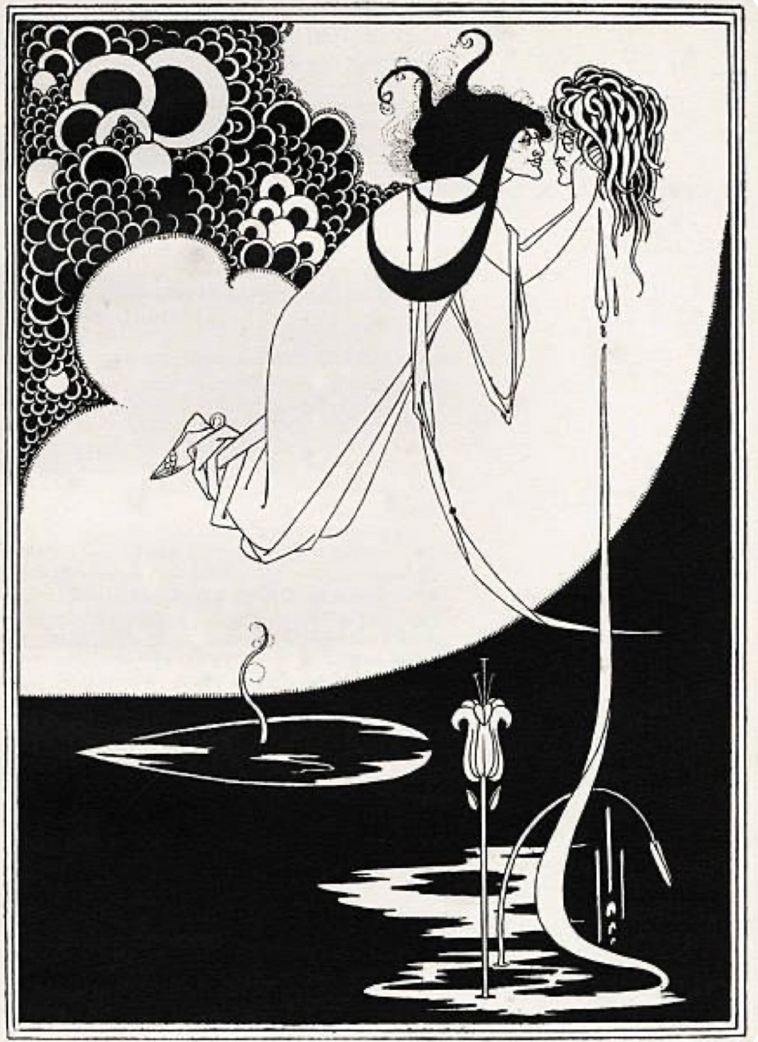
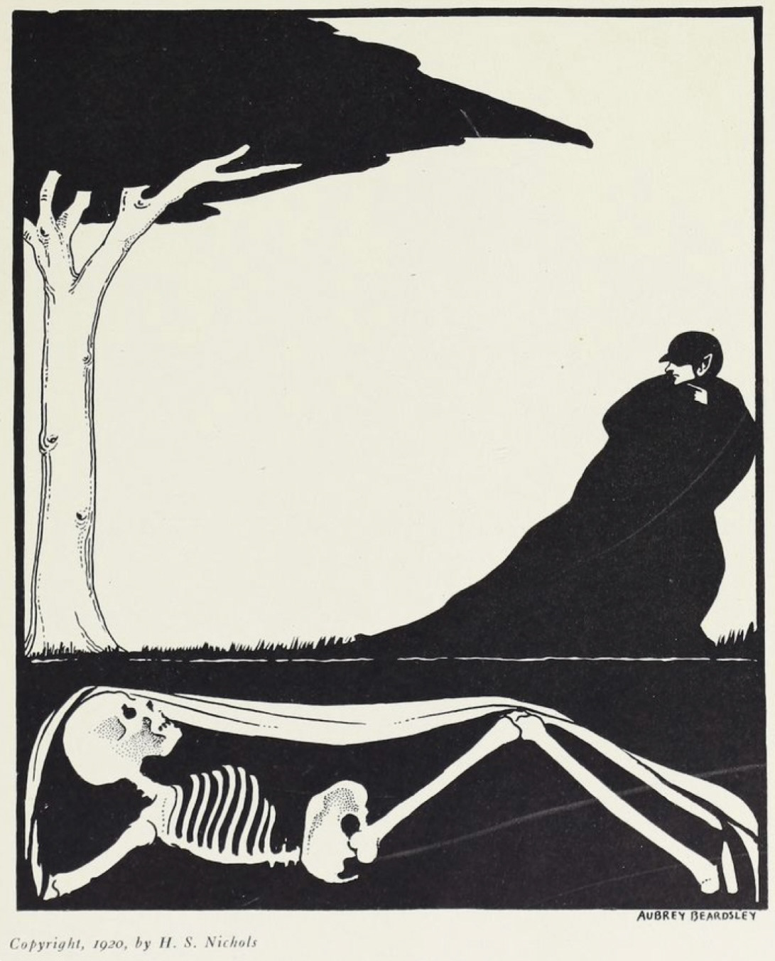
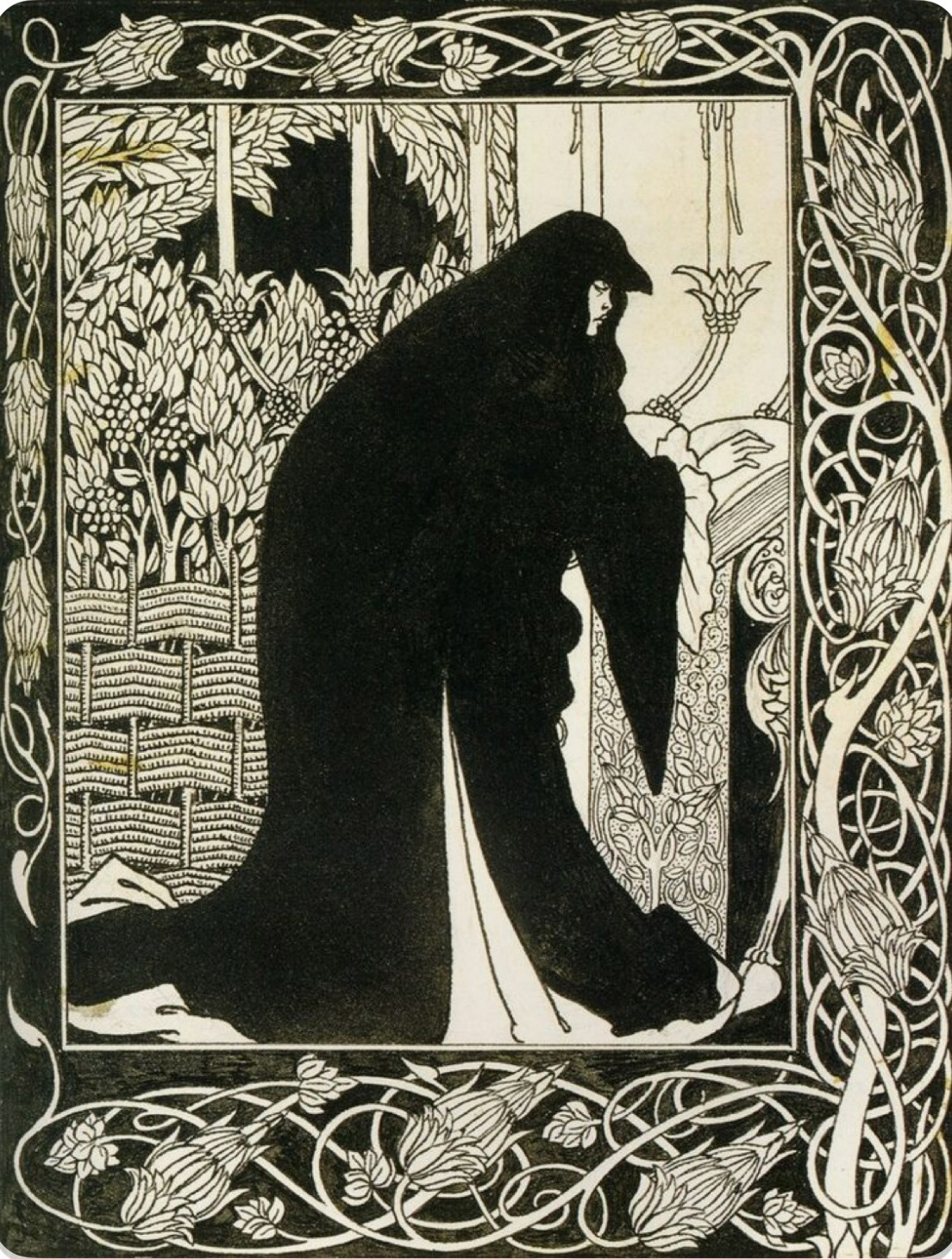
Aubrey Beardsley (1872-1898) was an artist and illustrator from the Victorian era who, in his early life, produced dramatic scenes of high detail depicting the ornate, the decadent , the scandalous and the macabre. in his later life however, when deathly ill with tuberculosis, Beardsley was greatly inspired by Japanese wood print. He produced simple but decorative, narrative scenes depicting greek antiquity and folk story telling using pen and ink, these pieces solidified his place in the art nouveau art scene.
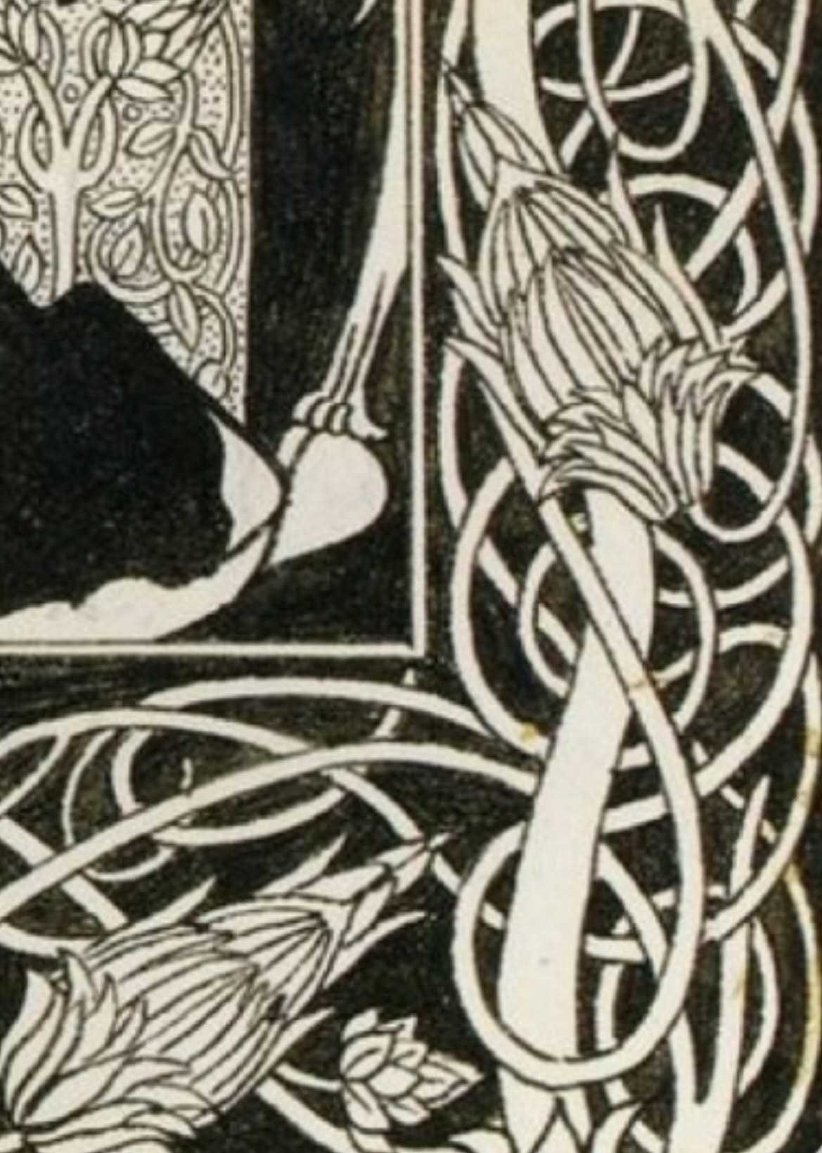
I have found that I am greatly drawn to both of Beardsleys styles however I think that drawing any inspiration from his early work and trying to pull from it into ceramic surface design, whilst still trying to make my images readable would be a task I think even the most skilful of ceramicists would find difficult. However I find that his later work is abundant with technique and style that I can draw from. Beardsleys use of large areas of black and negative space I think would lend itself quite well, especially in the use of underglazes. I also think that I can find inspiration from his use of bold pattern in his borders and background design to really enhance my work. (closer look below).
Now that I felt I had truly explored the styles and aesthetics of surface design I would like to try, I decided to embark on some sampling to see how I could transfer this research effectively.
In the workshop I took some of my home dug clay and ran some of it through the slab roller and cut out some simple circular tiles with which I could experiment on.
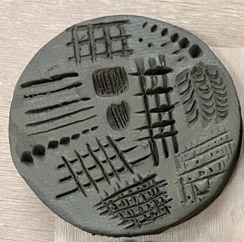
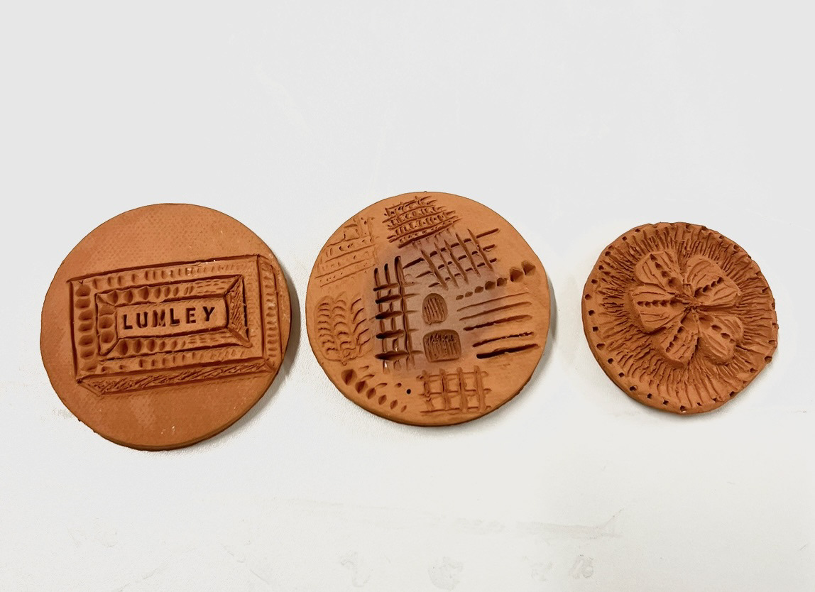
The first tile I produced would be a surface texture experiment tile where I would test out different types of mark making to see if I thought that tonal value could be achieved with just texture itself.
I used my pin tool to test out line thickness and depth, I also used this to see how effective crosshatching could be as a shading tool. I think that cross hatching may be quite a difficult thing to effectively transfer into a ceramic surface as there is an element of 'smushing' that does occur.
I then went on to test out some different tools and techniques, one of the most effective I thought was using the tip of my wooden kidney as I think the depth at which I pressed it into the clay, did quite a good job with creating tonal value. this was one of my most successful tests so I think I may use this moving forward.
finally I used a mix of tools and techniques to apply pattern in an experiment to see how variation could be used through pattern.
The second test I carried out was then how to incorporate these techniques when it came to imagery.
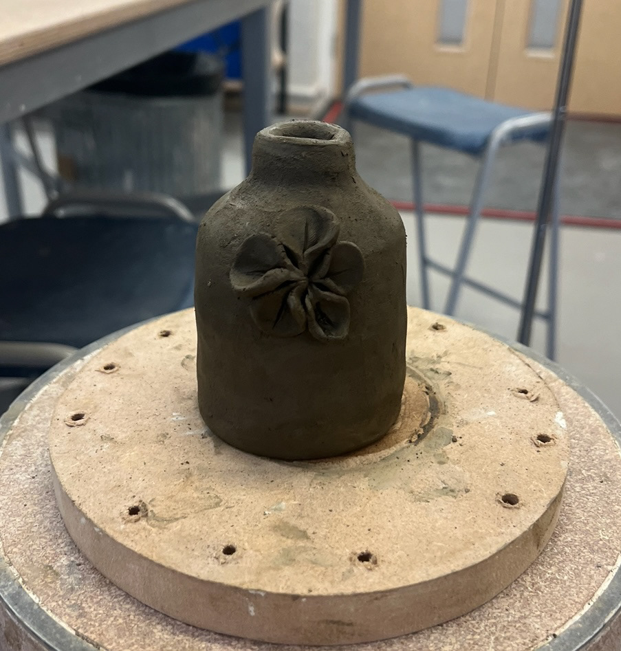
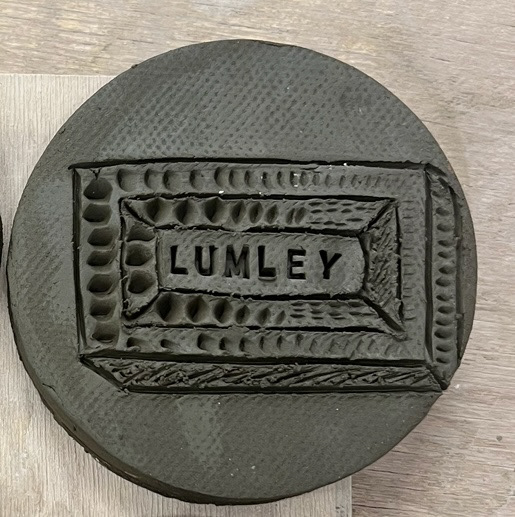
as my subject matter revolves heavily around the Lumley brick, I thought that this would be a good image to use.
I used my pin tool to apply the outline of my piece, then I used the tip of my wooden kidney to apply the shadow and pattern, I did unfortunately get the shadow placing wrong when applying this but I think that it is really effective and achieved the look I was trying to achieve.
I finished my illustration off by applying the word Lumley, as displayed on the real brick, using some letter stamps. I think this looked effective as the uniformity of the letters contrasted with the freehanded nature of the rest of the drawing added dimension to the piece.
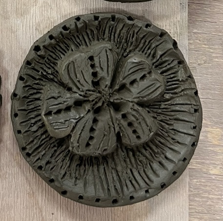
Finally on the texture samples side of things, i produced a sample inspired by some of the techniques I was inspired by from Edward Gorey (line shading) and Aubrey Beardsley (negative space).
I used a pin tool to draw out my flower drawing, then used a loop tool to cut out space around it. I then went back in with my pin tool to try and enhance the areas of shadow around my image. I think this is quite effective in person as the subject really stands out. I then went in again with my pin tool and wooden kidney to add more decoration to the flower. I think in future I will be a bit less liberal at this point as I think it might be a case for less is more but I can always experiment with this more in future.
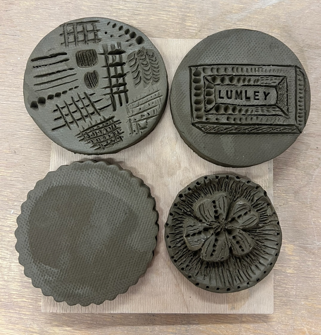
Finally I made a larger fourth tile so that once fired I can test out some black underglaze and see how it reacts to the surface of this clay, just so I can weigh up my options.
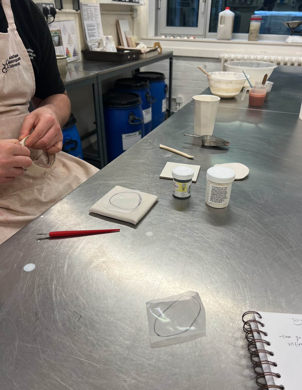
Whilst these were drying and getting ready to fire, I had a one on one workshop with Rudy the ceramics technician to test out some new image application methods that he had been experimenting with.
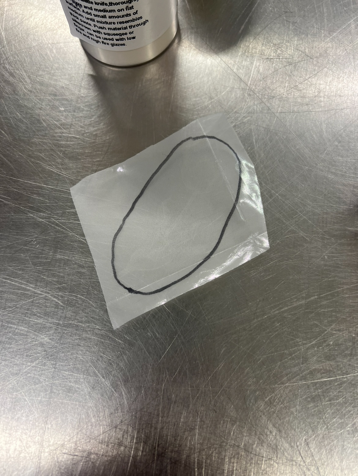
Rudy called me into the glazing studio to show me that he had been working with print to produce some ceramic screen printing screens and was wondering if I would like to test them out. I thought that this was a fantastic and exciting opportunity so leapt at the chance.
(Step by step workshop notes below.)
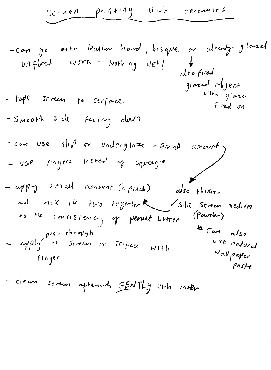
I also documented this process through Rudy's demonstration in photos (below).
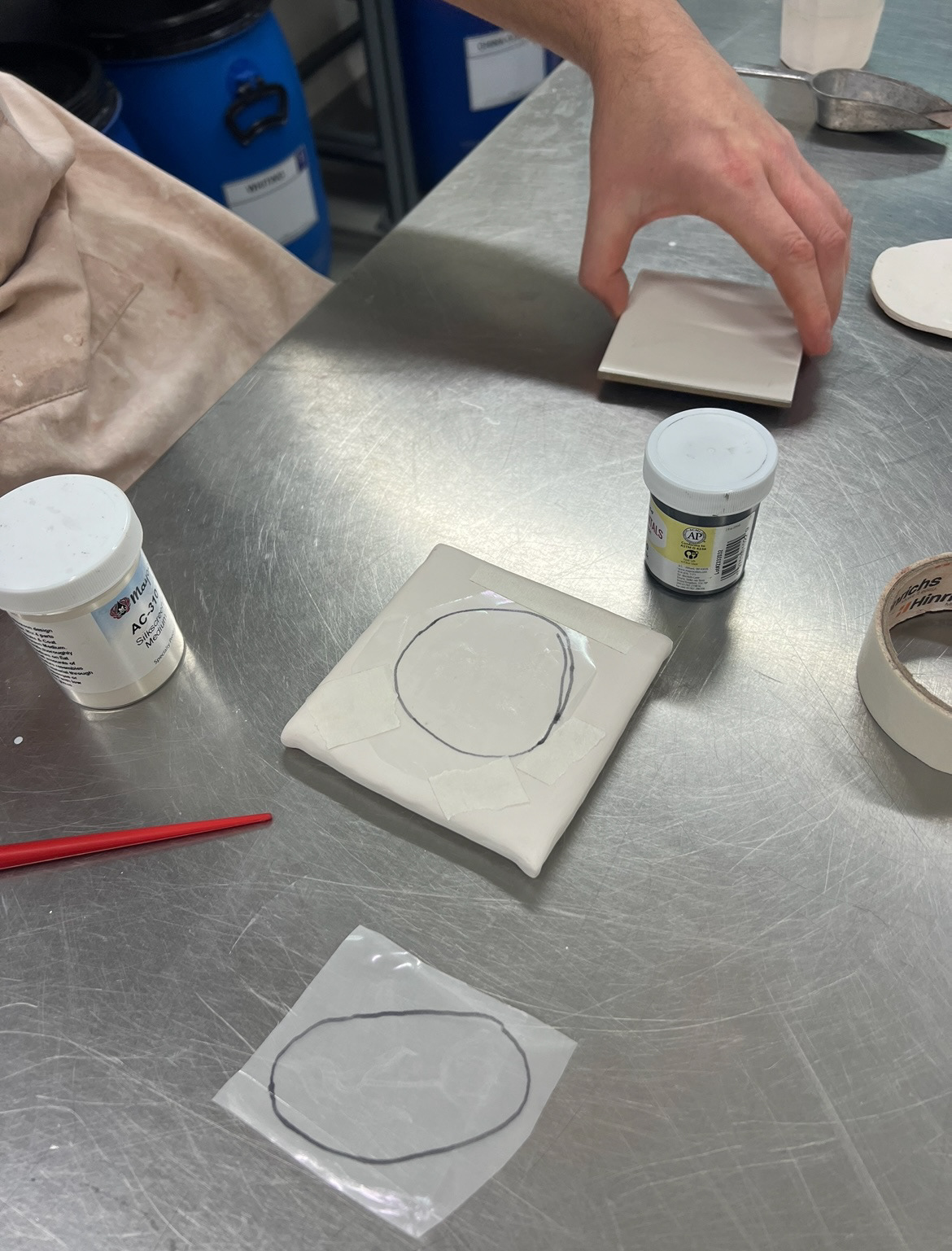
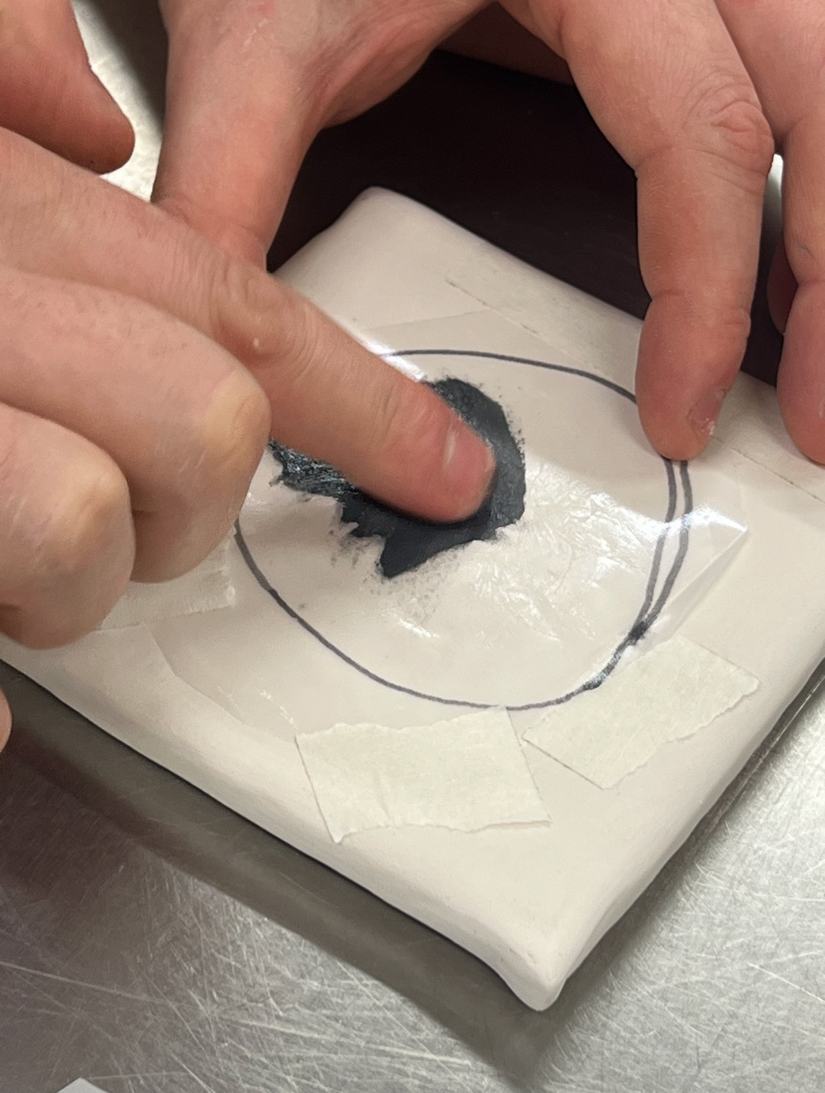
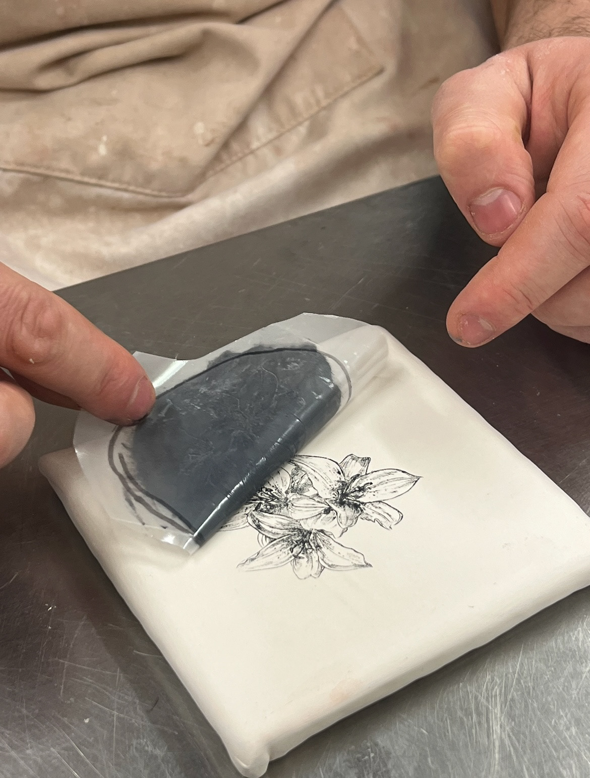
Once I had watched Rudy's demonstration, it was my turn. However this time we would be testing out applying the screen print to an already glazed piece rather than a bisque fired tile like the one we had just used. we were also testing for how the process would change when applied to a round surface as that is usually what I work with.
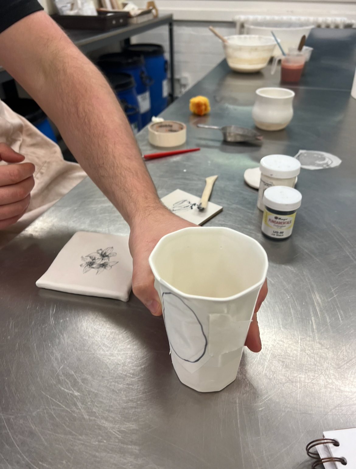
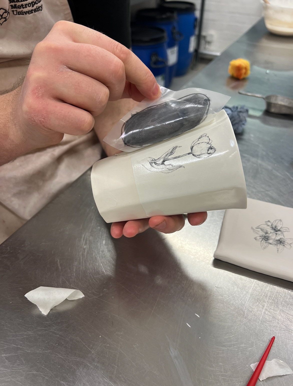
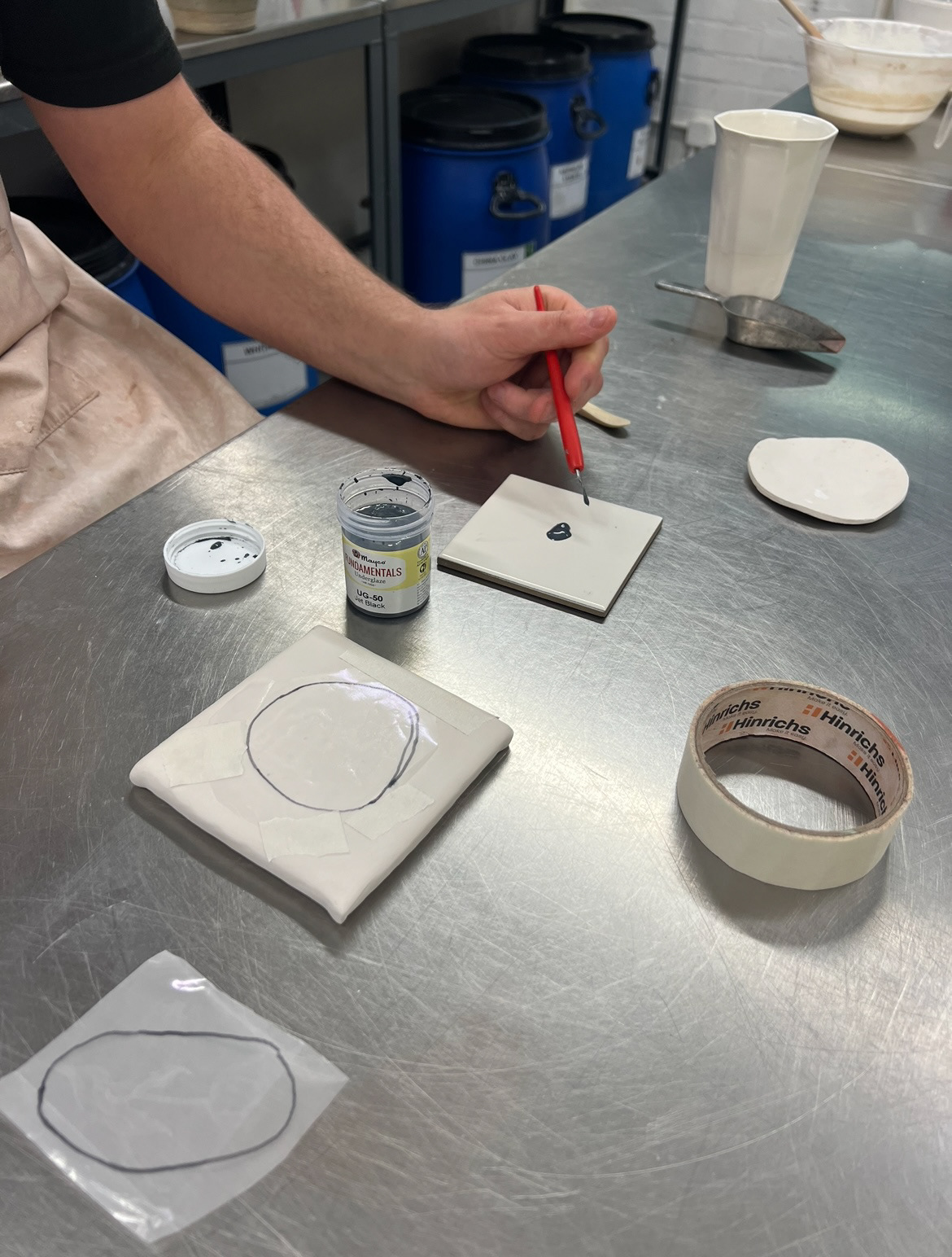
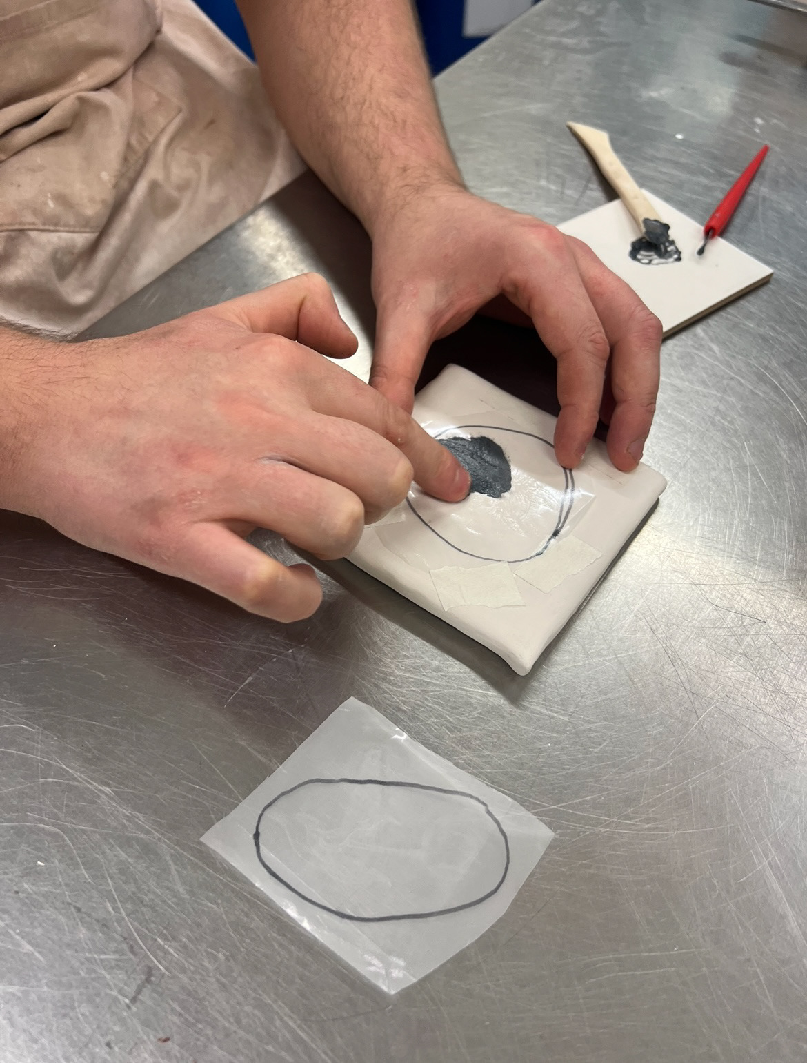
I carried out the process the same as the above, making sure all of my underglaze and thickening agent was mixed properly and the screen was tight to my surface and it seemed to work out well.
I then applied a clear glaze to the bisque tile and we sent them both into the kiln for firing. For these test pieces we thought that it would be best for us to test out the process first on a light clay and then if they worked well, test on a dark clay, such as my raw clay from home. Unfortunately however because of technical difficulties with the exposing unit over in print, I wouldn't be able to get my own screens of my own illustrations made until after Christmas so I'm not sure if I will get to use this process fro this project however I am excited for the future possibilities that this process has for me and transferring some of my more detailed illustrations onto my ceramic work.
Whilst I was waiting for all of my sample pieces to come out of the kiln, I wanted to really delve deeper into the history of the Lumley brick works.
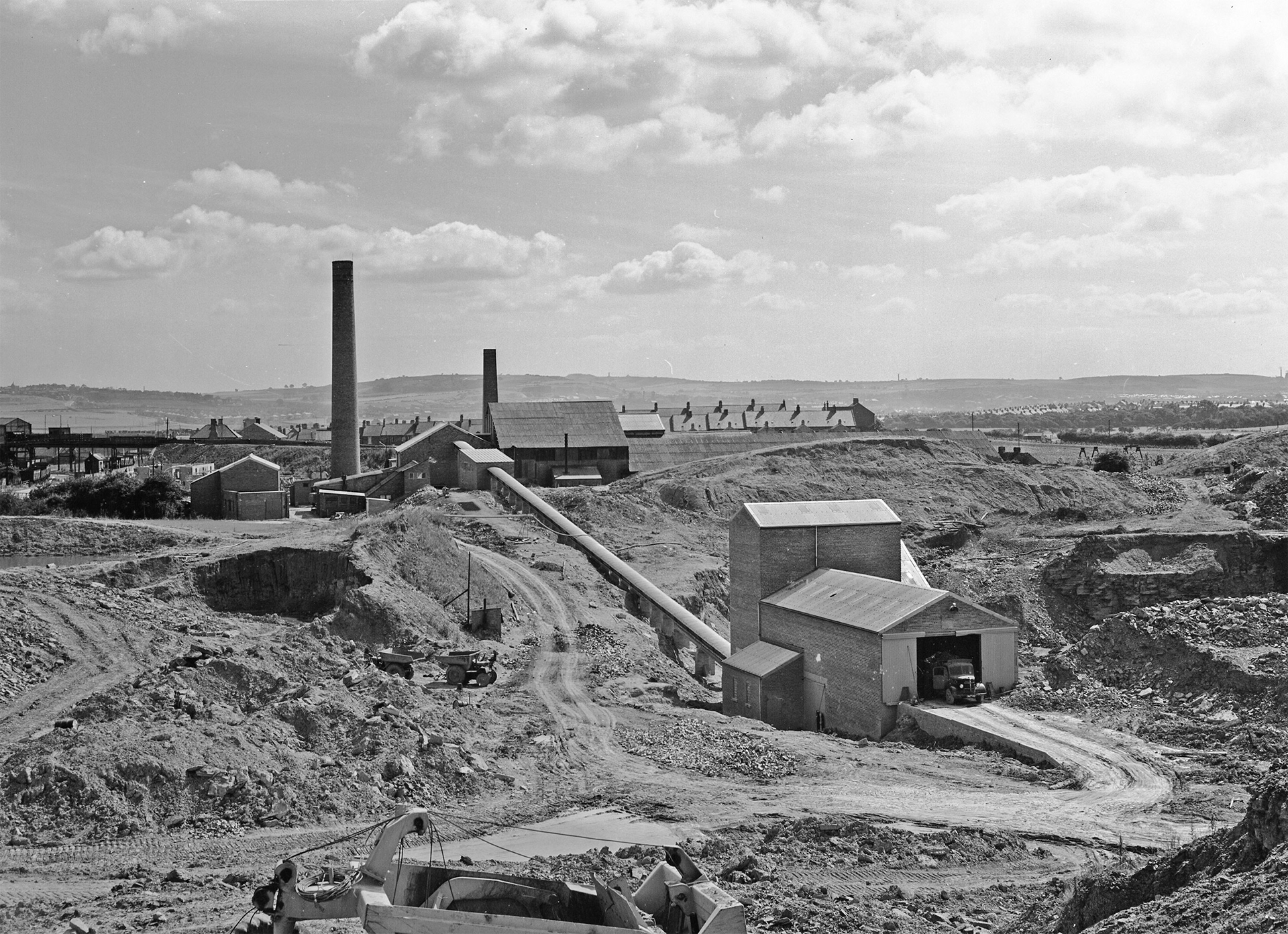
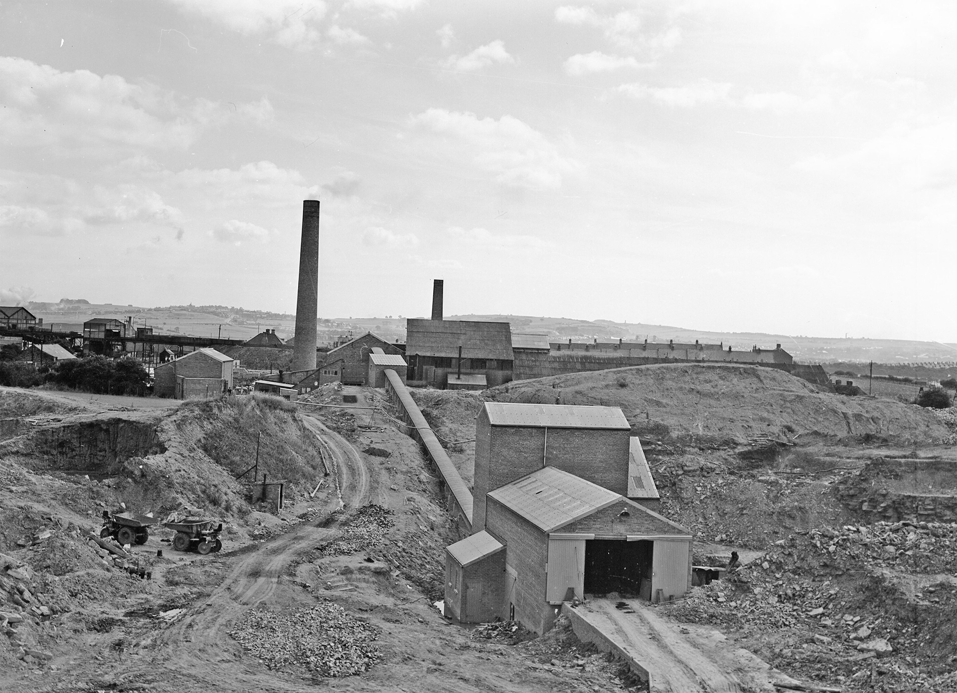
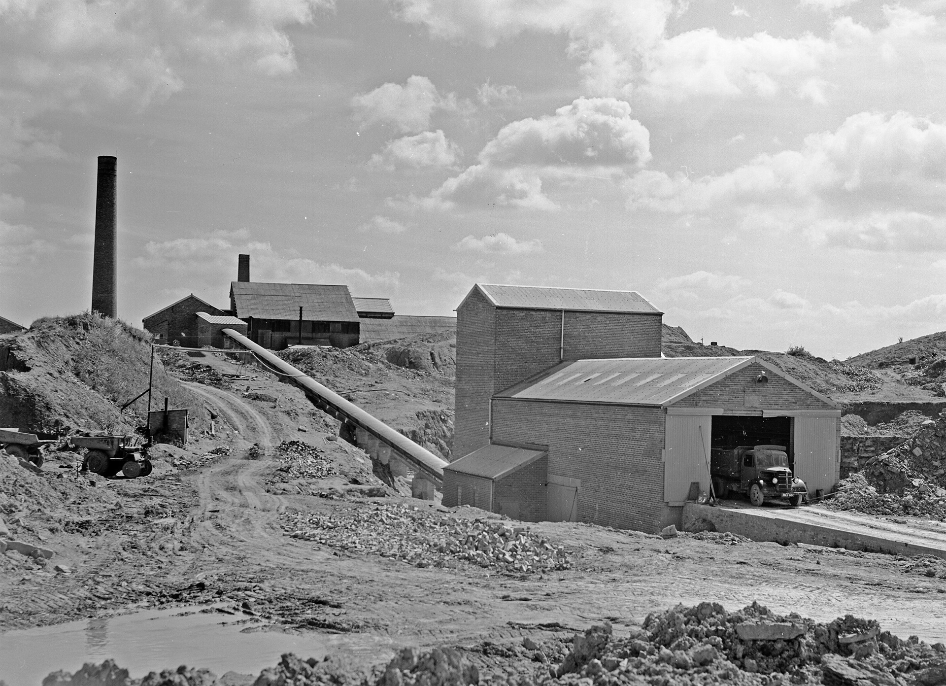
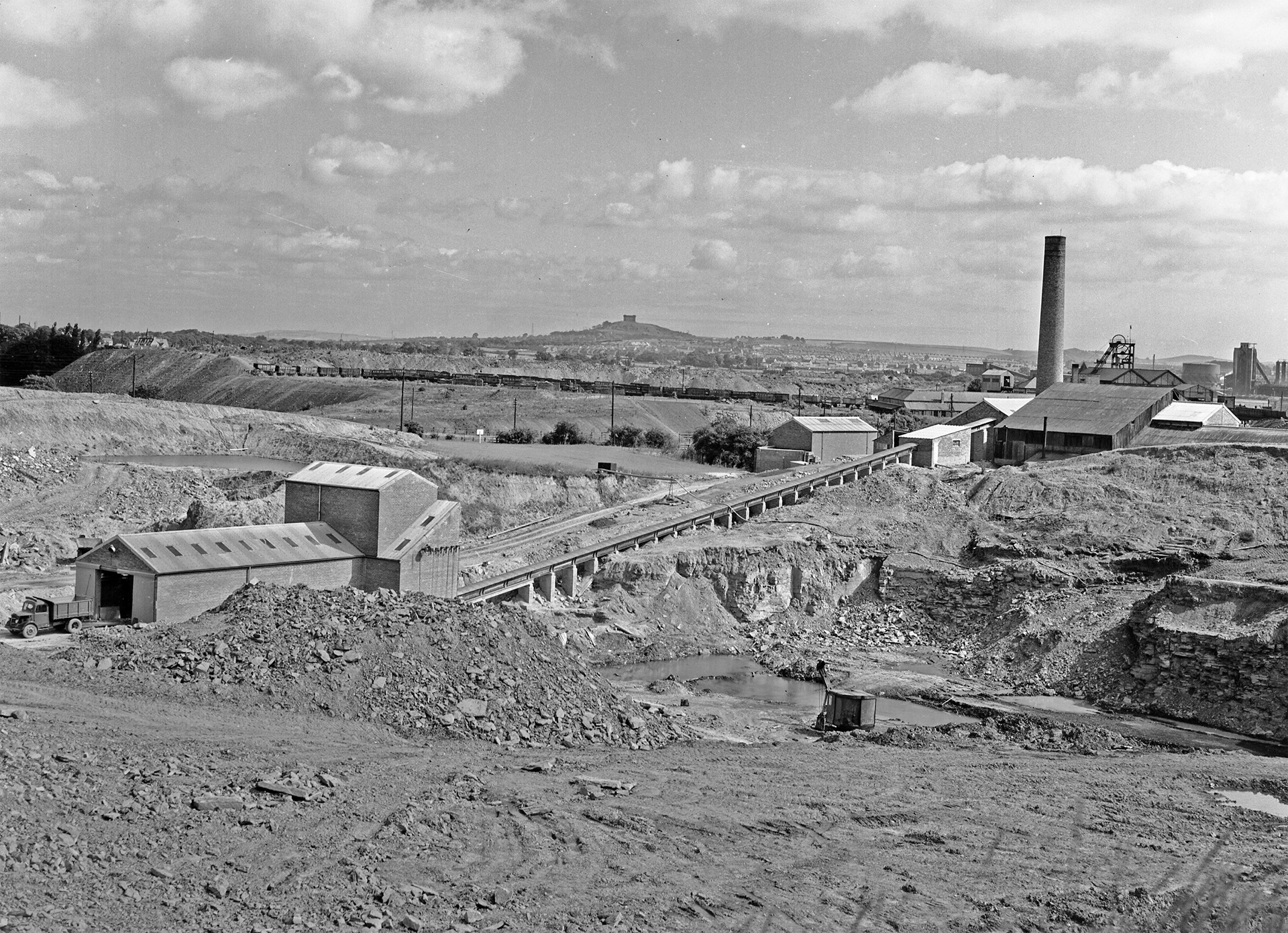
In depth information about the Lumley brick works, I've discovered is rather hard to come by. However as before, the Lumley brick works ran from 1870-1980, demolished in 1992. New information that I did find out however via local knowledge stated that the brick works at one point produced enamel bricks glazed in dark green, brown, deep yellow and cream, which I thought was quite interesting.
in my hunt to know more I decided to contact Beamish Museums' 'Peoples archive'. I sent them an email requesting any documents, records or photographs that they had to help assist me in my research. Very kindly, one of their volunteers replied to my message and said they would have a dig and see what they could do.
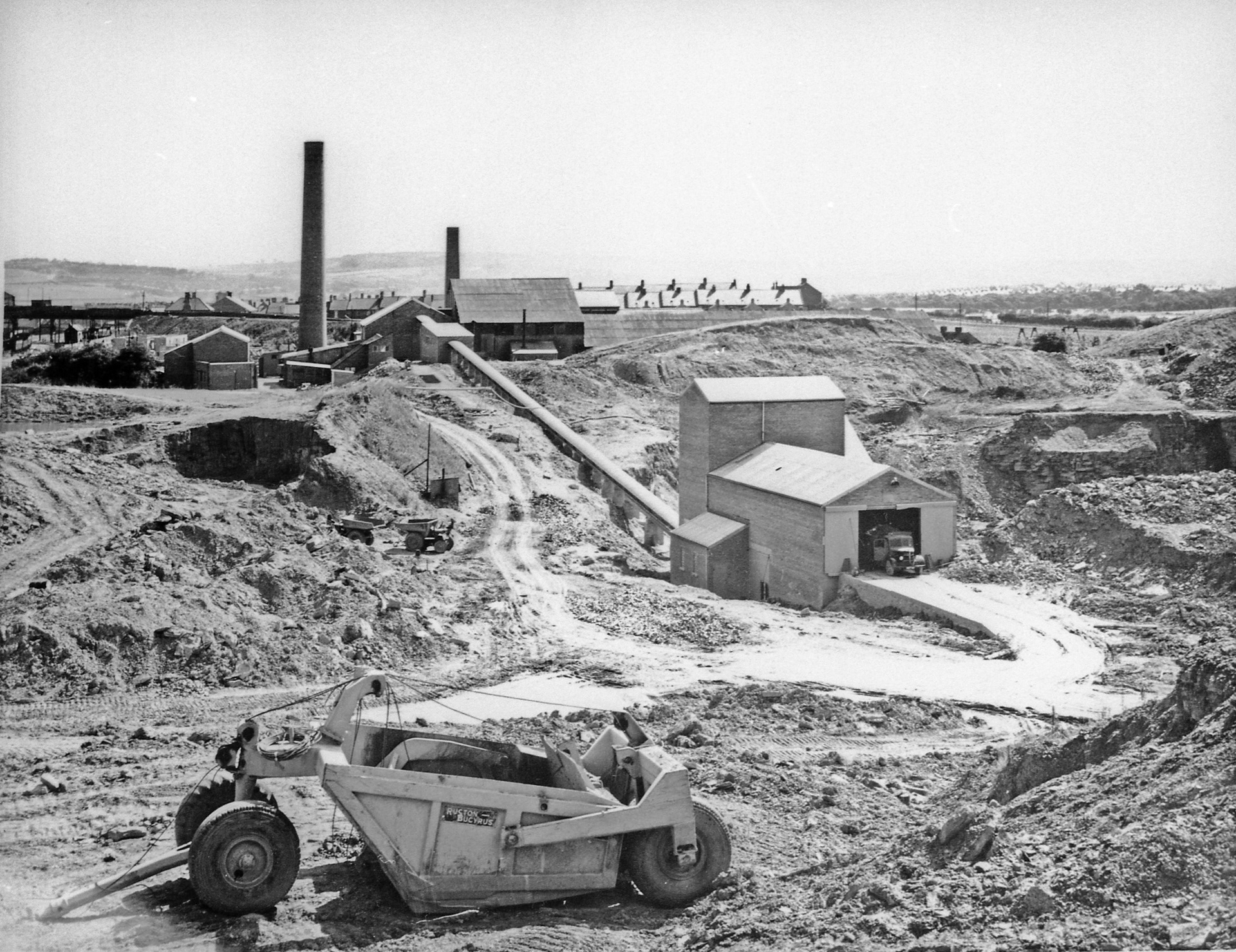
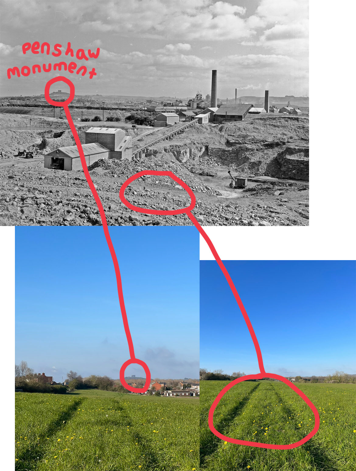
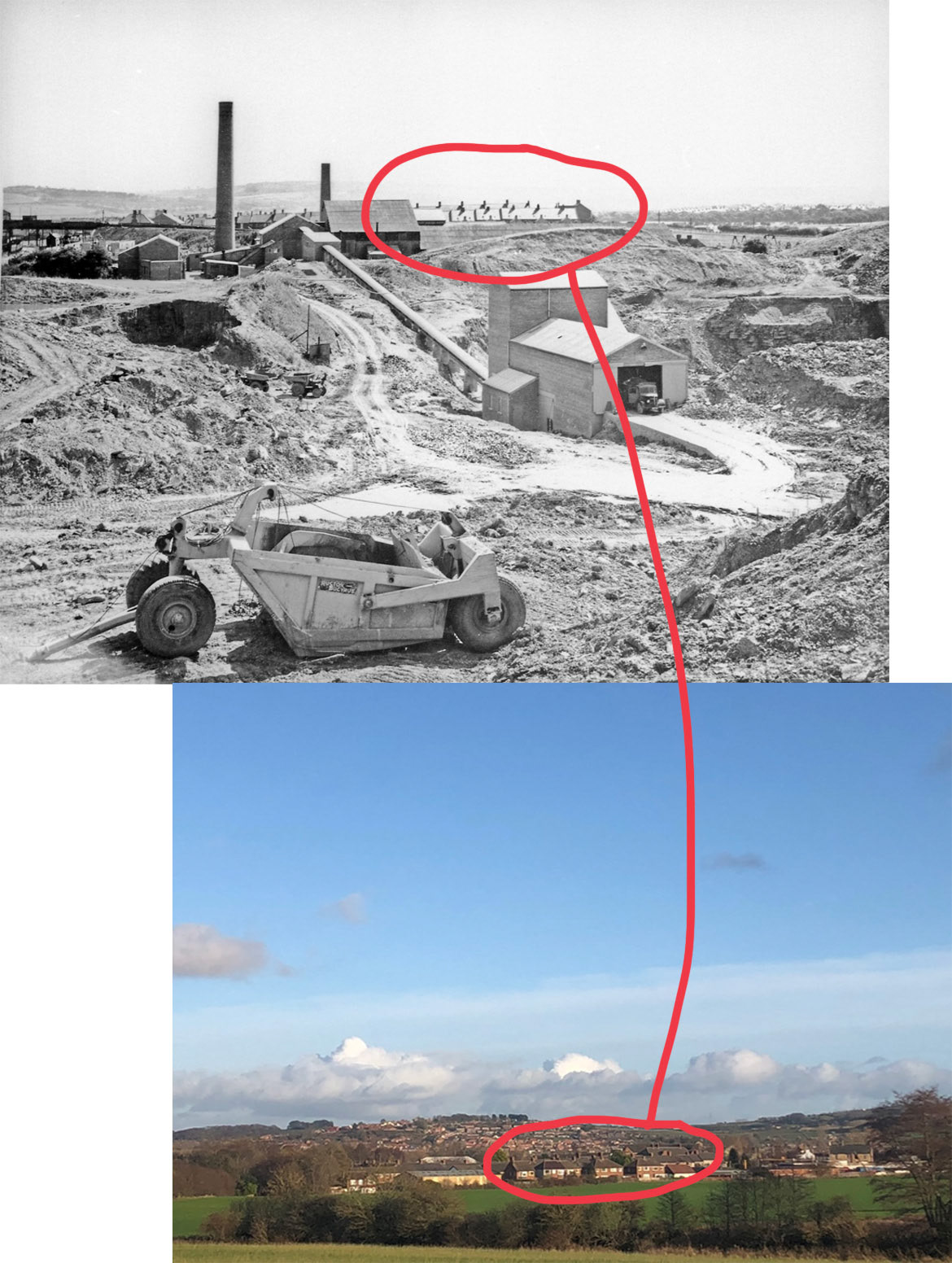
The next week they came back to me with a number of photographs taken on sight by Huwoods in 1958 and another advertising image from an unknown date. (below).
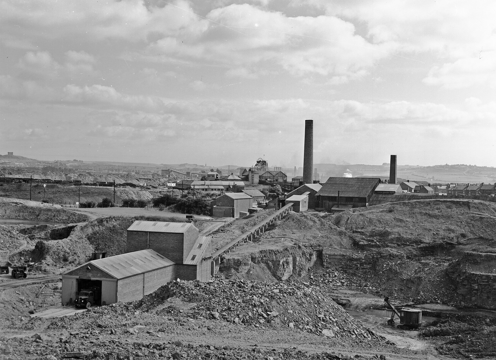
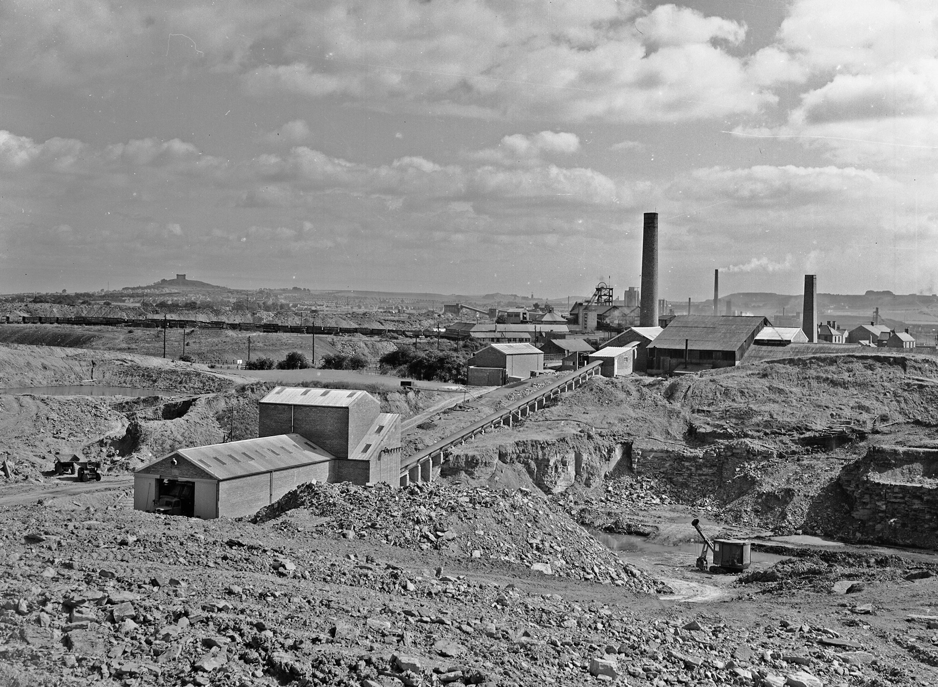
I absolutely loved seeing these photos and what the place where I call home once looked like. I thought that it would be quite interesting to look and see through my own personal archives if I had any photos of what the site (or parts of it) look like today. (below). These photos were taken in the field next to my house in 2021.
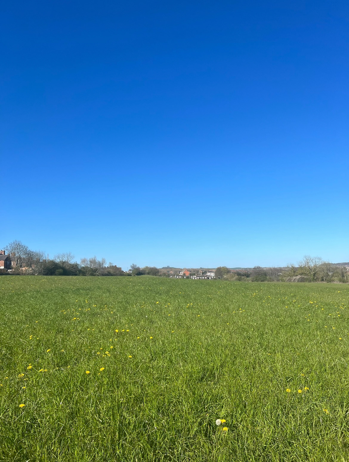
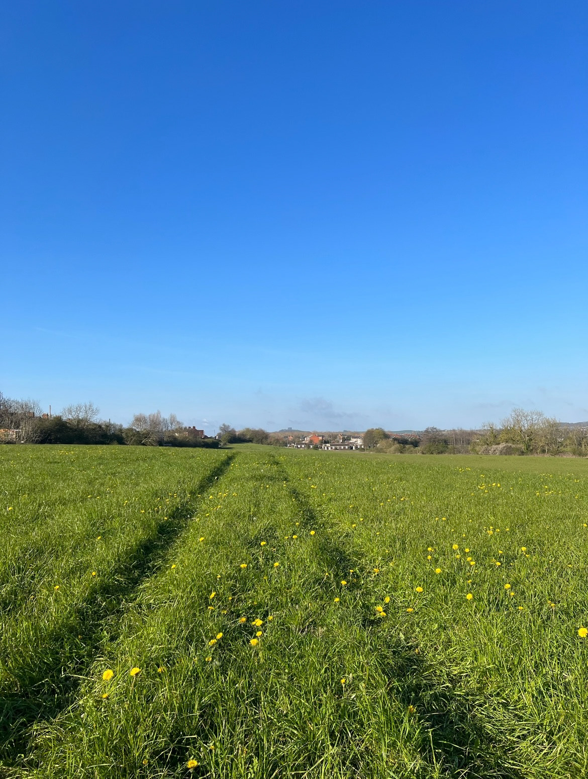
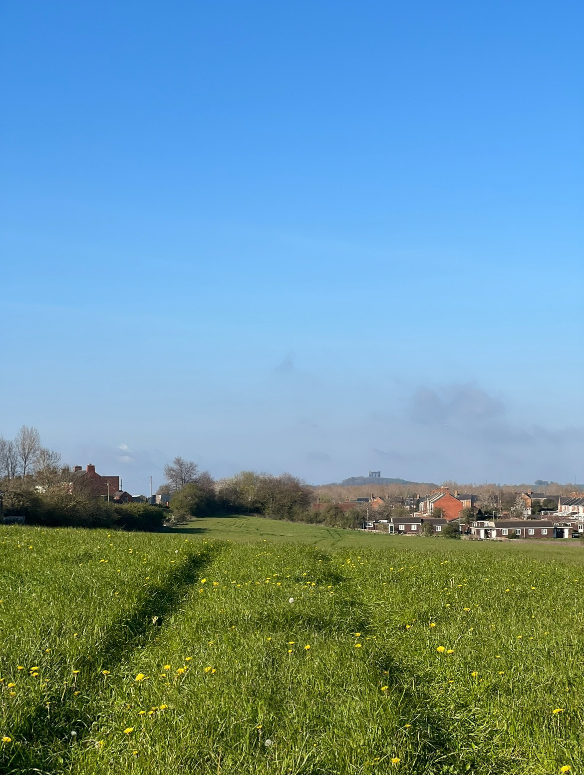
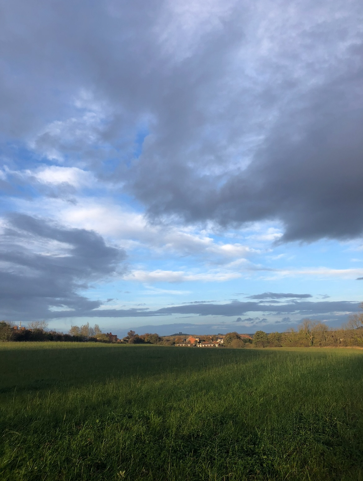
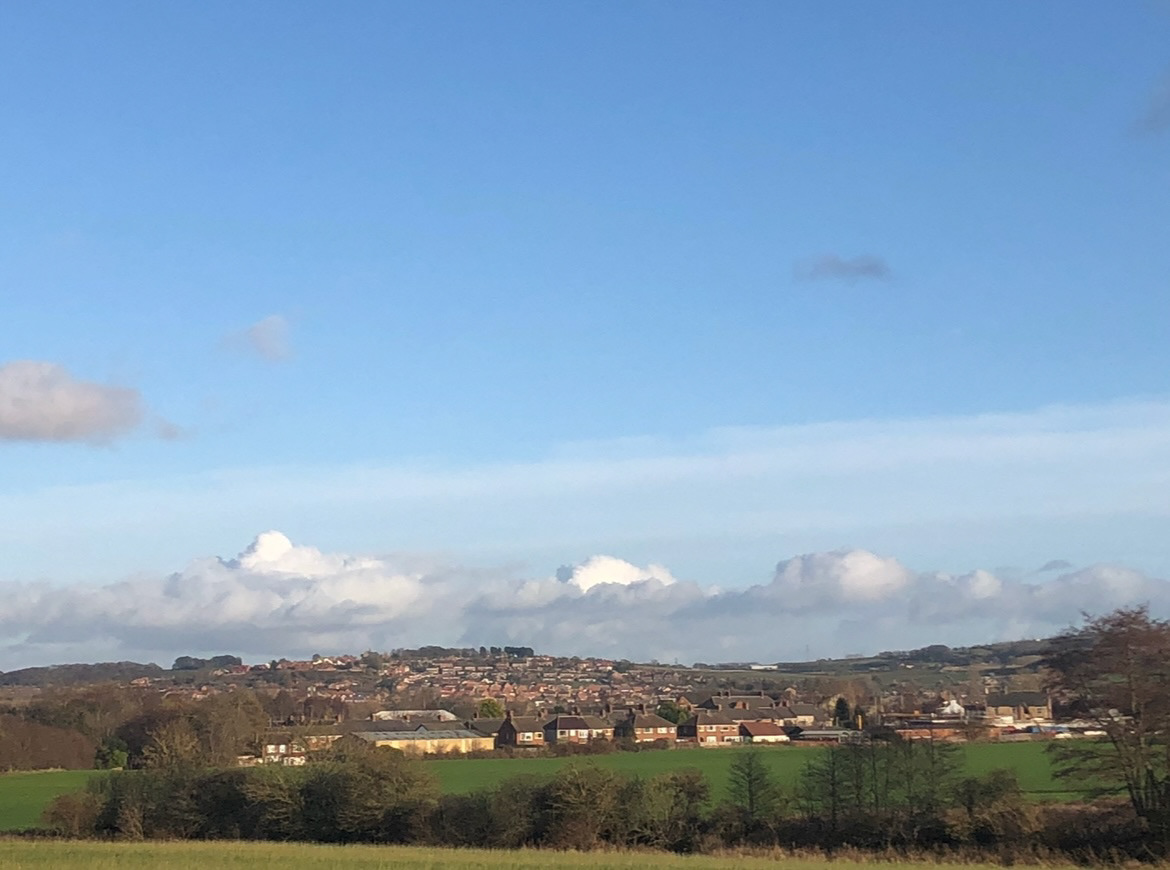
looking more at these photos together I realised that there were landmarks and comparisons between the two such as Penshaw monument which sits upon a hill in the distance and the houses of the nearby great Lumley. I also thought that it was quite interesting to note how in the old pictures the ground is marked with the tire tracks of the working vehicles, and also in the newer ones, the ground is imprinted with the farmers vehicle tracks as the land is still worked for hay farming. (below).
After this I decided to look on a few local newspaper archives, unfortunately I was only able to find one photograph, from the Wearside Echo, however I did think it was quite a good photograph from 1956. (below).
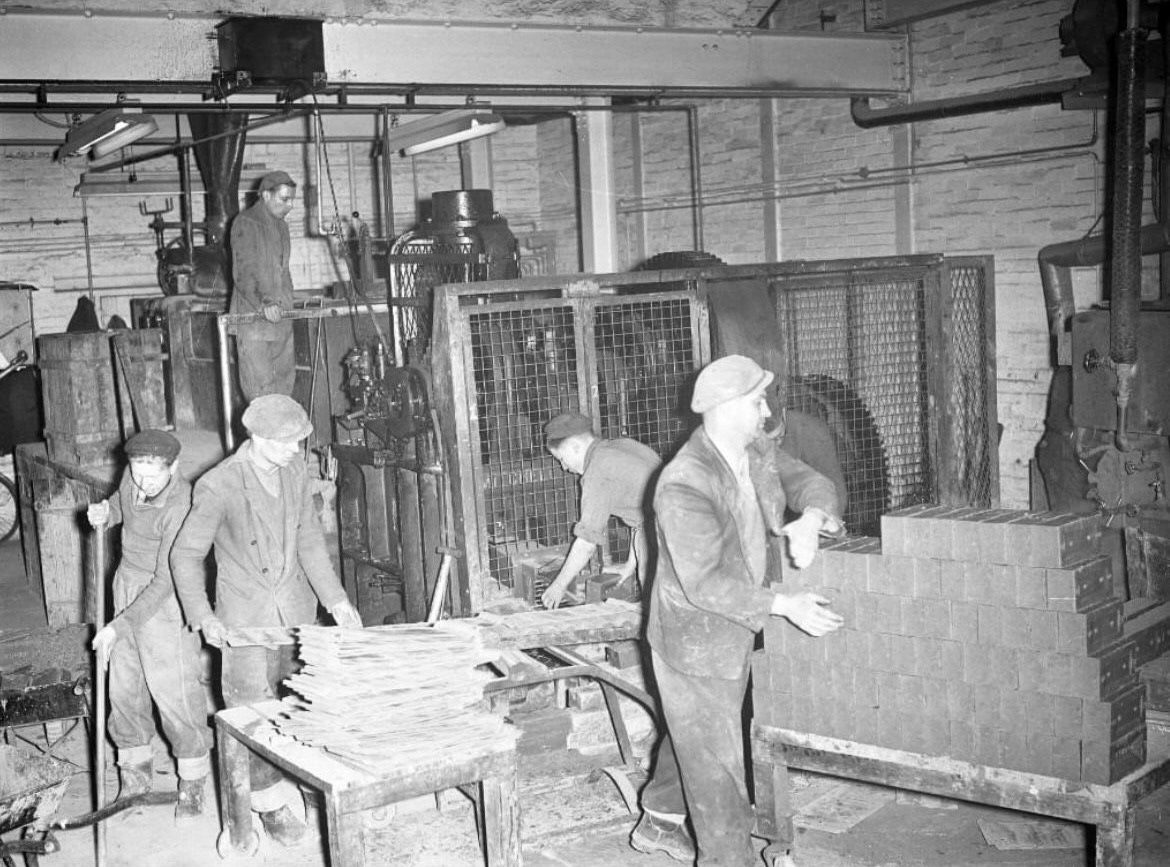
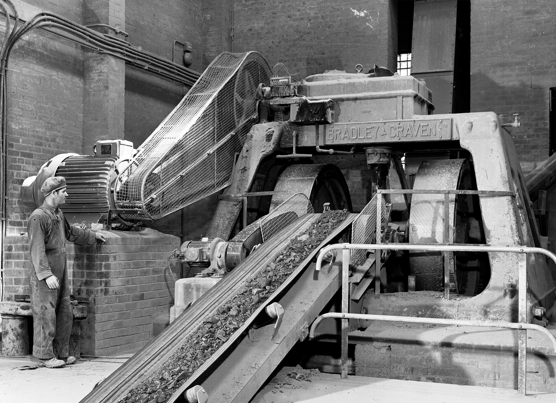
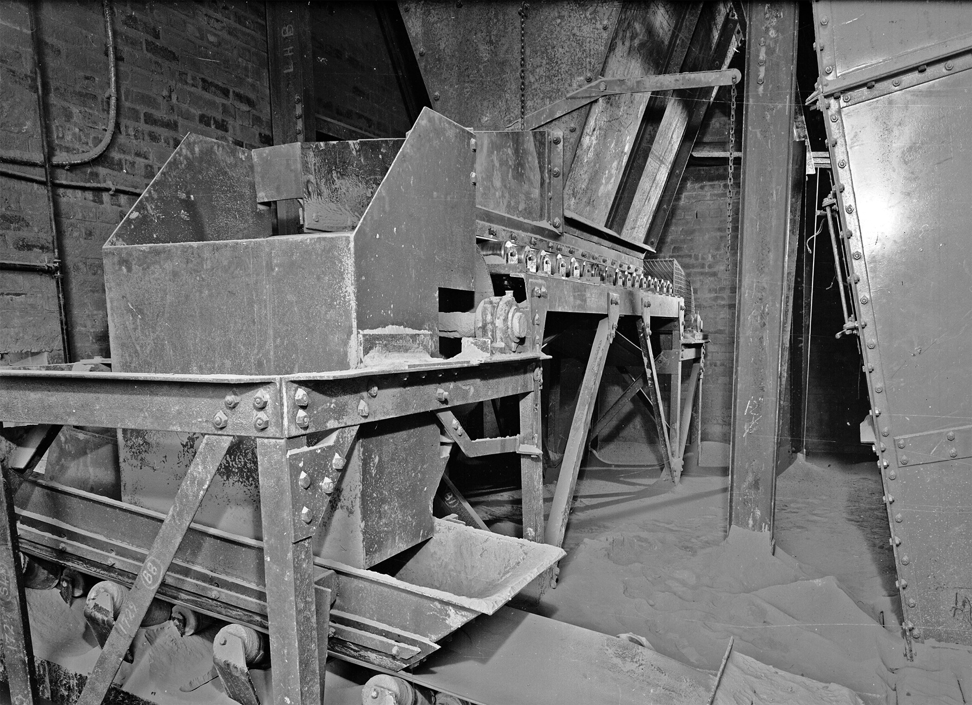
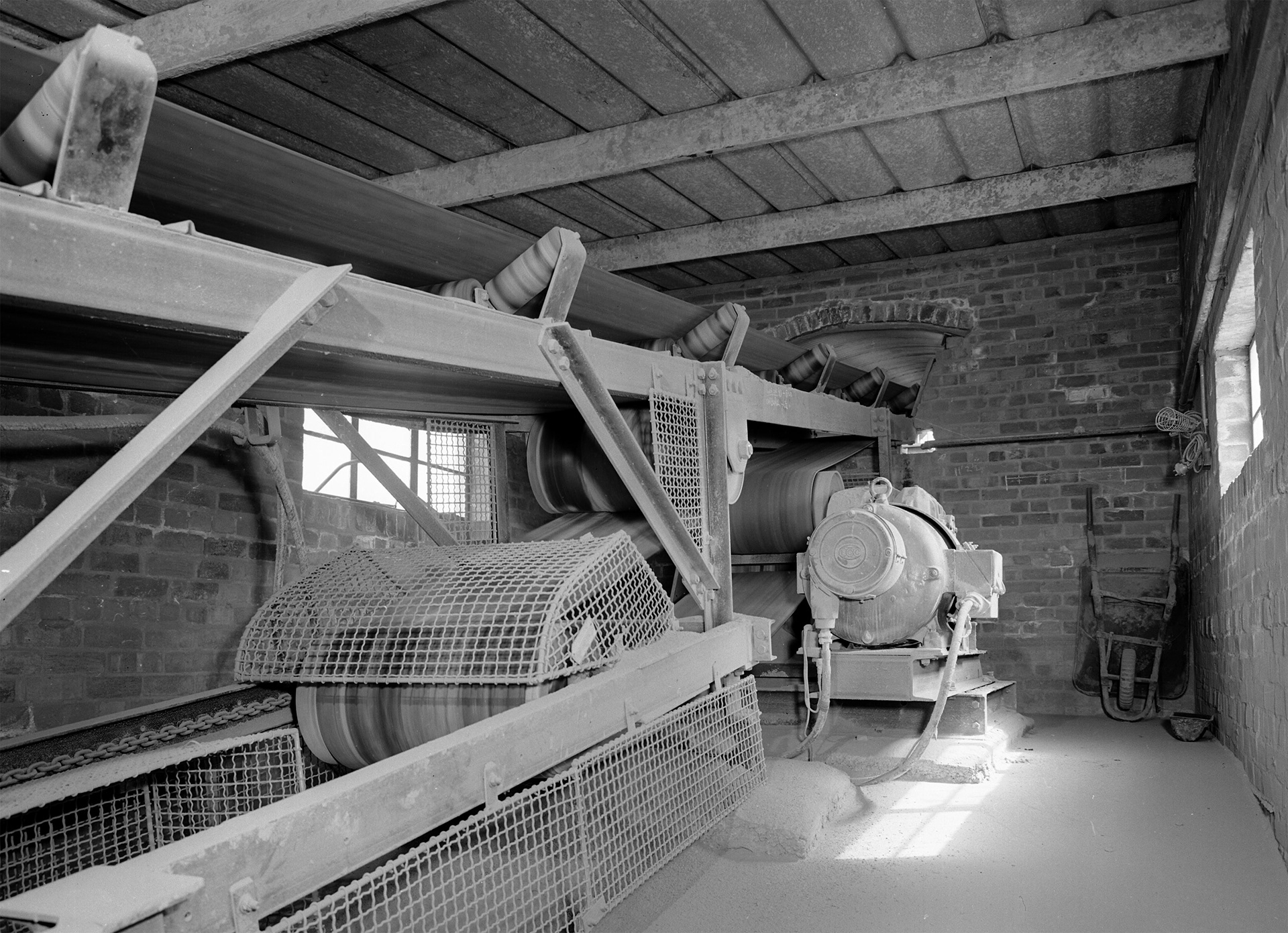
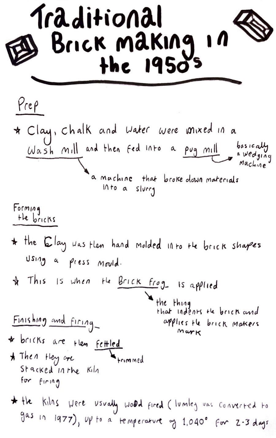
After looking at these photos I decided that it would be a good idea to actually know a bit more about what it is that the men in the pictures were doing. so I did some research and looked at multiple sources to find out the traditional brick building process and how it would have been carried out in the 1950s, when these pictures were taken. from this research (below), I could deduce that these men in the picture above were most probably stacking the bricks, ready to go in for a firing, and that the first picture sent to me by the Beamish peoples archive was more than likely the raw materials being loaded into the wash mill.
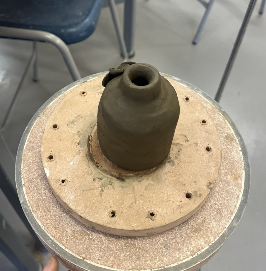
once I had completed this research, all of my samples had come out of the kiln. First was my structure sample, which was the one I was the most anxious about, as I knew if this one didn't survive, I would not be able to make pot with my clay and I would have to re think any ideas that I had for my final piece. However luckily when I got my piece back I found it to be all in one piece and completely structurally sound (below).
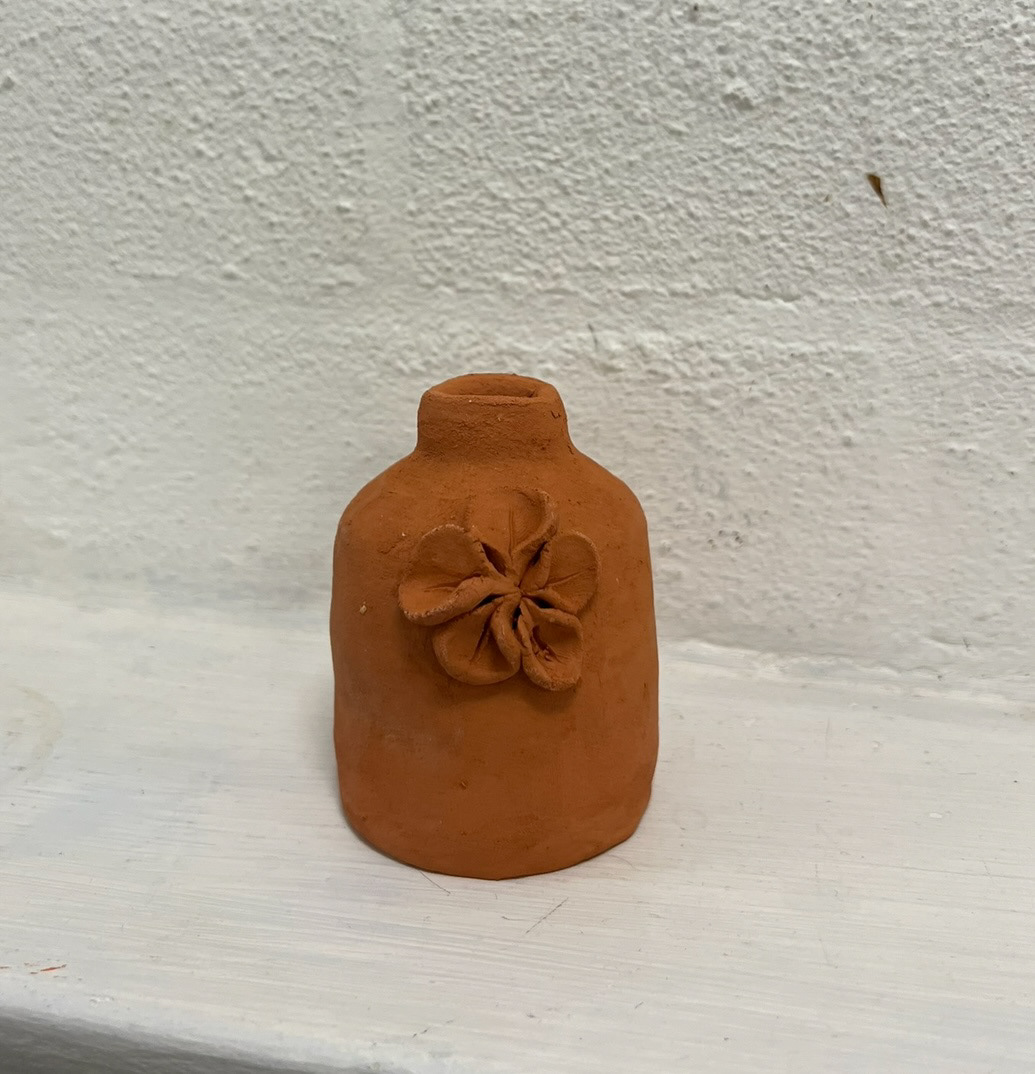
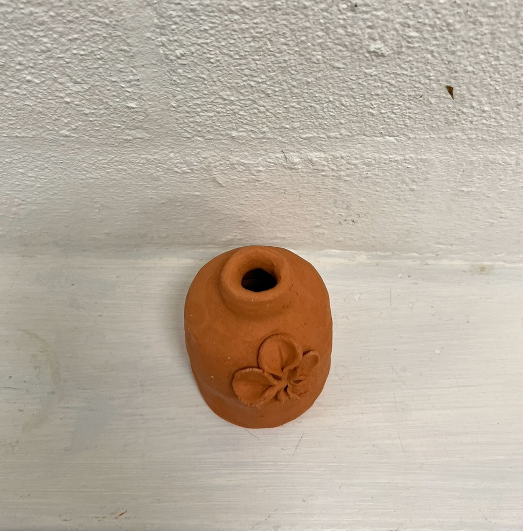
I was very pleased with this, as well as the rather bright orange colour that it had turned. I found this surprising however in hindsight it makes perfect sense for the fired clay to turn the colour of the iconic orange Lumley brick. The next step was to glaze this piece as I thought it would be interesting to see if there was any further change once a clear shiny glaze was applied, and also to see if the structure would still hold as well when the extra weight of glaze was applied. I glazed this piece and put it in for a further earthenware firing.
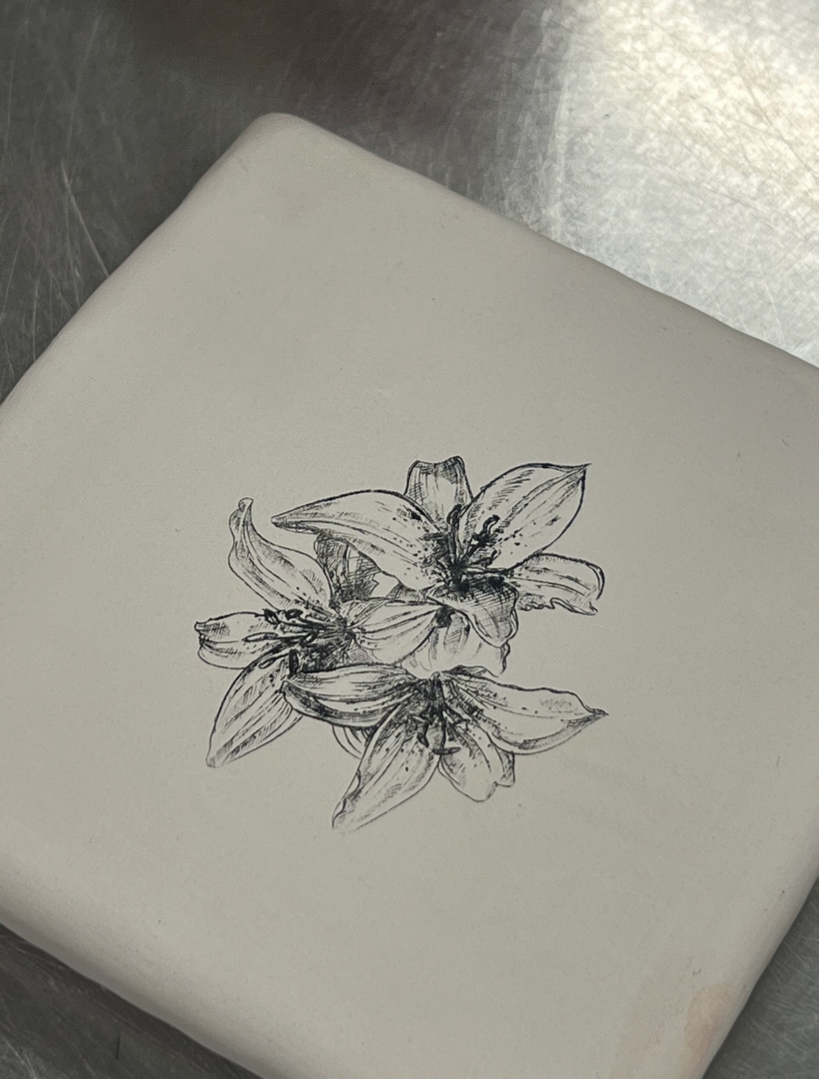
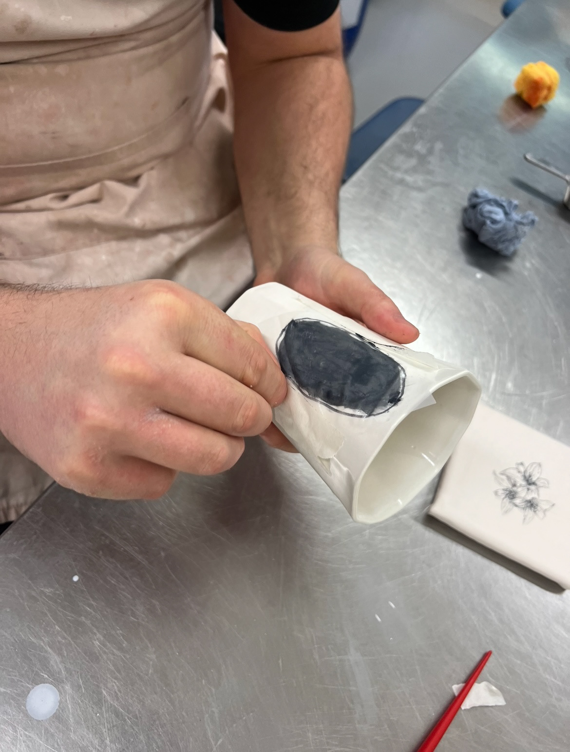
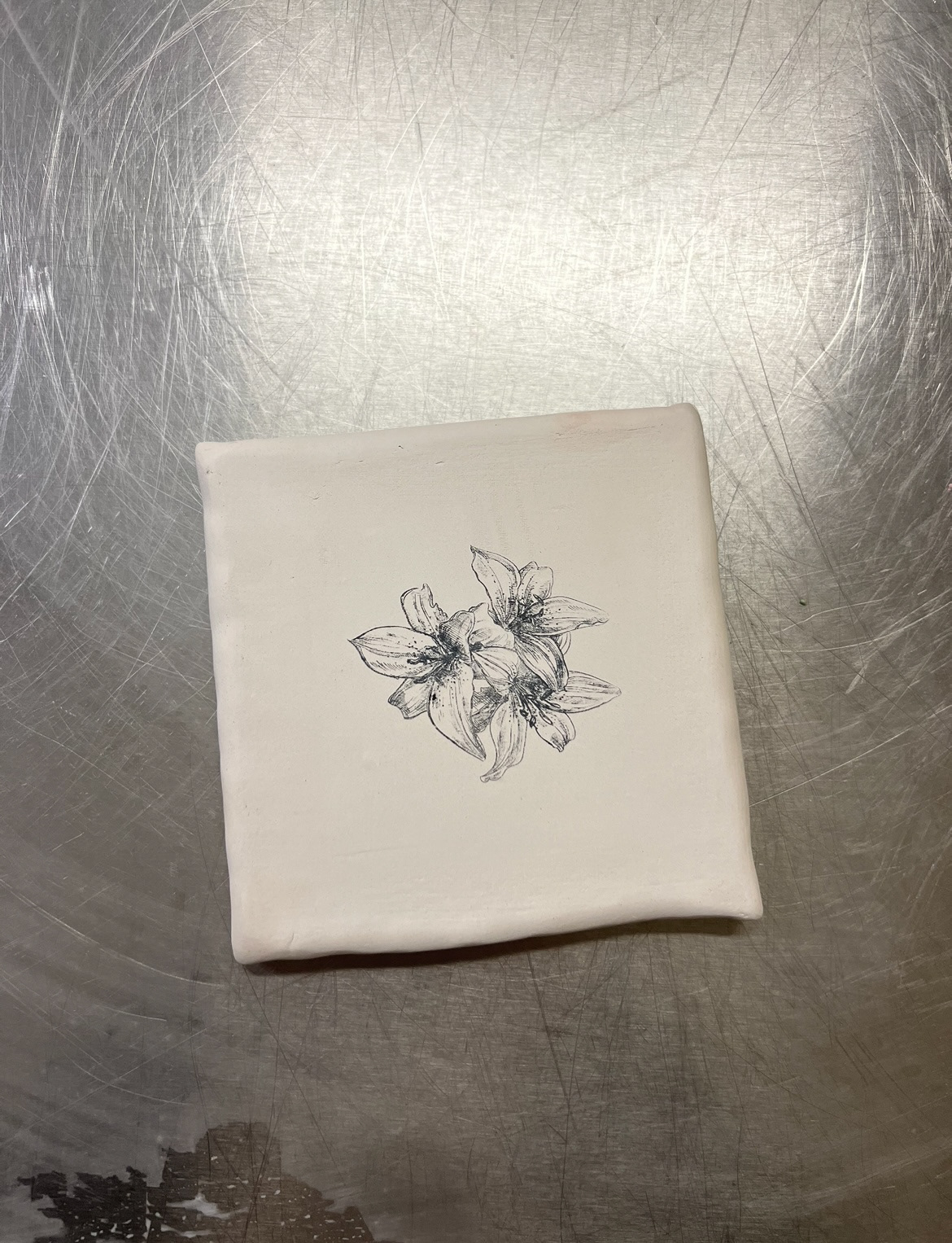
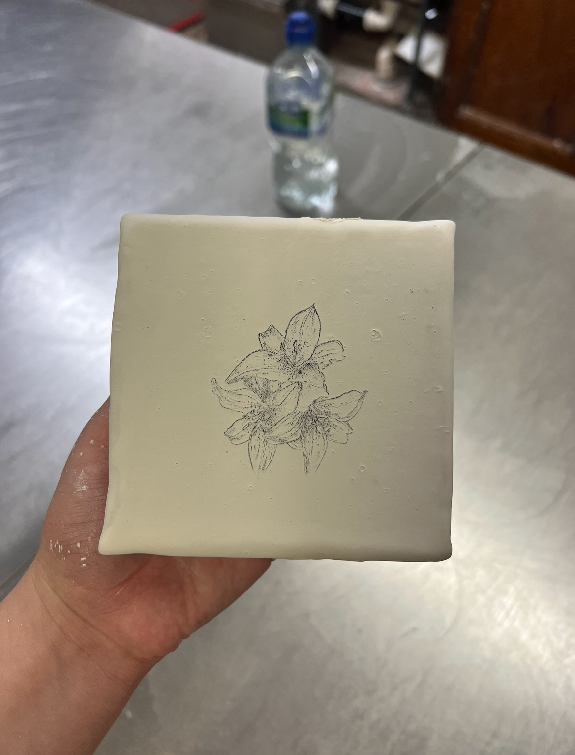
The next samples that came out were my ceramic screen printing samples. (below)
I was very excited at how these pieces came out and was sure that after Christmas when I could get my own screens made that this would be a process I would like to carry on experimenting with, I think that the sample that was bisque fired and then glazed afterwards (above left) defiantly turned out better than the one (above right) that was printed on after glazing. this is something I will take into consideration when I start using this process in future.
The last pieces in the first batch of samples to come out were my surface design samples. (below).
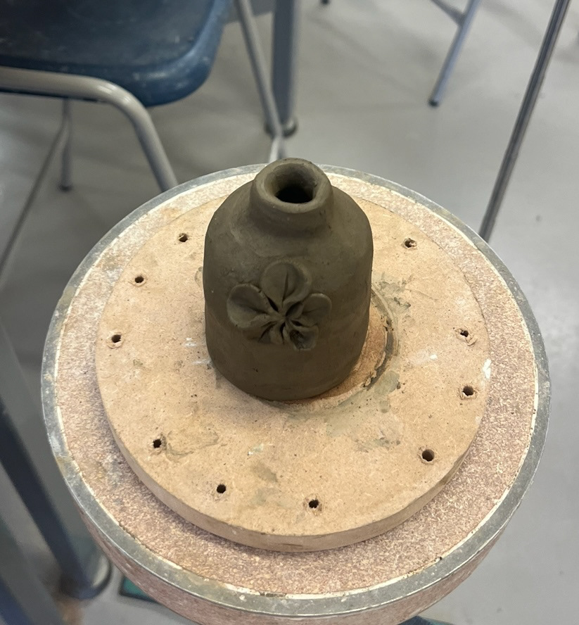
I think these came out nicely, however I do think that the tonal range was easier to see when the clay was wet and darker, but fortunately I do still think that it is clear to see as the shadows created by the different techniques still prove affective. I decided that this is the process that I will carry forward into my final piece. however I was still waiting on my underglaze sample to come out which had gone into a earthenware glaze firing with my glazed structure sample.
When these came out I was pleasantly surprised with even further drastic colour change. (below).
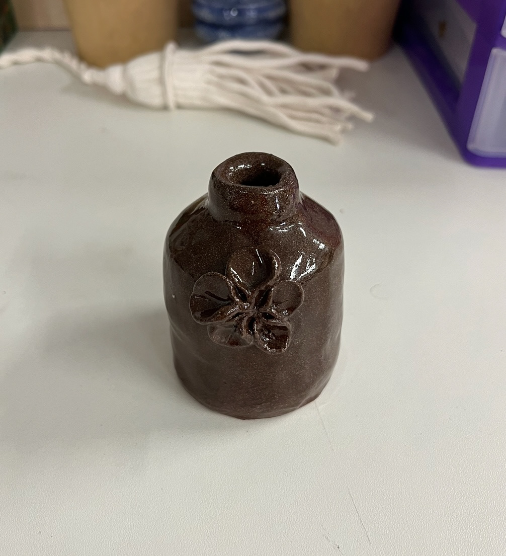
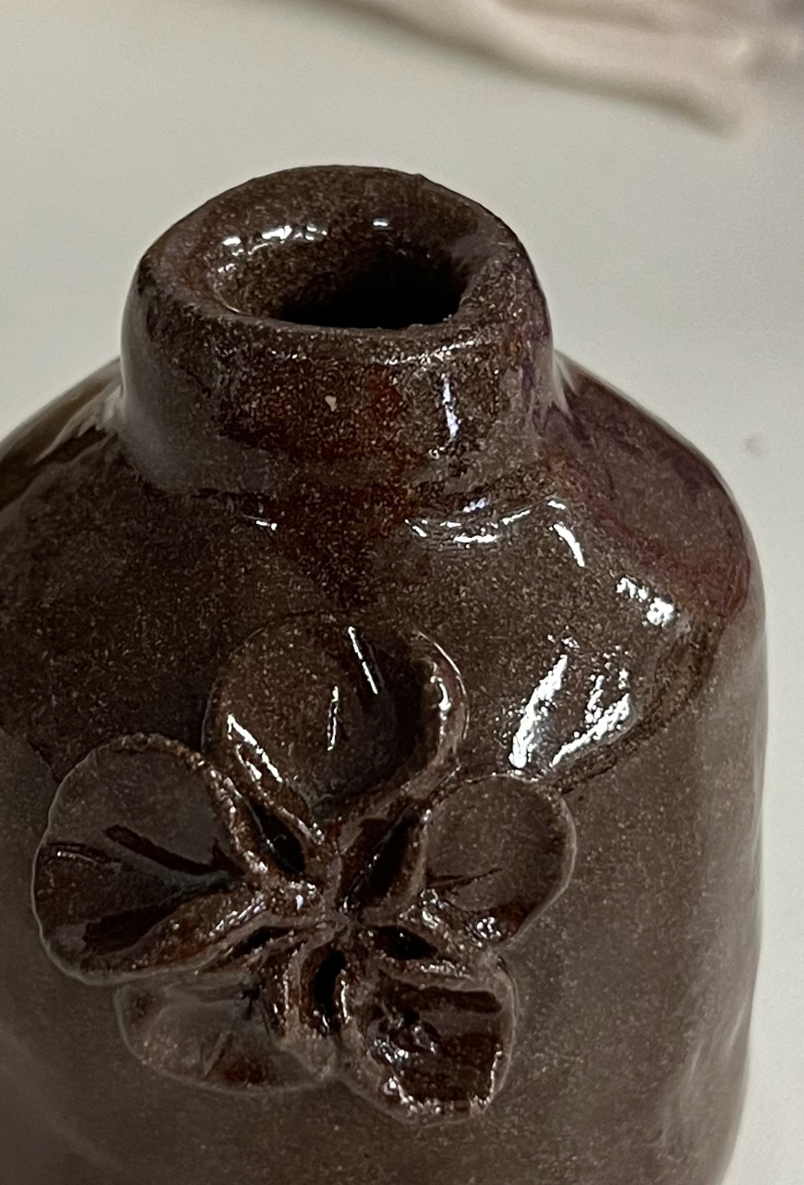
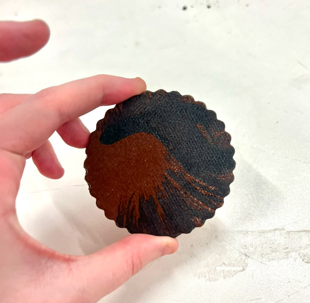
once glazed with a transparent shiny glaze, my piece came out a rich deep speckled brown colour which I wasn't expecting at all. I absolutely love this colour and think if time permits, I would like to perhaps use this colour changing property to enhance some of my final design, but that will have to be worked out later on when I have something definite in mind.
finally I also had my underglaze sample which I also covered with a transparent shiny top glaze, (below).
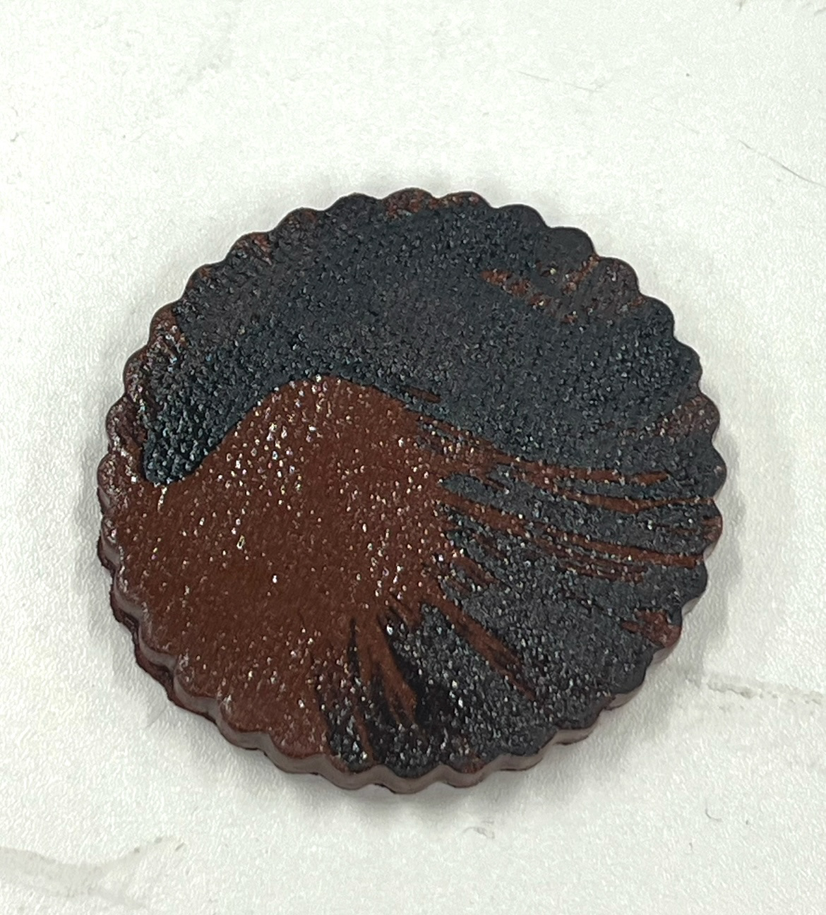
I really liked how this sample looked however I think that once seeing my texture based surface design samples, I find that I think the technique used on those provides a lot more character than just this flat surface design so I don't think I will be carrying this on.
Once I had carried out all of these samples I decided that it was time I actually started thinking about producing my final piece and what I would need to do so. Starting with material, I definitely needed a lot more clay! This would be a lot more difficult than just buying a bag of clay from Rudy out of the clay store, as all of my material was still in the ground of my mothers garden in the north east. I rang my mother and told her that this clay was the thing I needed and lost of it, so a grand logistics operation began. (illustrated below).
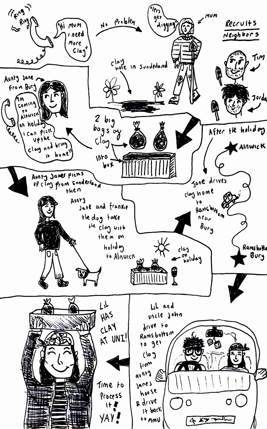
once my clay had travelled a total of 264 miles, it was time to process it so it could be made into usable clay and I could start building my final piece.
(See Unit X video page- Video 3: Processing clay pt1)
Then (See Unit x video page - Video 4: Processing clay pt2)
Continued in Unit X pt3...