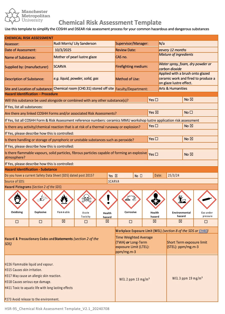
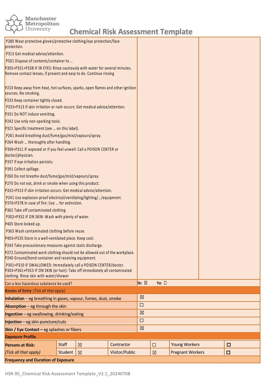
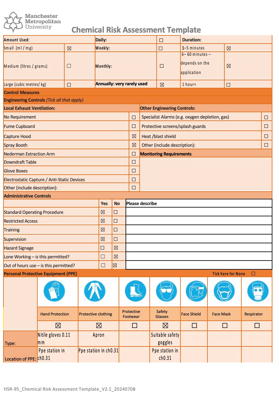
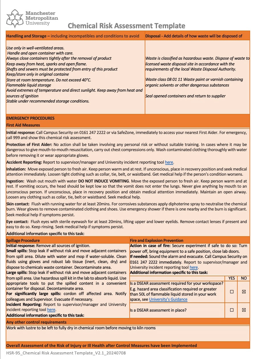
My safety data sheet for my lustre had also now arrived so I could fill in my risk assessment form with Rudi and could now use it. (below)
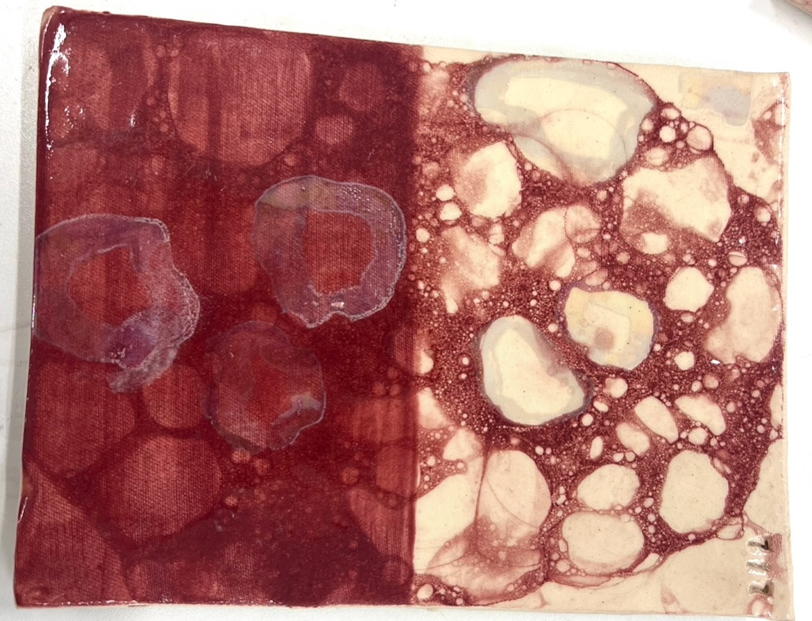
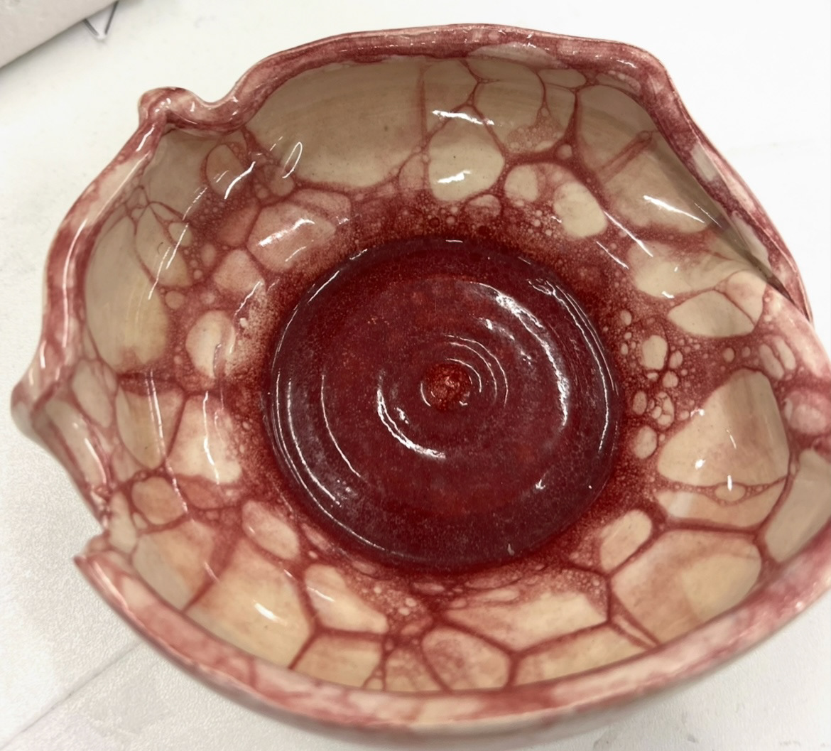
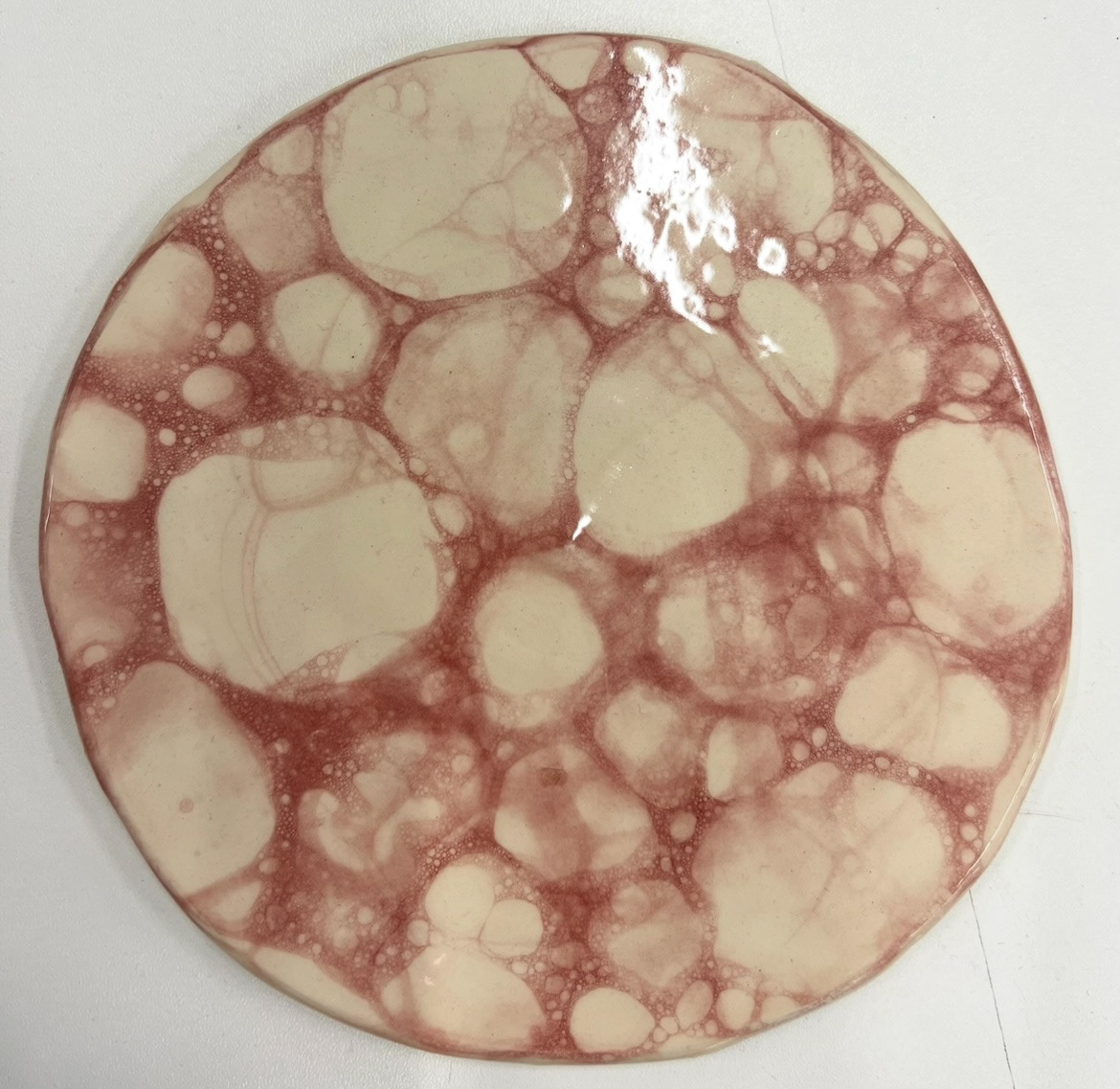
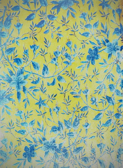
My bubble glaze samples had also come out of the kiln, this time at the lower temperature of earthenware so that the colour would not be bleached out.
I felt extremely good about these as the colour came out vibrant and the layers of bubbles had a huge amount of dimension. I felt that these were totally successful and that I now had to go ahead to use this technique going forward.
For time purposes, I then immediately used these to test my lustre on.
I followed every safety precaution on my risk assessment form and found it quite easy to work with, however I did figure out that it was prone to dripping if I wasn't careful about how I applied it.
(Finished lustre and bubble glaze samples below).
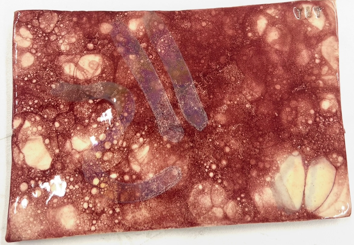
Once these came out of the kiln I realised that the lustre did not look as I wanted when applied over the top of the pink glaze so I would have to make sure that I have designated sections for lustre on my pieces of non pink ceramic where I can apply this.
Now that I had my plans in place it was time to start building my final pieces.
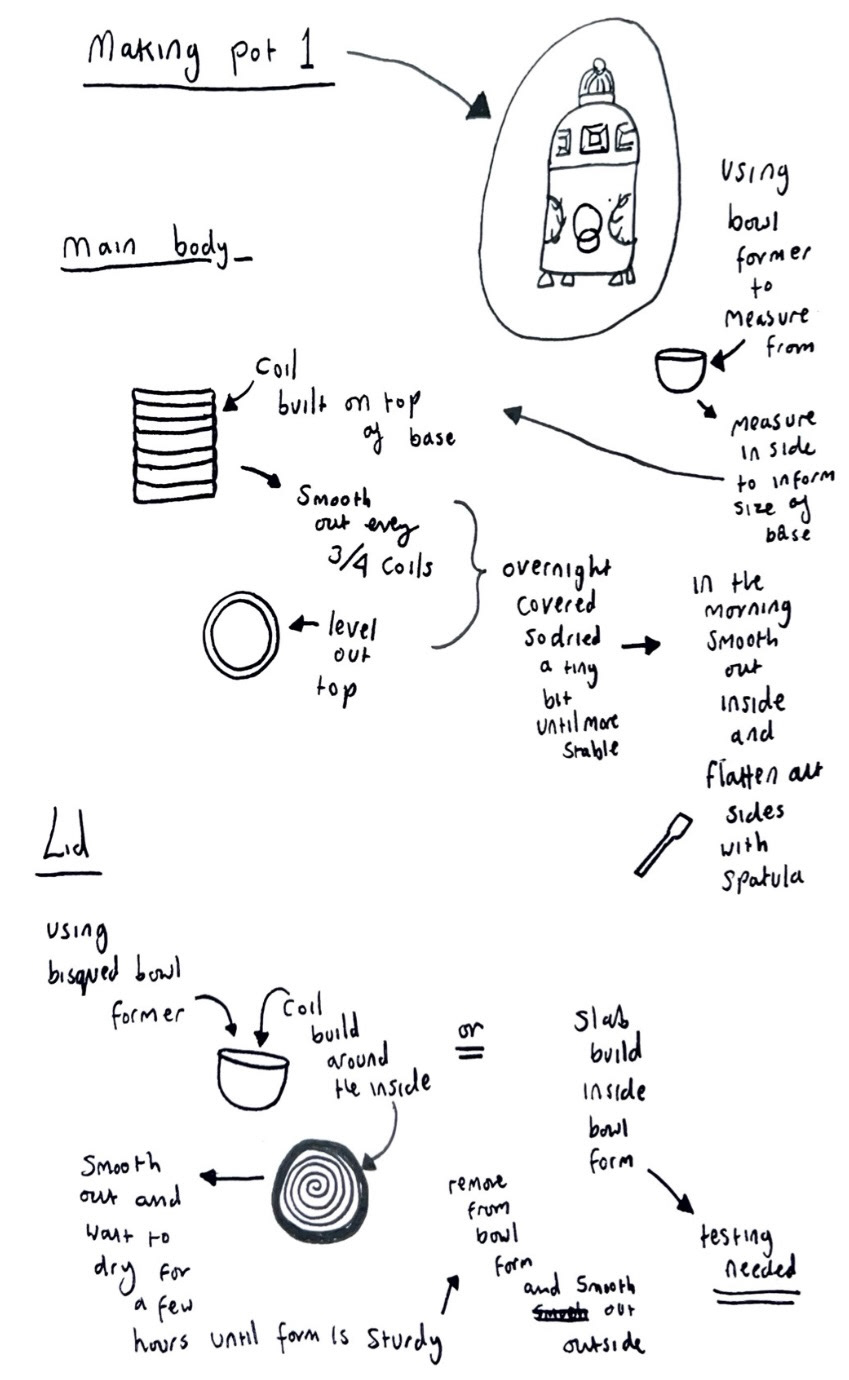
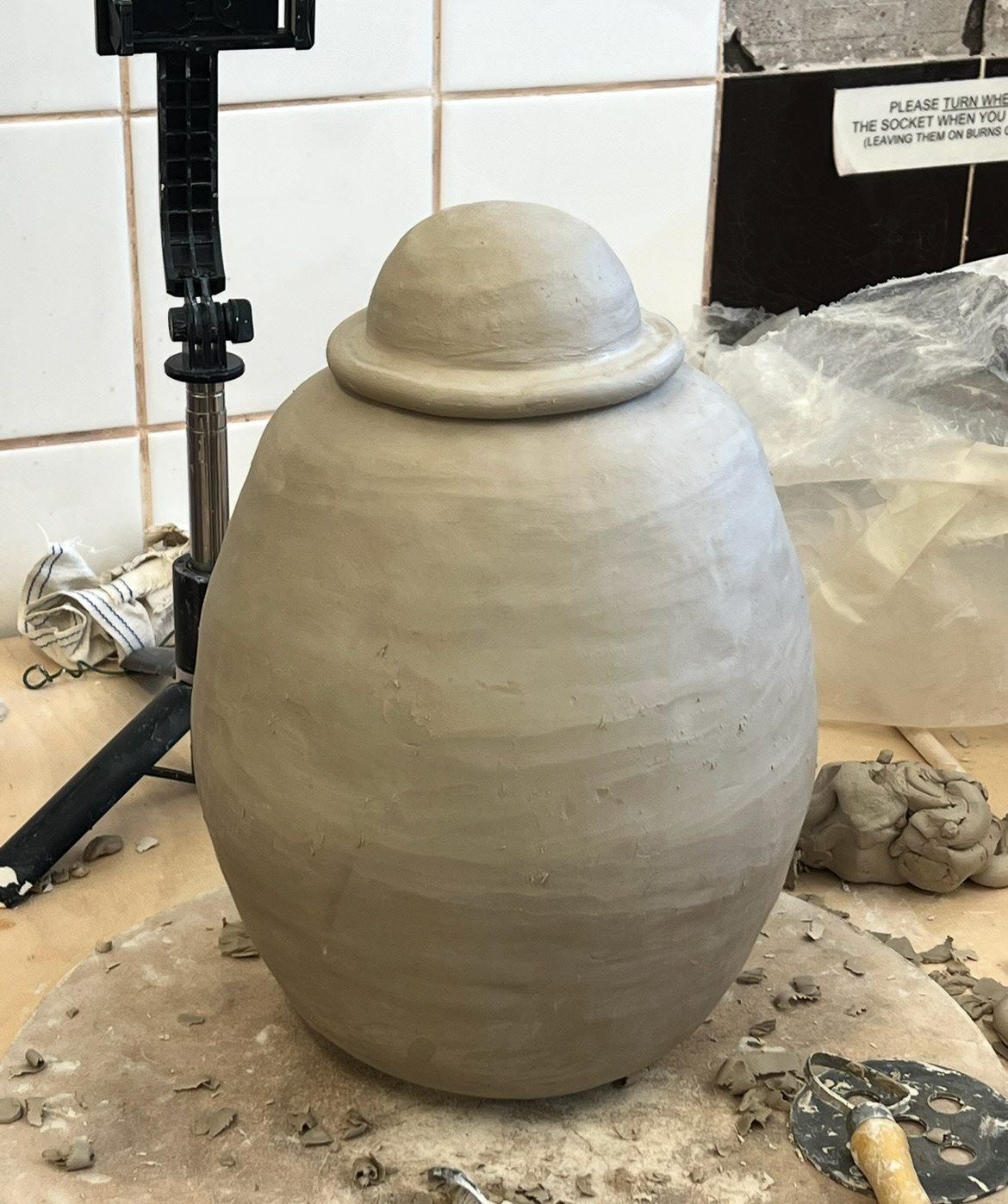
I started with my domed form first. I set out a plan for making it. (below).
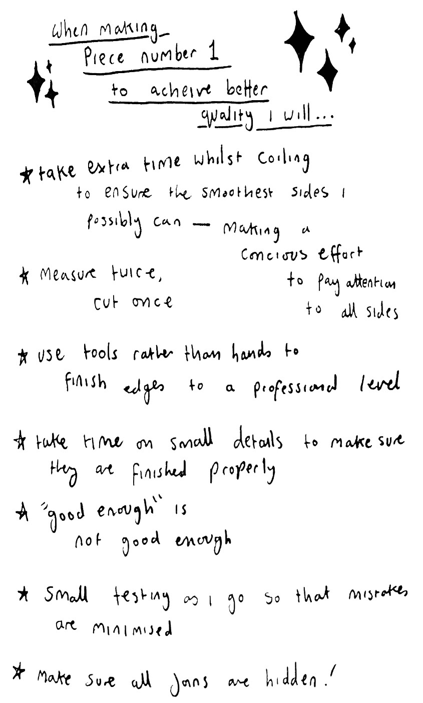
Whilst in my formative review I got a few comments about improving the quality of my work so at this time I also made a list of the things I will keep in mind while building to achieve this. (below).
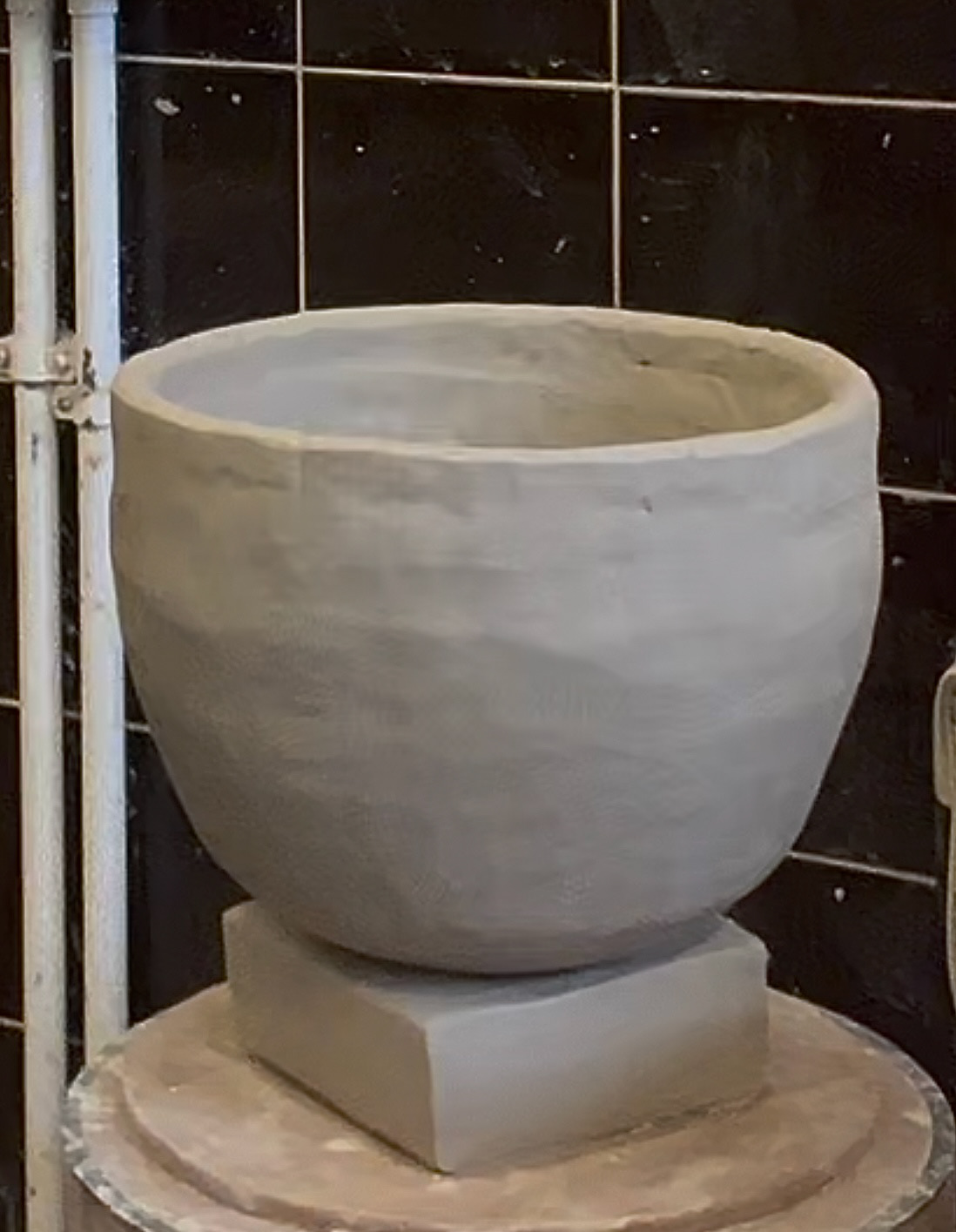
Before I started building, I decided that using a former/ press mould to base my domed elements from would work to my advantage to keep some consistency between forms. I knew that for this first form, my lid would be the domed element so I would measure my base from the diameter measurements of this former. I made a quick sample from this dome so that I could use it as a size reference while building, and could later use it for any potential glaze testing that I might need to do. (picture of this below resting on a block of clay). This sample also made my decision that I was going to coil build my domes as I thought it was a lot easier to work this way.
Now that I had tested out any unfamiliar elements, I could now start building my piece.
See S&R videos file (Video 5 - Final Piece 1 - pt.1)
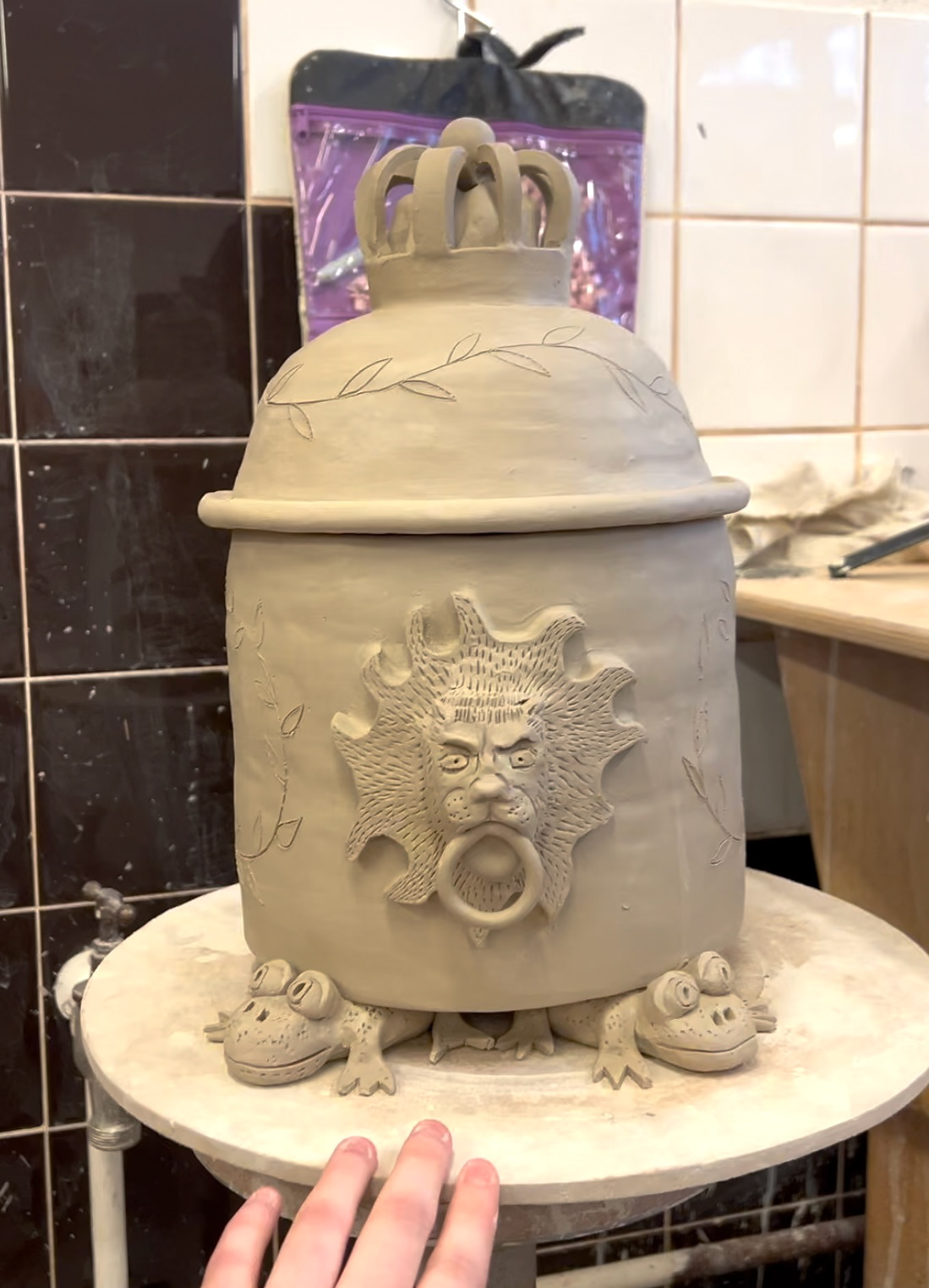
Once I had my basic form I covered it and left it over night to go leather hard. the next morning I smoothed out the inside and payed close attention to finishing off the edges. I then also added a slab rolled piece to the inside rim of the vessel so that when the lid was on, it would stay in place. I also decided to work on and add the crown to the top of the lid. (plan of execution for this below).
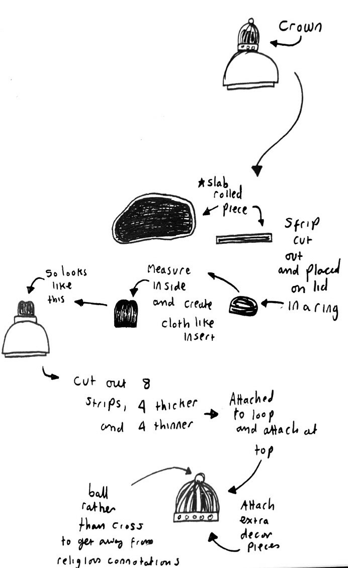
Because the cloth like insert was quite a hefty piece of clay and would take a long time to dry, I hollowed it out and before attaching it, cut a hole in the top of the lid to avoid any air pockets in the piece.
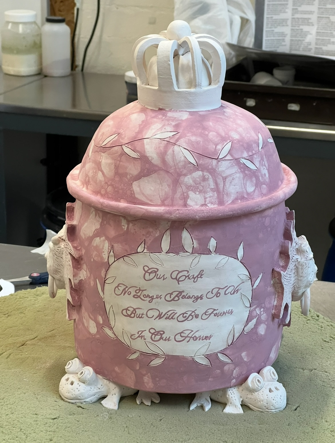
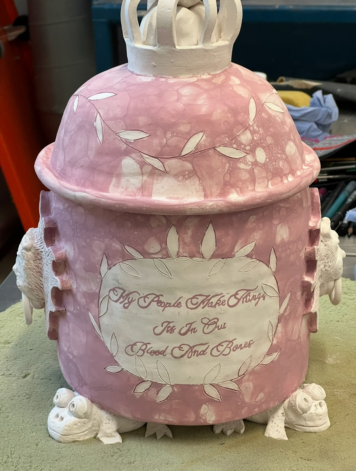
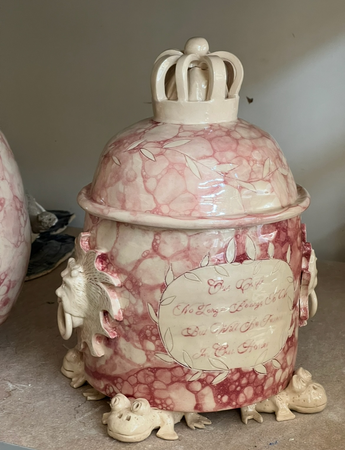
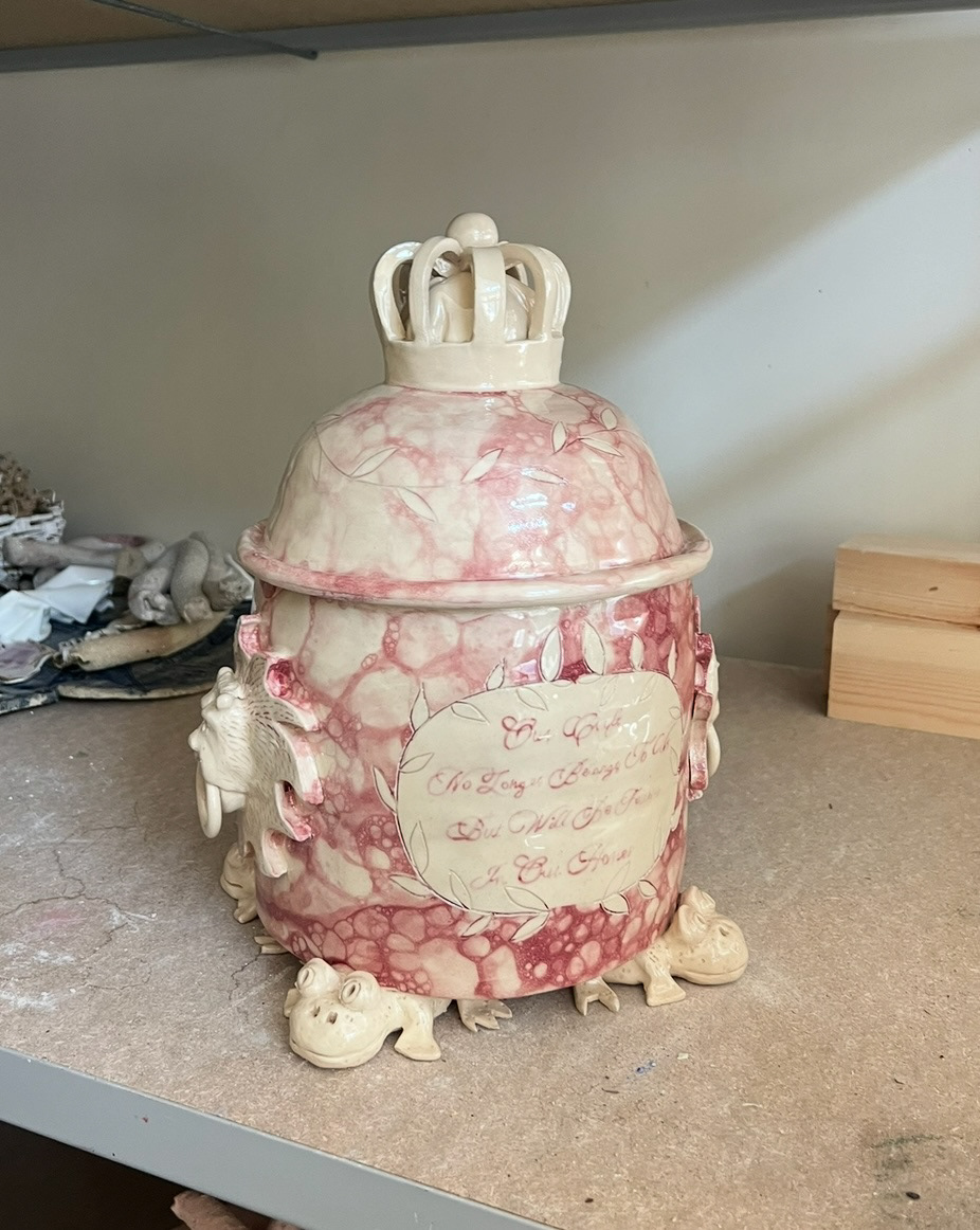
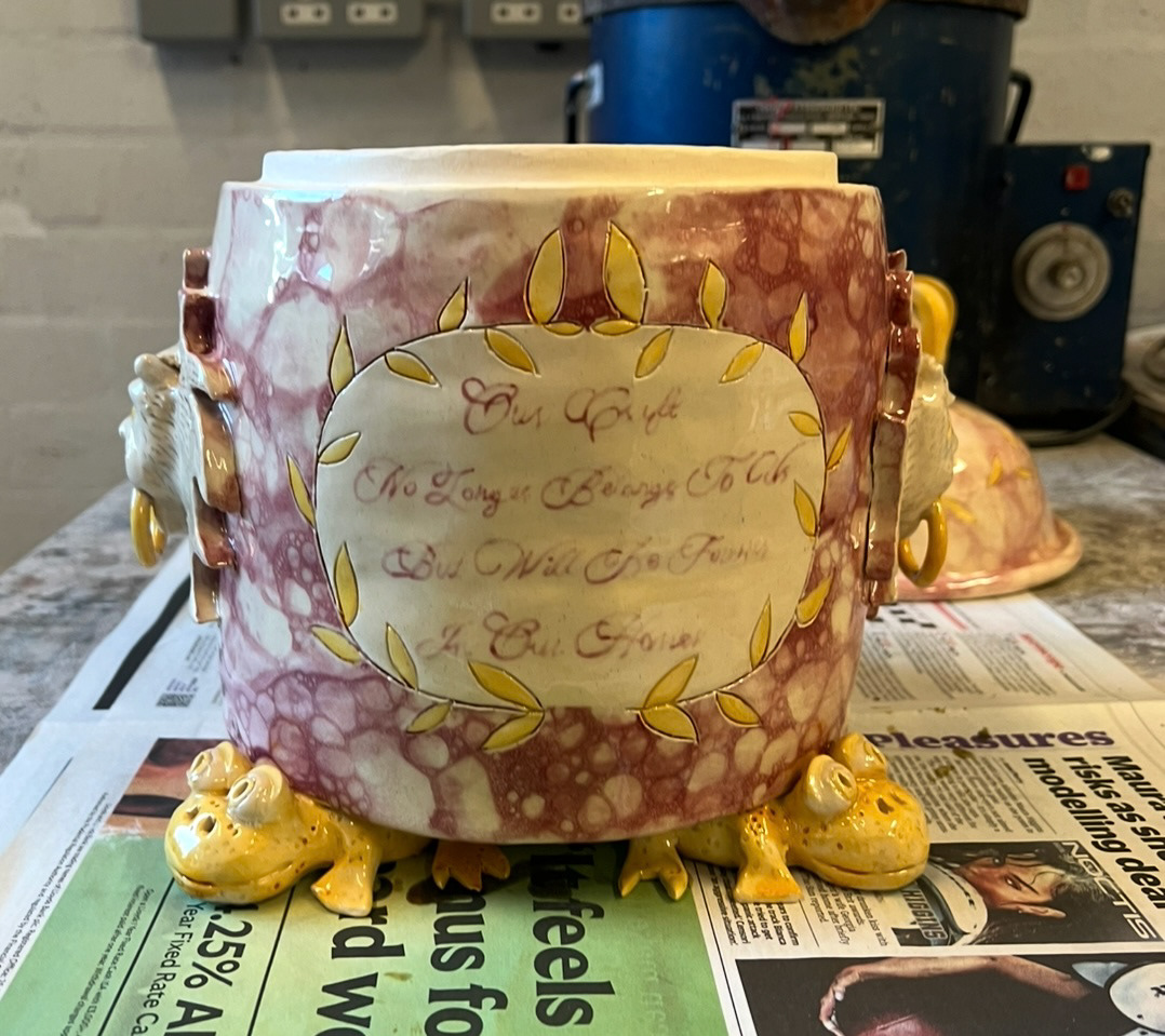
The day after this I decided to add some of the 3D pieces and some decorative etching features to the main body of the vessel. This would be my lion door knocker pieces and the text boxes.
see S&R Videos file (Video 6- final piece 1- pt.2)
When designing my text boxes, I thought that I would take a reference back to the original Sunderland ware, specifically its glaze that was made using arsenic. Throughout the 1800s, before its dangers were known, arsenic was used in the production of many things such as (to name a few), medicine, lighting, face powder, candle making, taxidermy, fertiliser and many pigments and dyes. These pigments and dyes were used to make things such as fabric for clothes, paints, ceramic glazes and also pigments for the printing of wall paper. The pigment made very vibrant greens, yellows, browns and pinks, depending on what it was mixed with.
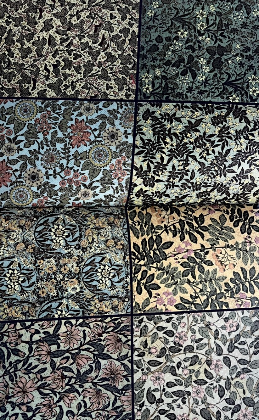
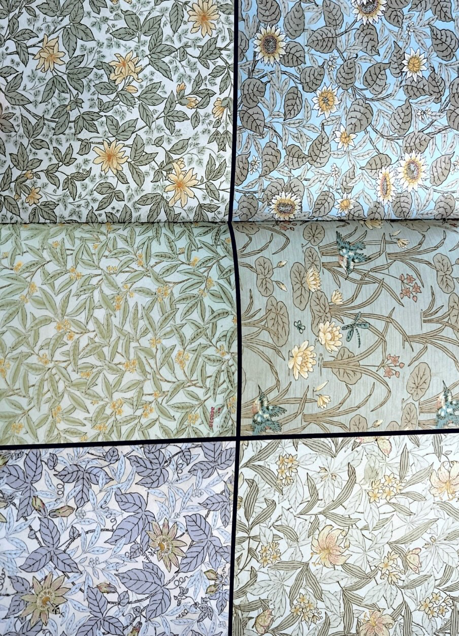
I thought that I could hark back to the original arsenic glaze by taking a look at some of the original patterns from arsenic wallpaper to inspire my design. I acquired a book called 'Bitten by Witch Fever' by Lucinda Hawksley which has an amazing selection of wallpapers from the time, provided by the National Archives.
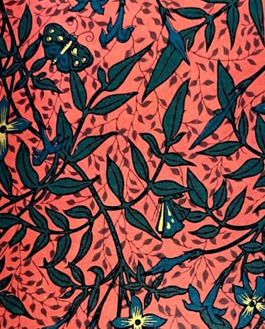
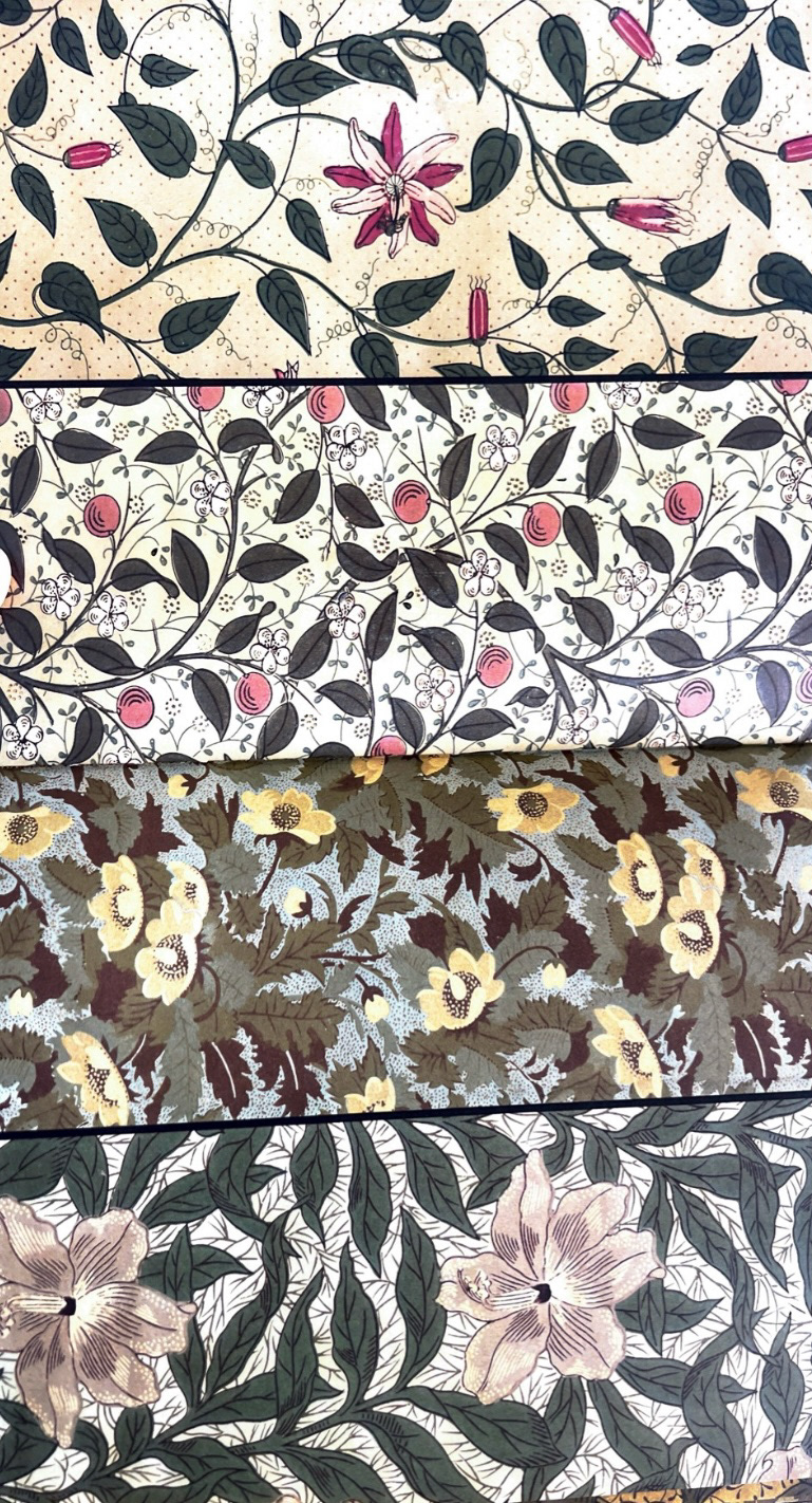
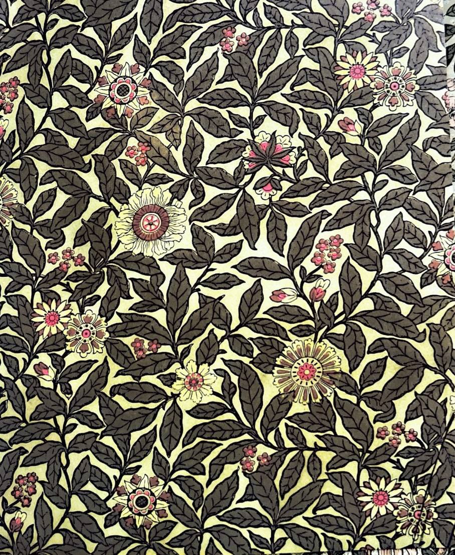
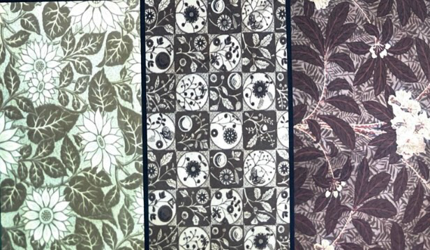
Whilst looking I noticed that a lot of the wallpapers had a common theme of vine leaves and garden themes, which was very popular for interiors at the time. (below). These themes can even be seen through the work of famous textile printers from the time such as William Morris.
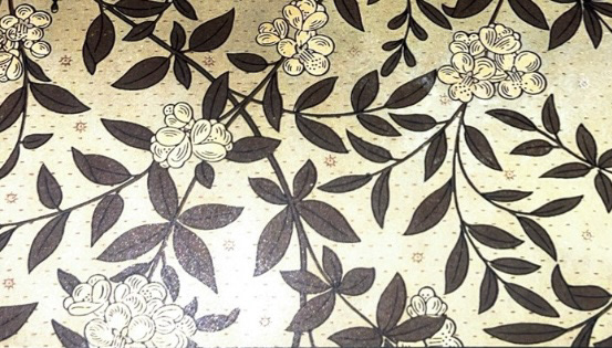
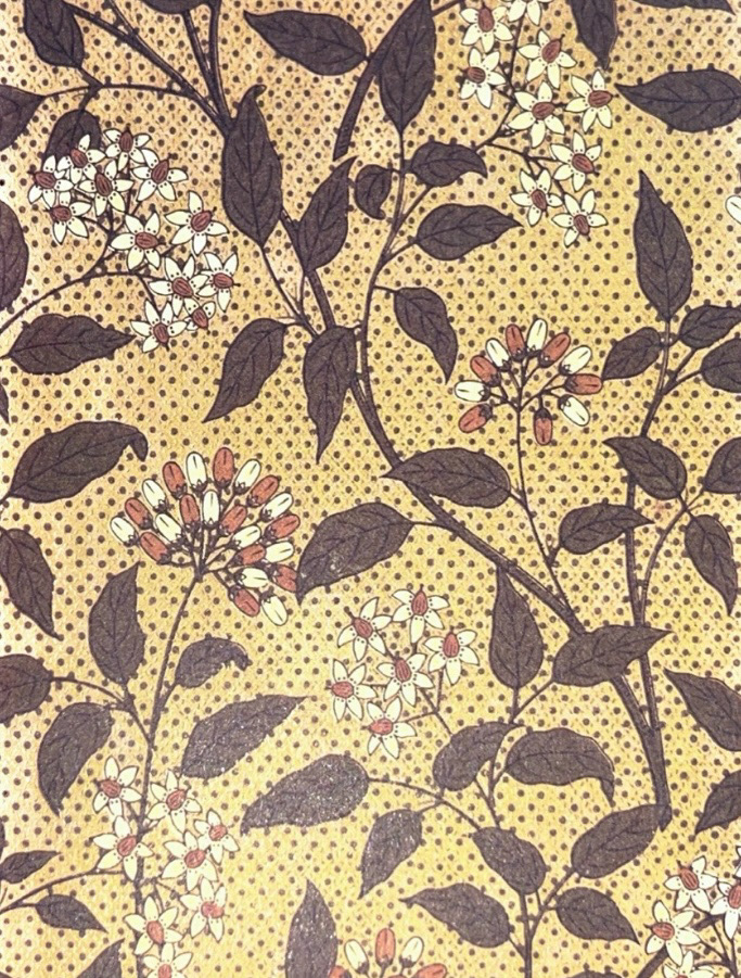
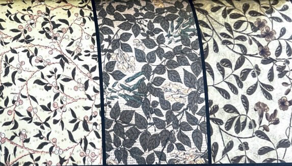
I thought that I could draw inspiration from these and create a text box surrounded by leaves in this style, however simplified as to not interfere to much with the glazing and lustre stage. which is what I did.
The last step in finishing the building of this piece was attaching the frog feet and final finishing touches.
See S&R Videos file (Video 7 - Final Piece 1 - pt3).
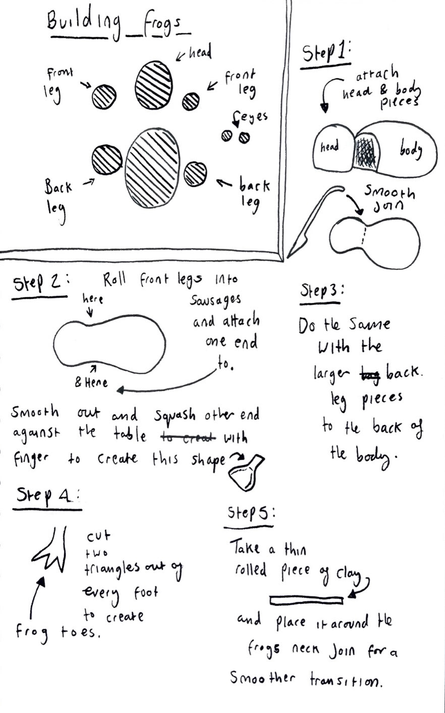
I knew I would have a challenge making the feet for this piece as I had to model four equity sized feet in the shape of frogs, this would be difficult as if there was a difference in even one of them then the whole piece would be wobbly. to combat that issue, I split each frog into six main pieces, the body, the head, two front feet and two back feet each. I then weighed out each of these components and duplicated them four times so that I had 4 identical pieces of clay for the head, 4 body pieces 8 front legs and 8 back legs.
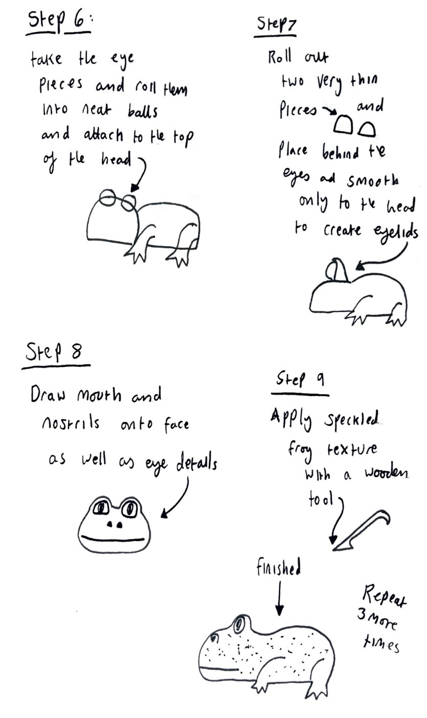
I then got to building and figuring out the first frog and made notes as I went. (below).
When building the next three frogs I built them all at the same time, repeating one step on all three before moving onto the next step to ensure consistency.
I then left these to dry for a while before attaching them to the bottom of the pot whilst it was upside down. I placed a fairly heavy board over the top to try and make them as flat as I possibly could to reduce wobbling when the pot was turned right side up.
After a while of these drying and I felt confident they could hold their shape and the weight of the pot, I then briefly turned the pot the right way up to asses what still had to be done.
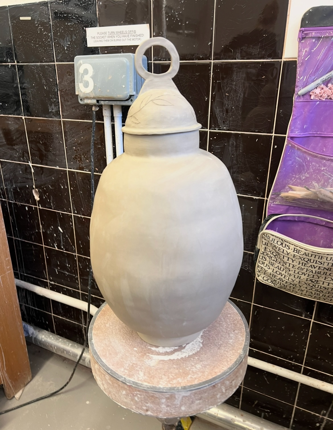
The lid still needed to be decorated, so I added a laurel ring to it to tie in the lid with the text boxes of the main body.
through building this piece I learnt that changes to the original design must be made whilst building, sometimes for technical reasons but sometimes also for aesthetic reasons, as some of the design features of the drawing on paper don't always translate well when applied to a physical object. I have done this on this piece with features such as the lid join, lid decoration, size of the frog feet and also certain elements of the body decoration but I believe that the overall vibe of the piece is very much the same.
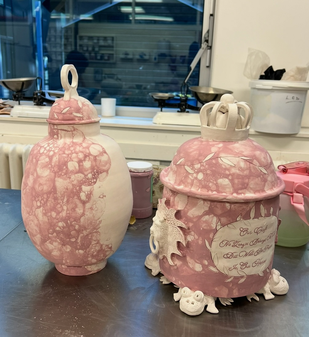
Whilst this piece (above) was drying and getting bisque fired, I could now more on and start to build my second piece.
See S&R Videos file (Video 8 - Final piece 2 - Pt1).
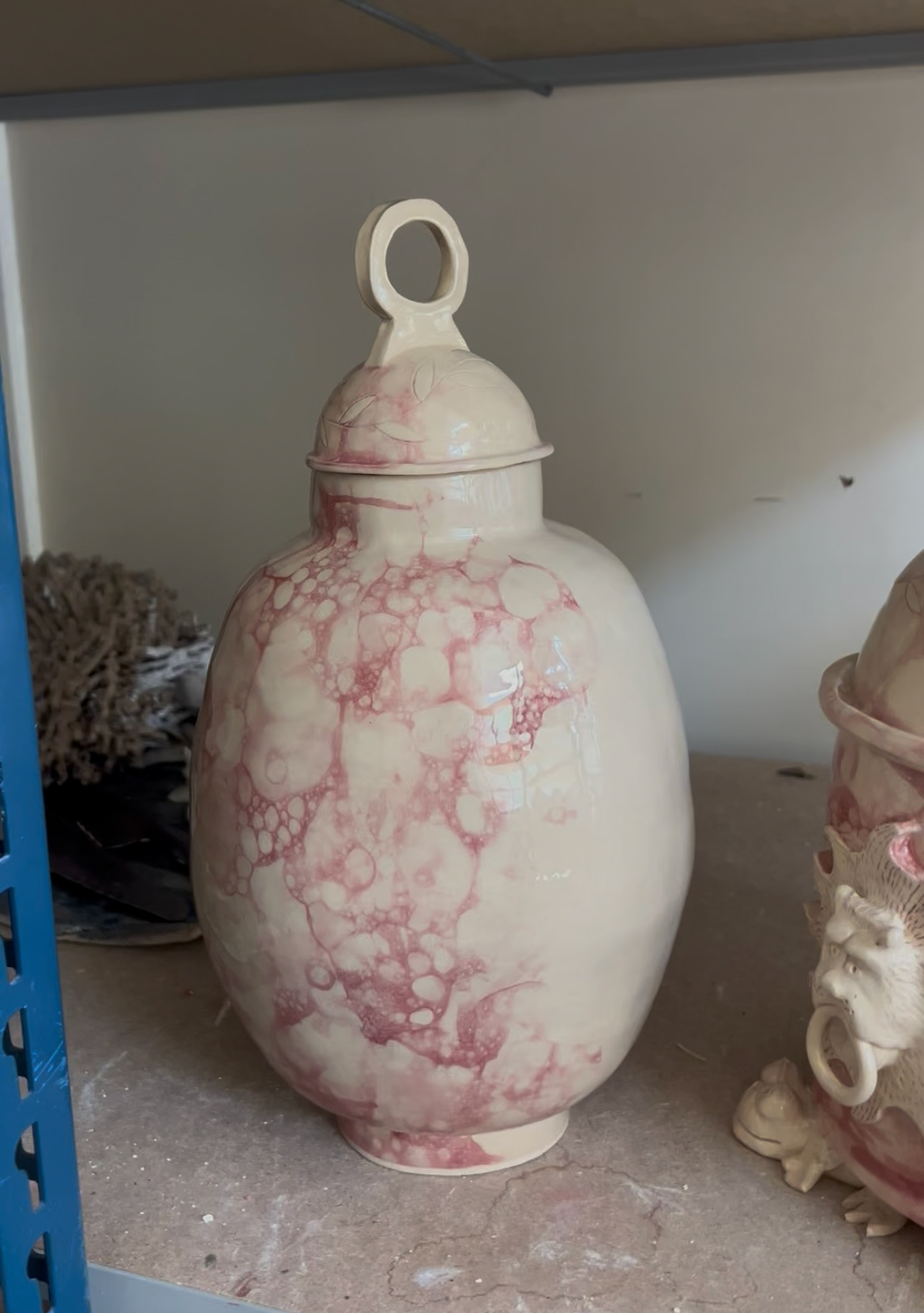
This piece, although less decoratively complicated, I did find it a lot more technically difficult. I used the same bowl former that I had used of the lid of the first piece to create the attaching pieces of the body to ensure consistency between the pieces. This piece was also a lot more exposed to I knew that I would have to really take the time to make sure it was as smooth as I could get it and everything was even (after this video I did make quite a few adjustments to make sure it was even and not wonky, grinding the base etc). The lid of this piece was also quite difficult as I had tried a few different rim sizes bearer I settled on the small one as anything larger made it look like a small bowler hat due to the shape and that was not in my vision. (below left)
A few aesthetic changes also had to be made with this piece, for example I added a neck for the lid to sit on as without it the pot looked a bit odd and not like I had envisioned in my drawing at all. (finished below right). Through this piece I also discovered the importance of smoothing out my pieces with a rubber kidney and I think it has worked fantastically.
At this point we were experiencing a bit of a clay shortage, so whilst this was drying and getting bisque fired, I could not start my next piece.
However my first piece had luckily come out of the kiln so I could get on with some glazing instead. I started by doing a good bit of sanding and finishing before adding the glaze.
I also got to this stage and realised that I hadn't tested blowing my glaze onto a round surface. I took a practice lid form that I had been using for reference when building that I had bisque fired to test on.
this meant I could come up with a technique that involved blowing the glaze not sections before rolling it slightly to avoid drips, and popping the bubbles myself by hand rather than letting them sit and migrate. this worked very well so I felt confident to use this on my final piece.
See S&R Videos file (Video 9 - glazing final piece 1 - Pt-1).
I then tidied up a lot of the edges and made the decision that the front toes of the frogs were much too fragile as I had already lost a significant number, decided to break them all off and file down the front feet so that it would look purposeful rather than inconsistency and damage. I think this looks okay but I will sand them more for a neater finish.
I left the bubble glaze to dry and luckily some more clay had been donated by other students in lower year groups and from other corses. I was very grateful for this and it meant that I could now move on to my third and final piece.
See S&R Videos file (Video 10 - final piece 3 - pt1.)
When building this piece I almost viewed it as the body of the second piece with the lid of the first one. thinking about it this way made it feel a lot more achievable and as I had done all of the steps at least once before I felt quite confident. this would also mean that the three pieces would look cohesive in form.
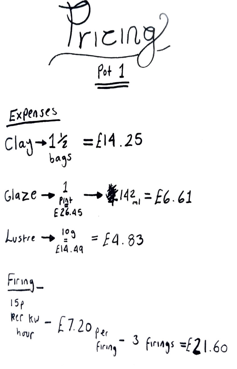
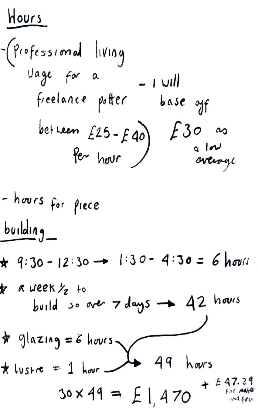
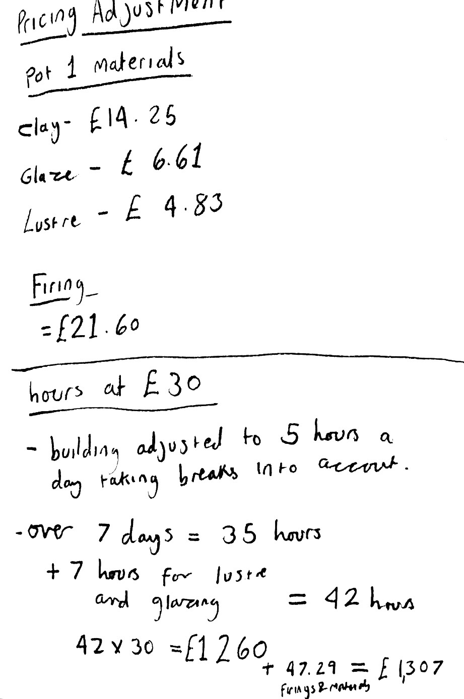
Over the weekend between making days I started to think about pricing. as I was the furthest ahead with my first pot i thought that I would start off by working the price of this piece first and then I could potentially use this as a template for later pieces. (below).
At this time I also started to finalise some of the sayings and phrases that would be featured on my final pieces.
I had been in contact with a Manchester based illustrator called John Cooper who helped me identify some similar fonts to the ones used on the original Sunderland ware. He came back to me with a few options.
Glosilla Castellana Regular, Chevalier LP, Engravia Sawtooth, Engravia Inline, Scotch Modern Micro Bold, Bonaire Titling Bold and Aston Script.
After looking into these I decided that my favourite was defiantly Glosilla Castellana Regular, so I drew this out by hand so that it would still have some of my own personal touch. (below).

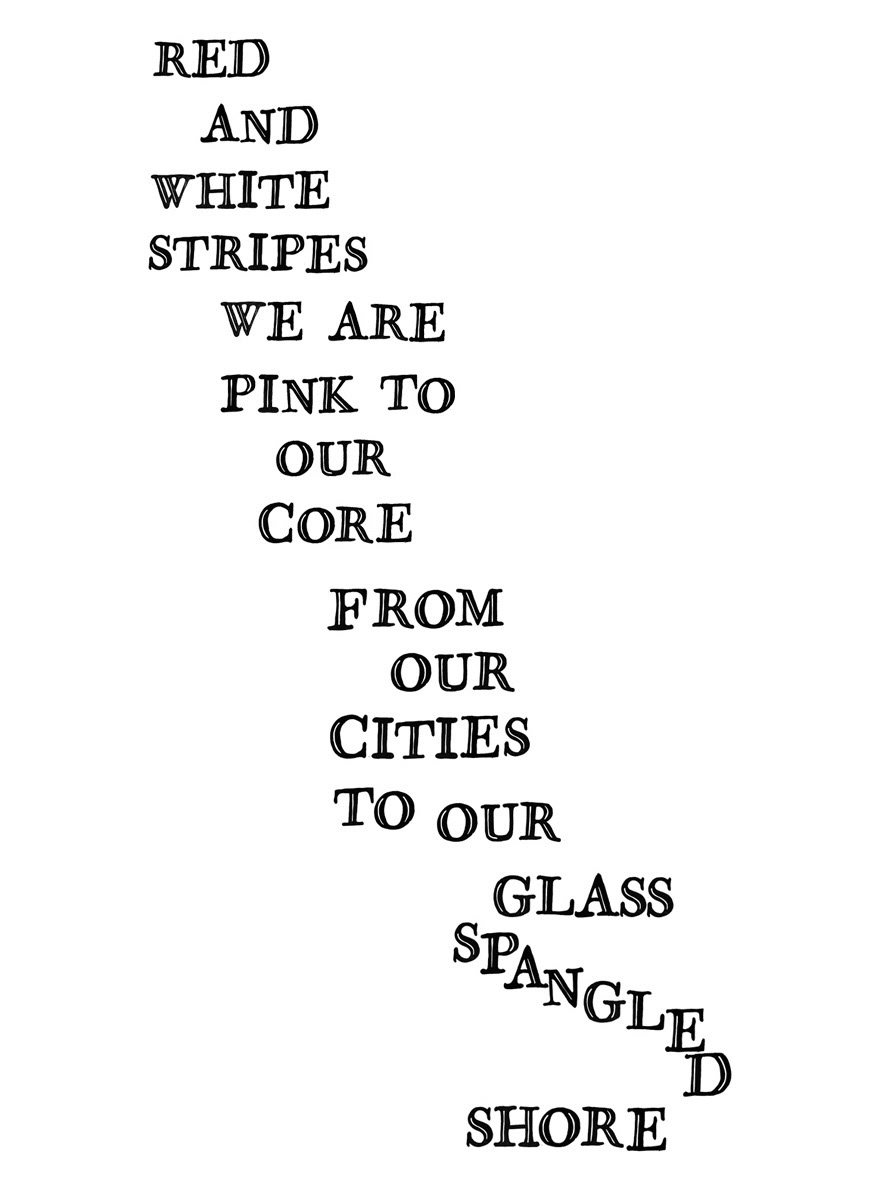
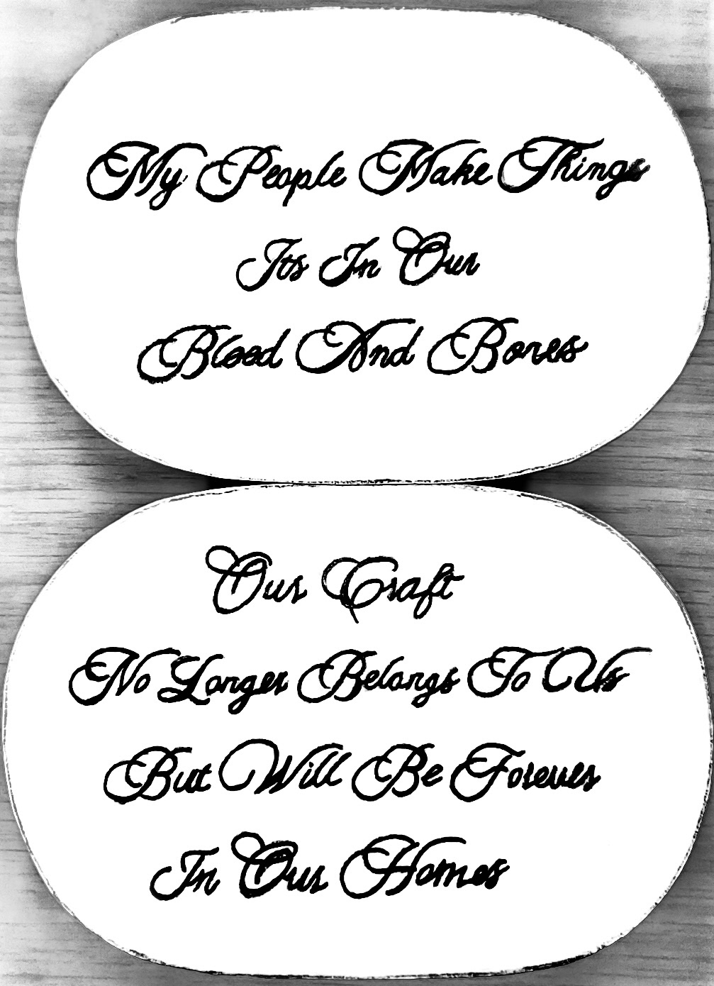
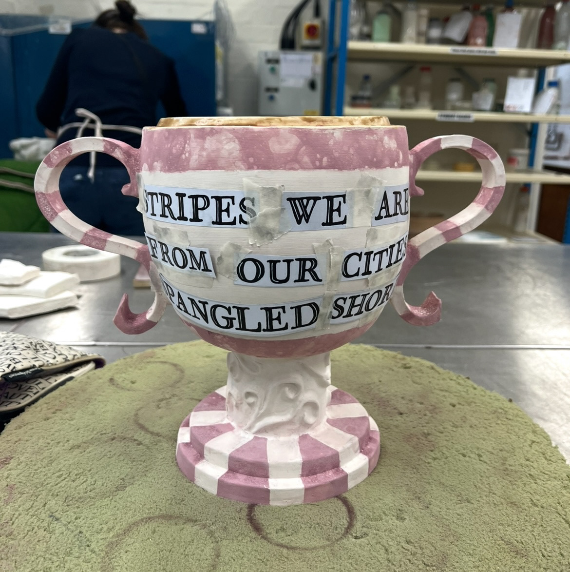
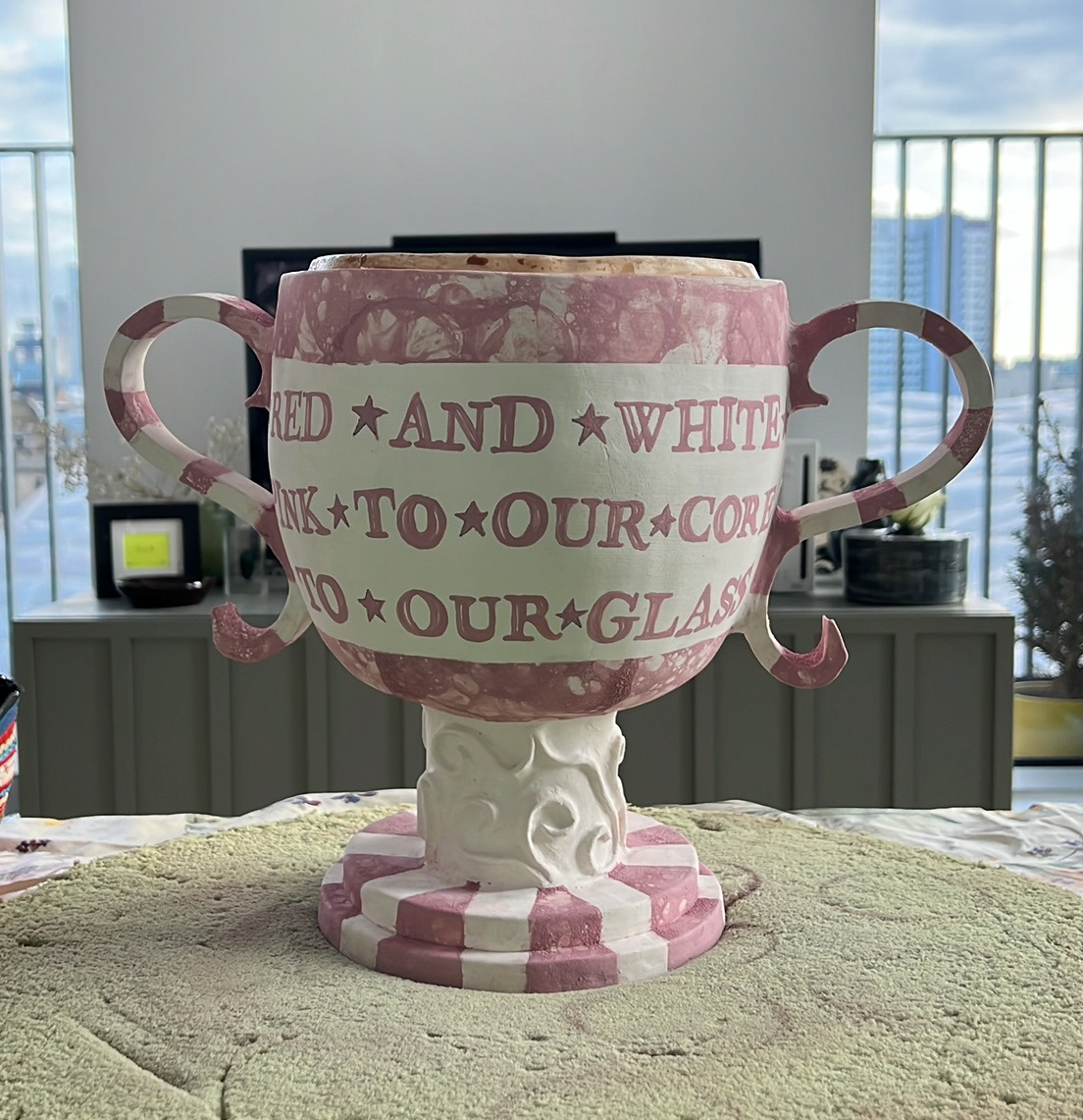
For a while now I have been workshopping some of the phrases that I wanted to have on my pieces, I decided to go for poems as this is a common theme of Sunderland ware. I wrote a short poem I'm the same rhythm of those on Sunderland ware pieces about the spirit of Sunderland with reference to our past industries. (below).
This poem is going to be wrapped around the second pot that I made, hopefully using transfers, so that I can map out the spacing of the letters before I can apply them.
I have also written a poem that will be featured on the text boxes of my first pot, this one will be in two parts on either side of the pot, using the font Aston Script. ( hand drawn templates that I will use below).
Once I had these and my first two pieces were out of their bisque firing, I could glaze these and have them in the kiln for firing on Wednesday.
See S&R Videos file, Video 11 (Glazing final piece 1 & 2 - pt 2)
Once I had glazed these and they had gone in the kiln, it was time to go back into the studio and finish building my third and final piece.
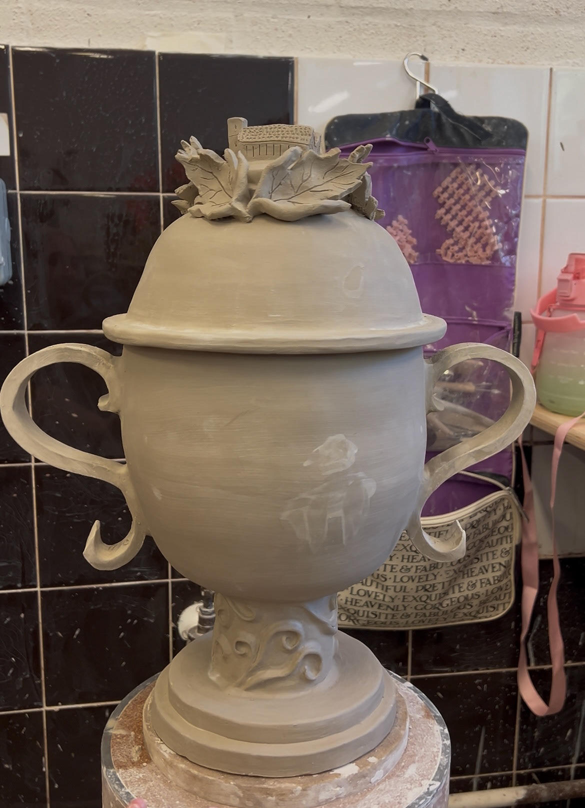
in this next building session it was time to build a base and attach the handles to finalise the trophy shape. At this point I decided to make a few subtle changes to my design as in real life the elements looked a little bit off, so instead of a square chunky base, I opted for a round tiered one, I also added some 3D decoration to the stand to add interest. I had also originally planned for my handles to be made from rounded coils, however swapped this out for more substantial cut out pieces of slab to balance out the scale.
See S&R Videos file, Video 12 (Final piece 3 - pt2)
Whilst working on these features I had to really take extra precautions on the moisture levels of my clay as it it was too wet, the pieces would collapse however if they were too dry, the pieces had a high chance of cracking at the join and coming apart during firing. after this building day however I was quite confident that this wouldn't be an issue, but I still added some re enforcement to the handle joins, just in case.
After this it was time for my final day in the studio before easter, and time to make my finishing touches to this third piece. Again I decided to make some more changes to my original design. (all changes mapped out below). All of these changes were informed by the building of my two previous pieces.
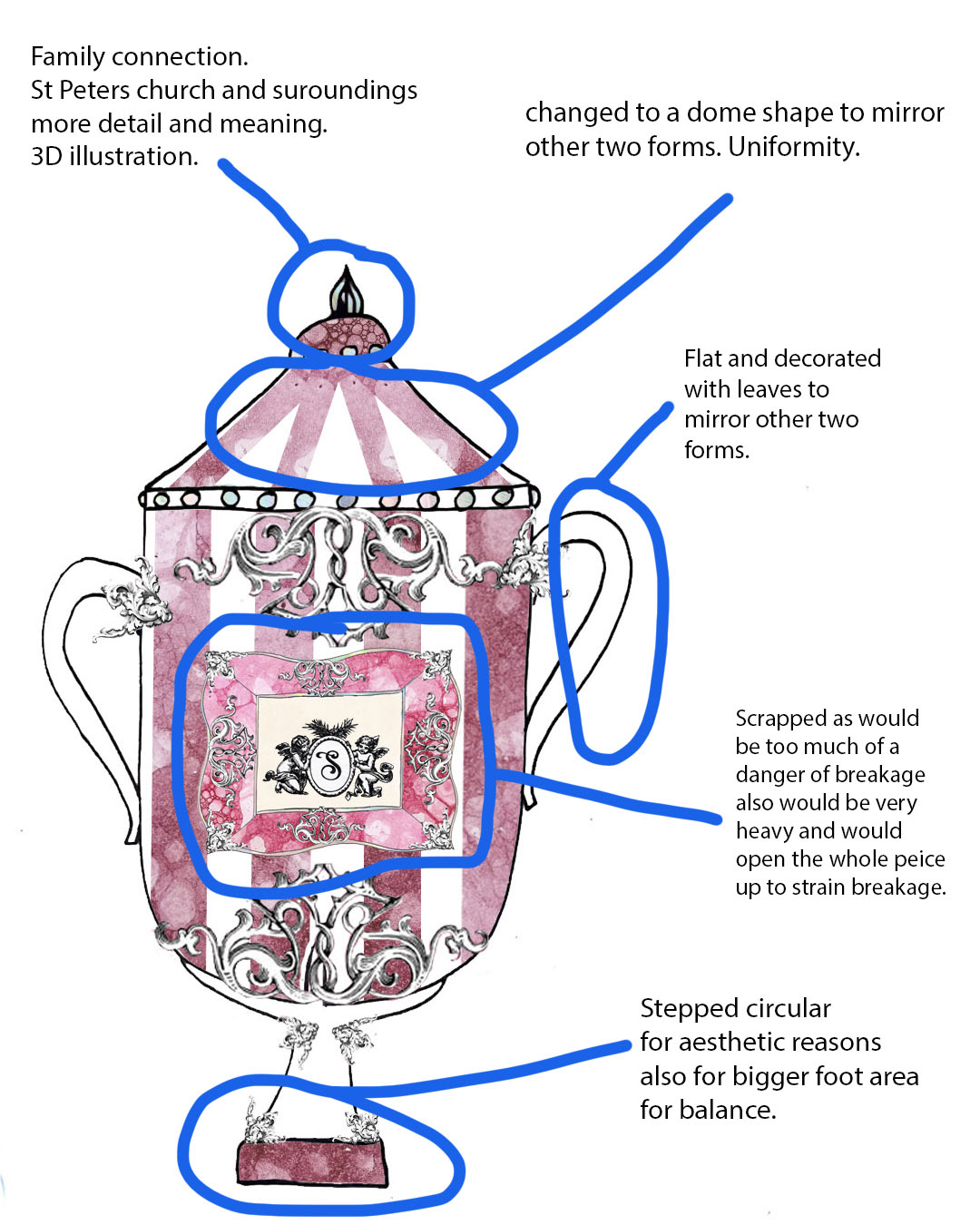
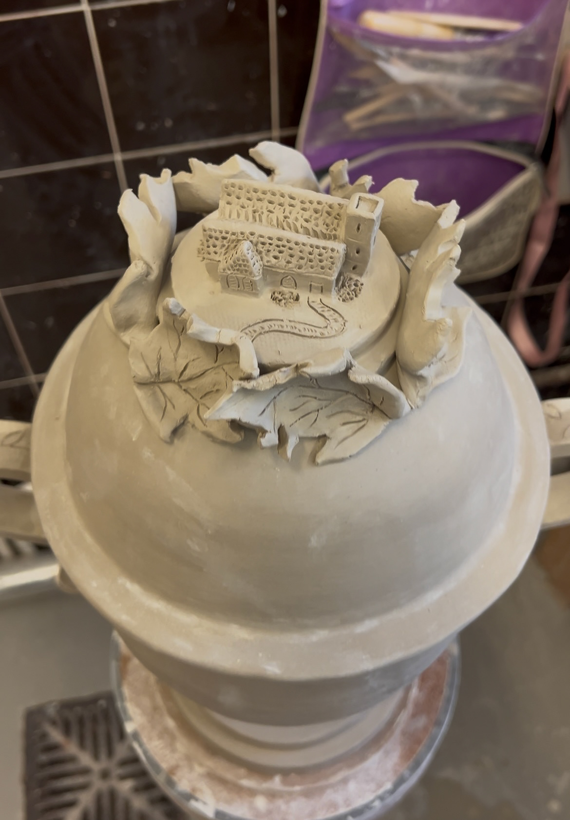
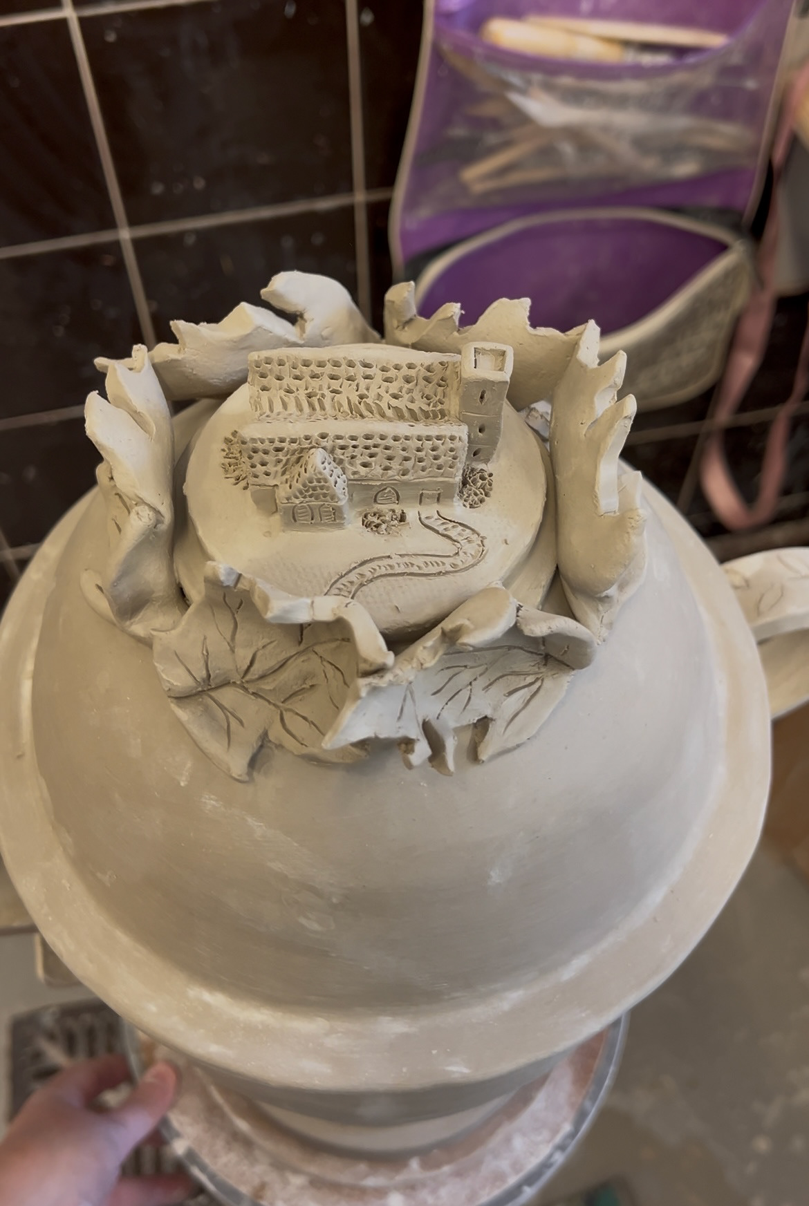
Out of all of these changes I think the change to the lid decoration would be the most significant as it has ran meaning and connection. throughout this project I have wanted to tie in a meaningful family connection, and as this third and final piece was about the city of Sunderland and its culture, I thought that this was a good place to add an element of this connection. I decided that I would add a small model of St Peters church to the top as this is a building that is very meaningful to the city of Sunderland as a whole as well as to my family. (below).
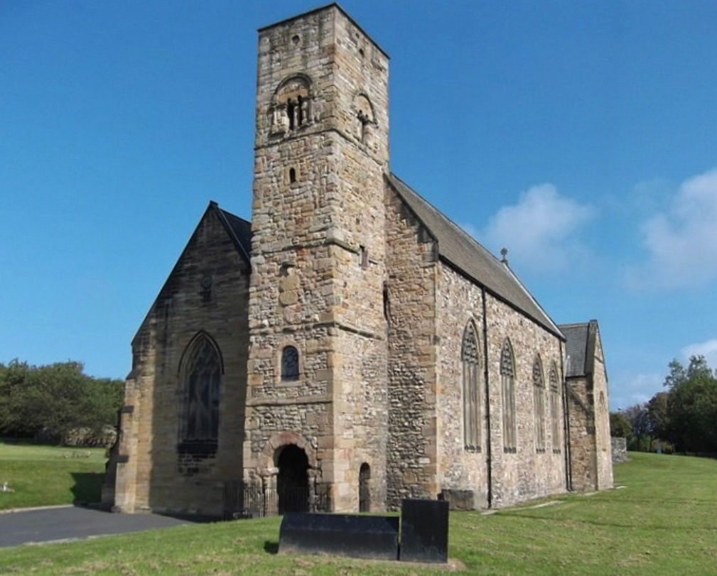
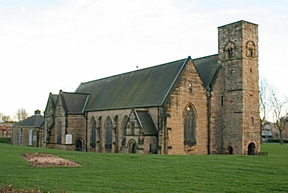
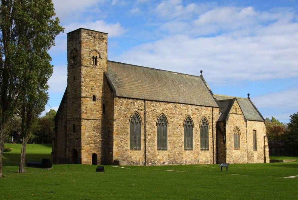
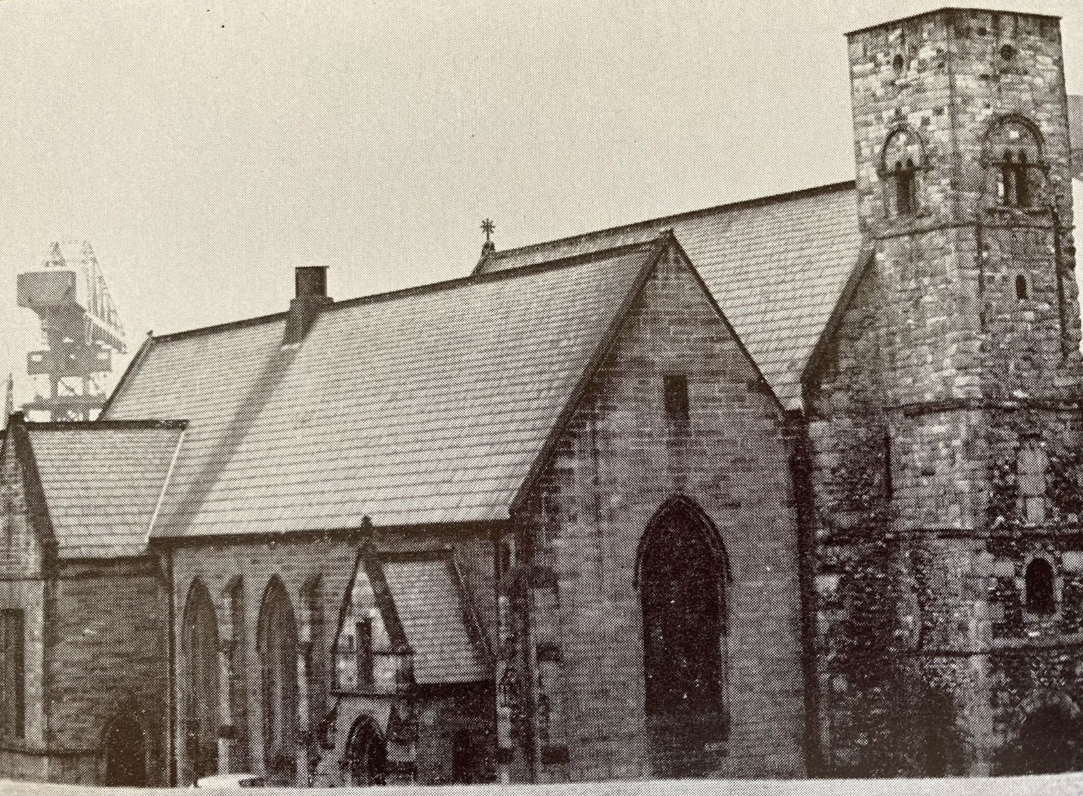
Built in 674AD, St Peters is the oldest remaining building in Sunderland. Built by Benedict Biscop and monastery to the Venerable Bede from the age of 7 years old. it is grade 1 listed for its historical and religious significance.
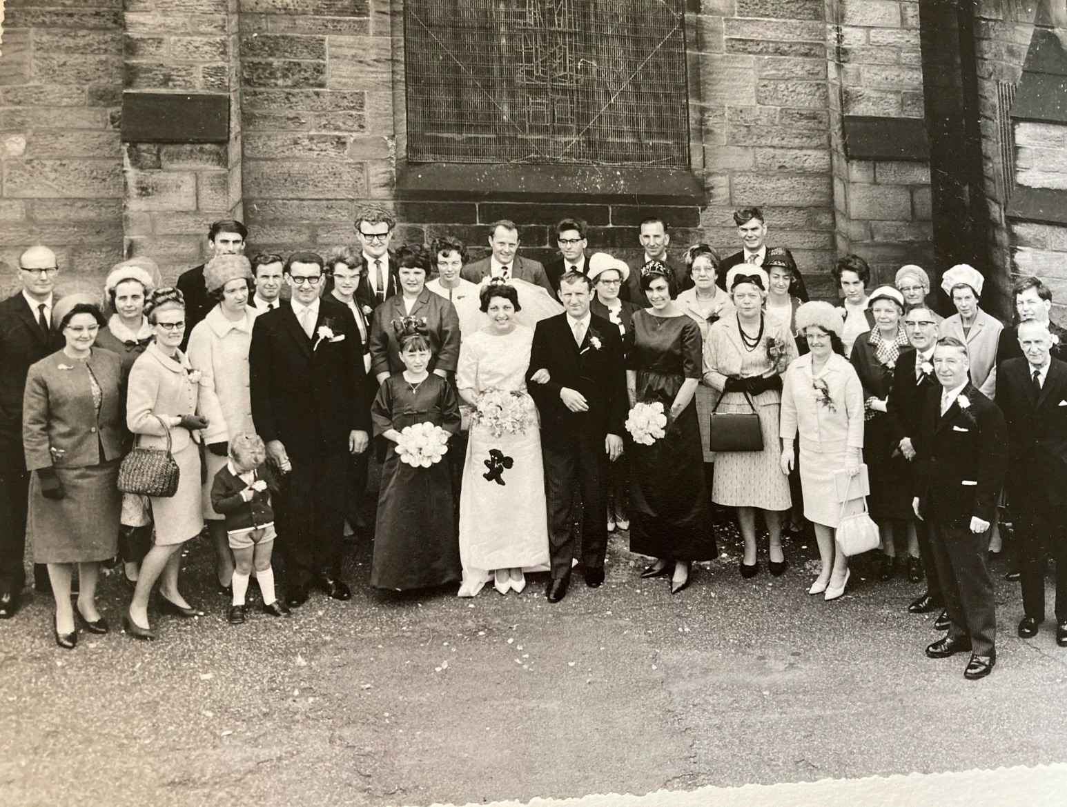
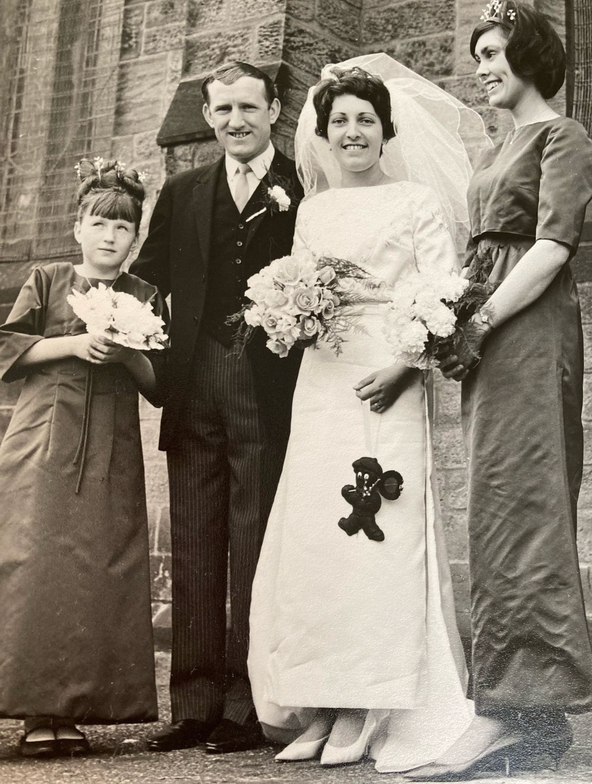
However it also has a great significance in my family. My Grandmas father, (my great grandad) was the church warden as well as wood craftsman, and restorer to this building. His craftsmanship and marquetry still lives on strong within this building. (the church group below) (my great grandfather is front row, third from the right, in front of the vicar and my grandma is the small girl in the front holding hands with her mother, my great grandmother).
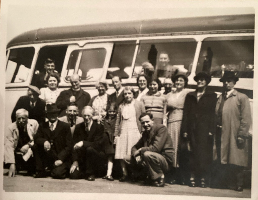
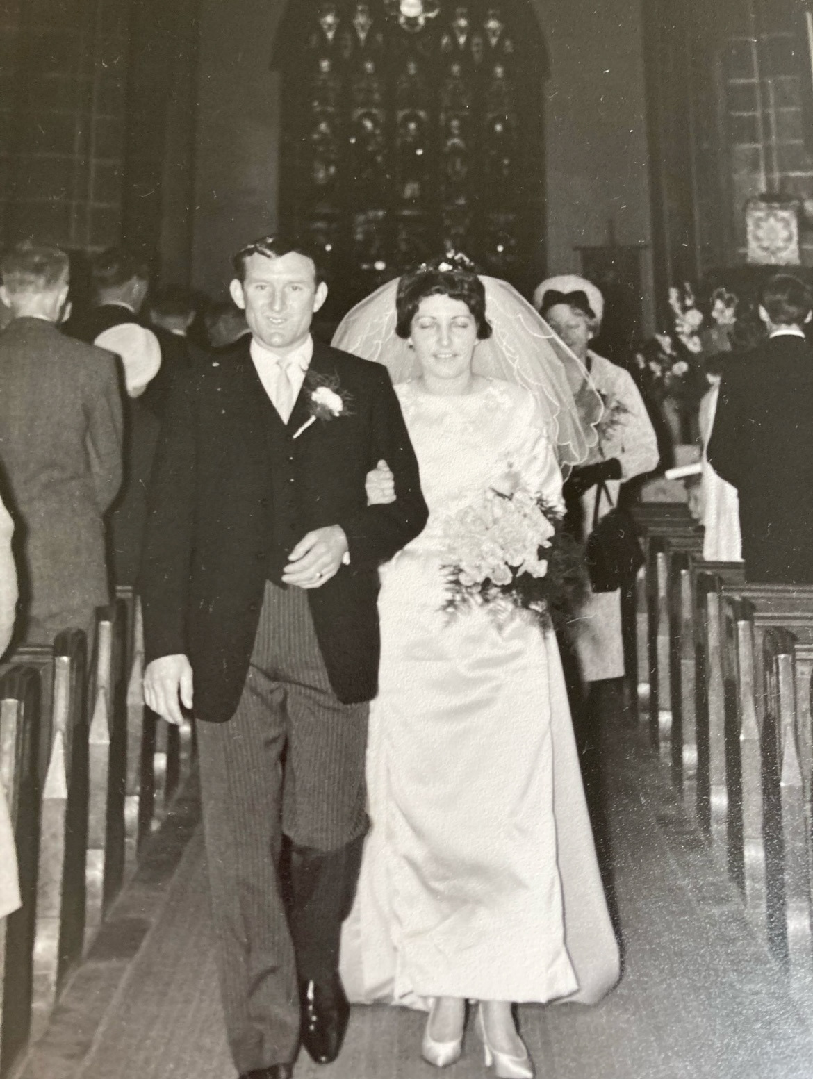
St Peters was also the meeting spot of my Grandma and Grandad and also the church were they later got married. They then christened their first child there (my mother) and then named their second child Peter, after St Peter. So this building is highly significant to us as a family and to me as, if not for this church I may not have existed today. (grandma and grandads wedding at St Peters below).
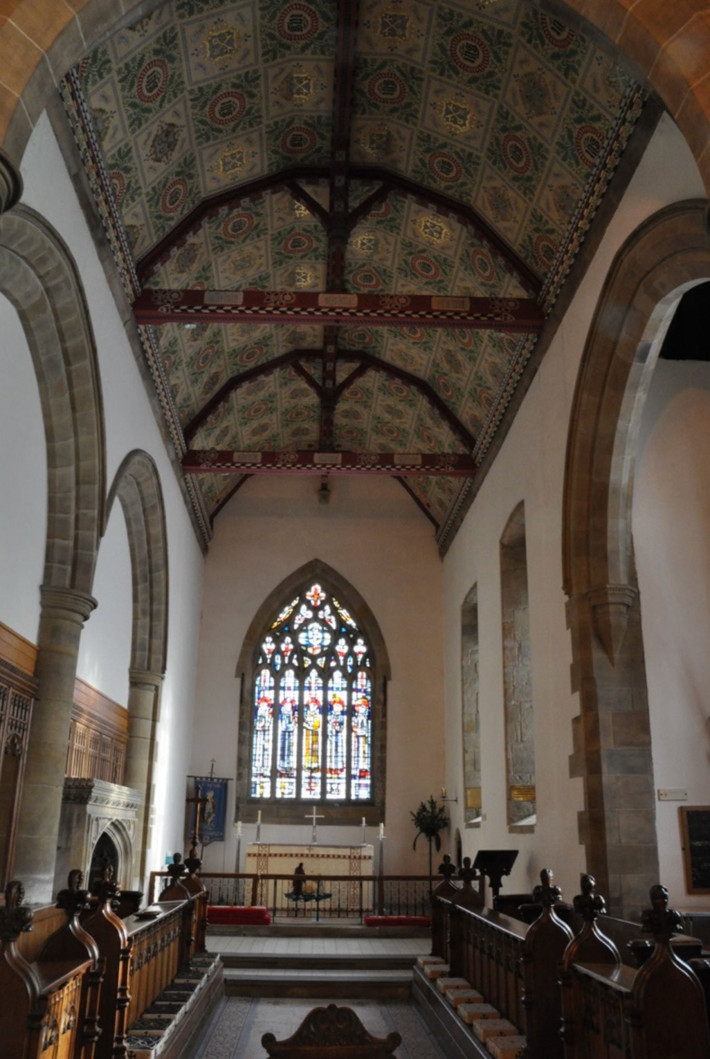
I also think that including this church on the top of my pot ties back nicely to the original Sunderland Ware too as a lot of Sunderland ware has religious messaging, as religion was an important aspect of every day life at its time of its production, and St Peters would have also have been operating as a significant parish at that time.
With all of this decided I set out to work executing this plan, I decided to sit St Peters on a smaller version of the stepped circle base to give it some presence and to tie it in with the body of the vessel. I also decided to add some modelled leaves for ornate detail and interest and added my carved vine leaf motifs to the handles to tie it into the set.
See S&R Videos file, Video 13 - (Final piece 3 - pt3)
The building of my final piece was finally done and all that was left to do was to wait for it to dry over easter, bisque fire, glazing and lustre.
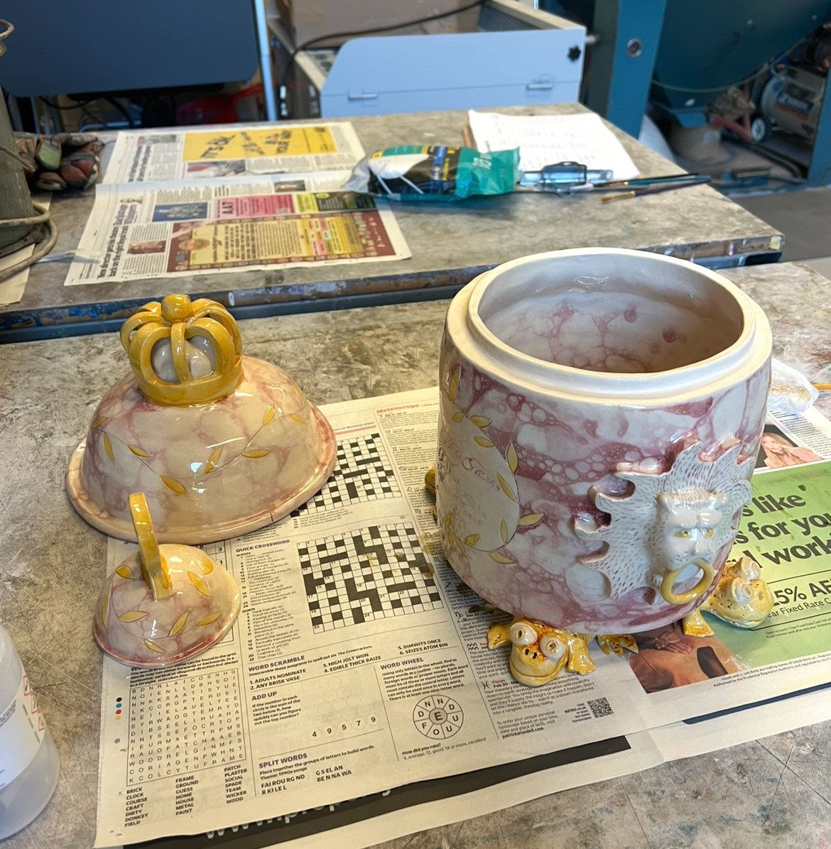
At this point my first two pieces had come out of their glaze firing. (below).
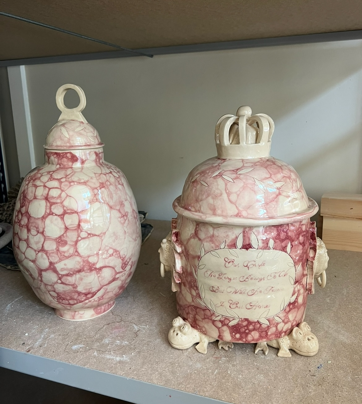
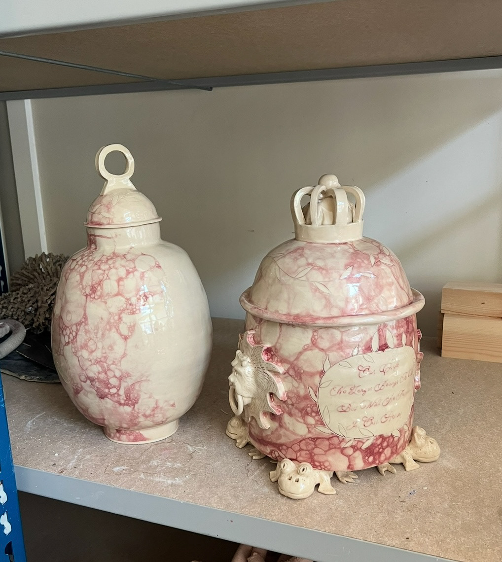
I really loved how these were looking so far and that in this firing, the weight of the pot had made it so that the frogs were now sitting flat on the ground, also I was beyond happy that all of the elements had stayed in tact and there were no breakages or unwanted warping. However there were a few issues that had to be addressed. on the inside of my first pot, there was a bit of a crack, as well as a crack on the rim of the lid, however this was to do with them cooling to quickly outside of the kiln. I also had an issue with this on the second piece, however not very visibly noticeable, structurally this one could be quite significant if I were to fire the body of the second piece again to apply its transfers. Unfortunately this meant that my second piece was unable to have any transfers or lustre on its body which meant that adding text at this stage was out of the question.
I think this is a shame however I think that because the topic of this piece is based around the future of Sunderland ware, that this could act as a commentary on minimalist ideas of the future and that it has been stripped to its old fashioned text and mottos and is open for future ideas, whatever they may be.
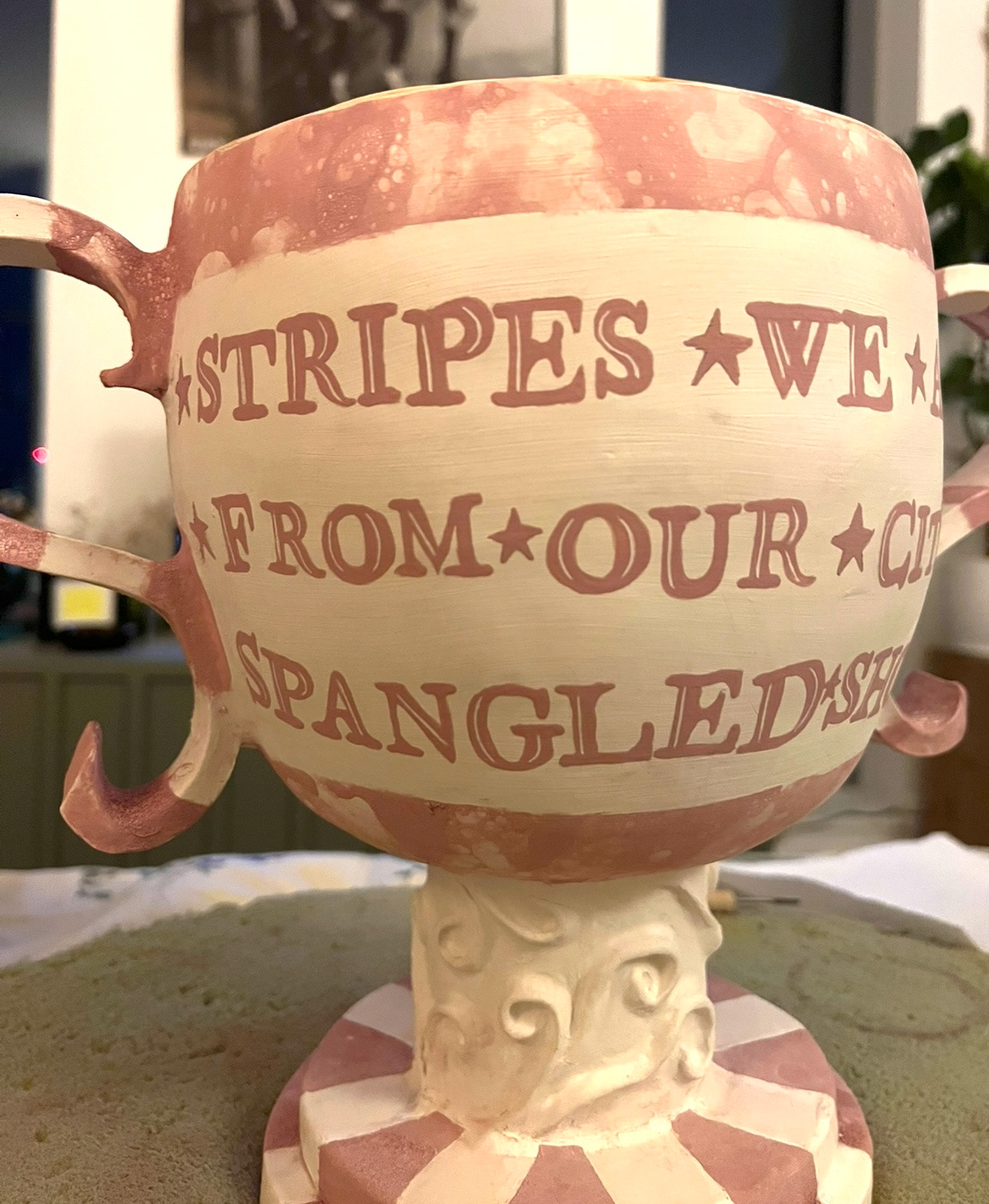
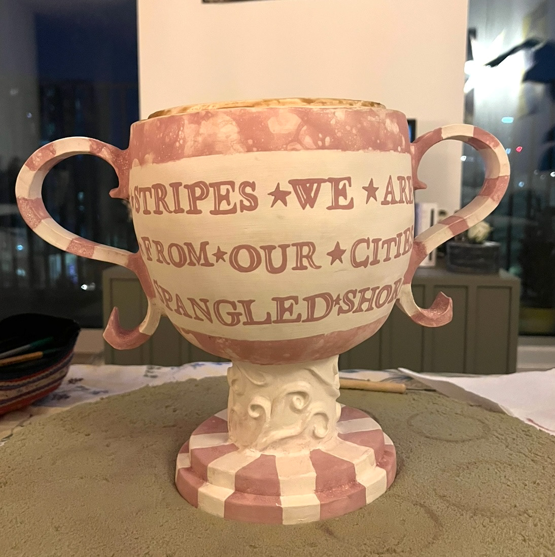
Another shame has to be how faint the text came out on the frog pot, as before glazing I think this looked really good but now is barely visible however again I think that I can spin this like the other pot. This one is about classic past of Sunderland ware and what makes it what it is, however a lot of this has been forgotten through time, so this could represent fading memory of Sunderland ware and of heritage craft and the stories told through them when not preserved.
Before I moved on, I thought that not being able to apply text to my second pot, might have to be another reason for some changes in design to my third and that I would have to redesign some of the glazing for this pot to include the text I wasn't able to add. (glazing plan below).
I'm quite looking forward to executing this design as I think it is taking the element of my pink bubble glaze and manipulating it in a different and more interesting way to create an elaborate design. from learning from my past pieces, I will make sure that these bubbles are saturated and that my text is written in at least three layers of glaze so that they are dark and clearly readable.
once I had this design, I set out to execute it. I taped off all of the areas that I wished to remain white and applied my bubble glaze.
See S&R Videos file, Video 14 - ( Glazing Final piece 3)
After I had done this step, I went back in with a small sponge and a scratching tool and tidied up all of the edges and small details so that It was as neat as possible.
Then It was time to apply my text. I printed out a stencil of my digital design and used a technique using graphite on the back of the paper to transfer this onto the pot, this would give me an outline that I could then paint in with glaze. (Applied stencil below)
This technique really helps me visualise the spacing and overall look of the lettering on my 3D piece before it is applied.
I didn't have much time to do this in the studio before it closed so after I had applied my graphite outlines, I carefully took the body of this piece home with me so that I could take the time and really perfect my lettering.
When I first started painting I tried to paint carefully around my highlight lines, however I decided that this was very hard to keep neat and as I was applying multiple layers of glaze, was taking significant time. (below)
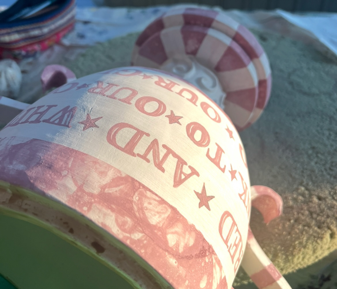
So instead I decided to paint my letters in full and then all three layers of glaze, go back in with a scratching tool and scratch my highlights into the glaze. this worked very well and meant that my highlights were all uniform and extremely tidy. (finished lettering below).
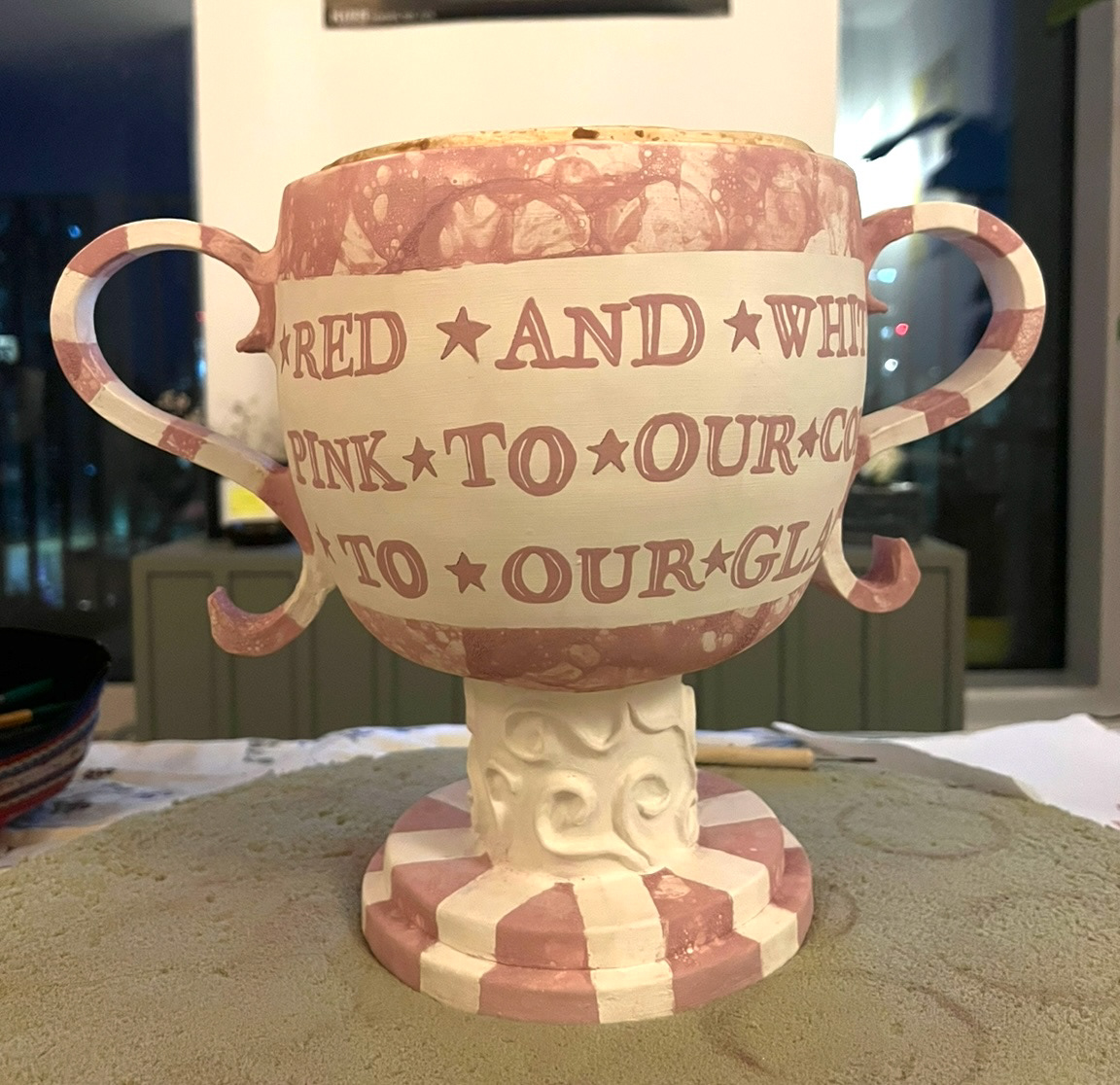
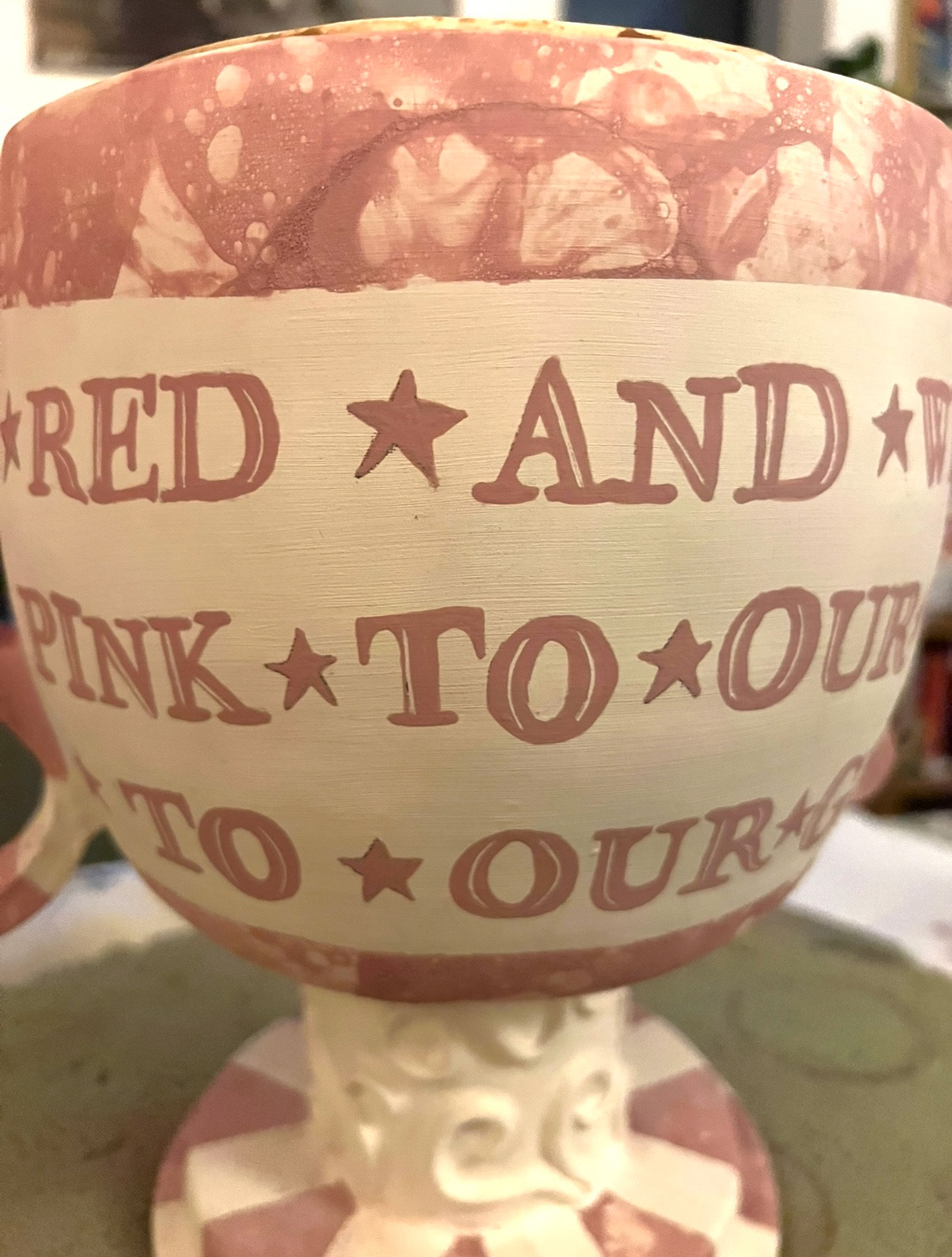
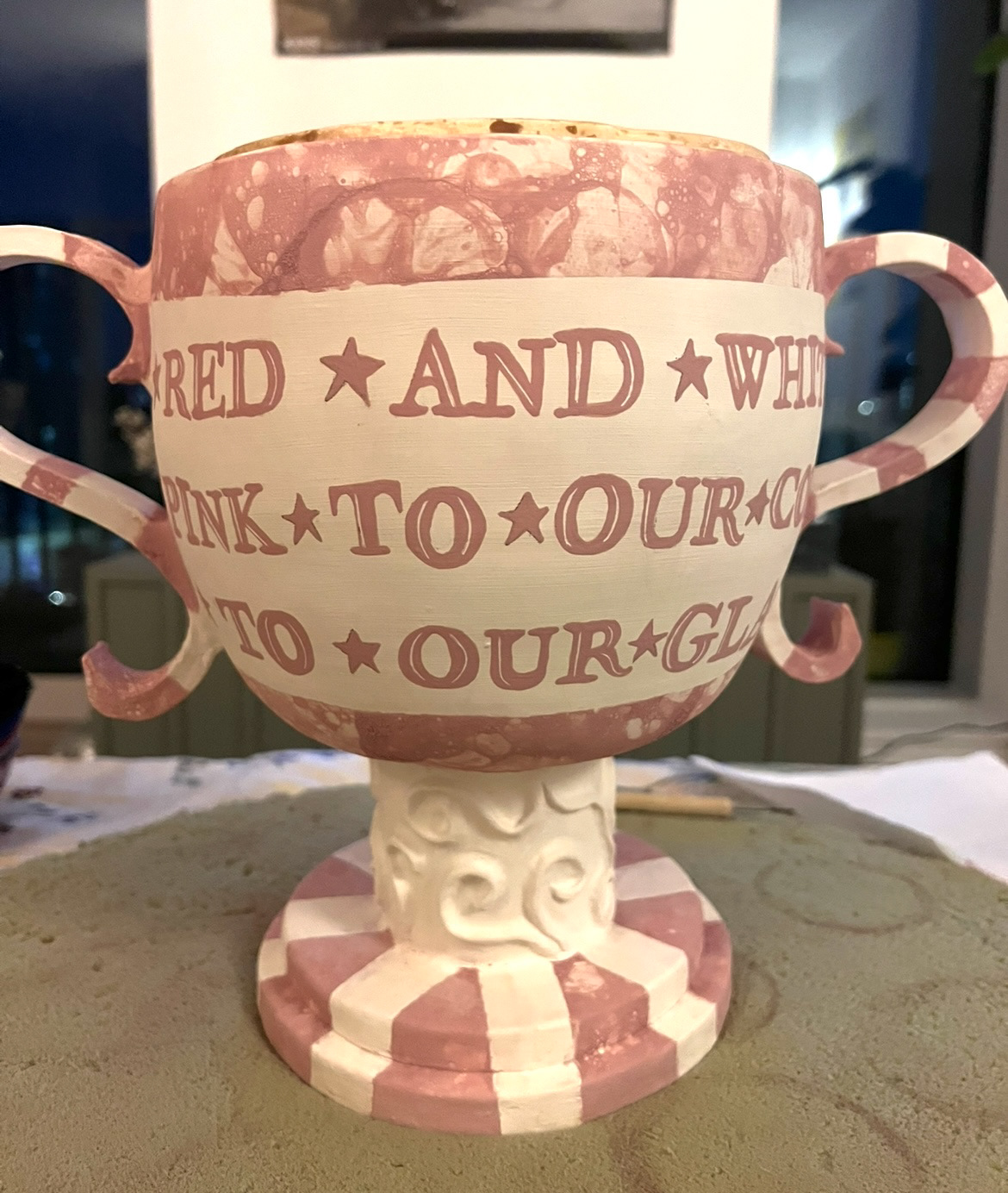
I also decided to add stars in-between words to create more of an interest and a flow to the lettering.
The next day I carefully brought this piece back to the studio and sprayed it with clear shiny glaze and left it to go into the kiln.
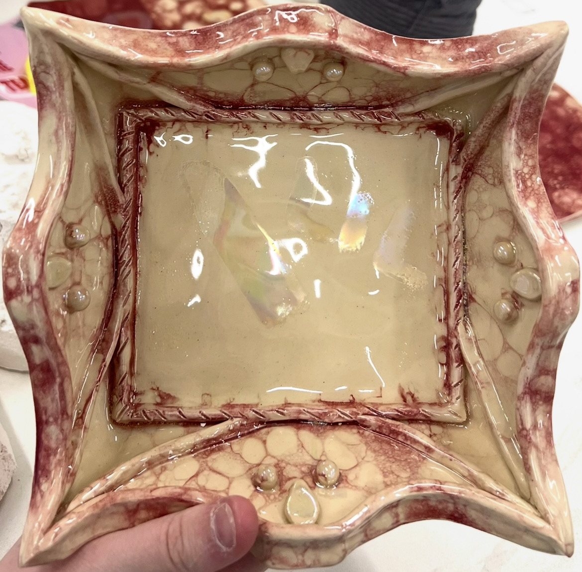
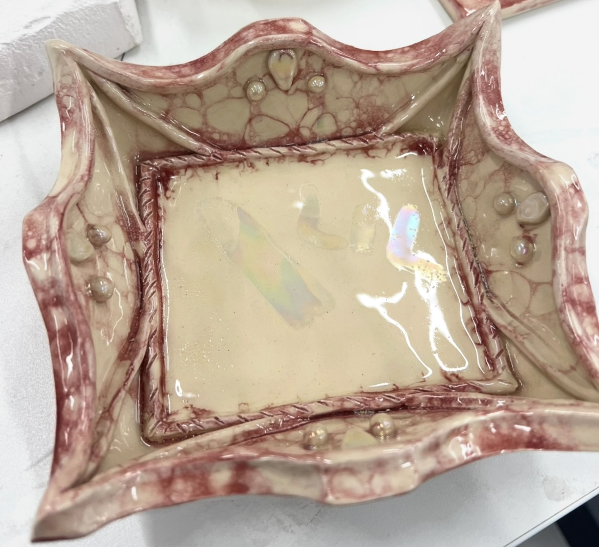
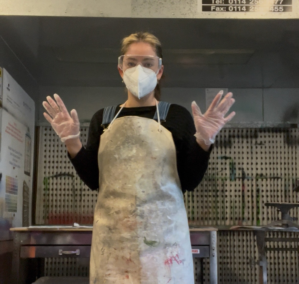
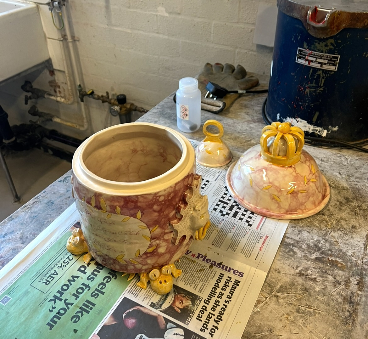
This day I also lustred my other two pieces. I followed all of my PPE instructions that I had planned out previously and followed my original designs for all of my lustred areas. (below)
These were then left to dry and put into their final firing.
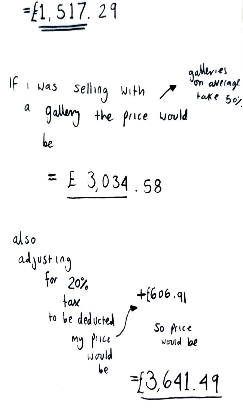
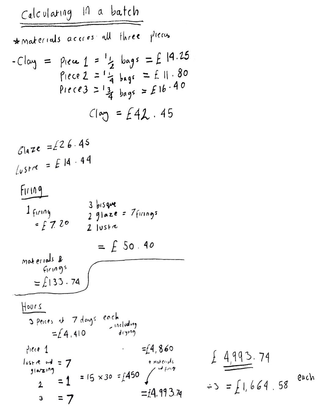
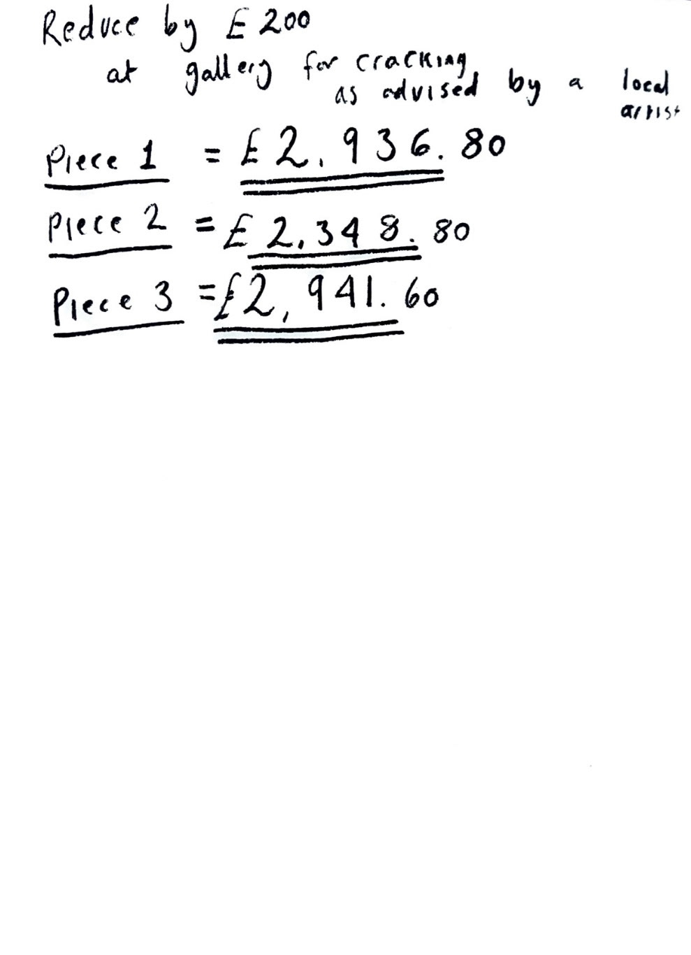
Whilst these were in the kiln I had a bit of time to review my pricing, I could now do this more accurately as I had nearly completed all of my making steps, so I could provide a proper hourly rate. Based on my last pricing I was advised to try and calculate all three pieces as a batch and see if the price came out any lower so that's what I did first.
(reviewed batch pricing below).
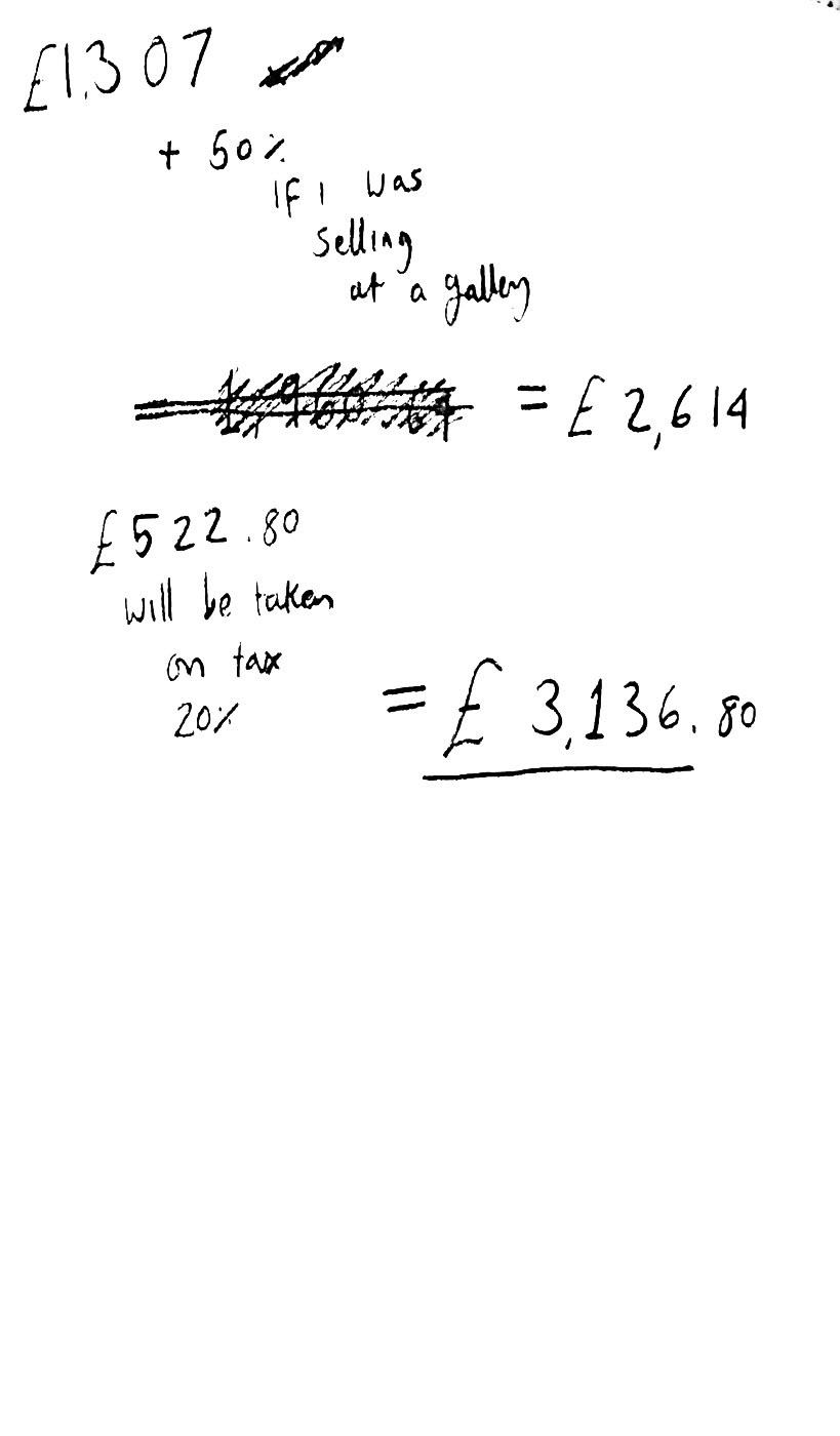
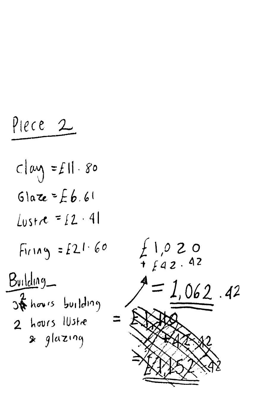
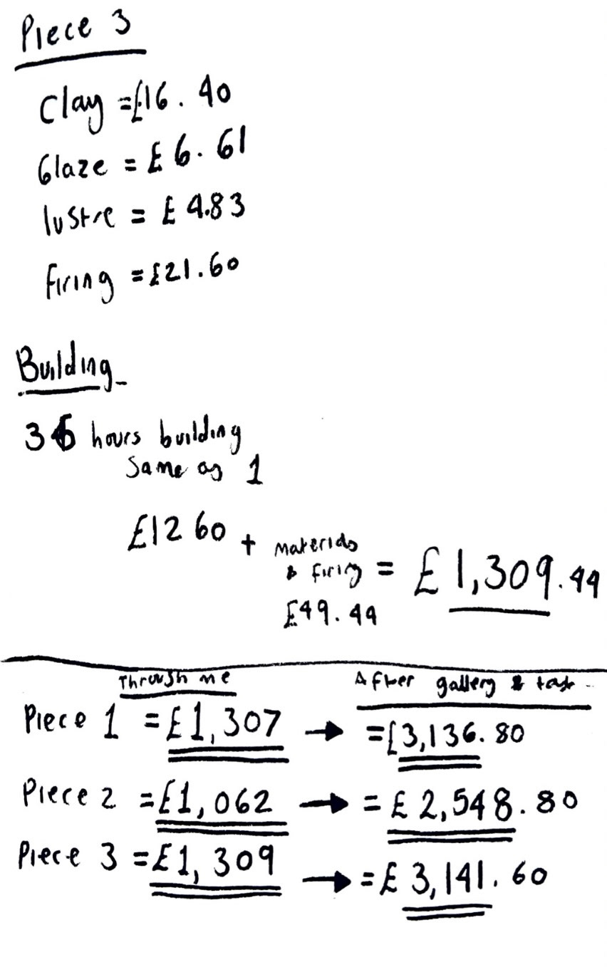
After this I found that it in fact did not make it any more inexpensive so I then worked it out again individual to the pieces, however now taking all of my new information into account and taking all opportunities to keep the cost down whilst at the same time, not underselling myself.
(adjusted individual pricing below).
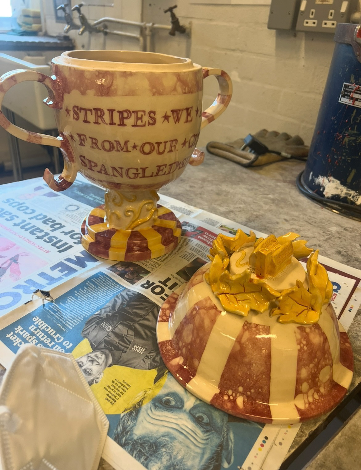
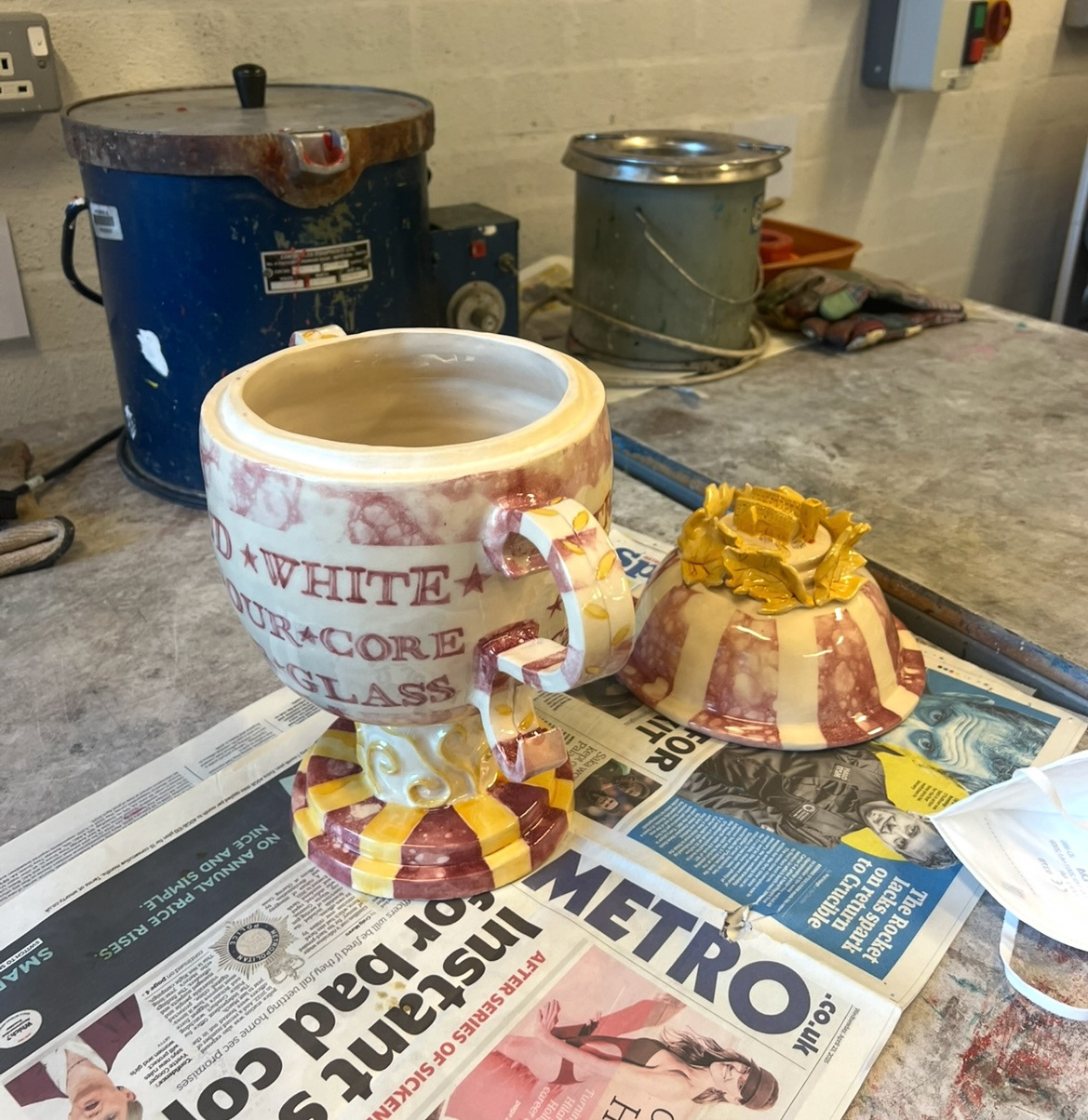
At this point my third piece had come out of its glaze firing and was ready to be lustred. I was extremely pleased that this piece hadn't warped under its own weight and that the handles and stand kept their shape. I was also pleased that the time I had put into perfecting my lettering had also payed off as it was very much readable after this firing.
I carried out my PPE once again and lustred this piece. (below)
Please See S&R pt4.