Now that I had done my research in Sunderland I could now come back to Manchester and have another tutorial with CJ.
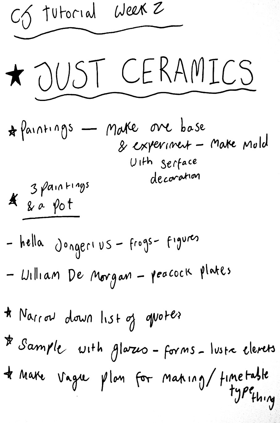
in this tutorial we basically decided that looking at Sunderland Ware is where my true passion lies, so we decided that, that is were I will specialise as there is so much to look at and research around it, as well as a large amount of visual inspiration.
We also talked about, instead. of just making pots like I normally do, I should diversify into trying to make wall plaque type pieces, and as this would need a lot of experimentation, that should be the first thing I focus on right now which I was pretty excited about because this would be a new exciting challenge for me, especially paired with my glazing experimentation that I would also have to be carrying out in the coming weeks.
At this time also, I had a conversation about Sunderland ware with my grandmother. She said that she thought it was funny that I had been to the museum to photograph the ceramics as some of it had once belonged to our family. This was a bit of a surprise to me as I had no idea about this and when I questioned her further, she revealed that her Aunt Lil, (who I am named after), donated some of her mothers Sunderland ware to the museum in the late 1950s, early 1960s, but she couldn't remember what specific pieces these had been. I found this extremely interesting, not just because of the Sunderland ware connection, but also because of the connection to my Great Aunt Lil, as I have not known much about her but have always felt a connection through her as my namesake. I also haven't had a huge opportunity to research the women in my family up until now however I think that this could defiantly be a start and by finding out which pieces belonged to her I could potentially find out more about her and even older generations of my family that I didn't know much about before.
I Started this journey by sending an email off to the Sunderland Museum which houses the collection to see if they had any records of donation or records of authentication dating back to then. I am currently waiting for a reply back but am looking forward to digging further in this.
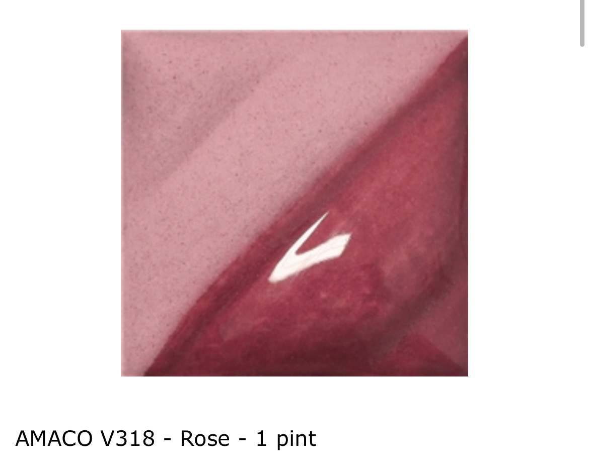
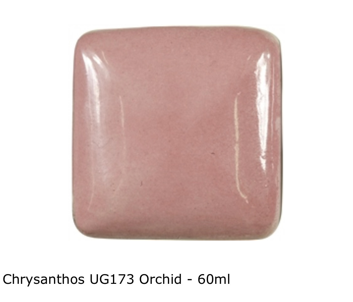
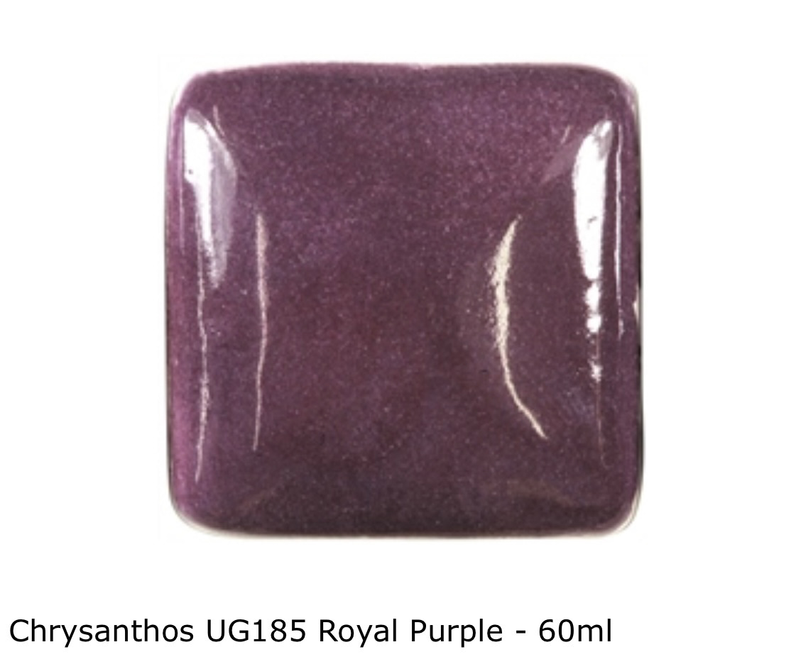
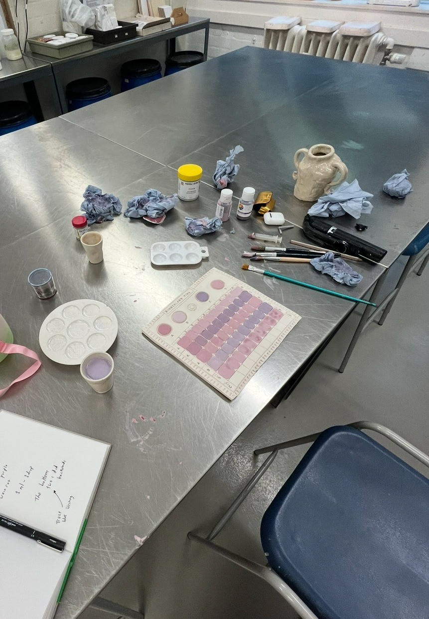
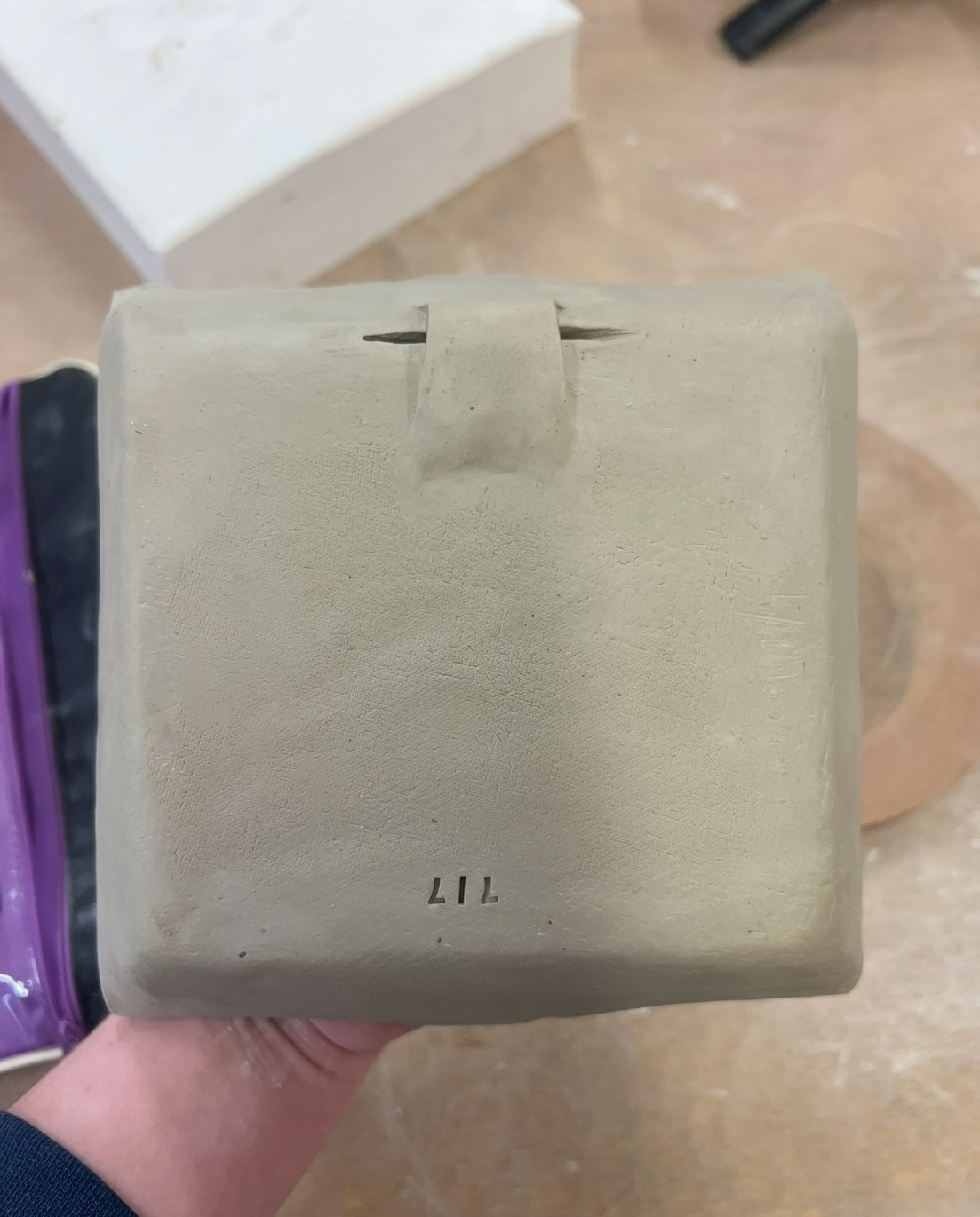
In the studio my first job I decided would be to think about my glazes. I looked on the website Scarva and ordered some underglazes that I thought either looked like a good colour match or I thought looked like I could mix them together in a line blend to create something close. (chosen glazes below).
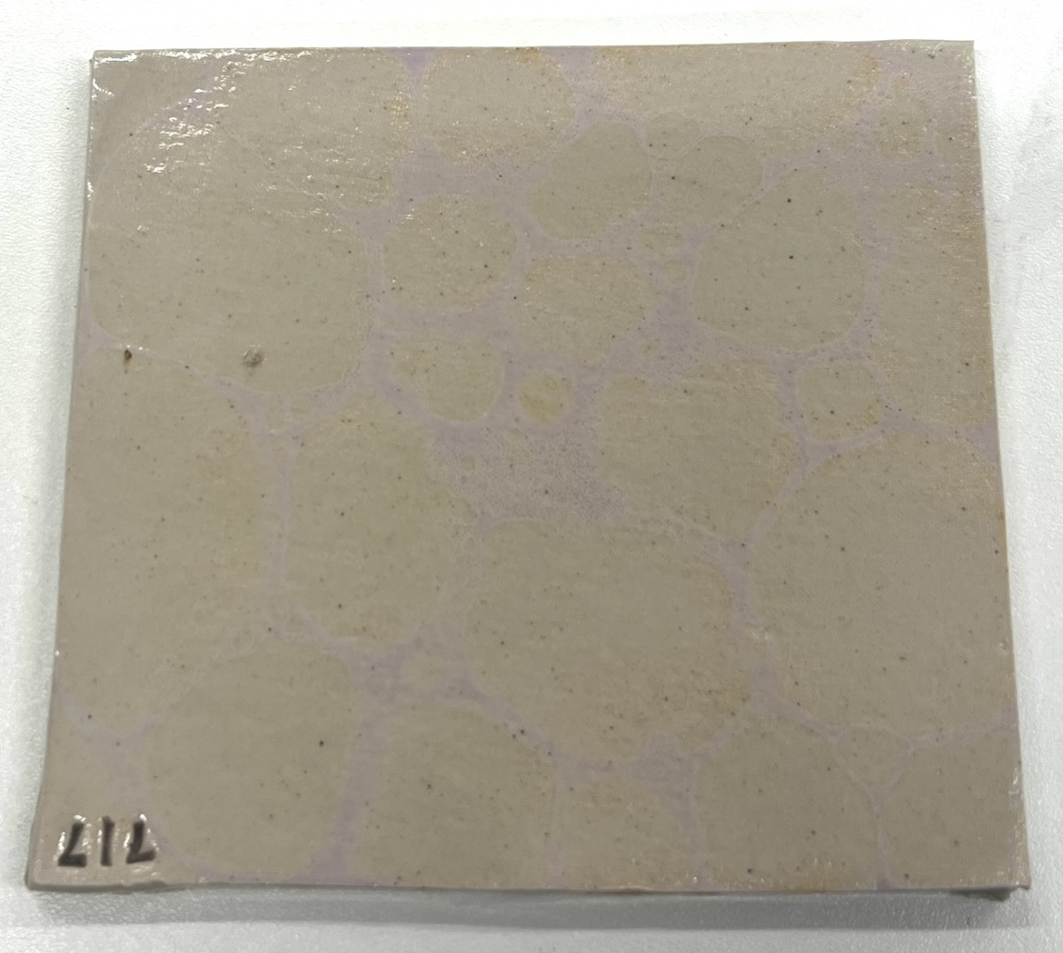
I then also in the studio made a test tile to carry out my line blends on (below) and waited for this to get fired and my glazes to get delivered.
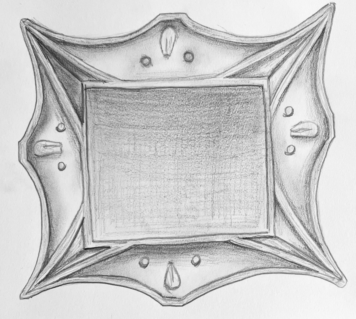
Meanwhile I started thinking about the making of my wall plaques and how I could start to sample making them. I first sketched out an initial drawing that my samples/ prototypes would be based from. (below).
I then decided to look into how these plaques would have been made originally at the Sunderland potteries.
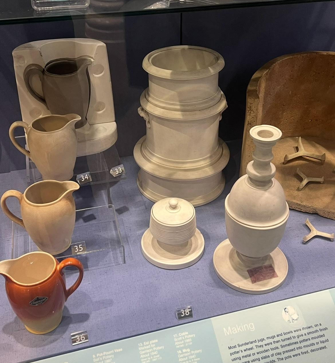
From my trips to the museum, I found out that the majority of Sunderland ware pieces, were first sculpted and made by a team of master sculptors, these original forms would then be made into slip cast moulds and the base forms then decorated in a number of various different styles. This meant that they could keep costs down and create multiples of one piece for an affordable price. This especially was the case with the wall plaques as they were once known as "Poor Means paintings" as they were affordable for the lesser well of people of the society. having a repeated base also meant variation could be expressed through decoration, which will be something I will explore later when it comes to the decoration stage.
Original moulds and carvings (left).
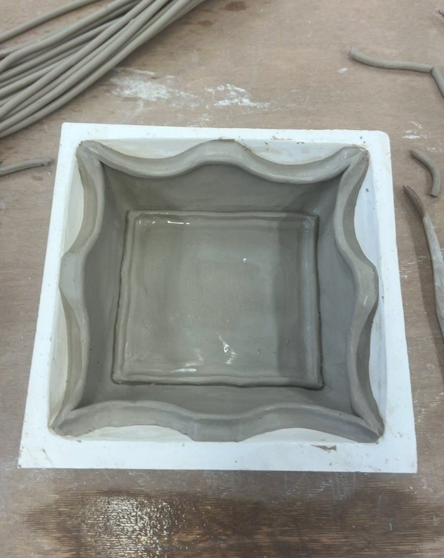
When making my samples I decided that a mould would be a wise choice if I'm going to reproduce multiples of the same base form, however, rather than opting for a slip cast mould, I decided to go for a press mould. This way I could save time and also apply unique surface decoration to each one whilst my clay was drying in the mould.
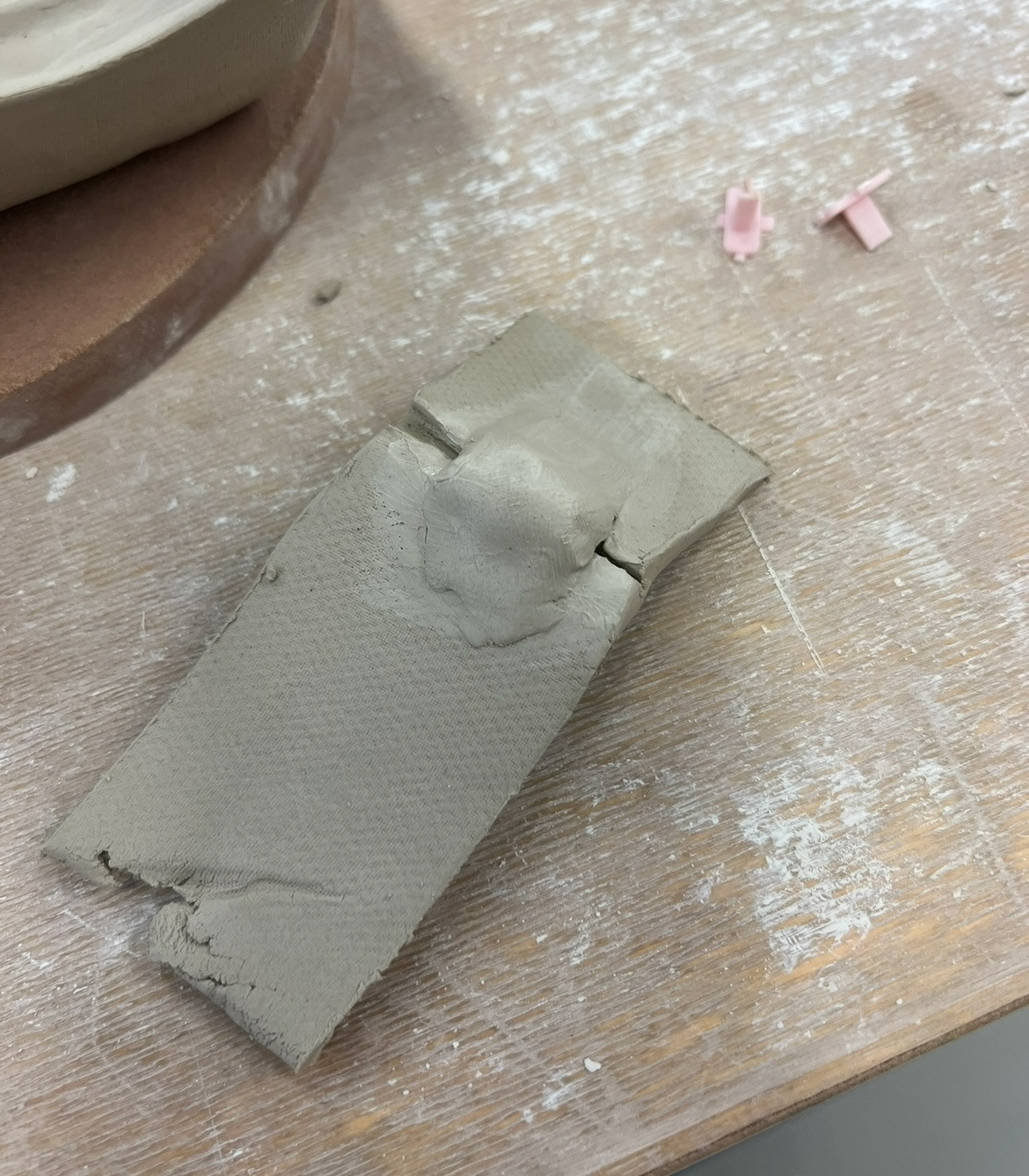
I thought that the best way to start to make these samples was to make a press mould, which would have to be made in plaster. I set out a plan of how I would go about doing these. (below).
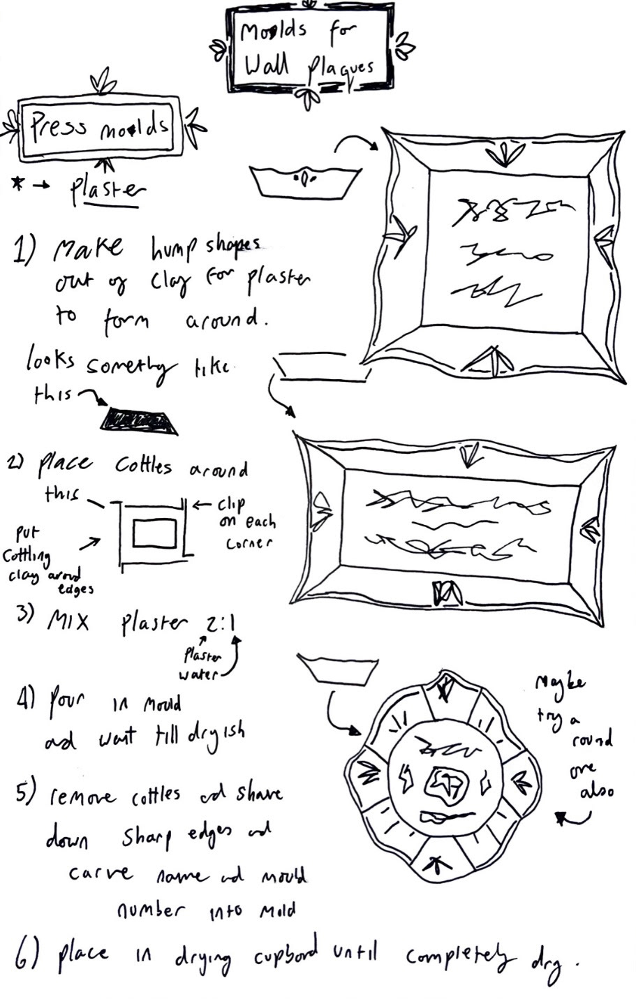
I then went into plaster to try and carry out this plan. (plan for mould one below).
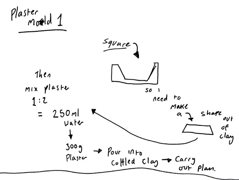
I carried out my plan exactly as I had stated however after I had mixed my plaster, I noticed that it had taken a bit longer than I had expected to thicken into pourable a pourable state, however after a while I decided to pour it and let it set. However again this was taking an unusually long amount of time. I decided to let it set and dry overnight, however when I got back to it in the morning, it was still incredibly soft. After reviewing my plan I realised that I had, by mistake added 1250ml of water to the 300g of plaster instead of the desired 250ml, so obviously it was defiantly too wet to set. I had not done plaster since first year so I forgave myself for this slip up and tore my mould apart and started again.
Whilst tearing this mould apart, I also noticed that the walls of my mould were very thin so I would need to widen my cottles around my clay hump if I was to get it to a desirable thickness. Luckily because my hump of clay had sat in wet plaster all night, it was still able to be used, so to make my next mould I could just cottle around it again and use it for a hopefully more successful mould.
For the second try at the mould I cottled up with wider gaps between them and the clay hump. I then made sure I mixed my plaster exactly in the right ratios and poured it over my clay hump. however because I had widened my cottles, this was no longer the right amount of plaster to cover my clay so I had to really quickly measure and mix up another lot of plaster and pour it over before the original plaster had set. so on this cold I learned that I need more plaster to cover my desired amount of clay. After this mould had actually set, I could take off my cottles and reveal the result which I was very proud of and was excited to try out to see whether it was usable or not.
I did also try and make a third more rectangular mould, this time using the right amount of plaster, however this was less successful as the second as the walls were again far too thin so again this is something I need to work on.
(See S&R Video File- Plaster moulds pt1)
I then had to wait for these to dry in the drying cupboard before I could test them out.
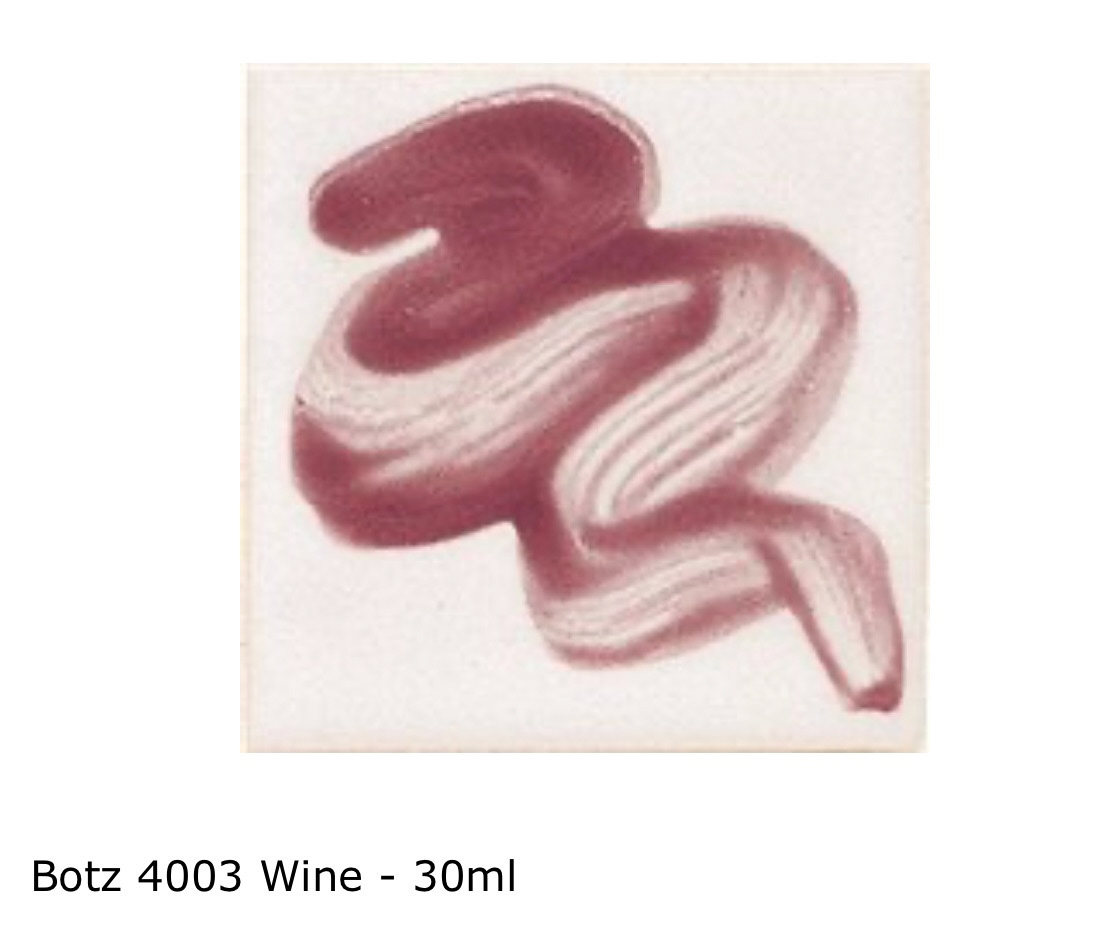
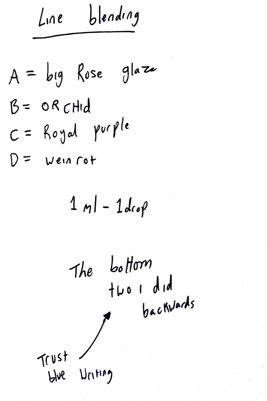
Meanwhile, my underglazes had arrived so I could test out some line blending to try and determine a close match to the original Sunderland ware pink.
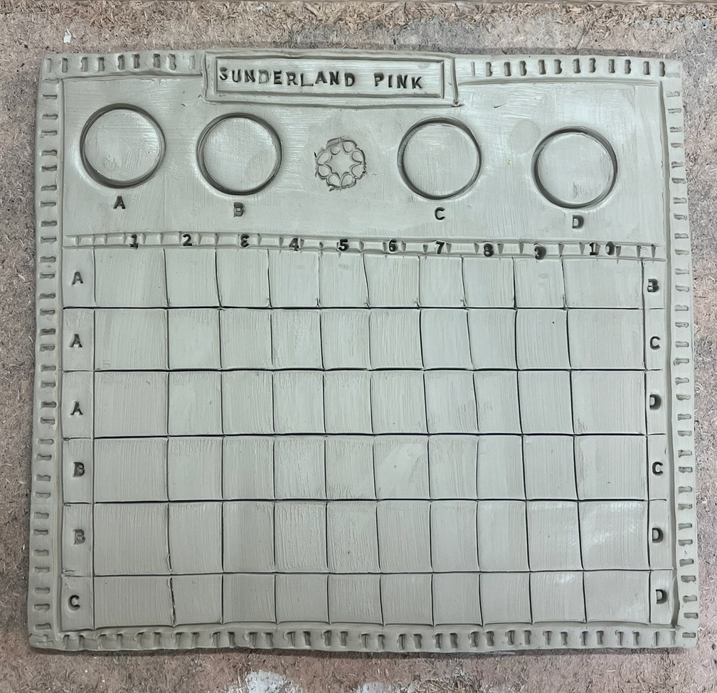
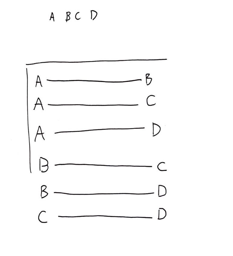
I ordered 4 glazes and carried out a sort of initial line blend on my board above to try and get the closest match I could. I gave each of my colours a letter A,B,C, and D, and planned out how I would blend them. (below).
Once in the studio I could then try and carry this out with my glazes. (result below).
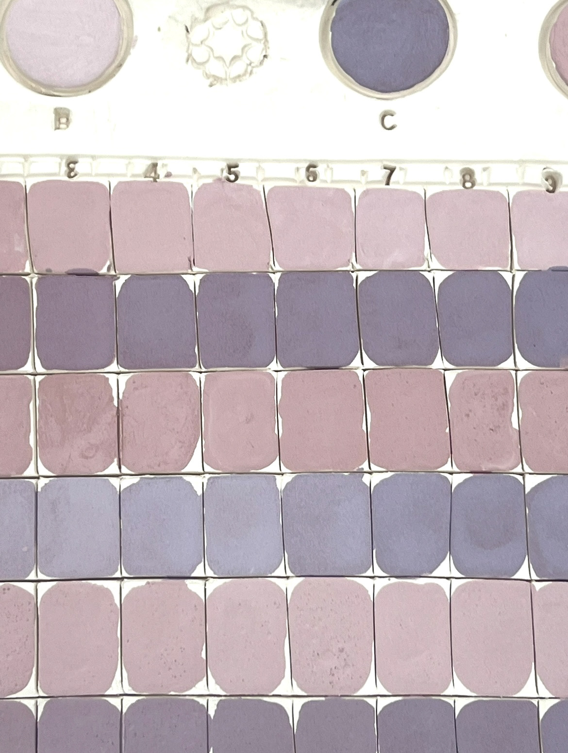
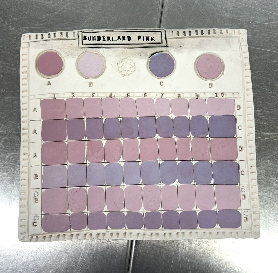
With each line I started with a base colour and then added another colour to that one in increasing amounts to achieve a gradient, and hopefully achieve a good log of all the possible pink outcomes, so that I could get as close to Sunderland Ware pink as I possibly could. I then added a clear stoneware glaze over the top of it once it was completely dry and put it on the shelf ready for firing.
Whilst I was waiting for this I decided that it was time to test out one of my plaster press moulds that I had made earlier.
(see S&R Video file- Video 2 prototype press mould test).
I started off by rolling out a large slab of ivory stoneware clay, and placing this in my press mould. I then gently pressed my clay into the corners so that it would take the form of the mould. I then cut off the excess clay and used a sponge and a rubber kidney to make sure all of my slides were flat and smooth. once I had this base piece in the mould, I took a knife tool and used my drawing as reference to create a more ornate and interesting border shape by cutting swooping shapes out of the sides. once I had this I took an extruder dye that would make very thin extruded pieces of clay. I then took these and cut them down to size and created a 3D border that would line the whole piece, I also did this around the flat well in the middle to create a flat canvas that would stand out. (below).
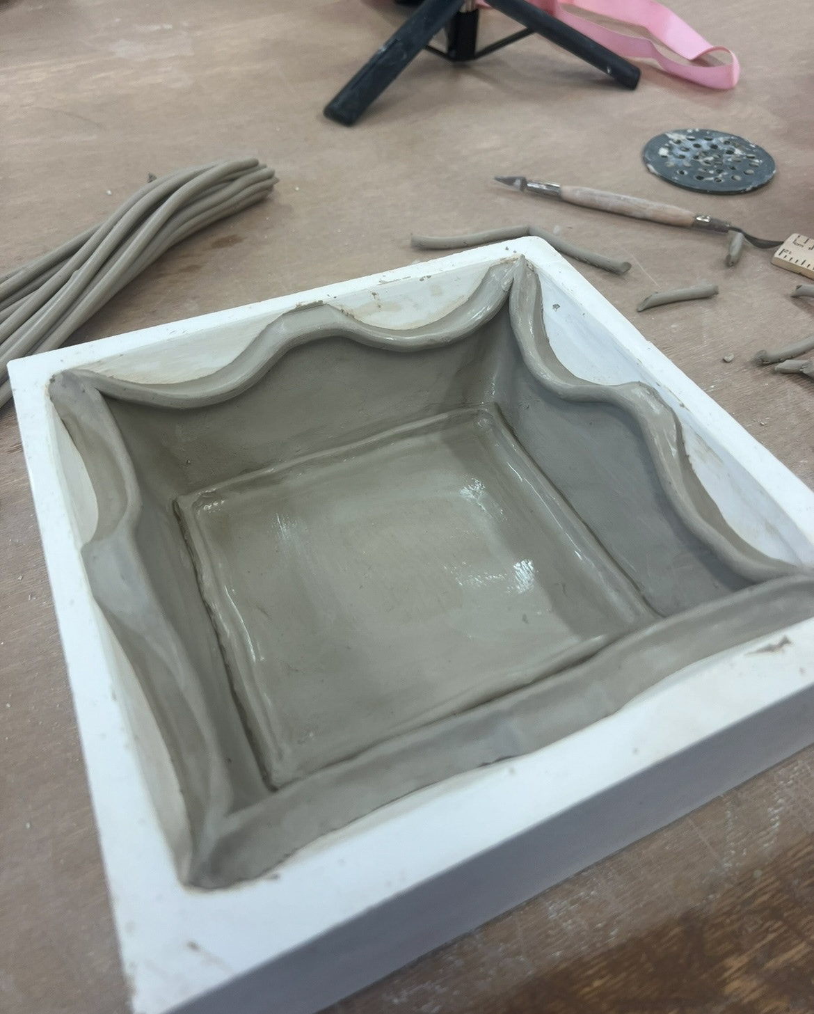
I then hand modelled some very simple decoration pieces and attached them around the border frame. I chose to do these very simply on this piece as it was just a prototype, I plan to go a lot more ornamental in further development. after this I wanted a short while until my clay was dry enough to come out of the mould and still hold its shape. (below).
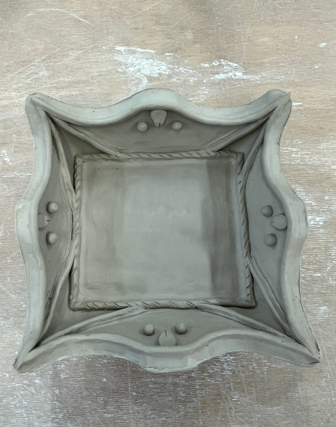
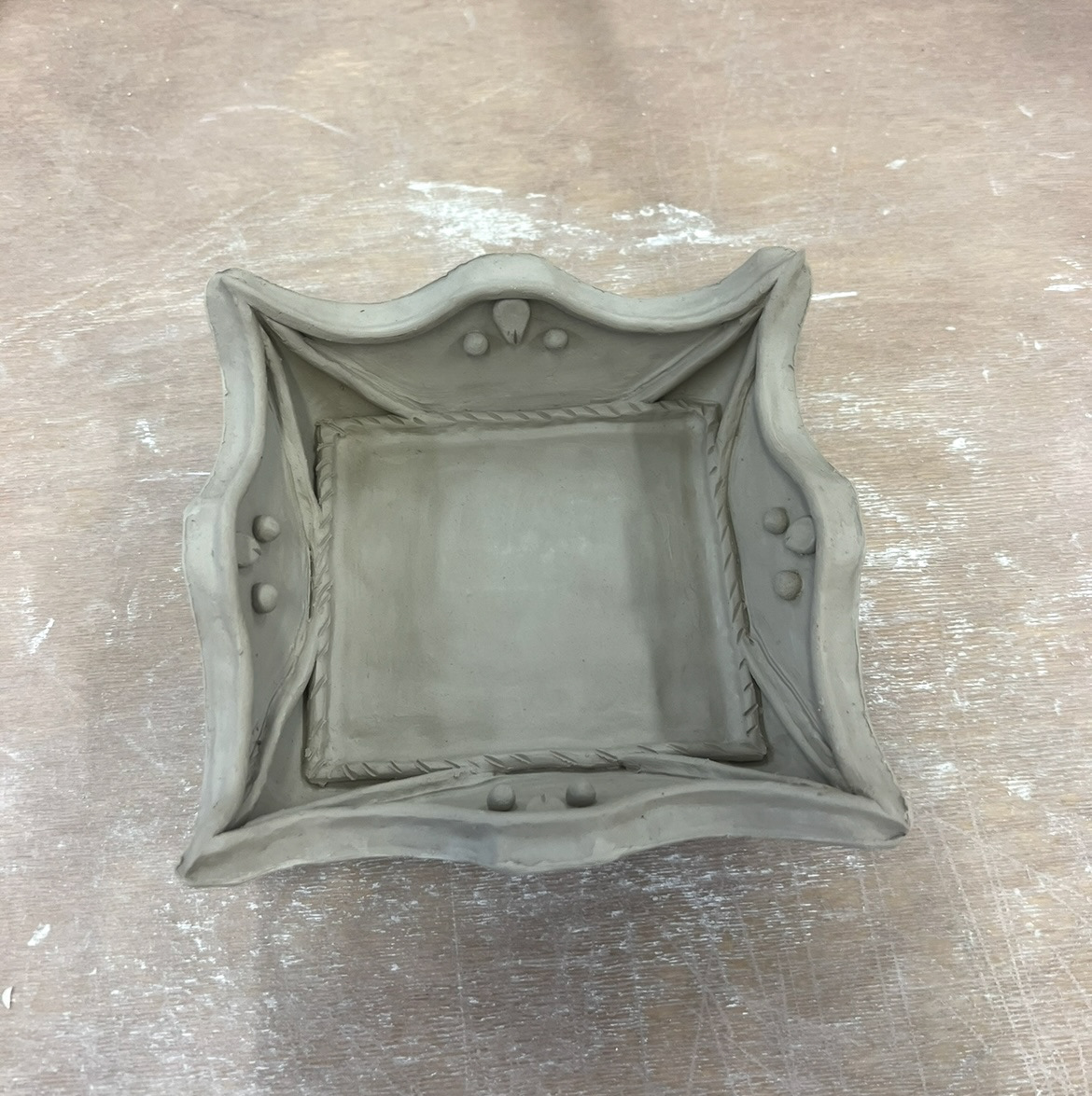
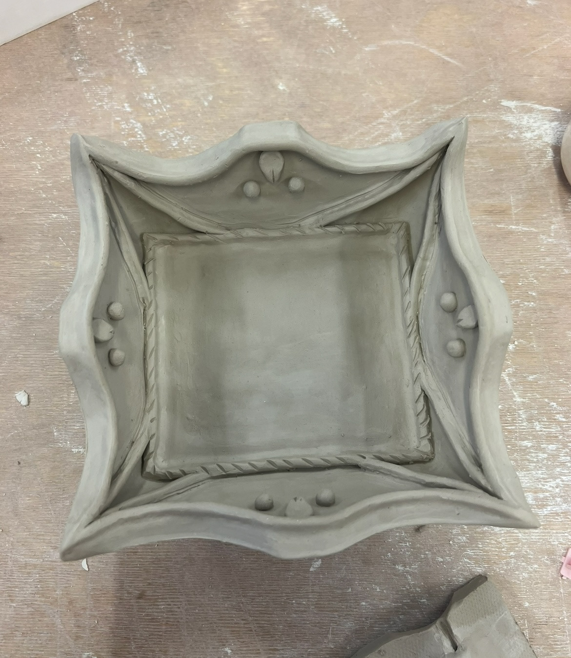
After this came out I decided that the walls of this mould were far too up right, and that the walls would have to widen out a lot more to get the desired look I was going for. I also think the next press mould I make will have to be a lot bigger because this piece was already quite small and I would need to account for some shrinkage in the kiln. overall however Im quite pleased with how this first prototype turned out, and now I know what areas I need to look into to make my improvements.
Lastly in the making of this sample, I had to think about a wall mounting feature.
because of the shape of the piece I thought that it would be wise to devise a wall hanging solution that included a string, so that I could play around with the length to determine how I would most want it to hang on the wall. I came up with this plan (left). I could carve a string hole into the corner edge of the piece and then add a piece of clay over the top that the string would be threaded behind. I thought that this was quite a simple but functional method, so I added it to the back of my piece (below). I'm looking forward to seeing how affective this is once it has been fired.
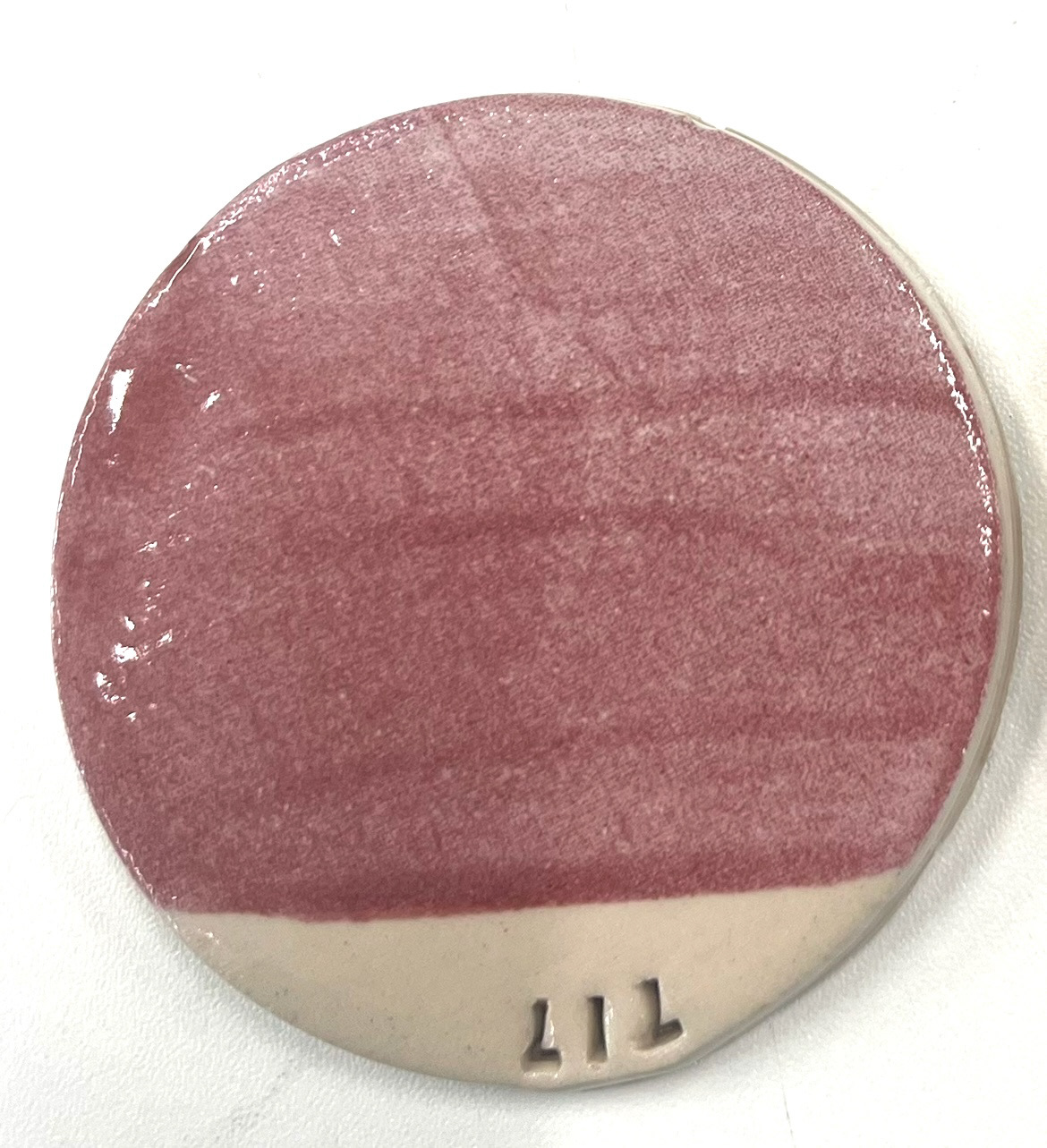
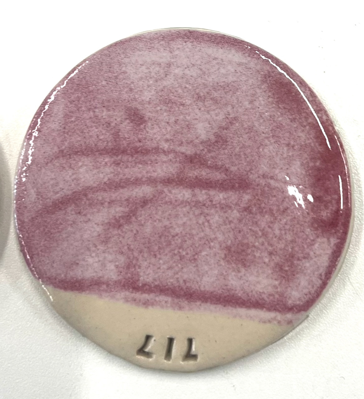
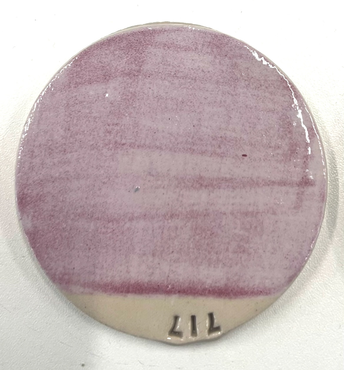
Once this had gone in the kiln to bisque fire, I found that my underglaze line blent tile had come out of its final firing. I was very much looking forward to seeing this as I expected a wonderful array of different pink shades to choose from and colour match with the original. However this is not what I found. (below).
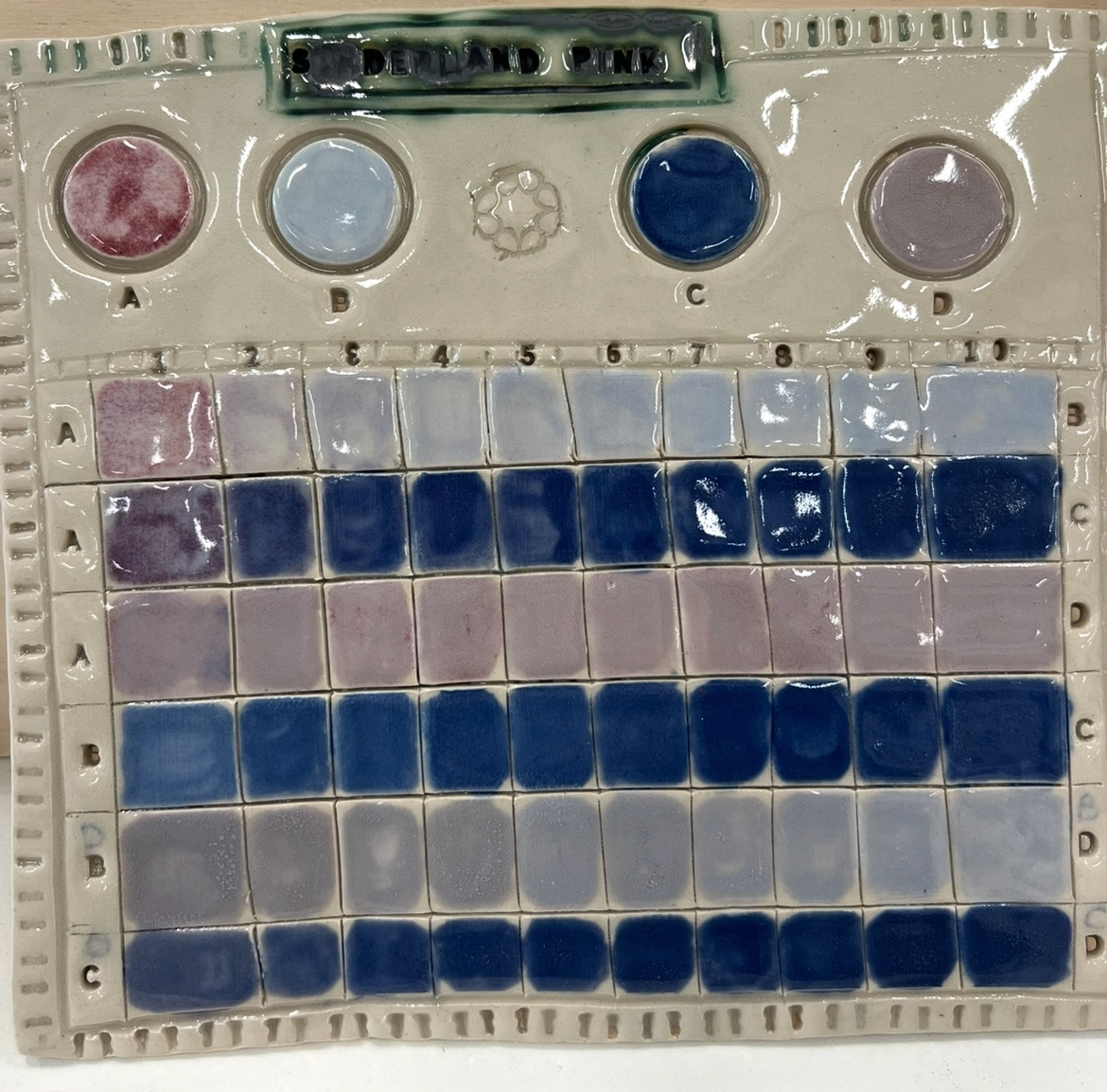
I was quite perplexed and bewildered to find that my pink tile was in fact blue in majority. I took this to Rudy, along with my underglazes and we started to unpick the issue. it turned out that when ordering these underglazes I had gotten a little bit mixed up. I read the firing temperatures of glazes B, C, and D as firing at cone 4-6, however their actual firing temperatures were cone 04-06. This temperature is a temperature below bisque, however I had fired the whole tile as stoneware, which is completely too hot for those underglazes to keep their pink colour. so it was completely my own error.
However one good thing that came out of this test was that underglaze A, the only one to actually stay its pink colour, was near enough spot on for what I needed. so this came out with quite a good result in the end.
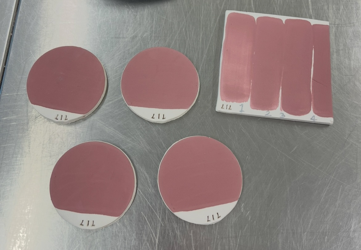
I decided I would do some further testing with this pink glaze to see all of its full properties and colour capabilities.
Firstly, I had been warned about the unpredictable nature of pink glaze as it can change colour quite dramatically based on even its placement in the kiln. So I decided that I would make four test tiles and paint them all equally with two coats of my pink underglaze, with a clear glaze on top and fire them each on different shelves of the same kiln. I chose to use test kiln 3 so that I could keep a fair test and fire further samples to the same result if successful.
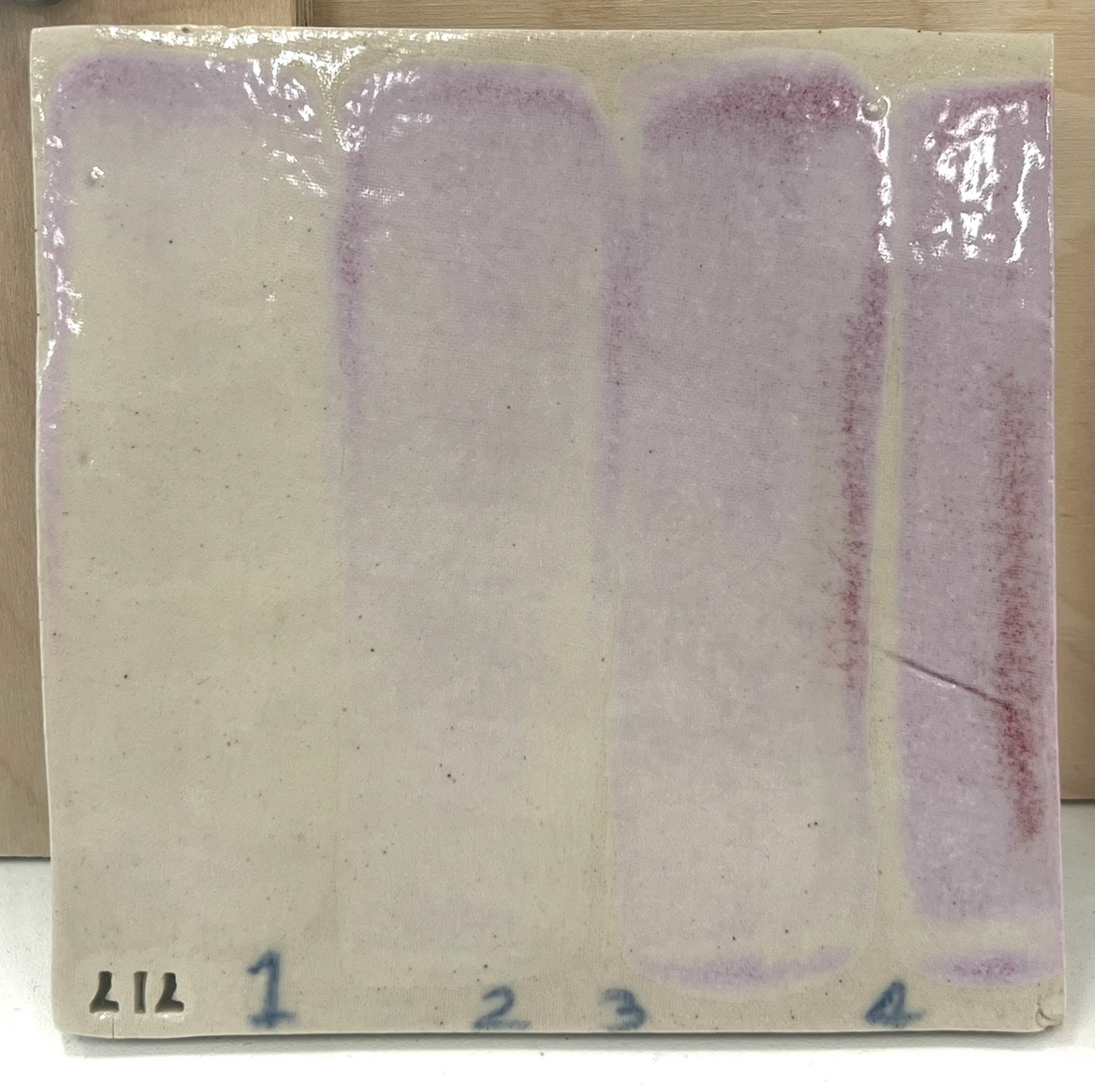
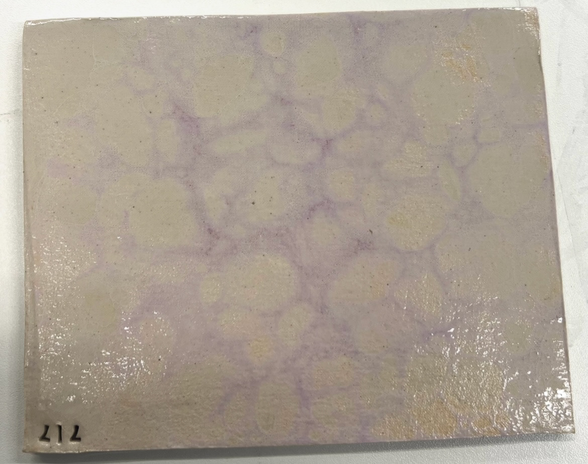
I also made a tile of layering samples, where I tested one coat, two coats, three and four, to see how or if the colour or the opacity of the underglaze would change depending on how much was applied.
(both below).
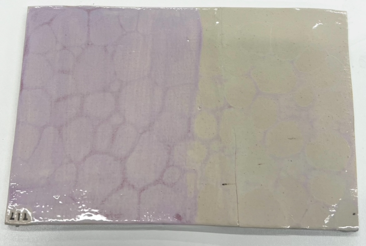
Whilst I was testing this pink glaze I had a technique in mind that I wanted to try to try and get the bubbled effect that the original Sunderland ware pink glaze had. (below).
I had a conversation with Rudy about this effect and how it is created. He said that it could be a result of the lustre in the glaze being fired to a temperature that was too high on purpose, however we can't really test this as the original glaze contained high levels of arsenic so is unable to be re created today.
This is also the reason I have decided to use underglazes. another reason for this is because I am familiar with them and I know how to layer them effectively with other glazing techniques such as transfers and lustre. I also think that colour wise they can be much more reliable.
I decided that a modern way of creating a similar effect would be with a technique I have seen other ceramicists do online. The process consists of adding liquid soap and a small amount of water to underglaze and blowing into the mixture with a straw and creating bubbles that then settle on the surface of a piece to create a bubble effect surface.
See S&R Video file - (Video 3 - Pink bubble effect)
I then topped these with a clear glaze and put it on the shelf for firing. I was extremely happy with how these looked before firing as I think they look like quite an interesting modern take on the original effect, which is what I was looking for.
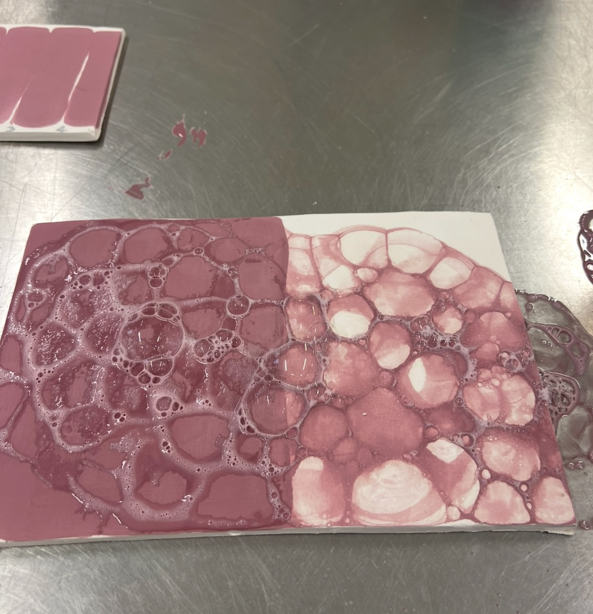
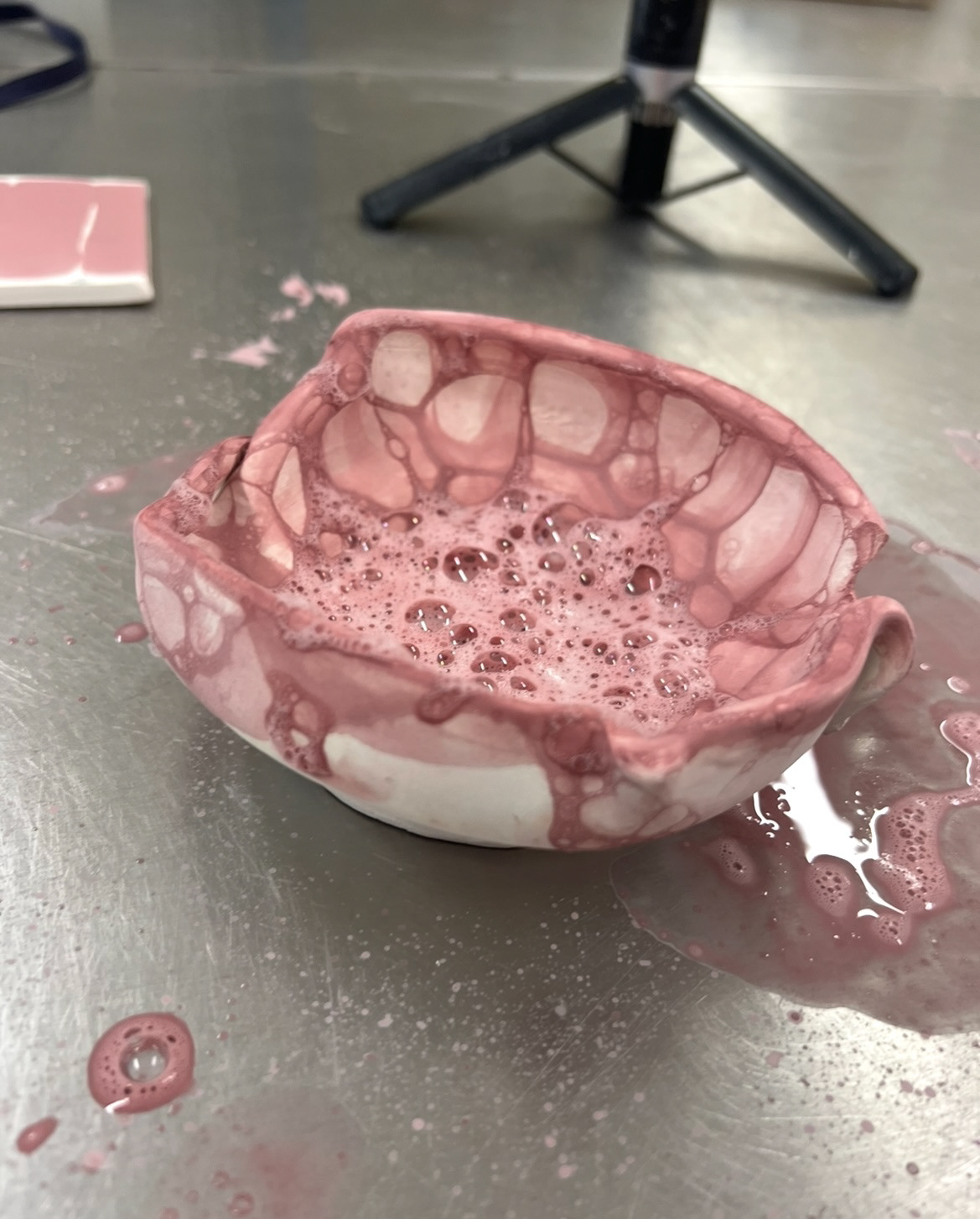
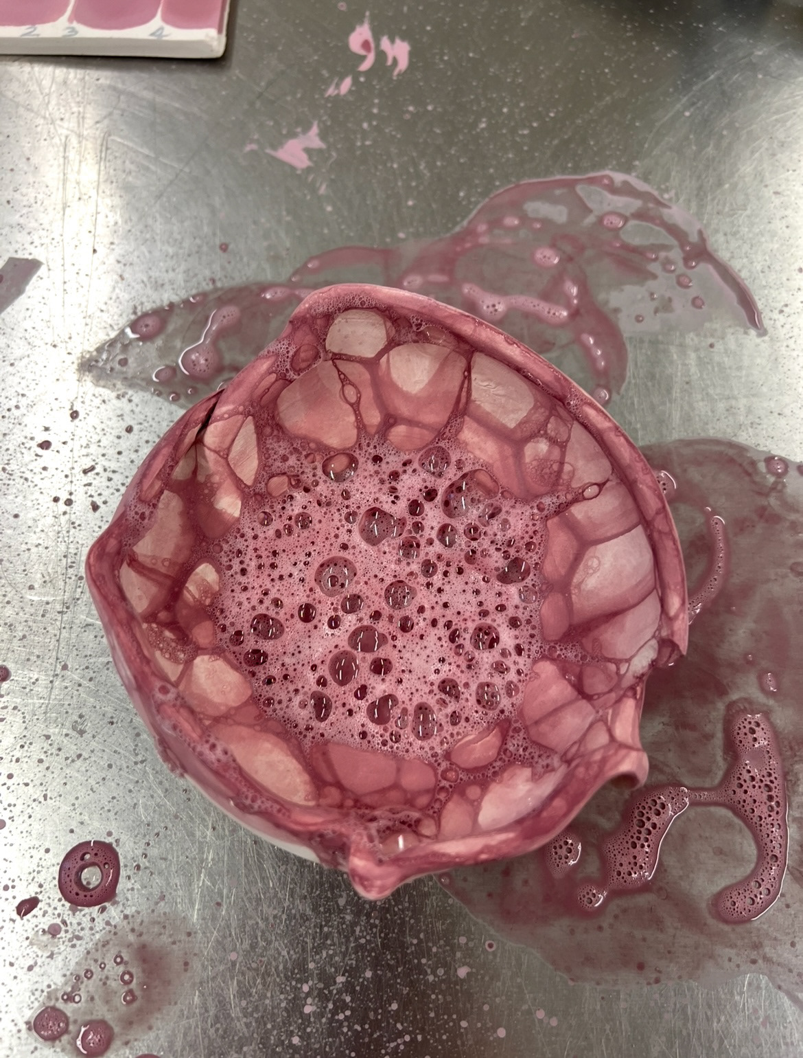
I tested out a few different ways of doing this technique. I did a small tile on its own with one layer of bubbles, a tile with 3 layers of bubbles to get a more saturated effect, a tile half white and half pink in 4 layers to see if the bubbles would show up on a surface of the same colour (above) and a sample on a bowl vessel (above) as I thought it would be wise to see how this technique faired on a surface that wasn't just a flat tile, as my wall plaques have raised sides which would be the parts that I would want to feature this effect. This technique on the vessel however, I did note that the bubbles tend to pop and leave quite a lot of residue in the bottom of the vessel, which is not easy to remove without damaging the pattern on the side, so this is something that I will have to bare in mind.
I left these on the shelf ready to be fired.
Meanwhile however when these were in the kiln, I decided to review and make a bigger more open press mould to fix the things I thought I could have improved on the last one I made. To get a better idea of what I wanted however, I made a cardboard and tape model of the sort of idea I was going for. (below).
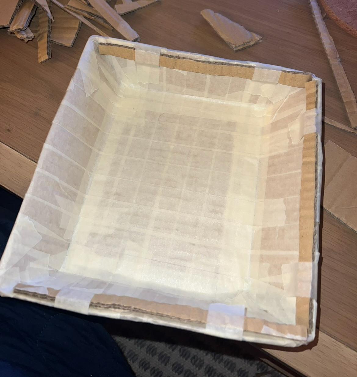
now that I had a more physical representation of what I was looking to make, I felt confident to go into plaster and make a new press mould that went along with this plan.
(See S&R Videos file - Plaster mould making Pt2)
When making this new mould I made sure correct past mistakes, for example, I made this mould much bigger with much thicker sides, I also made sure my mould was flat by agitating the surface while it was still wet. However because this mould was much bigger, I once again did not mix enough plaster at the first pour so I did once again have to top it up with some more at the end but I don't think this will have much affect on the final outcome.
Whilst this was drying, I decided to turn my head over to thinking a bit more about my subject matter and what would go on my plaques to tell the message I wanted to tell.
I knew that at the core of my project was the message of conservation of heritage crafts and that I was highlighting Sunderland ware as a lost and often forgotten about heritage graft to the area that I grew up.
I have found throughout working on this project, when mentioning Sunderland ware, no-one seems to even know it ever existed, which I have found has pushed my motivation further to represent it well and draw thought for perhaps other regional crafts that have fallen out of memory over time.
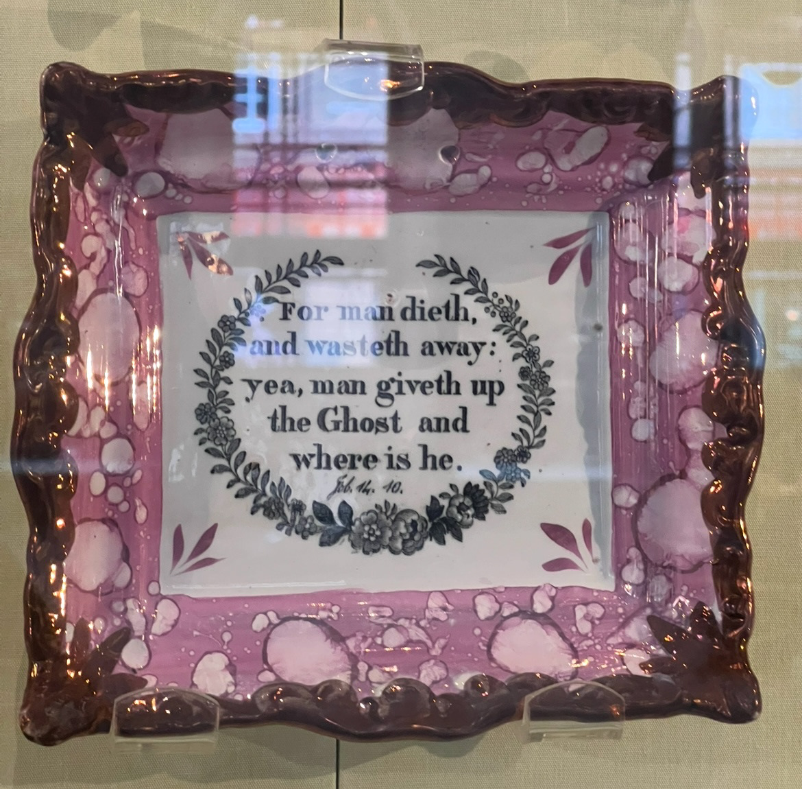
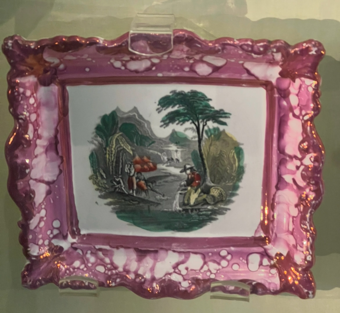
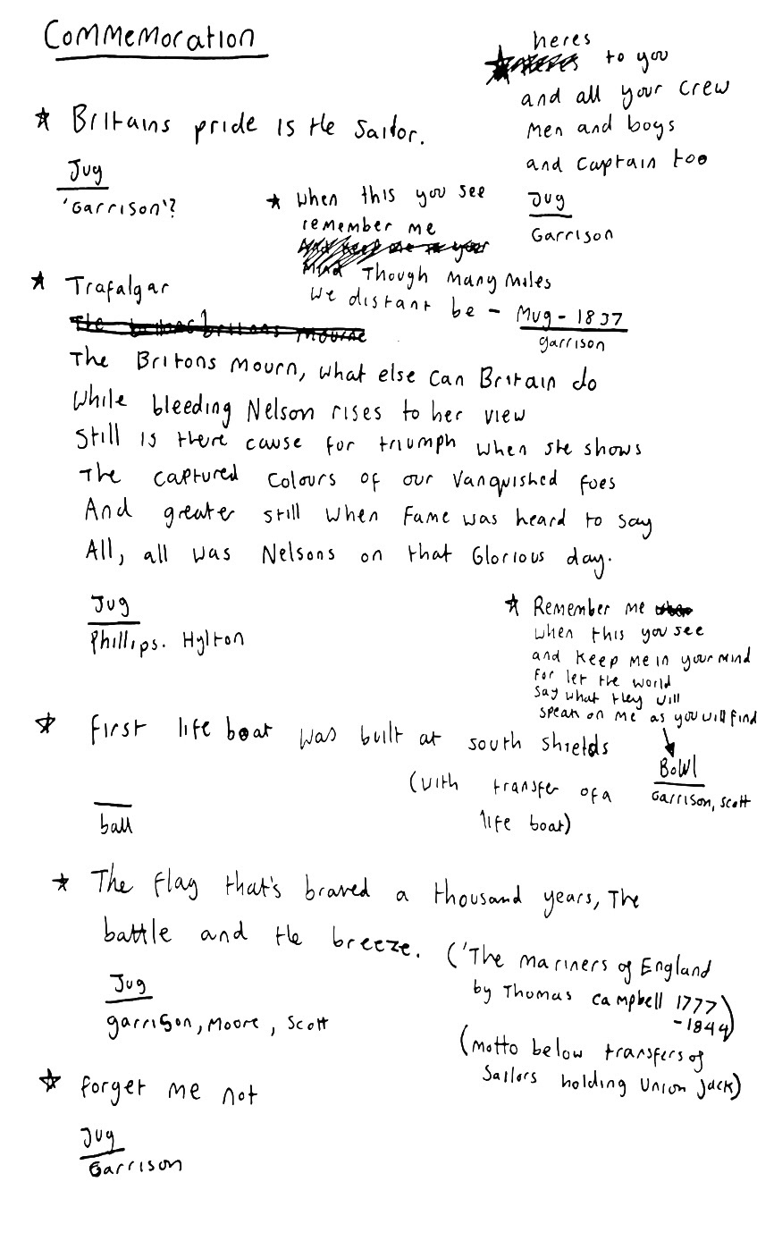
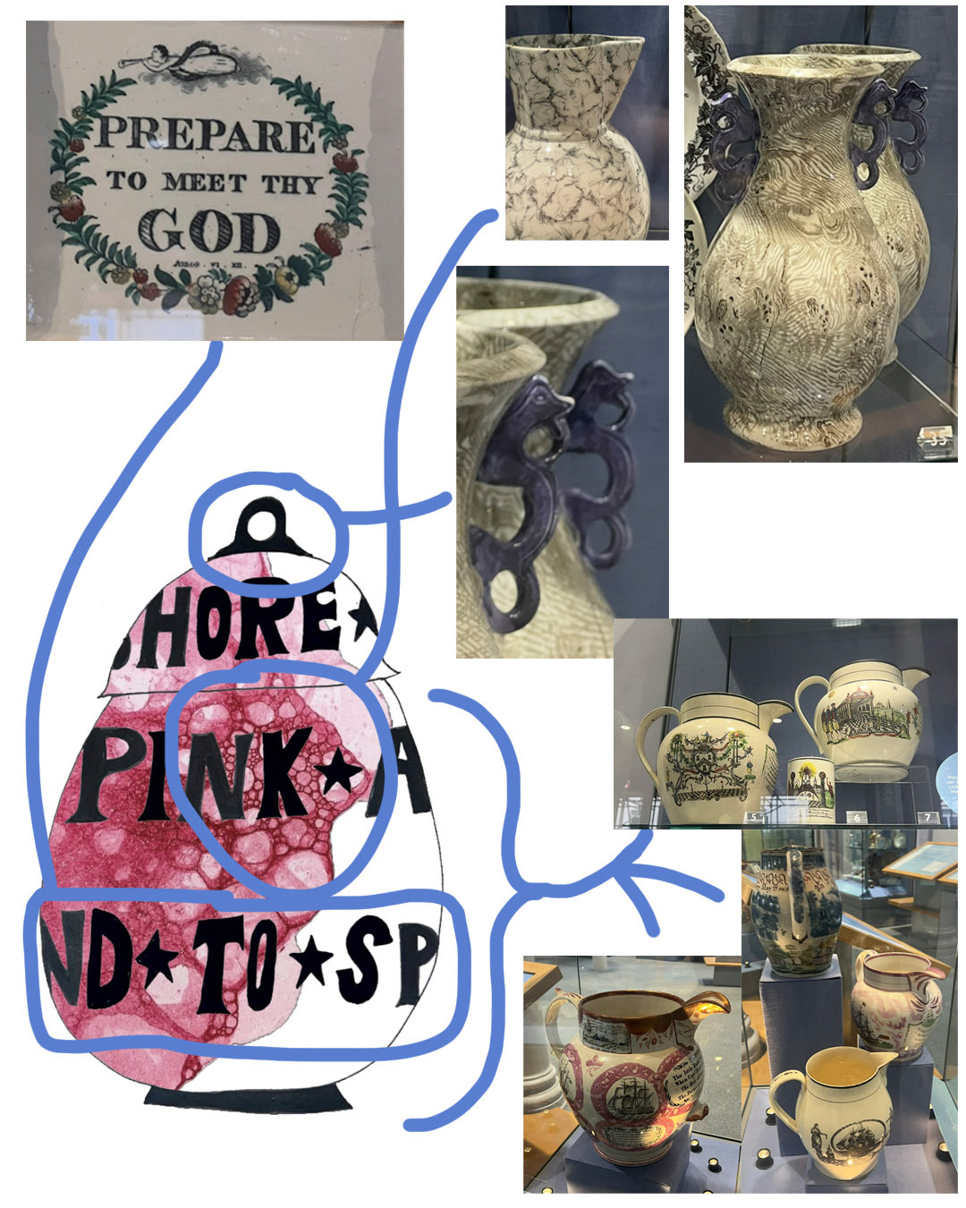
I started to think about the imagery, phrases and messaging on the original wall plaques, and came to the conclusion that a lot of them were to do with hope (hope through faith and religion), commemoration (through ships and bridges), and escapism (through idilic scenes of lifestyles much different to the ones of the people who would have once owned these pieces). I found that even just through identifying these themes, I have learnt a little bit about the people of Sunderland at the time, that they were most probably living tough lives, building ships and bridges at the steal works and adding these pieces to their homes to maybe brighten up their spaces and to help them remember their achievements and stay true to their religion for promise of a better afterlife.
I thought a bit about this and the idea of commemoration fit into my project extremely well so I decided that instead of commemorating ships and bridges, my Sunderland Ware inspired Pieces will commemorate Sunderland Ware itself as a whole, not only through form and colour but through what is also featured on the pieces.
I thought about what it was that I liked so much about Sunderland ware, and I decided that it was all of its little quirks that made it so imperfect and unusual, as I think that this is also where some of its most interesting stories are found. The bubbled pink lustre glaze made from arsenic, the transfers that are nine times out of ten completely wonky or out of place because 9 year old boys and girls were hired to apply them, the sometimes rather odd or scary phrases printed on them as focal points, the joke frogs and inconsistent clunky decoration over ornate moulding, are all part of its rich story and history that I would like to remember and share for others to see, as I think it is all so strange and unusual and beautiful at the same time.
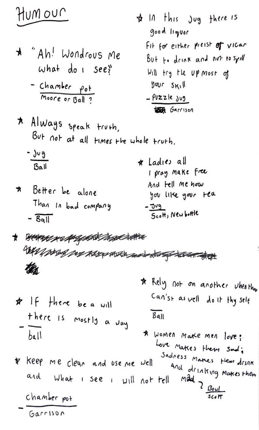
I started looking at these elements by starting with the phrases featured on these pieces from the list in the book called "Sunderland Ware" that I had previously borrowed from the Sunderland Library. Whilst looking through this list I was looking for phrases that entered around humour as well as commemoration as I thought that later I would be able to play on these as part of my pieces. (below).
I felt I was on a real roll with this however I had to put it on the back burner as my kiln tests had come out and needed some serious thinking about.
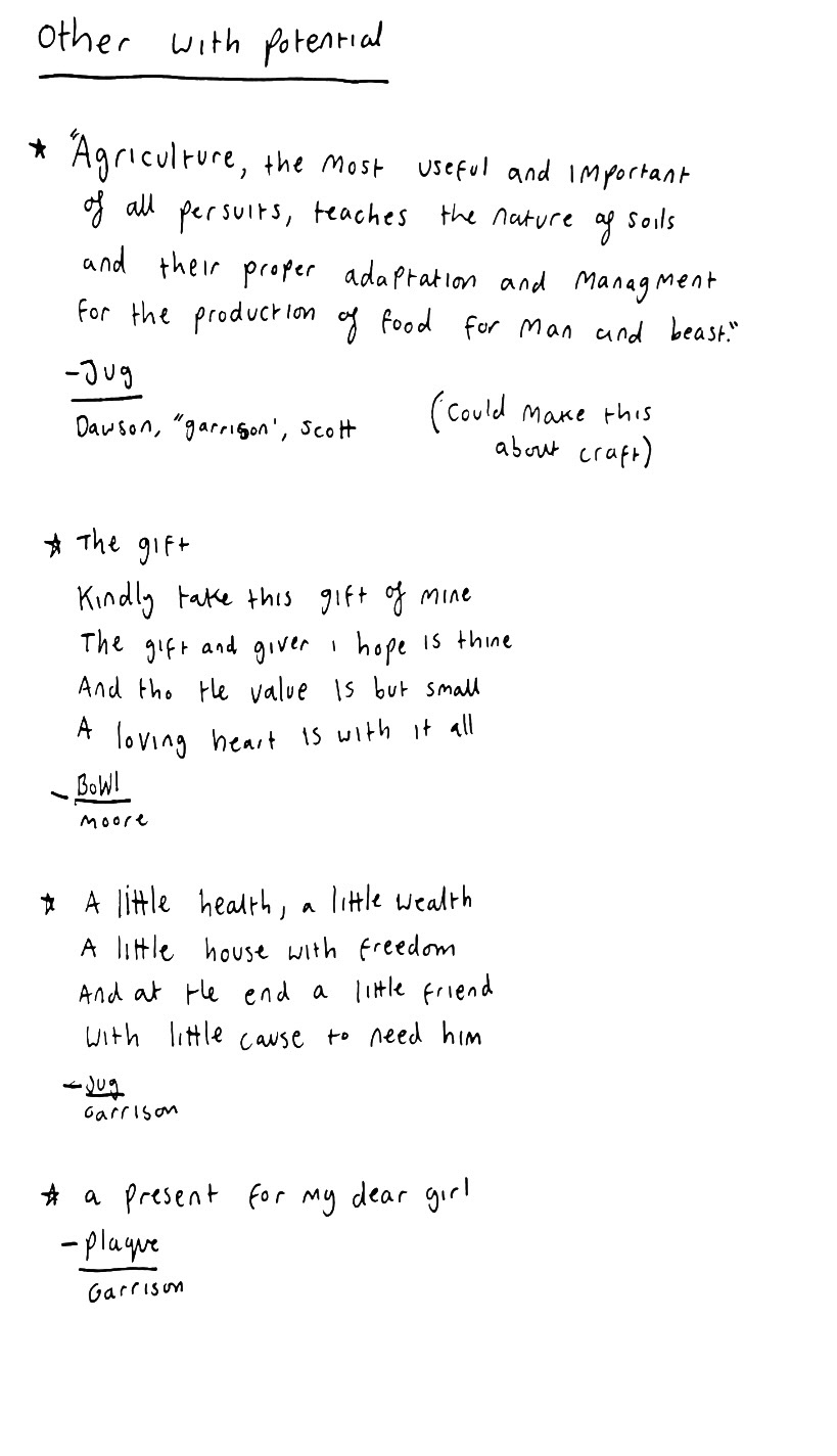
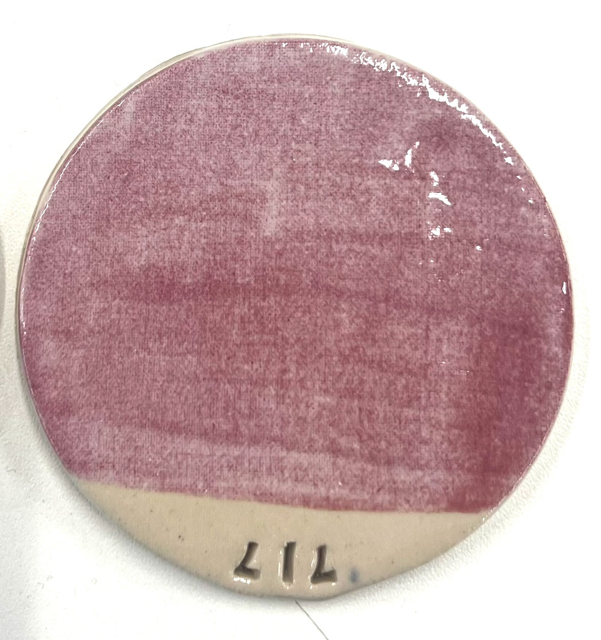
my glaze tests, kiln shelf tests and bubble samples had come out of the kiln and once again my glaze did not come out exactly as expected. (below).
The first piece I saw that came out of the kiln was my glaze layer sample (above), which defiantly had me perplexed and fearing for the worst. Unfortunately my fears were confirmed when my bubbled samples also came out the same way (below).
I was completely confused by this outcome because some of my samples had four or more layers of glaze on them and it didn't make sense as to why my samples had come out almost blank in some cases. However we were able to come to some sort of conclusion when I saw my kiln shelf samples. (below).
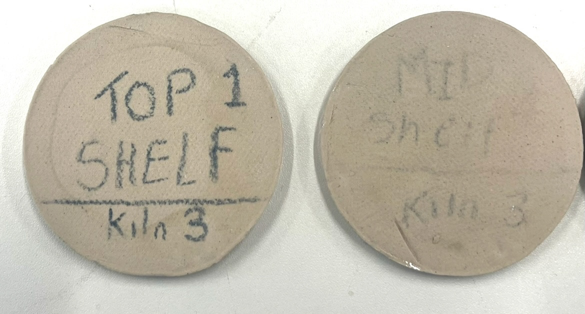
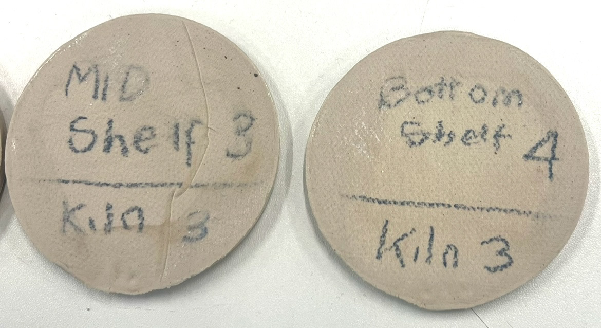
I showed these to Rudy and made some notes of our conversation.
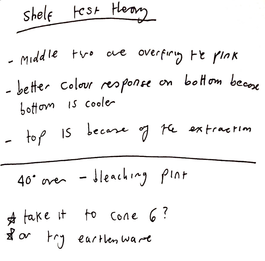
We came to the conclusion that I was putting these in for a much higher firing that what it needed so that the colour was getting bleached by the heat. So I decided that I would re run these tests and try some of them at cone 6 and some at earthen ware so that hopefully we would get a much more vibrant colour like the tests that had been on the topped bottom shelves of the kiln. luckily however the bowl vessel that I tested, did not go in this firing, so I can also fire this to earthenware in the next few days and save myself some time with moving onto some of my next steps. I made some test tiles and put them in to be bisque fired so that I could re try this process at a lower temperature.
This week my new lustre had also arrived.
I ordered some mother of pearl lustre so to try and emulate the effect of the original pearlescent pink glaze. I also showed this to Rudy who has organised for me to fill out a risk assessment form for it and show me the chemical room later on in the week so that I can use it most affectively. however we figured out that I would need an additional document called a Safety Data sheet before we could fill this out so I emailed Scarva requesting one, once this had arrived, I would be able to move on with this process.
whilst I waited for this to come through I had time to reflect on some of the feedback I had received in my last individual tutorial with CJ. She noted that she would like me to spend extra time and try and really refine my moulds for a cleaner finish. I took this on bored and started looking for new ways to make the insert for my moulds, that would give a cleaner finish than the hand modelled clay that I had been using previously. I ran through a few ideas such as 3D printing and laser cut, however because I try and do every step of my process by hand I decided that this was not the pathway for me, it would also use a lot of material and would mean going through inductions that I hadn't had yet which would mean I would have to wait for them and I didn't have this much time.
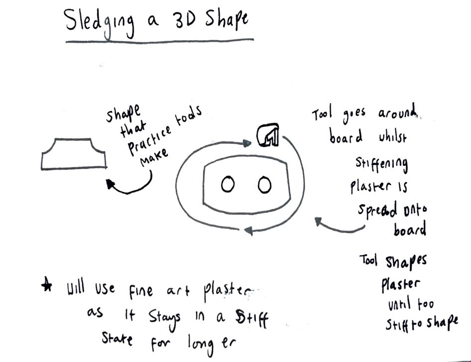
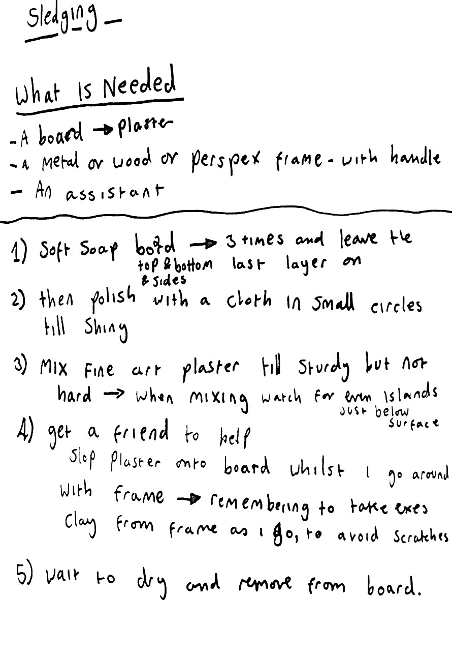
I had a conversation with Geoff and he suggested that I try sledging my insert piece in plaster and then forming a mould over the top of that. which I thought to be an interesting idea that I felt I could do well. I then went down to plaster and had a conversation with Dianne the plaster technician. She said that she hadn't seen anyone do this since a professional from Wedgwood came to do a workshop in 2019, and luckily she still had some of the tools that he left that I could practice with. (below).
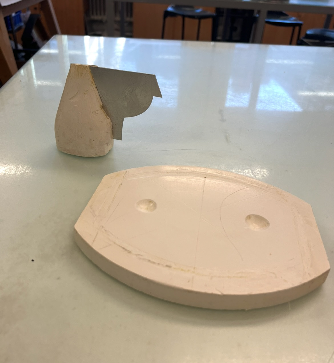
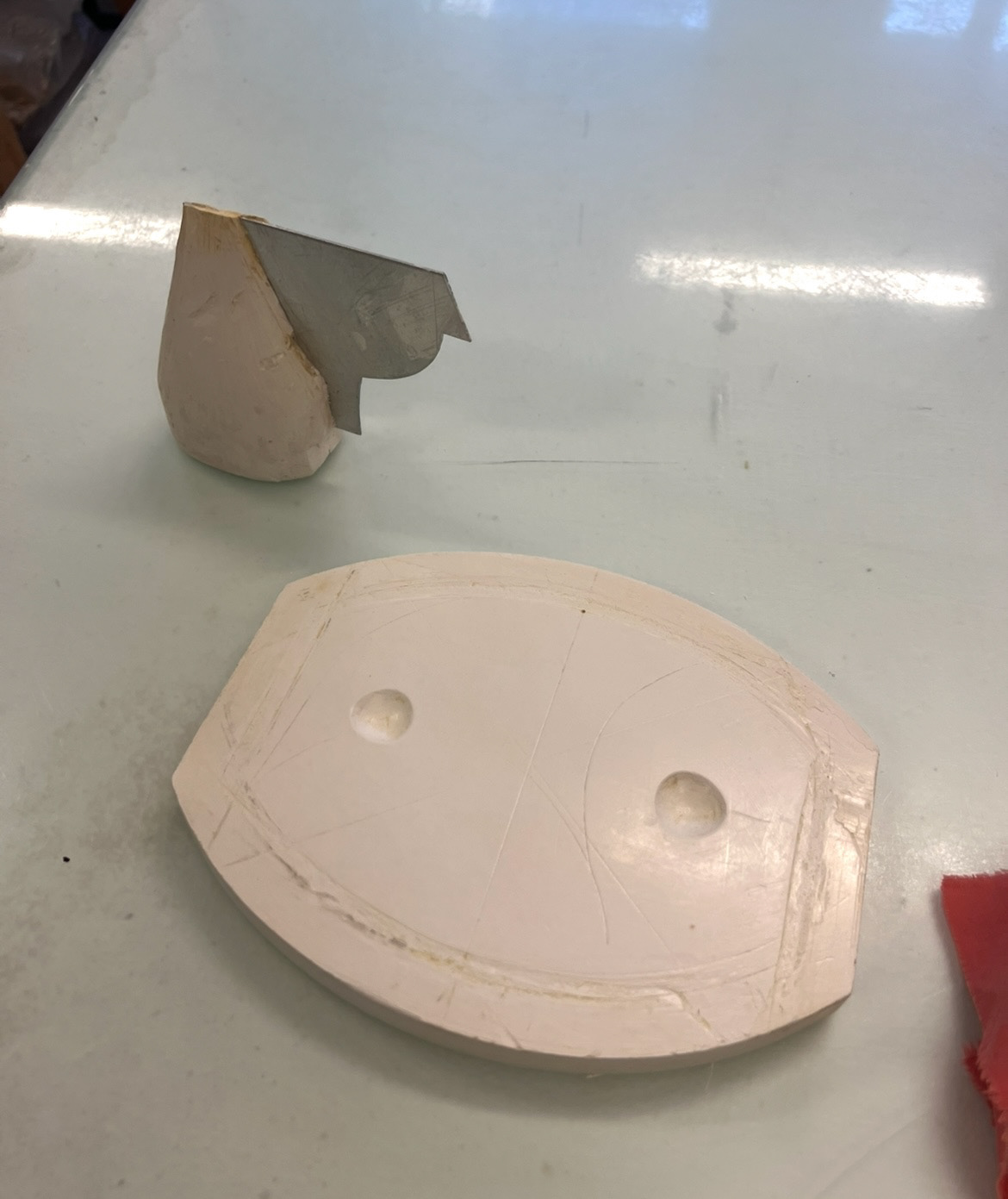
After getting a basic understanding of how this process worked I made some notes (below).
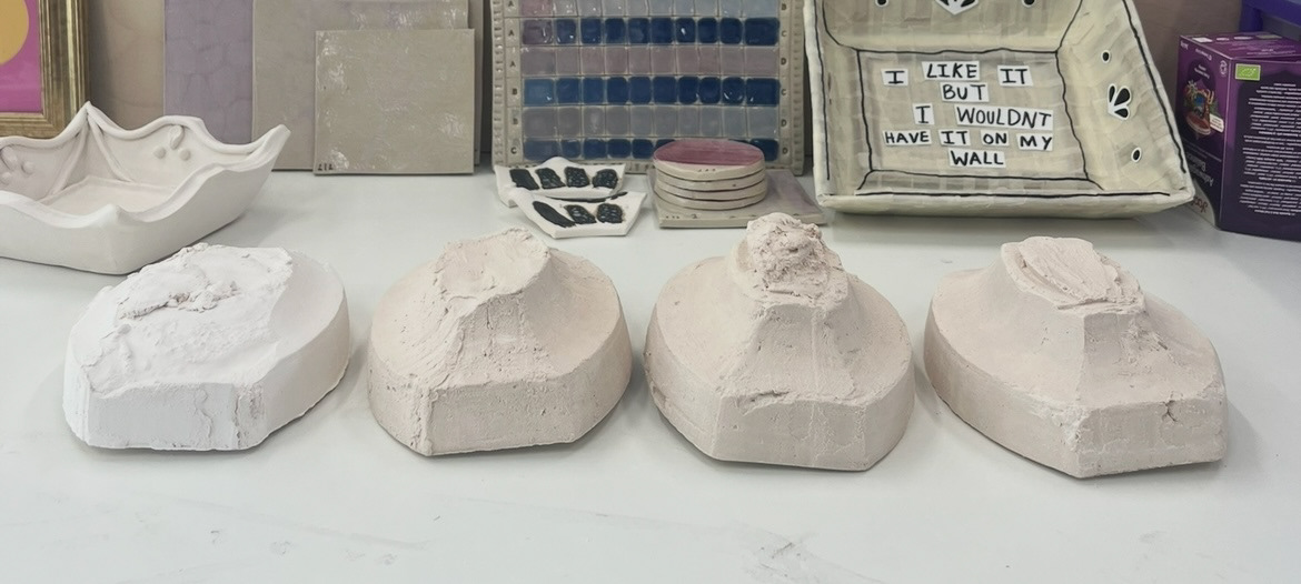
Over the corse of this week I completed this process many different times over with varying success. (chosen samples showing progression below)
with each one I was improving, however by my 6th sample I hit a bit of a stalemate where my samples were no longer improving or progressing. I couldn't, no matter how hard I tried, produce a sample with completely smooth sides, the best I could do was half a smooth section of side until the plaster started dragging and went rough. I chatted to Dianne again and saw if there could be any other ways that I could try and improve this. we came up with the idea of creating a clay centre to the shape so that the plaster would be anchored but this didn't work, we also came up with pouring over a thin layer of plaster to the shape and then giving it another few passes but the plaster ran off the sides and any remaining plaster did the exact same dragging as before. I also pulled the shape in sections to reduce drag and came up with a water spraying method but nothing worked.
This testing alone had taken up about a week and a half and at this point I was starting to get a little bit agitated about time. I decided that whilst still practicing, I would set out to start making my tools to make my own form.
for this I would need my plaster board base and my metal shaping tool. This required some quite exact measurements, especially for my tool. I got a friend in the metal workshop to help me with some of the working out. (measurements and working out below). we had to take into account the size and length of each part of the tool in relation to the plaster board and shape I wanted to create, we also had to work out the angle of the slope of the sides.
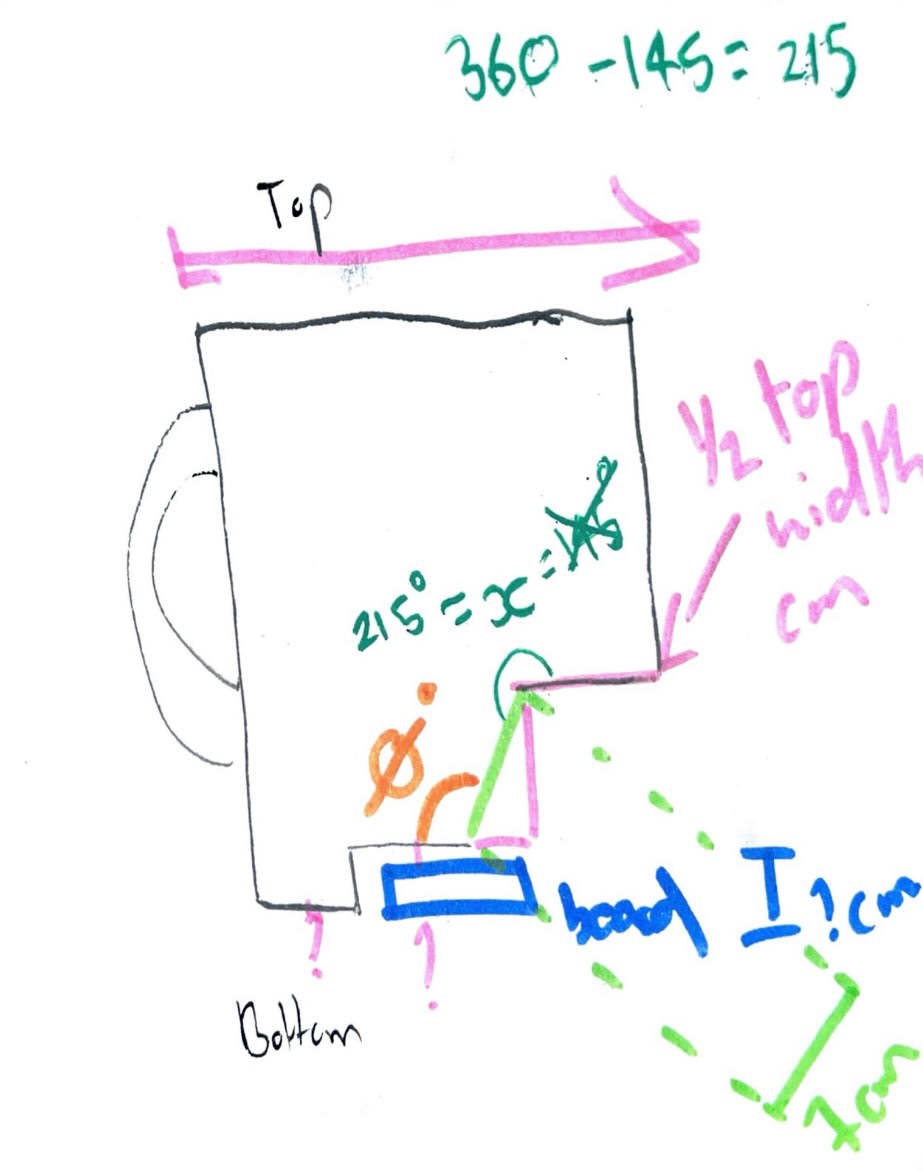
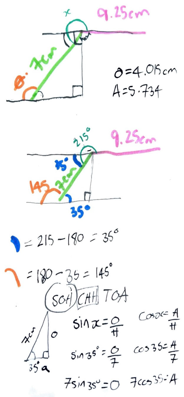
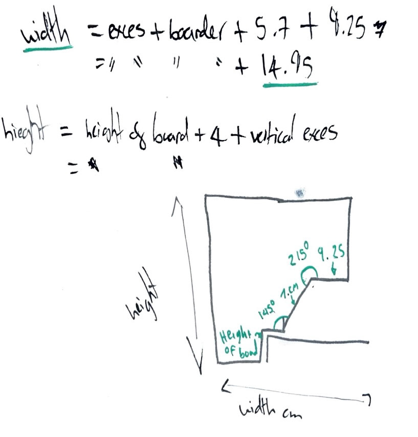
It was then I had to make plans to buy my metal and start cutting this piece.
However I was that I hit a bit of a wall with my project because I felt like I was getting nowhere with my sledging and this had caused me to fall a bit out of love with this form all together. I couldn't visualise my final pieces in my head as well as I could before and I felt I was fighting a losing battle against time. I felt it was time to draw the line and re evaluate whilst I still felt I had time to.
After a few days of thinking and again more failed samples, I made the hard decision to drop this form as my main pieces.
I thought about my practice and what had gotten me to this point and what I truly loved making and I came to the conclusion that this was pots. When I came to this conclusion, suddenly a million ideas flooded in to my head that I liked so much more than what I was doing before, and that I didn't have to drop the frame idea all together, however I could just interpret it in a new way.
I thought a lot about time frame and decided that I have the experience and the passion to coil build, slab build and hand model this idea into a reality within the time that I had. I thought that I was better to change my form into something that I was comfortable and confident with and then decorate with new techniques and materials, than be figuring out every single step out for the first time. I knew it would take a huge amount of hard work but I felt confident and started thinking about some ideas.
I thought that I would take the idea of a bachelors supper set, which is one form made from a number of different pieces. However I will create forms incorporating the forms from different pieces of existing Sunderland ware that catch my eye.
The first form I thought about and made a mock up of was this one. (below).
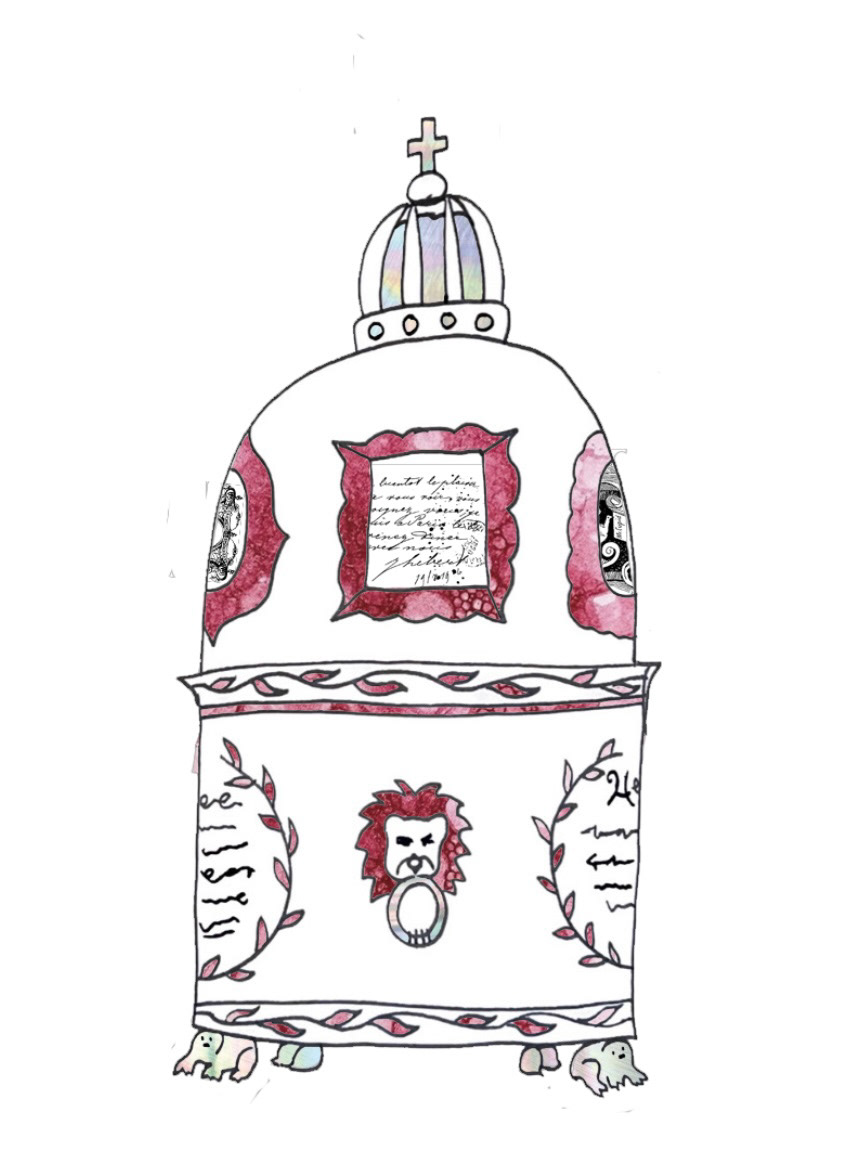
This piece is the one most derived from the original bachelors supper sets and the more classic forms and features of Sunderland ware, in its form and some elements of its decoration.
For decoration I have also taken inspiration from the pink wall plaques, especially in the frames which will house information, quotes and imagery. The layout is also inspired by the layout of quotes and poetry featured on some of the original pieces as well.
I have also included a nod to the joke frogs featured in some pieces of Sunderland ware, with the feet.
And the crown is also a feature found in a lot of commemorative Sunderland ware.
(below).
The second form I came up with was this one. (below).
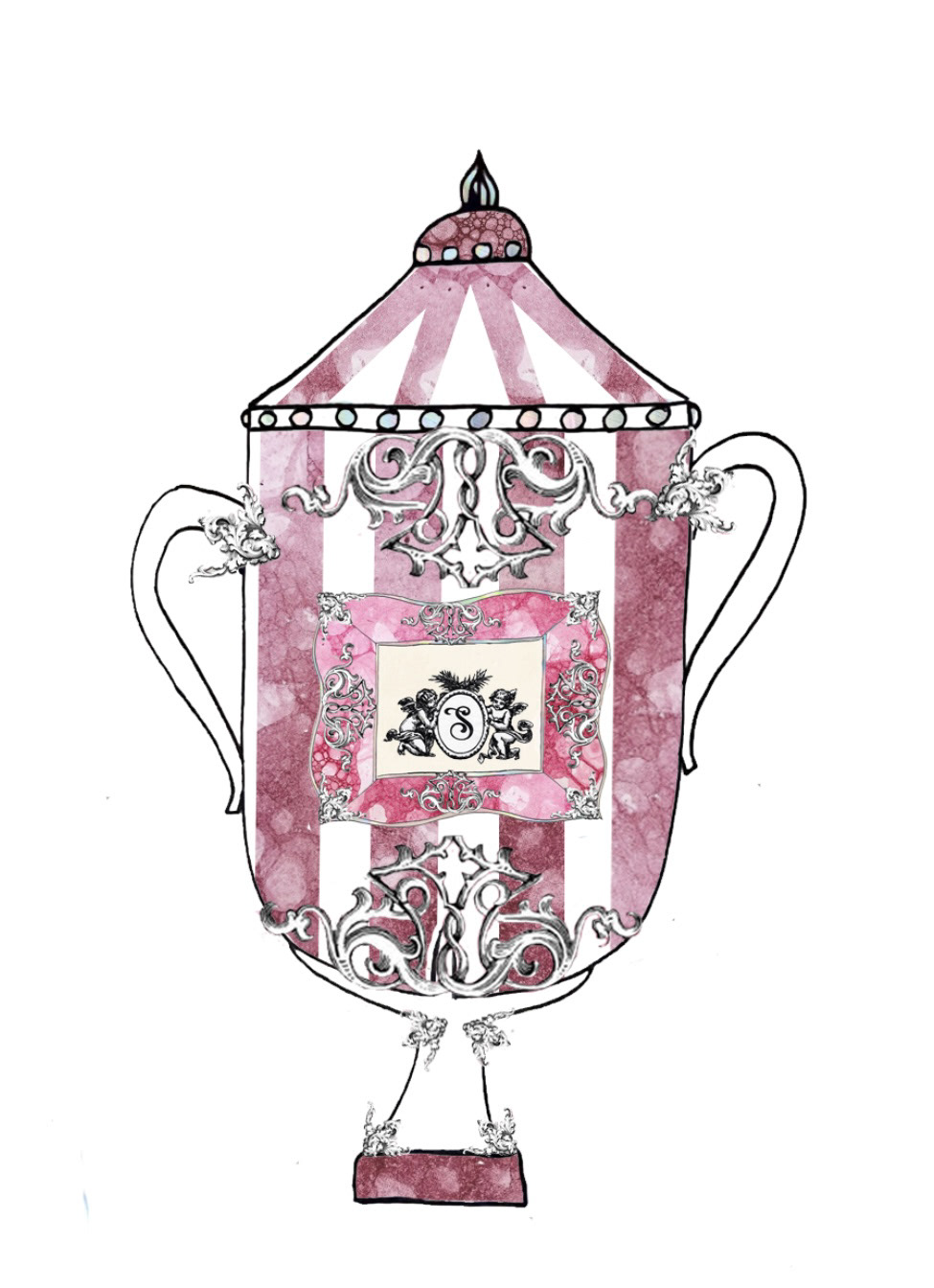
This pot is based on the more elaborate features of Sunderland ware as well as more cultural themes of Sunderland.
The form is based on an original Sunderland ware piece, as well as the FA cup which Sunderland have won twice, both times being extremely significant in the history of the city of Sunderland. I have also based the stripes on this pot from a Sunderland ware line but also from the red and white stripes of the Sunderland football strip, which are red and white (which mix together to make pink).
I have also featured a wall plaque frame on this piece, displaying a crest which was very common on these plaques.
I have also featured a large amount of 3D decoration, which reflects the more ornate features of some selected Sunderland ware pieces.
(below).
The final pot I came up with is this one (below).
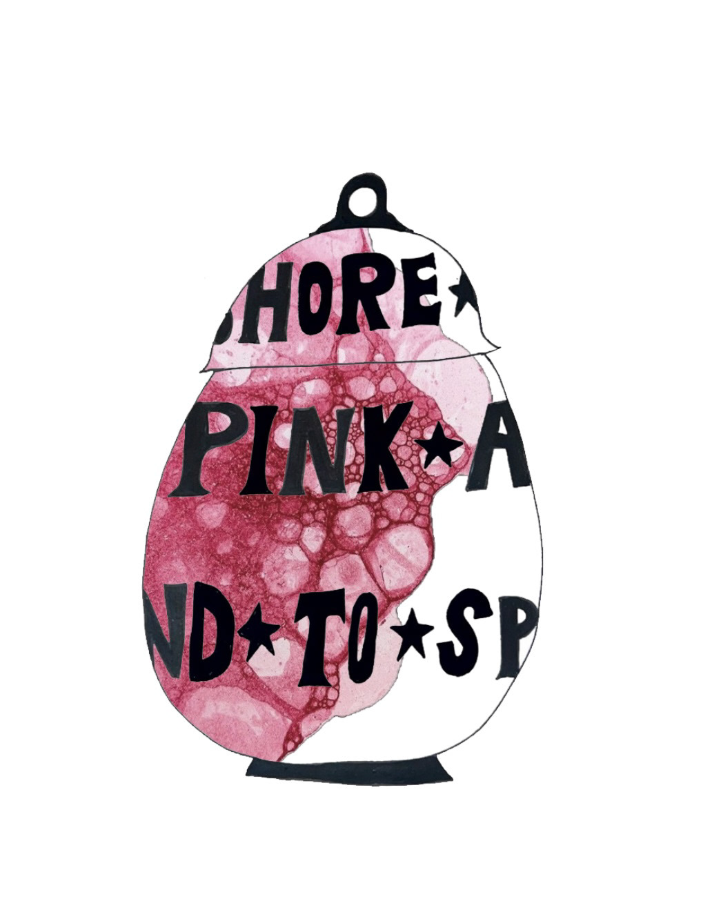
This pot I have based around modernising original elements of Sunderland ware.
I have taken inspiration from some original Sunderland ware pieces that to me already look quite modern despite them being made 100 years ago, I have taken this into the handle. these pieces also have quite free formed surface decoration so I thought I would take the classic pink bubbles and let them be more free form around my shape.
I have also taken the classic form of the iconic Sunderland ware jug and have modernised it into a bulbous jar form.
in this piece I will also take the traditional text seen on many Sunderland ware pieces and I will enlarge it and have it surrounding the piece rather than it be restricted to boxed off areas like it has been traditionally.
(below).
(see S&R pt3)